10,000 search results
(0.018 seconds)
- Mars Wars by Slava Antipov,
$29.00 Mars Wars is a futuristic display font. Thanks to its original technological outlines, it is well suited for logos, packaging, posters and much more. Mars Wars has very wide language support. It has expanded Latin and expanded Cyrillic. The font supports 80+ languages.
 - Gods of War - Unknown license

- Wars of Asgard - Personal use only

- Dog Eared by Andy Babb,
$19.20 Each character of Dog Eared began its life as a half-inch wide strip of paper, folded and Scotch-taped into formation, and then scanned and recreated digitally. Dog Eared is distinguished from other folded paper style typefaces by its robustness and versatility: each numeral and upper- and lowercase letter has a stylistic alternate. Dog Eared Striped is a traditional single color font, while Dog Eared Solid is a chromatic variant that can be used for a two-toned effect. Layer and multiply Dog Eared Striped and Dog Eared Solid together to achieve even more color variety.
 - Wan Font - Unknown license

- Gear - Unknown license

- Gears - Unknown license

- Gearing by Heyfonts,
$15.00 Gearing is a typeface that is widely associated with the extreme music genre of death metal. It is characterized by its dark and aggressive appearance, evoking a sense of brutality and chaos. The font is typically designed with sharp edges, bold and angular letterforms, and intricate or distorted shapes. The death metal font typically features strong upper and lowercase letter variations, often with sharp, exaggerated serifs or thorn-like spikes. These embellishments contribute to its menacing and threatening aesthetic. The letters may also have broken or damaged elements, giving them a weathered or decayed look. Though death metal fonts come in various styles and variations, they often prioritize legibility and impact over ease of reading. This means that certain parts of the letters may be missing or disconnected, making them appear jagged or incomplete. Ligatures, which are unique letter combinations, are sometimes included in the font to add a sense of continuity or artwork to the overall design. In terms of color, death metal fonts are commonly depicted in monochromatic shades such as black, grey, or dark red to maintain their sinister appearance. The color contrast often enhances the sharpness and intensity of the font, making it more visually striking. Due to its association with the underground music scene, the death metal font has become an essential element in album covers, band logos, posters, and merchandise. It effectively conveys the aggressive and rebellious spirit of the genre, becoming instantly recognizable to fans and enthusiasts.
 - Gears by Janworx,
$19.95 Gears, designed by Janet Valdez of Janworx, was inspired by the popularity of steampunk artwork, for which gears and levers are a defining element. Gears is a single bold typeface, incorporating gears and levers into each glyph in one form or another. It is intended to be used at a large size, and works well in graphics with gradient finishes, textures, and bevels. Lower case letters are uniformly understated, whereas upper case are more elaborate. This typeface is suitable for posters, screen printing, or any general graphics work that requires short words or slogans with high-impact, particularly in a steampunk theme.
 - War by Suomi,
$19.00 The matrix screen types from the movie War Games stuck in my mind, so I decided to make few versions.
 - Land of Fear by IKIIKOWRK,
$19.00 Proudly present Land Of Fear - Street Type, created by ikiiko Land of Fear is a hand-drawn street brush font in an urban style that has a gritty and edgy look, conveying the roughness of city streets. The letters have bold characters and appear to be scratched quickly with a strong brush. This font has wild strokes and comes in different widths and angles, giving the letter a sense of spontaneity and vitality. This font has an overall rough and rugged look, but also evokes a style that is young, wild and free. This typeface is perfect for an extreme sport stuff, street vibes, magazine layout, poster, fashion brand, urban style, quotes, or simply as a stylish text overlay to any background image. What's Included? Uppercase & Lowercase Numbers & Punctuation Alternates & Ligature Multilingual Support Works on PC & Mac
 - Evening Wear JNL by Jeff Levine,
$29.00 Evening Wear JNL, drawn from the elegant monoline lettering used as titling on the sheet music for "Smoke Gets In Your Eyes", conjures up images of 1930s New York at its apex. Fine restaurants, elegant night clubs and couples decked out in their best evening apparel were of a time long past when "doing the town" meant really dressing up for the occasion.
 - WEAR FAT SHIRT by TypoGraphicDesign,
$15.00 CONCEPT/ CHARACTERISTICS A display font that allows you to »Kleckern und Klotzen« (modified German proverb »to not take half-measures«) The fat and square character to the font, a bold and loud statement. The motto is square, practical, fat. The font styles ranging from high-contrast line difference "beanpole" over mediocrity "slim" to the fattest and blackest "okay" style. A font with humor ^^ APPLICATION AREA The modern, square lightweight »Fat Wear Shirt« would be happy as a display typeface in headline size on the following areas and would find this very real bold: Editorial Design (Magazine or Fanzine) or Webdesign (Headline Webfont for your website), party flyer, movie poster, music poster, clothing, fashion, t-shirts, music covers or webbanner. And and and… TECHNICAL SPECIFICATIONS Headline Font | Display Font | Fat Techno Font »Wear Fat Shirt« OpenType Font (Mac + Win) with 3 styles (okay, slim, beanpole) & 268 glyphs. Alternative letters and ligatures (with accents & €) Desktop Font (.otf) + Web Font (.svg, .eot, .woff) KONZEPT/BESONDERHEITEN Eine Display-Schrift bei der Kleckern und Klotzen erlaubt ist! (Verändertes deutsches Sprichwort »nicht kleckern sondern klotzen«) Der fette und eckige Charakter verleihen der Schrift eine plakative und laute Aussage. Das Motto lautet quadratisch, praktisch, fett. Die Schriftschnitte reichen von kontrastreichen Linienunterschied »beanpole«, über mittelmaß »slim« bis zum fettesten und schwärzesten »okay« Style. Eine Schrift mit Humor ^^ EINSATZGEBIETE Das moderne, quadratische Leichtgewicht »Wear Fat Shirt«, würde sich als Auszeichnungsschrift in Headlinegröße über folgende Einsatzgebiete sehr freuen und fände dies echt fett: Logos/Wortmarken aller Art, Flyer für fast jede Party, Platten Cover, CD-Cover und Icon Design, Plakat Design, Kleidung, T-Shirts, Comics und Graphicnovels, Game– und Videospiel Design aller Genres, als Headlineschrift für print und digitale Magazine, Bücher und Webseiten u.v.m. TECHNISCHE INFORMATIONEN Headline Font | Display Font | Fat Techno Font »Wear Fat Shirt« OpenType Font (Mac + Win) mit 3 Schriftschnitten (okay, slim, beanpole) & 268 Glyphen. Inkl. diakritisches Zeichen, alternative Buchstaben, Ligaturen & €. Desktop Font (.otf) + Web Font (.svg, .eot, .woff)
 - Ladies Wear JNL by Jeff Levine,
$29.00 Aside from his 1920s and 1960 editions of Sam Welo’s “Studio Handbook – Letter and Design for Artists and Advertisers”, Welo also published “Lettering - Practical and Foreign” in 1930. A monoline Art Deco Alphabet from that book is now available digitally as Ladies Wear JNL in both regular and oblique versions.
 - Long Ears MF - Unknown license

- GHEA Warm Font by Edik Ghabuzyan,
$30.00 GHEA Warm Font is a non-serif style text, tytle and Display typeface. It has two weights- SemiBold and SemiBold Italic. The font is very elegant and easily readable.
 - Summer Dear Font Duo by Lucky Type,
$12.00 Let me introduce the latest beautiful combination of handwritten font Summer Dier Font Duo + Extras. The Summer Dier Font typeface is designed to make your next great project look more natural and stand out. The Summer Dier Font includes several Opentype Ligatures included to make the typeface look more natural and lastly, it has over 30 handcrafted additions to help your future designs look prettier. Thank you very much for viewing.
 - Gear Proportion - Unknown license

- Geared Up - Unknown license

- Bevel Gear by Sipanji21,
$12.00 "Bevel Gear" is a racing display font with multiple layers that can be used to create a three-dimensional (3D) effect in your text. Fonts like this are often used in racing-related design projects, including logos, posters, and advertisements for racing events or automotive-related content. By utilizing the multiple layers available in "Bevel Gear," you can give your text a three-dimensional appearance that adds depth and dimension to your design. This font allows you to create text that looks dynamic and is well-suited for designs in the world of motorsports and racing.
 - Crasher Gear by Mofr24,
$10.00 Introducing "Crasher Gear," a captivating handwritten font with a monospaced, grunge-inspired design. Its multilingual support ensures global communication. With Regular, Italic, Oblique Italic, Bold, Bold Italic, and Bold Oblique Italic styles, it's ideal for posters, marketing, T-shirts, YouTube, games, and more. Embodying a bold, dystopian spirit, this versatile font leaves a lasting impression. Pair it seamlessly with various typefaces. Unleash creativity with "Crasher Gear" today.
 - My type of font - Unknown license

- bear - Unknown license

- Tear - Personal use only

- Genre by Storm Type Foundry,
$26.00The official terseness and grey of Neo-Classical type faces will stand out when we narrow them. The consistently vertical shading of the letters suppresses one's desire for eccentricity, just like tea with bromine. It would, however, be wrong to consider Bodoni as the originator of this - vertically shaded - trend in type face production. In his Manual we can also find type faces with a slanted axis of shade, picturesque italics and a number of normal, more human type faces. It remains a mystery why his name is connected only with one of his many works. Genre's basic design is fairly light in colour, which is why it looks good in illustrated magazines and short texts and directly calls for graphically striking, contrasting headings. It shows off beautifully next to photographs, on diplomas and on printed materials connected with a person's death. - Bear by La Boîte Graphique,
$16.00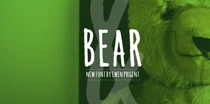 Bear is a hand made font ideal for your graphic project.
 - Angelic War - Personal use only

- War Letters - Personal use only

- War Eagle - Personal use only

- Colony Wars - Unknown license

- War Machine - Unknown license

- Stupid War by PizzaDude.dk,
$17.00 This font is not a rebel or a political font, but a simple and grungy stencil font. Use it for anything that needs a clear and catchy headline. The font is even suitable for massive text - perhaps for that skateboarding poster you have plans to do? Maybe a heavy metal concert flyer? Please don't use it for any war business, because war is stupid!
 - Street Wars by SemutHitam,
$19.00 Street Wars is an Oldschool Graffiti Tag Fonts, Back to Basic!!! For those of you who want a more funky design look. In the graffiti world, usually you'll use the initials as a sign of your masterpiece, or you use it for a graffiti battle. Street Wars present to you, Inspired from old style graffiti tagging. Street Wars Includes full set of funky uppercase, lowercase letters, numbers, punctuation, multilingual language, stylistic styles and various ligatures. To make you easily mix and match your own graffiti style tag. to use various style you have to use software that supports OpenType features. We hope you enjoy with Street Wars. Feel free to comment and give any feedback to build more good font. Thanks for your purchasing, and Happy creating... :)
 - American Way Of Life by Intellecta Design,
$19.90
- KR Western Wear 1 - Unknown license

- Fear of a Punk Planet - Unknown license

- Year supply of fairy cakes - Unknown license

- Font - Unknown license

- Gerful by VP Creative Shop,
$12.00 Introducing Gerful - Creative Display Typeface Gerful is geometric and creative font with multilingual support. It's a very versatile font that works great in large and small sizes. Gerful is perfect for branding projects, home-ware designs, product packaging, magazine headers - or simply as a stylish text overlay to any background image. FEATURES Uppercase, numeral, punctuation & Symbol Regular Italic Multilingual support No special software is required to type out the standard characters of the Typeface. Canva friendly Feel free to contact me if you have any questions! Mock ups and backgrounds used are not included. Thank you! Enjoy!
 - Ger by ParaType,
$25.00A set of historical Ossetic ornaments was designed by Lev Alborov in 1998 and licensed by ParaType.


Page 1 of 250Next page