4,669 search results
(0.011 seconds)
- DIVERGENT - Personal use only

- Canadian - Unknown license

- Yahoo - Unknown license

- Janda Snickerdoodle Serif - Personal use only

- Idolwild - Unknown license

- Bigplace Caps ExtBd ExtCond - Personal use only

- H74 The Black Bureau by Hydro74,
$9.99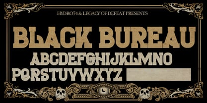
- BF Fiona Serif by BrassFonts,
$36.00 - GirderSuper by Wooden Type Fonts,
$15.00
- BF Fiona Script by BrassFonts,
$36.00 - Donald by Intellecta Design,
$9.00 - Bandera Text by AndrijType,
$21.00
- Bandera Text Cyrillic by AndrijType,
$21.00
- Big Mamma by Resistenza,
$39.00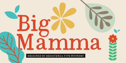
- Friday Jeans by PizzaDude.dk,
$19.00
- CRM American Horror by CRMFontCo,
$35.00
- Preferred Shares JNL by Jeff Levine,
$29.00
- Getih West by Twinletter,
$15.00
- Selectric Pyramid by Indian Summer Studio,
$45.00
- Poster Moderne JNL by Jeff Levine,
$29.00
- Picuxuxo by Intellecta Design,
$16.90 - Cyntho Next by Mint Type,
$35.00
- Ringa by Melvastype,
$25.00
- Kaine by The Northern Block,
$12.80
- Sewing Patterns 2 by Lauren Ashpole,
$15.00
- Yippie Yeah by Almarkha Type,
$25.00
- CPL Kirkwood by Kimmy Design,
$15.00
- Old Towne Pro by RMU,
$40.00
- Cinque by Adrianna Bilas,
$18.99
- Granic by Gror,
$9.00
- Mounth by Linecreative,
$16.00
- Abula by Typesketchbook,
$30.00
- SlabFace 2010 - 100% free

- KG Be Still & Know - Personal use only

- Rabanera - Personal use only

- Janda Quirkygirl - Personal use only

- Gipsiero - Unknown license

- Manometer by Fontador,
$18.99
- Horror Korpus by Mans Greback,
$69.00
- Dietal Sans by Tour De Force,
$25.00


