10,000 search results
(0.145 seconds)
- Rodley by Fettle Foundry,
$10.00 Rodley is a geometric sans-serif typeface and a ground-up redrawing of Bairne – the first ever typeface from Fettle Foundry – with a completely new character set that closer resembles the original vision for the typeface. The changes are so substantial that Rodley has taken on a life of its own, becoming a brand new typeface. Inspired by low-contrast Swiss and Modernist grotesque typefaces, with the addition of characterful geometric shapes, Rodley aims to be a more disruptive choice for brands, while retaining the appeal of those popular styles. Based upon a Latin S character set with additional glyphs, Rodley supports many latin-based languages, with a focus on pan-European and South American languages. Thorough kerning has been applied to uppercase/lowercase, uppercase/uppercase, lowercase/lowercase and CamelCase character combinations, with thorough attention paid to an incredibly large number of diacritical combinations. Available in 5 weights, from thin to bold, with matching italics, Rodley has been designed with a wide range of uses and sizes in mind.
 - Bronto by W Type Foundry,
$29.00 Bronto is a typeface that mutated many times: it went from being morphologically conventional, to have soft features, to finally have some inverted contrasts that made it more dynamical; but all this without losing sight of the meaning of a typefamily, and the aim pursued by this work: Bronto doesn’t behave as a piece of art, but as a tool. In some weights, this typeface possesses fluffy characteristics and is boldly bighead, while in other versions is slightly contrasted and controlled; this in order to maintain the essential features of the typefamily along the versatility and usability of the 20 variations that composed it. Bronto it’s inspired in neo humanists typographies of the 20th century, and in Chilean lettering. This kind of work was made by the spontaneity of the paintbrush, which gave an inverted contrast to some characters. This typeface has plenty of OpenType features, specially an extensive set of ligatures in all weights. Bronto is well suited for motion graphics, letterings, web, advertisings, magazines and books.
 - Magnirum Serif by Mans Greback,
$79.00 Magnirum Serif is a serif typeface with a medieval flair. Drawing inspiration from historic Roman typography and medieval design, Magnirum Serif is a timeless creation that exudes beauty and elegance. While its serifs and ornaments echo the intricacies of ancient manuscripts, the typeface is designed for modern legibility and regular usage. It combines the best of both worlds, offering a unique blend of historic charm and contemporary readability. Add symbol # after any letter to place a crown on top of it. Example: Cro#wn Magnirum Serif is built with advanced OpenType functionality and has a guaranteed top-notch quality, containing stylistic and contextual alternates, ligatures, and more features; all to give you full control and customizability. It has extensive lingual support, covering all Latin-based languages, and includes all the characters and symbols you'll ever need. Behind this captivating creation is Mans Greback. Renowned for his skill in marrying historical elements with modern utility, Greback has crafted Magnirum Serif to be a versatile yet nostalgic typeface. His portfolio showcases his ability to bring stories and emotions into the realm of type design.
 - Campeche Variable by Latinotype,
$199.00 Campeche variable is an expressive yet functional typeface family. Seeking to express its beauty, it twists the conventions of classic typography when necessary. Campeche finds its inspiration in the grotesque typefaces of the late 19th century coupled with a typical Latin American playful sense that gives it a modern freshness. The initial form arises from the idea of expanding Seriguela, evolving along the way, becoming its own system with a unique personality. Campeche is designed according to today's visual requirements. Taking advantage of variable technology in 3 axes: width, weight and display. Campeche Variable is a typeface that provides versatility for almost any use. It can be used for packaging, editorial, branding... etc. The mixture of its possibilities can generate complex graphic parts or systems with different levels of hierarchy, without losing unity.
 - Excelsor Script by Storm Type Foundry,
$32.00Excelsor Script is inspired by lithographically produced scripts. It is softer and simpler than, for example, engraved Splendid Script, because its designer used pens and lithographic needles. The graver for steel is held in a quite different way and this has an influence on the shape of the letter. Similar type faces were in use from Neo-Classicism until the beginning of Art Nouveau, when they were pushed aside by a completely different view of festive typography. It has, in contradistinction to other scripts, slightly narrowed letters, which signifies a distinctive elegance without wasting space on the line. For practical reasons it was not possible to encircle the bottle with too long a label. It is, therefore, a suitable type face for labels. Its two optical grades cover a wide range of sizes. - Millie by Kyle Wayne Benson,
$10.00 Millie is a stressed, geometric script who spends her days as industrial lettering and her nights paired with blackletter on the patches of motorcycle gangs. Millie was weighted by the conventions of broad nib calligraphy, inspired by the Milwaukee Tools logo, and finds herself best used in logos and titles. She was designed to be used on about a 20 degree angle, though she looks just fine on a level plane. By using opentype, many ligatures, and two sets of stylistic alternates, Millie was developed to look great with any string of letters. Access the first stylistic set for a disconnected script look, and the second set for even more connections and fluid script than standard. Millie Round takes the edge off a bit, giving the entire set a more approachable and versatile feel.
 - Grand Hotel Pro by Stiggy & Sands,
$39.00 Our Grand Hotel Pro finds its inspiration from the title screen of the 1937 film “Cafe Metropole” starring Tyrone Power. This condensed upright connecting script has a classic flair and weight to it that feels subtly tied to Holiday and Bakery themed designs, even though it can work outside that genre. Stylistic Alternates offer a non-swash set of Capitals, and a SmallCaps feature gives this upright script an exciting visual twist. Elegant, reserved, sophisticated, and yet festive all at once. Grand Hotel Pro is a style revival that still finds a strong visual appeal today. Opentype features include: - SmallCaps. - Full set of Inferiors and Superiors for limitless fractions. - Tabular, Proportional, and Oldstyle figure sets. - Stylistic Alternates for less stylized traditional Capitals. - Contextual Alternates for some initial and final forms.
 - Arpona Sans by Floodfonts,
$49.00 Arpona Sans is a contemporary sans serif family inspired by the work of Edward Johnston and Eric Gill for London Underground. As well as its serif companion Arpona it is a symbiosis of different design concepts. Arpona Sans combines the esthetics of a geometric Sans with the usefulness of the humanist concept and the calm of the modernist proportions. Arpona Sans is a good choice for editorial design, branding, app design and web design – a workhorse well readable even in running text on screen. The family has nine weights, ranging from Thin to Black plus corresponding italics. Each style includes 590 glyphs supporting all western-, eastern- and central-european languages including four sets of figures and various currency symbols. If you want to go into details visit the microsite: https://www.floodfonts.com/arponasans
 - Baldufa Cyrillic Ltn by Letterjuice,
$93.00 Baldufa is a charming typeface with strong personality, which looks very comfortable in text. There is a search to obtain complicated curves and detailed features, which gives the typeface a touch of beauty and elegance. However, this is also a self-conscious design that claims through the rounded serifs and irregular vertical stems appreciation for quirkiness and human imperfection. The letterforms are inspired by the slight distortions and idiosyncrasies that came with old printing methods. It has distinct, features such as rounded serifs, irregular vertical streams, ink traps and extremely thin junctions. In the Italic, serifs have been removed to enhance movement and expressivity. These experiments in form have not come at the cost of legibility: The typeface remains suitable for both small and display text. Baldufa Cyrillic Latin contains Cyrillic Extended and Latin.
 - ITC Styleboy by ITC,
$29.99 Although ITC Styleboy has a retro feel, it isn't based on any earlier typeface. As far as inspiration goes," says designer Chester Wajda, "I'd have to say comic strips of the '20s and '30s, and silent-film marquee lettering from the '20s - with a hint of a Chinese brush?" He originally created the typeface for a children's book he was working on. "I wanted it to be fun, but still somewhat formal in its underlying structure," he says. "It's largely based on right and 45-degree angles, with slight tucks inward on the stems and bowls, and a few flourishes here and there." Styleboy's top-heavy look is most noticeable in the caps, but it's exaggerated too in the "8" and the lowercase "g." Styleboy is Wajda's first typeface design."
 - Apium by Spilling Type,
$14.99 Apium is a non-trivial serif typeface. Inspired by the lettering of an old advert, it aims to add fun to a serif with distinctive features. It comes in five weights with matching italics. The typeface performs well in display environment: headings, stand out text, packaging, posters and so on. The regular and medium weights work well as body text. The typeface is suitable for print and digital. Apium has Latin Extended A and Latin Plus Multi-Lingual support. OpenType features include: Small capitals, Discretionary ligatures, Standard ligatures, Lining figures, Oldstyle figures, Proportional figures, Tabular figures, Ordinals, Denominators, Numerators, Scientific inferiors, Subscript, Superscript and Fractions. The word apium is Latin for parsley. The original advert was for a vegetable margarine and that got me on the road of a food theme.
 - Girard by House Industries,
$33.00 Whatever the medium, Girard’s love for typography was the common thread that wove his work together. We are honored that the Girard family has entrusted us to celebrate and expand upon the legacy of this design icon with this collection of fonts. The Girard Slab family gracefully synthesizes illustrative sensibilities into a practical typographic framework. Slab’s three widths and four weights ensure versatility in a modern editorial setting while its gentle curves transcend the sterility of traditional typography to add an unprecedented warmth and personality. From boutique chocolate packaging to the titling sequence for an indie vegan superhero cartoon, Girard Script deftly adds a contemporary sophistication to text and display settings. Inspired by a workhorse lettering style that helped Alexander Girard implement thousands of design elements in his overhaul of the Braniff identity system, Girard Sky pulls its weight in any contemporary application. In Girard Sansusie, each character stands alone as an illustrative element while coming together with its counterparts as a whimsical yet functional typeface. FEATURES: The ligatures feature substitutes specially-drawn letter combinations that combine two, three or even four characters to create smoother transitions and simulate lettering sensibilities. Girard Slab’s three widths and four weights ensure versatility in a modern editorial setting while its gentle curves transcend the sterility of traditional typography to add an unprecedented warmth and personality. Copious alternate characters and “smart” OpenType programming allow Sansusie to escape the rigid confines of typography to come alive as if flowing from Girard’s sketchpad. This animation shows a sampling of the swash characters available in the font. GIRARD CREDITS: Typeface Design: Alexander Girard, Ben Kiel, Ken Barber, Laura Meseguer Typeface Production: Ben Kiel Typeface Direction: Christian Schwartz, Andy Cruz, Ken Barber Like all good subversives, House Industries hides in plain sight while amplifying the look, feel and style of the world’s most interesting brands, products and people. Based in Delaware, visually influencing the world.
 - Buffet Script by Sudtipos,
$99.00 Buffet Script is based on fantastic calligraphy by Alf Becker, arguably the greatest American sign lettering artist of all time. The Alf Becker series of nameless alphabets published by Sign of the Times magazine in 1941 has attracted letter digitizers for a few years now, so it’s really a wonder that a few of those alphabets are still in the non-digital realm. It is understandable, though, that the basis for Buffet Script was not digitally attempted until now. The page presenting this alphabet shows a jungle of letters running into each others and swashes intertwining. The massive amount of work involved in digitizing such lettering, where scanning is nowhere near being an option, is quite obvious at a mere glance. If anyone was going to commit this particular alphabet to a digital form, it would have to be redrawn stroke by stroke and curve by curve on the computer. And don't we love a challenge! But seriously, the challenge was not the main attraction. In a way, the Becker approach to lettering is so far from digital that the imagination is almost forced to work out possibilities and letter combinations to solve problems presented by the scant showings in that magazine. After a few imaginative visualizations, the digital potential becomes clear in the mind, and the eye and hand follow. The result with Whomp (another Alf Becker-inspired work) was an enormous font with a lot of alternates and ligatures. With Buffet Script the imaginative process was no different, but the result particularly shines here, because this is some of the most fascinating flowing calligraphy ever seen. Calligraphy is where the accountability of all the little extra touches, such as alternates and swashes and ligatures, is raised to a higher level than in most other type categories. Buffet Script’s OpenType programming contains discretionary ligatures, stylistic and contextual alternates, interacting with each other to allow the composition of just the right word or sentence. This font is best used where lush elegance is one of the design’s requirements.
 - Whistle Sound by Balpirick,
$15.00 Whistle Sound is a Modern Calligraphy Font. Whether you’re using it for crafts, digital design, presentations, or making greeting cards, this font has the potential to become your favorite go-to font, no matter the occasion! - also multilingual support Enjoy the font! Feel free to comment or feedback! Thank you!
 - Goblin Hunters by Balpirick,
$15.00 Goblin Hunters is a Modern Calligraphy Font. Whether you’re using it for crafts, digital design, presentations, or making greeting cards, this font has the potential to become your favorite go-to font, no matter the occasion! - also multilingual support Enjoy the font! Feel free to comment or feedback! Thank you!
 - Royals Boutique by Balpirick,
$15.00 Royals Boutique is a Modern Handwritten Font. Whether you’re using it for crafts, digital design, presentations, or making greeting cards, this font has the potential to become your favorite go-to font, no matter the occasion! - also multilingual support Enjoy the font! Feel free to comment or feedback! Thank you!
 - Crimson Bouquet by Balpirick,
$15.00 Crimson Bouquet is a Modern Calligraphy Font. Whether you’re using it for crafts, digital design, presentations, or making greeting cards, this font has the potential to become your favorite go-to font, no matter the occasion! - also multilingual support Enjoy the font! Feel free to comment or feedback! Thank you!
 - Agista Script by Rotterlab Studio,
$15.00 Introducing by Rotterlab Studio. Agista Script is a Modern Handwritten Font. Whether you’re using it for crafts, digital design, presentations, or making greeting cards, this font has the potential to become your favorite go-to font, no matter the occasion! Enjoy the font! Feel free to comment or feedback! Thank you!
 - Honey and Yogurt by Balpirick,
$15.00 Honey and Yogurt is a Modern Calligraphy Font. Whether you’re using it for crafts, digital design, presentations, or making greeting cards, this font has the potential to become your favorite go-to font, no matter the occasion! - also multilingual support Enjoy the font! Feel free to comment or feedback! Thank you!
 - Blushing Woman by Balpirick,
$15.00 Blushing Woman is a Modern Handwritten Font. Whether you’re using it for crafts, digital design, presentations, or making greeting cards, this font has the potential to become your favorite go-to font, no matter the occasion! - also multilingual support Enjoy the font! Feel free to comment or feedback! Thank you!
 - Little Witch by Brithos Type,
$11.00 Little Witch is a cute and incredibly unique display font. Masterfully designed to become a true favorite, this font has the potential to bring each of your creative ideas to the highest level!
 - Slowmoon by Alit Design,
$23.00 Introducing Slow Moon - The Retro Display Font with Timeless Elegance Unveil the beauty of bygone eras with Slow Moon, a font that encapsulates the essence of retro design while offering an extensive range of dynamic alternatives and ligatures. With 976 meticulously crafted character glyphs, multilingual support, and PUA Unicode, Slow Moon is the quintessential choice for designers seeking to infuse a touch of nostalgia into their projects. Key Features: Timeless Retro Charm: Slow Moon embodies the spirit of the past, bringing to life the aesthetics of vintage signage and typography. Its classic appeal effortlessly transports your audience back to the golden days of design. Dynamic Alternatives and Ligatures: Slow Moon is not just a font; it’s a design toolkit. With an array of dynamic alternatives and ligatures, you can create eye-catching compositions that seamlessly flow from one character to the next. This feature allows you to achieve a genuinely unique and handcrafted look. 976 Unique Glyphs: Slow Moon’s extensive character set ensures that you’ll have the perfect letterform for any project. From decorative swirls to bold serifs, every character is designed with precision and care. Multilingual Support: In our globalized world, Slow Moon understands the importance of inclusivity. It offers multilingual support, making it versatile for projects spanning multiple languages and regions. PUA Unicode: Slow Moon is equipped with Private Use Area (PUA) Unicode encoding. This feature simplifies the process of accessing alternate characters and ligatures in various design software, enabling smooth integration into your creative workflow. Ideal for a Range of Applications: Slow Moon is the perfect choice for a myriad of design projects. Whether you’re crafting vintage-inspired posters, retro-themed branding, stylish packaging, or captivating web graphics, this font will lend an air of sophistication to your work. Its versatility allows it to effortlessly transition from glamorous and elegant to rugged and bold, depending on your creative vision. Get Creative with Slow Moon: Indulge in the allure of a bygone era and elevate your designs with Slow Moon. Its exquisite blend of retro charm, dynamic alternatives, ligatures, and extensive character set will empower you to create typography that stands the test of time. Whether you’re a seasoned designer or just starting your creative journey, Slow Moon is your trusted partner in delivering unique and unforgettable designs. Don’t wait to embark on a design journey that captures the magic of yesteryears. Choose Slow Moon and let your creativity shine in the soft, enchanting glow of nostalgia.
 - Rocaie by astype,
$37.00 The Rocaie fonts are base on antique Rococo letters from an gilding workshop. I was very lucky to acquire this set of metal letters in early 2018. Each of the letters has ornaments engraved by hand into its cast brass shapes. When drawing the digital outlines, I tried to preserve the handmade look of the original leaf engravings. Each of the letters uses a slightly different ornament pattern: no pattern is repeated identically. I expanded the very limited character set of the original, adding all the missing characters that today’s commercial fonts are expected to contain. I made additional font styles to easily add colour layers, outlines, and 3D shadows to the typeface. It’s up to you to decide how to “build” your colour font! You can combine the predefined font styles Regular, Pearl, Solid, Outline, and Magnum with each other, or with the Fill font styles. But you don't need to use all font styles to compose something nice! Have as much fun as I did with this Baroque beauty and enjoy the vintage.
 - Tomatoes Cake by Balpirick,
$15.00 Tomatoes Cake is a Cute Handbrushed Font. Whether you’re using it for crafts, digital design, presentations, or making greeting cards, this font has the potential to become your favorite go-to font, no matter the occasion! This font only has allcaps letters. - also multilingual support Enjoy the font! Feel free to comment or feedback! Thank you!
 - Simpleoak by Balpirick,
$15.00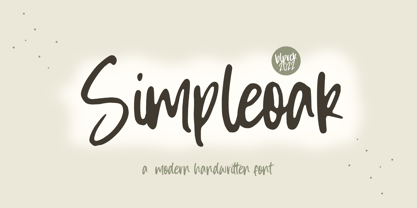 Simpleoak is a Modern Handwritten Font. Simpleoak is a cute and vintage styled handwritten font. Whatever the topic, this font will be a wonderful asset to your font library, as it has the potential to enhance any creation. - also multilingual support Enjoy the font, feel free to comment or feedback, send me PM or email. Thank you!
 - Obelisk Stone by Balpirick,
$15.00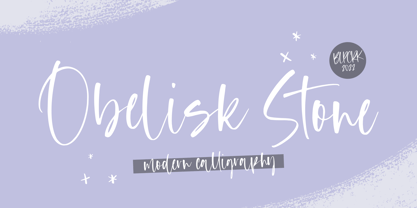 Obelisk Stone is a Modern Calligraphy Font. Obelisk Stone is a dazzling script font. Whatever the topic, this font will be a wonderful asset to your font library, as it has the potential to enhance any creation. - also multilingual support - Ligatures Enjoy the font, feel free to comment or feedback, send me PM or email. Thank you!
 - Fabulous Rabbit by Balpirick,
$15.00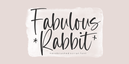 Fabulous Rabbit is a Handbrushed Script Font. Fabulous Rabbit is a cute and slim handwritten font. Whatever the topic, this font will be a wonderful asset to your font library, as it has the potential to enhance any creation. - also multilingual support Enjoy the font, feel free to comment or feedback, send me PM or email. Thank you!
 - Cupid Gummies by Balpirick,
$15.00 Cupid Gummies is a Sweet and Cute Handbrushed Font. Whether you’re using it for crafts, digital design, presentations, or making greeting cards, this font has the potential to become your favorite go-to font, no matter the occasion! This font only has allcaps letters. - also multilingual support Enjoy the font! Feel free to comment or feedback! Thank you!
 - Auguste Boutique by Balpirick,
$15.00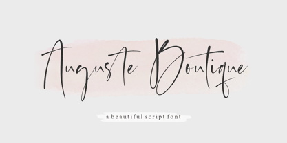 Auguste Boutique is a Modern Calligraphy Font. Auguste Boutique is a dazzling script font. Whatever the topic, this font will be a wonderful asset to your font library, as it has the potential to enhance any creation. - also multilingual support - Ligatures Enjoy the font, feel free to comment or feedback, send me PM or email. Thank you!
 - Dolphin Dolls by Balpirick,
$15.00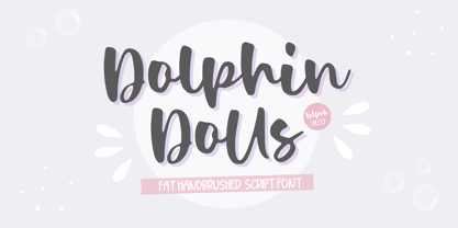 Dolphin Dolls is a Handbrushed Script Font. Dolphin Dolls is a cute and vintage styled handwritten font. Whatever the topic, this font will be a wonderful asset to your font library, as it has the potential to enhance any creation. - also multilingual support Enjoy the font, feel free to comment or feedback, send me PM or email. Thank you!
 - Yemeyi by AukimVisuel,
$9.00 Yemeyi family is a modern and daring display font. No matter the topic, this font will be an incredibly asset to your fonts’ library, as it has the potential to elevate any creation. Yemeyi is a simple and neat lettered sans serif font. Add this font to your creative ideas and notice how it will make them stand out!
 - Purple Bread by Balpirick,
$15.00 Purple Bread is a Tall Handwritten Font. Whether you’re using it for crafts, digital design, presentations, or making greeting cards, this font has the potential to become your favorite go-to font, no matter the occasion! This font only has allcaps letters. - also multilingual support Enjoy the font! Feel free to comment or feedback! Thank you!
 - Donkey Monster by Balpirick,
$15.00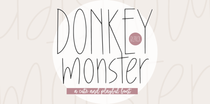 Donkey Monster is a Cute & Playful Font. Donkey Monster is a cute and slim handwritten font. Whatever the topic, this font will be a wonderful asset to your font library, as it has the potential to enhance any creation. - also multilingual support Enjoy the font, feel free to comment or feedback, send me PM or email. Thank you!
 - Queens Burger by Balpirick,
$15.00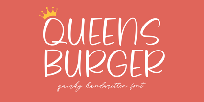 Queens Burger is a Quirky Handwritten Font. Whether you’re using it for crafts, digital design, presentations, or making greeting cards, this font has the potential to become your favorite go-to font, no matter the occasion! This font only has allcaps letters. - also multilingual support Enjoy the font! Feel free to comment or feedback! Thank you!
 - Almond Cookie by Balpirick,
$15.00 Almond Cookie is a Monoline Handwritten Font. Whether you’re using it for crafts, digital design, presentations, or making greeting cards, this font has the potential to become your favorite go-to font, no matter the occasion! This font only has allcaps letters. - also multilingual support Enjoy the font! Feel free to comment or feedback! Thank you!
 - Write Marker by Balpirick,
$15.00 Write Marker is a Bold Marker Font. Whether you’re using it for crafts, digital design, presentations, or making greeting cards, this font has the potential to become your favorite go-to font, no matter the occasion! This font only has allcaps letters. - also multilingual support Enjoy the font! Feel free to comment or feedback! Thank you!
 - Bali Script by Eclectotype,
$40.00 Inspired by the Indonesian island’s laid back feel and easy going culture, Bali Script is a tribute to the hand-lettered signage on beach bars, surf shacks and cafes. The swell of the stroke endings and the bolder-than-your-average gooey look convey a cool, contemporary take on baseball scripts. Overlay Bali Script Highlight for a cartoonish, glossy finish. Perfect for logos. This font is jam-packed with OpenType features that make smooth flowing text a doddle. Contextual alternates and ligatures are best left on by default. The alternates especially work a subtle magic that helps letters connect with an even rhythm, and automatically substitutes letters with the best fit alternatives based on their context, such as at the end of words, or adjacent to certain other letters. There are four stylistic sets (or all grouped together in the stylistic alternates feature for those without easy access to them) which do the following: SS01 - changes the r to a script form SS02 - makes certain caps more ‘scripty’ SS03 - capital I (and accented versions of it) get serifs SS04 - underline function. typing two or more underscores extends on underline beneath the previous word. Also included for your pleasure - oldstyle figures, automatic fractions, superior and inferior numbers, ordinals, some discretionary ligatures, swash alternates and extended language support.
 - MVB Embarcadero by MVB,
$79.00 MVB Embarcadero lies in a space between grotesque sans serifs and the vernacular signage lettering drawn by engineers. It’s a style that happens to convey credibility and forthrightness without pretense—it’s anti-style, actually. All of this makes for the most versatile of typefaces, capable of delivering any kind of message while staying out of the way. As is often the case with a type design that develops over several years, Embarcadero isn’t the realization of a specific concept. In the ’90s Mark van Bronkhorst began digitizing a blocky slab serif from the Victorian era, which was then set aside for many years. He later revisited the design, paring it down to its bare essentials, and as more time passed, it evolved from a grid-based outline to curves that echoed the rigid skeleton of the original. Eventually it became a complete family with all the readability requirements of a text sans serif, yet maintaining the subtle eccentricities of its inspiration. Functionally, the Embarcadero family is as adaptable as its design. The OpenType Pro set of 20 fonts contains two widths and five weights, each with italics, small caps, a full set of figures, bullets and arrows, and support for most Latin-based languages. In all, Embarcadero is suitable for headlines or text. And—thanks to its simple, square form—it’s ideal for type on screen too.
 - Chalice by Canada Type,
$24.95Chalice is a new original Canada Type family inspired by two different engraving eras and locations: Medieval England and 19th century Russia. Chalice's construct is geometric at heart, though the wedge serifs and their contribution to the overall idiosyncrasies of the counterspace give it a spirit entirely different from usual geometric types. Chalice's personality is that of a knowledgeable advisor, clinical yet old-fashioned, aware yet unsurprised, secular yet serene, clear yet artistic, hungry yet redeemable. Chalice comes in 4 weights, light to black, that range in expression from a sobering wise whisper of confidence all the way to the bells and whistles of Judgment Day. Such flexibility in expression among the different weights of the same typeface of this kind is quite rare, and will be appreciated by discriminating graphic artists who require more than just another tombstone type. Chalice's character set comes fully loaded across all 4 weights. Two dozen alternates are built into the map, including unicase variations on the a and e, double-barred alternatives for A, E, F, H and S, and connecting versions of b, d, f, h and t. Such variety gives the user to subtly define the set type without overpowering it. Chalice comes in all popular font formats, and is available in single weights, as well as one complete affordable package. - VLNL Thueringer by VetteLetters,
$30.00 We cannot imagine anyone not liking beer. Especially on a warm summer night there is simply little that can top an ice cold brewski. And with the current wave of home-brewed ales and lagers, Vette Letters decided to not stay behind and brew its own brand. Just so we can design our own beer bottle label using our own font. VLNL Thueringer comes from the drawing board of Jacques Le Bailly (a.k.a. Baron von Fonthausen), the German-French specialist in the fields of both beer and type design. One day Jacques got inspired by Albrecht Dürers 15th century Fraktur (blackletter) alphabet, and decided to design a contemporary rounded version of it. Although the historic context is clearly visible, Thueringer definitely stands its own ground. It's a modern techno-style blackletter with a (beer)truckload of interesting design details. Thueringer contains a number of ligatures and an alternate set of numbers. Apart from the regular uses like logos, posters, flyers and headlines we definitely would like to see our Thueringer used on beer bottle labels and crates, but also cafés and hipster bars would do well with this modern-day blackletter. Hell, even wine or liquor labels, football team jerseys, Oktoberfest flyers, it's just too much to mention. As long as it is accompanied by a cold beer.