10,000 search results
(0.035 seconds)
- H74 Pistola by Hydro74,
$9.99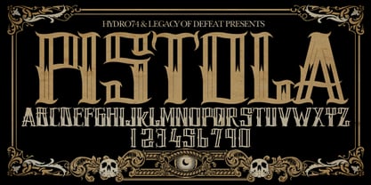 Pistola is a Tattoo inspired Typeface.
 - Mamba by W Type Foundry,
$19.50 Mamba is inspired by Cooper Black.
 - Holy Church by Intellecta Design,
$22.90inspired in medieval iluminated gotic manuscripts - Manic Tambourine AOE by Astigmatic,
$19.95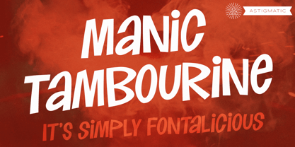 A dynamic font inspired by cartoons.
 - Metrica by Ixipcalli,
$20.00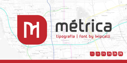 Métrica Font, Inspired for Modern Subway
 - Murray Slab by Tkachev,
$25.00 Murray Slab is a techno-style typeface with four styles. This font family will be the best solution for posters, signage, magazine, product branding, corporate branding, logos and titles.
 - Tool by Suomi,
$30.00 A classic, narrow and clean sans serif family with seven weights, Roman and Italic, all with Old Style Numerals and Small Caps, for both headlines and body text use.
 - Another Shabby by Zetafonts,
$39.00 Another Shabby is a script typeface family. Its shapes are defined by rough, wide brushstrokes, slightly rounded in corners to mimic the feel of a real handwritten casual script.
 - Fat Times by Wiescher Design,
$39.50 FatTimes is an extension to my HardTimes family. Times are too hard for boring typefaces, so try the fat one one for a change. Your hardworking typedesigner - Gert Wiescher
 - Venzel by Etewut,
$15.00 Introducing new font family Venzel. It's an interesting experimental deco all caps typeface. • 5 fonts with different wide • OTF and TTF version • alternative letters and numbers • multi-language support
 - Engrace by Angele Kamp,
$26.00 Meet Engrace, a serif font family with elegant & stylish curves. She’s romantic, classy and modern all wrapped into one, and surely can not be missed in your font collection.
 - CG Symphony by Monotype,
$29.99CG Symphony was among the first one hundred PostScript faces released by Compugraphic in 1988. The original version of CG Symphony font is the Linotype Original font family Syntax. - Manus Smooth by JOEBOB graphics,
$25.00 The Manus font family is extended with a new relative: Manus Smooth. Some major and minor adjustments were made, but it still has the look & feel of the original.
 - Sulawesi by Morganismi,
$12.00 Sulawesi is an adventurous font imitating old map style. The family contains a text typeface, and a picture font with fish, sea creatures, monsters, old sail ships and stuff.
 - Chakra by Etewut,
$30.00 Chakra is connected script. The family includes 7 styles. There are 3 characters with swashes for basic latin. It also has multi language support (æ, ß, ç, and more).
 - Mingray Mono by Rekord,
$39.00 Mingray Mono is a stylish Monospaced family in three weights. It contains old-style figures, small caps, fractions, ligatures, pictograms and arrows. Mingray Mono supports 85 Latin-based languages.
 - Xtoxina by FSdesign-Salmina,
$39.00 Xtoxina. Squint-eyed Pixelfont. Xtoxina is a new member oft the Atoxina family with experimental character. The designer must have a serious view issue! Experience strabismus too, with Xtoxina.
 - Solida by Graviton,
$4.00 Solida font family has been designed for Graviton Font Foundry by Pablo Balcells in 2012. It is display typeface with a geometric angular look. Solida consists of 10 styles.
 - Snow Now by Morganismi,
$12.00 Snow Now is a frisky, frosty, and snowy font family for active winter use. It includes two text fonts plus great pictures of snowflakes, tools, sculpture, animals and more.
 - Mothem by Gerobuck,
$23.00 MOTHEM font family with three modes, Black, ItalicBlack, and ThinOutline and supported by multiligual features. The shape has a sporty, strong, and futuristic impression, very perfect for classy designs.
 - Rtoxina by FSdesign-Salmina,
$39.00 Rtoxina. Pixels get smooth. Rtoxina is a new member oft the Atoxina family with experimental character. This experimental pixelfont surprises with carefully rounded pixels. Avoid accidental cuts, using Rtoxina!
 - Flagtail Display by Pekotype,
$23.00 Flagtail Display combines the familiar feeling of classic typeface with the modernish touch to suit the nowadays trend. With its semi-bold and sharp type of shape, it can easily catch and engage the reader's attention in an instant. The excellent readability of Flagtail Display will put any of the messages being delivered to be the limelight. This typeface suits for you who aim to catch attention through headlines, rebrand your products, and beyond.
 - The FT Ornamental font by Fenotype is a true celebration of intricate design and decorative flair. It stands as a testament to the exquisite craftsmanship of typography, where every character and gly...
- FF Meta Variable by FontFont,
$344.99The FF Meta® design is a sans serif, humanist-style typeface that was designed by Erik Spiekermann for the West German Post Office (Deutsche Bundespost). It was subsequently released in 1991 by Spiekermann's company FontFont The FF Meta family, initially released as a commercial font in 1991, now comprises over sixty fonts. The FF Meta 2 family was released in 1992, the FF Meta Plus family in 1993, and in 1998 a facelift of the complete font family reclassified the FF Meta series and combined them into family-sets named FF Meta Normal, FF Meta Book, FF Meta Medium, FF Meta Bold and FF Meta Black. These are all available in Roman, italic, small caps and italic small caps. Between 1998 and 2005, further light stroke weights and a condensed family were introduced by Tagir Safayev and Olga Chayeva and were named: FF Meta Light and FF Meta Hairline. The last addition to the growing FF Meta font family is FF Meta Serif released by FSI in 2007. FF Meta Variable Roman is a single font file that features two axes: Weight and Width. For your convenience, the Weight and Width axes have preset instances. The Weight axis has a range from Hairline to Black. The Width axis provides a range of condensed values. This Roman (upright) font is provided as an option to customers who do not need Italics, and want to keep file sizes to a minimum. FF Meta Variable Italic is a single font file that features an italic design with two axes: Weight and Width. For your convenience, the Weight and Width axes have preset instances. The Weight axis has a range from Hairline to Black. The Width axis provides a range of condensed values. This Italic font is provided as an option to customers who do not need Roman (uprights), and want to keep file sizes to a minimum. FF Meta Variable Set is a single font file that features three axes: Weight, Width and Italic. For your convenience, the Weight and Width axes have preset instances. The Weight axis has a range from Hairline to Black. The Width axis provides a range of condensed values. The Italic axis is a switch between upright and italic - State by Device,
$29.00 A futurist inspired geometric stencil in clean and rough versions. This design approach was distilled into a more regular typeface in Futura Black; State takes its inspiration from the more eccentric designs that predated that font.
 - Godfrey Sykes Initials by Celebrity Fontz,
$24.99This illustrative alphabet was inspired by the decorations of Godfrey Sykes, whose work was greatly influenced by that of Raphael and Michelangelo. This tile alphabet follows a Venetian 16th-century tradition of letters decorated with figures symbolizing each initial, a High Renaissance style. Includes one set of A-Z ornamental initials conveniently assigned to both the upper and lower case alphabet characters. Perfect for artistic publications, storybooks, fairy tales, and texts conveying the feel of the apogee of the visual arts in the Italian Renaissance. - Remora Sans by G-Type,
$39.00 Remora is an extensive new humanist sans serif which comes in 2 style variations, the effervescent Remora Sans and its corporate business partner Remora Corp . Both styles include 5 individual width sets ranging from the condensed W1 to the extra-wide W5. Furthermore, with an impressive 7 weights (Thin to Ultra) and true matching italics in each pack Remora is an ultra versatile super family comprising 140 individual fonts, perfect for any typographic assignment or design brief. Remora was designed by G-Type founder Nick Cooke. Both the Sans and Corp families share the same proportions, with the exception of certain key characters that change the overall appearance. Remora Sans is an exuberant and characterful typeface while Remora Corp, as its name suggests, is a businesslike typeface more suited to corporate typography. Quite early on in the design process Nick decided to give Remora Corp equal billing instead of incorporating these glyphs as alternates or a stylistic set that may get overlooked. “I created two separate families after learning a valuable lesson with one of my earlier typefaces, Houschka”, says Nick. “Houschka contained distinctive rounded A’s W’s and w’s, with ‘straight’ styles as character alternates. Even though style sets and alternates are easy to activate they are rarely used, so after many requests for customised versions of the fonts with the straight characters as defaults it was decided to create the separate ‘Alt’ family. So I cut straight to the chase with the two Remora variants and created two complementary families.” Both sets contain many shared letterforms, but it is the alternate characters that significantly alter the appearance of each font. Remora has been carefully designed for optimum legibility at large and very small sizes. Although fairly monolinear in appearance, especially in the lighter weights, particular attention has been paid to optical correction like the overshoots of the curved characters. Open counters and painstaking attention to detail (e.g. weight contrast between horizontal and vertical strokes, junctions of shoulders and stems etc) all boost readability and make Remora a great choice across all media. Remora Sans and Corp are ‘humanist’ rather than ‘geometric’ in style, meaning they’re not strictly based on rectangles and circles, resulting in a warm and friendlier feel. The slightly ’super-elliptical’ rounded forms create generously attractive curves. Remora has very distinctive italics in that they are only inclined by 8 degrees, but are not just based on slanted uprights. The italic styles are very alluring when used for display at large sizes and the good news is they come bundled free with their respective uprights. Each family also contains many OpenType features including proportional and tabular numbers, small caps, discretionary ligatures, plus five stylistic sets for ultra versatile typography.
 - Remora Corp by G-Type,
$39.00 Remora is an extensive new humanist sans serif which comes in 2 style variations, the effervescent Remora Sans and its corporate business partner Remora Corp. Both styles include 5 individual width sets ranging from the condensed W1 to the extra-wide W5. Furthermore, with an impressive 7 weights (Thin to Ultra) and true matching italics in each pack Remora is an ultra versatile super family comprising 140 individual fonts, perfect for any typographic assignment or design brief. Remora was designed by G-Type founder Nick Cooke. Both the Sans and Corp families share the same proportions, with the exception of certain key characters that change the overall appearance. Remora Sans is an exuberant and characterful typeface while Remora Corp, as its name suggests, is a businesslike typeface more suited to corporate typography. Quite early on in the design process Nick decided to give Remora Corp equal billing instead of incorporating these glyphs as alternates or a stylistic set that may get overlooked. “I created two separate families after learning a valuable lesson with one of my earlier typefaces, Houschka”, says Nick. “Houschka contained distinctive rounded A’s W’s and w’s, with ‘straight’ styles as character alternates. Even though style sets and alternates are easy to activate they are rarely used, so after many requests for customised versions of the fonts with the straight characters as defaults it was decided to create the separate ‘Alt’ family. So I cut straight to the chase with the two Remora variants and created two complementary families.” Both sets contain many shared letterforms, but it is the alternate characters that significantly alter the appearance of each font. Remora has been carefully designed for optimum legibility at large and very small sizes. Although fairly monolinear in appearance, especially in the lighter weights, particular attention has been paid to optical correction like the overshoots of the curved characters. Open counters and painstaking attention to detail (e.g. weight contrast between horizontal and vertical strokes, junctions of shoulders and stems etc) all boost readability and make Remora a great choice across all media. Remora Sans and Corp are ‘humanist’ rather than ‘geometric’ in style, meaning they’re not strictly based on rectangles and circles, resulting in a warm and friendlier feel. The slightly ’super-elliptical’ rounded forms create generously attractive curves. Remora has very distinctive italics in that they are only inclined by 8 degrees, but are not just based on slanted uprights. The italic styles are very alluring when used for display at large sizes and the good news is they come bundled free with their respective uprights. Each family also contains many OpenType features including proportional and tabular numbers, small caps, discretionary ligatures, plus five stylistic sets for ultra versatile typography.
 - 1534 Fraktur by GLC,
$38.00 This family was inspired by the early Fraktur style font used circa 1530 by Jacob Otther, printer in Strasbourg (Alsace-France) for German language printed books. Although it is an early Fraktur pattern, it is easy to see the characteristic differences with the Schwabacher style (look at 1538 Schwabacher), like in the small d, o or y... and the capitals (look at the H, K, T...). Frequently, Schwabacher and Fraktur were used together in the same book : Fraktur style for the main and Schwabacher for marginalia and comments. This font contains standard ligatures and German historical ligatures (German double s, long s, ts...) and diacritics (special ummlaut "e superscript" and "∞" instead of dieresis with letters a, o and u,) naturally, we have added numerous letters lacking in the original to permit a contemporary use of the font.
 - Mobley by Sudtipos,
$29.00Based on ten characters found on the cover of a 1960s Blue Note jazz album. The source characters were originally designed for film-based typesetting by Wayne Stettler as part of a single typeface published by Visual Graphics Corporation (VGC) under the name Neil Bold. Mobley Sans, along with its condensed and serifed counterparts, constitute a brand new typographic whole molded around the original inspirational source. The family embodies the independent creative spirit of that era - yet manages to remain contemporary with several modern design traits - creating its own unique visual theme through the use of odd counters, generous curves and sharp corners. Mobley delivers your message in a bold, yet friendly, and subtly discerning fashion. Perfect for music artwork, packaging and book covers. Available with both sans and serif versions, in regular and condensed widths. - Violencia by Wing's Art Studio,
$10.00 Violencia - An Illustrated Wild West Font Violencia is a hand-dawn font inspired by the legendary age of the Wild West and its tales of gunfights, train robberies and blood vendettas. It’s an all-caps design the evokes the textured style of vintage western movie posters, comics and novels. The Violencia font family includes all-caps uppercase and lowercase characters, along with numerals, punctuation, symbols and language support. It also comes with a complete set of alternative characters, all in the 3 unique styles of, Distressed, Outline and Block. Wingsart Studio Design Tip! Mix the uppercase and lowercase characters and look for interesting shape combinations that might occur within the letters. Take advantage of all the alternatives too for a much more custom look that’ll be unique to your design. For more great illustrated fonts browse the ever-growing collection by Wingsart Studio.
 - Gothica by Type Innovations,
$39.00 Say hello to Gothica. It’s a display geometric sans designed with Stencil-like elements and letter cutouts specifically created for visual impact—ideal for logo, branding and advertising purposes. The font includes capitals and capital alternatives in the lower case keystroke positions—it’s like having 2 display fonts in one. In addition, Gothica includes various opentype features that allow graphic designers to tailor the type for custom needs. The development of Gothica started in 1997, inspired by Alex Kaczun’s best selling grotesque font family called Contax Pro. An experimental design, Gothica is specifically introduced as a bold weight, but Alex plans to expand the design to include many weights, styles and alternative design treatments. Stay tuned! If you like Gothica—check out similar gothic alternates like Decrypt 01, Decrypt 02, Decrypt H1 and all of Type Innovations fonts from Alex Kaczun.
 - Arkais by Logitype,
$25.00 Introducing Arkais, a glyphic serif typeface inspired by the rhythmic construction of Gothic architecture. This unique typeface is characterized by slightly broken shoulder and bowl shapes, offering a fresh and classic feel. With contrasting brackets, consistent barb, and beak shapes, Arkais brings a touch of elegance to any project. Arkais features five weight variants—light, regular, medium, bold, and extra—as well as three width options: condensed, normal, and expanded. Each font family also includes italic styles, providing even greater versatility. Equipped with OpenType features, Arkais offers multiple character alternatives, ligatures, small caps, and more, ensuring a tailored look for your designs. Designed as an alternative to current trends, Arkais is perfect for creating strong headers or captivating display text. The typeface supports over 500 basic Latin glyphs, making it suitable for a wide range of projects.
 - Cindie Mono by Lewis McGuffie Type,
$34.99 Cindie Mono is a multi-width display font. Six different widths – A (condensed) through F (super extended) – mathematically correspond with one-another creating a stackable type family. Each face contains all caps full West, Central and East European language support. All diacritics and marks are done in a hairline to add style and contrast. And Cindie Mono is ideal for posters, headlines and display lettering. The inspiration for Cindie Mono came from the lettering styles on optometrists sight-test posters. Then through several stages of development the overall concept for Cindie became of a half-broken Commodore64 and the computer from the 1985 movie 'Weird Science' hooked up to a dot-matrix printer spitting out reams of mechanical but distorted mono-lettering all the while an old modem you can't seem find keeps beeping and beeping and beeping...
 - Ganges by ROHH,
$40.00 Ganges is a condensed sans serif typeface inspired by Central European advertising typography from late XIX century. The font has condensed proportions and original letter shapes. Ganges is designed mainly for editorial design, especially for display use, as well as short paragraphs of text. Its narrow proportion makes it very practical to use for posters and magazine covers. Characteristic letter forms fit great for branding, logo and packaging design. It is also a very interesting choice for websites and e-book headlines. Ganges family consist of 27 fonts - 9 weights, 9 italics and 9 obliques. It supports extended set of latin languages, as well as broad number of OpenType features, such as case sensitive forms, standard and dicretionary ligatures, stylistic alternates, contextual alternates, lining, oldstyle and tabular figures, slashed zero, fractions, superscript and subscript, ordinals, currencies and symbols.
 - Pop Krinks by Martype co,
$15.00 Introducing Pop Krinks serif display. A new brand serif font family, comes with 7 styles to make it more versatile and stylish. Perfect and suitable for Branding Design, Logotype, Wedding Invitation, Headline, Posters, Business Card and etc. Inspired by henrietta typeface specimen in homage photo the alphabet and born in new modern style and craft. Multilingual Support support many different languages 60+ Afrikaans, Albanian, ,Basque, Bemba, Bena, Breton, Catalan, Chiga, Cornish, Danish, Dutch, English, Estonian, Faroese, Filipino, Finnish, French, Friulian, Galician, German, Gusii, Indonesian, Irish, Italian, Kabuverdianu, Kalenjin, Kinyarwanda, Luo, Luxembourgish, Luyia, Machame, Makhuwa, Meetto, Makonde, Malagasy, Manx, Morisyen, North, Ndebele, Norwegian, Bokmål, Norwegian, Nynorsk, Nyankole, Oromo, Portuguese, Quechua, Romansh, Rombo, Rundi, Rwa, Samburu, Sango, Sangu, Scottish, Gaelic, Sena, Shambala, Shona, Soga, Somali, Spanish, Swahili, Swedish, Swiss, ,German, Taita, Teso, Uzbek (Latin), Volapük, VunjoZulu Thank You, Happy Design! :)
 - Film P3 by Fontsphere,
$16.00 Film P3 - Ultra Condensed sans-serif typeface. It refers to characteristic typefaces such as Film Poster or Film P2 (which were inspired by futuristic movie posters). Film P3 is deliberately more versatile and designed to be used successfully in a huge variety of projects. In addition, the letters retain their unique and distinctive style, which allows them to stand out from the crowd. The Film P3 family has 9 members that are complementary and allow the expression of the projects to be very varied and adapted for appropriate use. They look good in many sizes, single words, slogans, titles, sentences as well as longer texts. Fonts include multilingual support, numerals, and a large range of special characters. Film P3 typeface offers many creative possibilities in graphic design and digital art. For print, brand identity, web design, and much more.
 - Klear by Ahmad Jamaludin,
$15.00 Introducing Klear - A typeface that's turning design conventions on its head! Inspired by the graceful flow of art nouveau, Klear is a perfect blend of quirkiness and elegance. Whether you're working on a formal project or something more avant-garde, Klear has you covered. With two styles to choose from - Regular and Outline, Klear gives your creativity a fresh canvas to shine What's Included? Klear Main File Regular and Outline Family Instructions (Access special characters, even in Cricut Design) Unique Letterforms Works on PC & Mac Simple Installations Accessible in Adobe Illustrator, Adobe Photoshop, Microsoft Word even Canva! PUA Encoded Characters. Fully accessible without additional design software. Language Support: Danish, English, Estonian, Filipino, Finnish, French, Friulian, Galician, German, Gusii, Indonesian, Irish, Italian, Luxembourgish, Norwegian Bokmål, Norwegian Nynorsk, Nyankole, Oromo, Portuguese, Romansh, Rombo, Spanish, Swedish, Swiss-German, Uzbek (Latin) Thank you Dharmas Studio
 - Queulat Soft by Latinotype,
$- The font is the soft version of the Queulat basic and condensed families, but keeping the same features as the original typeface. Queulat Soft is a hybrid font that combines different styles, reflecting charm, freshness and, especially, a strong personality. The font is inspired by Modern and Grotesk styles. The former is shown in some characteristic features such as teardrop terminals, which give the typeface an attractive unique look, making it an ideal choice for logotypes and labelling. The latter, with its rationality, makes Queulat Soft a stable and strong face for headings and subheadings. The combination of styles can be clearly seen by comparing the Regular with the Alt version. The Regular version is more simple than the Alt one. Differently, the alternative version possesses more features of the Modern style, like teardrop terminals in ‘k’ and ‘v’.
 - Graffiti Classic by Robert Arnow,
$25.00 Graffiti Classic is a graffiti font that blends the improvisational urban quality of graffiti with the smoothness and regularity of a typeface. Growing up in Brooklyn, graffiti appeared to me as an explosion of expression and color in a sea of concrete. Inspired, I became a graffiti artist and practiced in both notebooks and subway tunnels. While I moved on to somewhat more traditional art forms in future years, with Graffiti Classic I pay homage to my artistic roots in a calligraphy marker/tag font. Like my other fonts, the entire Graffiti Classic font is spaced letter to individual letter so that the spacing will work smoothly, in spite of the expressiveness and irregularity of the forms. The Graffiti Classic family also includes an ornaments font, “Taglets,” which has clouds, underlines, arrows, crowns, halos and more to add flavor to your designs.