10,000 search results
(0.032 seconds)
- Wetetque by Ingrimayne Type,
$6.95 The two Wetetque faces are dual-line fonts made with simple lines. The family has two styles and is caps only, but the lower case in each style is different from the upper case, giving the family has four sets of letters.
 - Sadina S by NumidiaType,
$29.00 Sadina™ S is the small lowercase font family of the default version Sadina™, It comes with the same OpenType features provided in the default family, and all lowercase glyphs are designed smaller. It will give you a different scripting taste.
 - Morpeth by G-Type,
$60.00 Hardworking and versatile condensed sans family originally designed for Morpeth Borough's wayfinding system and thus eminently usable for signage purposes. The 6 weight OpenType family includes discretionary ligatures, small caps, 5 sets of numerals plus coverage for Central European, Baltic and Turkish languages.
 - Carlgine by Muksal Creatives,
$10.00 Carlgine is a unique and modern family of serif fonts. Carlgine has 18 families Regular and italic font, starting from the small thin to the largest black. This typeface is versatile and can be used successfully in magazines, posters, branding, websites, etc.*
 - Bispo by Custom Types,
$- Bispo is a script typeface family made based on italic chancery calligraphy. After one year of it first launch, Bispo family now has another variant, a Bispo Pro version. The Pro version now contains more than 450 glyphs and new OpenType features, enjoy!
 - Kyrial Sans Pro by Mostardesign,
$- Designed in 2011 by Olivier Gourvat, this font family has generous proportions with a range of weights make it a versatile family for print, text, signage, branding and web design work. Kyrial Sans Pro offers lots of OpenType goodness and broad language support.
 - Carltine by Muksal Creatives,
$10.00 Carltine is a unique and modern family of Sans serif fonts. Simply Conception has 18 families Regular and italic font, starting from the small thin to the largest black. This typeface is versatile and can be used successfully in magazines, posters, branding, websites.
 - Magola by Andinistas,
$39.95 Magola is a creamy flavor font family whose purpose is to season with emotions the reading of words and phrases formed by puffy glyphs coated with a caramel of empty spaces external and internal. Independently or in groups, members of the family serve to decorate and organize packaging or advertising material in letters apparently crafted for food or entertainment contexts. Its starting point was to draw letters like a ballon fish evolved into a black version with empty areas and microscopic contrasted with colorful inflated and filled areas. Then the challenge was based on the sum transferred between full and empty into a lighter caliber. In that vein, its overall design adapted skeletons of italics and Roman calligraphy. Therefore, its regular, bold and black files have great height "x" with upwards and downwards extremely short and large internal counterblocks to facilitate reading. In this regard, to strengthen its objective and capture the reader's attention, its kind of contrast and simulated auctions flat tip brush strokes, and amount of contrast between thick and thin in the black version is slightly inverted. Its sizes, smooth strokes and irregular lines reinforce its traditional spirit, so it is favorable to shine the information on posters or large-format media. In short, its optical conformation based on a non-literal way, in metrics similar in all family members to be easily exchanged without changing the ìxî height. It is therefore a striking and versatile tool, that besides being useful in large sizes, can be used in small sizes as well. And more importantly, its general concept is more profitable when its members are mixed to nest headings, subheadings and short paragraphs, designed according to size, position, color and location in logos, covers, posters, ads and flyers.
 - SST Thai by Monotype,
$67.99 Designed for global branding and supporting 93 languages, the SST® typefaces blend the organic readability and controlled structure of modern sans serif designs. In combining these attributes, the SST family is understated, versatile – and sure to be a timeless design. The SST Thai family has 4 fonts in total. It spans four weights from light to bold. SST’s subtle design traits provide a quietly handsome and consistently friendly typographic presence that can be used for just about any typographic application. Broad range branding applicability combined with coverage for almost a hundred languages, makes SST one of the most widely accessible and usable typefaces available. Originally designed in partnership with the global consumer brand, Sony, the SST family is one of the most comprehensive type families available. Since extensive multi-lingual support was a critical design goal from the beginning, Akira Kobayashi, Monotype type director and primary designer on the project, turned to a network of local designers around the world for their individual language expertise. As a result, the details – which could be as subtle as stroke curvature and width – are consistent across Latin, Greek, Cyrillic, Arabic and multiple Asian languages. SST performs equally well in print and on-screen and the designs can be used at very small sizes in packaging and catalogs; while massive print headlines – even complicated wayfinding projects pose no stumbling blocks to the family’s typographic dexterity.
 - FF Kievit Slab by FontFont,
$65.99FF Kievit Slab is an industrial strength, do anything, go anywhere, kind of design. Its exceptional legibility and straightforward strength contrasts with a friendly humanistic underpinning. Michael Abbink and Paul van der Laan carefully revised character shapes and stroke contrast of FF Kievit, when they adapted them to FF Kievit Slab. The result is that the striking and powerful FF Kievit Slab easily complements the other members of the FF Kievit super family, that also includes FF Kievit and FF Kievit Serif, and stands on its own in as a multi-talented design. Though created from the sans, FF Kievit Slab is not FF Kievit with slabs serifs tacked on. The family is the fruit of a four-year collaboration between Abbink and Van der Laan, to make the perfect companion to the FF Kievit family. Each glyph was painstakingly adjusted and to achieve proper density, contrast, and balance, while remaining a perfect companion to its sans serif and oldstyle cousins. Its nine weights and italics also harmonize perfectly with the original FF Kievit design. Each of the FF Kievit styles is a typographical all-rounder that is equally at home in headlines as it is in text copy. Together, the three designs of the FF Kievit super family span a wide and deep typographic universe in which they support one another perfectly. These fonts will help you achieve your typographic goals, no matter how lofty. Featured in: Best Fonts for Websites - SST Vietnamese by Monotype,
$67.99 Designed for global branding and supporting 93 languages, the SST® typefaces blend the organic readability and controlled structure of modern sans serif designs. In combining these attributes, the SST family is understated, versatile – and sure to be a timeless design. The SST Vietnamese family has 4 fonts in total. It spans four weights from light to bold. SST’s subtle design traits provide a quietly handsome and consistently friendly typographic presence that can be used for just about any typographic application. Broad range branding applicability combined with coverage for almost a hundred languages, makes SST one of the most widely accessible and usable typefaces available. Originally designed in partnership with the global consumer brand, Sony, the SST family is one of the most comprehensive type families available. Since extensive multi-lingual support was a critical design goal from the beginning, Akira Kobayashi, Monotype type director and primary designer on the project, turned to a network of local designers around the world for their individual language expertise. As a result, the details – which could be as subtle as stroke curvature and width – are consistent across Latin, Greek, Cyrillic, Arabic and multiple Asian languages. SST performs equally well in print and on-screen and the designs can be used at very small sizes in packaging and catalogs; while massive print headlines – even complicated wayfinding projects pose no stumbling blocks to the family’s typographic dexterity.
 - FM Bolyar TypeCraft by The Fontmaker,
$29.00 A super font family mastered to an unparalleled level of precision, Bolyar TypeCraft is a collection multiple textured styles that represent historical printing techniques. A proud member of our successful Bolyar lineage this unique type family provides unlimited options for your creativity and is quite able to satisfy every typographic taste. If you are addicted to classic vintage style, then you could easily use Bolyar TypeCraft for almost any project of desire - from letterheads, logos and catchy headlines to elegant packaging, book covers and wine labels. Alternates, Swashes and Ligatures will help you customize almost every single letter and fit perfectly to your artwork. Bolyar TypeCraft provides a broad range of advanced typographical features: Multiple subfamilies each packing the two classic Bolyar styles - Regular (N) and Ornate (O). Five weights per style ranging from thin (100) to black (900) with full multilingual support for all Latin based languages as well as Cyrillic. A 1000+ glyphs per weight including three multilingual stylistic sets, swash designs and useful discretionary ligatures. Sub- and superscript basic Latin and Cyrillic glyphs as well as figures. Two positional models for lowercase accessed as OpenType case sensitive forms - baseline (default) or vertical centering. Contextual alternates and special stylistic set with different contour roughness exclusively developed for Bolyar Rough subfamily. A multifunctional Bolyar Shadow family witch can be flawlessly paired with any of the sub-family styles provided. Check out some great examples of Bolyar TypeCraft in use by the Labelmaker
 - Galeb Texture by Tour De Force,
$15.00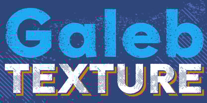 Galeb Texture is textured version of our Galeb font family.
 - Otostrada MF by Masterfont,
$59.00 Legible yet elegant font family with a variety of weights.
 - Aklimat MF by Masterfont,
$59.00 Elegant font family with a technical twist, formal yet elegant.
 - Dirty by SoftMaker,
$10.99 SoftMaker is offering its Dirty font family in 8 variants.
 - Zar2 Script Thin by SzarDesign,
$19.95 A graceful new addition to the Zar-2 Script family.
 - Modesto by Parkinson,
$25.00 Modesto is a loose-knit family based on a signpainters lettering style popular in the late-19th and early-20th centuries. It evolved from the lettering I used for the Ringling Bros. and Barnum & Bailey Circus Logo. The Modesto family was not planned. It just happened, a few fonts at a time over about fifteen years. In 2014 four new Italic fonts were added. There is a downloadable MODESTO USER MANUAL PDF in the Gallery section for this family.
 - Everest Pro by NicolassFonts,
$25.00 The complete family contains 24 weights, 1568 glyphs in each font, and supports OpenType features. RAlt sub-family has rounded corners. Everest Pro family is ideally suited for advertising, packaging, brand identity, books, magazines, logotype, software, sports as well as web and screen design. Everest Pro OpenType features list: zero, ordn, case, locl, c2sc, smcp, frac, subs, sinf, tnum, sups, numr, dnom, dnom, onum, lnum, pnum, ss01, ss02, ss03, ss04, ss05, ss06, ss07, ss08, ss09, dlig, liga, salt, hist
 - Hurme Geometric Sans No. 3 by Hurme,
$49.00 Hurme Geometric Sans No.3 includes seven weights with true Small Caps and obliques. Please see the specimen PDF for complete overview of the typeface and its features. Alternate characters and other Opentype features make for a versatile family that can be adjusted for specific needs. Hurme Geometric Sans is a series of font families all with distinctive qualities and features but share the same basic construction and proportions. See also the other Hurme Geometric Sans families.
 - Rainier by Kimmy Design,
$10.00 I was inspired to create the Rainier type family during my summer back home in the Pacific Northwest. The concept behind it may be simple - a hand crafted font family - but what it delivers is quite complex! Here is a breakdown of everything you get: FONT FAMILIES: Two sub-families with unique styles - Rainier North and Rainier West WEIGHTS: 4 weights per family, broken down numerically - 100 (light), 300 (regular), 500 (bold), 700 (black) OPENTYPE: In each family, there are tons of OpenType options, offering lots of customizable opportunities (in order to access all these goodies, you must be using Illustrator, Photoshop, Indesign or Publisher). Because Rainier is 100% handmade, contextual alternatives allow each letter has three subtle variations, this way it keeps that authentic hand-drawn look. Additionally, a full alphabet with special descending swashes, as well as start and end swashes for capitals and small caps. Titling alternatives offer a full character set just to help with readability! Meant for captions or smaller text, these letterforms are easy on the eye and a great complement to the regular alphabet. Stylistic Alternatives add a little fun, providing a unified cap height, no matter what case you are using (all caps, small caps or lowercase.) Discretionary Ligatures are created only for capitals, and takes specific letter pairs and creates a unique ligature between them To get a better understanding of everything, please check out the quicker user guide (http://bit.ly/1W0Bfma) and print if you so desire (http://bit.ly/23W9ZV6) that helps you navigate your way around and get the most out of Rainier! Unfortunately those links aren't working right now and soon I will have them fixed. So sorry! ORNAMENTS: In addition to the font, you get a set of awesomely rustic ornaments designed and drawn to go specifically with Rainier! - Rustic Northwest Illustrations - Banners & Flags - Frames - Flourishes - Lines & Line Breaks - Arrows There are a lot of extras packed in this set, so make sure you check out the Ornaments User Guide to get the most out of it! Check it out here: http://bit.ly/1rRVJRx And that’s all folks! Hope you enjoy Rainier!
 - Nordikka by Latinotype,
$29.00 Nordikka is a 10-style sans-serif simple pure typeface designed by Luciano Vergara. Nordikka is a condensed font with a large x-height and straight terminals well-suited for headlines and short texts. A good option for clean and visually appealing designs. Nordikka is inspired by Scandinavian culture and its globally recognised design, which is characterised by pure, clean and clear forms. The final stage of the design process was completed in Olinda, Brazil, which inspired some of the words in the font specimens, allowing for reflecting an image of people’s daily habits and customs.
 - Parisine Std by Typofonderie,
$59.00 Ultra legible forceful sanserif in 32 fonts Parisine was born as official parisian métro signage typeface. This family of typefaces has become over years one of the symbols of Paris the Johnston for the London Underground or the Helvetica for the New York Subway. The Parisine was created to accompany travelers in their daily use: ultra-readable, friendly, human while the context is a priori hostile. Meanwhile, Parisine is now a workhorse and economical sanserif font family, highly legible, who can be considered as a more human alternative to the industrial-mechanical Din typeface family. More human, but not fancy: No strange “swashy” f, or cursive v, w etc. on the italics, to keep certain expected regularity, important for information design, signages, and any subjects where legibility, sobriety came first. Born as signage typeface family, the various widths and weights permit a wider range of applications. In editorial projects, the Compress version will enhances your headlines, banners, allowing ultra large settings on pages. The Narrow version will be useful as direct compagnon mixed to standard width version when the space is limited. The various Parisine typeface subfamilies Parisine is organised in various widths and subsets, from the original family Parisine, Parisine Gris featuring lighter versions of the usual weights and italics, Parisine Clair featuring extra light styles, to Parisine Sombre with his darker and extremly black weights as we can seen in Frutiger Black or Antique Olive Nord. Many years of adjustments were necessary to refine this complex family. Initially, Parisine was designed by Jean François Porchez in 1996 for Ratp to solely fulfil the unique needs of signage legibility. Parisine remain the official corporate typeface of the public transport in Paris, the worldwide capital for tourism, and now integral part of the French touch. Directly related, Parisine Office was initially created for Ratp’s internal and external communication, Parisine Office is available at Typofonderie too. Not connected with Ratp and public transports, Parisine Plus was created as an informal version of Parisine. Parisine: Introducing narrow and compressed families About Parisine Parisine helps Parisians catch the right bus Observateur du design star of 2007
 - Saturday Party GT by Gartype Studio,
$10.00 Inspired by thin and condensed handwriting style, we present to you Saturday Party, a handwritten font with thin and condensed characters that was comes with alternates and multilingual glyphs to help people around world with that unique accent with this font. Saturday Party is very suitable like as sticky notes, handwritten project, signatures, and more.That way easily change the glyphs to make more unique glyphs.
 - Playbus Bays GT by Gartype Studio,
$10.00 Inspired by thin and childly handwriting style, we present to you Playbus Bays, a handwritten font with thin and childly characters that was comes with alternates and multilingual glyphs to help people around world with that unique accent with this font. Playbus Bays is very suitable like as text, cover book, poem, handwritten style, and more.That way easily change the glyphs to make more unique glyphs.
 - Story Maker GT by Gartype Studio,
$10.00 Inspired by slow and slanted handwriting style, we present to you Story Maker, a handwritten font with slow and slanted characters that was comes with alternates and multilingual glyphs to help people around world with that unique accent with this font. Story Maker is very suitable like as text, cover book, poem, handwritten style, and more.That way easily change the glyphs to make more unique glyphs.
 - Okay A by Okaycat,
$24.95 Okay-A lets you make 3D letters that look to be fastened down with screws. Inspired by the angular futuristic shapes of Japanese Katakana letters, this angular font is bold and square. Okay-A lets you easily make multicolour logos or signs as the styles can be overlaid. It features extended characters, containing West European diacritics & ligatures, making it suitable for international environments & publications.
 - 1550 Arabesques by GLC,
$15.00 Font inspired by the decorative elements and opening capitals frequently in use in the early 1500s, under Geoffroy Tory’s book “Champfleury” influence, especially in Lyon (France). It is an entirely original design. It is used to embellish texts, such as posters, greetings, invitations, gastronomic menus and much more... This font easily supports enlargement to 48, 60, 72 points and more, as it is made for those sizes!
 - History Walker GT by Gartype Studio,
$10.00 Inspired by bold and slanted handwriting style, we present to you History Walker, a handwritten font with bold and slanted characters that was comes with alternates and multilingual glyphs to help people around world with that unique accent with this font. History Walker is very suitable like as text, cover book, poem, handwritten style, and more.That way easily change the glyphs to make more unique glyphs.
 - Dead Rite PB by Pink Broccoli,
$14.00 A beefy unicase flare serif typeface inspired by a Frank Kane pulp paperback of the same name. Dead Rite is filled with awkward comic personality, mixing Capital and lowercase forms into a pseudo-unicase format that is a joy to play. A dangerous temptress, with large scale easily legible letterforms, this typographic conundrum is waiting for you to solve how it should be used for your designs!
 - Windy Monday GT by Gartype Studio,
$10.00 Inspired by thin and condensed handwriting style, we present to you Windy Monday, a handwritten font with thin and condensed characters that was comes with alternates and multilingual glyphs to help people around world with that unique accent with this font. Windy Monday is very suitable like as text, cover book, poem, handwritten style, and more.That way easily change the glyphs to make more unique glyphs.
 - Nighty Tales GT by Gartype Studio,
$10.00 Inspired by thin, childly, unique handwriting style, we present to you Nighty Tales, a handwritten font with thin and childly characters that was comes with alternates and multilingual glyphs to help people around world with that unique accent with this font. Nighty Tales is very suitable like as text, cover book, posters, handwritten style, and more.That way easily change the glyphs to make more unique glyphs.
 - The Stacy by BlackLotus,
$15.00 The Stacy is a retro script inspired font. This font has a variety of unique alternates and also has 2 styles, namely regular standard and italic. The Stacy is perfect for a wide variety of projects, and can be easily combined with a wide variety of colors. The Stacy has a bold character and soft nuances that will make a striking impression on everyone who sees it.
 - Pistacho by Estudio Calderon,
$20.00 Are you looking for an appropriate typeface for coffee shops concept? We want to introduce Pistacho, the new type family of Estudio Calderon that contains 18 fonts to design great illustrations and to be applied, especially, in coffee shops, bakeries, ice-cream shops, candy stores, pastry shops, fruit shops and all those places where food is the center. Pistacho was designed by hand using pencils and markers that let us get a handcrafted and rough texture. Below, a brief description of each style: Display: A fresh and modern type, perfect to be used in coffee shops outdoor signs. The logotype of “Central Perk”, the coffee shop of the tv show “Friends” was our inspiration to develop this beautiful font that contains 317 characters and three variables: Display 1, Display 2 and Display 3, each one has specific characteristics that will be an excellent resource for your designs. Sans: Style that contains 7 fonts that can be mixed to get interesting finishes in your designs, each variable has 363 characters with standard ligatures and stylistic alternatives. You can find this styles as: Sans 1, Sans 2, Sans 3, Sans 4, Sans 5, Sans 6 and Sans 7. Good news, you can get Sans 5 DEMO for free. Script: Script 1 and Script 2, two monolineal fonts with a generous spacing that provides contrast and movement, being a suitable complement for the rest of the types of Pistacho family. Serif: Font with a lot of style and personality, inspired in the interlock alphabets shown in «Photo-Lettering´s One Line Manual of Style». Serif 1, Serif 2, Serif 3 and Serif 4 contain a great number of ligatures that generate nice compositions by combining them. One of the characteristics of this style is the combination of upper case and lower case giving as a result a different touch in each design. Soft: Humanist type with a rustic texture and geometric forms ideal for long texts and small sizes. Dingbats: We have designed a package of 244 graphics, illustrations and ornaments that are the perfect complement to combine with each font of this family. Get Pistacho type family, enjoy using it… and do not forget your cup of coffee.
 - Qualion Round by ROHH,
$39.00 Qualion Round™ is a soft geometric sans serif with lots of swashes and ligatures, a sibling of successful Qualion™ and Qualion Text™ families. The rounded family is designed by carefully adjusting letter shapes, tapering and ink traps to in order to achieve optimal legibility as well as strong personality. The family is intended to serve in display situations like branding and advertising as well as in paragraph text and user interfaces. Its versatility can be even strengthened by pairing it with Qualion™ or Qualion Text™ families. Qualion Round™ family consists of 10 weights with corresponding oblique styles. It has extended language support, as well as broad number of OpenType features, such as case sensitive forms, standard and discretionary ligatures, swashes, terminal forms, stylistic sets, contextual alternates, lining, oldstyle, tabular figures, slashed zero, fractions, superscript and subscript, ordinals, currencies and symbols.
 - Berona Stripes by Alex Camacho Studio,
$18.00 Berona Stripes font family is a variable geometric sans serif based on the solid version of Berona family. A variable geometric sans serif with a modern display purpose. The dynamic sharp edges makes it ideal to be used in a medium and big scale.
 - Zornale Title by Eurotypo,
$20.00 Zornale TITLE is a family of four fonts that can be combined with the rest of Zornale family (text and caption). These fonts have been designed with precise kerning and full OpenType features: Old-style figures, swashes, stylistic alternates, ligatures and case-sensitive forms.
 - Musnad Serif by Sultan Fonts,
$19.99 About this font family Musnad Serif Is Old South Arabian typeface for desktop applications ,for websites, and for digital ads. Musnad font family contains two types: Rigular and bold. The font includes a design that supports Latin, Arabic, and Old South Arabian language systems.
 - Teethee by Ingrimayne Type,
$8.95 Teethee is a font family dedicated to oral hygiene. The characters are made from toothbrushes, toothpaste and toothpaste tubes, and teeth. Both fonts in the family are caps only, but most letters on the lower-case keys differ from those on the upper case keys.
 - Kentledge by Namogo,
$35.00 Kentledge is a grotesque sans type family based on geometric forms that have been optically corrected for better legibility. The family includes extended language support (over 200 languages), alternates, ligatures and more. It is best suited for graphic design and any display / text use.