1,825 search results (0.018 seconds)
  1. Nyak Squared - Unknown license
  2. Xylograph by Cuda Wianki, $30.00
    This font is based on 17th - 19th century woodcuts. It has many varied alternate characters and over 25 ornaments that make this font unique.
  3. DoctorBob by JOEBOB graphics, $-
    DoctorBob is a so-called stencil font. Notice the difference between upper- and lowercase; the lowercase has incomplete shapes to vary your text with.
  4. The font named Bald by Eyesaw is a distinct and expressive typeface that captures attention through its bold and unapologetic style. This font is characterized by its large, block-like letters that c...
  5. NewLibris by Hubert Jocham Type, $39.00
    The first version of Libris I designed in London in 1997 when I worked for Frank Magazine. Later Libris was used in the magazine for text and display. In 1999 Libris was chosen as the corporate typeface of Bally Switzerland. I also was involved in the design of the entire branding. NewLibris is the version that was published in my own shop. - What was the inspiration for designing the font? NewLibris is an elegant contemporary easy to read sans serif. It has a wide variety of weights and proportions that are easy to use in corporate branding and magazines. - What are its main characteristics and features? contemporary humanist legible sans serif - Usage recommendations: corporate branding and magazines and other publications
  6. Innie Outtie - Unknown license
  7. Jangly Bounce - Unknown license
  8. Tribute to Nova - Unknown license
  9. Relieftechnik - Unknown license
  10. Cheap Pizza - Unknown license
  11. Texas LED - Unknown license
  12. Stereophonic - Unknown license
  13. Warren - Unknown license
  14. Tape Loop - Unknown license
  15. General Merchant JNL by Jeff Levine, $29.00
    General Merchant JNL is a bold, compressed sans design in the 'Grotesk' fashion with varying character widths and flattened tops on the usually rounded characters.
  16. LFT Etica Sheriff by TypeTogether, $35.00
    "LFT Etica, the moralist type family by Leftloft, began at the end of 2000, but its development is ongoing as it expands to fill the astute designer’s needs. The starting point was the common, cold grotesque sans typefaces — ubiquitous and often badly applied in their everyday visual environment. The challenge was to obtain the same force, versatility, and colour, but with a much warmer feel. LFT Etica resides aesthetically somewhere between a grotesque and a humanist sans serif, resulting from a design of soft strokes with open counters and terminals. LFT Etica successfully combines forcefulness and delicacy, wrapping both with sober charm. Milan-based Leftloft studio teamed up with Octavio Pardo to develop 24 additional styles for the very successful LFT Etica type family. This expansion is a direct response to type users’ requests who found in LFT Etica a de facto choice for web design. The new styles come in two series — 12 condensed widths and 12 compressed ones — and have proven versatile in applications where the ratio between information and space becomes an important challenge. Each letter was scrutinised to ensure durability throughout time and adaptability within circumstance, so LFT Etica meets the challenge of balance head-on. With its wide current range of 40 styles and many OpenType features (four sets of numerals, fractions, arrows, and dingbats, as well as stylistic alternates), LFT Etica is a versatile typeface suitable for corporate or casual use, for printed publications as well as web design. The complete LFT Etica family, along with our entire catalogue, has been optimised for today’s varied screen uses."
  17. Bennet Display by Lipton Letter Design, $29.00
    Bennet, Richard Lipton’s spirited serif superfamily, was inspired by Moth Design’s logotype and stationery system for the North Bennet Street School in Boston. Initially modest in concept, Bennet grew to an expansive suite of 96 fonts tuned for editorial use. The three widths of Bennet’s Display and Banner sizes—Regular, Condensed, and Extra Condensed—are ideal for precise fitting of newspaper and magazine headlines. Lipton developed graded text styles for the series, offering users precise variations to help compensate for varying degrees of ink spread on different types of paper stock during the printing process. For example, because of ink absorption, the lightest grade—Bennet Text One—printed on low-quality newsprint stock will have the same gray value as the darkest grade—Bennet Text Four—on superior coated paper. (Bennet Text Two is the default grade and offered here.) Bennet also provides for a stellar reading experience in digital media, its carefully considered details vibrant yet legible on-screen.
  18. Bennet Text by Lipton Letter Design, $29.00
    Bennet, Richard Lipton’s spirited serif superfamily, was inspired by Moth Design’s logotype and stationery system for the North Bennet Street School in Boston. Initially modest in concept, Bennet grew to an expansive suite of 96 fonts tuned for editorial use. The three widths of Bennet’s Display and Banner sizes—Regular, Condensed, and Extra Condensed—are ideal for precise fitting of newspaper and magazine headlines. Lipton developed graded text styles for the series, offering users precise variations to help compensate for varying degrees of ink spread on different types of paper stock during the printing process. For example, because of ink absorption, the lightest grade—Bennet Text One—printed on low-quality newsprint stock will have the same gray value as the darkest grade—Bennet Text Four—on superior coated paper. (Bennet Text Two is the default grade and offered here. Additional grades are available upon request.) Bennet also provides for a stellar reading experience in digital media, its carefully considered details vibrant yet legible on-screen.
  19. Baltimore Geometric by HiH, $10.00
    Baltimore Type Foundry released its Antique Geometric series by 1883, including it that year on advance sheets for their 1886 Specimen Book, shortly after the firm was taken over by Charles J. Cary. We have chosen to call our version of the face “Baltimore Geometric” because we like the name better. The Central Type Foundry-Boston Type Foundry combine followed with a similar typeface in 1884, using an engraving machine to cut directly into matrices (Gray page 124). It was called simply “Geometric”. As noted in the write-up for HiH font Teutonia, a number of similar typeface designs have appeared over the years. The simplicity of concept is inviting and certainly fits nicely with some of the intellectual theories that developed in the early twentieth century, like the De Stijl and Constructivist movements. This font is useful in conveying an image that is logical and mechanical, implying a high degree of functionality.
  20. Bennet Banner by Lipton Letter Design, $29.00
    Bennet, Richard Lipton’s spirited serif superfamily, was inspired by Moth Design’s logotype and stationery system for the North Bennet Street School in Boston. Initially modest in concept, Bennet grew to an expansive suite of 96 fonts tuned for editorial use. The three widths of Bennet’s Display and Banner sizes—Regular, Condensed, and Extra Condensed—are ideal for precise fitting of newspaper and magazine headlines. Lipton developed graded text styles for the series, offering users precise variations to help compensate for varying degrees of ink spread on different types of paper stock during the printing process. For example, because of ink absorption, the lightest grade—Bennet Text One—printed on low-quality newsprint stock will have the same gray value as the darkest grade—Bennet Text Four—on superior coated paper. (Bennet Text Two is the default grade and offered here.) Bennet also provides for a stellar reading experience in digital media, its carefully considered details vibrant yet legible on-screen.
  21. DSari by Latinotype, $29.00
    It is inspired by the friendliness and cordiality of neo-humanist typefaces with a mix of rounded shapes, some apexed characters, and a little bit of black. Although it follows the ductus, D Sari is also a daring font with less pointed shapes, as is the case with regular neo-humanist typefaces. D Sari has 22 variants, which make it a very dynamic typeface. Well-suited for highlighting lettering, magazines, motion graphics, advertising, logotypes, signs, etc.
  22. Backup Generation - Unknown license
  23. Robotic Monkey - Unknown license
  24. Reverberation JNL by Jeff Levine, $29.00
    Reverberation JNL and its slanted counterpart are a throwback to the 1970s and 1980s when fonts featuring horizontal white lines of varying widths implied movement or activity.
  25. I am Monotonous - Unknown license
  26. Salinas Motion Clerk - Unknown license
  27. Almondita by Balpirick, $15.00
    Almondita feels equally charming and elegant. This stunning handwritten font is a stylish homage to classic calligraphy. It features a varying baseline, smooth lines, gorgeous glyphs and stunning alternates.
  28. 21 Kilobyte Salute - 100% free
  29. Tawattype II - Unknown license
  30. Phoebus by Linotype, $29.99
    Phoebus is one of Adrian Frutigers first typefaces which he made for the Deberny & Peignot foundry in Paris. The intention was to create a shadowed type with extra ordinary impression.
  31. Athena Signature by Viswell, $18.00
    Athena Signature is an authentic and stylish script font. Not too thin and not too thick, balanced and varied, this font was designed to enhance the beauty of your projects.
  32. Snubnose by Bogstav, $17.00
    ALL CAPS font with lovely traces after the brushstrokes. With contextual alternates, which makes sure that your text varies between 5 different versions of each letter - and they cycle automatically!
  33. Haigl Rapture by Viswell, $26.00
    Haigl Rapture is a unconnected script with a varied brush style. This font is contains stylistic alternates, ligatures, and swashes. It is suitable for logos, branding, and another design projects.
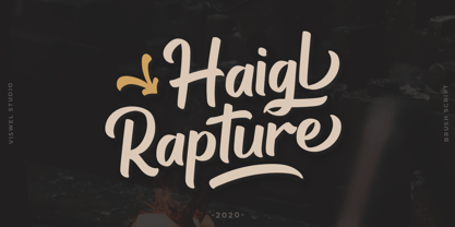
  34. Geometric Patterns JNL by Jeff Levine, $29.00
    Geometric Patterns JNL offers a large and varied assortment of interesting design variations in a 'tiled' (square) format that can be adapted to spot embellishments, running borders or repetitive patterns.
  35. Point Made JNL by Jeff Levine, $29.00
    Point Made JNL is a varied assortment of pointing hands and arrows used for embellishing word copy, drawing attention to key points or simply adding some retro flair to your print or web project. Twenty six designs in varying styles offer a wide range of visual diversity. The images point to the right on the capital keys and to the left on the lower case keys. This font is a companion to Point Taken JNL, which offers twenty-six more pointing hands and arrows.
  36. Bing by Pelavin Fonts, $20.00
    The sinuous, organic forms of Bing first came into being on a poster for a Smithsonian Institution exhibit on Siegfried Bing, a German art dealer in Paris who figured prominently in the development of Art Nouveau towards the end of the nineteenth century. Inspired by the natural forms of Antonio Gaudi, and the Paris Metro stations of Hector Guimard, Bing can be used effectively in the modernist style of Art Nouveau and is equally at home in the 1960s psychedelic rejuvenation of that genre.
  37. Gardenia Summer by Balpirick, $15.00
    Gardenia Summer feels equally charming and elegant. This stunning monoline script font is a stylish homage to classic calligraphy. It features a varying baseline, smooth lines, gorgeous glyphs and stunning alternates.
  38. Chendany by WNGSTD, $10.00
    Chendany is a friendly, neat, and cute-looking handwritten font. Not too thin and not too thick, balanced and varied, this font was designed to enhance the beauty of your projects.
  39. Christmas Preference by Seemly Fonts, $12.00
    Christmas Preference is a clean, simple, and natural handwritten font. Not too thin and not too thick, balanced and varied, this font was designed to enhance the beauty of your projects.
  40. Haldane by Greater Albion Typefounders, $16.50
    Haldane is an Art Nouveau 'punctuated' (i.e. not joined) script, ideal for certificates, calligraphic lettering and signage. Stroke width vary from almost hairline to extremely wide. Great fun for every application!
Looking for more fonts? Check out our New, Sans, Script, Handwriting fonts or Categories
abstract fontscontact usprivacy policyweb font generator
Processing