10,000 search results
(0.04 seconds)
- Nadah by Nantia.co,
$12.00 Nadah Grunge Handwritten Greek font is a decorative font. Of course, the font supports Greek character set and a full extended Latin character set with diacritics. The raw, organic feeling of the font it makes it ideal for the food industry. Also, it’s ideal for creating social media content, for branding, poster design, wedding invitations, or any other packaging. So with your purchase, what is included? Extended Latin Characters Greek Characters Numerals
 - Gaheris by Scriptorium,
$12.00Gaheris is a decorative font in the same tradition as our Goddard and Ganelon fonts, but with a somewhat more calligraphic look. It is suitable for use as a text or title font, but has some characteristics of a script font, which gives it an unusual and appealing appearance. It's based on early 20th century advertising type of a style which you don't see much any more, but which deserves to be preserved. - Mirallove Restimond by MJB Letters,
$20.00 Hello everyone, we hope you have a great day. Say hi to Mirallove Restimond a new casual modern font that is very perfect for branding, wedding designs, quotes, posters, business cards, logotype, display, watermarks, signatures, etc. This font also has a special character in terms of thickness and thinness on each side, so it will give a neat handwritten impression that will make your design look very attractive and it is PUA Encoded.
 - P22 Festiva by IHOF,
$29.95 Festiva is based on lettering found on a 1960s kitchen appliance catalog. It evokes ’60s TV and pop culture while still having a contemporary feel. The fun exuberant flavor of this face is perfect for parties and celebrations. The letters dance across the baseline and the lower case wants to be an upper case but just can’t quite make it. P22 Festiva Regular includes a full unicode European Character set (Western, CE, Turkish, Romanian, etc).
 - Palatino Nova Paneuropean by Linotype,
$67.99Palatino® Nova is Prof. Hermann Zapf's redesign of his own masterpiece, Palatino. The original Palatino was cut in metal by August Rosenberger at D. Stempel AG typefoundry in Frankfurt, and released in 1950. Palatino was later adapted for mechanical composition on the Linotype machine, and became one of the most-used typefaces of the 20th Century. Palatino was designed for legibility, and has open counters and carefully weighted strokes. The type was named after Giambattista Palatino, a master of calligraphy from the time of Leonardo da Vinci. Palatino is a typeface based on classical Italian Renaissance forms. A modern classic in its own right, Palatino is popular among professional graphic designers and amateurs alike, working well for both text and display typography. Hermann Zapf and Akira Kobayashi redeveloped Palatino for the 21st Century, creating Palatino Nova. Released by Linotype in 2005, the Palatino Nova family is part of Linotype's Platinum Collection. Palatino Nova includes several weights (Light, Regular, Medium, and Bold), each with companion italics. Four styles (Regular, Italic, Bold, and Bold Italic) have Greek and Cyrillic glyphs built into their character sets. The Palatino Nova family also includes revised versions of Aldus (now called Aldus Nova), as well as two titling weights. The first titling weight, Palatino Nova Titling, is based on Hermann Zapf's metal typeface Michelangelo, including Greek glyphs from Phidias Greek. The heavier titling weight, Palatino Nova Imperial, is based on Sistina. The fonts in the Palatino Nova family support all 48 Western, Central, and Eastern European languages. Additional features: ligatures and historical ligatures, Small Caps, ornaments, and a range of numerals (proportional & tabular width lining and Old style Figures, fractions, inferiors, and superiors)." - Blacker Pro by Zetafonts,
$39.00 Blacker Pro is the revised and extended version of the original wedge serif type family designed by Cosimo Lorenzo Pancini and Andrea Tartarelli in 2017. Blacker was developed as a take on the style that Jeremiah Shoaf has defined as the "evil serif" genre: typefaces with high contrast, oldstyle or modern serif proportions and sharp, blade-like triangular serifs. Due to the high contrast in the design - slightly reminescent of didone typefaces - Blacker has been developed in two optical subfamilies. The display version offers tighter tracking, higher contrast and sharper corners for maximum effect at big sizes, while the text variant offers better readability and screen rendering at smaller sizes, with lower contrast and looser spacing. In the pro version, two additional condensed variant families have been added (condensed display and condensed text) allowing for more freedom and versatility in typesetting where space constraints are present. Also, three titling uppercase-only variants have been added, with a slightly extended feel, and two decorative subfamilies (inline and diamond). Each of these seven variants has been developed in six weights from light to heavy, with matching italics, for a total of 69 styles covering a wide range of editorial and advertising uses. All Blacker Pro feature a revised and extended character set covering over two hundred languages using the latin, cyrillic and greek alphabets. Open type features include small caps, positional numerals, fractions, superior & inferior figures, alternate forms, and an extended set of standard and discretionary ligatures. With its bold personality, Blacker aims to be a modern classic used for bold statements and self-conscious brands, making your text look great both on paper and on the screens.
 - Palatino Nova by Linotype,
$50.99 Palatino® Nova is Prof. Hermann Zapf's redesign of his own masterpiece, Palatino. The original Palatino was cut in metal by August Rosenberger at D. Stempel AG typefoundry in Frankfurt, and released in 1950. Palatino was later adapted for mechanical composition on the Linotype machine, and became one of the most-used typefaces of the 20th Century. Palatino was designed for legibility, and has open counters and carefully weighted strokes. The type was named after Giambattista Palatino, a master of calligraphy from the time of Leonardo da Vinci. Palatino is a typeface based on classical Italian Renaissance forms. A modern classic in its own right, Palatino is popular among professional graphic designers and amateurs alike, working well for both text and display typography. Hermann Zapf and Akira Kobayashi redeveloped Palatino for the 21st Century, creating Palatino Nova. Released by Linotype in 2005, the Palatino Nova family is part of Linotype's Platinum Collection. Palatino Nova includes several weights (Light, Regular, Medium, and Bold), each with companion italics. Four styles (Regular, Italic, Bold, and Bold Italic) have Greek and Cyrillic glyphs built into their character sets. The Palatino Nova family also includes revised versions of Aldus (now called Aldus Nova), as well as two titling weights. The first titling weight, Palatino Nova Titling, is based on Hermann Zapf's metal typeface Michelangelo, including Greek glyphs from Phidias Greek. The heavier titling weight, Palatino Nova Imperial, is based on Sistina. The fonts in the Palatino Nova family support all 48 Western, Central, and Eastern European languages. Additional features: ligatures and historical ligatures, Small Caps, ornaments, and a range of numerals (proportional & tabular width lining and Old style Figures, fractions, inferiors, and superiors)."
 - Chong Old Style by Monotype,
$29.99In the tradition of Goudy Old Style and Goudy Modern, Chong Wah drew Chong Old Style™ and Chong Modern™ as visually different – but complementary – designs. According to Chong Wah, “The extended family of typefaces started as a concept rather than a preconceived design. The concept is different sans serif type styles with a common underlying structure and a clear lineage to traditional serif designs. While there are similarities between the designs, each typeface was drawn as a separate entity.” Chong Old Style has the flavor of traditional old style designs without slavishly replicating the earlier design traits. It has the heft and color of an old style design but lacks the serifs and inclined stroke axis customarily seen in these typefaces. The result is a versatile suite of typefaces that deliver a straightforward message in large or small sizes. Chong Modern is a sans serif interpretation of the classic modern, or neoclassical, designs of Bodoni and Didot. More than a Bodoni without serifs, Chong Modern also has an elegant, Art Deco demeanor. This is a design that walks the line between traditional and contemporary with grace and aplomb. Chong Wah drew his Old Style and Modern designs in Light, Regular and Bold weights, adding an Extra Bold to the Old Style. All designs benefit from harmonizing italic counterparts. Both branches of the Chong family are also available as OpenType Pro fonts, allowing graphic communicators to take advantage of OpenType’s diverse capabilities. These fonts, in addition to providing for the automatic insertion of old style figures, ligatures and small caps, also offer an extended character set supporting most Central European and many Eastern European languages - Today Sans Now by Elsner+Flake,
$59.00 With the publication of the “Today Sans Now” Elsner+Flake extends its offering of the “Today Sans Serif” type family, developed in 1988 by Volker Küster for Scangraphic, by another cut so that the gradation of the stroke width can now be more finely calibrated. The type complement is available for 72 Latin-based languages as well as Cyrillic. Where available, small caps were integrated, and mathematical symbols as well as fractions were included. In order to make the symbols for text applications in regard to headlines more flexible, the insertions which were formerly added, for technical reasons in order to sharpen the corners, were eliminated, and the optical size adjustments of the vertical and diagonal stem endings (I, v, H, V) to the horizontal bars (z, Z) were scaled back. Already since the end of 1984, Volker Küster experimented with broad sticks of chalk and a broad felt pen in order to develop a new sans serif typeface which, in the interest of easy legibility, would be built on the basic structures and proportions of the Renaissance-Antiqua. Using a normal angle of writing, his experiments lead to the form structure of the characters: a small contrast between bold and light weights, serif-like beginning and end strokes in some of the lower-case characters, and the typical, left-leaning slant of all round lower-case letters and the typical left-leaning axis of all round letter forms. In this way, a rhythmization of a line of type was achieved which created a lively image without being “noisy”. With this concept, Volker Küster has enlarged the Sans Serif by a distinctive, trend-setting form variation.
 - Chong Modern by Monotype,
$29.99In the tradition of Goudy Old Style and Goudy Modern, Chong Wah drew Chong Old Style™ and Chong Modern™ as visually different – but complementary – designs. According to Chong Wah, “The extended family of typefaces started as a concept rather than a preconceived design. The concept is different sans serif type styles with a common underlying structure and a clear lineage to traditional serif designs. While there are similarities between the designs, each typeface was drawn as a separate entity.” Chong Old Style has the flavor of traditional old style designs without slavishly replicating the earlier design traits. It has the heft and color of an old style design but lacks the serifs and inclined stroke axis customarily seen in these typefaces. The result is a versatile suite of typefaces that deliver a straightforward message in large or small sizes. Chong Modern is a sans serif interpretation of the classic modern, or neoclassical, designs of Bodoni and Didot. More than a Bodoni without serifs, Chong Modern also has an elegant, Art Deco demeanor. This is a design that walks the line between traditional and contemporary with grace and aplomb. Chong Wah drew his Old Style and Modern designs in Light, Regular and Bold weights, adding an Extra Bold to the Old Style. All designs benefit from harmonizing italic counterparts. Both branches of the Chong family are also available as OpenType Pro fonts, allowing graphic communicators to take advantage of OpenType’s diverse capabilities. These fonts, in addition to providing for the automatic insertion of old style figures, ligatures and small caps, also offer an extended character set supporting most Central European and many Eastern European languages - Bauer Bodoni by Linotype,
$45.99 Giambattista Bodoni (1740-1813) was called the King of Printers; he was a prolific type designer, a masterful engraver of punches and the most widely admired printer of his time. His books and typefaces were created during the 45 years he was the director of the fine press and publishing house of the Duke of Parma in Italy. He produced the best of what are known as "modern" style types, basing them on the finest writing of his time. Modern types represented the ultimate typographic development of the late eighteenth and early nineteenth centuries. They have characteristics quite different from the types that preceded them; such as extreme vertical stress, fine hairlines contrasted by bold main strokes, and very subtle, almost non-existent bracketing of sharply defined hairline serifs. Bodoni saw this style as beautiful and harmonious-the natural result of writing done with a well-cut pen, and the look was fashionable and admired. Other punchcutters, such as the Didot family (1689-1853) in France, and J. E. Walbaum (1768-1839) in Germany made their own versions of the modern faces. Even though some nineteenth century critics turned up their noses and called such types shattering and chilly, today the Bodoni moderns are seen in much the same light as they were in his own time. When used with care, the Bodoni types are both romantic and elegant, with a presence that adds tasteful sparkle to headlines and advertising. The Bauer Bodoni was done by Heinrich Jost for Bauer Typefoundry in 1927. This version has finer details of the original Bodoni types. It works well for headlines, logos, advertising.
 - TT Tricks by TypeType,
$35.00 TT Tricks useful links: Specimen | Graphic presentation | Customization options TT Tricks is a modern serif font family whose design refers us to the style of transitional serifs. The distinctive features of TT Tricks are the relatively low contrast of strokes, the slightly squarish shapes of round characters and the emphasized businesslike nature. The original idea of TT Tricks is based on the graduation project of student Sofia Yasenkova, who chose to create a daily planner font as her final project. This led to many stylistic decisions, for example, the large and asymmetrical serifs, low contrast strokes, and the presence of interesting details. In the process of working on TT Tricks, we have significantly revised the initial idea and expanded the areas of possible font application, while maintaining the original spirit of the project. Despite the large number of display details, the typeface looks great in a small point size, and also when it is used in large text arrays. TT Tricks features an original stylistic set which, when turned on, adds features of typical pointed-pen serifs to some of the lowercase characters. In addition, TT Tricks has small capitals for Latin and Cyrillic alphabets, as well as several interesting ligatures. The TT Tricks font family consists of two font subfamilies, these are the main version and the version with the original stencil cutting. Each subfamily consists of 12 fonts: Light, Regular, DemiBold, Bold, ExtraBold, Black + True Italics. Following a good tradition, TT Tricks supports a large number of OpenType features: ordn, case, c2sc, smcp, frac, sinf, sups, numr, dnom, onum, tnum, pnum, dlig, liga, calt, salt (ss01).
 - Thirsty Cream by PizzaDude.dk,
$20.00 Thirsty Cream is my handmade and slightly curly font. I had birthday greeting cards, invitations and products for kids. But I guess that it is useful for a good handful of other things. While the lowercase has it's curly moments, the UPPERCASE is quite steady and super legible
 - BrushtipTerrence by JOEBOB graphics,
$19.00 A spontaneous, fresh, honest and non-doctored brush script font with an almost complete set of extra characters. Excellent for people that want to put their statement on the wall, but don't have the hand for it, but it's also great for use in poster design, bookcovers and scrapbooking.
 - HiBaby by Dhan Studio,
$17.00 HiBaby is a beautiful hand-painted font, with an organic, fun design and with a mixture of lowercase and uppercase, making it interesting and unique. This fonts can be used for various purposes such as headings, signature, logos, wedding invitations, t-shirts, letterhead, signage, labels, news, posters, badges etc.
 - Lost City by Tigade Std,
$15.00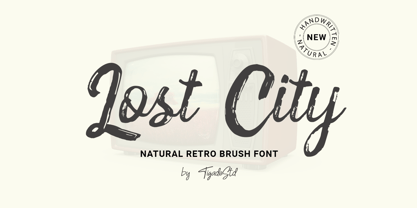 Lost City is a Natural Retro Brush Font. It is a handwritten which can beautifully enhance your design and product with the feel of retro. It's perfect for creating quotes, greeting cards, branding, promotion, advertisements (hello creative people!). This is a complete set comes with the International Characters. Enjoy!
 - Throll by Skiiller Studio,
$18.00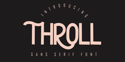 THROLL Modern sans serif font. It has a elegant, classy look and modern. It’s a great font for fashion, apparel projects, signature, album cover, logo, branding, magazine, social media, & advertisements. What's include: Stylistic alternate PUA Encoded Characters - Fully accessible without additional design software. Basic Latin Language Support (AÀÁÂÃÄÅCÇDÐEÈÉÊËIÌÍÎÏÑOØÒÓÔÕÖUÙÜÚÛWYÝŸÆß )
 - Alemoric Vintage by HansCo,
$15.00 Alemoric vintage font is a vintage decorative typeface which is inspired by lettering sign and art. While this font has a victorian touch, it still looks bold and solid. Very suitable for for packaging, headline, logotype, apparel, branding, advertising etc. How to access alternate / ornament ? : https://hanscostudio.com/tutorial/ Enjoy!
 - Furriatt by DVType,
$16.00 Furriatt is a heavy weight bold all caps display typeface. It’s perfect for posters, logos, merch, covers and all stuff you want to print or display in larger format. Font also contain alternative characters set, you could match it with standard glyph to get the best rhythm of letters.
 - Ramones by Namistudio,
$15.00 Rebel, Energy, Punk, Power... Ramones, jagged interlock letter with bold line. This font will bring that IN YOUR FACE attitude in your design. No more soft side. It's all about the energy ! Either choosing the auto-generate interlocking letters, or keep it original, Ramones still brings you the power.
 - Evadare by Scriptorium,
$18.00Evadare is a decorative text font inspired by the designs of Rudolf Koch and Nicholas Cochin. It has a freehand, calaligraphic look, yet is regular and works well at small sizes as required for text uses. It's a sort of a romantic, rustic alternative to more traditional text fonts. - Horse Puckey JNL by Jeff Levine,
$29.00Horse Puckey JNL is a lighthearted and fun, Western-styled font based on Halavah Twist JNL by Jeff Levine. This font lends itself to the less-serious side of Cowboy life... rodeos, barbecue cookouts, barn dances, etc. Use it liberally wherever the Western look is needed for informal headlines. - Ningrat by Bejeletter,
$20.00 Ningrat is a mix of classic with modern serif font family. It’s weight cover regular. The black weight of Ningrat Display font offers very strong impression. As a great choice for title and headers, it pairs well with most of the popular sans serif fonts for body text.
 - Mocktaile Typeface by Krismagraph,
$16.00 Mocktaile Typeface is a modern & luxury serif . It's soft curves mixed with high contrast glyphs lend it self to both feminine qualities. Great in layout design for quotes or body copy, and will be unique to the use of the fashion typography, logo design. And also multilingual support.
 - Linotype CaseStudyNo1 by Linotype,
$29.99With twelve different weights CaseStudy No1 is a new flexible type family that has a condensed technical style. Its different stroke thicknesses offer a wide variety for magazines, books, advertising, etc. For each weight the designers Jakob and Meißner have also made additional alternative letterforms, logos and symbols. - Gallicide by MuSan,
$12.00 Gallicide is a Handmade Modern Vintage Textured Display Typefaces. This fonts is combining the style of modern handwritten style and classic vintage looks. It comes with 3 Styles (Rough, Reglar and Outline). This font will look good on any retro design like poster, t-shirt, label, logo etc.
 - Lunch Show by Epiclinez,
$18.00 Lunch Show is a cute, friendly yet thick lettered display font. It embodies playfulness and it's the right choice for product packaging, logotype, games, children, or school projects. So what’s included: Basic Latin A-Z & a-z. Numbers, symbols, and punctuations Multilingual Support. Accented Characters : ÀÁÂÃÄÅÆÇÈÉÊËÌÍÎÏÑÒÓÔÕÖØŒŠÙÚÛÜŸÝŽàáâãäåæçèéêëìíîïñòóôõöøœšùúûüýÿžß Thank you
 - Mockerel Vintage by HansCo,
$15.00 Mockerel Vintage font is a vintage decorative typeface which is inspired by lettering sign and art. While this font has a victorian touch, it still looks bold and solid. Very suitable for for packaging, headline, logotype, apparel, branding, advertising etc. How to access alternate / ornament ? : https://hanscostudio.com/tutorial/ *Enjoy!
 - Sticky Rush by Bogstav,
$16.00 This is my and it's handmade super legible sans font. Very suitable for anything that needs a clearly handmade look, but not overdoing it. I've added several different versions, and they all fit on top of each other - or you can use them just fine as individual fonts.
 - Wishful Gloria by Invasi Studio,
$17.00 With its loop, curly, & playful strokes, Wishful Gloria creates a display font. The font comes in uppercase all caps with OpenType features. Alternate characters and ligatures can be used to give the composition a unique feel. Suitable for display needs such as quotes, branding, logo, poster, cover design, etc
 - Buck by Here East Fonts,
$16.00 BUCK HEAVY is an extremely monumental, architectural and brutal unicase font, designed for maximum visual and emotional impact. Use it in big and really big scales. It's great for headlines, prints, branding, editorial and websites — everything that strives for being really bold, vibrant and super strong and masculine.
 - Hayabusha by Typehand Studio,
$20.00 A display font with 700++ ligature, Hayabusha packs a full set of capitals, number and punctuation. Be it gigs, sport events, logo design or etc. Hayabusha was made to bring impact. Hayabusha features: AA AZ Ligature ZA ZZ Ligature ATA ETE and More ligature ATTA UTTU and More Ligature
 - Montern Vintage by HansCo,
$15.00 Montern Vintage font is a vintage decorative typeface which is inspired by lettering sign and art. While this font has a victorian touch, it still looks bold and solid. Very suitable for for packaging, headline, logotype, apparel, branding, advertising etc. How to access alternate / ornament ? : https://hanscostudio.com/tutorial/ Enjoy!
 - Wonky Kitten by The Arborie,
$11.00 Here we have a loopy and whimsical font called Wonky Kitten. Its crazy and unstructured form gives this font a mad personality while maintaining an air of innocence. It's perfect to use in book titles, children's and teen branding, as well as type for a poster or canvas.
 - The Camping by Fox7,
$12.00 The Camping is an elegant and stylish vintage slab serif font. This typeface is perfect for elegant and vintage logos, book or movie title designs, fashion brands, magazines, clothes, lettering, quotes, etc. Add this font to your favorite creative ideas and notice how it makes them come alive!
 - Midnight Story by Orenari,
$17.00 Midnight Story font is specially designed for spooky yet horror occasion. This font has rough texture, so it will bring the creepy atmosphere in every glyphs. It's really horror when your project didn't meet the perfect font. So let Midnight Story be friends with your design and craft projects.
 - The Majority by Letterhend,
$14.00 A classy script that beautifully flows and brings the feel of luxury. This font is perfect to be used on t-shirt designs, logos / branding, signatures, headlines, lettering quotes, etc. It also includes in uppercase, lowercase, punctuations, symbols & numerals, stylistic set alternate, ligatures, and support for multiple languages.
 - Pauline by insigne,
$24.99 Pauline is a sans serif with a strong influence from retro scripts. Pauline is a geometric face formed with slow and deliberate rounded brush strokes. The tall ascenders give it a useful touch of naïveté. It’s a face suitable for some interesting titling and short bits of copy.
 - Sugar Smile by Prioritype,
$12.00 Introducing. Sugar Smile - All Caps Display Font Sweet font with hand strokes. Simple and eye catching. You can apply it to craft designs, promotions, creative posts, apparel, quotes, merchandise, posters etc. See some of the previews above for reference. Features: • Uppercase • Lowercase • Numeral • Punctuation • Multilingual • PUA Encoded Thanks.
 - Regima by Martype co,
$20.00 Regima, a minimalist display font, perfect for logotype, branding, editorial and etc. Regima is a sleek and modern minimalist display font that is tailor-made for logotypes, branding, editorial designs, and more. With its clean lines and simple yet sophisticated design, Regima exudes an air of elegance and professionalism.