10,000 search results
(0.028 seconds)
- Sweet Rosetia by Runsell Type,
$9.00 Sweet Rosetia font family consists of a script, a sans style and a set of dingbats. The handwritten modern script works perfectly together with the sans serif and 190+ cute illustrations. Sweet Rosetia Script includes a full set of lowercase letters with beginning swashes , a full set of lowercase letters with ending swashes, contextual alternates, stylistic alternates and ligatures features that makes the font look more natural. Sweet Rosetia is perfect in designs such as logotypes, brand, magazines, websites or blog headlines, packaging, branding, quotes, invitation cards, greeting cards, business cards, wedding invites, and more. Sweet Rosetia Includes: - Ligatures, Contextual alternates, Stylistic alternates, and Swash (Beginning and Ending Swashes) Uppercase, lowercase, numeral and punctuation - Sweet Rosetia Regular and Sweet Rosetia Sans - 190+ cute illustrations - PUA Encoded Characters - Fully accessible without additional design software - Multilingual support for English, French, Italian, Spanish, Portuguese, German, Swedish, Norwegian, Danish, Dutch, Finnish, Indonesian, Malay, Hungarian, Polish, Croatian, Turkish, Romanian, Czech, Latvian, Lithuanian, Slovak, Slovenian. How to get access alternate glyphs with designing software to OpenType fonts, check this link : http: //adobe.ly/1m1fn4Y
 - Be Creative by Corradine Fonts,
$34.95 When you are trying to solve any problem, surely you round the solution like a swirl. This typeface represents that continuous search of creative solutions. So, our recommendation is “Be Creative” always. Based on the skeleton of the classic typeface from Corradine Fonts “Mussica”, this softened semi-serif type family comes in eight useful weights and has many full functional Open Type features that allow you to play with the extension and type of the ornaments including three levels of swash caps and many ascender, descender, starting and ending forms for the lower case set. Use the Swashes and Titling features separately or mixed to extend the length of the swashes and apply the Contextual alternates feature to obtain wonderful smart swashes. If you prefer to use the common lowercase “r”, instead the original one of the typeface, you could replace it just by applying the Stylistic Alternates feature. And finally you can enjoy the numerous discretionary ligatures that Be Creative has available to obtain a completely improved appearance of your design.
 - Blessed Christmas by Jinan Studio,
$20.00 Blessed Christmas is a versatile and festive typeface designed to bring the spirit of Christmas to your creative projects. This unique font is characterized by its mixable upper and lower case styles, making it perfect for adding a playful and decorative touch to your designs. It also features ligatures and a selection of swashes that can be seamlessly incorporated into your text, allowing for endless customization options. Whether you're creating holiday greeting cards, designing festive product packaging, or crafting Christmas-themed quotes and posters, Blessed Christmas is the perfect choice to infuse your designs with the spirit of Christmas. Its mixable styles, ligatures, swashes, and multi-language support make it a valuable addition to your design toolkit. Embrace the joy of the holiday season with this charming and versatile typeface. Features A set of uppercase and lowercase glyphs Number, symbol, and punctuation Multilingual Support Ligatures and swashes Type j_1 until j_5 to features swash, ligatures will automatically replace the standard letter pairs whenever available, when using any OpenType capable software.
 - Bonspire Script by Mans Greback,
$69.00 Bonspire Script is a dynamic and creative script typeface. Brimming with lively swashes and optimistic flair, Bonspire Script embodies the essence of movement and creativity. Its swirly strokes lend it an air of playful sophistication, making it equally suitable for heartfelt love letters or eye-catching advertisements. Its handwriting-inspired design gives it an approachable and personal feel. The typeface dances across the page, infusing any text with a sense of joy and possibility. Use underscore _ anywhere in a word for swashes. Example: Love_rose Use multiple underscore for different swashes. Example: Wonder________woman Use Bonspire Script's built-in swashes and stylistic alternates to fully express your creativity. Its OpenType functionality ensures top-notch quality and customizability. The typeface offers extensive lingual support, covering all Latin-based languages, and includes all the characters and symbols you'll ever need. The creative force behind Bonspire Script is Mans Greback. Renowned for his ability to evoke emotion through typography, Greback has outdone himself with this lighthearted yet intricate design. His extensive portfolio showcases a knack for blending practicality with artistic flair, making each font a unique masterpiece.
 - Arkhania by Adorae Types,
$16.00 Light the fire and get your spells ready for Halloween with this witchy font, Arkhania. This display family offers three different styles from which you can pick the one that best describes the atmosphere and mood of your composition: Striped, fun and wicked, Regular, a more strong and classical look, and Hollow, old styled and classy. All three typefaces inspired by the Triple Moon Goddess and its phases: Maiden, Mother, & Crone. Arkhania family features: 423 glyphs 3 styles 84 icons, drawings, swashes and flags Standard ligatures Alternate characters Contextual alternates Swashes more... In addition, there is Arkhania Sigils, a style filled with swashes, icons, drawings and symbols. Play with them, combine a few, choose from different beginnings and endings and create your own swashes, underlines and frames. You can also find flags and boxes along with common connectors. Tips for a clean and modern look: Combine this typeface with a sans serif, light or thin font, like Aeonian (Aeonian Light was used for these images), and let Arkhania cast a spell on the viewer.
 - Sathiya by Rotterlab Studio,
$10.00 Sathiya is a modern calligraphy font with sophisticated messy ink accents. It is perfect for branding, packaging design. Sathiya includes full set of lovely uppercase and lowercase letters, multilingual symbols, numerals, punctuation and ligatures. All lowercase letters include beautiful and unique (each letter has own "unpatterned" ending) beginning and ending swashes. Also, includes following multilingual symbols In order to use the beautiful swashes, you need a program that supports OpenType features such as Adobe Illustrator CS, Adobe Photoshop CC, Adobe Indesign and Corel Draw. The swashes are called alternative style. For example, letter "a" with beginning and ending swashes are alternative style for "a". In order to access you need them you need to open Glyphs panel. Photoshop has a glyph panel where you can find alternates and ligatures Select the Nagatha Christie font and go to Window Glyphs and double-click on the glyph you want to use. To open from Illustrator, please, follow: Window --Types --Glyphs. -Photoshop https://www.youtube.com/watch?v=Go9vacoYmBw -Illustrator http://youtu.be/iptSFA7feQ0nn Thanks and have a wonderful day.
 - Vinery by RagamKata,
$16.00 Vinery Sans serif Introducing Vinery - our latest sans serif font that combines modern design with unique swash alternates. This font is perfect for any design project that requires a clean and sleek look. With its minimalist and elegant design, it's ideal for branding, packaging, editorial, or web design. Vinery comes with a range of swash alternates that are carefully crafted to add an extra level of creativity to your designs. Whether you're looking for a simple or elaborate swash, this font has got you covered. The alternates are easily accessible, so you can switch them up to create different styles within your design. This font features a modern and sophisticated look with its clean lines and geometric shapes. It's easy to read and versatile, making it suitable for both headlines and body text. Vinery is perfect for creating a contemporary and professional look that stands out. With its unique swash alternates, it's sure to add a touch of creativity to any project. Try it out today and take your designs to the next level!
 - Winterfalls by Joanne Marie,
$30.00 I always like to make a heart swash font and this is my 7th. Winterfalls is a high quality, smooth, simple script font which is easy to read and ideal for anything romantic and loving. Use it on cards and notes for baby announcements, wedding stationery, birthday and thank you cards but most of all, anything for your Valentine. Winterfalls includes left and right end swashes and connecting swashes on the lowercase letters, and a set of alternate uppercase letters with heart swashes. There are a few alternate lowercase letters, such as the ‘i’ and the ‘j’ dotted with a cute little heart and many, many ligatures. As usual, this font also comes with a good set of international characters, which will come in handy when you want you entice your valentine with a little french, haha. If you use a program which doesn’t have a glyphs panel then it’s super easy to copy and paste the alternates and ligatures from Font Book (Mac) or Character Map (Windows).
 - Letterpress Studio by Fenotype,
$15.00 Letterpress Studio -Crafted Vintage Goods Letterpress Studio includes following • 7 fonts - a textured and clean version of each • Ornaments • Catchwords • 25 Logo Templates Letterpress Studios core is seven fonts - textured and clean version of each. Fonts are designed in same proportions and work great together. Here’s a short introduction to the fonts: • Letterpress Script -A connected script with lot’s of OpenType features • Letterpress Script Bold -Bold version of Letterpress Script • Letterpress Condensed -A condensed sans-serif typeface with swash uppercase characters on • Letterpress Gothic -A sans-serif typeface with swash uppercase characters • Letterpress Sans -An extended sans-serif typeface with swash uppercase characters • Letterpress Wood -A woodcut style serif typeface with swash uppercase characters • Letterpress Black -A black woodcut style serif typeface with swash uppercase characters • Letterpress Ornaments -A set of pictograms, ornaments, borders and badges (OTF, AI & PDF) • Letterpress Catchwords -A set of over 100 woodcut-style catchwords (OTF, AI & PDF) All fonts have West European, Central European, Baltic, Turkish and Romanian character sets. Fonts come in OTF format. TTF are also available but OpenType features won’t work with them. Letterpress Templates -25 templates (AI) Letterpress Templates is a set of 25 ready made compositions with font pairings, shapes, ornaments and ready made 2-4 color schemes for each. Templates can be used as such or as a starting point for your own project. Download Letterpress Templates here.
 - Egregio Script by Fontscafe,
$39.00 We at Fontscafe are forever trying to work on conniving up typography that will blend itself into your work space in a manner that will make you wonder how you ever managed without it…and that effort has led us to the birth of yet another all-new font for you! And this one like most of our others has a niche appeal although it is versatile as versatile can be. Now this is a font that can pretty much fit the bill when you want to send out an exclusive appeal but yet not overly formal. It is styled with fonts that cry out ‘eliteness’ and exclusivity, but without the part where it becomes so exclusive and classy that it goes way over people’s heads! The ‘Egregio’ can still connect on a very personal, almost friendly level with your audience while it remains in a class of its very own!
 - Salvatore by W Type Foundry,
$25.00 Salvatore is the neo-grotesque younger brother of Nutmeg type family. It comes with 36 weights that have been separated in two flavours. The first half is Salvatore normal, which has more neutral features; and the second one is Salvatore Roman, which has more versatility at the end of the characters. The name comes from the Mad Men character Salvatore Romano, who was a publisher in the mid 60s. In that period, grotesques typefaces ruled advertising, nevertheless, there wasn't a typeface that represented publishers as Salvatore Romano, that’s why we gave birth to this project. Designed with powerful OpenType features in mind, each weight includes alternate characters, ligatures, fractions, special numbers, arrows, extended language support and many more… Perfectly suited for graphic design and any display/text use. The 36 fonts are the first part of a larger Salvatore family. We’re proud to introduce: Salvatore.
 - Psyche by Haiku Monkey,
$10.00Psyche is a swash font, hand drawn and tweaked and kerned to within an inch of its life. Perfect for fancy, funky initials and phrases. - Kachong by ZetDesign,
$13.00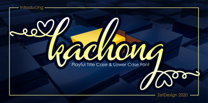 Kachong is a cute and elegant handwritten font with an incredibly friendly feel. It features gorgeous swashes and ligatures that make this script incredibly versatile.
 - Baltazak by PeachCreme,
$23.00 Ink. Messy Ink. Imperfect letters. Baltazak includes uppercase and lowercase letters, numerals, a large range of punctuation and ligatures. All lowercase letters include ending swashes.
 - Anjelina by Nandatype Studio,
$12.00 Anjelina is a beautiful and romantic script font. It is PUA encoded which means you can access all of the glyphs and swashes with ease!
 - Galiano by DearType,
$49.00 Galiano is an elegant combination of a script and a narrow modern serif. It is slender, feminine and classy, while still maintaining a friendly feel. Galiano is versatile and will work perfectly for fashion, e-commerce brands, trend blogs, wedding boutiques or any business that wants to appear upscale and chic. With its 1500+ glyphs the Galiano Script is perfect for creating original and functional designs. It has extensive language support and tons of ligatures, alternates, stylistic sets and swashes that add visual interest to every letter. The Galiano Font Family in a nutshell: - Galiano - a dancing baseline script with signature loops for ascenders and descenders - Galiano Inline - similar feel to Galiano, notably featuring a standartized x-height - Galiano Text - a simpler version of the script with no fancy loops for ascenders and descenders and no swashes and alts. - Galiano Serif + Italics - perfect for headlines - Galiano Ornaments - a set of 80 beautiful ornaments to embellish your typography. You can use the Galiano Family for high-end logotypes and magazine headlines, but let’s not forget greeting cards, invitations, posters, book covers, ads and the various web and screen usages. The overall feel of the font is elegant, sophisticated with a touch of informal and it is ideal if you want to convey a sense of class and style.
 - Sabine by Arabetics,
$45.00 Sabine is an Arabetic type design with a calligraphic flavor. It follows the guidelines of the Mutamathil Taqlidi type style with one glyph for every basic Arabic Unicode character or letter, as defined in Unicode Standards version 5.1, and one additional, final-position, glyph for each Arabic letter that is normally connected with other letters from both sides in traditional cursive Arabic strings. Sabine employs variable x-height values. It includes all required Lam-Alif ligatures and uses ligature substitutions and selected marks positioning but it does not use any other glyph substitutions or forming. Text strings composed using types of this family are non-cursive with stand-alone isolated glyphs. Tatweel (or Kashida) glyph is a zero width space. Keying it before any glyph will display that glyph isolated form. In Sabine Kashidah, Irsal, and Tasmim keying Tatweel (shift J) after certain glyphs will replace it with a long stroke glyph. In Sabine Tasmim, keying it a second time will replace glyph with a final form swash (Irsal) glyph. In Sabine Irsal all final forms are swash glyphs. Keying Tatweel before Alif Lam Lam Ha will display the Allah ligature. Sabine family includes both Arabic and Arabic-Indic numerals; all required diacritic marks, Allah ligature, in addition to standard English keyboard punctuations and major currency symbols. Fonts are available in regular and italic styles.
 - Fnord by Monotype,
$23.99 Fnord is a contemporary humanist serif typeface, it is ideally suited for display purposes, titling, headline copy and branding. The family has been designed to be highly versatile, containing a total of 23 fonts. Each font features discretionary ligatures, swash alternates and true small caps. The overall design is clean and simple with a little bit of rebelliousness thrown in for good measure – Fnord does not conform to the traditional serif blueprint. Fnord’s design has been strongly influenced by the complex, thought-provoking and mischievous works of authors Robert Anton Wilson and Robert Shea from the 1970s. I was re-reading their work while sketching the initial letterforms and realised that some of the proportions and angles were coinciding with some themes that run through the books – particularly the numbers 5, 17, 23, 40 and 93, which are key to this font family’s spacing and geometry. I found it both very interesting and enjoyable to play with a specific theme and purpose for creating this typeface. I am sure you will enjoy working with it in your own design projects. Key features: • 5 Weights in 4 Styles – Roman, Italic, Condensed and Extended • 3 Additional Display Styles in 1 Weight – Engraved, Inline and Woodcut • Small Caps, Alternates, Swashes and Discretionary Ligatures • Full European character set • 680 glyphs per font.
 - Greater Neue Condensed by NicolassFonts,
$40.00 The Greater Neue font family is a modern collection consisting of 32 weights, 16 uprights, and matching italics. Condensed width consisting of 16 weights, 8 uprights, and matching italics. It is perfect for packaging, advertisements, headlines, and corporate identities. This font family is well-suited for graphic design and any type of display use.
 - Moho FX Shadow Pro by John Moore Type Foundry,
$40.00 A display font collection for fantasy headlines within the concept of Moho Condensed based in letters with shadows as Moho Umbra Regular and Italic, or simple shadow effect as Moho Shadow Regular and Italic, or font effects to be used in color layers. all ideal for interesting lettering to magazines, posters and labels design.
 - ataxia by Justi,
$25.00 Ataxia was designed to be used in long texts such as books and magazines. The font has the weights regular, bold, italic and bold italic as well as ligatures, small caps, oldstyle numbers and support for many languages (unfortunately not German: ß is missing, lower quotes ‚wrong‘ and „missing“), with more than 500 glyphs.
 - BlamDude BB - Personal use only

- Planetary Orbiter - Unknown license

- Curbdog by MADType,
$21.00 Curbdog is a bold, playful display face with light horizontals and curved terminals in the italics.
 - !Lestatic CSS - 100% free

- Tenner by Suomi,
$35.00 All-caps script with swashes in upper case, and ligatures. And outline with same metrics, so the oulines fit snuggly on top of the book-variant.
 - Jackie Sue BF by Bomparte's Fonts,
$39.00 Based on the free-spirited handwriting style of a friend, this font features automatic ligatures, alternate character substitutions and swashes in applications that are OpenType-savvy.
 - Hatcher by Letterena Studios,
$9.00 Hatcher is a stylish and distinct serif font. This font is PUA encoded which means you can access all of the glyphs and swashes with ease!
 - Ayalda by Nissa Nana,
$19.00 Ayalda is a classy and elegant handwritten font with beautiful swashes. Get inspired by its unique look, and turn any design idea into a true standout!
 - Mixink Std by MIX.Jpg,
$14.00 Mixink Std is a serif font features amazing swashes. It has a vintage feel and look that makes it perfect for any retro and nostalgic project.
 - Algaida by Hikhcreative,
$19.00 Algaida is a beautiful modern script font with beginning and ending swashes, All characters that add more beautiful and aesthetic fonts to perfect your extraordinary project.
 - Merendina by Resistenza,
$29.00 Merendina has a geometric construction with an handwritten touch. This family contains regular and slanted and 6 weights. Do not miss all the alternates and swashes.
 - Sabrina Script by Straight.Co,
$12.00 The Sabrina is a modern script font with an elegant style. You can alternate between the regular and swashed letters to get a handwritten, professional look.
 - RONDOS by Letterena Studios,
$10.00 Rondos is a squared lettered and robotic styled display font. This font is PUA encoded which means you can access all glyphs and swashes with ease!
 - Hello Stranger by Sarid Ezra,
$15.00 Hello Stranger is handwritten font that contain ligatures, stylistic alternates, swash, and more to create your own customized handwriting. This font also includes multi-language support.
 - Winslow Title by Kimmy Design,
$25.00 Winslow Title is a high contrast modern type family comes in two styles and a monolinear script family. The traditional proportions of Winslow Title are historical in nature and follow the design and style of Winslow Book as a high contrast variant. The Winslow Title Mod family is a contemporary take on the style, with tapering terminals and less pronounced finials. Each family includes both styles, to be accessed through the opentype panel as a stylistic alternate. If preferable, you can purchase the entire family collection to have easier access to both styles, but it's not necessary. The typeface family comprises of roman and italic styles in six weights from Thin to Black and two widths in the roman style: Regular and Narrow. The accompanying script family has a single weight but offers five tracking widths, from Narrow to Wide. The bundle is an elegant combination of styles perfect for titling and display design. The serif typeface is packed with features that make ideal titling styles. Not only do they include the Stylistic Alternates, but also Titling Alternates, Discretionary Ligatures, Small Capitals, Swashes and Contextual Ligatures. As noted previously, the typeface comes in two styles, Traditional and Modern. Each can be accessed either by the Stylistic Alternates or Stylistic Sets. Titling Alternates are alternates that expand the ball terminals to K, R, V, W, and Y (see Titling Alternates slide). Contextual Ligatures are for capital combinations with A that tighten the gap created by the extended serifs. It connects characters with a pairing serif (the lower right serif of the M with the lower right serif of the A) and bridges them together. This combination works for single and multiple A combinations. It is turned on automatically in the Opentype panel and shouldn’t need to be accessed individually. Alternatively, the Discretionary Ligatures feature combines diagonal or baseline stems with lifted small capitals, creating a unique combination of characters. Swashes is an extensive feature that offers up to five swash options per many of each character. These can be selected via the Glyphs panel or as character alternates in Adobe programs. The Script family has a feature set of it’s own, with initial and final swashes on lowercase letters, middle swashes for select characters, and a titling feature that joins words together by replacing the space with a line. Stylistic alternates create a bouncing baseline on connecting strokes. *Note: there is no great need to purchase both families as all styles can be accessed via Opentype features, but if customers prefer to purchase both styles, it can be done by selecting the Complete Typeface Family collection.
 - ITC Bodoni Seventytwo by ITC,
$29.99Giambattista Bodoni (1740-1813) was called the King of Printers; he was a prolific type designer, a masterful engraver of punches and the most widely admired printer of his time. His books and typefaces were created during the 45 years he was the director of the fine press and publishing house of the Duke of Parma in Italy. He produced the best of what are known as modern" style types, basing them on the finest writing of his time. Modern types represented the ultimate typographic development of the late eighteenth and early nineteenth centuries. They have characteristics quite different from the types that preceded them; such as extreme vertical stress, fine hairlines contrasted by bold main strokes, and very subtle, almost non-existent bracketing of sharply defined hairline serifs. Bodoni saw this style as beautiful and harmonious-the natural result of writing done with a well-cut pen, and the look was fashionable and admired. Other punchcutters, such as the Didot family (1689-1853) in France, and J. E. Walbaum (1768-1839) in Germany made their own versions of the modern faces. Even though some nineteenth century critics turned up their noses and called such types shattering and chilly, today the Bodoni moderns are seen in much the same light as they were in his own time. When used with care, the Bodoni types are both romantic and elegant, with a presence that adds tasteful sparkle to headlines and advertising. ITC Bodoni™ was designed by a team of four Americans, after studying Bodoni's steel punches at the Museo Bodoniana in Parma, Italy. They also referred to specimens from the "Manuale Tipografico," a monumental collection of Bodoni's work published by his widow in 1818. The designers sought to do a revival that reflected the subtleties of Bodoni's actual work. They produced three size-specific versions; ITC Bodoni Six for captions and footnotes, ITC Bodoni Twelve for text settings, and ITC Bodoni Seventytwo - a display design modeled on Bodoni's 72-point Papale design. ITC Bodoni includes regular, bold, italics, Old style Figures, small caps, and italic swash fonts. Sumner Stone created the ornaments based on those found in the "Manuale Tipografico." These lovely dingbats can be used as Bodoni did, to separate sections of text or simply accent a page layout or graphic design." - ITC Bodoni Twelve by ITC,
$29.99Giambattista Bodoni (1740-1813) was called the King of Printers; he was a prolific type designer, a masterful engraver of punches and the most widely admired printer of his time. His books and typefaces were created during the 45 years he was the director of the fine press and publishing house of the Duke of Parma in Italy. He produced the best of what are known as modern" style types, basing them on the finest writing of his time. Modern types represented the ultimate typographic development of the late eighteenth and early nineteenth centuries. They have characteristics quite different from the types that preceded them; such as extreme vertical stress, fine hairlines contrasted by bold main strokes, and very subtle, almost non-existent bracketing of sharply defined hairline serifs. Bodoni saw this style as beautiful and harmonious-the natural result of writing done with a well-cut pen, and the look was fashionable and admired. Other punchcutters, such as the Didot family (1689-1853) in France, and J. E. Walbaum (1768-1839) in Germany made their own versions of the modern faces. Even though some nineteenth century critics turned up their noses and called such types shattering and chilly, today the Bodoni moderns are seen in much the same light as they were in his own time. When used with care, the Bodoni types are both romantic and elegant, with a presence that adds tasteful sparkle to headlines and advertising. ITC Bodoni™ was designed by a team of four Americans, after studying Bodoni's steel punches at the Museo Bodoniana in Parma, Italy. They also referred to specimens from the "Manuale Tipografico," a monumental collection of Bodoni's work published by his widow in 1818. The designers sought to do a revival that reflected the subtleties of Bodoni's actual work. They produced three size-specific versions; ITC Bodoni Six for captions and footnotes, ITC Bodoni Twelve for text settings, and ITC Bodoni Seventytwo - a display design modeled on Bodoni's 72-point Papale design. ITC Bodoni includes regular, bold, italics, Old style Figures, small caps, and italic swash fonts. Sumner Stone created the ornaments based on those found in the "Manuale Tipografico." These lovely dingbats can be used as Bodoni did, to separate sections of text or simply accent a page layout or graphic design." - ITC Bodoni Ornaments by ITC,
$29.99Giambattista Bodoni (1740-1813) was called the King of Printers; he was a prolific type designer, a masterful engraver of punches and the most widely admired printer of his time. His books and typefaces were created during the 45 years he was the director of the fine press and publishing house of the Duke of Parma in Italy. He produced the best of what are known as modern" style types, basing them on the finest writing of his time. Modern types represented the ultimate typographic development of the late eighteenth and early nineteenth centuries. They have characteristics quite different from the types that preceded them; such as extreme vertical stress, fine hairlines contrasted by bold main strokes, and very subtle, almost non-existent bracketing of sharply defined hairline serifs. Bodoni saw this style as beautiful and harmonious-the natural result of writing done with a well-cut pen, and the look was fashionable and admired. Other punchcutters, such as the Didot family (1689-1853) in France, and J. E. Walbaum (1768-1839) in Germany made their own versions of the modern faces. Even though some nineteenth century critics turned up their noses and called such types shattering and chilly, today the Bodoni moderns are seen in much the same light as they were in his own time. When used with care, the Bodoni types are both romantic and elegant, with a presence that adds tasteful sparkle to headlines and advertising. ITC Bodoni™ was designed by a team of four Americans, after studying Bodoni's steel punches at the Museo Bodoniana in Parma, Italy. They also referred to specimens from the "Manuale Tipografico," a monumental collection of Bodoni's work published by his widow in 1818. The designers sought to do a revival that reflected the subtleties of Bodoni's actual work. They produced three size-specific versions; ITC Bodoni Six for captions and footnotes, ITC Bodoni Twelve for text settings, and ITC Bodoni Seventytwo - a display design modeled on Bodoni's 72-point Papale design. ITC Bodoni includes regular, bold, italics, Old style Figures, small caps, and italic swash fonts. Sumner Stone created the ornaments based on those found in the "Manuale Tipografico." These lovely dingbats can be used as Bodoni did, to separate sections of text or simply accent a page layout or graphic design." - ITC Bodoni Brush by ITC,
$29.99Giambattista Bodoni (1740-1813) was called the King of Printers; he was a prolific type designer, a masterful engraver of punches and the most widely admired printer of his time. His books and typefaces were created during the 45 years he was the director of the fine press and publishing house of the Duke of Parma in Italy. He produced the best of what are known as modern" style types, basing them on the finest writing of his time. Modern types represented the ultimate typographic development of the late eighteenth and early nineteenth centuries. They have characteristics quite different from the types that preceded them; such as extreme vertical stress, fine hairlines contrasted by bold main strokes, and very subtle, almost non-existent bracketing of sharply defined hairline serifs. Bodoni saw this style as beautiful and harmonious-the natural result of writing done with a well-cut pen, and the look was fashionable and admired. Other punchcutters, such as the Didot family (1689-1853) in France, and J. E. Walbaum (1768-1839) in Germany made their own versions of the modern faces. Even though some nineteenth century critics turned up their noses and called such types shattering and chilly, today the Bodoni moderns are seen in much the same light as they were in his own time. When used with care, the Bodoni types are both romantic and elegant, with a presence that adds tasteful sparkle to headlines and advertising. ITC Bodoni™ was designed by a team of four Americans, after studying Bodoni's steel punches at the Museo Bodoniana in Parma, Italy. They also referred to specimens from the "Manuale Tipografico," a monumental collection of Bodoni's work published by his widow in 1818. The designers sought to do a revival that reflected the subtleties of Bodoni's actual work. They produced three size-specific versions; ITC Bodoni Six for captions and footnotes, ITC Bodoni Twelve for text settings, and ITC Bodoni Seventytwo - a display design modeled on Bodoni's 72-point Papale design. ITC Bodoni includes regular, bold, italics, Old style Figures, small caps, and italic swash fonts. Sumner Stone created the ornaments based on those found in the "Manuale Tipografico." These lovely dingbats can be used as Bodoni did, to separate sections of text or simply accent a page layout or graphic design."


