10,000 search results
(0.042 seconds)
- The Candy by DainType,
$15.00 When the conditions are met, a heart is attached to the capital letter. It feels soft and lovely. It goes well with wedding cards, invitations, elegant brochures, web images, and promotional materials. If you do not apply the open type feature, the letters without hearts are applied, so you can use it in two moods.
 - Rachel by Gatype,
$8.00 Rachel is modern script font, where every single letter has been carefully crafted to make your text look beautiful. With a modern script style, this font will perfect for many different projects including: quotes, blog headers, posters, weddings, branding, logos, fashion, apparel, letters, invitations, stationery, and more. Rachel includes alternate glyphs and beautiful swirls.
 - Hawkes by Kimmy Design,
$15.00 Hawkes is an extensive handmade typeface family that comes with a bundle of weights, widths and styles, all designed to work cohesively. Here is a breakdown of the Hawkes family. Hawkes Sans: The primary subfamily is a sans-serif typeface that includes nine fonts: three weights (light, medium and bold) and three widths (narrow, regular and wide). Within this set are an array of stylistic features; including small capitals, character style alternatives, discretionary ligatures and contextual alternatives. See details below for more information on OpenType Features. Hawkes Variable Width Sans: The secondary subfamily is the same base sans-serif fonts but combined in variating widths. Essentially, it takes all three widths of each weight and randomly mixes them together. This creates a funky and creative alternative to the more traditional sans-serif set. The variations are for the uppercase, lowercase, small capitals, ligatures and numbers. Hawkes Script: The last subfamily is the script typeface. It’s a quirky script with variations of its own, including ligatures, swashes and contextual alternatives (again, see below for further details.) The script font works great as a complimentary style to the sans-serif, or on it’s own. FEATURES Alright, let’s get into all the extra goodies this typeface has to offer. Small Capitals: Small caps are short capital letters designed to blend with lowercase text. These aren’t just capital letters just scaled down but designed to fit with the weight of both the lowercase and capitals. With Hawkes, small caps can either sit on the baseline (in line with the base of the capital and lowercase) or to be lifted to match the height of the capital letters by applying the discretionary ligature setting in the OpenType panel. These small capitals have a dot underlining them that sit along the baseline. The feature offers a unique display affect that is great for logos, titles and other headline needs. Discretionary Ligatures: A discretionary ligature is more decorative and unique combination than a standard ligature and can be applied at the users discretion (as the name indicates.) The specific styling for these ligatures varies for different fonts. With Hawkes, they are used as an all capital styling feature, or to lift the small capitals to align with the height of the capitals. In the former setting, both lowercase and uppercase letters are first changed to all capitals, then a specialized set of letter combinations are transitioned so small characters are positioned within a main capital letter. These combinations only happen with main characters that include an applicable stem, such as C F K L R T Y. Some of these combinations include two or three characters. When Small Caps is turned ‘on’, this feature will lift the small caps to the height of the capital letter. For more information, please check out the user guide! Stylistic Alternatives: Stylistic alternates are a secondary form of a character, often used to enhance the look or style of a font. For Hawkes, these alternatives provide a slightly more handmade feel. A - the capital and small capital A will lose its pointed apex and become rounded. Think of it more as an upside-down U than an up-side-down V ;-) Oo, G, Ss, Cc- these characters’ topmost terminal becomes a loop. The O is applied automatically, the G S and C need to be turn on individually. Titling Alternatives: This feature does sort of the opposite of what it intends. Instead of being used for titling purposes, this feature makes the text look better in paragraph text settings. Kk Rr h n m - curved terminals on the are straightened e - the counter stroke also gets straightened from a more looping motion y - the shape of y is changed from a rounded character to a sharper apex (think more like a ‘v’ than ‘u’) Contextual Alternatives: Contextual alternates are glyphs designed to work within context of other adjacent glyphs. With Hawkes Sans, there are three slightly different variations per character. The feature rotates the application of each variation. This helps with organic authenticity, so if you have two e’s next to each other, they won’t look identical (reflecting the natural variations in handwriting and lettering.) With Hawkes Variable width fonts, I have created a contextual pattern that randomizes the widths of each character. So, when the feature is turned ‘on’ in the OpenType panel, the widths would alternate in a pattern such as: Narrow, Wide, Regular, Narrow, Regular Wide, Narrow, etc. It happens automatically so the user doesn’t have to think or worry about getting a random seed. With Hawkes Script, contextual alternates allow strokes to connect properly from one character to the next while maintaining a believable, natural flow. Connecting strokes are present for two letters next to each other but are replaced by a shorter stroke when located at the end of a word or sentence. Some characters have in-strokes when located at the start of a word. When a character is preceded by a capital letter that doesn’t connect, it too needs an in-stroke or altered spacing. This feature is complicated and messy, but luckily you don’t really have to think about it! I’ve done all the coding so all you have to do is turn ‘on’ the feature in the OpenType panel and you are off to the races! I’m just letting you know what’s happening behind the scenes. Swashes: These are just for Hawkes Script and provide tail swashes to the start and ends of letters. There are three different options. You can pick the basic option by turning ‘on’ the swash feature in the OpenType panel, or you can pick using the Glyph panel. Stylistic Sets: This feature work in new versions of Illustrator CC and InDesign CC. You can pick specific styling sets instead of turning on an entire feature. For example, let’s say you want to have a loopy S, but not a loopy C or O, you can just turn on the S in the Style Set. It also helps create the little drop box that pops up when you hover over a character, showing you the alternates associated with that character. This makes it easy to pick and choose specific styles you want in a word or headline. ---------- And there it is folks! That’s all the basic info on Hawkes, I know it’s been a lot and I appreciate you hanging on. If you are like me and need more of a visual reference to accessing all these goodies, I’ve made a user guide to help navigate Hawkes and everything it has to offer. Altogether this extensive family boasts 14 total fonts in a wide array of styles, weights and widths, making it a great addition to any handmade type collection. Enjoy!
 - Escritura by Vanarchiv,
$30.00 The handwriting typeface Escritura was created for editorial purposes and the letter forms are influenced by chancery handwriting from the Italian Renaissance. The asymmetrical shapes of the undulating serifs cause the characters to have a large aperture. Originally designed for display sizes, the typeface also comes in a text version for small sizes. With taller vertical proportions, the text version has slightly longer serifs and increased white space between the characters to optimize legibility in small sizes. Ascenders and descenders and serifs are shorter in the display version, which has more economical letter spacing resulting in a visually compact text image. The stress in the letter strokes create changing widths according to their direction, improving the calligraphic rhythm in the characters. The oblique crossbar as well as other typographic details lend the typeface that typical Renaissance atmosphere.
 - Arcade King by Ditatype,
$29.00 Arcade King is an exciting display font inspired by classic arcade games. Designed in uppercase, this typeface captures the nostalgic essence of retro gaming with its playful style. With consistent letter proportions and high contrast, this font ensures easy readability while immersing you in a world of gaming fun. The consistent letter proportions of Arcade King create a sense of harmony and balance throughout the font. Each uppercase letter is carefully crafted to maintain visual cohesion, ensuring a smooth and enjoyable reading experience. This design choice guarantees that every character complements the others, resulting in a visually appealing and cohesive typographic composition. The stark difference between thick and thin strokes enhances the visibility of each letter, making them easily distinguishable even at smaller sizes. The high contrast design adds a touch of boldness and excitement to the font, capturing the essence of the arcade gaming experience. Enjoy the available features here. Features: Stylistic Sets Multilingual Supports PUA Encoded Numerals and Punctuations Arcade King fits in headlines, logos, posters, product packaging, branding materials, print media, editorial layouts, website headers, and any projects that aim to evoke a sense of fun and adventure. Find out more ways to use this font by taking a look at the font preview. Thanks for purchasing our fonts. Hopefully, you have a great time using our font. Feel free to contact us anytime for further information or when you have trouble with the font. Thanks a lot and happy designing.
 - Not My Type by It's me Simon,
$14.00 If you want your design to have that nostalgic typewriter effect, Not my Type would be perfect. It's old-fashioned and retro—letters are worn and grungy like it needs a new ink ribbon. Some of the letters are misaligned—just like a real old typewriter. It is best used at smaller sizes, perfect for logos, headlines, covers and any design where you want that vintage look and feel. Each letter has two alternatives, making three in total. Using the alternative letters, you can make your type layouts look more random, like a real typewriter. You can manually set the alternatives via the glyphs panel in your design software or you can enable them automatically. If you enable contextual alternatives in your design application, the letters will change automatically as you type.
 - Kalender Serif by Gurup Stüdyo,
$10.00 ∙Kalender is designed as a high-contrast modern serif for display use. Kalender is provides you an elegant and luxurious typographic colour. ∙When Kalender's lines invisible at small sizes you can use Kalender No 2 which have thicker lines and serifs to assist readability. ∙Kalender Blok is arranged for situations which are diacritical marks overflow to leadings of the headline and headline typographical color is affected negatively from this situation. For this purpose, majiscule diacritical letters are resolved within the letter height. However, when this is done, new forms are obtained by integrated diacritical marks with letters instead of directly merging them. The idea behind this approach is to preserve the typographic value of diacritical marks and emphasize the semantic value of diacritical letters. 68 letters have been redesigned in this way. And also Kalender have different meanings in Turkish: large, humble etc. I considered this name appropriate because it described the structure of this font well.
 - LC Gianluca by Compañía Tipográfica de Chile,
$29.00 Gianluca is a typeface of glyphic serif, or “flare” inspired by Aldo Novarese’s fonts from the 70s, with a fresh and modern touch. It is a type family that can be elegant in its normal version, or very playful, to compose from extensive texts to flashy headlines in books, magazines, labels, posters, branding and more. It has many discretionary ligatures in capital letters (with its diacritics) to play with the text, 5 stylistic sets: among them medieval style or references to Herb Lubalin, and some special letters. Gianluca consists of 5-weight fonts, from Thin to Extra Bold. All of them with matching italics. It has a nice set of small capitals, modern and old style numbers, and capital-sensitive punctuation, among other striking glyphs. Play with Gianluca!
 - Hella Instegra by Skypia,
$17.00 Start good day for new font! present to you, Hella Instegra! Hella Instegra is a stylish font It has both modern and retro look - clear, modern and fun. Helps to create layout design in 60s or 70s design projects. This font have more than 150 unique alternate and 59 ligature that to give your logo,business card and another project to a unique vintage look. It has Italic and Outline version too so what a perfect vintage font! Hella Instegra is also included full set of: uppercase and lowercase letters multilingual symbols numerals punctuation Alternates PUA Encoded Unique letterforms I really hope you'll get pleasure using Hella Instegra font and it will be perfect addition to your font collection! If you have some questions, please write me a letter! Thank You Skypia.
 - English Engravers Roman by Smith Hands,
$38.00 English Engravers Roman is inspired by the beauty and eccentric detailing of British stone carved lettering. After observing many beautiful inscriptions around London and southern England, Robbie Smith decided to create a font family in homage to this rich heritage. English Engravers Roman features a set of beautifully balanced uppercase Roman, and a characterful lowercase alphabet with some endearing quirks. Included in the each font are two forms of lowercase 'q', one very similar to an uppercase 'Q' with a tail, and a traditional 'q'. Each font in the family features a comprehensive character set with many ligatures, added to enhance letter spacing. The fonts all feature an additional set of old style numerals. Many extra characters and ligatures can be accessed via the 'insert glyph' functions in graphic design software.
 - Artful Nouveau JNL by Jeff Levine,
$29.00 Artful Nouveau JNL was modeled from the hand lettering on the sheet music cover for the 1910 song "Gee, But It's Great to Meet a Friend from Your Home Town".
 - Flixuble by PizzaDude.dk,
$20.00Flixuble is a mess! It was made involving an inky pen and sandpaper! Comes with more than 60 ligatures in order to make the font look more like handmade letters! - Symcaps Vario X1 by Deniart Systems,
$20.00 The Symcaps Vario X1 typeface is a monospaced design created to give optically symmetrical message forms. This all-caps alphabet provides two styles of capital letters plus numbers 1-0.
 - KD Diagona by Kassymkulov Design,
$9.95 KD Diagona is a display, geometrical face with 45 degree diagonal cut. Letter spacing along with almost 4000 kerning pairs were designed to match the diagonal progression of the font.
 - Xandercode by Sipanji21,
$10.00 Xandercode is a bold and chunky lettered display font. Add this font to your creative ideas and notice how it will make them stand out! with spalsh vector bonus inside.
 - Tapas Signpainting by Cifonts,
$50.00 Tapas Signpainting is a typeface based on traditional sign painting letters designed by Cifonts. This family has six variants and is useful to compose display texts, vintage logos, headlines & packaging.
 - Caeli AT by Arctype,
$18.99 A typeface that invokes the beauty, strength and liberty of nature. Plant life is honoured with curves flowing from strong stems along with subtle references to Art Nouveau letter-shapes.
 - Klein by Zetafonts,
$39.00 Klein PDF Specimen Klein is Zetafonts love letter to the grandmother of all geometric sans typefaces, Futura. Starting from a dialogue with Paul Renner’s iconic letterforms and proportions, Francesco Canovaro and Andrea Tartarelli decided to depart from its distinctive modernist shapes with slight humanist touches and grotesque solutions - with some design choices evoking the softness of humanist sans serifs like Gill Sans. The end result is a workhorse superfamily of 54 fonts with full multilingual capabilities and coverage of over two hundred languages using latin, cyrillic and greek alphabets. The original display-oriented family, developed in nine weights with matching italics (from the hairline thin to the sturdy black), has been paired with a text version (with slightly higher x-height, better readability and maximum legibility at small point size) and with a condensed version, to be used for space-saving display solutions in editorial and advertising formats. With a name that is both a nod to its humble functionality and an homage to french nouveau realiste artist Yves Klein, this typeface aims to become your next trusted companion in all your adventures in print, digital and motion design.
 - Becky by W Type Foundry,
$22.00 Becky is a versatile display type designed to appeal to to a young audience of creative, up-to-date people. Geared towards the world of advertising and retail. It is well-suited for large headlines, branding, logos, publishing and short texts. With a modern look inspired by such geometric classics as Futura and an overall edgy, informal quality (seen in details like the subtle curve of its verticals), Becky stands out as a fun, unique type. Becky is a 10-variant type family that comes in 5 weights: light, regular, medium, bold and extra bold. It features 445 characters in total. Becky features 2 alternative stylistic sets: SS1 in which the diagonals in the letters X, Y, V, W, R, K, y,x,v,w and k shift from curved to straight in order to achieve a more formal look, especially useful for smaller texts. SS2 offers alternate glyphs for I, E, J, e, j and t, further expanding the possibilities of the typography. Learn about upcoming releases, work in progress and get to know us better! On Instagram W Foundry On facebook W Foundry wtypefoundry.com
 - Evangeliaire Uncial by Intellecta Design,
$14.90an approach to the uncial medieval style of letters - FWD Zooks by Fontwright Design,
$29.00 FWD Zooks is a very casual pen style OpenType LatPro font containing 411 characters. This font contains a full complement of characters including many extra ligatures and OpenType alternates. FWD Zooks was designed directly from hand lettered notes with a few uniquely creative features added yielding a truly individual and recognizable typeface. FWD Zooks is perfect for your personalized casual text across numerous document types. FWD Zooks was designed with a natural bounce to provide a more personalized, hand lettered appearance. For instance, while FWD Zooks is great for Cartoons and Comics, it is also an excellent choice for Invitations, Cards, Posters, Book Covers, Personalized Letters and much, much more!
 - Maitre d Stencil JNL by Jeff Levine,
$29.00 Maître d' Stencil JNL is based on an alphabet example found in the 1949 French lettering book “Album de Lettres Arti”, and is available in both regular and oblique versions.
 - Nice Trendy by Arendxstudio,
$13.00 Nice Trendy - A Groovy Typeface is a font with distinctive handwritten characters perfect for branding projects, logos, wedding designs, media posts, advertisements, product packaging, product designs, labels, photography, watermarks, invitations, stationery, and any project who need handwritten dishes. Features : • Character Set A-Z • Numerals & Punctuations (OpenType Standard) • Accents (Multilingual characters) • Ligature Multilingual Support : Afrikaans, Albanian, Asu, Basque, Bemba, Bena, Catalan, Chiga, Cornish, Danish, English, Estonian, Faroese, Filipino, Finnish, French, Friulian, Galician, German, Gusii, Icelandic, Indonesian, Irish, Italian, Kabuverdianu, Kalenjin, Kinyarwanda, Low German, Luo, Luxembourgish, Luyia, Machame, Makhuwa-Meetto, Makonde, Malagasy, Malay, Manx, Morisyen, North Ndebele, Norwegian Bokmål, Norwegian Nynorsk, Nyankole, Oromo, Portuguese, Romansh, Rombo, Rundi, Rwa, Samburu, Sango, Sangu, Scottish Gaelic, Sena, Shambala, Shona, Soga, Somali, Spanish, Swahili, Swedish, Swiss German, Taita, Teso, Vunjo, Zulu
 - Cosmic Rock by Arendxstudio,
$13.00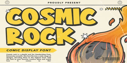 Cosmic Rock - A Comic Display Font is a font with distinctive handwritten characters perfect for branding projects, logos, wedding designs, media posts, advertisements, product packaging, product designs, labels, photography, watermarks, invitations, stationery, and any project who need handwritten dishes. Features : • Character Set A-Z • Numerals & Punctuations (OpenType Standard) • Accents (Multilingual characters) • Ligature Multilingual Support : Afrikaans, Albanian, Asu, Basque, Bemba, Bena, Catalan, Chiga, Cornish, Danish, English, Estonian, Faroese, Filipino, Finnish, French, Friulian, Galician, German, Gusii, Icelandic, Indonesian, Irish, Italian, Kabuverdianu, Kalenjin, Kinyarwanda, Low German, Luo, Luxembourgish, Luyia, Machame, Makhuwa-Meetto, Makonde, Malagasy, Malay, Manx, Morisyen, North Ndebele, Norwegian Bokmål, Norwegian Nynorsk, Nyankole, Oromo, Portuguese, Romansh, Rombo, Rundi, Rwa, Samburu, Sango, Sangu, Scottish Gaelic, Sena, Shambala, Shona, Soga, Somali, Spanish, Swahili, Swedish, Swiss German, Taita, Teso, Vunjo, Zulu
 - Tropical Wind by Arendxstudio,
$13.00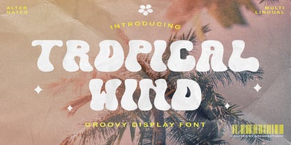 Tropical Wind - A Groovy Font Style is a font with distinctive handwritten characters perfect for branding projects, logos, wedding designs, media posts, advertisements, product packaging, product designs, labels, photography, watermarks, invitations, stationery, and any project who need handwritten dishes. Features : • Character Set A-Z • Numerals & Punctuations (OpenType Standard) • Accents (Multilingual characters) • Ligature Multilingual Support : Afrikaans, Albanian, Asu, Basque, Bemba, Bena, Catalan, Chiga, Cornish, Danish, English, Estonian, Faroese, Filipino, Finnish, French, Friulian, Galician, German, Gusii, Icelandic, Indonesian, Irish, Italian, Kabuverdianu, Kalenjin, Kinyarwanda, Low German, Luo, Luxembourgish, Luyia, Machame, Makhuwa-Meetto, Makonde, Malagasy, Malay, Manx, Morisyen, North Ndebele, Norwegian Bokmål, Norwegian Nynorsk, Nyankole, Oromo, Portuguese, Romansh, Rombo, Rundi, Rwa, Samburu, Sango, Sangu, Scottish Gaelic, Sena, Shambala, Shona, Soga, Somali, Spanish, Swahili, Swedish, Swiss German, Taita, Teso, Vunjo, Zulu
 - Flora Inside by Arendxstudio,
$10.00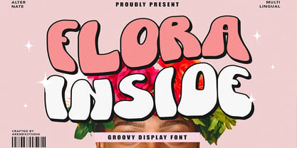 FloraI Inside - A Groovy Display Font is a font with distinctive handwritten characters perfect for branding projects, logos, media posts, advertisements, product packaging, product designs, labels, photography, watermarks, invitations, stationery, and any project who need handwritten dishes. Features : • Character Set A-Z • Numerals & Punctuations (OpenType Standard) • Accents (Multilingual characters) Multilingual Support : Afrikaans, Albanian, Asu, Basque, Bemba, Bena, Catalan, Chiga, Cornish, Danish, English, Estonian, Faroese, Filipino, Finnish, French, Friulian, Galician, German, Gusii, Icelandic, Indonesian, Irish, Italian, Kabuverdianu, Kalenjin, Kinyarwanda, Low German, Luo, Luxembourgish, Luyia, Machame, Makhuwa-Meetto, Makonde, Malagasy, Malay, Manx, Morisyen, North Ndebele, Norwegian Bokmål, Norwegian Nynorsk, Nyankole, Oromo, Portuguese, Romansh, Rombo, Rundi, Rwa, Samburu, Sango, Sangu, Scottish Gaelic, Sena, Shambala, Shona, Soga, Somali, Spanish, Swahili, Swedish, Swiss German, Taita, Teso, Vunjo, Zulu
 - Happy Teas by Kellina James Designs,
$20.00 Happy Teas is a handwritten script font that was designed to create a sense of joy and fun. It includes upper and lowercase letters, numerals, punctuation, and multilingual support. In addition, there are also special characters, alternates, and ligatures to add more flair to your projects. Great for invitations, headers, packaging, branding, wall art, and more.
 - Cookie Powered by PizzaDude.dk,
$15.00 Tall, thin, grid, legible and handmade! What's not to like?! The font was made using a squared paper as a base for the lines. However, I managed to keep the free spirit of the handmade look, despite the guides. Play around with the 4 different versions of each letter and the swashes to make your text stand out!
 - Yemeyi by AukimVisuel,
$9.00 Yemeyi family is a modern and daring display font. No matter the topic, this font will be an incredibly asset to your fonts’ library, as it has the potential to elevate any creation. Yemeyi is a simple and neat lettered sans serif font. Add this font to your creative ideas and notice how it will make them stand out!
 - Mon de Tresor by Reyrey Blue Std,
$14.00 Mon De Tresor is an elegant and thin lettered sans serif font. Perfect for editorial projects, Logo design, Clothing Branding, product packaging, magazine headers, or simply as a stylish text overlay to any background image. It will add a luxury spark to any design project that you wish to create! Includes: Uppercase and Lowercase Ligatures Stylistic Alternate
 - Chocolate Peaches by PeachCreme,
$12.00 Hey guys! So happy to introduce you our new font “Chocolate Peaches”! It is great for projects that have a playful or cute theme, whether for labels, signage, packages, stickers, etc. Along with being legible due to its bold letters, this typeface can make a lovely addition to boho designs that incorporate natural elements, patterns, texture and many colors.
 - Margin by Ahmad Jamaludin,
$17.00 I'm present to you, new retro serif called Margin! Margin is a stylish font that is both retro and bold font. It's thick curves give a 70s groovy vibe with the serifs bringing it slightly back to traditional Margin fits perfectly into those nostalgic moodboards and vintage logos. It come with a unique lower and uppercase plus numbers, punctuation & multilingual letters. What you get OTF Letters, numbers, punctuation, multilingual support, alternate and ligature Regular and Italic version Follow my shop for upcoming updates including additional glyphs and language support. And Please message me if you want your language included or If there are any features or glyph requests, feel free to send me a message, I would like to update it. Enjoy!
 - Appetite Pro by Serebryakov,
$39.00 Appetite Pro is a total upgrade of the world wide popular display font Appetite (2011). It is based on original lettering and belongs to the upright script like. Appetite Pro consists of 10 weights of the refreshed curves — 5 regular and 5 italic — from Light to Heavy. It’s a multilingual and international font, with a full Western Latin, Cyrillic (Russian, Belarusian, Ukrainian) and basic Greek support. The Appetite Pro font family is specially designed for food identity and packaging design projects. In addition to standard letter cases, Appetite Pro also includes dingbats set. Due to the 10 weights font palette, you can solve a wide variety of professional problems without spending money on extra fonts for titles, subtitles, and main text. Try and buy!
 - Fedorro by Leeza Chepugova,
$13.00 We are proud to present to you our new Latin+Cyrillic font Fedorro! Fedorro typeface is a classy example of a modern Ukrainian style of type design. It is inspired by traditional fonts of the past, but with a strong modern twist to its appearance. The main feature of this font are round and playful letters combined with a relatively tiny negative space, making it unique like no other: many typeface elements were borrowed from historical exemplars of Ukrainian handwritten letters and redesigned with modern trends in mind. Fedorro is perfect for all the situations when you need the text to pop and catch the viewer's eye: posters, books and magazine covers, headlines, banners and ads, logotypes, corporate branding, lables, ads etc.
 - Honeypirls Regular by Tebaltipis Studio,
$20.00 I'm present to you, new retro serif called Honeypirls! Honeypirls is a stylish font that is both retro and bold font. It's thick curves give a 70s groovy vibe with the serifs bringing it slightly back to traditional Honeypirls fits perfectly into those nostalgic moodboards and vintage logos. It come with a unique lower and uppercase plus numbers, punctuation & multilingual letters. What you get Letters, numbers, punctuation, multilingual support, alternate and ligature Regular and Italic version Follow my shop for upcoming updates including additional glyphs and language support. And Please message me if you want your language included or If there are any features or glyph requests, feel free to send me a message, I would like to update it. Enjoy!
 - HWT Brylski by Hamilton Wood Type Collection,
$24.95 HWT Brylski is a typeface by Nick Sherman, named for retired wood type cutter Norb Brylski and designed to be cut as wood type at the Hamilton Wood Type & Printing Museum. This font is the digital counterpart to the wood type made as part of the Hamilton Legacy Project . It incorporates several themes that were common in 19th-century type design, including split tuscan serifs with angled mansard-style sides, heavy weight placement at the top and bottom of letters (traditionally referred to as French or Italian/Italienne, regardless of any actual relation to those countries), and an extended overall width. This digital version contains over 400 glyphs for full European language coverage.
 - Ritornelos by PintassilgoPrints,
$24.90 Ritornelos is a lively hand-drawn typeface, perfect for adding that whimsical touch to your designs. It's a unicase alphabet that contains two variations for each letter (accessible through keyboard's upper/lower keys) and handy embellishments.
 - Melody and Memory by Epiclinez,
$19.00 Melody and Memory is a delicate and elegant handwritten font. Its distinct and well rounded letters make this font a masterpiece. Fall in love with its incredibly versatile style and use it to create spectacular designs!
 - Offaly by Fontdation,
$20.00 Introducing Offaly, a funky geometric sans serif font. Offaly comes with a smooth and clean characteristics. Combine the upper and lowercase to get the harmonic letter combinations. Suits best for branding, headline, quote/poster design, etc.
 - Lubaline by Lián Types,
$39.00 Who haven't heard the phrase that ‘any past time was better’?. Although I sometimes find this phrase a little too pessimistic (because I try to think that the best is yet to come), it may be true regarding my passion, typography. I'm too young (29) unfortunately, and this means I did not have the pleasure of being contemporary with maybe the man who has influenced my work the most (1). The man that showed that letters are more than just letters to be read. Herb Lubalin (1918-1981), also called sometimes as ‘the rule basher’ (2), smashed the taboos and sacred rules of type design and gave it personality. He rejected the functionalist philosophy of europeans in favor of an eclectic and exuberant style. To him, letters were not merely vessels of form, they were objects of meaning. (3). Nowadays, when looking at his portfolio, who dares to deny that the term ‘typography’ and ‘beauty’ may go hand-in-hand without any problem? Ed Benguiat, one of Herb’s partners, still likes making jokes with the phrase “screw legibility, type should be beautiful” and what I understand of this is not to forget the rules, but to know and break them carefully. In an era of pure eclecticism, we, the lovers of flourishes and swashes, can't do nothing but admire all the legacy that Lubalin, this wonderful type-guru, left. My font Lubaline read as “the line of Lubalin” is my humble tribute to him. Those who know his work, may see the influences easily like in his ‘Beards’ (1976) and ‘The Sound of Music’ (1965) posters; the art-deco forms in many of his amazing logos and practically in all his creations where letters seem to be alive just like you and me. I really hope that the future finds me still learning more and more about type-design and letterforms, and like him, always willing to make innovations in my field: Because letters are not just letters to be read. NOTES (1) These are some of my fonts in which some of Lubalin’s influences can be seen (in order of creation): Reina, Aire, Erotica, String, Beatle, Heroe, Selfie, Model, Seventies, and many others that are still in progress. (2) (3) Steven Heller. Herb Lubalin: Rule Basher. U&lc (1998) http://www.printmag.com/imprint/my-favorite-lubalin/