10,000 search results
(0.059 seconds)
- Vernaccia by Eurotypo,
$32.00 Last year I went to visit a friend in Tuscany. One day he took me to meet his neighbor, a nice old man; Mr. Giulio. After giving us a tour of his small vineyard, he insisted us to try his production: a delicious Vernaccia! When his wife left the bottle containing the gold liquid on the table, I fell in love with the label: it was handwritten by herself, as if to highlight the "homemade" feature. As a tribute to this beautiful and hardworking couple, I asked permission to be inspired to make a typeface ... and here goes! The family Font Vernaccia... Vernaccia is a type family of four fonts: Regular, Bold, Condensed and Condensed Italic. Is a modern and casual calligraphy family font. As an exclusively Open Type release, with 759 glyphs and 45 ornaments, it has several special alternatives for all letters with lots of possibility and an infinity of combinations. Most of the ornaments can be used alone, but really were especially designed to combine with the different glyphs. There are plenty of options to allow you to create something unique and special: standard and discretionary ligatures, several swashes and stylistics alternates for each letter, catchwords, tails that can be added to the beginning or end of each letter, ornaments, and much more. These lovely fonts have already an extended character set to support Western European languages. Vernaccia was made to make your project more beautiful and attractive! Have fun with it!
 - Worthington Arcade by Device,
$39.00 Worthington Arcade is a classically-proportioned capitals-only type incorporating a selection of ligatures and alternates. It loosely resembles the hand-painted architectural lettering of the 30s to the 50s, exemplified by the likes of Percy Smith’s interior signage for the BBC or George Mansell’s lettering for the University of London and the signs found on London’s bridges. However, rather than a slavish copy of any historical model, it is more an examination and evocation of certain idiosyncratic quirks of civic lettering of the period, and an attempt to create a peculiarly English titling typeface. The round letters, for example the O, Q and C, are wider than the perfect circle usually found in such designs, while the straight-sided characters, usually drawn on a square, are narrower. This lends the whole a subtle elegance that is also emphasized by the raised crossbars on the H, E and F and extended lower leg of the E. Includes old-style numerals.
 - Navigated by Ditatype,
$29.00 Introducing Navigated, a captivating script font that seamlessly combines boldness with balance. Navigated showcases a unique connected letterform design, where each letter is expertly linked, resulting in a fluid and harmonious appearance. With consistent proportions and a low-contrast style, Navigated offers both stability. Adding a touch of flair to Navigated, you'll find striking swinging endings on select letters. These graceful flourishes bring an element of charm and sophistication to your words, making them stand out with a captivating visual appeal. Navigated fits in headlines, logos, posters, flyers, branding materials, print media, editorial layouts, and many more designs. Find out more ways to use this font by taking a look at the font preview.
 - Triump by Latinotype,
$26.00 The typeface family Triump is a simple sans serif with 6 weights from Thin, ideal for use as an epigraph, to Black for head titles of special impact. Excellent for applying in graphic design as logos, trademarks, posters, editorial and web design. Inspired by the classic types of the late twentieth century with rounded corners that give the typography a smooth appearance with rounded ends, with a horizontal stroke that exceeds the vertical in the letters A, E, F, H, J and K which gives a distinct personality. Triump comes with a Black weight in normal and italic Line both upper and lowercase letters, especially to give a vintage look to the designs.
 - Boardwalk Avenue Rough by Fenotype,
$30.00 Boardwalk Avenue Rough is a textured version of Boardwalk Avenue. It’s a robust type collection of three styles and two weights of each. It’s divided into Boardwalk Pen, Boardwalk Antiqua and Boardwalk Serif. Boardwalk Avenue’s core is a connected mono linear script that works fantastic when paired with either of the impressive serif styles. All the fonts work great on their own but try putting them all together for a complete display font setup for a project. Here’s a short introduction on what’s included: Boardwalk Avenue Rough Pen is a connected Script. It’s great for headlines, quotes or in packaging. It has a casual hand drawn vibe to it but it’s clean and legible. It’s equipped with automatic Contextual Alternates that keep the connections smooth and versatile. For instance when you type double letter another of them will automatically change to add variation. Or if you type “i” for example, as a first letter after space or after capital letter the code will add starting point to the letter to keep the letterforms more balanced. If you need more ambitious letterforms you can try Swash or Titling Alternates -there’s alternates for every standard letter and seek for even more alternates from the glyph palette. Boardwalk Avenue Rough Antiqua is a high contrast serif with strong character. It’s great for glamorous headlines or as a logotype. Boardwalk Avenue Rough Serif is a low contrast serif with bulky character. It’s great for strong and sturdy headlines or as a logotype.
 - Stridere by Greater Albion Typefounders,
$16.00 Think of a slender Black Letter screeching to a halt on the page and you have the essential idea of Stridere. Want ornate formality and fast movement all in one? Here it is!
 - Becka Brush by Sulthan Studio,
$14.00 Becka Brush is a bold and chunky lettered display font, created with the help of a brush pen. Add it to your most creative ideas and notice how it makes them come alive!
 - Wake Up Now by Seemly Fonts,
$12.00 Wake Up Now is a cute and simple lettered handwritten font that can be used for all chalkboard quotes or teaching material! Its authentic look will add a realistic feel to your designs.
 - Bonna by Eurotypo,
$28.00 Bonna and Bonna Bold is a casual calligraphy family Font with an original textured appearance that will allow you to create an effect even more authentic. It’s an exclusively Open Type release with 815 glyphs, 93 ornaments to combine with letters and decorate your text. There are plenty of options to create something unique and special with lots of possibility an infinity of combinations: standard and discretionary ligatures, several swashes and stylistics alternates for each letter, catchwords, tails that can be added to the beginning or end of each letter, and much more. These ravishing fonts have already an extended character set to support Central and Eastern as well as Western European languages. Bonna was designed to help your projects look more creative, wonderful and fascinating! Have fun with it!
 - Youth Heritage by Heyfonts,
$15.00 Youth Heritage Font is a vintage bold script font that pays homage to the rich visual heritage associated with youthful exuberance and retro aesthetics , This typeface combines bold, expressive strokes with a script style reminiscent of classic hand-lettering from bygone eras, capturing the spirit of vintage design. Here's a detailed explanation of the key features and characteristics of the Youth Heritage Font: Features: Vintage Aesthetics: The Youth Heritage Font is designed to evoke a sense of nostalgia, drawing inspiration from vintage typography prevalent during the mid-20th century, Its design elements reflect the bold and charismatic lettering styles associated with retro signage and advertising. Bold and Expressive Strokes: One of the defining features of this font is its bold and expressive strokes. Each letter is crafted with confidence, making a strong visual impact. This characteristic contributes to the font's ability to command attention and stand out in various design applications. Script Style: The script style of the font imparts a handwritten and personalized feel. The cursive letterforms flow seamlessly, creating a sense of dynamism and adding a touch of informality to the overall design. Distinctive Lettering: Each letter in the font is crafted with attention to detail, featuring unique and distinctive characteristics. This ensures that the font maintains its individuality and offers a distinct typographic personality. Applications: Vintage Branding: The Youth Heritage Font is well-suited for vintage branding projects. Apparel Design: Designers in the fashion industry can leverage this font for apparel branding and graphic designs. Its bold script style adds a retro flair to T-shirts, hoodies, and other clothing items, giving them a timeless and stylish appeal. Retro Signage: The bold and expressive nature of the font makes it a perfect choice for retro signage and display purposes. Event Posters and Flyers: When designing promotional materials for events, concerts, or parties with a vintage theme, the Youth Heritage Font can contribute to a cohesive and visually appealing poster or flyer design. Social Media Graphics: Its bold and expressive script style can make posts and announcements more engaging and shareable.
 - Subtitle by Type.write.type,
$8.00 Subtitle is a handdrawn slab serif that contains condensed and wide width capital letters in one font. With slightly wobbly lines, Subtitle is designed to be legible at a variety of sizes to give that quirky, fun feel to any informal occasion or brand. Central, Eastern and Western European language support included.
 - Quetzal by Scriptorium,
$12.00Quetzal is a decorative font designed to look like letters formed by mosaic tiles in a Mayan or Aztec style. The font features two different character sets and customizable over-and-under decorative tails which can be added to any character to make hundreds of possible combination forms which nest together attractively. - Ondise by Magpie Paper Works,
$32.00 Ondise is a curvy and warm hand-lettered calligraphy script with a natural, dancing baseline. This Opentype font was created with a pointed pen & ink, and includes six different ampersands as well as a swash feature that automatically substitutes beginning & end of word letters. To enable alternate ampersands, simply turn on the contextual alternates feature and type &1, &2, &3, etc. Opentype coding automatically substitutes the new ‘and’.
 - Leathercrafter JNL by Jeff Levine,
$29.00A popular hobby in the 1950s and 1960s was creating your own wallets, belts and other items from leather do-it-yourself kits. Stamped or carved initials, names or phrases were often added to the leather with special tools and templates - many featuring a Western-styled alphabet with a hand-lettered look. Leathercrafter JNL recreates that same look in a digital font format, complete with the unusual and contrasting letter shapes. - Soldier Slab Stencil Dstrssd by Alphabet Agency,
$15.00 Soldier Slab Stencil Dstrssd. is a grungy military stencil font. The bold slab characters provide a great base to present the distressed effect. The font has been developed from a war related computer game project. The font contains 26 letters of the English alphabet in capitals and alternative capitals are represented when typing in lowercase letters. Each font also contains numbers, punctuation and a range of Latin characters as displayed.
 - Poster Project JNL by Jeff Levine,
$29.00 An online image of a grid page [circa 1930s] showing teachers how they and their students could create cut-out letters and numbers inspired Poster Project JNL. The typeface is available in both regular and oblique versions. A crude, yet charming simplicity to the lettering can help replicate old time school bulletin boards and posters, or simply provide a less formal typographic approach when that is needed for a project.
 - Fleur Bleue by DM Studio,
$30.00 The Fleur Bleue Beautiful Romantic Font is a graceful and elegant typeface that encapsulates the beauty and romance of delicate flowers. With its flowing letterforms and intricate details, this font brings a touch of sophistication and romance to your designs, making it perfect for wedding invitations, love letters, branding, and other projects that require a touch of enchantment. Features: Romantic and Elegant Style: The Fleur Bleue Font exudes a romantic and enchanting aesthetic. Its graceful letterforms and delicate details create an air of elegance and beauty, making it ideal for projects that require a touch of romance and sophistication. Beautiful Floral Design: The font’s intricate details and floral elements add a touch of enchantment and whimsy to your typography. It captures the essence of delicate flowers, bringing a sense of natural beauty to your designs. Versatile Application: This font is versatile and well-suited for various design projects that aim to evoke emotions of love and romance. Use it in wedding invitations, love letters, branding, packaging, and more to add a touch of beauty and enchantment to your designs. Uppercase and Lowercase Letters: The font includes both uppercase and lowercase letters, providing flexibility and creative freedom in your designs. Mix and match the cases to create visually appealing and harmonious typography. Stylistic Alternates: The Fleur Bleue Font offers a selection of stylistic alternates that enhance the visual interest of your text. These special characters create unique connections between letters and alternate forms, allowing you to create beautiful and captivating typography. Punctuation and Symbols: In addition to the alphabet, the Fleur Bleue Font includes a comprehensive set of punctuation marks, numerals, and common symbols. This ensures consistency and ease of use when incorporating the font into your design projects. Easy to Use: Installing and utilizing the Fleur Bleue Font is hassle-free. It is compatible with both Windows and Mac operating systems and seamlessly integrates into popular design software such as Adobe Photoshop, Illustrator, and InDesign. This ensures a smooth and efficient design workflow. Infuse your designs with the grace and romance of the Fleur Bleue Beautiful Romantic Font. Let its flowing letterforms and intricate details bring a touch of sophistication and enchantment to your wedding invitations, love letters, and branding. Embrace the timeless beauty of this font and create designs that evoke feelings of love and admiration.
 - Wanderlust Collection by Cultivated Mind,
$32.00 Wanderlust Letters has returned, but now offered in a beautiful collection of hand painted scripts. New versions include Wanderlust Letters Pro, Decorative, Boho, Chic, Shine, Gold, Caps, and Ornaments. Wanderlust Letters Pro is an extended version of the immensely popular Wanderlust Letters. This latest version includes three sets of basic alternates, one set of decorative alternates, and one set of ligatures. Wanderlust Decorative Pro offers a magnificent updated flow from the initial Wanderlust Letters release. Decorative Pro includes two sets of decorative alternates, two sets of basic alternates, and one set of ligatures. Decorative Regular comes with one set of decorative alternates. Boho, Chic, Shine and Gold are an updated spin off of Wanderlust Letters. These fonts offer new letter styles that blend seamlessly with all Wanderlust fonts. Pro versions of Chic, Shine and Gold comes with three sets of basic alternates and one set of decorative alternates. Boho Pro comes with with two sets of basic alternates and two sets of decorative alternates. Caps is a perfect choice for headline use since it’s an all uppercase font. But don't be afraid to mix it up with all the other Wanderlust fonts. The entire Wanderlust Collection works impeccably to enhance your magazine, packaging, advertising, branding, posters, websites, and films. Combine all Wanderlust fonts with Ornaments to create unique hand painted typography art.
 - Old Kharkiv by Bohdan Hdal,
$24.00 Old Kharkiv was inspired by the first half of the 20th century photo with a signage on the building of the Ivan Kotlyarevsky Kharkiv National University of Arts. During the development, the font has acquired unique features not from the original signage, for example, drops in uppercase were replaced with sharp serifs. This font contains the letters of all the main European languages, Cyrillic and basic special characters. Some uppercase letters (where allowed their form) have decorative elements (swashes) to use them as drop caps or initials. There are stylistic alternatives for some Ukrainian letters. Also, as a bonus, this font contains up to a dozen graphic elements that you can use in your layout.
 - Equines by Attractype,
$12.00 Equines Display is a versatile font family designed specifically for display purposes. Its modern, thick and strong appearance is perfect for branding, logos, banners and any lettering that requires bold and clear letters. To add an artistic image rather than just the thickness of the shape, Equines Display adds a rounding feature to the corners of the letters with a cross system, which makes the word display dynamic, strong and elegant. Until this description was published, Equines Display had 14 styles including condesed, expanded, outline and shaded in hopes of meeting the display font needs of designers and everyone at large. Enjoy working with the Equines Display font family. Best regards, Saefulloh - Attractype Foundry.
 - Summer Strike by Letterafandi Studio,
$14.00 Summer Strike is a simple, thin lettered and flowing handwritten font. This adaptable font will look great on a variety of design ideas. It will add a fun and friendly touch to each of your projects!
 - Love Flowers by Epiclinez,
$15.00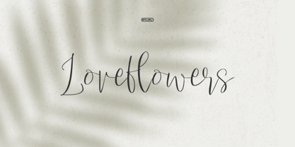 Love Flowers is a lovely and timeless handwritten font. It is a nice choice for creating eye-catching logos, branding, and quotes. Every letter has a unique and beautiful touch, to make your design come alive.
 - PIXymbols Signet Classic by Page Studio Graphics,
$29.00A font package to generate traditional three-letter monogram designs, or a single initial. Includes 29 borders, each accessed by a single keystroke on the computer keyboard. The borders will automatically line up with the initials. - Toy Decals JNL by Jeff Levine,
$29.00 For decades, cereal companies have included premiums [promotional gifts] inside their packages, printed on the cartons or to send for with a special coupon and redemption instructions. During the 1940s, Pep cereal [a long-discontinued Kellogg's brand] offered a series of water-applied decals within its boxes. Most likely made by the Meyercord Company (one of America's largest transfer decal manufacturers at the time), one decal in particular had an alphabet in gold letters with black outlines. (One can only presume the marketing strategy was to have kids bug their parents to buy more Pep cereal if the child needed more than one letter of the alphabet for his or her initials!) Those decal letters have inspired a digital version as the outline character font Toy Decals JNL, which is available in regular oblique, solid and solid oblique styles.
 - Ellora by 99TyppeFoundry,
$10.00 Ellora , a captivating piece of typographic art, depicts a harmony between traditional elegance and modern simplicity. With a mesmerizing design, each letter is a carefully carved work of art, creating a stunning yet easily understandable appearance. The combination of sans-serif style with a human touch elevates Ellora beyond a mere set of letters. Every curve and angle is meticulously chosen to create a captivating visual harmony, making it the perfect choice for designs that prioritize clarity and elegance. With balanced letter heights and precision in every detail, Ellora establishes a timeless classical ambiance that is invaluable. It's more than just a font; it's an expression of beauty that transcends words. With each character, Ellora Humanis Typeface radiates timeless magnificence and undeniable relevance in contemporary design. As you explore each letter, you'll feel the profound artistic beauty, inviting you to reflect on the richness of aesthetics and tranquility offered by this perfect typography. Ellorai s not just a communication tool; it's a living work of art, telling its beautiful story on every page
 - Muggsy by Missy Meyer,
$10.00 I do a lot of taller, narrower handwriting fonts; this time around, I was inspired to make a wider, shorter handwriting font! MUGGSY has everything you expect from one of my fonts: clean and smooth curves, a full set of alternates, and a feeling of fun! MUGGSY has two uppercase-height alphabets (with a few lowercase-style letters like a and e in the lowercase set), plus a full set of 63 "smallternates" -- the same letters, numbers, and ampersand sized down to 75%, and beefed up in weight so they can be mixed in with the full-size letters. Plus 30 double-letter ligature sets, and a few additional alternates for variety! You also get a ton of punctuation, and my usual 300+ extended Latin characters for language support, for a total of over 600 glyphs! And just because you may want things a bit heavier, I've also made Muggsy Heavy, a bolder weight of Muggsy with all of the same alternates and extras. Enjoy, my fonty friends!
 - Bigfoot by Canada Type,
$24.95 Bigfoot is the fattest font ever made. It began as a simple exercise given to students in a design course: Most people don't appreciate type because they don't really know what it actually is. One way to understand it is looking at it like a combination of sculptures that have to work together to achieve a certain harmony, where each letter form is one of those sculptures. Most people understand and appreciate that a sculpture starts from a rock of an incomprehensible form, which is manipulated by someone into becoming the recognizable or abstract work of art it eventually is. Consider type design a kind of two-dimensional sculpting. You have a rectangle. Take away as a little as possible from it until it is recognizable as the letter A. Repeat to get the letter B, and so on. After all 26 minimal letters are made, do they actually function as an alphabet to build words and sentences that are recognizable to the human eye? This exercise can trigger thoughts and theories about the overall subjective nature of identifying abstract yet somewhat familiar shapes. It can go into the psyche of art in general. But one thing for certain, this exercise has so far helped a few people find a new appreciation for finely crafted typefaces. If you are a design educator, your students' typographical perspective and arguments would benefit from it. And if you are a designer, well, fat faces are all the rage these days, and this is as fat as it can get. Please note that that this typeface, due to its minimalistic nature, does not include accented characters. It does however support the full C0 Controls and Basic Latin Unicode set. All proceeds from this font go to support the Type Club of Toronto.
 - Rhomantics by BaronWNM,
$12.00 Rhomantics is a sans serif font that carries a classic style. Rhomantics font takes a simple form but still has a classic feel in its shape so it is easy to identify each character of the letter to make it easier for us to read. This font can be used in invoice designs, history book covers, branding, advertisements, business cards, etc.
 - MPI Arcadian by mpressInteractive,
$5.00 Arcadian was first produced in wood type around 1870 by William H. Page & Company. It is a semi-ornamented face based on a French Clarendon, with dots added to the median and the tops and bottoms of the letters. It has a distinctly “Old West” feel, and was likely used to add a little pizzazz to advertising and broadsides of the time.
 - Jerky Tash by PizzaDude.dk,
$20.00Jerky Tash is supposed to look somewhat handwritten, that’s why it has got jumpy letters, different sized serifs and a loose kerning. The font is spaced to look okay when used without kerning, but the font definitely deserves to be viewed using the kerning pairs! - Pepperminta by PizzaDude.dk,
$16.00 A curly and playful sans serif font with blurry lines. Fits nice to anything that has to do with products for kids! Comes with 3 different versions of each lowercase letter, and they automatically cycle as you type
 - Ahoy Amigo by Konstantine Studio,
$10.00 Say hello to Ahoy Amigo! A couple of all caps and script brush hand lettering font. Fully stroked by human hand with the authentic traditional handmade vibes to catch up your vintage crafted branding feels. Absolute perfectly imperfect.
 - ArTarumianGrigNor by Tarumian,
$40.00 This typeface reproduces letters written with a broad-nib pen casually by hand. The pen direction is close to vertical. Designed to create captions for illustrations, especially children's books, as well as for inscriptions in balloons of comics.
 - XXII CoolScript by Doubletwo Studios,
$25.99 XXII CoolScript - The vibrant typeface with a ton of alternates MAJOR UPDATE This is a big update of XXII CoolScript. First of all, from now it’s a whole family with 7 new weights from ExtraThin to Black. It comes with more than hundred additional glyphs, some more alternates, ligatures, numerals and fitting opentype features for fractions and two extra ampersands. This lovely script font by Lecter Johnson is another, more soft and round one in the series of Doubletwo Studios’ script fonts (XXII YeahScript, XXII AwesomeScript). Its wonderfully designed letters, ligatures and alternates may bring a charming and individual handwritten look to your creation. This fonts are designed to easily create logos, headlines and text phrases within a blink of an eye. Just open your glyphs-palette* and simply chose, from up to 27 different alternates and variations per glyph, the one that fits best for your needs. *For further information visit the Behance Project.
 - Lunanic by Ingrimayne Type,
$9.00 Lunanic is a geometric novelty typeface family with a touch of graffiti. The letters are formed from a circle with a notch or nick taken out, a shape that reminds me of a partial lunar eclipse. Half of the family have the nick on the left and half on the right. The faces are monospaced and so tightly spaced that there is no space between most of the letters so the filled styles cannot be used alone without tweaking. There are several ways to tweak them to make them readable: adjacent letters can be colored differently, the characters spacing can be increased, or an outlined style can be layered on top of the filled letters. The family does not have a true lower case. Most of the characters in the lower-case slots are alternates for those on the upper-case keys and they can be mixed in whatever way the user finds best. The family has twelve members: two orientations with three weights each and each of these six has an outline style to go with it. Lunanic is fun, bizarre, weird, and obviously a decorative display font.
 - River Stone by Yumna Type,
$16.00 It may be difficult to find a font with characters and legibility rates when creating impactful visual designs. Amid the abundance of ordinary font options, the branding and marketing processes can remain stagnant because the absence of unique fonts will increase the risk of your visual designs getting blended with other people’s designs and be left forgotten. For that reason, we would be glad to introduce you to River Stone, a font to give you assistance to create prominent visual designs quickly and easily. River Stone is an uppercased display font in textured letter shapes with which it shows firm, eye-catchy impressions. The font’s textures can add dimensions to the letters’ displays and live up the design nuances. With the use of uppercases, this font is capable of protruding the desired messages and make the design displays more attractive. Its unique shapes will affect the legibility rate of the font, therefore, you need to use this font for big text sizes for a better legibility reason. In addition, this font provides you a clipart as a bonus and you can make use of the available features here as well. Features: Multilingual Supports PUA Encoded Numerals and Punctuations River Stone fits best for various design projects, such as brandings, posters, banners, headings, magazine covers, quotes, printed products, merchandise, social media, etc. Find out more ways to use this font by taking a look at the font preview. Thanks for purchasing our fonts. Hopefully, you have a great time using our font. Feel free to contact us anytime for further information or when you have trouble with the font. Thanks a lot and happy designing.
 - Show Card Casual JNL by Jeff Levine,
$29.00 Alf Becker graced the pages of "Signs of the Times" magazine month after month for decades, presenting attractive and unusual hand lettered alphabets as inspiration for other sign painters and show card writers. From straightforward text faces to novelty ideas, Becker's talent as a master sign crafter was constant in his work. Show Card Casual JNL is one example of what is referred to as a "one stroke" alphabet (utilizing a single brush stroke in each direction to form the letter or number). Its casual look and playful charm allow for a message to be presented in an informal format that is pleasing to the eye. The type design is available in both regular and oblique versions. Special thanks to Tod Swormstedt of ST Publications for providing the reference material.
 - Sweet Square by Sweet,
$39.00The Engraver’s Square Gothic—like its rounder cousin, the engraver’s sans serif, Sweet® Sans,has been one of the more widely used stationer’s lettering styles since about 1900. Its minimal forms, made without curves, were popularized long ago by bankers and others seeking a serious, established feel to their stationery. One might argue that the design is a possible precursor to Morris Fuller Benton’s Bank Gothic® typeface. Sweet® Square is based on antique engraver’s lettering templates called “masterplates.” Professional stationers use a pantograph to manually transfer letters from these masterplates to a piece of copper or steel that is then etched to serve as a plate or die. This demanding technique is rare today given that most engravers now use a photographic process to make plates, where just about any font will do. But the lettering styles engravers popularized during the first half of the twentieth century remain both familiar and appealing. Referencing various masterplates, Mark van Bronkhorst has drawn Sweet Square in nine weights. The sources offered just uppercase, small caps, and figures, yet similar, condensed examples had a lowercase, making it possible to interpret a full character set for Sweet Square. Italics were also added to give the family greater versatility. The fonts are available as basic, “Standard” character sets, and as “Pro” character sets offering special characters, a variety of typographic features, and full support for Western and Central European languages. Sweet Square gives new life to an uncommon class of typeface: an early twentieth-century commercial invention that brings a singular verve to modern design. Its unique style is as useful as it is novel. Bank Gothic is a registered trademark of Grosse Pointe Group LLC. - Sweet Square Pro by Sweet,
$59.00 The Engraver’s Square Gothic—like its rounder cousin, the engraver’s sans serif, Sweet® Sans,has been one of the more widely used stationer’s lettering styles since about 1900. Its minimal forms, made without curves, were popularized long ago by bankers and others seeking a serious, established feel to their stationery. One might argue that the design is a possible precursor to Morris Fuller Benton’s Bank Gothic® typeface. Sweet® Square is based on antique engraver’s lettering templates called “masterplates.” Professional stationers use a pantograph to manually transfer letters from these masterplates to a piece of copper or steel that is then etched to serve as a plate or die. This demanding technique is rare today given that most engravers now use a photographic process to make plates, where just about any font will do. But the lettering styles engravers popularized during the first half of the twentieth century remain both familiar and appealing. Referencing various masterplates, Mark van Bronkhorst has drawn Sweet Square in nine weights. The sources offered just uppercase, small caps, and figures, yet similar, condensed examples had a lowercase, making it possible to interpret a full character set for Sweet Square. Italics were also added to give the family greater versatility. The fonts are available as basic, “/fonts/sweet/square/” character sets, and as “Pro” character sets offering special characters, a variety of typographic features, and full support for Western and Central European languages. Sweet Square gives new life to an uncommon class of typeface: an early twentieth-century commercial invention that brings a singular verve to modern design. Its unique style is as useful as it is novel. Bank Gothic is a registered trademark of Grosse Pointe Group LLC.
 - Rafaella by Lián Types,
$37.00 To Rafaella, a menina dos cachos. We, designers, have grown accustomed to seeing that lowercase letters—not only in calligraphy but also in typography (1)—may be very playful and decorative. Almost every part of them can become a potential swash, ligature or decorative accolade (2) if the designer has some expertise regarding this matter. However, since we are living in an era that elevates the status of handcrafts, lettering has gained a lot of ground in different kinds of mediums, and with it there’s a sort of overuse of capitals. This may be due to the reason that lettering pieces need a high impact to convey their messages and many times why big capitals are the only solution. With this in mind, I started Rafaella: A font consisting entirely of capitals which go from unadorned to very decorative. Rafaella has ductus and forms vaguely based on the 1970s Bookman-like styled fonts. The presence and behaviour of serifs and ball terminals in this style were the perfect excuse to make really attractive aternates which the user can choose from the glyphs panel. The result is a font full of life. Able to be both very playful and formal due to its roman style which can be combined with (and between) a wide range of other styles of expressive scripts or geometric fonts with nice results (3). Also try Rafaella Shade Solo combined with Rafaella or Rafaella Bold for a layer effect to emphasize any given word or phrase. NOTES (1) See my fonts Erotica from 2013 or Dream from 2014. (2) Accolades is a wonderful word that refers to the ornaments made around the words in the spencerian style of calligraphy (3) Combinations often seen in different pieces of lettering were usually a contrast of style is wanted.