10,000 search results
(0.132 seconds)
- Location JNL by Jeff Levine,
$29.00 The lettering style of Location JNL is based on sets of "vintage" metal house identification letters and numbers seen for sale online. As these sets are available from overseas sources, it's not clear whether those metal characters are cast from original vintage dies that have been used for years or just designed to look like a vintage style of lettering. Nonetheless, they make for a great digital interpretation and the design is available in both regular and oblique versions.
 - Sigmund Freud Typeface by Harald Geisler,
$29.00 “For those who regret what keyboards and touch screens have done to their penmanship, typographer Harald Geisler has an answer: Sigmund Freud.” — The Wall Street Journal Sigmund Freud was a neurologist who lived from 1856 to 1939. His research and studies led to the foundation of ‘Psychoanalysis’. When I first saw Freud’s century old letters, I was fascinated by the beauty of these historic manuscripts. It made me smile to imagine a person writing his or her shrink a letter set in Freud’s handwriting. I started to plan creating a font based on his manuscripts. I contacted the Sigmund Freud Museum Vienna and Freud Museum London. To start the creation I selected eight handwritten documents from the archive in Vienna – This selection of specimen was my orientation during the design process. The Samples were created between 1883 to 1938 and are of various character such as handwritten scientific papers, personal letters, notes and a telegram. A successful Kickstarter Campaign "The Sigmund Freud Typeface - A Letter to your Shrink" with over 1400 Backers enabled me to visit the archive in Vienna and study the original manuscripts of Sigmund Freud. After a year of preparation and design work, I finished four alphabets based on Freud’s handwriting. What are the different Versions PRO, Kurrent, #1, #2, #3 and #4 about? “This project gives people the convenience afforded by the computer while maintaining the romantic nostalgia, beauty, and character of letter writing with real handwriting.” — Daniel Vahab, The Huffington Post When you write with your hand, every letter looks a little different. When you write a text on your computer every letter looks exactly the same. In order to make type look like handwriting, I chose four different variations of each letter from Freud’s manuscripts, drew and stored them in the font. The font is then programmed to exchange letters while you are typing. This makes the rendered result on your screen or print look like unique handwriting. PRO While you are typing… the PRO Version actively combines all four alphabets and exchanges them automatically. Through this mechanism never the same two o’s will stand next to each other. With every touch a unique look is generated. This works in certain applications i.e. Word 2010(or newer), Pages, TextEdit, Editor(Pre-installed on Windows 7 or newer), InDesign, Illustrator… →Here you can see an animation of what this effect looks like in action. (Please Note: some applications like LibreOffice, OpenOffice do currently not support this feature. Date: December 2013) #1 #2 #3 and #4 The Sigmund Freud Typeface #1, #2, #3 and #4 each hold one individual lowercase alphabet based on Freud’s handwriting. Kurrent Most of Freud’s correspondence was written in German. Until the 1950′s a different handwriting was taught throughout German speaking countries (Switzerland, Austria, Germany). This style is called Kurrent. The name Kurrent and Cursive derive from the Latin word currere - to run, hurry - both styles were designed to write fast. As you can see in the samples above, Freud practiced both Kurrent and when writing english Cursive (Latin script or Joined-up). Kurrent has three significantly different letters (s,h,e). Use Kurrent to render the authentic look of an historic Sigmund Freud letter in German. Bundle On the Top of this page you can get all six fonts of the Sigmund Freud Typeface Family in a bundle. International Typeface All styles of the Sigmund Freud Typeface feature a wide range of accented letters so you can write to all your friends in Sweden (Bjørn) France (Chloé & Zoë), Ireland (Dáirine), Poland (Łucja), Germany (Jörg) and almost everywhere around the globe (Find a complete list in the tech specs). Usage recommendations I hope that this design will be valuable to you and most of all that you have fun with this typeface! 1. Point Size — To reproduce the size of Sigmund Freud’s handwriting adjust the type size between 18-24 point in your word processor. If you are using an imaging software like Photoshop set the resolution to 300dpi and adjust the point size between 18-24. 2. Line Spacing — Narrow the line hight until swashes of capital letters touch the baseline above. This also happens when you write a letter and gives the document a unique handwritten look. 3. Right Aligned — Freud had the habit to write towards the right edge of the page and start loosely on the left. Set your text alignment to ‘right’ to incorporate this dramatic expression also to your documents. What do other People say about the Sigmund Freud Typeface? “Wouldn’t you love to write a letter to your shrink using the Sigmund Freud typeface?” — Dorothy Tan, Design TAXI ''“JUST DON’T WRITE A LETTER TO YOUR MOTHER WITH IT… …until the reader looks a bit closer, and they see 70+ years of modern science weighing in on turn-of-the-century pop psychology."'' — Mark Willson, Fast Company “Doctor, what does it mean if you dream of creating a font of Freud’s handwriting?” — Ayun Halliday, Open Culture “…geekily romantic, at once artistic and scientific” — Edie Jarolim, Freud’s Butcher “…sympathisch” — Jürgen Siebert, Fontblog !WOW! Thank you for reading the complete font description! You are awesome! If you still have a question please contact me through MyFonts or my website haraldgeisler.com. Credits This project was made possible by the help of 1481 Backers on Kickstarter and the kind support of the Sigmund Freud Museum Vienna and the Freud Museum London. Thank you. All of Freud’s Manuscripts shown are © Sigmund Freud Museum Vienna. Poster Image: IN17 - Sigmund Freud, Germany 1932. © Freud Museum London. Flag Image: IN19 - Sigmund Freud 1930’s. © Freud Museum London.
 - AvéAvé BB by Blambot,
$20.00Mix and match the upper and lowercase keys to access swash and non-swash letters in this unconventional serif font with a plethora of European characters. - Quidic by Ingrimayne Type,
$12.95 Quidic is an unusual display typeface. The upper-case letters are strongly vertical, condensed, and bold. Used by themselves, they make headlines and titles that stand out. The lower case letters do not have serifs similar to those on the upper-case letters, but rather have the serif shapes one expects from an italic style. The lower-case is also quite short compared to the upper-case letters. The italic styles of the family are unusual because the lower-case letters keep their shapes and the upper-case letters and numbers change. The family has three styles that differ more by width rather than by weight. Although some Bauhaus fonts have several letter shapes that are similar, there is no other typeface quite like Quidic. The family can be used for many things, but not for text. For a "normalized" version of this typeface, see Qwatick.
 - Italiko by Luca Bolognese,
$11.00 Italiko is a calligraphic font. The letters have been hand-drawn individually to extract the common strokes. The strokes have then been re-composed to give the font a more unified appearance. It comes in Black, Bold, Regular, and Thin. The Thin version is different as the extreme contrast in the font makes the thinner lines disappear. It is likely best used as a display font. There are ligatures for the combination of letters that can be written more quickly by using a single stroke and letters that are slightly different from the ‘Italic canon.’ You can select which one to use in your application (i.e., Word) using combinations of italic/bold: No selection -> Regular Bold -> Bold Italic -> Thin Bold Italic -> Black If you end up using the font, get in touch at https://github.com/lucabol/Italiko. Feel free to suggest improvements or let me know if you encounter problems.
 - Black Witcher by Ditatype,
$29.00 Black Witcher is a spine-chilling display font that will cast a spell of fear on your designs. With its big letters and bold weight, this font demands attention and exudes an aura of dread. The horror theme is brought to life with meticulously crafted tree root details on each letter, adding a nightmarish and eerie touch to the font. Each letter in this font is bold and impactful, making a powerful statement in your designs. The large size of the letters enhances the font's haunting presence. The tree root details in Black Witcher give the font a sinister and otherworldly appearance, as if the letters are entangled with ancient and malevolent roots. These haunting details add a sense of mystery and foreboding, immersing the viewer into a world of dark and chilling horrors. For the best legibility you can use this font in the bigger text sizes. Enjoy the available features here. Features: Alternates Multilingual Supports PUA Encoded Numerals and Punctuations Black Witcher fits in headlines, logos, movie posters, flyers, invitations, branding materials, print media, editorial layouts, headers, and any horror-themed project. Find out more ways to use this font by taking a look at the font preview. Thanks for purchasing our fonts. Hopefully, you have a great time using our font. Feel free to contact us anytime for further information or when you have trouble with the font. Thanks a lot and happy designing.
 - Bambusa Pro by Fontforecast,
$29.00 Bambusa Pro is a sturdy expressive modern calligraphy family of 4 fonts: Regular, Bold, Basic and Ornaments. It owes its name to the bamboo pen that was used to draw all of the characters and swashes. The typical ink-strokes of the bamboo pen give Bambusa Pro a distinctively different appearance than dip pen calligraphy fonts like Salt & Spices Pro. Similarities between the two are a wide variety of long swashes that connect to the first and last letter of a sentence or name. But with Bambusa Pro this even goes for accented characters, and all upper and lower case letters. Together with five different connecting spaces you can create phrases that look as if the pen was never lifted from the paper. Like Stylist Pro all characters of Bambusa Pro connect to each other, both lower case and upper case letters and vice versa. Bambusa Pro Basic also is hand-lettered with a bamboo pen, but is a lot more straight forward. It combines beautifully with the connected styles Regular and Bold. On top of that Bambusa Pro Ornaments offers 100+ glyphs for additional designs possibilities. Enjoy! You will need an opentype savvy application to get the most out of Bambusa Pro.
 - Lovely Morentia by Mercurial,
$19.00 Lovely Morentia is lovely script calligraphy made with a touch of sweet, lovely and charming attraction that adds to the impression of a beautiful and elegant. a charming typeface and So beautiful on invitation like greeting cards, sublimation, wedding invitation, branding materials, business cards, quotes, posters, aheadings, signature, logos, t-shirt, letterhead, signage, lable, news, posters, badges and more What is interesting? Imagine you get a beautiful and very charming font in the design you make. that would be the answer you wanted right now. Lovely Morentia has a script typeface and extra letters that allows you to be more free in designing. Lovely Morentia come as OTF Files, and requires no special software to use or access the alternate letters. You can even use Lovely Morentia in basic writing apps like Word For those with Opentype capable software ( Photoshop CC or any version of Illustrator/ Indesign), Lovely Morentia also comes with Opentype features such as access to all the alternate letters and double letter ligatures. And this Font has given PUA unicode (specially coded fonts). so that all the alternate characters can easily be accessed in full by a craftsman or designer. Don't forget to check out other cool fonts on our store and wait for new fonts.
 - Undulated by Ingrimayne Type,
$10.00 Undulated is another typeface family from IngrimayneType that explores the possibilities of alternating letters sets. Undulated is similar to the typeface Undulate. Both alternate two sets of characters to form a wavy line of text. This alternating is done automatically in applications that support the OpenType feature contextual alternatives (calt). However, the peaks and valleys of the wave are in the middle of the characters in Undulate while in Undulated the peaks and valleys are at the right and left edges of each character. The waves in Undulated seem more chaotic and less soothing than the waves in Undulate. Undulated has monospaced and monoline letters. The letter spacing is tight to accentuate the ripple pattern. The family includes an outline style that can be used in a layer above the regular style to add color. The unusual patterns that Undulated gives are eye-catching and may be useful for advertising or signage and in other places where one wants attention-grabbing lettering.
 - Rara by Jiaone,
$9.00 Rara is a display font that has a free and energetic expressive character. Rara has a letter shape similar to brushes but solid, this font is suitable for use as a medium that complements passive objects
 - Kestaik by Product Type,
$17.00 Kestaik is a classic serif font that combines elegance and sophistication in its design. With its 460+ glyphs, this font offers a wide range of typographic options to suit your needs. The font features stylistic set alternate options for both uppercase and lowercase letters, adding a unique touch to your designs. Additionally, Kestaik includes several ligatures that allow for smooth letter connections and give your text a natural flow. This font is also multilingual, supporting a variety of languages, making it versatile for various projects such as branding, editorial, and web design. Whether you’re designing a book cover, creating a logo, or designing a website, Kestaik will add a touch of classic elegance to your project.
 - Castlery by Fikryal,
$25.00 Castlery Modern Serif Font is a modern and elegant font designed with great care to provide a professional look for documents and graphic designs. This font has smooth and clean lines, while maintaining clear and easy-to-read letter heights. With an elegant serif style, this font is perfect for use in logos, books, magazines, posters, and other marketing materials that require a classy look. Castlery Modern Serif Font is available with uppercase letters, making it easy to customize to meet your design needs. With the advantages of a very modern and elegant design, as well as the ability to give a professional impression to your designs, Castlery Modern Serif Font is the perfect choice for graphic designers looking for cool and high-quality fonts. Features: Multilingual Support Thank you
 - Autentico realistic handwriting by Redy Studio,
$19.00 Beautiful and sexy handwriting types. You will love the look of this font. Autentico font was inspired by modern calligraphy, but with a more crushed look, making it perfect for wedding invites, greeting cards, or logos. Use the upper case letters to add elegance to images or give your design some style. We included a full set of lower and upper case letters, numbers, punctuation marks, and 93 ligatures to take your design to the next level. Authentico features: A full set of upper & lowercase characters Numbers & punctuation 93 Gorgeous ligatures Alternates in lowercase Multilingual symbols PUA Encoded Characters – Fully accessible without additional design software. Feel free to give me a message if you have a problem or question. Thank you so much for taking the time to look at one of our products.
 - Castor by Albatross,
$20.00 Castor is a woodtype and letterpress hybrid based on grotesque letterforms. It’s a vintage decorative bold distressed display with 3 options for each letter; Uppercase, lowercase, and alternates. Castor comes complete with 4 styles plus catchwords, unique ‘catchword dividers’ (horizontal rules), ornaments, as well as a free set of extras! (grunge, dividers and bullets) The catchwords, ornaments, and dividers are designed to compliment the font family giving it a ton of diversity, and the designer unlimited creative options. Opentype features include alternate letters and numbers, double letter ligatures for realism, subscript numbers,and superscript numbers.
 - Richard Starkings Brush by Comicraft,
$19.00 If you’re looking for lettering that’s a little fancy-schmancy, a little stylish, lively and free flowing, comic book lettering legend Richard Starkings has a bold, bodacious and exciting pen style for your font library! Richard Starkings Brush is exuberant and yet also quietly confident -- originally rendered with a Brush Pen, this slick new addition to the Comicraft library puts the Flam in Flamboyant. Includes four weights (Regular, Italic, Bold & Bold Italic) with automatic alternate letters, Western and Central European international characters, Vietnamese characters, and Comicraft's patented Crossbar I Technology.
 - Selomita by Thanoestd,
$15.00 Selomita is a magical handwritten font carefully created with a touch of elegance. This is a beautiful combination of timeless elegance and authentic calligraphy. It features an incredibly classic style, while still keeping a friendly feel. This font is the perfect font for making original and outstanding designs. To keep maximum real hand lettered effect, there were created 65 ligatures. Selomita also includes full set of uppercase and lowercase letters, full uppercase alternate and some lowercase alternate letters, swash, numerals, punctuation. I hope you like with this font. Thanks.
 - ALS Lamon by Art. Lebedev Studio,
$63.00 Lamon is a soft-natured display typeface. It looks best when used for short words and succinct phrases. Lamon’s outlined glyphs are made of both uppercase and lowercase letters with the smaller letters hiding inside the bigger ones. The face's smooth lines give street signs, packaging and decorative materials a friendly lightness, while the unexpected contrast involves the viewer in an interesting optical game. Lamon is a perfect typeface for neon signs. In addition to Cyrillic and Latin letters, Lamon includes a set of useful characters and currency signs.
 - Auteur by Up Up Creative,
$29.00 Introducing Auteur, a graceful, full-featured script font with tons of alternate characters and OpenType features. Hand-lettered with a heavy right slant and realistic disconnected letters (connected versions also included), Auteur’s casual elegance is particularly well-suited to invitations, branding, and editorial design. Auteur comes with more than 1200 glyphs! Specific OpenType features include contextual alternates, stylistic alternates, optional initial and final forms, multiple alternate glyphs for many letters (accessed through the glyphs panel), multilingual support (including multiple currency symbols), ligatures, multiple numeral forms (standard, tabular, proportional oldstyle), and ten ampersand styles. Perhaps the most fun thing about Auteur is that it includes multiple versions of all ascending and descending letters, making it lots of fun to play with layouts and compositions.
 - Qafidut by Twinletter,
$18.00 Qafidut Groovy is a psychedelic-inspired retro typeface with a bold and playful character. It’s ideal for branding, product packaging, or even just to add a little flair to your editorial work. This elegant typography has a simple and contemporary look but with a touch of beautiful simplicity to give a modern feel to every curve of the letter. what are you waiting for start using this font to create your own special project now!
 - Sontira by Brand Type,
$25.00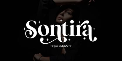 Sontira - Elegant Stylish Sontira is a stylish font that is chic, elegant and unique font that uses ligatures to smoothly link letters. Perfect for branding, logos, invitation, masterheads and more. Wish you enjoy our font and if you have a question, don't hesitate to drop message & I'm happy to help :)
 - Porker by Ingrimayne Type,
$6.95 Porker was an experiment in making a barely readable but very simple and very bold typeface with no curves. It is caps only with some of the letters on the lower-case keys giving alternate versions. Include are three variants, a tall version, a striped version, and a randomized version. The striped version can be placed in a layer above the regular version to give two-colored letters.
 - La Villette by Create Big Supply,
$15.00 Experience the elegance and beauty of La Villette, a captivating handwriting script font that adds a touch of sophistication to your designs. With its flowing calligraphy writing style, La Villette offers a seamless and graceful look, making it ideal for logos, labels, magazines, books, greeting cards, packaging, and more. The combination of uppercase and lowercase letters in La Villette creates a harmonious balance, allowing you to achieve a natural and handcrafted feel. Express your creativity and bring a personal touch to your projects with this versatile font. La Villette caters to a global audience with its multilingual support, ensuring that your message resonates with diverse communities. From numbers to punctuation, this font provides a comprehensive set of characters to enhance the legibility and versatility of your designs. Unlock endless possibilities with ligatures, which effortlessly connect letters and bring a seamless flow to your typography. Additionally, La Villette features PUA (Private Use Area) Encoding, granting you access to special characters and glyphs, further expanding your design options.
 - Finest Romance by Din Studio,
$25.00 Be a trendsetter and get prominent with the best style from the Finest Romance. Finest Romance is a duo font from mixtures of serif and script fonts. This harmonic duo font work hand in hand to produce marvelous designs because it expresses modernity, elegance and a little romance. Additionally, the geometric serif font’s letters are simple and consistent for a great legibility purpose. On the other hand, the script font’s letters are designed to be similar to a handwriting by adding more variations to the letters with curves and final swinging wipes. You can use this font together or separately based on your necessity. With this font’s amazing features, you can enhance your design products. Features: Stylistic Sets Ligatures Multilingual Supports PUA Encoded Numerals and Punctuations Finest Romance fits for various design projects, such as posters, banners, logos, magazine covers, quotes, name cards, invitations, headings, printed products, merchandise, social media, etc. Find out more ways to use this font by taking a look at the font preview. Hopefully, you have a great experience using our font. Feel free to contact us if you require more information when you are dealing with a problem. Thank you. Happy designing.
 - Anisette Std Petite by Typofonderie,
$59.00 Geometric font inspired by shop signs in 4 styles Anisette has sprouted as a way to test some ideas of designs. It has started with a simple line construction (not outlines as usual) that can be easily expanded and condensed in its width in Illustrator. Subsequently, this principle of multiple widths and extreme weights permitted to Jean François Porchez to have a better understanding with the limitations associated with the use of MultipleMaster to create intermediate font weights. Anisette built around the idea of two widths capitals can be described as a geometric sanserif typeface influenced by the 30s and the Art Deco movement. Its design relies on multiple sources, from Banjo through Cassandre posters, but especially lettering of Paul Iribe. In France, at that time, the Art Deco spirit is mainly capitals. Gérard Blanchard has pointed to Jean Francois that Art Nouveau typefaces designed by Bellery-Desfontaines was featured before the Banjo with this principle of two widths capitals. The complementarity between the two typefaces are these wide capitals mixed with narrow capitals for the Anisette while the Anisette Petite – in its latest version proposes capitals on a square proportions, intermediate between the two others sets. Of course, the Anisette Petite fonts also includes lowercases too. Anisette Petite, a geometric font inspired by shop signs in 4 styles So, when Jean François Porchez has decided to create lowercases the story became more complicated. His stylistic references couldn’t be restricted anymore to the French Art-déco period but to the shop signs present in our cities throughout the twentieth century. These signs, lettering pieces aren’t the typical foundry typefaces. Simply because the influences of these painted letters are different, not directly connected to foundry roots which generally follow typography history. The outcome is a palette of slightly strange shapes, without strictly not following geometrical, mechanical and historical principles such as those that typically appear in typefaces marketed by foundries. As an example, the Anisette Petite r starts with a small and visible sort of apex that no other similar glyphs such as n or m feature, but present at the end of the l and y. The famous g loop is actually inspired by Chancery scripts, which has nothing to do with the lettering. The goal is of course to mix forms without direct reports, in order to properly celebrate this lettering spirit. This is why the e almost finishes horizontally as the Rotis – and the top a which must logically follow this principle and is drawn more round-curly. This weird choice seemed so odd to its designer that he shared his doubts and asked for advise to Jeremy Tankard who immediately was reassuring: “Oddly, your new top a is fine, it brings roundness to the typeface, when the previous pushes towards Anisette Petite to unwanted austerity.” The Anisette Petite, since its early days, is a mixture of non-consistent but charming shapes. Anisette, an Art Déco typeface Anisette Petite Club des directeurs artistiques, 46e palmarès Bukva:raz 2001
 - Kontext H by Elster Fonts,
$20.00 Imagine a font that is easier to read the smaller it is – or the further away the text is. There are already many line screen fonts, I wanted to take it to the extreme and use as few lines as possible, while keeping the grid of the fonts metrics. The result is a typeface that lives up to its name. Each individual line makes no sense on its own; individual letters are only recognisable in the context of all associated lines, individual letters are most likely to be recognised in the context of whole words. Attached to a building wall, text would be readable from a great distance and become increasingly difficult to decipher the closer you get to the building. Placed on the ground or on a large flat roof, text would only be readable from an aeroplane or - depending on the size - in Google Earth. Kontext has old style figures, superscript numerals, case-sensitive questiondown and exclamdown and an alternative ampersand, 390 glyphs at all. Use the same value for font size and line spacing to keep the lines in the grid, or change the line spacing in 10% steps. Change the spacing in 100-unit or 25-percent increments increments to keep the grid. The »H« in the font name stands for horizontal (lines). The numbers in the font name refer to the brightness of the background and letters themselves, with the first number describing the background and the second the letters. Starting with »00« (white) to »200« (dark) See also my Family Kontext Dot
 - Kontext V by Elster Fonts,
$20.00 Imagine a font that is easier to read the smaller it is – or the further away the text is. There are already many line screen fonts, I wanted to take it to the extreme and use as few lines as possible, while keeping the grid of the fonts metrics. The result is a typeface that lives up to its name. Each individual line makes no sense on its own; individual letters are only recognisable in the context of all associated lines, individual letters are most likely to be recognised in the context of whole words. Attached to a building wall, text would be readable from a great distance and become increasingly difficult to decipher the closer you get to the building. Placed on the ground or on a large flat roof, text would only be readable from an aeroplane or - depending on the size - in Google Earth. Kontext has old style figures, superscript numerals, case-sensitive questiondown and exclamdown and an alternative ampersand, 390 glyphs at all. Use the same value for font size and line spacing to keep the lines in the grid, or change the line spacing in 10% steps. Change the spacing in 50-unit or 25-percent increments to keep the grid. The »V« in the font name stands for vertical (lines). The numbers in the font name refer to the brightness of the background and letters themselves, with the first number describing the background and the second the letters. Starting with »00« (white) to »200« (dark) See also my family Kontext Dot
 - Caligari Pro by Elsner+Flake,
$99.00 The silent film »The Cabinet of Dr. Caligari« (1920) is undoubtedly one of the breathtaking milestones within the German Expressionist Movement, a time of extraordinarily creative works of art as a reaction to a world in rapid change. The original intertitles of Caligari were worked out by the set designers (and painters) Walter Reimann, Walter Röhrig, and Hermann Warm, using a unique expressionistic language of form for dramatic and iconic lettering. When in 2010 KOMA AMOK’s Joerg Ewald Meißner and Gerd Sebastian Jakob were commissioned by the Institut Mathildenhöhe Darmstadt and publisher Hatje Cantz to design the catalog for the exhibition »The Total Artwork in Expressionism«—showing works of art, architecture, film, literature, theater, and dance—it was soon perfectly clear that a new typeface, inspired by the Caligari intertitles, should speak for all the expressionistic arts. An intense process of research and analysis began. The original letters of the Caligari intertitles were individuals on their own. Furthermore, each of the three title designers had added his specific approach to the basic Caligari type style. From hundreds of different As to Zs a choice had to be made, which should be THE characteristic Caligari letter for a digital typesetting font. Finally the chosen letters were cut and drawn again, missing letters were added according to the formal priniciples, all-in-all 1000 glyphs were digitised to complete a usefull OpenType font ready for use. When in the autumn of 2010 the exhibition started successfully with great media interest, the posters all over Darmstadt announced »You must become Caligari!« – set in the brandnew typeface. The font Caligari Pro offers alternative forms for every letter and a whole bunch of ligatures, thus creating an expressive, individual image of headlines and text. By using included Stylistic Alternates the image will get even more vivid. Caligari comes with a complete set of expressionist ornaments and true old style figures—thus the heyday of the Expressionist Movement and the era of the silent films can be revived typographically by the means of today: »Express Yourself!«.
 - Romp by Positype,
$30.00 With all ego aside, Romp was designed and influenced by my daughter, Angel. For some time now, she has wanted me to design a font based on her handwriting. But each time I sit down to do it, I run into more that she needs to do and redo. On a recent attempt, I ran into the same situation again. Instead of moving on to something else, I decided to whip out a sumi brush and start making letters...for me, type design is something a little ‘serious’ and never a time to just have fun. This typeface proved that notion wrong—it really was fun. As a result, each letter encouraged another and the design grew...and grew! The happy result spawned 3 separate sets of letters & numerals (small caps and some ligatures too!). Using the beauty of OpenType, these 3 sets have been fused into one, randomly generating font set. If you are using any type of OpenType enabled application, then the Romp Pro typeface is the way to go. They include everything found in the 3 separate variants for each style as well as entirely expanding offering of additional small cap and ligature sets.
 - Wigwams by Struvictory.art,
$14.00 We would like to introduce our new product Wigwams - Handwritten Geometric Font. Wigwams is a linear font in a hand-drawn minimalistic style, the lowercase is decorated with geometric elements. The typeface includes Regular and Symbol versions. Combine the font with symbols to get a unique design. The font is easy to use in various design programs or without any program. Wigwams is suitable for lettering posters, camping products, photo overlays in hipster style and music albums. The font works great both for printing clothes and craft products, branding and packaging (herbal tea, handmade soap, organic food). Also use individual letters and symbols to create logos and monograms.
 - Elixir by Fenotype,
$25.00 Elixir is a strong display pack of five styles and total eleven fonts. Elixir fonts are designed to act together but they also work just fine by themselves. Elixir Script is a monoline Script with plenty of OpenType features: Contextual Alternates helps to keep letter connections smooth whereas Swash, Stylistic or Titling Alternates can be used to add flavour to your words! Elixir Brush is a smooth brush script with Contextual Alternates, Swash and Titling Alternates. Elixir Sans is a sturdy all caps font with wider uppercase letters. Elixir Circus is a circus style version of Elixir Sans. Elixir Serif is a rounded slab serif. Elixir Print is a rugged version of Elixir with rough outlines and worn-out print texture.
 - Melloner by Alit Design,
$10.00 Present the new and charming Melloner Trio, with an additional swash weight. It is suitable for additional fonts collection because it can be used for any type of design. Melloner has a beautiful script font and is very easy to use, with simple and unique characters. It is very interesting to use Melloner yourself or in combination with Melloner Fun and Melloner Happy which has a handwritten character with a brush. Melloner Fun is a handwritten font with a relaxed and unique sans serif style, while Melloner Happy has a slightly more formal serif style, plus a unique swash and lots of choices to enhance your letter design. So you get everything you need to make your lettering design. Thank you and enjoy :)
 - Unchain My Heart by Harald Geisler,
$68.34 Unchain My Heart is Font that renders hearts on a string with a capital letter in the middle. All hearts are designed to align to a perfect string by remaining the handmade look. Lowercase letters produce a heart with outline. Uppercase letters produce a filled heart. Type in a parenthesis and a loose string end will be rendered either on the right or left side. Look in the full character set to find out more about the special decoration. Ideal for individualized mailings and greeting cards. Unchain My Heart is a part of the Light Hearted Font Collection that is inspired by a recording of Jean Baudrillard with the title, "Die Macht der Verführung" (The Power of Seduction) from 2006. Further inspiration came from the article, "The shape of the heart: I'm all yours". The heart represents sacred and secular love: a bloodless sacrifice. by British writer Louisa Young printed in EYE magazine (#43) London, 2002.
 - VLNL Cleaver by VetteLetters,
$29.99 Chop chop! VLNL Cleaver is an important tool in the Vette Letters’ kitchen. It’s a butcher knife of a font. Razor sharp, ultra heavy and with pointy slanted serifs. At first glance it seems straight-lined, but a closer look revails that all straight lines are curved inward slightly, which enhances the sharp image even more. Cleaver was originally designed by DBXL for cutting meat - hell, it even hacks right through bone. It can easily splice a chicken in one slash or seperate ribs, just like that. You can also very well use it to chop up hard vegetables like pumpkin or squash on the chopping block. It gets better, the opposite blunt side can be deployed to crush ingredients like garlic, nuts or spices like black pepper. You could use a grinder, but with Cleaver it’s more fun, isn’t it? VLNL Cleaver is suitable to give a sharp edge to flyers, posters, logos (Heavy metal bands and other) or magazine headlines.
 - Letterbot by Comicraft,
$19.00 "If you prick me, do I not bleed? If you tickle me do I not laugh? If you poison me do I not DIE? And if you wrong me shall I not REVENGE?" "I am not a TYPEWRITER! I am not a MACHINE! I am -- NOT -- JUST -- a lettering ROBOT! I -- AM -- A -- HUMAN -- BEING!" Having trouble with YOUR lettering artist? LETTERBOT is here to help. Take all the fuss and muss out of dealing with a real person and install this helpful and responsive robotic font. It has no opinions of its own and will assist you in the lettering of your comic without all that tedious human interaction which lettering artists seem to think they're entitled. Designed by John JG Roshell.* *Now obsolete. Features: Four weights (Regular, Italic, Bold & Bold Italic) with upper and lower case alphabets. Includes Western & Central European accents and Cyrillic characters.
 - Quayside by Eclectotype,
$40.00 Quayside is a deliciously thick and bulbous baseball script, with a wealth of OpenType features. Features include: Contextual alternates - I would suggest having these on by default; they make letters connect more smoothly (uppercase letters like M and H, which are normally non-connecting for all-caps purposes, connect to lowercase letters. The swash variant of J, and all o and b characters connect to any e character at a lower junction for a smoother join). Contextual alternates also make sure special end-forms of lowercase letters are used at the ends of words. Ligatures - A nice collection of useful ligatures which make the text flow smoother. Swash - Gives you more exuberant capitals. Not recommended for all-caps usage! The swash function also gives a variation of the ampersand and turns # into a nice numero symbol. Oldstyle Figures - lining figures are default but with the flick of a switch in OpenType savvy applications, you get expressive oldstyle figures. Quayside is a versatile typeface. Depending on the mood you're after, it can easily be retro or modern, fun or (fairly) serious. I'm often pleasantly surprised by the wide variety of uses my fonts get put to, and I can't wait to see what you do with this one!
 - Grassroots Typewriter by BeckMcCormick,
$16.00This font was inspired by a 1950’s Royal Quiet De Luxe Typewriter, and features textured letters & symbols, creating a realistic look & feel without needing to source your own antique machine! Each keystroke on an old typewriter shows variations based on the ink ribbon & how hard or soft the typebars strike the ribbon & paper. This font was designed to provide multiple options for each letter so that you can further customize the look & feel of your text. - Mountain Expedition by Vozzy,
$10.00 Introducing a vintage label font named Mountain Expedition. It contains capital and small characters. The small letters I created to support main design of the capital letters. Therefore the punctuation characters are designed to be used just with the capitals. Also the capital characters have a lot of ligatures. All available characters you can see on the preview. This strong typeface will be good viewed on vintage style posters, t-shirts, greeting cards, logo and more.
 - Hello Melodi by IRF Lab Studio,
$10.00 Hi, Introducing the latest styles Hello melodi Script with the kind of modern hand scratches, I hope you are interested in this font, if you want to use for your work this font can be used easily and simply because there are a lot of features in it to contain a complete set of letters lower and uppercase letters, assorted punctuation, numbers, and multilingual support. font also contains several ligatures and alternate style Stylistic. Thank You.
 - MFC Aldercott Monogram by Monogram Fonts Co.,
$189.00 The source of inspiration for Aldercott Monogram is a decorative alphabet designed in 1901 by Marcus Goldsmith, an inventor of elegant accessories of personal nature. Originally developed to be used as individual letters or for advertising purposes, this elegant lettering style is now digitally remastered and updated with smallcaps for modern monogram typesetting use for additional functionality beyond its original intentions. Download and view the MFC Aldercott Monogram Guidebook if you would like to learn a little more.
 - Overbold by Catharsis Fonts,
$32.00 Overbold is an unapologetic display typeface inspired by an illustration in Eric Gill's Essay on Typography (p.51), in which he demonstrates �how not to make letters�. In particular, he shows that increasing the weight of the downstroke in a serif �A� without structural adjustments yields an absurd, �overbold� result. I found the letter so charming that I decided to blatantly disregard Gill's wisdom and draw an entire overbold typeface. Here is the result. I'm not sorry.