10,000 search results
(0.06 seconds)
- Brimley by Chank,
$49.00This slinky number will seduce you with its linking letters and special ligatures. Brimley's strokes are tight and sharp, and its characters are tied together with slender, whispy hooks. Although its elegance is timeless, this is a style that typifies lettering of last century's late '50s and early '60s. Chank Co. intern Tim Drabandt created Brimley with inspiration from antique type books. He named the font after Wilford Brimley. You know... the chubby old guy who tells you to check your blood sugar and eat your Grape Nuts and Quaker Oats. Haven't you ever seen Cocoon? - Gripewriter by Elemeno,
$20.00Typewriters are becoming scarce, but fonts designed to look like they came from typewriters aren't. In this case, however, Gripewriter is meant to look as if it were typed on a textured paper and enlarged, emphasizing flaws and lending it a funkier, grungier look than your average typewriter face. This was originally called Hypewriter until it was pointed out that a font already existed with that name. The current name is a better fit, anyway, since Gripewriter looks like it might hold a grudge. - Tailpen by Yumna Type,
$25.00 It is a tough task to create a visual identity without using a characteristic, multipurpose font to represent your brand in order to look different, yet unexaggerating. For that reason, let us welcome Tailpen, the perfect balance of simplicity, charm, and boldness to live up your brand identity. Tailpen is a display font in simple, inclined square letter shapes to show charming, real, attractive nuances. It is greatly legible due to the simple shapes in high contrasts with which you can apply this font for various text sizes. It also gives you a clipart as a bonus and you can make use of the available features here as well. Features: Multilingual Supports PUA Encoded Numerals and Punctuations Tailpen fits best for various design projects, such as brandings, posters, banners, headings, magazine covers, quotes, printed products, merchandise, social media, etc. Find out more ways to use this font by taking a look at the font preview. Thanks for purchasing our fonts. Hopefully, you have a great time using our font. Feel free to contact us anytime for further information or when you have trouble with the font. Thanks a lot and happy designing.
 - Pariphoom Compressed by Jipatype,
$27.00 ขอแนะนำ Pariphoom Compressed ส่วนเสริมของฟอนต์ Pariphoom ด้วยอักษรอันโฉบเฉี่ยวและทันสมัย เหมาะสำหรับงานออกแบบหลากหลายประเภท ด้วยอักษรแบบ sans-serif condensed และมุมโค้งมน แบบอักษรนี้ให้ความสมดุลที่ระหว่างความเป็นทางการและความเข้าถึงได้ง่าย ชื่อปริภูมิมาจากภาษาไทย แปลว่า “Space” และเช่นเดียวกับชื่อของมัน ฟอนต์นี้สามารถให้พื้นที่มากขึ้นในงานออกแบบของคุณ ไม่ว่าคุณกำลังสร้างสื่อสำหรับสร้างแบรนด์ พัฒนาแคมเปญการตลาด หรือออกแบบเว็บไซต์ Pariphoom Compressed มอบความยืดหยุ่นและความอเนกประสงค์เพื่อให้ได้รูปลักษณ์ที่คุณต้องการ Pariphoom Compressed มาพร้อมกับรูปแบบที่แตกต่างกันถึง 18 รูปแบบ สิ่งนี้ทำให้คุณมีตัวเลือกมากมายและมีความยืดหยุ่นในการใช้งานในหลากหลายบริบท นอกจากนี้ ฟอนต์นี้รองรับหลายภาษาสำหรับภาษาต่างๆ มากมาย แต่นั่นไม่ใช่ทั้งหมด Pariphoom Compressed มาพร้อมกับฟีเจอร์ Opentype เจ๋ง ๆ เช่น Small Caps และ Tabular ซึ่ง Small Caps เป็นวิธีที่ยอดเยี่ยมในการเพิ่มความหลากหลายให้กับงานออกแบบของคุณโดยใช้ตัวพิมพ์ใหญ่แทนตัวพิมพ์เล็ก ในขณะเดียวกัน Tabular ก็สมบูรณ์แบบสำหรับการสร้างตารางและจัดตำแหน่งตัวเลขเพื่อให้ดูเป็นระเบียบมากขึ้น โดยรวมแล้ว Pariphoom Compressed ทำให้เป็นตัวเลือกที่ยอดเยี่ยมสำหรับนักออกแบบที่ต้องการสร้างผลงานการออกแบบที่น่าจดจำและมีประสิทธิภาพ Introducing Pariphoom Compressed, a extended of Pariphoom with sleek and modern typeface that is perfect for a wide range of design projects. With its condensed sans-serif design and rounded corners, this font offers a unique balance of professionalism and approachability. Derived from the Thai language, the name Pariphoom means "Space" and just like its name suggests, this font can give you more space in your design. Whether you're creating branding materials, developing marketing campaigns, or designing websites, Pariphoom Compressed offers the flexibility and versatility you need to achieve your desired look. Pariphoom Compressed comes with 18 different styles. This gives you plenty of options to choose from and the flexibility to use it in various design contexts. Additionally, this font offers multi-language support for a wide range of languages. But that's not all – Pariphoom Compressed comes with some cool Opentype features such as Small Caps and Tabular. Small Caps are a great way to add variety to your design by using small capital letters instead of lowercase letters. Meanwhile, Tabular is perfect for creating tables and aligning numbers for a more organized look. Overall, Pariphoom Compressed making it a great choice for designers who want to create memorable and effective design projects.
 - Trakya Slab by Bülent Yüksel,
$19.00 Thrace (/θreɪs/; Greek: Θράκη, Thráki; Bulgarian: Тракия, Trakiya; Turkish: Trakya) is a geographical and historical region in Southeast Europe, now split among Bulgaria, Greece, and Turkey, which is bounded by the Balkan Mountains to the north, the Aegean Sea to the south, and the Black Sea to the east. It comprises southeastern Bulgaria (Northern Thrace), northeastern Greece (Western Thrace), and the European part of Turkey (East Thrace). Trakya Slab is a modern slab serif with a geometric touch. It has a modern streak which is the result of a harmonization of width and height especially in the lowercase letters to support legibility. Ideally suited for advertising and packaging, editorial and publishing, logos, branding and creative industries, posters and billboards, small text, way-finding and signage as well as web and screen design. Trakya Slab provides advanced typographical support for Latin-based languages. An extended character set, supporting Central, Western and Eastern European languages, rounds up the family. The designation “Trakya Slab 500 Regular” forms the central point. The first figure of the number describes the stroke thickness: 100 Thin to 900 Bold. "Trakya Slab" comes with 5 weights and italics; "Trakya Slab Alt" also comes with 5 weights and matching italics, giving a total of 20 styles. The family contains a set of 630+ characters. Case-Sensitive Forms, Classes and Features, Small Caps from Letter Cases, Fractions, Superior, Inferior, Denominator, Numerator, Old Style Figures just with one touch, easy to access in all graphic programs. Trakya Slab is the perfect font for web use. Enjoy using it.
 - GummiType AOE by Astigmatic,
$19.00 GummiType is a wildly wobbly and clumsy gummy/jelly style letter font. This was a weird typeface that I originally designed back in 2000 but never finished it. Coming across it again recently, I thought it would be a fun font family to get out there. Perfect for a range of designs that require a spooky or gooey-gooey typestyle. Sometimes the inspiration for my typefaces comes from random everyday things, and this is the perfect example of that. My daughter is addicted to those little peach gummy rings and gummy worms, and gummy anything, but it was my own prior addiction to gummy peach rings that inspired this font. Pulling and distorting the ring sparked the inspiration for the droopy warped characters.
 - Hello Radio by Invasi Studio,
$18.00 Say hello to Hello Radio font, the perfect font to add a touch of vintage charm to your designs! With its monoline stroke script style, this font brings back the good old days with a fun and quirky twist. The best part? It supports multilingual characters, so you can spread the retro vibes in any language you desire. Every character in Hello Radio font has a delightful imperfect shape, giving your designs a natural and handcrafted feel. It's like having your vintage radio station right at your fingertips! This font is a true team player, cooperating effortlessly with other elements in your design. Whether you're creating traditional-style logos, labels, package designs, or awesome lettering for t-shirts, Hello Radio Font has got you covered.
 - Atmosfera by Eurotypo,
$28.00 Atmosfera is a classic Didona typeface, recognizable by its extreme vertical tension, great contrast between thin and thick sticks and its straight and fine linear serifs that is angularly related to the staff of the letter, giving them an excellent legibility and a very clear and elegant appearance. In the design of this version, we chose to eliminate some serifs to give it a more avant-garde and modern look while maintaining an elegant style. With its 890 glyphs, it is enriched with a complete set of OpenType Type features: swashes, ligatures, alternates, stylistics sets and small caps, even so in the characters used in Western languages.. Atmosfera is an elegant text typeface that offers a wide range of possibilities.
 - Xants by Adobe,
$29.00In 1932, Xanti Schawinsky (1904?1979) designed an alphabet that combines two styles: a neo-classic stroke contrast paired with characteristics of stencil lettering. This mix is a child of its time and seems to reflect the Swiss and Italian biography of Schawinski. Luca Pellegrini took on the modern look and re-drew the letterforms, interrupted by subtle spaces where thick and thin strokes meet. Although Schawinsky had already designed a complete alphabet and figures in the early 1930s, Pellegrini took the character set to another level, adding currency signs, mathematical symbols and all kinds of punctuation ? anything needed to set more than just headlines. Xants is a blend of Swiss elegance and exclusiveness with Italian charm and imperfection, a combination that never gets old. - Nobella by Mans Greback,
$59.00 Nobella is a flowing, mid-century script typeface, perfect for logos and sport-style graphics. With its curly style and decorative swashes, this font could be considered a baseball classic and is guaranteed to give any logotype a creative, vivid appearance. Its thin parts and its large capital letters makes for a typeface that combines lightness with expressiveness. Use underscore _ to make a swash. Example: Yankees_ Use multiple underscores to make swashes of different lengths. Example: New York________ (Download required.) The font contains all characters you'll ever need, including all punctuation and numbers. It contains contextual and stylistic alternates and many other OpenType features. It supports all Latin based languages: North, East, West and Central European; North and South American; Southeast, North, Central Asian.
 - Naive by S&C Type,
$8.00 Naïve is a serif handwritten font designed by Fanny Coulez and Julien Saurin in Paris. Our goal was to draw a font with finely irregular lines that give a human and whimsical feeling. The three weights of this subtle Parisian hand-drawn font can be enhanced with two alternates fancy glyphs for each letter, the “Fantaisies”, to improve your designs and bring a more poetic and unusual feeling. We hope you will enjoy our work :) You could follow us on our Instagram: instagram.com/sc.type Merci beaucoup! Note: This font is part of our Naïve superfamily that contains lot of variations: Line, Inline, Serif, Sans Serif, and a special Art Deco one. Just click on our foundry name to see them all!
 - Valverde Rounded by Jehoo Creative,
$20.00 Valverde Rounded is the more playful and gentle variant of Valverde Family. It still remains a super-serif font family with 2 widths condensed and normal, each width consists of 18 fonts and has a complete weight from thin to black combined with beautiful italic cuts to meet the needs of any design in any format. Inspired by the type of vintage rounded look that has recently become a trend, this round letter character has a comfortable and friendly impression. Opentype features such as Stylistic Alternate and Ligature on the Valverde family make it look more aesthetic so that it fits in a classy modern look. Stunningly beautiful and vintage rounded serifs make them an essential addition to any type of tool kit.
 - Jenthill by Katsia Jazwinska,
$15.00 Introducing Jenthill - a lovely font family which includes 4 font styles: - a wonderful script typeface Jenthill - Jenthill Light - a delicate version of Jenthill - 2 uppercase fonts Jetnthill Caps and Jenthill Light Caps which are perfect for headings. Each font consists of about 380 glyphs and includes basic punctuation, numbers, roman typeface and international characters, so the font can be used with most of the European languages. Each font in this family is amazing in itself and perfectly combined with each other. So, if you are looking for a font that simulates the soft-edged handwriting, the Jenthill is just for you! Every letter of this font has been carefully crafted to look wonderful and helps you to add a little fancy to your work.
 - Birtgoche by Ilhamtaro,
$14.00 BIRTGOCHE is a serif font with long, thin hooks, it's beautiful because it's quite formal and manly. Attractive fonts to support elegant art designs. A fairly standard serif font because there are not many changes from the basics of the previous serif fonts, only the modifications to the hooks are not too significant and some letters have their body part below the baseline. For media, it will also be very suitable for the headline of a magazine or poster because this font has a strong character supported by this font, which is an all caps font. To enable the OpenType Stylistic alternates, you need a program that supports OpenType features such as Adobe Illustrator CS, Adobe Indesign & CorelDraw X6-X7. Cheers!
 - Mateo Unique by IbraCreative,
$14.37 Mateo is an extraordinary and unique handwritten typeface that stands out with its captivating originality. With letters that seem like hand-drawn works of art, each character in Mateo carries a distinct personality, exuding a sense of authenticity and creativity. The charmingly irregular lines and artistic flourishes lend this typeface an artistic and handcrafted feel, making it a perfect choice for projects that require a touch of individuality and unconventional style. Mateo’s versatility is showcased in its ability to seamlessly adapt to diverse design contexts, whether used for eye-catching logos, expressive quotes, or artistic illustrations. With its one-of-a-kind appearance, Mateo transcends traditional typefaces, inviting viewers to explore the world of handwritten artistry in every stroke and curve
 - Reina by Lián Types,
$37.00ATTENTION! See the newest version of Reina here. Reina Neue is now a family of 45 styles and it's also a Variable Font! Have a look. For the traditional version of Reina, you may stay here ;) --- Reina is Sproviero’s didone of the year. We recommend seeing its user’s guide . Inspired in the sweet letters of calligraphy and typography masters of our past; such as Didot, Bodoni and the incredible Herb Lubalin, its aim was to incorporate the decorative accolades from blackletter and copperplate styles of calligraphy into a Modern Roman typeface. Reina reflects sovereignty due to the enveloping atmosphere and the sensation of greatness that can be felt when using it. It has an unique way of standing over paper and screen, being its swashes responsible of an extreme elegance. Similar to what Lian did in his last font Breathe , Reina was designed to be playful yet formal: While none of its alternates are activated it can be useful for short to medium length texts; and when the user chooses to make use of its open-type decorative glyphs, it can be useful for headlines with dazzling results. TECHNICAL Reina is a family with many members. In order to achieve better results when printing, Lian took his time to design the necessary styles: Reina 72 Pro, prepared for display sizes; Reina 36 Pro, for medium sizes; and Reina 12 Pro, the best for text or decorative words in small size. Each of these members have variants inside, which are open-type programmed: The user decides which glyph to alternate, equalizing the amount of decoration wanted. Reina Engraved Pro has the same features than the variants mentioned above. The family also contains variants which were made exclusively for decoration. These are: Reina Words, a set of the most common words used in english, german, italian, french and spanish; Reina Capitals, which consists in a big set of ornamented capitals; and Reina Fleurons, those little friends which always help to embellish our work. - Template Sans by Jeff Levine,
$29.00 The Wright-Regan Instrument Company (Wrico) was one of the leading manufacturers of lettering templates for many years. Aside from their own line of products, they also did custom manufacturing. A series of lettering guides called “Mimeostyle” for the A. B. Dick Company of Chicago (produced for use in making mimeograph machine printing stencils) featured an art Deco squared letter design with rounded corners. This is now available digitally as Template Sans JNL, in both regular and oblique versions.
 - Ensenada by Wordshape,
$30.00 Ensenada is a typeface designed based on hand-cut lettering that adorns businesses throughout the city of Ensenada in Baja California in Mexico. - What was the inspiration for designing the font? Looking at the hand-cut lettering in Ensenada, Mexico. Variations on this type of lettering are often used by Mexican pop-techno acts. - What are its main characteristics and features? It is a geometric display face that works in both retro and futuristic settings. - Usage recommendations: Display type
 - Smith Premier NF by Nick's Fonts,
$10.00In ye olden days, nothing said “personalized business correspondence” like a typewritten letter, and several type foundries cast simulated typewriter fonts so authentic-looking “personal” letters could be mass-produced. This typeface is based on one such font from a href="/foundry/atf/">American Type Founders, which was patterned after the letters of the Smith Premier No. 3. Both versions of the font include 1252 Latin and 1250 CE (with localization for Romanian and Moldovan) character sets. - MeM by 26+,
$40.00 MeM is an eccentric experimental type system created by Elena Schädel and Jakob Runge in 2012. It produces many personalities, each individual and emotive. You will never know which of the alternating letters is going to occur next. Basically, at the heart of it all is MeM: four different weights and letter shapes melded together into one powerful font and shuffled with the sleek usability of OpenType.
 - Battle Cry by Comicraft,
$19.00 As Titans Clash in The Final Battle of Good versus Evil, Man versus Machine, God versus Mortal and Coke versus Pepsi, ace lettering artist, Ferran Delgado from Spain teams up with our very own John ‘JG’ Roshell for one last attack on the assembled Cover Lettering Styles of Yore. Fill your lungs and prepare for... BATTTTTTLECRRRRRYYYYYYYYYYY! See the families related to Battle Cry: Battle Scarred & Battle Damaged .
 - Phonema by Fontop,
$10.00 Warm welcome to my new sans serif typeface PHONEMA. Six stylish and modern fonts are included into this type family. Looks great as headlines on posters, text in magazines, presentations. Also can be used in logos and blog posts. Will reinforce your creative work with eye catching and bold message. Each font has Latin multilingual support as well as uppercase letters, lowercase letters, numbers and basic punctuations.
 - Schreibmeister by RMU,
$30.00 Schreibmeister is my interpretation of Arno Drescher’s design for Ludwig Wagner, Leipzig, completed in 1958. The letters X and x were improved as well as some ligatures. The letter E has an alternative, and the small d comes with two alternatives, of which one form can be reached by typing the partial different key. Generally it is recommended to activate both Standard and Discretionary ligatures.
 - ArTarumianTeodik by Tarumian,
$30.00 The font is named after the Armenian writer Theodoros Grigor Lapchinchian (Armenian Թեոդորոս Գրիգորի Լափչինճյան: March 5, 1873, Constantinople — May 24, 1928), who in 1912 published book "Type and Letter" (Armenian: Տիպ ու տառ), dedicated to 1500th anniversary of the creation of the Armenian alphabet and the 400th anniversary of Armenian printing. The letter shapes are influenced by some Armenian fonts of the 18th and 19th centuries.
 - Butterfield by Scriptorium,
$18.00Butterfield is based on poster lettering from posters for rock shows at the Fillmore in the 1960s. It is particularly influenced by the lettering of Wes Wilson, but has added features and improvements to make it more generally useful. It is one of the most effective examples of the psychedelic style. Combining the basic font with Photoshop's wave pattern produces the unique look seen above. - Moon Type by Thomas Käding,
$1.00 This font of Moon Type is modelled after Dr. Moon's original poster. He developed this embossed writing system to help those who have lost their sight later in life, and so are familiar with the shapes of English letters. Moon writing is still used, and you can find books written with it. This font only contains the letters and punctuation that are in the Moon Type system.
 - Hooptie Script by FDI,
$25.00 Two typefaces inspired by the car lettering of the Motor City. In contrast to other car script fonts, the Hooptie Script fonts make full use of modern OpenType technology. Just turn on contextual alternates and ligatures and watch how each letter pair always connects perfectly. The full package includes seven bonus vector images of vectorized hooptie cars. Check out the type specimen for more details.
 - San Louis by Inumocca,
$25.00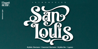 San Louis is an Elegant Serif typeface , Modern , Classy and Glamour Worlds. Awesome Stylictic Set, Beautiful Ligature and unique contecttual alternates, stylistic alternates. Really playful typeface to covering your Project, like Lettering, Website Interface, Magazine, Branding, Poster, wedding invitations, Quotes Lettering, Logos, and more your project design. - Unique glyphs - Multilingual Characters - UPPERCASE - Lowercase - Numeric - Symbol - Punctuation Character - Ligature - Contextual Alternates - Stylistic Alternates - SS01, SS02, SS03, SS04
 - Gopixel by Ditatype,
$29.00 Go Pixel is an exciting game-themed display font designed in uppercase, capturing the essence of retro pixel art. The consistent proportions of this font create a harmonious and balanced visual experience. Each uppercase letter is crafted with precision, ensuring uniformity and maintaining the overall aesthetic appeal. This design choice guarantees that every character fits seamlessly together, resulting in a cohesive and visually pleasing typographic composition. The uneven borders of Go Pixel add a touch of vintage charm and quirkiness to the font. Each letter is outlined with varying thickness, mimicking the imperfections found in retro pixel art. This unique feature gives the font a distinct personality and captures the nostalgia of classic video games. With low contrast, it embraces a softer and more subtle approach to readability. The slight variation in stroke width allows for a smooth and comfortable reading experience. While the low contrast may be unconventional, it enhances the overall retro feel of the font, immersing your audience in the world of classic gaming. Enjoy the available features here. Features: Multilingual Supports PUA Encoded Numerals and Punctuations Go Pixel fits in headlines, logos, posters, titles, branding materials, print media, editorial layouts, website headers, and any projects that aim to evoke a sense of fun and nostalgia. Find out more ways to use this font by taking a look at the font preview. Thanks for purchasing our fonts. Hopefully, you have a great time using our font. Feel free to contact us anytime for further information or when you have trouble with the font. Thanks a lot and happy designing.
 - Sleuth JNL by Jeff Levine,
$29.00 The movie trailer for the1936 film "After the Thin Man" is filled with text lettered in this classic Art Deco condensed typeface. Sleuth JNL seems the appropriate name for this digital revival, as the romantic comedy centers around detective Nick Charles' and his wife Nora's adventures.
 - Airplanes In The Night Sky Pro by CheapProFonts,
$10.00 Couldn't you really use a wish right now? Girly. Swirly. Quirky. And utterly adorable. This Pro version of one of Kimberlys latest cutesy handwriting fonts has received lots of corrections and tweaks to the outlines - to remove autotracing artefacts, stroke width inconsistencies and create a better flow. Finally the character set was completed and expanded. Job done! Back to stargazing.. ALL fonts from CheapProFonts have very extensive language support: They contain some unusual diacritic letters (some of which are contained in the Latin Extended-B Unicode block) supporting: Cornish, Filipino (Tagalog), Guarani, Luxembourgian, Malagasy, Romanian, Ulithian and Welsh. They also contain all glyphs in the Latin Extended-A Unicode block (which among others cover the Central European and Baltic areas) supporting: Afrikaans, Belarusian (Lacinka), Bosnian, Catalan, Chichewa, Croatian, Czech, Dutch, Esperanto, Greenlandic, Hungarian, Kashubian, Kurdish (Kurmanji), Latvian, Lithuanian, Maltese, Maori, Polish, Saami (Inari), Saami (North), Serbian (latin), Slovak(ian), Slovene, Sorbian (Lower), Sorbian (Upper), Turkish and Turkmen. And they of course contain all the usual "western" glyphs supporting: Albanian, Basque, Breton, Chamorro, Danish, Estonian, Faroese, Finnish, French, Frisian, Galican, German, Icelandic, Indonesian, Irish (Gaelic), Italian, Northern Sotho, Norwegian, Occitan, Portuguese, Rhaeto-Romance, Sami (Lule), Sami (South), Scots (Gaelic), Spanish, Swedish, Tswana, Walloon and Yapese.
 - Argone LC by Graphite,
$22.00 Argone LC is a handmade organic typeface family. It is a variant of Argone typeface, but has lower case letters. It comes in four weights– light, regular, bold and black, which is a feature not seen much in handmade typefaces. This makes Argone LC a versatile and flexible type family. There is also a version of Argone LC which only has upper case letters – Argone
 - Corkboard JNL by Jeff Levine,
$29.00Corkboard JNL is a bold, yet fun rounded-ends typeface that was popular in the 1970s and enjoying a revival amongst students and teachers via die-cut bulletin board letters. Five variations are offered—Regular, Slanted, Shadow, Shadow Slanted and Kiddies. Corkboard Kiddies JNL has a limited character set and eccentric spacing that emulates the way a child might put letters onto a bulletin board. - Glassier by Mchcrafter,
$18.00 Glassier is a unique and very elegant font for brand and logo design. It is a bold, detailed and assertive sans serif font. This font is imposing and features uniquely shaped alternatives, and as a result, it will easily match a wide range of creations that require a distinct touch. Glassier includes: All uppercase & lowercase letters All numbers 0-9 & Punctuation Symbols Multiligual Letters Ligatures & Alternates
 - FF Mark Paneuropean by FontFont,
$79.00Geometric sans fonts in the Bauhaus tradition were the inspiration for the design of FF Mark®, for example the Universal font by Herbert Bayer, Erbar® Grotesk, Kabel®, Neuzeit Grotesk and of course Paul Renner's Futura®. From an aesthetic point of view, FF Mark is a descendant of these classics of German typeface design that intends to meet the needs of modern communication. Hannes von Döhren and Christoph Koeberlin had the support of the entire FontFont Type Department in the design of FF Mark, including Erik Spiekermann, who took over the artistic direction of the project. The teamwork resulted in carefully planned, balanced forms, which are responsible for the harmonious overall impression of the font. The capitals are not based on Roman square capitals; rather, they have a uniformly wide letter form in a comfortable ratio to the x-height. Thanks to the x-height, which is significantly larger compared to the historical models, FF Mark is also very legible in small sizes. This makes it a very flexible font in terms of its range of applications. A contrast in the stroke width is barely noticeable. At the same time, light modulation supports readability, especially in the bold styles in small sizes. The uniform line ends are obvious for a contemporary sans family nowadays (unlike some of the historical precedents, which evolved over years). Other details from the predecessors are consciously maintained and provide for added individuality in FF Mark. For example, the limbs in the uppercase "K" and "R" are offset slightly from the stem. Alternative characters with crossbars are available for the numbers "0", "1", "7" and the uppercase "Z" and the lowercase "a" also has an alternative with an open form. German typesetters have the option of uppercase umlauts with points that are set lower, as well as a long "s" from the Fraktur. And last but not least, FF Mark has the very characteristic ft-ligature of Futura. FF Mark is available in ten finely tuned weights ranging from Hairline to Black. A Book style for text setting further emphasizes the well-rounded features of this contemporary typeface. When the font was published, it also included ten carefully designed cursives for all weights. Users also have the option of various numeral sets with old-style and uppercase numbers as well as small capitals. FF Mark also has some geometric shapes and arrows based on the features of Futura. FF Mark is a modern, full-featured, geometric sans serif that you can use without hesitation for large projects in headlines as well as in texts. FF Mark's design is a nod to the historical models and transports their charm, elegance and in some cases unusual design applications into a modern font family equipped with the most current typographical features. NEW: the new FF Mark W1G versions features a pan-European character set for international communications. The W1G character set supports almost all the popular languages/writing systems in western, eastern, and central Europe based on the Latin alphabet and also several based on Cyrillic and Greek alphabets. - Honey Beachy Sh by Sohel Studio,
$14.00 Honey Beachy is a retro display serif font that exudes a classic charm and bold character. With its design inspired by retro styles, this font brings an elegant touch and evokes a sense of the past. Each letter is meticulously crafted with careful attention to detail and proportion, resulting in a visually appealing and unique appearance. Honey Beachy is perfect for projects that require a vintage feel, such as posters, logos, packaging, and promotional materials that aim to capture a nostalgic and sophisticated atmosphere. This font will add a special touch to your designs and captivate viewers with its retro allure and distinctiveness. Honey Beachy Features: - Regular And Outline - Uppercase And Lowercase - Alternates And Ligature - Numerals & Punctuation - Accented characters - Multilingual Support - Unicode PUA Encoded While using this product, if you encounter any problem or spot something we may have missed, please don't hesitate to drop us a message. We'd love to hear your feedbacks in order to further fine-tune our products. Thanks and have a wonderful day .
 - RoglianoPro by Untype,
$25.00 RoglianoPro is a 70-font humanist slab serif super family (7 weights on 5 styles each plus matching italics) that while maintaining a strong and direct backbone, sustains a warm undertone that nods to the lettering and lithographic posters of the Victorian era when you take into account its multiple stylistic alternates, borders and decorative ornaments. Extremely legible for small text as well as finely-detailed enough to be very attractive when used in large settings, RoglianoPro is a versatile typeface that offers a wide range of voices that can move from mechanical to humanistic with absolute ease, and perform efficiently from branding to editorial design. Its Slab serif letterforms are strong, but gregarious and approachable – it’s friendly, but its solid presence is still a typographic force to be reckoned with. Rogliano includes a large set of over 900 glyphs, support for more than 200 latin script languages, a full complement of ligatures, small caps, swashes, William Morris-influenced borders and many Opentype features. In summary, a great addition to any multi-purpose type library.
 - Ripe Mango by Sohel Studio,
$14.00 Ripe Mango is a retro display serif font that exudes a classic charm and bold character. With its design inspired by retro styles, this font brings an elegant touch and evokes a sense of the past. Each letter is meticulously crafted with careful attention to detail and proportion, resulting in a visually appealing and unique appearance. Ripe Mango is perfect for projects that require a vintage feel, such as posters, logos, packaging, and promotional materials that aim to capture a nostalgic and sophisticated atmosphere. This font will add a special touch to your designs and captivate viewers with its retro allure and distinctiveness. Ripe Mango Features: - 4 Weight (Regular, Slant, Semi Bold, Outline) - Uppercase And Lowercase - Alternates And Ligature - Numerals & Punctuation - Accented characters - Multilingual Support - Unicode PUA Encoded While using this product, if you encounter any problem or spot something we may have missed, please don't hesitate to drop us a message. We'd love to hear your feedbacks in order to further fine-tune our products. Thanks and have a wonderful day .
 - Moritza Script by Max.co Studio,
$15.00 Moritza Script is a calligraphy script font that comes with a very beautiful character change, a kind of classic decorative copper script with a modern touch, designed with high detail, it took time since July 2019 - September 2020 to present an elegant style. Moritza Script is attractive as a typeface that is smooth, clean, feminine, sensual, glamorous, simple and very easy to read, because there are many fancy letter connections. I also offer a number of viable style alternatives for many letters. The classic style is perfect to be applied in various formal forms such as invitations, labels, restaurant menus, logos, fashion, make up, stationery, novels, magazines, books, greeting / wedding cards, packaging, labels or any type of advertising purpose. Moritza Script including various language support. With OpenType features with alternative styles and elegant ligatures. The OpenType feature does not work automatically. I highly recommend using a program that supports OpenType features and Glyphs panels such as Adobe Illustrator, Adobe Photoshop CC, Adobe InDesign, or CorelDraw, so you can see and access all Glyph variations. Moritza Script is encoded with Unicode PUA, which allows full access to all additional characters without having special design software. Mac users can use Font Book, and Windows users can use Character Map to view and copy one of the extra characters to paste into your favorite text editor / application. How to access all alternative characters using Adobe Illustrator: https://www.youtube.com/watch?v=XzwjMkbB-wQ How to access all alternative characters, using Windows Character Map with Photoshop: https://www.youtube.com/watch?v=Go9vacoYmBw If you need help or have questions, please let me know. I'm happy to help. Thanks & Happy Designing! New Update • Moritza Script! Moritza has now been updated to include 3 styles; bold version, regular & italic version. This gives you the option to completely change your font style with the click of the mouse, whether you're looking for a smoother style, a bold version, or an italic finish. And don't forget the elegant touch of ornament.
 - KT Quantum by Kotivoro Lab,
$11.00 KT Quantum is a Display Serif Typeface with 8 weight from Thin to Extrablack. Quantum adapted from 1911 old style serif typeface, Our mindset is to bring this historical typeface to this era, which is we have to redrawing that from the scratch and refining the shape to build the strong characteristic and make it ours. KT Quantum have total 434 glyphs and 203 language support. Quantum support latin basic, latin-1 supplement, latin extended A-B, Spacing modifier letters, and combining diacritical marks. This typeface have a bold characteristic with masculine and feminine effect in the same time, that's make this typeface suitable for your Headline and sub-headline, we don't recommended to use it as body text in small size, because it has a very large contrast and reduce the legibility and readability Whats Include: Webfont is available if you purchase the webfont option and we will send the file direct to download it. Enjoy & Happy Creating We're Here Tapinkco@gmail.com