10,000 search results
(0.045 seconds)
- Starlit Neon by Ditatype,
$29.00 Starlit Neon is a delightful display font that combines the elegance of rounded letterforms with the captivating allure of neon lights. With its bold uppercase characters and unique design, this typeface adds a touch of playfulness and charm to your projects. The defining feature of Starlit Neon lies in its rounded letterforms, which exude a sense of softness and approachability. Each letter is meticulously crafted with smooth curves, creating a harmonious and pleasing aesthetic. The rounded shapes give the font a friendly and welcoming appearance, while the neon style adds a touch of excitement and vibrancy. Inspired by the mesmerizing glow of neon signs, Starlit Neon infuses a sense of enchantment and allure into each character. The font captures the captivating charm of neon lights, casting a radiant glow that evokes a magical atmosphere. In some letters, you'll find additional subtle accent lines, which enhance the overall composition with a touch of sophistication. The uppercase letterforms of Starlit Neon are bold and assertive, commanding attention with their rounded shapes. Each letter of Starlit Neon is thoughtfully crafted to strike a balance between rounded shapes and legibility. The uppercase characters are distinct and easily recognizable, ensuring your message remains clear and impactful. The additional subtle accent lines in select letters add an extra touch of visual interest, elevating the font's overall composition. Find out more ways to use this font by taking a look at the font preview. Features: Alternates Multilingual Supports PUA Encoded Numerals and Punctuations Starlit Neon perfect for designs like headlines, logos, and eye-catching titles that seek to make a bold statement with a touch of whimsy. Whether you're creating posters, branding materials, digital artwork, or anything in between, this font will infuse your projects with a sense of joy and uniqueness. It particularly shines in applications related to entertainment, children's products, beauty, and lifestyle themes. Find out more ways to use this font by taking a look at the font preview. Thanks for purchasing our fonts. Hopefully, you have a great time using our font. Feel free to contact us anytime for further information or when you have trouble with the font. Thanks a lot and happy designing.
 - Racesky by ZetDesign,
$20.00 Racesky is a racing-themed font but is still suitable for other purposes. This font is created in two bevel styles to give different choices to each user. This font is also accompanied by open type features in the form of kerning, ligature, and stylistic alternate to make it easier to choose styles and shapes. Consistent lettering is also an advantage that makes it easier for you to produce a perfect and stylish work. don't hesitate to choose this font as part of your collection ... happy working and enjoy your font ...!
 - FS Lucas by Fontsmith,
$80.00 Pure and not-so-simple Maybe it’s the air of purity, openness and transparency that they transmit, but geometric typefaces are more popular than ever among leading brands. Based on near-perfect circles, triangles and squares, geometric letterforms look uncomplicated, even though making them readable is anything but – something the designers of the first wave of geometric fonts discovered nearly a century ago. Many of the world’s most recognisable brands in technology, retail, travel, food, manufacturing and other industries continue to be drawn to the straightforward, honest character that geometric fonts convey. Fontsmith set out in 2015 to develop a typeface in the same tradition, but optimised for the demands of modern brands – online and offline usage, readability and accessibility. And, of course, with the all-important Fontsmith x-factor built in. FS Lucas is the bold and deceptively simple result. Handle with care The letterforms of FS Lucas are round and generous, along the lines of Trajan Column lettering stripped of its serifs. But beware their thorns. Their designer, Stuart de Rozario, who also crafted the award-winning FS Millbank, wanted a contrast between spiky and soft, giving sharp apexes to the more angular letterforms, such as A, M, N, v, w and z. Among his inspirations were the colourful, geometric compositions of Frank Stella, the 1920s art deco poster designs of AM Cassandre, and the triangular cosmic element symbol, which led him to tackle the capital A first, instead of the usual H. The proportions and angles of the triangular form would set the template for many of the other characters. It was this form, and the light-scattering effects of triangular prisms, that lit the path to a name for the typeface: Lucas is derived from lux, the Latin word for light. Recommended reading Early geometric typefaces were accused of putting mathematical integrity before readability. FS Lucas achieves the trick of appearing geometric, while taking the edge off elements that make reading difficult. Perfectly circlular shapes don’t read well. The way around that is to slightly thicken the vertical strokes, and pull out the curves at the corners to compensate; the O and o of FS Lucas are optical illusions. Pointed apexes aren’t as sharp as they look; the flattened tips are an essential design feature. And distinctive details such as the open terminals of the c, e, f, g, j, r and s, and the x-height bar on the i and j, aid legibility, especially on-screen. These and many other features, the product of sketching the letterforms in the first instance by hand rather than mapping them out mechanically by computer, give FS Lucas the built-in humanity and character that make it a better, easier read all-round. Marks of distinction Unlike some of its more buttoned-up geometric bedfellows, FS Lucas can’t contain its natural personality and quirks: the flick of the foot of the l, for example, and the flattish tail on the g and j. The unusual bar on the J improves character recognition, and the G is circular, without a straight stem. There’s a touch of Fontsmith about the t, too, with the curve across the left cross section in the lighter weights, and the ampersand is one of a kind. There’s a lot to like about Lucas. With its 9 weights, perfect proportions and soft but spiky take on the classic geometric font, it’s a typeface that could light up any brand.
 - FS Lucas Paneureopean by Fontsmith,
$90.00Pure and not-so-simple Maybe it’s the air of purity, openness and transparency that they transmit, but geometric typefaces are more popular than ever among leading brands. Based on near-perfect circles, triangles and squares, geometric letterforms look uncomplicated, even though making them readable is anything but – something the designers of the first wave of geometric fonts discovered nearly a century ago. Many of the world’s most recognisable brands in technology, retail, travel, food, manufacturing and other industries continue to be drawn to the straightforward, honest character that geometric fonts convey. Fontsmith set out in 2015 to develop a typeface in the same tradition, but optimised for the demands of modern brands – online and offline usage, readability and accessibility. And, of course, with the all-important Fontsmith x-factor built in. FS Lucas is the bold and deceptively simple result. Handle with care The letterforms of FS Lucas are round and generous, along the lines of Trajan Column lettering stripped of its serifs. But beware their thorns. Their designer, Stuart de Rozario, who also crafted the award-winning FS Millbank, wanted a contrast between spiky and soft, giving sharp apexes to the more angular letterforms, such as A, M, N, v, w and z. Among his inspirations were the colourful, geometric compositions of Frank Stella, the 1920s art deco poster designs of AM Cassandre, and the triangular cosmic element symbol, which led him to tackle the capital A first, instead of the usual H. The proportions and angles of the triangular form would set the template for many of the other characters. It was this form, and the light-scattering effects of triangular prisms, that lit the path to a name for the typeface: Lucas is derived from lux, the Latin word for light. Recommended reading Early geometric typefaces were accused of putting mathematical integrity before readability. FS Lucas achieves the trick of appearing geometric, while taking the edge off elements that make reading difficult. Perfectly circlular shapes don’t read well. The way around that is to slightly thicken the vertical strokes, and pull out the curves at the corners to compensate; the O and o of FS Lucas are optical illusions. Pointed apexes aren’t as sharp as they look; the flattened tips are an essential design feature. And distinctive details such as the open terminals of the c, e, f, g, j, r and s, and the x-height bar on the i and j, aid legibility, especially on-screen. These and many other features, the product of sketching the letterforms in the first instance by hand rather than mapping them out mechanically by computer, give FS Lucas the built-in humanity and character that make it a better, easier read all-round. Marks of distinction Unlike some of its more buttoned-up geometric bedfellows, FS Lucas can’t contain its natural personality and quirks: the flick of the foot of the l, for example, and the flattish tail on the g and j. The unusual bar on the J improves character recognition, and the G is circular, without a straight stem. There’s a touch of Fontsmith about the t, too, with the curve across the left cross section in the lighter weights, and the ampersand is one of a kind. There’s a lot to like about Lucas. With its 9 weights, perfect proportions and soft but spiky take on the classic geometric font, it’s a typeface that could light up any brand. - Hiatus by Stephen Rapp,
$59.00 Hiatus bridges the gap between formal scripts used for invitations and more classic settings and casual scripts that exude a warmer tone. Like many formal scripts, Hiatus is fully connecting. Its low body height combined with generous letterspacing adds an elegant profile to lines of text. Like casual scripts, Hiatus has a warm, hand-lettered appearance with great rhythm. Solid in structure; Hiatus also sets well at smaller sizes. Type enthusiasts will enjoy the variety of options. For optimal text flow, both letters and ligatures have alternate versions programmed to come in at the appropriate place for both beginnings and endings as well as in various contextual settings. In addition, there are variations and flourished versions of almost every letter and ligature. Some ligatures have as many as 12 variations. Also included are fractions, a set of old-style numbers, and a set of ornamental flourishes. Hiatus is a unique contemporary script with the strength of a time-tested classic. Please note that this version supports a wider range of languages compared with the lower-priced version available through other channels.
 - Whistle by Arendxstudio,
$18.00 Introducing: Whistle - Signature casual handwritten font with personal charm. With an elegant sweep that is perfect for branding your product needs and brand name. PUA ENCODING SUPPORT Whistle contains upper & lower case letters, numbers and various complete marks while Whistle Alt has an alternative character set with lowercase letters that are completely new. Ligatures available for several lowercase letters (more natural double letters). This can only be accessed through software with different devices or machine panels, eg Photoshop / Illustrator. There he is! I really hope you enjoy it - comments & likes are always welcome and accepted. More importantly, don't hesitate to send a message if you have a problem or question. Now just read this, go there and make it happen. Come and say hello on Instagram! https://www.instagram.com/aseprendii.otf/?hl=en
 - Artiglow Script by Joelmaker,
$20.00 Artiglow Script is a brush script from handwritten artistic touch elegant modern the as well as a unique blend of ligatures a letter, so that the authors compose it with a and little swirly embedding, so that a modern font is formed and ready to make a statement by adding elegant and unique flair to your next design project. Artiglow Script can be used for various purposes such as Magazine Title, Poster, Logo, T-Shirt, Sub Title, Business cards, Trademark, Label, Book Covers, Wedding Invitations,Templates Instagram Story Post, Greeting Cards, Quotes, etc. These letters are embedded into the font file and easily accessible in programs such as photoshop and illustrator. You can access these in more basic design programs but you will need to use your character map or font book. Come on..let's style and pamper your next design with Artiglow Script
 - Valrepozix by Yumnacreative,
$25.00 Introducing **Valrepozix - Esport Font* This Font is a delicate, elegant, and flowing handwritten font. It has a beautiful and well as unique blend of ligatures a letter, so the authors compose it with a little swirly embedding so that a modern font is formed and ready to make a statement by adding an elegant and unique flair to your next design project. Add it to your most creative ideas and notice how it makes them come alive! This Font can be used for various purposes such as Magazine Title, Posters, Logos, T-Shirt, Sub Title, Business cards, Magazines, Book Covers, Wedding Invitations, Templates Instagram Story Post, Greeting Cards, Quotes, etc. **FEATURES** - Uppercase and Lowercase letters - Numbering and Punctuation - Multilingual Support - Works on PC or Mac - Simple Installation - Support Adobe Illustrator, Adobe Photoshop, and Adobe InDesign, also works on Microsoft Word Hope you Like it. Thanks.
 - Sponger by Mans Greback,
$49.00 Spongy is a rubbery sans-serif typeface. It has round, soft shapes but a stiff and funny character. A quirky, clowny font, Spongy's highlighted cartoon letters looks like levitating balloons. Drawn and created by Mans Greback in 2021, this comic lettering has a satirical style and a light-hearted personality. It is provided as Highlighted, Bold, Light, Solid and Outlined! The combination of these jolly jelly fonts makes for the perfect set of party and birthday types. The font is built with advanced OpenType functionality and has a guaranteed top-notch quality, containing stylistic and contextual alternates, ligatures and more features; all to give you full control and customizability. It has extensive lingual support, covering all Latin-based languages, from North Europe to South Africa, from America to South-East Asia. It contains all characters and symbols you'll ever need, including all punctuation and numbers.
 - Plinc Kerpow by House Industries,
$33.00 Inspired by the hand-lettered sound effects found in comic books, Dave West takes a three-dimensional deep dive into the genre with his extensive onomatopoeic alphabet originally designed for Photo-Lettering, Inc. The sonorous voice of Kerpow’s caps captures “cartoon” brilliantly, while the accompanying lowercase provides options for broader applications. Turn to Kerpow for eye-catching children’s book covers, fast casual restaurant marketing, or family fun centers, and…BAM!…all eyes will be on your design. Originally drawn in the late 1960s, Kerpow was digitized by Allen Mercer in 2011. Please note that the shaded version of the typeface is composed by layering the Regular font and a separate Drop Shadow font. Some assembly required. Like all good subversives, House Industries hides in plain sight while amplifying the look, feel and style of the world’s most interesting brands, products and people. Based in Delaware, visually influencing the world.
 - Touch Of Nature - Unknown license

- Monggirella Cyrillic by Ira Dvilyuk,
$20.00 Monggirella script font is a pretty calligraphic script font with flourishes, that will look gorgeous on all your designs, wedding invitations, love stories, branding materials, logos, business and wedding cards, calligraphy Insta quotes elegant fashion sketches, calligraphy love monograms and much more. Monggirella script font contains the Cyrillic glyphs too. Monggirella script font contains a full set of uppercase and lowercase letters and can be used to create a handwritten calligraphy look. Some letters include the flourishes and you can receive them by typing numbers after letters. Please use the glyphs map to choose the letters with flourishes Multilingual Support for 31 languages: Latin glyphs for Afrikaans, Albanian, Basque, Bosnian, Catalan, Danish, Dutch, English, Estonian, Faroese, Filipino, Finnish, French, Galician, Indonesian, Irish, Italian, Malay, Norwegian Bokmål, Portuguese, Slovenian, Spanish, Swahili, Swedish, Turkish, Welsh, Zulu. Cyrillic glyphs support for Russian, Belorussian, Bulgarian, and Ukrainian languages. (Does font support more Cyrillic languages just type a message in the text box below and see if all characters you’ll need are there.) Please note, sometimes the text box may not display the flourishes, but they are definitely available! :)
 - Raina by Nathatype,
$29.00 Want to have a more unique design? Raina is a new way to show uniqueness and freedom in your design. Raina is one of the sans serif font combinations with the display font. Unlike the other solid, firm displays of sans serif font, Raina expresses more artistic, unique displays as a result of the display font’s character combinations. Its differing letter shapes from ordinary alphabets create uniqueness for this font because each letter has no straight lines, but indentations or cavities instead, and no tiny lines or hooks as a sans serif font character. With the unique shape of this font, use this font on bigger screens for a legibility reason. This font has included outstanding features to take your creativity and ideas to the next level. Features: Ligatures Multilingual Supports PUA Encoded Numerals and Punctuations Raina fits for various design projects, such as posters, banners, logos, book covers, quotes. , headings, printed products, merchandise, social media, etc. Find out more ways to use this font by taking a look at the font preview. Feel free to contact us if you require more information when you are experiencing a problem. Thank you. Happy designing.
 - Houseback by Wacaksara co,
$16.00 Houseback is truly inspired by hand-lettering and vintage style, with the natural flow of hand-lettering this typeface is ready to use for your projects such as logotype, letterhead, posters, apparel design, labels, advertisements, product designs, mural, and more.
 - Maribon Script by PeachCreme,
$20.00 Say hello to our brand new font duo “Maribon“ - a contemporary elegant all-caps serif and stylish script font. Maribon Serif • A delicate modern serif includes classy regular and multilingual letters, symbols, punctuation, numerals and brings a touch of character to any design. Maribon Script • A clean, elegant hand-drawn script font with natural flow contains upper & lowercase characters, all punctuation, numerals, and gives a custom-made feel to any text. "Maribon" Font Duo is a perfect choice for logos, headlines, social media posts, invitations and so many more.
 - Good Slient Night by Scoothtype,
$10.00 Good Slient Night is handmade fresh typeface, created with brush and ink. contemporary approach to design hand-painted natural and also a combination of delicate script with an irregular baseline. Suitable for use in watercolor design or as a hand brushed bold letters. Such as Novel tittle, Apparel, Invitations, Quotes, Books tittle, Stationery Design, Branding, Logos, Greeting Card, T-shirt, Packaging design, Poster and more. Good Slient Night includes a complete set of uppercase and lowercase letters, as well as multi-language support, numbers, punctuation, ligatures and alternative character. How to access all alternative characters, using Windows Character Map with Photoshop: https://www.youtube.com/watch?v=Go9vacoYmBw How to access all alternative characters using Adobe Illustrator: https://www.youtube.com/watch?v=XzwjMkbB-wQ If you need help or advice, please contact me by e-mail. Thank you.!
 - Starlive Script by Cooldesignlab,
$13.00 Starlive Script is a beautiful and interesting calligraphy handwriting font. You can see from scratches that give a realistic and modern style. This font looks sweet and is full of the best characters. You can use this font in your design product range like invitation, mockup, embossed, branding card and others. Starlive Script includes a full set of large and attractive international letters, numbers, punctuation and ligatures. All lowercase letters include the beginning and end of the swashes. Also, Starlive includes multilingual symbols. The script is encoded with PUA Unicode, which allows full access to all additional characters without special design software. Mac users can use Font Books, and Windows users can use Map Characters to view and copy additional characters to be included in your favorite text editor / app.
 - Gantrol by Beary,
$15.00 Gantrol is an amazing hand lettered, bold script with a retro feel, attractive swashes and alternates! Every single letter has been carefully crafted to make your text looks beautiful. This font is suitable for headlines, logos, typography design, t-shirt design, invitations, branding, packaging, advertising, classic designs, poster design, and more. I hope this can make inspire you from your work. Font is PUA encoded so you can access extras from character map in most design software. To enable the OpenType Stylistic alternates, you need a program that supports OpenType features such as Adobe Illustrator CS, Adobe Indesign & CorelDraw. There are additional ways to access alternates, using Character Map (Windows), Nexus Font (Windows), Font Book (Mac) or a software program such as PopChar (for Windows and Mac). Happy Creating
 - Cursive Script by Scrowleyfonts,
$12.00 Cursive Script is a digital handwriting font. It is slightly different from many other handwriting fonts as it is designed to be regular and highly legible. As such it is clearly a digital font, inspired and informed by natural handwriting rather than attempting to emulate it. It contains 697 glyphs, mostly lower case alternates to ensure natural, flowing script. It also has stylistic alternates for many lower case letters, particularly those with ascenders and descenders.
 - Chicago Darling Serif by Gatype,
$14.00 Chicago Darling is a modern and classy minimalist design typography that features more alternative characters and lots of ties. Lifestyle friendly fonts with on-trend designs. The Chicago Darling is designed to be versatile, to match all your designs. This alternative makes the Chicago Darling very versatile. You can design beautiful, elegant and diverse typographic elements with it. It's perfect for logos, lettering artwork, t-shirt designs, editorial illustrations to name a few.
 - Metropole by Greater Albion Typefounders,
$12.00 Metropole is an exercise in combing the curvaceous lines of the Art Nouveau with the solid character and simplicity of Art Deco. The resulting three display faces combine the spirit of the 20s and of the thirties, creating lively fun display faces for headings, signage and banners. These characterful faces with clear simple outlines are also ideal to lend a distinctive air to your web pages, or to create a distinctive 'house-style' for lettering.
 - Alaca by Plasebo Studio,
$10.00 Alaca typeface was designed, based on its octagonal form, as contemporary, dynamic and modern font family. While designing Alaca typeface each glyph was given a form to link with other glyphs. As such, the harmony between the letters was carried to an advanced level. Alaca font family consists of 6 weights and italics matching those weights. It can be used typographically as a logo, title and text font up to certain sizes.
 - Ganigar Style by Sensatype Studio,
$15.00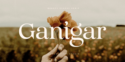 Ganigar is a sans serif font with luxury, elegant, modern, unique and classy-look. This font crafted specials for luxury-themed projects, ready to use on Magazine, Social Media, Branding, Logo, and Many more that needs Luxury touches. Glamour is also included full set of: uppercase and lowercase letters multilingual characters numerals punctuation Wish you enjoy our font and if you have a question, don't hesitate to drop message & I'm happy to help :)
 - HaManga Irregular by Linotype,
$29.99This unusual font was designed by Alessio Leonardi, who plays with the difference between content and impression. At first glance the font looks almost like a row of pictograms or Asiatic characters. The forms become Arabic letters when the characters are set together to form words. HaManga Irregular is a good font to use when the reader is supposed to contemplate not only the text but the form of what he or she sees. - Silly Habit by Bogstav,
$12.00 Don't we all have a silly habit? I've got mine, for sure! - like checking whether I remembered to bring my keys, immediately after locking the door...and then checking again like 2 minutes later! Silly Habit is my laid back comic font, easy to read and fresh enough for a design that needs an extra party to it! Comes with contextual alternates, which in this case means 4 different versions of each lowercase letter
 - Caswallon by Scriptorium,
$18.00The original Caswallon font was based on samples of 17th century text script, featuring a decorative upper case character set with clean, basic lower case letters plus some bonus decorative ornaments to add flair to any design. The popularity of the original script style has lead us to develop a full family of associated fonts, including the recently released Caswallon Ornament set, plus the brand new Caswallon Archaic Text font and Caswallon Alternate script style. - The PUNCHER by PAC Font Corner,
$120.00 ThePuncher typeface is made exactly for the book, poster, flyer or any type of titles, and for customers who wants to have bold and eye-catching final product. It can be used as a single letter for a logo or for numbering of anything you want. It is not made for long sentences. ThePuncher typeface purpose is to make big bang from your short and specific messages you want to share with the world.
 - Skylines by Zamjump,
$19.00 Skylines- a chic modern serif with letters that seem to accentuate their character.Lots of ligatures for both uppercase and lowercase, as well as several alternates, to add typographical style to your designs.To access these OpenType features, you need software that supports Opentype such as: Word, Textedit, Photoshop, Sketch, Pages, Keynote, Numbers, iBooks Author, QuarkXPress, Indesign, and Illustrator. A wide variety of useful glyphs are included - see preview images of all glyphs. Thank you
 - Easter Day by Yoga Letter,
$16.00 Easter Day is a very cute and unique font. The font is embellished with a bunny shape which adds to the funniness of this font. This font is very easy to use because it is specially designed, so it will be very easy to bring out the embellishment of the letters. Easter Day is perfect for Easter celebrations, logos, branding, banners, book titles, movie titles, animation, children's world, promotions, business and more.
 - Surfside by Victory Type,
$14.00 These are the letters I doodled in the margins of my high school notebooks. As it turns out, a man named Milt Glaser doodled them first. He doodled a lot of other amazing things too. Mr. Glaser called his blocky alphabet Baby Teeth. I think the type looks better when it says Surfside, so that's what I called my incarnation. This version has been digitized and expanded, and is available for Mac and PC. These letters remind me of the 80s and the 90s, of Gotcha shorts, Ocean Pacific shirts and fluorescent windbreakers. Surfside matched my Airwalks. They're big and bold. Clunky and funky. Spices up words. Makes 'em look great! Surfside is cool and available for a low low price... scoop it up today!
 - Gaufre de Bruxelles by TypeAddiction,
$10.80 TypeAddiction presents “Gaufre de Bruxelles”, a playful handmade uppercase font. Lowercase letters have filled letters (A, B, D, O etc) and the uppercase letters have unfilled letters. "Gaufre de Bruxelles" means a Brussels waffle in English. The Brussels waffle is a rectangular-shaped waffle and is a Belgian culinary speciality. The characters of the font were inspired by the waffle dough and more specifically the shape that the dough takes when it is poured into the waffle iron.
 - Bookable Sans by Stiggy & Sands,
$24.00 A Sans Serif Family with a few unique relatives Our Bookable Sans Family was inspired by a lettering specimen from “Letters and Lettering” by Carlyle & Oring, but you'll find the inspiration has come a long way, baby. From its original reference of displaying a standard width and weight, to the two words showing a light narrow and a heavy wide, this friendly utilitarian display text face has grown to include three width families, with six weights from light to black each. The outliers of the family are Bookable Mondo: an uber heavyweight wide style exuding all brute power in an all-caps form, and Bookable Noir: a lightweight and narrow style with many unique alternate letterforms and ligatures that spoof film noir titling, but also goes off the rails having fun. Opentype features for the traditional families include: - Full set of Inferiors and Superiors for limitless fractions. - A small collection of f-based Ligatures. - Tabular & Proportional figure sets. - Ordinals. - Approx. 419 characters. Opentype features for Bookable Mondo include: - Full set of Inferiors and Superiors for limitless fractions. - Ordinals. - Approx. 391 characters. Opentype features for Bookable Noir include: - Full set of Inferiors and Superiors for limitless fractions. - Five Stylistic Alternate Sets. - Sixty-six unique ligatures. - Ordinals. - Approx. 701 characters.
 - Thang by Fenotype,
$30.00 Aint’ nuthin but the Thang. Thang is a street cred script family with big initial caps and tight flow. Thang is great for flashy headlines or as a logotype. Thang family comes with three weights. Thang Extras is a pack of strokes and dots that can be used to decorate your texts typed with Thang. Thang Extras can also be combined with Thang letters for custom Swash. Thang is packed with several OpenType features: keep on Standard Ligatures and Contextual Alternates for smooth flow. Try Swash, Stylistic or Titling Alternates for alternate characters to create customised lettering works. Check out Glyph Palette for even more alternate characters and go wild the Thang.
 - Modernica by Quintana-Font,
$29.00 Modérnica is a sans serif type including roman & oblique styles in 9 weights. Originally published in 2014, then in 2020 we released version 2.0, in which we expanded the language coverage and character set, adding a new Fat weight, tabular figures, smart fractions & arrows. We’ve improved the OpenType features adding new Stylistic Sets. Besides this, we have retuned the letters spacing in the whole family. Seeking for the best performance, we added a bit of spacing between letters in the text versions (middle weights from Book to Bold), while as for the display variants (extreme weights from Thin to Fat) we made them gain space in the light versions and loose it in the blacks.
 - Soest St Mary by New Renaissance Fonts,
$10.00Unusual decorative capitals from embroidery work in a German church. Upper case has a diamond-shaped frame around each letter; lower case is just the letters without the diamond frame; and the ampersand gives just the diamond frame so you can use a different colour from the letter. - South Bay by Olivetype,
$18.00 If you're looking for something cute yet unique and natural, then South Bay is perfect for you. It would be great for a child's journal, a school project, or even a book cover. The letters will help you unleash your creative side and make anything from a basic to an advanced project look amazing!
 - Umpire Serif by Mans Greback,
$59.00 Umpire Serif is a heavy sans-serif immersed in Victorian grandeur, exuding a kingly confidence that commands respect. Every letter carved is a testament to its solid and heavy foundation, echoing the decorative prowess of a bygone era. With its bold demeanor, the typeface effortlessly portrays nobility and pride. It's not merely decorative; it's regal.
 - Fong Shay Noon JNL by Jeff Levine,
$29.00 Fong Shay Noon JNL is a non-traditional approach to an Oriental-styled font as there are some letter forms with curves and others with straight lines. The name derives from a Chinese restaurant in North Miami Beach, Florida during the 1960s, which in turn took its name from a play on a Yiddish phrase.
 - Xard by Sryga,
$10.00 Introducing Xard, a typeface that brings a cosmic flair to your words. Its captivating contours mirror the fractured elegance of crystal asteroids adrift in space, infusing your text with an otherworldly charm. With Xard, every letter becomes a celestial fragment, forming a captivating constellation of characters that will leave your readers stargazing in awe
 - CompassOne by Ingrimayne Type,
$9.00 CompassOne was a design I began in 1990 or so, but did not bother to finish until five years later. Its name comes from the fact that all the letters could have been drawn with a compass (which draws circles) and a straight edge. The typeface Demotte was a further development of this design idea.
