10,000 search results
(0.036 seconds)
- Maree by Ashton,
$5.00 If you want to write something sincere and genuine but not too formal then this is the font for you. It is based on real handwriting, not some artificial calligraphy made to be either too haphazard or spiky or have loads of elegant flourishes but an ordinary person's writing, and designed to look as natural and as close to the original lettering as possible. Like any person's writing it is individual and distinctive, but so easy going on the eye those differences sit comfortably with you. It is friendly and open with easy to read glyphs both as lowercase and uppercase. The letters are relatively wide with clearly shaped distinct outlines. This font may be ideal for projects where you expect a wide readership with different reading abilities from young to old. When you are using this font a slightly bigger point size usually gives a better result so for a standard letter or similar you should size up to 15 points or more. Maree has been individually crafted to the smallest detail. To create a realistic handwriting font that looks relatively simple but works in a wide variety of languages requires a complexity and attention to detail most fonts will never require. This font in any ordinary business environment would never have been made, the effort required to make it too great, the length of time too long. There have been no shortcuts in this font, no automatic scanning or tracing, no automatic generation, no class kerning. Not only is each glyph individual but the width of letters, the height, the accents and the positions of the accents are all different. Even the line weight of the letters is designed to have natural variation but yet similar enough that the font appears as though it were written effortlessly in the same pen. And in order to keep the spacing consistent even though the letters have different widths, heights, lengths of descenders and so on, there are a vast number of kerning pairs, letter to letter, number to number, letter to number... All kerning has been individually assessed with an eye to proportionality taking in character shape, size and weight. For instance if you write a telephone number the numbers all sit close together but if you write a number before a letter such as in a UK post code or before a unit of measurement an extra little bit of space has been added which makes the number more distinct and therefore readable. That space is so natural to the eye that you don’t even know it is there. However even in the spacing allowance has been made for the fact it can’t be too perfect because when you write by hand the spacing is inconsistent. There have to be some letters which are too close or far apart otherwise the font would look artificial. For similar reasons if you are going to print out this font for a letter, etc, check the print version before you make any letter spacing changes because with the zoom functions in modern applications that uneven spacing and lettering can seem more pronounced than it actually is. When this font is printed out you will find it is surprisingly neat. This font is what it is, simple clear handwriting. You will not go wow. But if you want something unique and different and looks good on the page you won’t be disappointed. This font is not a work of art but it is a work of love. This font has a soul. How many fonts can you say that about?
 - Block Gothic by Red Rooster Collection,
$45.00 In 1992, Red Rooster Typefounders created Block Gothic Extra Condensed based on the TP Collection Block Gothic. In 1994, the company created and produced Block Gothic Condensed loosely based on the Extra Condensed; the weight range is markedly different than the earlier release.
 - Ratatouille by Jonahfonts,
$40.00 Ratatouille was inspired by wooden faces of old with pointed serifs. Very suitable for Packaging greeting cards magazines posters and Advertising Ads. Designed in four weights from Extra-Light to Bold including Italics, covering a large range of editorial and advertising applications.
 - Hello Miracle by Letterafandi Studio,
$16.00 Hello Miracle is a cool and interestingly designed display font. It will elevate a wide range of crafting ideas, from cards, to branding, labels and much more. This font is PUA encoded which means you can access all of the glyphs with ease!
 - Paz by Sudtipos,
$29.00 Paz, a squarish 4-weight industrial family, ranging from extreme hairline to black. It is ideal for editorial headlines where type plays a major role in the overall design. The fonts were designed by Ariel Di Lisio and digitized by Alejandro Paul.
 - Pisang by Hanoded,
$15.00 Pisang means banana in Malay and Bahasa Indonesia. It is a tall, narrow and very clear font, ideal for books, recipes, food labeling and posters. It comes with a full range of diacritics and some interesting alternates for the closed glyphs as well.
 - Zamroot by Evo Studio,
$16.00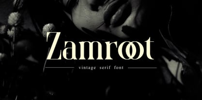 Zamroot a distinct and unique serif font. It feels playfully nostalgic and delivers an incredible vintage aesthetic. Zamroot will elevate a wide range of design projects to the highest level, be it branding, headings, wedding designs, invitations, signatures, logos, labels, and much more!
 - Restu Bundah by Stringlabs Creative Studio,
$25.00 Restu Bundah is a retro bold script with a groovy style. It features a vintage style and is perfect for retro lovers. It will elevate a wide range of design projects, be it barbershops, motorcycle clubs, clothing, logos, coffee shops, and much more!
 - Linotype Pegathlon by Linotype,
$29.99Linotype Pegathlon is an unusual, eye-catching typeface, perfect for headlines and short texts. The bold strokes have a mystical, Asian touch and allow a large range of applications. Whether a text should look exotic or esoteric, Linotype Pegathlon is an excellent choice. - Montesla Diamond by Letterena Studios,
$9.00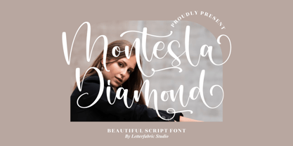 Montesla Diamond is an enchanting handwritten font. This versatile script font has a wide spectrum of applications ranging from greeting cards to headlines. Montesla Diamond is PUA encoded which means you can access all of the amazing glyphs and ligatures with ease!
 - Forge Caffeine by Nocturnal Workspace,
$9.00 FEATURES Standard Ligature Stylistic Alternate Fraction, Numerator, Denominator Includes a range of multilingual characters. PUA encoded To improve the quality of use & enrich the font family, we always update the fonts that have been published. Feel free to give us suggestions. Thank you!
 - Gingar by Melli Diete,
$42.00 Gingar – a headline face, playful and classic – a proper font. Gingar includes swash-characters and ligatures in a wide range of weights from UltraLight to ExtraBlack, plus Italics. Typeface for life, fashion, food, wellness, magazines, corporate design projects and more. Rock with Gingar!
 - Cikal by Beary,
$14.00 Cikal is an elegant serif font with captivating alternate characters. With a total of 245 glyphs, this font offers a wide range of design possibilities. Its timeless elegance makes it a perfect choice for various design needs. Don't wait, get it now!
 - Este by Michael Prewitt,
$20.00 Este is a modern sans serif typeface. The family has 7 weights, ranging from Thin to Bold and is suited for branding, logo, transportation, product design, advertising and packaging. The modern feel is complimented by alternative characters via the OTF stylistic sets.
 - No Liming by chicken,
$17.00 A chunky, laid-back typeface inspired by a hand-painted notice on the doors of a mechanic's workshop in Plymouth, Tobago. Two different mostly-uppercase alphabets in one font help to keep things loose. 'Liming'? hanging out, drinking rum, shooting the breeze...
 - Remedia by Kent Barns,
$5.00 Remedia is a simple linear typeface with a wide range of font weights, from a hairline Ultra Light to Extra Black. Legible in body copy and a great starting point for a unique logo, Remedia is a creative typeface for everyday uses.
 - Notably Absent by Ali Hamidi,
$10.00 Notably Absent is a cool and fun styled display font. It will elevate a wide range of crafting ideas, from cards, to branding, labels and much more. Add it confidently to your favorite creations and let yourself be amazed by the outcome generated.
 - Murisa Mondriana by Murisa Studio,
$10.00 Mondriana is a cool and modern looking sans serif font. It will elevate a wide range of crafting ideas, from cards, to branding, labels and much more. Add it confidently to your favorite creations and let yourself be amazed by the outcome generated.
 - Flower Park by AEN Creative Studio,
$15.00 Flower Park is a sweet and playful display font. This font is perfect for the autumn theme, floral design, and nature theme, fitting a wide range of contexts. Add it to your creative ideas and notice how it makes them stand out!
 - Aterline by AEN Creative Studio,
$15.00 Aterline is a simple but elegant slab serif font family. It will elevate a wide range of crafting ideas, from cards to branding, labels, and much more. Add it confidently to your favorite creations and let yourself be amazed by the outcome generated.
 - Born Strong by Rook Supply,
$16.00 Born Strong is built with athletics in mind. The goal was to make the perfect typeface for sports teams, college football, athletic wear and everything in between. The font family supports a wide range of languages and is available in many different weights.
 - Jumping Squid Graffiti by Sipanji21,
$16.00 Jumping Squid is a Handwritten font with a Natural monoline graffiti style, perfect for your awesome urban designs. It will elevate a wide range of design projects to the highest levels, be it branding, headings, designs, invitations, signatures, logos, labels, and much more!
 - Kyrial Sans Pro by Mostardesign,
$- Designed in 2011 by Olivier Gourvat, this font family has generous proportions with a range of weights make it a versatile family for print, text, signage, branding and web design work. Kyrial Sans Pro offers lots of OpenType goodness and broad language support.
 - Blok by Studio Few,
$10.00 Built on a square grid, Blok's variable axis conforms to your canvas. With pre-defined weights ranging from 2x1, through to 1x16, Blok is as flexible as it is structured. Character Set: A-Z, Period & Exclamation Mark Weights: 6 Normal & 6 Rounded
 - Gaby Pro by RMU,
$35.00 Inspired by the 1947 Weber font Gabriele, Gaby Pro is a freshly designed versatile and everyday cursive font that can be used for a wide range of printed products and for web design as well. The font was carefully extended for multilingual use.
 - Spartacus by Alan Meeks,
$45.00 A further development of the Colosseum range but this with a slab serif. Visually monoline and modern in appearence it still retains its Trajan characteristics. The addition of Spartacus black with its unusual Italic gives a the face a strong original headline font.
 - Vandal Zoy Graffiti by Sipanji21,
$18.00 Vandal Zoy is a Thick font with a graffiti style and bubble looks. It will elevate a wide range of design projects to the highest level, be it branding, headings, wedding designs, invitations, signatures, logotype, wall art illustration, apparel, labels, and much more!
 - Vinyle by Lián Types,
$37.00 Bold, rounded and super cool. Those are the attributes of my latest font “Vinyle”, french for vinyl. In this epoque where all fields of Design are giving a lot of importance and attention to Typography and Lettering, I felt it was my duty to contribute with something that could really stand alone and ‘say something else’ that just words to be read. I've found that lately in the world, regarding a finished piece of design, the role of Typography (and of letters in general) went from being secondary, (like a minor player or a supporting actor) to the most important one. People are starting to understand the beauty of a well-done letter: they want their storefronts with unique scripts, they want to drink coffee surrounded by lettered blackboards, they want to buy books with astonishing covers with swashes ‘por doquier’. I'm more than happy to be alive in a present where even the most unimaginable friends of mine, (who couldn't spot differences between comic sans and helvetica before) are now conscious of the importance of a letter, or let’s say: Of the ‘voice’ of Typography. With Vinyle I tried to make a font with power. Following the nowadays trend of, let me say, “the vintage sans renaissance”. This time I put my brushes and nibs aside and experimented with something new. It wasn't easy, if you will pardon, for me to see swashes all over the place withouth the classic calligraphic ‘thick and thins’, but with after some weeks of work I started to love them. Like I already showed you in other creations (1) let me finish with the phrase: GEOMETRY IS SEXY! TIPS Vinyle has a lot of attitude, it shouts “here I am!” it really can ‘design an entire piece’ for you with just a word or two: It was designed with a 10 degree slant on purpose so the user may rotate it (like on the posters) that amount of degrees in order to see better results. Use Vinyle with the ‘fi’ standard ligatures activates for better kerning and ligatures! NOTES (1) See my font Selfie , the ‘little sister’ of Vinyle.
 - Ready For Anything BB by Blambot,
$15.00 Ready for Anything BB is a classic comic book lettering font designed with a Speedball C-6 pen nib, giving it supremely versatile letter-forms to complement any comic book art. As if that weren't enough, it also features contextual alternates that swap through six versions of every letter, three versions of every number, exclamation point, and questions marks. It also automatically corrects errant serif-I, and creates a bouncy baseline for any more than three consecutive letter!
 - Sightseeing Tour JNL by Jeff Levine,
$29.00 Samuel Welo was a sign painter who had published in the 1920s and again in 1960 his “Studio Handbook – Letter and Design for Artists and Advertisers”, prolifically hand lettering all of the type style examples within the pages of the publication. In 1930 Welo also published “Lettering - Practical and Foreign”. From this book comes a thick-and-thin hand lettered Art Deco alphabet – now available digitally as Sightseeing Tour JNL in both regular and oblique versions.
 - Gaufre de Bruxelles by TypeAddiction,
$10.80 TypeAddiction presents “Gaufre de Bruxelles”, a playful handmade uppercase font. Lowercase letters have filled letters (A, B, D, O etc) and the uppercase letters have unfilled letters. "Gaufre de Bruxelles" means a Brussels waffle in English. The Brussels waffle is a rectangular-shaped waffle and is a Belgian culinary speciality. The characters of the font were inspired by the waffle dough and more specifically the shape that the dough takes when it is poured into the waffle iron.
 - CoffeeMug by Ingrimayne Type,
$10.00 CoffeeMug has letters on coffee mugs. Upper-case letters have the handles to the left and lower-case characters have the handles to the right. The letters on the mugs are from the typeface InsideLetters. The typeface contains characters that will add color to letters. There are two ways to do this. One uses layers and the other a combination of characters, some with zero-width. A file in the gallery explains the ways that this can be done.
 - Kitsch by Zetafonts,
$39.00 Designed by Francesco Canovaro with help from Andrea Tartarelli and Maria Chiara Fantini, Kitsch is a typeface happily living at the crossroads between classical latin and medieval gothic letterforms. But, rather than referencing historical models like the italian Rotunda or the french Bastarda scripts, Kitsch tries to renew both its inspirations, finding a contemporary vibe in the dynamic texture of the calligraphic broad-nib pen applied to the proportions of the classical roman skeleton. The resulting high contrast and spiky details make Kitsch excel in display uses, while a fine-tuned text version manages to keep at small sizes the dynamic expressivity of the design without sacrificing legibility. Both variants are designed in a wide range of weights (from the almost monolinear thin to the dense black), and are fully equipped with a extended character sets covering over two hundred languages that use latin, cyrillic and greek alphabets. Special care has been put in designing Kitsch italic letterforms, with the broad-nib movements referencing classical italian letterforms to add even more shades to your typographic palette. The resulting alternate letter shapes have also been included in the roman weights as Stylistic Alternates - part to the wide range of Open Type features (Standard and Discretionary Ligatures, Positional Numerals, Small Caps and Case Sensitive Forms) provided with all the 32 weights of Kitsch. Born for editorial and branding use, Kitsch is fashionable but solid, self-confident enough to look classic while ironic enough to be contemporary.
 - Theman Cathos by Alit Design,
$21.00 Introducing "Theman Cathos" Font: A Bubble Dynamic, Modern, and Funky Typeface Theman Cathos is a captivating font that combines the essence of bubble dynamics with a modern and funky style. Its unique design exudes energy and playfulness, making it perfect for projects that require a fresh and vibrant look. This typeface features rounded letterforms with soft edges, giving it a friendly and approachable feel. The bubbly contours of each character create a sense of movement and liveliness, capturing attention and adding a touch of whimsy to any design. With its modern twist, Theman Cathos brings a contemporary edge to traditional bubble fonts. It embraces clean lines, sleek curves, and a balanced composition, making it versatile for a wide range of applications. Whether you're designing a logo, branding materials, advertising campaigns, or social media graphics, this font will add a dynamic and eye-catching element to your project. Theman Cathos also offers a wide range of glyph variations, including ligatures, alternates, and stylistic sets, allowing you to customize and experiment with different letter combinations. This versatility empowers you to create unique typographic compositions that truly reflect your creative vision. Embrace the spirit of modernity and funk with Theman Cathos font. Elevate your designs, stand out from the crowd, and infuse them with a sense of joy and energy. Let this captivating typeface be the perfect tool to express your creativity and make a memorable impact.
 - Bacute by Afkari Studio,
$13.00 BACUTE Display Sans Typeface offers a captivating blend of contemporary design and readability, ensuring your projects stand out with finesse and clarity. Features: Three Unique Styles: Enjoy the versatility of BACUTE's three styles - Light, Regular, and Bold. Each style adds its distinctive visual appeal to complement various design aesthetics. Special Alternates: Unleash your creativity with alternative characters and glyphs that infuse uniqueness into your designs, allowing for personalized expressions. Complete Character Set: BACUTE includes uppercase and lowercase letters, numerals, punctuation, and a range of essential glyphs for comprehensive design flexibility. Cross-Platform Compatibility: Seamlessly use BACUTE across both PC and Mac platforms, effortlessly integrating with leading design software like Adobe Illustrator, Adobe Photoshop, Adobe InDesign, and Microsoft Word. Effortless Installation: Experience hassle-free installation, granting instant access to the font's capabilities without the necessity of additional design software. Multilingual Support: BACUTE ensures inclusivity by supporting a variety of special characters, catering to multiple languages, including ä, ö, ü, Ä, Ö, Ü, ß, ¿, and ¡. BACUTE adapts flawlessly to an extensive range of design projects, including Logos, Posters, Product Labels, Cartoons, Comics, Editorial Designs, Website/Blog Elements, Social Media Posts, Packaging Designs, Social Media Subtitle And more! Dive into the boundless potential that BACUTE Display Sans Typeface offers. Its modern aesthetic, coupled with a multitude of features, positions it as an invaluable asset for designers seeking to make an impactful impression without compromising readability. Embrace BACUTE to elevate your projects and captivate your audience with its distinctive charm!
 - Sancoale Narrow by insigne,
$22.00 Sancoale Narrow is a carefully honed and meticulously crafted new family member for the Sancoale series. Sancoale Narrow has been specially designed to allow for even more versatility for the Sancoale Family. Sancoale Narrow continues with Sancoale's successful simple, geometric and legible structure. It is a contemporary design that is distinctive and unique. This new narrow addition can be used in conjunction with the original Sancoale, but it can also stand on its own. Narrow type comes in a handy in a myriad of situations, from poster design to book covers, web pages to editorial layouts. Sancoale Narrow's six weights make for a typeface family that is very useful for many applications, and also includes a set of true italics. The design is simplified without stems or spurs in the default character set. OpenType alternates do include alternates with stems, Small Caps, Fractions, Tabular Figures, and plenty of alts, including "normal" capitals and lowercase letters. Please see the informative .pdf brochure to see these features in action. Sancoale Narrow also includes a full array of Latin diacritics for multilingual support. OpenType capable applications such as Quark or the Adobe suite can take full advantage of the automatically replacing ligatures and alternates. This family also includes the glyphs to support a wide range of languages. The Sancoale superfamily is suitable for a wide range of uses and is a very economical and versatile addition to any designer's font collection.
 - Goodfood by MaGo Fonts,
$9.00 Introducing our stunning Goodfood Font Family, a versatile and delicious sans serif display typeface that is perfect for your most tasteful design projects. With a total of five different weights, this font family offers you ultimate flexibility in creating captivating and impactful designs. Whether you're working on a logo, branding materials, product packaging, or editorial projects, this font family will enhance the overall aesthetic and make your designs stand out. To further enhance creativity, Goodfood Font Family includes alternates and ligatures. These additional characters provide you with ample possibilities to customize and stylize your typography, creating unique and eye-catching designs. By utilizing alternates and ligatures, you can bring a distinctive touch to your headers, titles, headlines, and other important elements of your design. Here's what you can expect from this font family: Five Weights: The font family offers five weights, ranging from Light to Bold. This wide range allows you to experiment with different typographic hierarchies and create visually appealing compositions. Alternates: The inclusion of alternates expands the versatility of this font family. By simply swapping characters, you can create different stylistic variations, giving your designs a fresh and creative look. Ligatures: The font family also includes ligatures, which are special characters that combine two or more letters into a single unique glyph. Ligatures ensure smooth and visually pleasing connections between characters, resulting in a harmonious and cohesive typography. Superior Legibility: While the Goodfood Font Family features elegant and decorative serifs, it doesn't compromise on legibility. The carefully crafted characters and balanced letterforms ensure readability across various sizes and mediums. Extensive Language Support: This font family supports a wide range of languages, allowing you to create designs for global audiences with ease. Whether you're a professional designer looking to elevate your creative projects or an individual seeking a unique font for personal use, the Display Serif Font Family offers an impressive array of options. Add sophistication, versatility, and a touch of uniqueness to your designs with this remarkable font family.
 - Aspire SmallCaps by Grype,
$18.00 Geometric/Technical style logotypes have been developed for car chrome labels since the early 1980's. Many of these sleek logotypes are lacking an expansive family to enhance and express their brand in a richer sense, becoming true brand workhorses. The Aspire SmallCaps family finds its origin of inspiration in the ACURA automotive company logo, and from there expands to an 6 font family of weights & oblique styles, striving to become a workhorse. Aspire SmallCaps is perhaps the most true to form tribute to the original all capitals inspiration logotype. It maintains all capital forms (whether standard or smallcaps) and yet is still strikingly powerful in its presence and readability including numerals, and a comprehensive range of weights, creating a straightforward, uncompromising collection of typefaces that lend a solid foundation and a broad range of expression for designers. Here's what's included with the Aspire SmallCaps Family bundle: - 438 glyphs per style - including Capitals, Small Caps, Numerals, Punctuation and an extensive character set that covers multilingual support of latin based languages. (see the 6th graphic for a preview of the characters included) - Stylistic Alternates - alternate characters that remove the angled stencil cuts for a more standardized text look. - 3 weights in the family: Light, Regular, & Black. - 3 obliques in the family, one for each weight: Light, Regular, & Black. - Fonts are provided in TTF & OTF formats. The TTF format is the standard go to for most users, although the OTF and TTF function exactly the same. Here's why the Aspire SmallCaps Family is for you: - You're in need of automotive sans font family with a range of weights and obliques - You're love that ACURA letter styling, and want to design anything within that genre - You're looking for an alternative to Eurostile with more stylized letterforms. - You're looking for a battle-tech typeface for your futuristic war chest labelling. - You just like to collect quality fonts to add to your design arsenal
 - Sancoale Slab by insigne,
$32.00 The contemporary feel of the Sancoale superfamily takes a bolder turn with this futuristic slab. Built from Sancoale's successfully simple geometry, Slab's serif elements and tall x-height give the face an energetic, yet clean figure that easily complements its cousins: Sancoale Softened--a sans with blunted terminals; Sancoale Narrow; and, of course, the original Sancoale itself. The weights of each member have been balanced carefully to ensure compatibility with the others, and when used together, the combination creates a powerful design that is easy to identify. With weights ranging from the classier Thin to the authoritative Black, Slab opens the door to a range of applications. Used in different text sizes, its tech image is legible and neutral enough for longer bodies of copy--both in print and on the web. Have a more prominent need? The web font also stands out well in a headline or even as a display face. Slabís great personality puts a strong foot forward without giving its reader a kick in the teeth. Whatever the task, this font's one to capture the Zeitgeist into your work. All Insigne fonts are fully loaded with OpenType features. Sancoale Slab is also equipped for complex professional typography, including alternates with stems, small caps and plenty of alts, including "normalized" capitals and lowercase letters. The face includes a number of numeral sets, including fractions, old-style and lining figures with superiors and inferiors. OpenType-capable applications such as Quark or the Adobe suite can take full advantage of automatically replacing ligatures and alternates. You can find these features demonstrated in the .pdf brochure. Included are small caps, fractions, old-style and lining numbers, scientific superior/inferior figures, complete ordinal and inferior alphabet, and a set of symbols and arrows. The Sancoale family also includes the glyphs to support a wide range of languages, including Central, Eastern and Western European languages. In all, Sancoale Slab supports over 40 languages that use the extended Latin script, making the new addition a great choice for multi-lingual publications and packaging.
 - Sancoale Softened by insigne,
$22.00 Sancoale Softened is the new rounded companion to Sancoale. While the original Sancoale is crisp and defined, its delicate forms also lend themselves well to a lighter, more rounded version. The stems of Sancoale Softened are blunted, and its corners have been carefully rounded, avoiding the “sausage” look seen with some rounded fonts. This blend of definition and delicacy makes the Sancoale Superfamily versatile and appropriate for a variety of applications. The design minimizes the characters to their essence, leaving a default set of simple characters without notches or spurs. However, the typeface family’s slightly technological feel still appears friendly and approachable to the reader. It’s slightly condensed proportions and tall x-height also make the design readable at a wide range of sizes, which works especially well for web pages. These softer letterforms give Softened its unique, futuristic look--great for distinguishing your text or display. There are six weights with true italics. All insigne fonts are fully loaded with OpenType features. Sancoale Softened is also equipped for complex professional typography, including alternates with stems, small caps and plenty of alts, including “normalized” capitals and lowercase letters. The face includes a number of numeral sets, including fractions, old-style and lining figures with superiors and inferiors. OpenType capable applications such as Quark or the Adobe suite can take full advantage of automatically replacing ligatures and alternates. You can find these features demonstrated in the .pdf brochure. The Sancoale family also includes the glyphs to support a wide range of languages, including Central, Eastern and Western European languages. In all, Sancoale Softened supports over 40 languages that use the extended Latin script, making the new addition a great choice for multi-lingual publications and packaging. Sancoale Softened continues with Sancoale’s successfully simple, geometric and legible structure. With its suitability for a wide range of uses, the Sancoale superfamily is a very economical and versatile addition to any designer’s font collection.