10,000 search results
(0.033 seconds)
- Kotomi Display by The Paper Town,
$26.00 Kotomi Display is a high contrast all-caps serif font with an elegant calligraphic touch. Inspired by didones, it features thin bracketed serifs, sleek lines, proportioned curves, angled axis...all, with a sense of fashion. Designed for high end branding, Kotomi Display is intended for large titles and big headers where its sharp and refined finish is particularly appreciated. The font is equipped with beautiful alternates and countless ligature variations that flows in harmoniously to achieve a well balanced combination and a legible composition. With a set of 1414 glyphs, Kotomi Display can serve a wide range of projects from editorial to branding, logos, posters, magazines, blog titles, packaging, wedding invitations, social media and more. Included case sensitive punctuation, numerals, symbols and multilingual support for western, central and south east European languages. Caps Only Fonts.
 - Hucks Serif by S6 Foundry,
$25.00 Hucks Serif is a contemporary serif typeface that seamlessly incorporates large open counters and gracefully curved and rounded forms, resulting in a glyph set that exudes a modern and elegant aesthetic. The pronounced contrast between thick and thin strokes imparts Hucks Serif with a harmonious and stylish appearance. Meticulously crafted to infuse letterforms with an inherent elegance, this font lends a distinctive style and atmosphere to every project it graces. Its versatile nature makes Hucks Serif particularly well-suited for many applications, including but not limited to editorial, headlines, large-format prints, brand identities, social media graphics, advertising materials, editorial designs, posters, magazines, logos, headings, and more. The adaptability of Hucks ensures it can effortlessly enhance the visual appeal and impact of a diverse range of creative projects.
 - Tiqqun by Harvester Type,
$20.00 Tiqqun appeared as a font for a monumental, but at the same time futuristic design. During the creation process, many variations for each glyph came to mind. Therefore, it was decided to create an entire system of alternative options. As a result, we have more than 130 alternative characters and as many as two full-fledged alternative sets. The font contains monumentality, brutality, futurism, rigor and uniqueness of some forms. As a result, Tiqqun has become a font system that can cover a large range of your design needs: Prints on clothes, logo, packaging, banner, title, text, poster, merchandising, identity, branding or product design. - 360+ Glyphs - 130+ Alternative Glyphs - Supports 80+ Languages - Special Symbols and Features - 2 Full Alternative Set - OT Features: aalt, case, kern, ordn, salt, sups, ss01-09
 - Storica by Arkitype,
$15.00 Storica is a display typeface with roman style serifs that create a sense of history and culture. The Storica family has 7 weights as well as a Heavy Rough and Heavy Hand version that give you an option for a more rustic or hand style approach to you projects. The character set is expansive and has a wide range of language support. Storica has a great selection of Stylistic alternates, ligatures, small-caps, old-style numbers and more packed into the opentype features. This typeface is an excellent choice for branding, particularly in the beverage industry, it is also perfect for typographic layouts for magazines, poster, books etc. Storica has been designed to make it easy for a designer to create beautiful typography with creative flair quickly and easily.
 - Mellios by Keristyper Studio,
$14.00 Mellios is a modern semi-script font that combines elegant calligraphy with a contemporary twist. With its smooth and flowing curves, Mellios is perfect for adding a touch of sophistication to your designs. Whether you're creating invitations, logos, or social media graphics, Mellios is sure to impress. Its versatility makes it suitable for a wide range of projects and purposes, from branding to editorial design. With Mellios, you can elevate your designs and create a memorable impression. Featured: Standard, Uppercase & Lowercase Numeral & Punctuation Multilingual : ä ö ü Ä Ö Ü ß ¿ ¡ Alternate & Ligature PUA encoded We recommend programs that support the OpenType feature and the Glyphs panel such as Adobe applications or Corel Draw, so you can use all the variations of the glyphs. Hope you enjoy our fonts!
 - BR Omny by Brink,
$30.00 BR Omny is a rounded geometric sans serif, it is based on a softened geometric framework with a confident and friendly persona. The family contains 7 weights ranging from Thin to Black with corresponding italics. It supports an ‘Extended Latin’ character set that provides support for 200+ latin based languages.
 - Singularity Type by Davide Mascioli,
$15.00 Singularity Type is a Modern sans-serif Geometric font with homogeneous thickness, based on essential geometric shapes. Built around 4 different widths, ranging from Extra Light up to Bold, the font contains 744 glyphs and supports more than 30 Latin alphabet languages. Singularity Type is Designed by Davide Mascioli ©2021
 - Christmas Neighborhood by Mvmet,
$15.00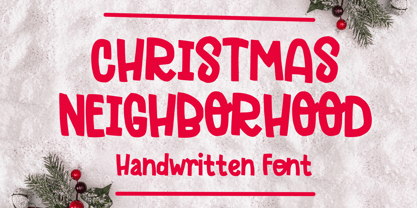 Christmas Neighborhood is your perfect stylish Christmas font. You can use it for anything ranging from t-shirts, kids’ book designs, and greeting cards to stickers and posters, or anything that needs a casual touch. Fall in love with its incredibly versatile style, and use it to create lovely designs!
 - Winter Quarter by Mvmet,
$12.00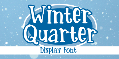 Winter Quarter is your perfect winter and season font. You can use it for anything ranging from t-shirts, kids’ book designs, and greeting cards to stickers and posters, or anything that needs a casual touch. Fall in love with its incredibly versatile style, and use it to create lovely designs!
 - Sweet Cane Comic by Mvmet,
$15.00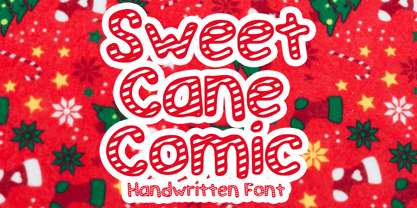 Sweet Cane Comic is a festive Christmas font. You can use it for anything ranging from t-shirts, kids’ book designs, and greeting cards to stickers and posters, or anything that needs a casual touch. Fall in love with its incredibly versatile style, and use it to create lovely designs!
 - Joe Kubert by Comicraft,
$39.00 The official Joe Kubert font has been digitally mastered by John 'JG' Roshell based on Joe's own specifications for an upcoming SGT ROCK project for DC Comics. Pull up a chair at our Thanksgiving table and marvel at Joe's legendary work in comics ranging from TOR to FAX FROM SARAJEVO.
 - Retro Candy by Mvmet,
$10.00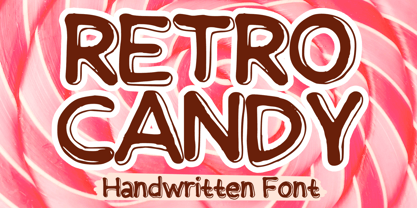 Retro Candy is a cool retro style candy display font. You can use it for anything ranging from t-shirts, kids’ book designs, greeting cards, stickers, and posters, or anything that needs a casual touch. Fall in love with its incredibly versatile style, and use it to create lovely designs!
 - Catrina by Latinotype,
$26.00 Catrina, designed by Eli Hernández, is an expressive typeface whose curves and straight lines meet each other in harmonious synchrony. Catrina comes in 6 weights, ranging from Thin to Black, plus a Handmade version and includes Dingbats and Catchwords which make it the perfect choice for packaging, branding, titles and advertising.
 - Brozo by Creaditive Design,
$19.00 Brozo typeface is a versatile font with 18 styles, ranging from thin to black, thin italic to black italic. Its captivating and elegant look, complemented by multilingual support and a standard character set, caters to diverse designs. Brozo's minimalist yet sophisticated appeal ensures comfortable readability. Elevate your designs with Brozo's perfection.
 - Xmas Bubbles by Mvmet,
$18.00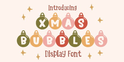 Xmas Bubbles is a cool ornamental Christmas display font. You can use it for anything ranging from t-shirts, kids’ book designs, and greeting cards to stickers and posters, or anything that needs a casual touch. Fall in love with its incredibly versatile style, and use it to create lovely designs!
 - Christmas Kringle by Mvmet,
$16.00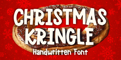 Christmas Kringle is a fun and festive Christmas display font. You can use it for anything ranging from t-shirts, book designs, and greeting cards to stickers and posters, or anything that needs a casual touch. Fall in love with its incredibly versatile style, and use it to create lovely designs!
 - Ardena by Julien Fincker,
$34.99 About the design: Ardena is a modern sans-serif typeface family. While neutral and clear at first glance, it can be characterized as both pleasant and confident due to its open, rounded forms and vertical terminals. It can be used in both a restrained and expressive way. The thinner and thicker weights are particularly suitable for strong headlines, while the middle weights can be used for typographic challenges and body text. Completed with an extensive character collection, it becomes a real workhorse. A versatile allrounder that is up to all challenges – for Corporate Identity, Editorial, Branding, Orientation and Guidance systems and much more. Features: The Ardena family has a total of 20 styles, from thin to heavy with matching italics. With over 1064 characters, it covers over 200 Latin-based languages. It has an extended set of currency symbols and a whole range of Open Type Features. There are alternative characters as stylistic sets, small caps, automatic fractions – just to name a few. Arrows and numbers: In particular, the extensive range of arrows and numbers should be highlighted, which are perfectly suited for use in orientation and guidance systems. Thanks to Open Type Features and an easy system, the various designs of arrows and numbers can also be simply "written" without first having to select them in a glyph palette. The principle is easily explained: If a number is placed in round or square brackets, it will automatically be displayed in an outlined circle or square. If you add a period to the number, it is displayed in a full circle or square. The same principle also applies to the arrows. The arrows themselves are combinations of greater/less symbols with the various slashes or hyphens. Get the Variable Font here: https://www.myfonts.com/fonts/julien-fincker/ardena-variable/
 - Milio by Tipo Pèpel,
$22.00 Any typeface has two intrinsic elements that does´t work at the same levels, form and appearance. These peculiar visual behavior generate a wide range of graphics games. At reading level, we observe a uniform gray spot, but large bodies allows us to appreciate their shapes and counterforms. Milio takes this duality to offer unparalleled service in newsprint and magazine publishing, specially in small bodies but hard and formal cogency in titling. Its wide variety of weights, 10 in total, together with a slight condensation allows us to save space without losing legibility, even under poor printing conditions. Its basic quasi humanistic forms include support for a wide range of details that give great originality and strength. A friendly appearance, but a strong, all-road typeface with internal forms that reinforced visibility in small sizes thanks to its high average eye and the contrast that generates its soft curved external and internal squared angles. The nuances here are fundamental and explain its powerful large sizes, where you can see these contrasts between the curved, organic, humanistic, and straight, angled, almost mechanical shapes. Milio has the bonus of a large multilingual support for all alphabets based on the Latin and Cyrillic, as well as large Opentype features for expert users, among which we have true small caps, ligatures and automatic contextual alternates. Several sets of numerals for use on tables and other “delicatessen” as fractions are also included. Having in mind the daily struggle in newspaper and magazines´ edition, Milio has been designed with the idea of being Cinta´s perfect couple, a similar contrast and proportion typographic san serif family produced by the same Foundry as Milio, to cover almost all the graphic needs in actual DTP.
 - Ardena Variable by Julien Fincker,
$185.00 About Ardena: Ardena is a modern sans-serif typeface family. While neutral and clear at first glance, it can be characterized as both pleasant and confident due to its open, rounded forms and vertical terminals. It can be used in both a restrained and expressive way. The thinner and thicker weights are particularly suitable for strong headlines, while the middle weights can be used for typographic challenges and body text. Completed with an extensive character collection, it becomes a real workhorse. A versatile allrounder that is up to all challenges – for Corporate Identity, Editorial, Branding, Orientation and Guidance systems and much more. Variable Font The Variable Font contains 2 axes: weight and oblique – all in just one file. Features: With over 1064 characters, it covers over 200 Latin-based languages. It has an extended set of currency symbols and a whole range of Open Type Features. There are alternative characters as stylistic sets, small caps, automatic fractions – just to name a few. Arrows and numbers: In particular, the extensive range of arrows and numbers should be highlighted, which are perfectly suited for use in orientation and guidance systems. Thanks to Open Type Features and an easy system, the various designs of arrows and numbers can also be simply "written" without first having to select them in a glyph palette. The principle is easily explained: If a number is placed in round or square brackets, it will automatically be displayed in an outlined circle or square. If you add a period to the number, it is displayed in a full circle or square. The same principle also applies to the arrows. The arrows themselves are combinations of greater/less symbols with the various slashes or hyphens. Get the static version of the Ardena family here: https://www.myfonts.com/fonts/julien-fincker/ardena/
 - Jenson Classico by Linotype,
$29.99In 1458, Charles VII sent the Frenchman Nicolas Jenson to learn the craft of movable type in Mainz, the city where Gutenberg was working. Jenson was supposed to return to France with his newly learned skills, but instead he traveled to Italy, as did other itinerant printers of the time. From 1468 on, he was in Venice, where he flourished as a punchcutter, printer and publisher. He was probably the first non-German printer of movable type, and he produced about 150 editions. Though his punches have vanished, his books have not, and those produced from about 1470 until his death in 1480 have served as a source of inspiration for type designers over centuries. His Roman type is often called the first true Roman." Notable in almost all Jensonian Romans is the angled crossbar on the lowercase e, which is known as the "Venetian Oldstyle e." In the 1990s, Robert Slimbach designed his contemporary interpretation, Adobe Jenson™. It was first released by Adobe in 1996, and re-released in 2000 as a full-featured OpenType font with extended language support and many typographic refinements. A remarkable tour de force, Adobe Jenson provides flexibility for a complete range of text and display composition; it has huge character sets in specially designed optical sizes for captions, text, subheads, and display. The weight range includes light, regular, semibold, and bold. Jenson did not design an italic type to accompany his roman, so Slimbach used the italic types cut by Ludovico degli Arrighi in 1524-27 as his models for the italics in Adobe Jenson. Use this family for book and magazine composition, or for display work when the design calls for a sense of graciousness and dignity. - Gill Sans Nova by Monotype,
$61.99 The Gill Sans® Nova typeface, by Monotype Studio designer George Ryan, expands the much-loved Gill Sans family from 18 to 43 fonts and features a coordinated range of roman and condensed designs. Several new display fonts are available, including a suite of six inline weights, shadowed outline fonts that were never digitized and Gill Sans Nova Deco that was previously withdrawn from the Monotype library. A variety of OpenType® features are supported that make it possible to include experimental characters from different points in Gill Sans’s long history, including pointed diagonals on ‘A’, ‘V’ and ‘W’ and alternatives for ‘b’, ‘d’, ‘p’ and ‘q.’ Proportional figures are also available as an alternative to the tabular designs. The Gill Sans Nova family has a large character set that supports Latin, Greek and Cyrillic languages. The display weights support Latin only. “Gill Sans was fast to strike a chord with people after its initial 1928 release and quickly became popular,” explains Ryan. “It’s been adapted for every publishing technology, from mechanical typesetting to digital imaging – always receiving the best treatment from Monotype in each iteration. This is especially true with all that we’ve added to the new series, while still retaining the familiarity of Gill Sans. My goal was to ensure clarity across digital environments, add missing weights, and bring more personality to the family with new display fonts, as well as Gill-inspired alternate characters.” The Gill Sans Nova typeface family is part of the new Eric Gill Series, drawing on Monotype's heritage to remaster and expand and revitalize Eric Gill’s body of work, with more weights, more characters and more languages to meet a wide range of design requirements. The Series also brings to life new elements inspired by some of Gill’s unreleased work, recently discovered in Monotype’s archive of original typeface drawings, designer correspondence and documents from the last century.
 - FS Albert by Fontsmith,
$80.00 The x factor How do you make a font like FS Albert unique, distinctive? “When designing a font I try to question every letter,” says Jason Smith, “but all you need is a few that have an x factor. With FS Albert, they’re the lowercase ‘a’ and ‘g’ and the uppercase ‘I’ and ‘J’. “I remember a friend saying, ‘Why on earth have you designed the ‘a’ like that? Isn’t it too friendly for this kind of font?’ And, in a way, that’s what I wanted – honesty and warmth, because a lot of big brands at the time really needed to show a more human side.” Range of weights and styles FS Albert is a charismatic type: a warm, friendly sans serif face with a big personality. Open, strong and amenable, and available in a wide range of weights and styles, FS Albert suits almost every task you put it to. Fontsmith has crafted five finely-tuned upright Roman weights and four italic weights, as well as a special Narrow version to provide the best coverage and give headlines and text an easy-going character. The chunky kid “FS Albert was inspired by – and named after – my son, who was a bit of a chunky kid,” says Jason Smith. “I designed an extra bold weight because I always felt that the really big font heavy weights had the most personality. “I recently told Albert this story. He laughed, and forgave me for thinking he was a fat baby. He liked the big personality bit, though.” 1000s of glyphs Not content with a character set that covered Europe and the whole of the Western world, the studio decided to go further afield. There are now FS Albert character sets that cover western and eastern European languages, including those of Russia, as well as Cyrillic, Arabic and Greek scripts. In fact, the font now covers more than 100 languages, making it ideal for bringing a consistent typographic style to the communications of global brands.
 - Stinger by Zetafonts,
$39.00 Since their first appearance as Italians on the pages of the 1821 William Caslon type specimens, reverse contrast typefaces have been typography's best loved quirky outcasts. Subverting the traditional relationship between thick verticals and thin horizontals made them perfect for eye-catching advertisements. The unexpected contrasts and the thick slabs produced by reverse-contrast serifs became ubiquitous in period posters, and synonymous with wild west and circus iconography. In designing Stinger, the Zetafonts design team composed by Maria Chiara Fantini, Andrea Tartarelli and Francesco Canovaro and orchestrated by Cosimo Lorenzo Pancini decided to marry this subversive tradition with the workhorse approach of modernist sans serif typefaces like Univers, developing a super-family with four widths, each in five different weights, from thin to heavy. This gives the designer a full range of options for type setting, with the Normal and Fit widths providing two different text-sized alternatives, the wide width adding display and titling options and the Slim ready to deal with the space-saving necessities of extremely long texts. True italics have been added developed for all weights and variants, bringing the Stinger family to a total of 40 fonts, with a latin extended + Russian Cyrillic character set covering over 200 languages, and open type features including positional numbers, stylistic sets and alternate forms. In the crowded panorama of contemporary grotesque typefaces, all aiming to stark geometric perfection, Stinger stands out with its bold choices and strong personality. From the calligraphy-inspired terminals in the thin weights to the logo-ready sculptural approach in the heavy weights, each variant manages to look striking without forgetting the readability and flexibility lessons of modern reverse-contrast classics like those designed by Excoffon or Novarese. A variable version is included with the full family, allowing maximum flexibility and control for the designer over the wide range of expression capabilities of the Stinger super family.
 - Biome by Monotype,
$29.99 In the sketches that formed the basis for his typeface Biome, Crossgrove experimented with inner and outer shapes in different styles, adapted letters to the form of the super-ellipse, and added curves only to remove these again. His challenge was to find a harmonious and coherent approach that provided sufficient contrast with existing fonts. Biome is essentially in the sans serif tradition and the letters exhibit only minor variations in terms of line thickness. There is still a suggestion of the super-ellipse at many points, but this never becomes the predominant design factor. While most of the terminals of the vertical strokes are only slightly rounded, the horizontals and diagonals have pronounced arches and it is these that basically determine the round and soft character of the typeface. The more unconventionally shaped letters, such as the lowercase 'g' with its two semi-open counters and the 'k' and 'x' with their crossbars, provide Biome with an individual personality. And this effect is emphasized by the generously rounded links in the 'v' and 'w' and the uppercase 'M' and 'N'. Biome has been designed as a typeface super-family. From the near hairline Extra Light to the amply proportioned Ultra, there are seven clearly differentiated weights and three tracking widths. There are oblique italic versions of all variants. The range includes small caps and numeral sets containing lowercase and uppercase digits. With its available range of characters, Biome can be used to set texts in all Eastern European languages. Although the remarkable individuality of Biome is most clearly apparent in the larger point sizes, this typeface is not just suitable for producing headlines and logos. Biome's elegant visual effects mean that it is equally comfortable in short texts while its large x-height and generous counters make it readily legible even in the small font sizes. Biome is a contemporary typeface that employs mid-20th century futurist elements which ironically give it a retro feel.
 - FS Albert Paneuropean by Fontsmith,
$90.00The x factor How do you make a font like FS Albert unique, distinctive? “When designing a font I try to question every letter,” says Jason Smith, “but all you need is a few that have an x factor. With FS Albert, they’re the lowercase ‘a’ and ‘g’ and the uppercase ‘I’ and ‘J’. “I remember a friend saying, ‘Why on earth have you designed the ‘a’ like that? Isn’t it too friendly for this kind of font?’ And, in a way, that’s what I wanted – honesty and warmth, because a lot of big brands at the time really needed to show a more human side.” Range of weights and styles FS Albert is a charismatic type: a warm, friendly sans serif face with a big personality. Open, strong and amenable, and available in a wide range of weights and styles, FS Albert suits almost every task you put it to. Fontsmith has crafted five finely-tuned upright Roman weights and four italic weights, as well as a special Narrow version to provide the best coverage and give headlines and text an easy-going character. The chunky kid “FS Albert was inspired by – and named after – my son, who was a bit of a chunky kid,” says Jason Smith. “I designed an extra bold weight because I always felt that the really big font heavy weights had the most personality. “I recently told Albert this story. He laughed, and forgave me for thinking he was a fat baby. He liked the big personality bit, though.” 1000s of glyphs Not content with a character set that covered Europe and the whole of the Western world, the studio decided to go further afield. There are now FS Albert character sets that cover western and eastern European languages, including those of Russia, as well as Cyrillic, Arabic and Greek scripts. In fact, the font now covers more than 100 languages, making it ideal for bringing a consistent typographic style to the communications of global brands. - Zarlino by Patricia Lillie,
$29.00 Zarlino is an original typeface in the Blackletter style. It does not solidly adhere to any of the historical Blackletter classifications, but draws from all of them, with some characters owing more to the Roman than the Fraktur. Zarlino Delux includes three complete sets of upper case, ranging from the simple to the embellished to the even more embellished, two complete sets of lower case, and two more sets of embellished alternates for selected lower case characters. These alternates are available through Stylisitic Sets in OpenType aware applications. For use in non-OpenType aware applications, Zarlino Delux comes with a set of separate, standard fonts, one for each style. These standard fonts are also available for individual purchase. Zarlino was named by my cousin, a musician. Gioseffo Zarlino was a sixteenth century composer and musical theorist. Among other things, he offered detailed advice on the setting of words to music. With its blends of the old and the new, the simple and the ornate, Zarlino is suitable for many uses, from the elegant to the aggressive.
 - Tenky by Twinletter,
$13.00 Introducing “Tenky Font” – Embrace the Essence of Summer. Tenky Font embodies the spirit of summer in every stroke. With its refreshing summer theme, this font brings the warmth and vibrancy of the season into your creative projects. Whether you’re designing beach party flyers, tropical-themed banners, or anything under the sun, Tenky Font effortlessly captures attention and infuses your designs with the joyful essence of summer. Crafted with meticulous detail, Tenky Font radiates the energy and sunshine of the season, creating an immediate connection with your audience. Its versatility knows no bounds, making it a perfect fit for a wide range of applications, from vacation postcards to festival posters. Tenky Font elevates your text with its playful and breezy characters, giving your designs a carefree and inviting look. Plus, it supports various languages, ensuring it resonates with a global audience. Capture the essence of summer in your creative projects with Tenky Font. Explore this delightful typeface today and let your designs shine with the warmth and spirit of the season. – PUA Encoded Characters – Fully accessible without additional design software.
 - Guinevere Pro by Canada Type,
$29.95 Guinevere Pro is a typeface designed by Icelandic art director Sigurdur Armannsson. It started in 2001 as simple hand-drawn sketches of a few letters built from modules, then became an experiment with four goals: - Construct an original alphabet from a specific set of predetermined modules. - See how certain letter forms built without said modules would behave within the totality of the module-constructed alphabet. - See if certain letters would actually enforce their own shapes to be drawn a certain way within the totality of the typeface. Likewise, see if the totality of the alphabet demands that individual letters be drawn in a specific way, and if so, how much room for variation would there be? - See how all of the above reacts/changes to implementing the alphabet across different weights. The experiment was finessed and re-worked over many years of technology changes, and Guinevere Pro is the final outcome, ten years later. The Guinevere Pro set is four cross-platform Open Type fonts, with built-in small caps, alternates, ligatures, and support for a wide range of Latin-based languages.
 - Vinicius by Jehoo Creative,
$19.00 Introducing the Vinicius font, a gorgeous typeface that combines the timeless allure of gothic typefaces with a contemporary twist. Inspired by the rich heritage of medieval calligraphy, Vinicius offers beautiful forms that attract attention and inspire courage. Vinicius offers a range of Stylistic Alternate, allowing you to explore artistic possibilities and customize your typography creations. One of Vinicius' standout features is his striking collection of ligatures. These skillfully crafted letter combinations enhance the flow and coherence of your text, giving it a harmonious and seamless appearance. Whether you're crafting a headline, invitation or logo, Vinicius ligatures add a signature touch that sets your design apart. Italic variants add a touch of dynamism and flair to your text, allowing you to emphasize specific words, phrases or paragraphs with a visually appealing slant. Vinicius font is ideal for a variety of creative projects, including branding, editorial design, packaging, and more. Its ability to seamlessly blend tradition and modernity makes it a powerful tool for conveying both classic and contemporary aesthetics.
 - Palms & Chill by Ardian Nuvianto,
$19.00 Palms & Chill is a laid-back and stylish script font that effortlessly captures the essence of tropical vibes and relaxation. With its fluid strokes and casual letterforms, this font transports your designs to a sun-soaked paradise, making it the perfect choice for projects that exude a carefree and easygoing aesthetic. Inspired by the leisurely swaying of palm trees and the warmth of a tropical breeze, Palm & Chill is an invitation to infuse your designs with a touch of coastal charm. Its versatility makes it suitable for a range of applications, from beach party invitations to vacation-themed branding and social media graphics. The breezy, handwritten quality of Palm & Chill adds a personal touch to your designs, making them feel approachable and inviting. Whether you're creating logos for beachside cafes or designing laid-back apparel, this font brings a sense of relaxed sophistication to your projects. Embrace the chill vibes of Palm & Chill script font and let your creativity flow as you craft designs that transport your audience to a world where every day feels like a beach day."
 - Henrician by Greater Albion Typefounders,
$16.50 Henrician can claim two sources of inspiration. One of these was a set of beautiful capital letterforms seen on the cover of a 19th century album of engravings. The engravings contained therein depicted lovely examples of half-timbered Tudor architecture and there was a clear 'Tudor' intent behind the letterforms. The second source of inspiration is more conceptual-the title lettering of period films from the 30's to the 60's…think if the opening text when Errol Flynn plays Robin Hood, or think of Richard the Lionheart, or even that great comedy Classic 'Carry on Henry', and it's discussion of Sir Thomas de Cobbler….but we digress! Henrician is a set of eight display and text (but perhaps not Body Text) faces in a 'Tudor Revival' spirit. Like any good revival design they are somehow at home with a wide range period themed design work, covering the medieval until, perhaps, the 18th century, just so long as we're more concerned with fun and appearance than strict historical accuracy. The family will be at home in the realms of advertising, posters, cover design and web design. Try Henrician out today!
 - Pulse JP by jpFonts,
$19.95 Pulse JP is a constructivist text and display font that differs from comparable fonts due to its special sharpness and harmonious balance. Its technical and constructed form creates a somewhat artificial impression of special appeal. It is ideal for display on the screen and is used in many projects. Pulse JP is a super family consisting of 48 weights from compressed to expanded in 6 fat gradations each. This opens up a wide range of designs and the possibility of combining typefaces of the same character in a wide variety of variants, or of being able to adapt typefaces to very different conditions. The details of the individual typefaces are coordinated with each other with great precision and perfectly implemented in terms of craftsmanship. In all variants, this leads to a well-balanced typeface with particular sharpness. The very extensive character set supports 120 Latin languages. Pulse JP meets the pulse of the times, which is in a transition away from the humanistic to the classicistic designs. jp Pulse outperforms many other fonts not only in terms of sharpness but also in terms of variety and is therefore always a good choice.
 - Kinesthesia by Typodermic,
$11.95 Introducing Kinesthesia, the hypermodern typeface that channels the sleek, futuristic aesthetic of liquid crystal displays. With its sharp diamond points and hi-tech letterforms, Kinesthesia is the perfect choice for anyone looking to communicate their message with a cool, technical tone. Whether you’re designing a cutting-edge website, a high-tech advertisement, or a bold logo, Kinesthesia will give your work an unmistakable edge. But what sets Kinesthesia apart from other typefaces on the market? For starters, it offers a wide range of monetary symbols, as well as numeric ordinals, primes, and OpenType fractions. So whether you’re writing a report for work or creating a digital design for a client, you can be confident that Kinesthesia has all the symbols and characters you need to convey your message with precision. And of course, let’s not forget Kinesthesia’s angular design. With its sharp, diamond-shaped points, this typeface is the perfect choice for anyone looking to add a contemporary edge to their work. Available in Ultra-Light, Extra-Light, Light, Regular, Semi-Bold, Bold, and Heavy with obliques, Kinesthesia offers a wide range of weights and styles to suit any design need. So if you’re ready to take your design game to the next level, look no further than Kinesthesia. With its technical aesthetic and wide range of features, this typeface is the perfect choice for anyone looking to make a bold, unforgettable statement. Most Latin-based European writing systems are supported, including the following languages. Afaan Oromo, Afar, Afrikaans, Albanian, Alsatian, Aromanian, Aymara, Bashkir (Latin), Basque, Belarusian (Latin), Bemba, Bikol, Bosnian, Breton, Cape Verdean, Creole, Catalan, Cebuano, Chamorro, Chavacano, Chichewa, Crimean Tatar (Latin), Croatian, Czech, Danish, Dawan, Dholuo, Dutch, English, Estonian, Faroese, Fijian, Filipino, Finnish, French, Frisian, Friulian, Gagauz (Latin), Galician, Ganda, Genoese, German, Greenlandic, Guadeloupean Creole, Haitian Creole, Hawaiian, Hiligaynon, Hungarian, Icelandic, Ilocano, Indonesian, Irish, Italian, Jamaican, Kaqchikel, Karakalpak (Latin), Kashubian, Kikongo, Kinyarwanda, Kirundi, Kurdish (Latin), Latvian, Lithuanian, Lombard, Low Saxon, Luxembourgish, Maasai, Makhuwa, Malay, Maltese, Māori, Moldovan, Montenegrin, Ndebele, Neapolitan, Norwegian, Novial, Occitan, Ossetian (Latin), Papiamento, Piedmontese, Polish, Portuguese, Quechua, Rarotongan, Romanian, Romansh, Sami, Sango, Saramaccan, Sardinian, Scottish Gaelic, Serbian (Latin), Shona, Sicilian, Silesian, Slovak, Slovenian, Somali, Sorbian, Sotho, Spanish, Swahili, Swazi, Swedish, Tagalog, Tahitian, Tetum, Tongan, Tshiluba, Tsonga, Tswana, Tumbuka, Turkish, Turkmen (Latin), Tuvaluan, Uzbek (Latin), Venetian, Vepsian, Võro, Walloon, Waray-Waray, Wayuu, Welsh, Wolof, Xhosa, Yapese, Zapotec Zulu and Zuni.
 - Karela by Blancoletters,
$39.00 English description Karela is a humanist slab serif family. Karela is also the Basque word for gunwale, this is, the widened edge at the top of the side of a boat, where the edge is reinforced with wood or other material and to which the thwarts are attached. Gunwales resemble the way slab serifs reinforce vertical stems giving a more robust appearance to the letters. The sturdy, solid and often mechanical structure that is customary in slab serif or mechanistic typefaces is softened in Karela applying subtle tweaks as: humanist proportions, slightly curved endings in ascenders, and curved edges in serifs. The influence of calligraphy is noticeable all over the character set, especially in counters and letters with instrokes like “m”, “n” and “r”, and it becomes explicit in the italics. On the other hand, its low contrast, generous x-height and the constant width of characters across weights makes it very convenient for editorial uses when low resolution is a concern. Karela pursues to give a human touch to a strong and highly functional structure. It seeks for the ideal combination of strength, precision and warmth of the wooden parts painstackingly handcrafted by ancient boat builders. Besides its 12 standard styles, Karela offers also four additional fonts called "grades". Grades are subtle changes in stroke weight in order to compensate for differences in printing media or display conditions of text layouts. To minimize these subtle changes without a reflow of the text they have to be designed with the same character width of the base style. Karela offers 4 grades for its Regular weight: Grade Minus 5, Grade Minus 5 Italic, Grade Plus 5 and Grade Plus 5 Italic. This makes possible to counteract the effect of changes in paper, temperature, paper, background color… In addition, Karela takes this no‑reflowing idea from grades and extends it to the whole range of styles, allowing to play with any of its weights without undesirable text reflows. Enjoy the layout stability while you experiment and play with variations! Karela presents also a wide range of Opentype features for a professional text layout.
 - Coco Gothic Pro by Zetafonts,
$39.00 Inspired by a biography of Coco Chanel and trying to capture the quintessential mood of classical fashion elegance, Cosimo Lorenzo Pancini designed Coco Gothic looking for the effect that the first geometric sans typefaces (like Futura, Kabel or the italian eponyms like Semplicità) had when printed on paper. The crisp modernist shapes acquired in printing charme and warmth through a slight rounding of the corners that is translated digitally in the design of Coco Gothic. This signature touch is enhanced by the inclusion of light humanist touches to the proportions of the letters, resulting in the unique mix that makes Coco Gothic one of our best sellers, with a look that is both contemporary and vintage. After six years from the original project (that has spawned in the meanwhile successful families like Cocogoose and Coco Sharp), we went back to the design to completely redraw and expand the original family, creating with a Pro version that has better on-screen readability, a wider weight range, variable type versions and more language coverage (with Coco Gothic Arabic adding a new script to the latin, greek and Cyrillic of the original). Coco Gothic Pro comes in three subfamilies, each with seven weights with matching italics and featuring an extended character set with open type support for small caps, ligatures, alternates, European languages, Greek and Cyrillic alphabets. The original, body-text optimised Coco Gothic and Coco Gothic Alternate subfamilies have been kept for compatibility with the previous version, while a new Coco Gothic Display subfamily has been developed with a complete redesign aimed at display usage, featuring tighter spacing and optimised letterforms. A distinguishing feature of Coco Gothic Pro is the inclusion of ten alternate historical sets that allow you to use the typeface as a true “typographic time machine”, selecting period letterforms that range from art deco and nouveau, to modernism and to eighties’ minimalism. Equipped with such an array of historical variants, Coco Gothic Pro becomes an encyclopedia of styles from the last century, ready to transform itself and adapt to the mood of your text.
 - Vianova Serif Pro by Elsner+Flake,
$59.00 The font superfamily Vianova contains each 12 weights of Sans and Slab and 8 weights of the Serif style. The design from Jürgen Adolph dates back into the 1990s, when he studied Communication Design with Werner Schneider as a professor at the Fachhochschule Stuttgart. Adolph started his carrier 1995 at Michael Conrad & Leo Burnett. He was responsible for trade marks as Adidas, BMW, Germanwings and Merz. He has been honored as a member of the Art Directors Club (ADC) with more than 100 awards. On February 26, 2014, Jürgen Adolph wrote the following: “I was already interested in typography, even when I could not yet read. Letterforms, for instance, above storefronts downtown, had an irresistible appeal for me. Therefore, it is probably not a coincidence that, after finishing high school, I began an apprenticeship with a provider of signage and neon-advertising in Saarbrücken, and – in the late 1980s – I placed highest in my field in my state. When I continued my studies in communications design in Wiesbaden, I was introduced to the highest standards in calligraphy and type design. “Typography begins with writing” my revered teacher, Professor Werner Schneider, taught me. Indefatigably, he supported me during the development of my typeface “Vianova” – which began as part of a studies program – and accompanied me on my journey even when its more austere letterforms did not necessarily conform to his own aesthetic ideals. The completely analogue development of the types – designed entirely with ink and opaque white on cardboard – covered several academic semesters. In order to find its appropriate form, writing with a flat nib was used. Once, when I showed some intermediate designs to Günter Gerhard Lange, who occasionally honored our school with a visit, he commented in his own inimitable manner: “Not bad what you are doing there. But if you want to make a living with this, you might as well order your coffin now.” At that time, I was concentrating mainly on the serif version. But things reached a different level of complexity when, during a meeting with Günther Flake which had been arranged by Professor Schneider, he suggested that I enlarge the offering with a sans and slab version of the typeface. So – a few more months went by, but at the same time, Elsner+Flake already began with the digitilization process. In order to avoid the fate predicted by Günter Gerhard Lange, I went into “servitude” in the advertising industry (Michael Conrad & Leo Burnett) and design field (Rempen& Partner, SchömanCorporate, Claus Koch) and worked for several years as the Creative Director at KW43 in Düsseldorf concerned with corporate design development and expansion (among others for A. Lange & Söhne, Deichmann, Germanwings, Langenscheidt, Montblanc.”
 - Vianova Slab Pro by Elsner+Flake,
$59.00 The font superfamily Vianova contains each 12 weights of Sans and Slab and 8 weights of the Serif style. The design from Jürgen Adolph dates back into the 1990s, when he studied Communication Design with Werner Schneider as a professor at the Fachhochschule Stuttgart. Adolph started his carrier 1995 at Michael Conrad & Leo Burnett. He was responsible for trade marks as Adidas, BMW, Germanwings and Merz. He has been honored as a member of the Art Directors Club (ADC) with more than 100 awards. On February 26, 2014, Jürgen Adolph wrote the following: “I was already interested in typography, even when I could not yet read. Letterforms, for instance, above storefronts downtown, had an irresistible appeal for me. Therefore, it is probably not a coincidence that, after finishing high school, I began an apprenticeship with a provider of signage and neon-advertising in Saarbrücken, and – in the late 1980s – I placed highest in my field in my state. When I continued my studies in communications design in Wiesbaden, I was introduced to the highest standards in calligraphy and type design. “Typography begins with writing” my revered teacher, Professor Werner Schneider, taught me. Indefatigably, he supported me during the development of my typeface “Vianova” – which began as part of a studies program – and accompanied me on my journey even when its more austere letterforms did not necessarily conform to his own aesthetic ideals. The completely analogue development of the types – designed entirely with ink and opaque white on cardboard – covered several academic semesters. In order to find its appropriate form, writing with a flat nib was used. Once, when I showed some intermediate designs to Günter Gerhard Lange, who occasionally honored our school with a visit, he commented in his own inimitable manner: “Not bad what you are doing there. But if you want to make a living with this, you might as well order your coffin now.” At that time, I was concentrating mainly on the serif version. But things reached a different level of complexity when, during a meeting with Günther Flake which had been arranged by Professor Schneider, he suggested that I enlarge the offering with a sans and slab version of the typeface. So – a few more months went by, but at the same time, Elsner+Flake already began with the digitilization process. In order to avoid the fate predicted by Günter Gerhard Lange, I went into “servitude” in the advertising industry (Michael Conrad & Leo Burnett) and design field (Rempen& Partner, SchömanCorporate, Claus Koch) and worked for several years as the Creative Director at KW43 in Düsseldorf concerned with corporate design development and expansion (among others for A. Lange & Söhne, Deichmann, Germanwings, Langenscheidt, Montblanc.”
 - Vianova Sans Pro by Elsner+Flake,
$59.00 The font superfamily Vianova contains each 12 weights of Sans and Slab and 8 weights of the Serif style. The design from Jürgen Adolph dates back into the 90th, when he studied Communication Design with Werner Schneider as a professor at the Fachhochschule Stuttgart. Adolph started his carrier 1995 at Michael Conrad & Leo Burnett. He was responsible for trade marks as Adidas, BMW, Germanwings and Merz. He has been honoured as a member of the Art Director Club (ADC) with more than 100 awards. On February 26, 2014, Jürgen Adolph wrote the following: “I was already interested in typography, even when I could not yet read. Letterforms, for instance, above storefronts downtown, had an irresistible appeal for me. Therefore, it is probably not a coincidence that, after finishing high school, I began an apprenticeship with a provider of signage and neon-advertising in Saarbrücken, and – in the late 1980s – I placed highest in my field in my state. When I continued my studies in communications design in Wiesbaden, I was introduced to the highest standards in calligraphy and type design. “Typography begins with writing” my revered teacher, Professor Werner Schneider, taught me. Indefatigably, he supported me during the development of my typeface “Vianova” – which began as part of a studies program – and accompanied me on my journey even when its more austere letterforms did not necessarily conform to his own aesthetic ideals. The completely analogue development of the types – designed entirely with ink and opaque white on cardboard – covered several academic semesters. In order to find its appropriate form, writing with a flat nib was used. Once, when I showed some intermediate designs to Günter Gerhard Lange, who occasionally honored our school with a visit, he commented in his own inimitable manner: “Not bad what you are doing there. But if you want to make a living with this, you might as well order your coffin now.” At that time, I was concentrating mainly on the serif version. But things reached a different level of complexity when, during a meeting with Günther Flake which had been arranged by Professor Schneider, he suggested that I enlarge the offering with a sans and slab version of the typeface. So – a few more months went by, but at the same time, Elsner+Flake already began with the digitilization process. In order to avoid the fate predicted by Günter Gerhard Lange, I went into “servitude” in the advertising industry (Michael Conrad & Leo Burnett) and design field (Rempen& Partner, SchömanCorporate, Claus Koch) and worked for several years as the Creative Director at KW43 in Düsseldorf concerned with corporate design development and expansion (among others for A. Lange & Söhne, Deichmann, Germanwings, Langenscheidt, Montblanc.”
 - Tobelord by Haksen,
$17.00 TOBELORD is a strong modern sans serif style with All Caps feel nice balanced. Its wide range of uppercase with ligatures allow versatile design options and works perfectly for headlines, logos, posters, packaging, T-shirts and much more. Ligatures feature is default setting in Adobe Illustrator or Adobe Photoshop in Uppercase character. So when you want not to use the ligatures. Open glyphs panel : In Adobe Photoshop choose tool Window Character and then please klick fi symbol In Adobe Illustrator choose tool Window Type Open Type and then please klick fi symbol Have a great day, Haksen
 - Avonick by Valentino Vergan,
$16.00 Avonick is a beautiful condensed font family with an elegant touch. Avonick has a sophisticated and professional look, its clean and elegant letters make it perfect for sleek and professional projects. Avonick comes in four weights, Light, Regular, Semibold and Bold. Each font weight has an oblique version. Avonick has a stylish design which makes it very versatile, the font can cover a wide range of projects such as: branding, mastheads, magazines, logos, banners, wedding invitations, websites, blog posts, pull quotes, editorials, packaging, social media posts, advertisements and much more. We hope you enjoy using the Avonick font family.