10,000 search results
(0.024 seconds)
- Caffe Sunday by Mvmet,
$9.00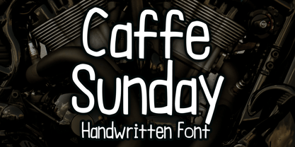 Caffe Sunday is a casual and playful blackletter font. You can use it for anything ranging from t-shirts, book designs, and greeting cards to stickers and posters, packaging designs, or anything that needs a casual touch, it will be your perfect font to pick. Fall in love with its incredibly versatile style, and use it to create lovely designs!
 - Kari Pro by Positype,
$45.00 I have always enjoyed this typeface and have had fond memories from the time I originally drew its predecessor, Kari. Now with almost 100 new ligatures, alternate and swash characters, Kari Pro has a great deal more personality and versatility. Subsets from the original Kari have been integrated into each unified weight adding both lining and hanging (oldstyle) numerals as options as well.
 - Bloody Nightmare by Mvmet,
$18.00 Bloody Nightmare is a fantastic ink drips font inspired by vintage horror movies, comics, and Metal music. It will be perfect for your horror and Halloween themed needs! You can use it for anything ranging from merchandise like t-shirts and clothing, for your scary book designs, Halloween party needs, greeting cards, stickers, posters, banners, or anything that needs a horror touch.
 - FF Ticket by FontFont,
$41.99 German type designer Daniel Fritz created this display FontFont in 2000. The family has 8 weights, ranging from Thin to Bold (including italics) and is ideally suited for advertising and packaging, editorial and publishing as well as poster and billboards. FF Ticket provides advanced typographical support with features such as ligatures, alternate characters, and case-sensitive forms. It comes with tabular lining figures.
 - Grinc Heart by Mvmet,
$25.00 Grinc Heart is a playful and perfect Christmas font. The font is awesome for creating cool designs that scream for attention. It’s ideal for anything ranging from t-shirts, book designs, poster, blog writing, greeting cards to stickers, or anything that needs a casual touch. Fall in love with its incredibly cool style, and use it to create lovely designs!
 - Saffron by Tall Chai,
$15.00 Saffron is a contemporary, luxurious sans-serif font family with weights ranging from Light (300) to Bold (700). Features: Available in 5 weights Over 320 glyphs supporting extended Latin Ideal for display texts: Titles, Logos and Headlines etc. Perfect for branding and rebranding Supports OpenTypes features like Ligatures and Stylistic Alternates Symbols for 10 major currencies including Bitcoin provided in all weights
 - Comic Bold Large by Mvmet,
$12.00 Comic Bold Large is a fun bold cartoon display font for your everything needs! You can use it for anything ranging from t-shirts and clothing, for your kids book designs, kids party needs, greeting cards, stickers, posters, banners, or anything that needs a bold and fun touch. Try it to create fabulous designs and feel the fun and cheering vibes with it!
 - Skinny Pencil by Mvmet,
$16.00 Skinny Pencil is a skinny handwritten font with pencil or chalk texture that you can use it for anything ranging from t-shirts, book designs, packaging, and greeting cards to stickers and posters, or anything that needs a casual touch, it will be your perfect font to pick. Fall in love with its incredibly versatile style, and use it to create lovely designs!
 - Snowy Days by Mvmet,
$10.00 Snowy Days is a cool and playful snow-themed display font. The font is awesome for creating cool designs that scream for attention. It’s ideal for anything ranging from t-shirts, book designs, restaurant menu, blog writing, greeting cards to stickers, or anything that needs a casual touch. Fall in love with its incredibly cool style, and use it to create lovely designs!
 - Cute Fire by Mvmet,
$15.00 Cute Fire is a cute display font with a fire decorative twist for your everything needs! You can use it for anything ranging from t-shirts and clothing, kid’s book designs, kid’s party needs, greeting cards, stickers, posters, banners, or anything that needs a decorative and fun touch. Try it to create fabulous designs and feel the fun and cheering vibes with it!
 - Hype Marker by Mvmet,
$14.00 Hype Marker is a cool marker hand lettered font. You can use it for anything ranging from t-shirts, book designs, and greeting cards to stickers and posters, packaging designs, or anything that needs a casual touch, it will be your perfect font to pick. Fall in love with its incredibly versatile style, and use it to create lovely designs!
 - Faithful Colony by Creativemedialab,
$20.00 Faithful Colony is a modern, elegant, classic typeface with a timeless look. It comes with seven weights ranging from thin to black, matching italics, and a variable format. Faithful Colony is perfect for fashion-related concepts, Luxury and Elegant design, Classy or high-end branding, logo, and many more. Try to combine the regular and italic styles for a modern and elegant look.
 - FF Beekman Square by FontFont,
$41.99 Dutch type designer Donald Beekman created this display FontFont in 1999. The family has 6 weights, ranging from Light to Bold (including italics) and is ideally suited for film and tv, music and nightlife as well as poster and billboards. FF Beekman Square provides advanced typographical support with features such as ligatures and case-sensitive forms. It comes with proportional lining figures.
 - Green Fairy by Maria Montes,
$39.00 Green Fairy is a chromatic font family highly ornamented for display purposes. Green Fairy’s characters have been specifically designed to accommodate its loops and ornaments following a modern typeface structure. Green Fairy has four chromatic weights: 1. Green Fairy Outline 2. Green Fairy Dots 3. Green Fairy Stencil 4. Green Fairy Full The outline weight has been created as the base or structure for the other weights. You can combine these weights as well as add colours to obtain multiple effects and type styles. Green Fairy has also three combined weights (combos) to simplify your work flow, for these occasions when you only want to use one single colour in your font: 5. Green Fairy Dots Combo 6. Green Fairy Stencil Combo 7. Green Fairy Full Combo GREEN FAIRY ORIGINS The origin of this typeface is the lettering I designed in October 2015 as part of my illustrated cocktail artwork called “Absinthe. La Fée Verte (The Green Fairy)”. Originally, this lettering only featured eight letters “AB·SINTHE” vector drawn in Illustrator. Right after creating the full-colour artwork, I designed a fountain-letterpress print version of it, in collaboration with Ladies of Letters, A.K.A. Carla Hackett and Amy Constable from Saint Gertrude Fine Printing. At the beginning of 2016 –and thanks to the project @36daysoftype– I found the motivation, and most importantly the deadline, to draw the rest of the twenty-six letters of the uppercase alphabet using Illustrator. I started 2017 having my first two calligraphy courses sold out, so I took this amazing opportunity to devote myself to Green Fairy for a few months. In February 2017, I purchased the font software Glyphs and I started to re-draw all twenty-six letters of the uppercase alphabet again. PRODUCTION PROCESS Green Fairy started being one weight, but quickly turned into a layered/chromatic font. Things were going more or less fine till I arrived to the Dots weight: 1) I started drawing squares following a grid; 2) Then, the squares turned into diamonds following the same grid; 3) Then, the grid wasn’t working so well on the round letters so I tried randomising the position of the diamonds but it didn’t work; 4) So I went back to the grid, and this time scaled down the size of the diamonds creating a visual half-tone effect. I spent over four weeks working on the Dots weight and I felt like I was in the middle of a very long tunnel and I couldn’t see the light at the end. I encountered many other problems along the way but by June 2017, I felt I was back on track again. I kept working, tweaking, re-drawing and re-adjusting, and then the diacritics came on board… And then more re-drawing, re-tweaking, re-adjusting and then numbers… And then spacing, symbols, and currencies… And then more spacing, kerning, contextual kerning for triplets… In September 2017 I told myself “that’s it, I’m going to finish it now!” But guess what? More re-tweaking, testing, hinting, testing, rendering, testing… For those of you not familiarized with typeface design, it is extremely time consuming and it requires a lot of hard work, focus and determination. This project could not have been possible without the help of these generous professionals: Jose Manuel Urós, typeface designer based in Barcelona and my teacher twice in the past; Jamie Clarke, freelance letterer and typeface designer who has released a couple of chromatic fonts recently; Troy Leinster, Australian full-time typeface designer living and working in New York City; Noe Blanco, full-time typeface designer and hinting specialist based in Catalonia; And Nicole Phillips, typographer currently relocating from Australia to New Zealand. To all of you: THANK YOU VERY MUCH!
 - PF Bodoni Script Pro by Parachute,
$79.00 Always intrigued by Bodoni's original work, I was set out—back in 2000—to examine his work and study Manuale Tipografico, one of the greatest specimen books ever printed. Issued in 1818 at Parma, Italy by Bodoni's widow, the two-volume work shows an impressive array of 142 roman alphabets and some foreign ones such as Greek and Cyrillic. After a careful examination of all characters, I decided to create a typeface based on the distinct script capitals presented in the book. Matching lowercase italics were later selected and designed to complete the series. Since my intention was not to create simply a digital version of Bodoni's work, this typeface was designed with connected characters and capitals with extra calligraphic elements. The result was released in 2002 and published in our award-winning catalog/book IDEA/Trendsetting Typography vol.1. Later in 2005 we revived a large number of ornaments and borders (credit goes to designer George Lygas). All this work was left behind till recently when it was revisited to create a complete 'Pro' family. Several new uppercase and lowercase glyphs were designed in order to create a distinct typeface, which is based on Bodoni but yet it stands out on its own. The new version also takes care of conflicts between neigbouring letters, something that was not included in the first version. Bodoni Script Pro is a 3-weight superfamily. It supports 10 special opentype features including 'contextual alternates' as well as support for both Latin and Greek. Each font comes with 725 glyphs including a large number of alternates as well as 144 ornaments. Furthermore, when you purchase the whole package you get a bonus font which contains 120 frame parts. These parts, when put together, create some truly amazing borders. -Panos Vassiliou
 - Corinthiago by 38-lineart,
$19.00 “Corinthiago” feels equally charming and elegant. This stunning handwritten font is a stylish homage to classic calligraphy. It features a varying baseline, smooth lines, gorgeous glyphs and stunning alternates Alternates to help enrich your designs: 1. Titling (titl) alternates, are accents for initial letters. is the first stroke that is long and and slightly curved according to the letters, both lowercase and uppercase. 2. Swash (swsh) alternates, is an accent at the end of a letter, is an additional stroke to end writing. 3. Stylistic alternate (Salt), is an alternative glyph to add style emphasis. 4. Stylistic set (SS), some additional glyphs for design alternatives. If you use a combination of two lowercase with a combination of tilt and swsh it will produce a harmonic letter that you can use for a logo, no problem also for a logo consisting of more than two letters, all you have to make sure is starts with a titl and ends with swsh. All glyph alternates (titl, swsh, Salt and SS) are also supported by multiple languages. Another OpenType that is also very important is Ligature (league), this font consists of 51 Ligatures including: Abe, Ade, Ale, Ab, Ad, Af, Aj, Ak, Al, Am, An, Ao, Ap, As, Ax, Ay, Az, aa, ar, be, cc, da, de, di, do, du, dy, ee, er, ii, ir, is, le, ll, lt, om, on, oo, op, or, ov, ow, ox, oy, oz, ss, st, th, tl, tt, ur and uu. We continue to see the possibility to update ligatures in the future. This font is the right choice for a modern design, can be applied to invitations, writing messages in the form of quotes, book and magazine covers, and of course for your brand logo text.
 - Tailwind by Grype,
$19.00 The world of aviation is filled with clean and iconic logotypes, yet some of the earlier logotypes were friendly and simple. The Tailwind family finds its origin of inspiration in an early Air Jamaica company logo, and from there is expanded into a small but comprehensive font family. Tailwind celebrates the typographic stylings of the 70’s, with the soft rounded terminals and open geometric feel, transcending its brand inspired origin to give birth to a family that feels both retro and modern. It inherited the friendly stylings of the mostly lowercase logo that inspired it, and goes on to include a full standard character set with expansive international support of latin based languages, small caps styles, and three weights jumping from light to regular to a heavyweight black. This family is ready to chart a course for your designs towards that of a modern, comfortable appeal. Here's what's included with the Tailwind Collection bundle: 382 glyphs per style - including Capitals, Lowercase, Numerals, Punctuation and an extensive character set that covers multilingual support of latin based languages. (see the 6th graphic for a preview of the characters included) 6 fonts in 3 weights: Light, Regular, Black . Small Caps versions available in all weights. Fonts are provided in TTF & OTF formats. The TTF format is the standard go to for most users, although the OTF and TTF function exactly the same. Here's why the Tailwind Collection is for you: You're in need of a soft rounded font with a variety of weights with small caps for your designs You're a retro airline junkie and have to have anything inspired by Air Jamaica You love VAG Rounded, but you really want something just a little different You really dig the Akademics & Bloomingdales logos, but would like a softer type in that genre You just like to collect quality fonts to add to your design arsenal
 - Crispy Thunder by Vishnu Sathyan,
$9.00 Introducing Crispy Thunder, a bold and electrifying font that will make your designs stand out with its unique and powerful look. Inspired by the raw energy and force of thunder, Crispy Thunder is a reimagining of this natural phenomenon with sharp, crisp lines that add a touch of modernity to the design. The result is a font that captures the essence of thunder with its strong, geometric shapes and a crisp design that gives it a cutting-edge feel. Every letter is crafted with care to reflect the power and intensity of a thunderstorm, making Crispy Thunder the perfect choice for designs that need a touch of drama and excitement. With its modern and futuristic look, Crispy Thunder is ideal for a range of applications, from branding and advertising to digital and print media. Its clean and minimalist design ensures that it is both easy to read and visually striking, making it a versatile font for any project. So whether you're looking to add a touch of thunderous energy to your next design project or simply want to make a bold statement, Crispy Thunder is the font for you. Download it now and experience the power of thunder in your designs.
 - Retro Checkbook JNL by Jeff Levine,
$29.00 By the 1990s, the availability of font creation software opened the door to an explosion of creativity, experimentation and exploration into the world of digital typography by amateur and professional alike. The undisputed king of the freeware fonts was Ray Larabie through his Larabie Fonts website. It seemed at the time that Ray’s output was endless, and he amassed dozens upon dozens of fonts that ranged from the ridiculous to the sublime. In fact, Ray was the driving force of encouragement and a behind-the-scenes “mentor” who helped Jeff Levine Fonts get underway in January of 2006. As Larabie’s focus changed to higher-quality commercial type design with the launch of Typodermic, Inc., many of his “less than perfect” font experiments were withdrawn and shelved. Ray eventually turned those lost (and sometimes questionable) typefaces into a bundled zip archive released into the public domain through Creative Commons. One particular design “Boron” (circa 1996) featured computer-oriented lettering as if etched onto a circuit board. Running with this idea, and with Ray's approval, the electronic elements were stripped away, the characters cleaned up and modified, and the font reworked in Retro Checkbook JNL, which is available in both regular and oblique versions.
 - Kyral by Twinletter,
$13.00 Introducing “KYRAL Font” – Capturing the Essence of a Blissful Summer. KYRAL Font brings the carefree spirit of summer to life in your design projects. With its delightful summer theme, this font is your perfect choice for infusing the season’s joy into your creative works. Whether you’re crafting beachside invitations, tropical posters, or sun-soaked social media graphics, KYRAL Font effortlessly embodies the very essence of summer, immediately captivating attention and infusing your designs with the warmth and happiness of the season. Artfully crafted with the lightheartedness of summer in mind, KYRAL Font radiates the energy and exuberance of this sun-drenched time, creating a vibrant and inviting atmosphere in your designs. Its adaptability knows no bounds, seamlessly fitting into a wide range of summer-inspired projects, from travel brochures to festival advertisements. KYRAL Font enhances readability and fluidity with user-friendly OpenType features, ensuring that your text flows seamlessly. It also offers support for multiple languages, making it accessible to a diverse global audience. Elevate your creative endeavors and let the joy of summer shine through with KYRAL Font. Discover this unique typeface today and infuse your designs with the delightful spirit of the season. – PUA Encoded Characters – Fully accessible without additional design software.
 - Univers Cyrillic by Linotype,
$55.00 The font family Univers is one of the greatest typographic achievements of the second half of the 20th century. The family has the advantage of having a variety of weights and styles, which, even when combined, give an impression of steadiness and homogeneity. The clear, objective forms of Univers make this a legible font suitable for almost any typographic need. In 1954 the French type foundry Deberny & Peignot wanted to add a linear sans serif type in several weights to the range of the Lumitype fonts. Adrian Frutiger, the foundry’s art director, suggested refraining from adapting an existing alphabet. He wanted to instead make a new font that would, above all, be suitable for the typesetting of longer texts — quite an exciting challenge for a sans-serif font at that time. Starting with his old sketches from his student days at the School for the Applied Arts in Zurich, he created the Univers type family. In 1957, the family was released by Deberny & Peignot, and afterwards, it was produced by Linotype. The Deberny & Peignot type library was acquired in 1972 by Haas, and the Haas’sche Schriftgiesserei (Haas Type Foundry) was folded into the D. Stempel AG/Linotype collection in 1985/1989.
 - Business Penmanship by Sudtipos,
$79.00 Business Penmanship is an ode to the business handwriting from the era penmanship was a highly-valued part of business education and practice. In the early 1800s, Platt Rogers Spencer (1800-1864) created what would become the most widely accepted and prized cursive writing method used in business. Before the American Civil War, Spencer was the undisputed king of handwriting. He was also an outspoken supporter of American business education. By the late 1800s business education included some focus on penmanship, and there were many colleges that specialized in it. One of the most influential penmanship schools was founded by Charles Paxton Zaner and his partner E. W. Bloser. Later on, in the early 1900s Austin Palmer introduced the Palmer Method of business penmanship, and it soon became the most popular handwriting system in the United States. Business Penmanship is a single feature-rich font that includes over 1100 characters, covering ligatures, alternates, a large set of beginning and ending extensions, as well as a wide range of Latin-based languages, including Turkish and the languages of Central and Eastern Europe and the Baltic region. To take advantage of all the OpenType features included in the font, please use within programs that support such advanced typography.
 - Wingko by Sabrcreative,
$17.00 Introducing Wingko font, a delightful and versatile display sans serif typeface that will elevate your designs with its clean and fun style. Whether you're working on quotes, headlines, crafts, or any creative project, Wingko is here to add a touch of charm and playfulness. With its simple and clean design, Wingko offers a contemporary aesthetic that is both eye-catching and readable. The combination of uppercase and lowercase letters provides creative flexibility, allowing you to experiment with different layouts and styles. The inclusion of numbers and punctuation ensures seamless integration with various design elements. One of the notable features of Wingko font is its multilingual support, making it accessible to a wide range of languages and global audiences. From English to French, German to Spanish, and beyond, your message can be beautifully communicated in different parts of the world. Wingko font is designed with attention to detail, ensuring legibility and visual appeal across different mediums. Whether you're designing digital content, print materials, logos, or social media graphics, this font will captivate your audience and leave a lasting impression. Embrace the versatility of Wingko font and let your creativity soar. Download this clean and fun display sans serif typeface today and infuse your designs with a touch of character and whimsy.
 - Kremlin II Pro by CheapProFonts,
$10.00 Most uppercase letters of these constructivist fonts are made to look like cyrillic letters, so by carefully interspersing those you can set your text and headlines with it and make it look Russian! To a native Russian this of course looks very silly indeed, so to make amends for toying with their letters I have also included a full proper and genuine cyrillic character set. So these are the first CheapProFonts fonts to support languages using the cyrillic script in addition to the usual 65 latin-based languages. Check out Kremlin Pro for a version with different designs for these glyphs: ¡ ¿ 0 3 6 9 K k M m N n R r V v X x ? ! ALL fonts from CheapProFonts have very extensive language support: They contain some unusual diacritic letters (some of which are contained in the Latin Extended-B Unicode block) supporting: Cornish, Filipino (Tagalog), Guarani, Luxembourgian, Malagasy, Romanian, Ulithian and Welsh. They also contain all glyphs in the Latin Extended-A Unicode block (which among others cover the Central European and Baltic areas) supporting: Afrikaans, Belarusian (Lacinka), Bosnian, Catalan, Chichewa, Croatian, Czech, Dutch, Esperanto, Greenlandic, Hungarian, Kashubian, Kurdish (Kurmanji), Latvian, Lithuanian, Maltese, Maori, Polish, Saami (Inari), Saami (North), Serbian (latin), Slovak(ian), Slovene, Sorbian (Lower), Sorbian (Upper), Turkish and Turkmen. And they of course contain all the usual "western" glyphs supporting: Albanian, Basque, Breton, Chamorro, Danish, Estonian, Faroese, Finnish, French, Frisian, Galican, German, Icelandic, Indonesian, Irish (Gaelic), Italian, Northern Sotho, Norwegian, Occitan, Portuguese, Rhaeto-Romance, Sami (Lule), Sami (South), Scots (Gaelic), Spanish, Swedish, Tswana, Walloon and Yapese.
 - Browood by Alit Design,
$15.00 Presenting the 🗯️💬The Browood Layered Comic Font💬🗯️ by alitdesign. The Browood Layered Comic Font is inspired by the style of letters in comics that have less serious and fun characters. The lettering of the Browood Layered Comic Font is a sans serif with display font characters which gives a fun and design impression for children. The Browood Layered Comic Font has 3 layered font. The Brootahh font is perfect for creating designs with non-serious concepts, designs for children, book headers, and of course for text on comics. The Browood Layered Comic Font also gets a bonus character of 230 Comic-themed illustrations that make creating designs even easier. Simply by downloading The Browood Layered Comic Font creating a Comic and non formal themed design is very quick and easy. The Browood Layered Comic Font is perfect for magazine cover designs, brochures, flyers. Instagram ads, Canva Design and so on with comic, non-serious, pop art, game mobile and fun design. Besides that this font is very easy to use both in design and non-design programs because everything changes and glyphs are supported by Unicode (PUA). The Browood Layered Comic Font contains 544 + 230 bonus glyphs with many unique and interesting alternative options. Language Support : Latin, Basic, Western European, Central European, South European,Vietnamese. In order to use the beautiful swashes, you need a program that supports OpenType features such as Adobe Illustrator CS, Adobe Photoshop CC, Adobe Indesign and Corel Draw. but if your software doesn't have Glyphs panel, you can install additional swashes font files.
 - Kremlin Pro by CheapProFonts,
$10.00 Most uppercase letters of these constructivist fonts are made to look like cyrillic letters, so by carefully interspersing those you can set your text and headlines with it and make it look Russian! To a native Russian this of course looks very silly indeed, so to make amends for toying with their letters I have also included a full proper and genuine cyrillic character set. So these are the first CheapProFonts fonts to support languages using the cyrillic script in addition to the usual 65 latin-based languages. Check out Kremlin II Pro for a version with different designs for these glyphs: ¡ ¿ 0 3 6 9 K k M m N n R r V v X x ? ! ALL fonts from CheapProFonts have very extensive language support: They contain some unusual diacritic letters (some of which are contained in the Latin Extended-B Unicode block) supporting: Cornish, Filipino (Tagalog), Guarani, Luxembourgian, Malagasy, Romanian, Ulithian and Welsh. They also contain all glyphs in the Latin Extended-A Unicode block (which among others cover the Central European and Baltic areas) supporting: Afrikaans, Belarusian (Lacinka), Bosnian, Catalan, Chichewa, Croatian, Czech, Dutch, Esperanto, Greenlandic, Hungarian, Kashubian, Kurdish (Kurmanji), Latvian, Lithuanian, Maltese, Maori, Polish, Saami (Inari), Saami (North), Serbian (latin), Slovak(ian), Slovene, Sorbian (Lower), Sorbian (Upper), Turkish and Turkmen. And they of course contain all the usual "western" glyphs supporting: Albanian, Basque, Breton, Chamorro, Danish, Estonian, Faroese, Finnish, French, Frisian, Galican, German, Icelandic, Indonesian, Irish (Gaelic), Italian, Northern Sotho, Norwegian, Occitan, Portuguese, Rhaeto-Romance, Sami (Lule), Sami (South), Scots (Gaelic), Spanish, Swedish, Tswana, Walloon and Yapese.
 - Mofid Mahdi by Linotype,
$187.99Mofid Mahdi is a distinctive, bold Arabic display face, suitable for heading and titling work in Arabic newspaper and magazine composition. In this typeface the rounded internal counters and dots contrast with the angular and more robust outlines of the letterforms to give a decorative, harlequin-like appearance. The design was originally developed for use in dry-transfer format, and was first produced as a digital font by Linotype-Hell Ltd. in the early 1980s. Initially a simplified face, with its inherent limited range of letterforms, Mofid Mahdi was enhanced during the late 1980s by the introduction of medial letterforms to improve character spacing and balance. The recent advent of OpenType has led to the release of Mofid Mahdi. This OpenType font includes Latin glyphs from Memphis Extra Bold, allowing users to set text in both most Western European and Arabic languages without switching between fonts. Mofid Mahdi incorporates the Basic Latin character set and the Arabic character set, which supports Arabic, Persian, and Urdu. The font also includes tabular and proportional Arabic, Persian, and Urdu numerals, as well as a set of tabular European (Latin) numerals. - Ulga Grid Rounded by ULGA Type,
$19.00 ULGA Grid Rounded is the smooth, rounded sibling of ULGA Grid and ULGA Grid Solid. The typeface consists of three weights, regular, medium and bold, with corresponding oblique styles. Every character in the extended ULGA Grid family shares the same width. ULGA Grid Rounded features a rounded square design, giving this typeface a soft, yet sturdy appearance. A contradictory mix of stiffness and suppleness, characters slide around like lead-filled snakes trying to find their way through a maze. If this typeface were a snack, it would be a smooth, chocolatey treat - too much of it and you’ll feel dizzy and a bit sick. But, hey, I’m not your dad, do what you want. Learn from your mistakes, that’s what I say. A versatile display typeface that can be used for a wide range of purposes including CD covers, posters, packaging, advertising, name badges for robots, brochures and film titles. Mix and match with ULGA Grid and ULGA Grid Solid, use the alternatives, sneak in an oblique style to spice things up, but most of all this is a fun typeface family. The character set supports Western Europe, Vietnamese, Central/Eastern Europe, Baltic, Turkish and Romanian.
 - Galeiya by Craft Supply Co,
$20.00 Introducing Galeiya – Cute Script Font Adorable Playfulness Step into the enchanting world of Galeiya – Cute Script Font, where adorable playfulness takes center stage. This font is the embodiment of girly charm and fun. Joyful Whimsy Galeiya’s joyful whimsy adds a delightful and whimsical touch to your projects, making it the perfect choice for a wide range of creative endeavors. Versatile Delight Beyond its cute appearance, this font is exceptionally versatile. It effortlessly adapts to various design contexts, from invitations to branding, infusing each project with a joyful spirit. Expressive Typography Galeiya is more than just cute; it’s incredibly expressive. Its lovely script style injects character and a sense of fun into your content, ensuring it leaves a memorable impression. In Conclusion In summary, Galeiya – Cute Script Font is the font that seamlessly combines girly charm with a sense of playfulness. Its versatility and expressive nature ensure your content is not only cute but also highly engaging. Whether it’s invitations, branding, or an array of creative projects, Galeiya brings a unique, expressive touch that appeals to a broad audience, leaving behind a lasting and delightful impression.
 - Fixture by Sudtipos,
$39.00 Fixture is our massive 72-font take on plentiful offerings of the late 19th century’s typefaces, posters and wood letterpress sundry done in the Grotesk genre. Four widths ranging from Ultra Compressed to Expanded each come in nine weights and accompanying italics. Some common sans-serif alternates, such as the a and g, are included in all the fonts. The idea with this design was to put together a workhorse font family with enough functional flexibility to work in multiple environments, from the subtlety of magazine layout or film credits to the visual drama of billboards or packaging. Aesthetically speaking, it is quite interesting — though in retrospect quite unintentional — that each different width and/or weight of this face ended up pulling a different dominant trait from the melting-pot origins of the entire family. It’s almost like a tribute album to some famous band’s covers of older songs. It may also be a good conversation piece on our tools shaping the very things for which they’re used. Can’t really get any more post-Grotesk than this. In the 21st century, this is the one genre to rule them all.
 - Antonietta by Latinotype,
$59.00 Antonietta is Mauricio Astete Brito's first typeface, which is inspired by the eccentricity of the rococo style and Queen Marie Antoinette's wild personality. This project, supervised by Latinotype Team, was born from the idea of turning lettering into a digital typeface. Antonietta is based on the Copperplate style and inspired by the works of, among others, Hermann Zapf, Ricardo Rousselot and Herb Lubalin. The font comes in the following variants: Antonietta Script, Antonietta Caps, Antonietta Caps Illuminated, Antonietta Caps Shadow, Antonietta Caps Inline and Antonietta Ornaments. Antonietta Script is characterised by a big x-height, condensed proportions, and short ascenders and descenders, which can be modified by using the contextual alternates included in the set. Antonietta Caps, a companion font to the Script, is an all-caps typeface with rational structure and high contrast between thin and thick strokes. Antonietta is a 7-weight typeface well-suited for logotypes, labelling, headlines and short text. The Script variant contains a set of 878 characters that provide a wide range of contextual alternates to fit any project. The typeface also comes with an 'Ornaments' variant, which includes dingbats, borders and catchwords that complement the rest of the fonts.
 - Lomesty by Sabrcreative,
$25.00 Introducing Lomesty, a captivating signature monoline font that exudes elegance and style. Designed with precision and attention to detail, Lomesty is the perfect choice for adding a touch of sophistication to your projects. Whether you're creating wedding invitations, branding materials, or personal stationery, this font will leave a lasting impression. With its seamless integration of uppercase and lowercase letters, Lomesty offers versatility and flexibility in your designs. Its extensive range of numbers and punctuations ensures consistency and harmony throughout your typography. Lomesty goes beyond language barriers with its multilingual support, allowing you to express yourself in various languages and cater to a diverse audience. From English to Spanish, French to German, Lomesty has got you covered. Unlock the full potential of Lomesty with its PUA encoding, which provides easy access to alternate glyphs and ligatures. This feature enhances the flow and uniqueness of your designs, making them truly stand out. Experience the beauty and finesse of Lomesty, where every stroke embodies elegance. Let this signature monoline font elevate your projects and bring them to life. Whether it's a logo, a website, or an art print, Lomesty will leave a lasting impression.
 - Schnebel Sans Pro by URW Type Foundry,
$35.99 It took me 12 years to bring this extensive font family to completion. A lot has been changed, transformed, peeled and developed in all those years. For many of my projects I used it as my quarry and so it might have become something like a synthesis of all my imaginations and experiences. To me »Schnebel Sans« represents the optimal design of a contemporary grotesque that perfectly unites dynamics with statics. For copy text the typefaces are very legible, neutrally and remain in the background, but despite this generate the necessary tension when set as headlines. »Schnebel Sans« is available in 48 different styles. It is available as a Pro Font, containing West, East Greek, and Cyrillic or as the Schnebel Sans ME, also containing Arabic and Hebrew. The scripts include small caps and various figure sets. This big range of styles from Thin to Black and from Compressed to Expanded offer many possibilities for design and fulfill all requirements for a professional use. Because of the supplement of several non-Latin character sets, the »Schnebel Sans« is perfectly suitable for global services too. Volker Schnebel, 2016
 - Fakir Pro by Underware,
$50.00 Fakir | A Hindu ascetic or religious mendicant, especially one who performs feats of magic or endurance. The well known feats performed by them include sitting steadily on a bed of nails and walking on burning coals. Blackletter | A script used throughout Western Europe from approximately 1150 to 1500. It continued to be used for the German language until the 20th century. Fakir, a blackletter with a holy kiss is a contemporary interpretation of gone letterforms with origin in blackletters. More precisely, we based the construction on broadnip textura, with lots of broken, edgy, interrupted strokes – try to sit on a nail bed and you’ll know why fakirs like to read just these kind of fonts! After being abandoned for some time (not accepted, nearly forbidden), we would like to give our generation a blackletter from here and now. So Fakir is not a revival, but an all new 21st-century blackletter. Fakir is a set of edgy text and display fonts, ranging from tight and heavy to light and wide. It has 11 fonts, all supporting Underware Latin Plus character set, that covers 219 languages.
 - Mandilla by Create Big Supply,
$15.00 Introducing Mandilla, a captivating bold calligraphy font that showcases natural brush strokes and exudes elegance in every character. With its distinctive style and versatility, Mandilla is the perfect choice for a wide range of design projects, from logos and labels to magazines, books, packaging, and more. The bold and dynamic nature of Mandilla makes it ideal for creating impactful and eye-catching designs. Its smooth and fluid brush strokes lend a sense of authenticity and craftsmanship to your typography, adding a touch of sophistication to your visual compositions. Mandilla features a harmonious combination of uppercase and lowercase letters, offering flexibility and creativity in your design work. The font also includes numbers and punctuation, ensuring seamless integration of numerical and textual elements in your projects. With multilingual support, Mandilla allows you to communicate your message effectively in various languages, making it accessible to a global audience. The font incorporates ligatures and alternate characters, enabling you to add subtle variations and artistic flourishes to your text. Mandilla is designed with PUA (Private Use Area) Encoding, granting you easy access to special characters and alternate glyphs. This feature enhances your design process, empowering you to create unique and visually captivating compositions.
 - Goldney by Set Sail Studios,
$16.00 There are a lot of script fonts out there - but Goldney isn't your average one, it's designed to be your go-to modern handwriting font. Goldney produces incredibly realistic letterforms and free-flowing sentences - this was achieved by writing out hundreds of individual words, then hand-picking the most natural looking letters. Also hand-picked was a whopping 90 Ligatures - these unique letter combinations give even more authenticity to each word layout. It's the perfect choice for genuine handwritten logos & branding, advertisement text, quotes, headers and product packaging. Goldney consists of 4 fonts files; Goldney • A handwritten script font containing upper & lowercase characters, numerals, and a large range of punctuation. Goldney Alt • This is a second version of Goldney, with a completely new set of both upper and lowercase characters. If you wanted to avoid letters looking the same each time to recreate a custom-made style, or try a different word shape, simply switch to this font for an additional layout option. Slanted Versions • Are included for both regular and alternate fonts. These can be used for a more italicised, fast-hand flow to your text.
 - Ekamai by Eclectotype,
$40.00 This is Ekamai, named after the district of Bangkok I lived in. It is based on Quinella, and was supposed to be a quick and easy reworking of that font into a "tight-not-touching" (rather than overlapping) version. As is often the case with quick and easy things, it turned out to be neither, and the vast majority of glyphs needed to be completely overhauled to fit the new system. This face is deliciously plump face, with lovingly rendered curves and just the right amount of cuteness; perfect for food packaging (of the sweeter variety probably!), logos, magazine headlines and the like. It performs admirably in all caps settings. The numerals are expressive hybrid figures (somewhere between lining and oldstyle). The overall feel is friendly and soft, without being overtly saccharine. Ekamai is equipped with subtle contextual alternates (which I'd recommend leaving on) to help with the tight fit, a handful of discretionary ligatures if that's your thing, and a case feature for all caps settings. The stylistic alternates and stylistic set 1 features simply change the # glyph to an attractive numero. Automatic fractions are included along with wide-ranging language support.
 - VVDS Big Tickle by Vintage Voyage Design Supply,
$15.00 To the sound of smooth jazz 50's and incendiary Rock'n'Roll dance of 60's Im glad to Introduce you the new product in my Vintage Voyage — The Big Tickle Font Family! Absolute useful collection! Firstly is playful serif. The range of weights can be used to maintain an even colour across different sizes. Use it normally or all caps and play with baseline, give more bounce to composition. Or try to use Caps alternates and get really bouncing letters. Alternates has every uppercase letter. Also, for more variety I add a few versions for decoration: Inner hatched and Offset with Shadow. Okay, folks! The second one is Script. I really love them, they look like was signed with true brush. It can be perfectly used both independently and in tandem with the serifs. And the last one is Retro Graphic! Authentic collection of typical design elements of 50's and 60's style of Poster, Books or Ads. You can create awesome retro patterns or use them individually. 124 graphic elements total. A-Z; a-z; 0-9. Multilingual. Grab this stuff and have a good time with Mid Century Modern Adventure!
 - Boring Sans by Zetafonts,
$39.00 Boring Sans, designed by Cosimo Lorenzo Pancini, is a typeface family designed along two variable axis: weight and weirdness. These two parameters allow designers to explore a full range of variations on sans serif design, starting from a neutral set of proportions and evolving to a strongly contrasted and dynamic treatment, ready to raise eyebrows on social media. The basic "A" subfamily, developed in in five weights plus italics, behaves like a traditional, solid workhorse sans serif, with finely tuned proportions for optimal readability and minimal emotional impact. The "B" subfamily, developed in the same ten weights, shows a more contemporary "brutal" approach, with slanted lines, deep inktraps and stronger contrast. All these features are brought to the extreme in the ten weights of the "C" subfamily, with each letter a bombastic show of exhuberant weirdness. Each of the style variant is developed in five weight with matching italics, with a glyph set covering extended latin languages and including many alternate forms and stylistc sets. For control freaks the family package includes two variable font versions that allow fine tuning and control of the design options.
 - Schnebel Sans ME by URW Type Foundry,
$35.99 It took me 12 years to bring this extensive font family to completion. A lot has been changed, transformed, peeled and developed in all those years. For many of my projects I used it as my quarry and so it might have become something like a synthesis of all my imaginations and experiences. To me »Schnebel Sans« represents the optimal design of a contemporary grotesque that perfectly unites dynamics with statics. For copy text the typefaces are very legible, neutrally and remain in the background, but despite this generate the necessary tension when set as headlines. »Schnebel Sans« is available in 48 different styles. It is available as a Pro Font, containing West, East Greek, and Cyrillic or as the Schnebel Sans ME, also containing Arabic and Hebrew. The scripts include small caps and various figure sets.This big range of styles from Thin to Black and from Compressed to Expanded offer many possibilities for design and fulfill all requirements for a professional use. Because of the supplement of several non-Latin character sets, the »Schnebel Sans« is perfectly suitable for global services too. Volker Schnebel, 2016