10,000 search results
(0.053 seconds)
- Literal by Kosinsky,
$25.00 Literal is a classic sans serif typeface with closed shapes. Simple and elegant at the same time, it is perfect for a wide range of uses, where you need both large and small text, be it a print product, website design, logo design and much more. The font supports Extended Latin and Extended Cyrillic. Created in 2019. Type designer Igor Kosinsky.
 - Plop by Gleb Guralnyk,
$14.00 Presenting a decorative liquid font Plop. It's a splashing funny typeface perfect for authentique lettering composition. To use a bigger splash letter just type a capital letter. Same way the last letter in word will be automatically replaced to correct glyph using OpenType features. Both sides splashes are available for all letters including multilingual characters. Thank you and have a nice day!
 - Renathalia Signature by Letterena Studios,
$9.00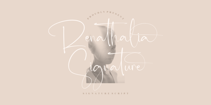 Renathalia Signature is a beautiful signature script font suitable for any projects such as logos, branding projects, homeware designs, product packaging, mugs, quotes, posters, shopping bags, t-shirts, book covers, name cards, invitation cards, and greeting cards. It’s also a perfect fit for labels, photography, watermark, special events, and all your other lovely projects that need a beautiful script taste.
 - Impact by URW Type Foundry,
$35.99 Impact As its name suggests, Impact, a bold sans serif, is designed to make an impression on the reader. Obviously a display font, Impact makes use of its thick strokes and blocked style, to catch and hold the eye. Because Impact is so striking, it is best placed in plenty of white space so that it does not overwhelm any accompanying text.
 - Mooners by Burntilldead,
$14.00 Make your design as a time machine with "Mooners" typeface. Inspired by the decorative victorian advertising poster, Mooners came to make make your document, poster, logo, etc... perfectly have a vintage victorian vibes. It's a solid combination that can bring your design, logo, document, website, etc. back to 1800 decade. Multilingual fonts-family and playful one with 165 alternate characters.
 - Orange Avenue by Krismagraph,
$15.00 Orange Avenue is an Elegant Ligature Serif Font. Its soft curves mixed with high contrast glyphs, give it a feminine and masculine quality. Come with two versions, namely Regular & Outline. It comes with epic ligatures and alternates. Great in layout design for quotes or body copy, best used as a display for headings, logos, branding, magazines, product packaging, and invitations.
 - Lily Hilo NF by Nick's Fonts,
$10.00This sometimes-top-heavy, sometime-bottom-heavy, sometimes-centered typecase is based on an old Photolettering face designed by the irrepressible Dave West, originally called "Nickelodeon". That name was already taken, so I chose another with a nod to the 1953 film starring Leslie Caron. Both versions of this font include the complete Unicode Latin 1252 and Central European 1250 character sets. - Eckhardt Showcard JNL by Jeff Levine,
$29.00Eckhardt Showcard JNL and Eckhardt Showcard Two JNL are drawn from more lettering found in an old sign painting book. Jeff Levine has continued naming a series of fonts for the late Albert Eckhardt, Jr. (1929-2005) who had owned Allied Signs in Miami, Florida from 1959 until his passing. Al was a talented lettering artist and a good friend to Jeff. - Crane Titling NF by Nick's Fonts,
$10.00This multipurpose display alphabet combines medieval-inspired uppercase letters drawn by famed book illustrator Walter Crane with charming, if somewhat quirky, lowercase letters by J. W. Weekes. The net effect is a typeface which can add style and warmth to any project. Both versions of this font include the complete Unicode 1252 Latin and Unicode 1250 Central European character sets. - Marins Perdus by Biroakakarati,
$9.00 This font is inspired by graffiti calligraphy, it's only block letters in a modern style and more readable. The name "Marins Perdus" is from a novel by Jean-Claude Izzo "Les Marins Perdus", set in Marseille. The letters of "Marins Perdus" have a light inclination to the left, slim letters in a cool style, perfect for a title or a street event.
 - Bergell by ITC,
$29.00Inspired by the work of famed Swiss artist Alberto Giacometti, the German designer Thomas Finke created Bergell, a lively and natural script face. Bergell's calligraphic style is both dynamic and elegant, like the kind of special, festive handwriting many desire, but few ever manage to achieve. Why spend so much time at your drawing table when there are great fonts like this one? - Preston Signature by Cititype,
$17.00 Prestons signature is made with a medium-sized marker pen with a casual groove. Feel the sensation of natural handwriting. This font is a great choice for digital signatures, brand names, logos, banners, headlines, wedding invitations, business cards, book titles, movies, podcast texts and craft work. we complement with alternate and ligature to strengthen the natural impression on your design
 - Quride by Arendxstudio,
$18.00 Introducing my new font - Quride Quride is a modern Serif with a very unique alternate and ligature Quride came with opentype features such stylistic alternates, stylistic sets & ligatures good for logotype, poster, badge, book cover, tshirt design, packaging and any more. Features : -Uppercase & Lowercase -Multilingual support -Number, -Symbol -Punctuation. -Support in Mac and Windows OS -Support in design application (photoshop, illustrator, and more) .
 - Castaway by Studio K,
$45.00 Fun, footloose and fancy free, Castaway is a font family that knows no boundaries: equally at home in Naples and Nairobi, Rimini and Rio, Tijuana and Timbuktu. It was inspired by those ‘far away places with strange sounding names’, and will bring a touch of the exotic to tourist and travel promotions, and a breath of fresh air to any graphics project.
 - Display Uncanny by Gerald Gallo,
$20.00 Display Uncanny is a display font not intended for text use. It was designed specifically for display, headline, logotype, branding, and similar applications. The same A to Z characters are located under the shift+character set and character set keys with the ones under the character set keys reduced in size. There are numbers and punctuation located under their respective keys.
 - Monem by Wiescher Design,
$39.50 Monem is the word for the smallest significance-carrying part of a language. I thought that was a good name for a clean, straightforward Sans typeface. Monem is very sturdy and usable for lots of occasions. I am using this font myself for those of my clients that want to convey a clean unobtrusive image. Your very restrained Gert Wiescher
 - Prismatic Interlaces by MMC-TypEngine,
$93.00 PRISMATIC INTERLACES TYPEFACE! Prismatic Interlaces is a decorative system and ‘Assembling Game’, itself. Settled in squared pieces modules or tiles, embedded by unprecedented Intertwined Prismatic Structures Design, or intricate interlaced bars that may seem quite “impossible” to shape. Although it originated from the ‘Penrose Square’, it may not look totally as an Impossible Figures Type of Optical Illusions. More an “improbable” Effect in its intertwined Design, that even static can seem like a source of Kinetical Sculptures, or drive eyes into a kind of hypnosis. Prismatic Interlaces has two related families, both as a kind of lighter weight versions Prismatic Spirals Default & Pro. While Default is simpler or easier to use, same way as Prismatic Interlaces, Pro provides a more complex intricate Design that requires typing alternating caps. Instructions: Use the Map Font Reference PDF as a guide to learn the 'tiles' position on the keyboard, then easily type and compose puzzle designs with this font! All alphanumeric keys are intuitive or easy to induce, you may easily memorize it all! Plus, often also need to consult it! *Find the Prismatic Interlaces Font Map Reference Interactive PDF Here! (!) Is recommended to Print it to have the Reference in handy or just open the PDF while composing a design with this typeface to also copy and paste, when consulting is required or when it may be difficult to access, depending on the keyboard script or language. As a Tiles Type-System, the line gap space value is 0, this means that tiles line gaps are invisibly grouted, so the user can compose designs, row by row, descending to each following row by clicking Enter, same as line break, while advances on assembling characters. Background History: The first sketches of my Prismatic Knots or Spirals Designs dates back then from 2010, while started developing hand-drawn Celtic Knots and Geometric Drawings in grid paper, while engage to Typography, Sacred Geometry and the “Impossible Figures” genre… I started doing modulation tests from 2013, until around 2018, I got to unravel it in square modules or tiles from the grid, then idealized it as fonts, along with other Type projects. This took 13 years to come out since the first sketches and 6 months in edition. During the production process some additional tiles or missing pieces were thought of and added to the basic set, which firstly had only the borders, corners, crossings, nets, Trivets connectors or T parts and ends, then added with nets and borders integrations. Usage Suggestions: This type-system enables the user to ornate and generate endless decorative patterns, borders, labyrinthine designs, Mosaics, motifs, etc. It can seem just like a puzzle, but a much greater tool instead for higher purposes as to compose Enigmas and use seriously. As like also to write Real Text by assembling the key characters or pieces, this way you can literarily reproduce any Pixel Design or font to its Prismatic Spirals correspondent form, as Kufic Arabic script and further languages and compose messages easily… This Typeface was made to be contemplated, applied, and manufactured on Infinite Decorative Designs as Pavements, Tapestry, Frames, Prints, Fabrics, Bookplates, Coloring Books, Cards, covers or architectonic frontispieces, storefronts, and Jewelry, for example. Usage Tips: Notice that the line-height must be fixed to 100% or 1,0. In some cases, as on Microsoft Word for example, the line-height default is set to 1,15. So you’ll need to change to 1,0 plus remove space after paragraph, in the same dropdown menu on Paragraph section. Considering Word files too, since the text used for mapping the Designs, won't make any literal orthographical sense, the user must select to ignore the Spellcheck underlined in red, by clicking over each misspelled error or in revision, so it can be better appreciated. Also unfolding environments as Adobe Software’s, the Designer will use the character menu to set body size and line gap to same value, as a calculator to fit a layout for example of 1,000 pts high with 9 tiles high, both body size and line gap will be 111.1111 pts. Further Tips: Whenever an architect picks this decorative system to design pavements floor or walls, a printed instruction version of the layout using the ‘map’ font may be helpful and required to the masons that will lay the tiles, to place the pieces and its directions in the right way. Regarding to export PNGs images in Software’s for layered Typesetting as Adobe Illustrator a final procedure may be required, once the designs are done and can be backup it, expanding and applying merge filter, will remove a few possible line glitches and be perfected. Technical Specifications: With 8 styles and 4 subfamilies with 2 complementary weights each (Regular and Bold) therefore, Original Contour, Filled, Decor, with reticle’s decorations and 2 Map fonts with key captions. *All fonts match perfectly when central pasted for layered typesetting. All fonts have 106 glyphs, in which 49 are different keys repeated twice in both caps and shift, plus few more that were repeated for facilitating. It was settled this way in order for exchanging with Prismatic Spirals Pro font which has 96 different keys or 2 versions of each. Concerning tiles manufacturing and Printed Products as stickers or Stencils, any of its repeated pieces was measured and just rotated in different directions in each key, so when sided by other pieces in any direction will fit perfectly without mispatching errors. Copyright Disclaimer: The Font Software’s are protected by Copyright and its licenses grant the user the right to design, apply contours, plus print and manufacture in flat 2D planes only. In case of the advent of the same structures and set of pieces built in 3D Solid form, Font licenses will not be valid or authorized for casting it. © 2023 André T. A. Corrêa “Dr. Andréground” & MMC-TypEngine.
 - Architectural Lettering by Outside the Line,
$19.00 This font is for architects everywhere. This all cap font was created for use with CAD programs. It gives the handlettered look of old to computer generated blueprints. Architectural Lettering Bold is the heavier weight for Architectural Lettering. This additional weight makes a best selling font even more versatile. It has all the international currency symbols. Architectural Lettering Regular was redesigned in 2006 to include the same. It can be found in the book “Indie Fonts 3, a Compendium of Digital Type from Independent Foundries”.
 - Chelsie Hilton by PeachCreme,
$19.00 We're excited to present to you our new font, "Chelsie Hilton"! A great thing about this font is that it is both chic and legible at the same time. You can confidently use it on such machines as Cricut since its edges are smooth enough and this font will fit just right. When creating this signature font, we took care to make it as crisp and modern as possible. "Chelsie Hilton" is perfect for logos, wedding designs, quotes, cards, stationery, signature, display text, and many more.
 - Pilot Point NF by Nick's Fonts,
$10.00One in the series of fonts called Whiz-Bang Wood Type, intended to be set large and tight. Pilot Point is based on an older font found in Dan X. Solo’s book on Circus Type; the designation fits perfectly. The font gets its name from a small town in Northeast Texas, where several scenes from Arthur Penn’s Bonnie and Clyde were filmed. Both versions of this font contain the Unicode 1252 Latin and Unicode 1250 Central European character sets, with localization for Romanian and Moldovan. - Almanor Peninsula by Subqi Studio,
$15.00 Introducing our new font, Almanor Peninsula . Not too shabby a name, right? A display logotype script, not too bold and not too thin either. This font has been created for your sporty display projects, whatever they may be. This font contains the basic script ligature 'tt' with some necessary alternates here and there. Plus some swash for the cherry on top. This font is PUA encoded already, so you can access all the glyphs with the basic character map apps. So have fun with this one !
 - Kinuhi by Twinletter,
$15.00 Introduce a display font named Kinuhi. What can you do with a font like this? With a simple line of code and some creativity, you can make it the centerpiece of your next snowboarding gear or create a cool logo for your design agency. Or, maybe use it to quickly make a fun Halloween party invitation. The possibilities are endless. Of course with this font your various design projects will be perfect and amazing, get a beautiful title and start using our font for your special project.
 - Bullish by Gerald Gallo,
$20.00 Bullish is a clean, contemporary, geometric font family. There are 12 fonts in the Bullish family, Light, Medium and Bold. Each with a lower case, small caps, lower case oblique and small caps oblique. The small caps versions have small caps in place of the lower case alphabets. The lower case and small caps versions have the same uppercase alphabet, numbers, punctuation, symbols and miscellaneous characters. The Bullish fonts are ideal for headlines, titles, branding, small blocks of text or wherever a fresh font is desirable.
 - Roca by My Creative Land,
$29.00 Initially started as an extension to Praline MCL, Roca transformed into a new font family - influenced by the same fonts as Praline - Windsor and Cooper Black - the hits of 60s and 70s – with a hint of Bookman. Created in 2 styles and 6 weights that can be mixed and match, it contains 24 fonts including alternates and true italics . It is full of OpenType features – stylistic alternates and ligatures. This multilingual font family supports most of the European languages as well as Cyrillic ones (Russian and Ukrainian).
 - Stonechips by FadeLine Studio,
$10.00 Stonechips is a new Display Font with a bold and unique style. This font is carefully made to maintain the balance of each letter, so that creating a bold and strong style in this font. And very easy and convenient to use! With a style like this, this font will be suitable in use for logo's, branding projects, homeware designs, product packaging, mugs, quotes, posters, shopping bags, logo's, t-shirts, book covers, name card, invitation cards, greeting cards, and all your other lovely projects.
 - Bollolo by YuliusParyadi,
$11.00 Bollolo (Handwritten) is a fun and playful font. Bollolo name is made from bolo-bolo which is mean lets be friend. This font is readable, catchy, and easy to use. This font is suitable for quotes, logo designs, kids toys, story book, and many other design projects. Bollolo is includes: - full set uppercase and lowercase letter; - numerals; - multilingual support; - large number of punctuations; - ligatures. Please add this font as your favorite, hit like button, or follow me. I'll very happy for that and appreciated it.
 - Heartfilia by RagamKata,
$14.00 Heartfilia, this font is as elegant as its name. It’s unique look makes it incredibly authentic serif font. The font gives off an elegant and classic feel, while still appearing modern and in line with the current design trends. Orchestra is a well- suited font for a high-end design, makes it more eye-catching. Orchestra will make your designs, such as invitations, posters, product package design, and many more, looks more exclusive and luxurious. Enhance your design by the elegant yet classic appearance of Orchestra.
 - Smudger by ITC,
$39.00 Smudger, from designer Andrew Smith, is oriented toward a young generation who does not want to mind the rules. The font invites unconventional and playful use. The figures seem to be almost coincidentally shaped. Letters alternate between thin and thick strokes alternate and give the font the smudged look that inspired its name and gives the font its unmistakable character. Smudger is a font that just cannot settle down. It is best used for headlines and short texts in point sizes of 12 or larger.
 - Hollgati by Grontype,
$4.00 Hollgati is a bold sans serif font with moderate and elegance lines, It is based on the combining a variety of styles available in both an elegant regular weight as well as outlined weight.The font is simply work with bold scary touch which is great for halloween titles. Holgati font is Suitable for Logo, greeting cards, quotes, posters, branding, name card, stationary, design title, blog header, art quote, typography. Please contact us if you have any questions. Enjoy the font and thanks for supporting us. Regards, Grontype.
 - Peanut Jam by PizzaDude.dk,
$18.00 Peanuts are a good source of healthful fats, protein and fiber - and besides that, I looove peanuts! Every once in a while, I have to name a font peanut-something. But I only do that with fonts that have that organic and handmade look and feeling ... and in this case, this font looked perfect to have the honour! :) Peanut Jam is super handmade and has 4 different versions of each lowercase letter and besides that, the font has multilingual support! Go get that peanut butter feeling! :)
 - Walk Da Walk Two - Personal use only

- Walk Da Walk Three - Personal use only

- Tevegraphy - Personal use only

- Arachnids - Personal use only

- Walk Da Walk One - Personal use only

- Sharpe Variable by Mans Greback,
$19.00 Sharpe Variable is a stylish serif typeface family. The original type was drawn between 2018 and 2019, and the variable font and its updated styles was created in 2020. It is clear, sharp and has brave, lively letter forms but with a conservative backbone. This font is provided as a Variable Font. It is only one font file, but this file contains multiple styles. Use the sliders in Illustrator, Photoshop or InDesign to manually set any weight and width. This gives you not only the 15 predefined styles, but instead more than half a million steps to customize the type to the exact look your project requires. Each style contains ligatures and support for a wide range of languages. More info about Variable Fonts: https://mansgreback.com/s/About_Variable_Fonts.pdf
 - Bazinga Comic by Ferry Ardana Putra,
$10.00 Bazinga! is a fabulous new layered comic book style font that is inspired by Sheldon favorite jokes word - Bazinga! You can combined this font with any layered style which included in this font family. This font is Perfect for adding a comical feel to your designs, whether it is comical quotes, label, logotype poster and many more! Bazinga! features: A full set of uppercase characters Numbers & punctuation Multilingual language support PUA Encoded Characters 275 Total glyphs Layered Style If you have any queries, questions or issues please don't hesitate to contact us directly, Note: In order to use this font, you need a program that supports OpenType features such as Adobe Illustrator CS, Adobe Photoshop CC, Adobe Indesign and Corel Draw. For more information about accessing alternative, you can see this link: http://adobe.ly/1m1fn4Y
 - Franklin Gothic by Linotype,
$45.99Franklin Gothic was designed by Morris Fuller Benton for the American Type Founders Company in 1903-1912. Early types without serifs were known by the misnomer "gothic" in America ("grotesque" in Britain and "grotesk" in Germany). There were already many gothics in America in the early 1900s, but Benton was probably influenced by the popular German grotesks: Basic Commercial and Reform from D. Stempel AG. Franklin Gothic may have been named for Benjamin Franklin, though the design has no historical relationship to that famous early American printer and statesman. Benton was a prolific designer, and he designed several other sans serif fonts, including Alternate Gothic, Lightline Gothic and News Gothic. Recognizable aspects of Franklin Gothic include the two-story a and g, subtle stroke contrast, and the thinning of round strokes as they merge into stems. The type appears dark and monotone overall, giving it a robustly modern look. Franklin Gothic is still one of the most widely used sans serifs; it's a suitable choice for newspapers, advertising and posters. - Ever West by Andrew Tomson,
$10.00 Meet the new font family! This font came to my mind while I was sitting in line at the dentist. There are often different magazines at the front desk to read and pass the time while waiting. One of those magazines turned out to be about fashion. When I opened it on a random page, I saw beautiful pictures. But you know what the first thing that catches my eye? The font! The font in which the headline or quote is written. After you read it, you look at everything else. And I wondered what my font would be in this case. I present to you my version of a font for fashion lettering. Good luck and love to you, friends!
 - Octin Sports Free - 100% free


