10,000 search results
(0.037 seconds)
- Magical Brush by Hanoded,
$15.00 Personally I think a brush font should have the word ‘Brush’ in its name. It’s not that easy finding a name - you need some magic to come up with a good one! Magical Brush is a completely handmade font. I used a small brush (a number 3 to be precise) and Chinese Ink. I wanted just a little ‘erosion’, so I used copier paper rather than my expensive French water color paper (which is quite rough). Magical Brush comes in the normal variant and a chickenpox one. Use it for your posters, your book covers and your Christmas invitations!
 - Suco De Laranja by Hanoded,
$20.00 I like orange juice. Come on, who doesn't? Orange juice is the drink of heroes; it's the elixir of life; it's the gods' own ambrosia. Suco De Laranja means orange juice in Portuguese and I named this font thus, just because I love the stuff! Suco De Laranja is a very narrow, very gentle typeface with a rough edge. It comes in a variety of languages and guess what? I have added Cyrillic as well. Just to be complete. So there you have it: a font named after a juice. Take a sip and enjoy! На здоровье!
 - Denala by Attype Studio,
$16.00 Denala is a delicate signature font with ending swash. Fall in love with its incredibly versatile style and use it to create spectacular designs! Denala is perfect for branding, logo, invitation, stationery, social media post, product packaging, merchandise, blog design, game titles, cute style design, Book/Cover Title and more. What's Included : - Ending Swash - Ligatures - Multilingual Support - Made it into separated file to make it easier to use by beginner & separated file user can use the font with software which doesn't accept open type features.
 - Recumba by Pixesia Studio,
$23.00 Introducing Recumba - Modern Display Font Recumba is modern display font with bold characters. Recumba is perfectly suited for branding projects, headlines, poster, movie titles, games, logos, social media posts, advertisements, product packaging, labels, photography, watermarks, stationery, and any creative project seeking a touch of modern bold elegance. FEATURES - Stylistic Alternates - Ligatures - PUA Encoded - All Caps - Numbering and Punctuations - Multilingual Support - Works on PC or Mac - Simple Installation - Support Adobe Illustrator, Adobe Photoshop, Adobe InDesign, also works on Microsoft Word Hope you Like it. Thanks.
 - Diana Crush by Attype Studio,
$14.00 Diana Crush is a delicate lovely font with 2 stylistic set. Fall in love with its incredibly versatile style and use it to create spectacular designs! Diana Crush is perfect for branding, logo, invitation, stationery, social media post, product packaging, merchandise, blog design, game titles, cute style design, Book/Cover Title and more. What's Included : - Multilingual Support - Made it into separated file to make it easier to use by beginner & separated file user can use the font with software which doesn't accept open type features.
 - Burgery by Arterfak Project,
$18.00 Say hello, to Burgery! A playful display font. Inspired by kids' games and snacks typography. Burgery designed in monoline concept and adjusted well to keep the legibility. Burgery is a flexible typeface that you can use for many kinds of stuff and themes. Burgery is an all-caps font, equipped with stylistic alternates, ligatures, Burgery is perfect for kids' merchandise, quotes, t-shirts, posters, social media, pillow, packaging, storybook, food menu, cafe decoration, logos, and much more! Mix and play your words with Burgery!
 - Spooky Hill by Attype Studio,
$10.00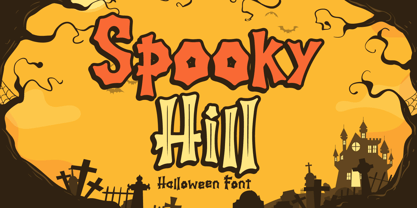 Hello! Spooky Hill is an incredibly unique and playful display font. Fall in love with its authentic feel and use it to create spectacular Halloween designs! Spooky Hill is perfect for branding, logo, invitation, stationery, social media post, product packaging, merchandise, blog design, game titles, cute style design, Book/Cover Title and more. What's Included : - Spooky Hill.otf - Spooky Hill Inline.otf - Multilingual Support (Afrikaans, Albanian, Catalan, Danish, Dutch, English, Estonian, Finnish, French, German, Icelandic, Italian, Norwegian, Portugese, Spanisch, Swedish, Zulu) --- Hope you enjoy with our font! Attype Studio
 - Balsoon by Attype Studio,
$12.00 Introducing Balsoon - Inspired by urban typeface with texture style, Balsoon has strong character perfect for urban street design. Balsoon is perfect for branding, logo, invitation, stationery, product packaging, merchandise, monogram, blog design, game titles, cute style design, Book/Cover Title and more. Features : - Ending swash - Ligatures - Multilingual Support - Made it into separated file to make it easier to use by beginner & separated file user can use the font with software which doesn't accept open type features. Hope you enjoy with our font! Attype Studio
 - Mouser by Sharkshock,
$100.00 Mouser has been an ongoing project that originated as a geometric sans of the same name before morphing into a similar, but entirely different family called TypoGraphica. It retains much of its earlier character such as limited contrast, high legibility, and tight spacing. Major changes were made for a simplistic, more cohesive look. This was done to maximize its usefulness for body text while keeping characteristics used for display purposes. Slices to top strokes are much more subtle with styling dialed down to a minimum. This family comes in 6 different versions to meet a variety of needs. Mouser is equipped with Basic and Extended Latin/diacritics, Cyrillic, kerning, ligatures, and fractions. Try it for website text, applications, or headlines.
 - Monkton Aged by Club Type,
$36.99 This antique-aged version of Monkton can be used to imitate old letterpress printed documents such as old English text. The rough edges resemble ink spread on paper to give an old look. The inspiration for this typeface family came from my childhood experiences at Monkton, amidst an historic part of the South West of England. Studies of the original incised capitals of the Trajan column in Rome were analysed and polished for this modern version. The lower case letterforms and numerals were then created in sympathy, taking their proportions from the incised letters of local gravestones. Its name honours not only the area where the original alphabet was conceived and drawn, but also the people responsible for fostering my initial interest in letters.
 - Simpliciter Sans by Cercurius,
$19.95 Simpliciter Sans is a typeface based on the lettering used in the 20th century on technical drawings, either written by free hand or using templates. The lettering was made with a round pen, therefore all lines got rounded ends. All lines had the same thickness in uppercase, lowercase and small caps. The upright style was used on construction drawings and the italic style on machine drawings. The backslant style was used on maps for names of water bodies — seas, lakes, rivers etc. — and for water depth. Simpliciter Sans is primarily intended for texts on drawings, diagrams, charts and maps, but it can also be used for signs and labels. It also works surprisingly well as a body type in smaller sizes.
 - Picture Yourself by Linotype,
$29.99Create your own world with the Picture Yourself collection! Picture Yourself is a graphic image collection, which functions a font family instead of hundreds of EPS files. The family is made up of 24 different symbol typefaces. Designed by the collaborative effort of Karin and Peter Huschka, both living in Germany, Picture Yourself was a winner in the 2003 International Type Design Contest, sponsored by Linotype GmbH. The symbol library found in Picture Yourself offers an astounding array of high-contrast, simple forms, which may be used happily either separately or together in your layouts. Just as the fonts themselves stem from two designers working in collaboration, the imagery of the collection itself stems from two different influences. In large part, the font family was inspired by work displayed in the Frankfurt-based German Architecture Museum's 2003 Oscar Niemeyer exhibition. The photographs and sketches that were displays there inspired the first ideas for the Picture Yourself world of images. More of the typeface's design, as well as its name, were inspired by the underlying philosophy of the Beatles' music, especially the classic song from Lennon and McCartney, "Lucy In The Sky With Diamonds." In comparison with other large pictographic type collections, all of the characters in Picture Yourself fonts share the same horizon. The glyphs themselves are also drawn so that many of them can be combined with one another, creating tall or wide decorative compositions. Additionally, the proportions of the forms of the pictographs are aligned with various industry standards, in order to harmonize workflow. Picture Yourself Portraits (3:4), Landscapes (6:4), Cinema (9:4), and Panorama (12:4) each adhere to one of several photo or video formats. The Picture Yourself family of fonts can best be used with graphics applications like Adobe Photoshop or Illustrator, where different characters may be assigned to different layers, each with their own color. - ZT Floogn by Khaiuns,
$14.00 The new ZT Floogn font family, designed by Khaiuns and published by Zelowtype, is a modern, dense sans-serif style with a rounded look. This font is characterized by its balanced proportions, uniform stroke width, and subtle variations in type forms, giving it a distinctive look at all weights. Due to the narrow shape of the ZT Floogn typeface, it is best applied to headlines and poster-sized typography, resulting in designs with a fresh, friendly personality. ZT Floogn has 8 weights, one of them is commercial-free, and each style has a unique alternative font. I hope you have fun using ZT Floogn. Thanks for using this font ~ Zelowtype X Khaiuns
 - Ye Paradigma by Yinon Ezra,
$30.00 Sans-serif, with clean and fresh Character. "Ye Paradigma" has been established in order to keep its forms as simple as possible - without losing the unique character of each letter, and without simplifying too much. The process was gradual, like the ripening of a sauce that leaves it to be reduced to strengthen flavors, so the letters ripened while reducing unnecessary details, until the taste became more concentrated and uniform. The result is a clean, fresh, remarkably useful 24 fonts typeface, with a clear and stable graphic language.
 - Nuber Next by The Northern Block,
$39.95 Nuber Next is a modern geometric sans influenced by the popular neo-grotesques of the 1950s including Helvetica and Univers. Carefully remastered from the original Nuber type family to improve letter shape, overall uniformity and introduce a flexible width system capable of handling a wider variety of typographic applications. Details include 750 characters per font, nine weights and five widths with matching italics. Opentype features include seven variations of numerals, fractions, case-sensitive forms, stylistic alternates, ligatures, extended monetary symbols and language support covering Cyrillic, Western, South and Central Europe.
 - Valenzka by UICreative,
$23.00 Introducing our new product the name Valenzka Vintage Serif Fon. Modern Serif font that feels beautiful classy, elegant, and modern. This font is perfectly suited for a wide variety of projects, such as signature, stationery, logo, wedding, typography quotes, magazine or book covers, website headers, clothing, branding, packaging design, and more. Also for fashion-related branding or editorial design and displays both masculine and feminine qualities.
 - Areplos by Storm Type Foundry,
$53.00To design a text typeface "at the top with, at the bottom without" serifs was an idea which crossed my mind at the end of the sixties. I started from the fact that what one reads in the Latin alphabet is mainly the upper half of the letters, where good distinguishableness of the individual signs, and therefore, also good legibility, is aided by serifs. The first tests of the design, by which I checked up whether the basic principle could be used also for the then current technology of setting - for double-sign matrices -, were carried out in 1970. During the first half of the seventies I created first the basic design, then also the slanted Roman and the medium types. These drawings were not very successful. My greatest concern during this initial phase was the upper case A. I had to design it in such a way that the basic principle should be adhered to and the new alphabet, at the same time, should not look too complicated. The necessary prerequisite for a design of a new alphabet for double-sign matrices, i.e. to draw each letter of all the three fonts to the same width, did not agree with this typeface. What came to the greatest harm were the two styles used for emphasis: the italics even more than the medium type. That is why I fundamentally remodelled the basic design in 1980. In the course of this work I tried to forget about the previous technological limitations and to respect only the requirements then placed on typefaces intended for photosetting. As a matter of fact, this was not very difficult; this typeface was from the very beginning conceived in such a way as to have a large x-height of lower-case letters and upper serifs that could be joined without any problems in condensed setting. I gave much more thought to the proportional relations of the individual letters, the continuity of their outer and inner silhouettes, than to the requirements of their production. The greatest number of problems arose in the colour balancing of the individual signs, as it was necessary to achieve that the upper half of each letter should have a visual counterbalance in its lower, simpler half. Specifically, this meant to find the correct shape and degree of thickening of the lower parts of the letters. These had to counterbalance the upper parts of the letters emphasized by serifs, yet they should not look too romantic or decorative, for otherwise the typeface might lose its sober character. Also the shape, length and thickness of the upper serifs had to be resolved differently than in the previous design. In the seventies and at the beginning of the eighties a typeface conceived in this way, let alone one intended for setting of common texts in magazines and books, was to all intents and purposes an experiment with an uncertain end. At this time, before typographic postmodernism, it was not the custom to abandon in such typefaces the clear-cut formal categories, let alone to attempt to combine the serif and sans serif principles in a single design. I had already designed the basic, starting, alphabets of lower case and upper case letters with the intention to derive further styles from them, differing in colour and proportions. These fonts were not to serve merely for emphasis in the context of the basic design, but were to function, especially the bold versions, also as independent display alphabets. At this stage of my work it was, for a change, the upper case L that presented the greatest problem. Its lower left part had to counterbalance the symmetrical two-sided serif in the upper half of the letter. The ITC Company submitted this design to text tests, which, in their view, were successful. The director of this company Aaron Burns then invited me to add further styles, in order to create an entire, extensive typeface family. At that time, without the possibility to use a computer and given my other considerable workload, this was a task I could not manage. I tried to come back to this, by then already very large project, several times, but every time some other, at the moment very urgent, work diverted me from it. At the beginning of the nineties several alphabets appeared which were based on the same principle. It seemed to me that to continue working on my semi-finished designs was pointless. They were, therefore, abandoned until the spring of 2005, when František Štorm digitalized the basic design. František gave the typeface the working title Areplos and this name stuck. Then he made me add small capitals and the entire bold type, inducing me at the same time to consider what to do with the italics in order that they might be at least a little italic in character, and not merely slanted Roman alphabets, as was my original intention. In the course of the subsequent summer holidays, when the weather was bad, we met in his little cottage in South Bohemia, between two ponds, and resuscitated this more than twenty-five-years-old typeface. It was like this: We were drinking good tea, František worked on the computer, added accents and some remaining signs, inclined and interpolated, while I was looking over his shoulder. There is hardly any typeface that originated in a more harmonious setting. Solpera, summer 2005 I first encountered this typeface at the exhibition of Contemporary Czech Type Design in 1982. It was there, in the Portheim Summer Palace in Prague, that I, at the age of sixteen, decided to become a typographer. Having no knowledge about the technologies, the rules of construction of an alphabet or about cultural connections, I perceived Jan Solpera's typeface as the acme of excellence. Now, many years after, replete with experience of revitalization of typefaces of both living and deceased Czech type designers, I am able to compare their differing approaches. Jan Solpera put up a fight against the digital technology and exerted creative pressure to counteract my rather loose approach. Jan prepared dozens of fresh pencil drawings on thin sketching paper in which he elaborated in detail all the style-creating elements of the alphabet. I can say with full responsibility that I have never worked on anything as meticulous as the design of the Areplos typeface. I did not invent this name; it is the name of Jan Solpera's miniature publishing house, in which he issued for example an enchanting series of memoirs of a certain shopkeeper of Jindrichuv Hradec. The idea that the publishing house and the typeface might have the same name crossed my mind instinctively as a symbol of the original designation of Areplos - to serve for text setting. What you can see here originated in Trebon and in a cottage outside the village of Domanín - I even wanted to rename my firm to The Trebon Type Foundry. When mists enfold the pond and gloom pervades one's soul, the so-called typographic weather sets in - the time to sit, peer at the monitor and click the mouse, as also our students who were present would attest. Areplos is reminiscent of the essential inspirational period of a whole generation of Czech type designers - of the seventies and eighties, which were, however, at the same time the incubation period of my generation. I believe that this typeface will be received favourably, for it represents the better aspect of the eighties. Today, at the time when the infection by ITC typefaces has not been quite cured yet, it does absolutely no harm to remind ourselves of the high quality and timeless typefaces designed then in this country.In technical terms, this family consists of two times four OpenType designs, with five types of figures, ligatures and small capitals as well as an extensive assortment of both eastern and western diacritics. I can see as a basic text typeface of smaller periodicals and informative job-prints, a typeface usable for posters and programmes of various events, but also for corporate identity. Štorm, summer 2005 - Newbeats by Kustomtype,
$25.00 The "Newbeats" typeface came about after watching the film A Hard Day's Night starring the Beatles, hence the name "Newbeats". The font was on the poster of the film and based on these letters I designed a full alphabet, complete with ligatures. The font has been fully digitized and fine-tuned to make it possible to use in all software applications and graphics programs. Whomever sees the font for the first time would think this is a totally new font; it has a modern look despite the mid-60s feel that I have tried to preserve. This characterful and playful typeface can be used for all kinds of graphic applications, both for vintage style design and in modern designs. The "Newbeats" font is a real hit! For those who want to come up with a surprising style, look and feel, this is highly recommended. Logos, posters, advertisements, branding, magazines, t-shirts and other hip designs will look much more attractive! A must for those who want to give their designs a big twist. Play and win with Newbeats and you will be amazed by the result. What are you waiting for?
 - Garrigos by Underground,
$- Set of ornaments based on the decorative motifs used by the first typographic workshop in Buenos Aires: “Imprenta de Niños Expósitos”, between 1780 and 1824. This set is the product of an extensive historical research that aims to identify the type that came from Europe to the City during colonial times, and during the first years of Argentina’s independence. This group has a lot of diversity, which fluctuates between organic baroque forms and geometric neoclassical. Its characters can be used in editorial design along with Roman typefaces, they work individually or grouped to form different figures, guards or frames. It was baptized in honor to the first printer who worked in the workshop: the Spanish Agustín Garrigós.
 - Gondolieri by Greater Albion Typefounders,
$16.50 The design of Gondolieri has its origins in an experiment to combine aspects of Didone and Tuscan typefaces. The result has a continental 'Italianate' feel. If you wonder what lies behind the name, just look at the lower case 'f'...definite overtones of a Venetian Gondola here, and throughout the design. Gondolieri is offered in regular and bold weights, as well as a simplified form for smaller text use. All of these are available in three widths. The Gondolieri family has a lovely Didone, 'Belle Epoch' feel for use in design, posters, book covers and so forth. An extensive range of Opentype features, including ligatures and terminal forms is included in the regular and bold faces.
 - Ageer by Twinletter,
$14.00 Introducing Agerr, our newest font. Ageer is a cheerful, soothing typeface with a delightful theme. Because of its relaxed attitude, you may use this font in a variety of projects to increase the quality of your design appearance, making it more beautiful and elegant. This font is perfect for games, sporting events, branding, banners, posters, movie titles, book titles, quotes, logotypes, and more. of course, your various design projects will be perfect and extraordinary if you use this font because this font is equipped with a complimentary font family, both for titles and subtitles and sentence text, start using our fonts for your amazing projects.
 - Arkham77 by Jvne77 Studio,
$20.00 Inspired by the works of Howard Philips Lovecraft (1890-1936), and the city of Arkham lying abroad the Miskatonic River... witth all those witchcrafts secrecy and the infamous Necronomicon. The Elder Ones and the mighty Cthulhu, who lies and not dies within the dephts of the ocean in R'lyeh he's awaiting... arf, anyway this font will well set for posters, detective stories or horror books, pulps and others... *Full western latin language with most diacritics and numbers* Included in this set: - ARKHAM77 Black (More formal display) 560 glyphes - ARKHAM77 Elegante (for a creepiest rendition) 590 glyphes - ARKHAM77 Titles (as its name do not tells, for credits, or simple text) 560 glyphes - ARKHAM77 Extras (Embellish your work with this cool collection of frames and ornaments) +100 glyphes
 - VerzierteSchwabacher - 100% free

- Square Spray by Blankids,
$22.00 Introducing of our new product the name is Square Spray Graffiti Font, Square Spray inspired by graffiti style with a fun theme very good for graffity poster, Hip Hop music, kids poster, flyer, childrenbook, cartoon, comic etc
 - Bomber Throw by Blankids,
$21.00 Introducing of our new product the name is Bomber Throw Graffiti Font, Bomber Throw inspired by graffiti style with a fun theme very good for graffity poster, Hip Hop music, kids poster, flyer, childrenbook, cartoon, comic etc
 - Street Lord by Blankids,
$23.00 Introducing of our new product the name is Street Lord Graffiti Font, Street Lord inspired by graffiti style with a fun theme very good for graffity poster, Hip Hop music, kids poster, flyer, childrenbook, cartoon, comic etc
 - Heywood by Elemeno,
$25.00Named for Algonquin Round Table wit Heywood Broun, Heywood is bold, but playful. The simplicity of the letters combined with the shifting baseline make this the least formal and most fun of The Algonquin Collection of fonts. - Bay Area Nouveau JNL by Jeff Levine,
$29.00 Bay Area Nouveau JNL is an ultra bold, Art Nouveau headline font inspired by hand lettering on the cover of a piece of 1911 sheet music entitled "The Only Pal I Ever Had Came from 'Frisco Town'".
 - Nirwana by Arendxstudio,
$14.00 Introducing Nirwana, a Brush font script that is very suitable and captivating, with a very detailed hand touch so that the characters are the same and that Nirwana will be very suitable for your project design needs.
 - Arrany by Arkrist Letter,
$14.00 Arrany is a unique, sweet, and cute display font. It is very suitable for logo designs, product tags, product names, celebration events, etc. Get inspired by its playful touch and create the most attractive and joyful projects!
 - Hijrnotes by Mans Greback,
$59.00 Hijrnotes is a quick, handwritten and monolined script font. Big uppercase with a very small lowercase, but it is still elegantly readable. Very good for autography design, name cards, neon signs and quote typography posters and flyers.
 - Eastlake by Solotype,
$19.95Eastlake was a popular furniture style of the period when the MacKellar, Smiths & Jordan foundry brought out this font. As with many types, we find it difficult to see the connection between the name and the face. - Steiner - Unknown license

- Mingler by Chank,
$99.00 The Mingler fonts have a great big smile and a crisp clear voice. They were originally created as a branding font for a restaurant chain to use in coupons, print ads and tv commercials. More recently this font is picking up popularity as a multi-purpose headline font for screens. It looks good on the web, in games and on-screen apps. Inspired by the subtle bends and flow of hand-painted signage, each stroke bends a bit in the middle and flairs out a bit on the ends. And look at that "e" —it is smiling!
 - Yamatha by Attype Studio,
$13.00 Yamatha is a script font with swash style perfect for wedding designs. Combine it with Yamatha beginning & ending swash to make your letter more beautiful! Yamatha perfect for wedding promotion, branding, logo, invitation, stationery, social media post, product packaging, merchandise, blog design, game titles, cute style design, Book/Cover Title and more. What's Included : - Yamatha Family Font - Ligatures - Multilingual Support - Made it into separated file to make it easier to use by beginner & separated file user can use the font with software which doesn't accept open type features. --- Hope you enjoy with our font! Attype Studio
 - Alunta by Attype Studio,
$13.00 Alunta is a layered script font with versatile style and use it to create spectacular designs Combine it with Alunta - Extrude & Ending Swash to make an amazing 3D effect on your letter! Alunta perfect for wedding promotion, branding, logo, invitation, stationery, social media post, product packaging, merchandise, blog design, game titles, cute style design, Book/Cover Title and more. What's Included : - Alunta Family Font - Multilingual Support - Made it into separated file to make it easier to use by beginner & separated file user can use the font with software which doesn't accept open type features. --- Hope you enjoy with our font! Attype Studio
 - Slimedunk by Mozatype,
$11.00 SLIMEDUNK is a sans serif display font, which contains 4 styles and It features a unique and modern sans serif. This font would be perfect for E-sport Logo, film posters, games, sports, and any project. It’s also perfect for that delicate look that you want in your invitations, poster Use this font for any crafting project that requires a personalized look! What’s Included : - Works on PC & Mac - Easy to use ( Installations ) - Compatibility Windows, Apple, Linux, Cricut, Silhouette, and Other cutting machines Thank you for purchasing this font. Please appreciate, if you like this. ENJOY it :)
 - Cutey Patchy by Attype Studio,
$12.00 Cutey Patchy is a layered display font inspired by tailor patching & sewing cloth! Combine it with Cutey Patchy - Extrude & display style to make an amazing 3D effect on your letter! Cutey Patchy perfect for display promotion, branding, logo, invitation, stationery, social media post, product packaging, merchandise, blog design, game titles, cute style design, Book/Cover Title and more. What's Included : - Cutey Patchy Family Font - Multilingual Support - Made it into separated file to make it easier to use by beginner & separated file user can use the font with software which doesn't accept open type features. --- Hope you enjoy with our font! Attype Studio
 - Beast Maker by Remedy667,
$18.00 Unleash the beast with Beast Maker, the ultimate gritty horror font from Remedy667. Inspired by 1970s Giallo films and perfect for creating a powerful and sinister vibe, Beast Maker is an essential tool for any horror designer. Beast Maker is perfect for spooky posters and flyers, horror-themed video games and movies, or any project that needs an eerie touch. Beast Maker - because fear is always in fashion. Doubles Elimination for letters and numbers gives you a more natural look. All caps font design. Includes a Remedy667 Font Catalog PDF, all your favorite fonts in one handy catalog. Unleash the Beast Maker!
 - Temporarium - 100% free


