10,000 search results
(0.036 seconds)
- Irrlicht by Aarhaus,
$30.00 Irrlicht is based on C. H. Kleukens’ 1923 typeface Judith Type . Whilst Dunkle Irrlicht is a fairly faithful rendition and extension of Kleukens’ typeface, the Licht style was initially added as a stand-alone stencil version; yet, the two styles work perfectly together – for different nuances, for emphasis or simply stacked/layered. Irrlicht is equipped with upper- and lowercase ligatures, contextual and stylistic alternates, fractions, superior and inferior figures, extended language support and a few extra goodies. Additional information – How Irrlicht came to life Christian Heinrich Kleukens cut his Judith Type in 1923, at the peak of German expressionism, exclusively for publications with the Ernst-Ludwig-Press, such as a limited series of biblical prints – the first being the Book of Judith , hence the original’s name. I stumbled upon this typeface a couple of years ago in a nice little 1930 booklet of the Gutenberg-Gesellschaft and was struck by its forceful darkness on paper and its seemingly simple, crude letterforms. The lack of a long-ſ in the final version of Judith Type – quite unusual for a German typeface of that time – adds to this feel of crudeness and spontaneity*. Judith Type seemed to me like a semi-blackletter cousin of Rudolf Koch’s typeface Neuland (cast in the same year). Besides its apparent affinity with expressionism, it reflects a lot of that deeply spiritual craftsmanship of the era – much like Neuland. A few months later, when I was working on a stencil project and looking for a typeface that could be cut into thin wooden plates easily, I remembered those dark, sharp letters that seemed to be lacking any curves at all. After enlarging a few letters and tracing them by hand, the whole set was redrawn digitally, using only straight lines. As for spacing, the goal was to keep the letters tight but to avoid touching characters – without ironing out all the original’s tension and rhythm. Deliberate kerning, subtle contextual alternates and ligatures help to deal with critical glyph combinations. Two additional versions were developed: a stencil version with open counters and, in reference to a popular style of the 1920s and inspired by dry, cracked wood, an inline version. These two additional styles were later merged into one font – Lichte** Irrlicht was born. — AARHAUS * Consequently, the original typeface’s German eszett is simply a ligature of the “round s” and standard z . In some of his publications, Kleukens dispenses with using eszett altogether and sets double s instead. Irrlicht , however, does feature a more common eszett (ß); the original, among other more faithful letter forms, can be accessed via the stylistic sets feature ** licht – literally bright – being the German term for inline typefaces – not to be confused with leicht ( light )
 - Tact Slab New by Pesic,
$29.00 Tact Slab New is geometrically a slab serif font, with 3 weights, condensed looks glyphs, with an alternative glyph set to improve its use in different graphic contexts. Tact Slab New is compatible with the sans serif font Tact New. It is suitable for use in the fields of science, art, architecture, urban planning, techniques, electronics, advertising, posters, corporate designs, futuristic themes, sport, film, computers, phones, video games, publishing... Contains all the Latin and Cyrillic glyphs.
 - Bone Master by Attype Studio,
$7.00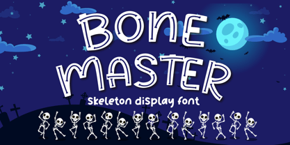 Bone Master is a Halloween display font with bone display on the glyph, perfect for any halloween events and promotions. Bone master is perfect for branding, logo, invitation, stationery, social media post, product packaging, merchandise, blog design, game titles, cute style design, Book/Cover Titles and more. Includes Multilingual Support for Afrikaans, Albanian, Catalan, Danish, Dutch, English, Estonian, Finnish, French, German, Icelandic, Italian, Norwegian, Portugese, Spanisch, Swedish, Zulu. Hope you enjoy with our font! Attype Studio
 - Sun Pride by Attype Studio,
$13.00 Sun Pride is script font with beginning and ending swash of sun flower and is suitable for any summer event. Sun Pride is perfect for branding, logo, invitation, stationery, social media post, product packaging, merchandise, blog design, game titles, cute style design, Book/Cover Title and more. Includes Multilingual Support for Afrikaans, Albanian, Catalan, Danish, Dutch, English, Estonian, Finnish, French, German, Icelandic, Italian, Norwegian, Portuguese, Spanish, Swedish, Zulu. Hope you enjoy with our font! Attype Studio
 - Fido Pro by Canada Type,
$29.95Fido Pro is the official font of dog owners everywhere. Woof! When the original Fido font was published in 2009, it became an instant hit with cartoon channels, comic book artists, toy makers, cereal packagers and game developers. Now, more than a decade later, we decided to pick it up and give it the Pro treatment. This new version boasts more than 800 glyphs, including 117 interlocking ligatures, plenty of alternate glyphs, and and Pan-European language support. - Boxtoon by Mofr24,
$15.00 Introducing Boxtoon, a lively comic font with a bold, modern-retro twist. Bursting with fun, it seamlessly blends the nostalgia of classic cartoons with a contemporary edge. Boasting 16 versatile styles, this multilingual marvel supports Cyrillic characters. Perfect for dynamic displays, comics, posters, book covers, and playful designs like t-shirts, games, and digital crafts. Embrace the whimsical charm that Boxtoon brings to kid's books and beyond—an all-in-one font for your creative adventures! **Uppercase
 - TOMO Pillo by TOMO Fonts,
$15.00 TOMO Pillo! a blocky style fat face with attitude. Bold, heavy and fun! all at the same time! You will only need this font to make your designs stand out fresh!
 - Plenti by MADType,
$19.00 Plenti is the fat font to add to your visual communication toolbox. Friendly, square, and quirky all at the same time. It is itching to get used on posters and websites.
 - Greatest Hits JNL by Jeff Levine,
$29.00Greatest Hits JNL is Jeff Levine's serif version of his 50s style font, Doowop JNL... complete with the same fun look and "good-time-rock-and-roll" feeling as the original! - Relocation by Gassstype,
$25.00 Introducing of our new product the name is Relocation is Rough Brush horror font Bold handmade with ligature and Multilanguage support. Best for halloween poster, horror poster, childrenbook, cartoon, comic etc
 - TRGrunge by Ingrimayne Type,
$9.00 As its name suggests, TRGrunge is a rough, grungy font that is surprisingly readable. Derived in 1997 from a 1989 sans-serif face, it was expanded with additional characters in 2021.
 - JoyRider by The Northern Block,
$12.80 JoyRider is an 8-font family consisting of 4 weights with italics. Its bold appearance is strongly influenced by motor racing and the fast car modification culture, hence the name JoyRider.
 - Goodbye Crewel World NF by Nick's Fonts,
$10.00Quite simply, a classic country sampler alphabet with a sorry-I-couldn't-help-myself name. Both versions of the font include 1252 Latin, 1250 CE (with localization for Romanian and Moldovan). - Ding by RodrigoTypo,
$25.00 An entertaining typography, dense but at the same time very gestural. "Ding" is a sans font that contains different alternatives of letters, a Cyrillic alphabet and Dingbat, special for children's titles.
 - Eccentric Wood Type JNL by Jeff Levine,
$29.00 An online display of pages from a book on wood type fonts provided an example of a bold, eccentric slab serif design with unusual curves and letter shapes. This font’s eccentricities became the basis for its name, Eccentric Wood Type JNL – which is available in both regular and oblique versions.
 - Hatchery JNL by Jeff Levine,
$29.00 A photo from Gene Gable (a regular contributor of ideas to Jeff Levine Fonts) shows the vintage signage for the Lasher Hatchery in a slightly different take on the classic Art Deco solid letter style. Since good ideas, like eggs can be hatched, thus the font's name of Hatchery JNL.
 - Schotis Text by Huy!Fonts,
$35.00 Schotis Text is a workhorse typeface designed for perfect reading on running texts. Its design is based in Scotch Roman 19th-century style but designed from scratch, with a more contemporary and not nostalgic look. It has seven weights plus matching italics, with 1100 glyphs per font, with a very extended character set for Latin based languages as well as Vietnamese, and shows all its potential with OpenType-savvy applications. Every font includes small caps, ligatures, old-style, lining, proportional and tabular figures, superscript, subscript, numerators, denominators, and fractions. The Scotch Romans were one of the most used letters during the 19th and early 20th century, but they don’t have their own place in the main typographical classifications. They appeared at the beginning of the 19th century with Pica No. 2 in the catalog of William Miller (1813) and assumed the British route towards high contrast and vertical axis modern Romans. In fact, they were called just Modern. In opposition to the continental route of Fournier, Didot, and Bodoni, the English way opted for a wider, more legible letter also resistant to bad printing conditions. The name Schotis comes from the misspelling of Scottish that gave the name to a popular dance in Madrid in the 19th-century. It first was called Schotis and today is knows as Chotis.
 - FS Hackney by Fontsmith,
$80.00 Elliptical The squareness of curves. That was the elliptical – in more than one sense – notion being explored in the making of FS Hackney. The squareness of curves and vertical terminals to create a gentle, soft sans serif, with a little bit of magic. A momentary thought – “It doesn’t have to be like this” – provided the spur to explore the verticals and skeletons of letterforms beyond conventional type design limits. A 12-month gestation period gave rise to a font with a larger-than-usual character set, including non-lining figures, small caps and superior and inferior numbers. It’s a collection that speaks confidently for itself. Assertive It was the Hackney carriage – the black London cab – that gave this font its name, not the north London neighbourhood. Solid, dependable, effective and built to last, FS Hackney was honed to perform in all conditions. Cool, compelling lines and a satisfying overall simplicity lend FS Hackney its assertive air. Assured, versatile and effective; just like a black cab (but without the grumbling). Machined Over a string of meetings, Jason Smith and FS Hackney designer Nick Job worked out how to infuse Nick’s sketched letterforms with Fontsmith’s familiar geniality. “Nick is very meticulous and produces very clean design work,” says Jason. “Hackney is ideal for branding as it’s very clear and its quirks are sensible ones, not odd ones, that don’t distract from the message.”
 - Mathias by Bisou,
$15.00 Except doodling on your notebook, what a better occupation would you have while the teacher tries to explain physics on the blackboard ? Create an awesome font ? Mathias is a font created in class by a lazy designer named Mathias. The result is one of the most complete font made by Bisou. Mathias font is retro. It will catch the attention of the reader in a blink of an eye. Exclusively recommended for titles, this bold font will suite perfectly your company name on a big truck, your old school car spare parts sign, the logo for a brand of cigarettes, alcoholics or shoe polish.
 - Anfalas - 100% free

- ITC Eastwood by ITC,
$29.99 ITC Eastwood is the work of British designer Martin Archer and is named for Clint Eastwood. Archer was looking for a plain oldstyle typeface with open lower case forms and used Stempel Garamond as his starting point, although the result ended up well beyond its origins. In small point sizes the typeface looks interestingly rough while at display sizes it looks like a 16th century French typeface and its unique details come forward.
 - North End Stencil JNL by Jeff Levine,
$29.00 An image of a vintage British lettering stencil set [probably circa 1960s] spotted in an online auction inspired North End Stencil JNL. The original lettering was a hybrid of both stencil and solid letter forms, but for the digital version all of the characters were given the stencil treatment. North End Stencil JNL is named after a district in London, and the type face is available in both regular and oblique versions.
 - Michaels - Unknown license

- Ad Lib by SoftMaker,
$15.99 Ad Lib was created by Freeman Craw for ATF in 1961. Sporting irregular character shapes, this informal typeface makes a good impression when a 1960s look is desired in advertising and display work.
 - Birch by ParaType,
$25.00 Designed at ParaType (ParaGraph) in 1995 by Tagir Safayev. Based on informal pen handwriting. For use in advertising and display typography. A set of Western characters was added in 2011 by Gennady Fridman.
 - Lisboa Hebrew by Vanarchiv,
$52.00 Lisboa Hebrew is humanist sans-serif typeface base on the same design as the original Lisboa (2005). The main structure is more close to the Sephardic proportions, where the letterforms contains reverse contrast and the terminals following the same calligraphic approach (Humanist). There are some characters and figures designed as small caps which have the same proportions from Hebrew. Latin transliteration characters were also included.
 - Kimora by Twinletter,
$12.00 Kimora is a sanserif typeface with a relaxed yet elegant tone. It’s a versatile font that can be used in both formal and informal settings. Because this typeface is comfortable to read, every message you send will be readily read and comprehended. of course, your various design projects will be perfect and extraordinary if you use this font because this font is equipped with a font family, both for titles and subtitles and sentence text, start using our fonts for your extraordinary projects.
 - Gothic Birthday Cake - 100% free

- Brazza by Scholtz Fonts,
$17.00Brazza is a a font that fuses the look of handwriting, brush and comic script. It is loose, very versatile and informal, yet it is very readable. Suggestions for use: - music video marketing - greeting cards - valentines day media - comic books - captions The font is fully professional: carefully letterspaced and kerned. It contains over 235 characters - (upper and lower case characters, punctuation, numerals, symbols and accented characters are present). - Krupkrop by Jipatype,
$25.00 Krupkrop is a font that uses straight lines as the main structure of the font design. Rotate a little bit vertical line, give a feeling Informal, hard, crisp, fun, lively, suitable for headlines on various media such as billboards, packages. There are 9 weights and italics of each weight total, 18 styles. - ฟอนต์ กรุบกรอบ แบบอักษรที่ใช้เส้นตรงเป็นหลักในการออกแบบโครงสร้างอักษร มีการเอียงเส้นแนวตั้งเล็กน้อย ให้ความรู้สึกไม่เป็นทางการ แข็งกรอบ สนุกสนาน มีชีวิตชีวา เหมาะกับผาดหัวบนสื่อต่างๆ เช่น ป้ายโฆษณา แพ็คเกจ มีทั้งหมด 9 น้ำหนัก และตัวเอียงของแต่ละน้ำหนัก รวม 18 สไตล์
 - Spooky Pumpkin by HandletterYean,
$15.00 Spooky Pumpkin is an incredibly unique and bold display font. Add this font to your creative Halloween themed ideas and notice how it will make them stand out! To access the alternate glyphs, you need a program that supports OpenType features such as Adobe Illustrator CS, Adobe Photoshop CC, Adobe Indesign, and CorelDraw. More information about how to access alternate glyphs, check out this link: http://goo.gl/ZT7PqK
 - Aux Mono by ATK Studio,
$15.00 Aux Mono is a display monospaced font designed with tech industrial taste and solid font style by Radinal Riki. Inspired by airline tickets and airport sign, and created for electronic displays found in our modern techie world such as postal packing slips, airline tickets, informational video displays, coding, ads, logos and more. It comes in single weight with uppercase and lowercase and with a character set that covers over 100 languages.
 - Sweet Farm Story by Epiclinez,
$15.00 Sweet Farm Story is an informal and friendly handwritten font that can be used for all chalkboard quotes or teaching material! Its authentic look and feel will add a personal and realistic feel to your designs. This font supports Multi-Languages, including Afrikaans Albanian Catalan Danish Dutch English Estonian Finnish French German Italian Norwegian Portuguese Spanish Swedish Zulu. Features : Basic Latin All Caps Numbers, symbols, and punctuations Thank you
 - Soda Fountain JNL by Jeff Levine,
$29.00 In most cities during the 1950s and 1960s the corner pharmacy or soda shop was a mainstay of teenage life. It was a place to hang out with friends, hear the latest hits on the jukebox and indulge in everything sugary from malted milkshakes to banana splits. During this time, a popular form of window advertising was supplied by the Coca-Cola Company to promote its product being served by these locations. Specialty window decals designed to emulate drawn (raised) Venetian blinds "bookmarked" by the soda's logo were adhered to the shop's windows, with a space provided to add in customized lettering. The store's name or its specialties were applied to each window pane, and this formed a consistent border at the top of all of the shop's windows. Although few visual images exist of this specific bit of advertising nostalgia, an old record album by a late-1950s singer named Chip Fisher called "Chipper at the Sugar Bowl" provided a somewhat usable sample for what is now Soda Fountain JNL.
 - Osiyo Dohitsu NF by Nick's Fonts,
$10.00This rugged typeface is based on letterforms in the Cherokee Syllabary, reputedly devised by a gentleman named Sequoyah in the early nineteenth century. In addition, Native American petroglyphs—some authentic Cherokee designs, some from other tribes—are included in several positions. The name of the typeface, however, is authentic Cherokee, and can be loosely translated as “Yo! Wuzzup?” Both versions of the font include 1252 Latin, 1250 CE (with localization for Romanian and Moldovan). - Bouteilles by Hanoded,
$16.00 Bouteilles is French for bottles. No fancy name this time, just bottles. You’re probably wondering why I chose this name… Well, I was taking out the glass (in Holland we recycle just about everything, glass, paper, plastic, metal, garden and kitchen waste, etc.), which included a number of French wine bottles. As I was throwing them into the underground container one block from where I live, I realised that the word Bouteilles actually sounds great and it would be a nice name for a font! Yes, it is that simple! Bouteilles is a nice brush font I made with my trusted Chinese ink and a really worn brush I found. It comes with all the diacritics you need plus two sets of alternates, which you can play with!
 - Fugu by Positype,
$25.00 When Baka and Baka Too did very well commercially (Baka was named the Best Cursive Rough Script in 2005), I shied away from doing rough, handwritten scripts in fear as being seen as a one-trick-pony. A few years have passed and some early sumi-e brush ‘doodles’ kept appealing to me. I initially thought this new font would just fall under the Baka mantle and just become a new sibling, but as brush hit paper over and over again, the letters took on a different personality from Baka. This new font was turning out to be far more expressive, smooth and rough, tasty but sticky. This dichotomy demanded a new name. The rough and smooth texture suggested the name Fugu—oddly delicate while rough and functional.
 - Pata Slab by In-House International,
$10.00 Pata Slab: the ultra-heavy optimism we all need in 2020 Pata Slab is the type equivalent of a catwalk stomp down a city sidewalk, a font that’s assertive, funky and more than a little sexy. Named after a colloquialism for ‘feet’, Pata features ultra-heavy slabs and contrasting hairline centers that rise from its chunky footprint. The resulting, retro-inspired vertiginous curves add instant attitude to any design. Developed in 2020, Pata is a type of its time.Pata is all upside, as it is a typeface with no descenders — one that elevates all characters to grow upward from the baseline (because, c’mon, we could all use something uplifting right now!) All uppercase characters were built to fit precisely inside a square, so they’re all the same width and height. The lowercase alphabet, eñes, cedillas, punctuation, numbers and symbols all follow the same height restrictions. Despite all that confinement, Pata sports standard-height terminals that connect seamlessly so there’s nearly endless options for modular ligatures. The upshot of all this meticulous awesomeness is that laying out, customizing and stacking text super simple. Pata Slab was created by In-House International, designed Alexander Wright in collaboration with Rodrigo Fuenzalida. It's available for Opentype format (.otf) compatible with Mac and PC.
 - Unusually Deco JNL by Jeff Levine,
$29.00 The hand lettered words “Pere Noel” under a vintage French magazine’s photo of Santa with two bikini-clad beauties inspired the digital version of this quirky, condensed type style. Unusually Deco JNL is available in both regular and oblique versions From Wikipedia: “Père Noël “Papi Christmas”, sometimes called ‘Papa Noël’ (“Daddy Christmas”), is a legendary gift-bringer at Christmas in France and other French-speaking areas, identified with the Father Christmas and/or Santa Claus of English-speaking territories. Though they were traditionally different, all of them are now the same character, with different names, and the shared characteristics of a red outfit, workshop at the North Pole/Lapland, and a team of reindeer.”
 - Monkton Incised by Club Type,
$39.00 The inspiration for this typeface family came from my childhood experiences at West Monkton, amidst an historic part of the South West of England. Studies of the original incised capitals of the Trajan column in Rome were analysed and polished for this modern version. The lower case letterforms and numerals were then created in sympathy, taking their proportions from the incised letters of local gravestones. Its name honours not only the area where the original alphabet was conceived and drawn, but also the people responsible for fostering my initial interest in letters. These stylized incised typefaces give a depth to the letterforms that can be exploited in your typography - evoking the carved monumental inscriptions of the Roman era.


