10,000 search results
(0.025 seconds)
- Aghellay by Liartgraphic,
$16.00 Meet our newest product, we call this product Aghellay font. Aghellay font are cute typeface font Whit a uniqe touch and assertive. Aghellay font is very nice to use on: fashion magazine, logos, ,and photography, landing page, fliyer. What’s includes - multilingual support - alternate - ligature Ali Sifak Muftari
 - Venice Magnefia by Krntype Studio,
$16.00 Venice Magnefia Font Duo is a bold synergy font. The composition between thick brush and a clean hand writing is very suitable. this font created with brush marker and gel pen. Venice Magnefia font come for you to use in all your creative and boldness needs.
 - Shocker by Vozzy,
$10.00 Introducing original label font named Shocker. This font has a multilungual characters support (check out all available characters on previews). The font family has three styles: Regular, Rough and Lightning. This font will look good on any designs like a poster, T-shirt, label, logo, etc.
 - Bougenville by Liartgraphic,
$16.00 Meet our newest product, we call this product Bougenville font. Bougenville font are typeface font Whit a uniqe touch and assertive. Bougenville font is very nice to use on: fashion magazine,logos ,and photography, landing page, fliyer, What’s includes - Multilingual support - alternate - ligature Ali Sifak Muftari
 - Brand Stylist by PeachCreme,
$15.00 Looking for perfectly paired branding fonts? Check out our new baby "brand stylist". Not boring display font combined with a sassy script font can become your casual logo designing font. If you have questions, just send us a message and we’re happy to help:) Happy designing, Gulya
 - Night Michy by Zeenesia Studio,
$16.00 Have a great day! My new font was present, Night Michy!! Night Michy is a Bold vintage style serif font with strong character and soft features. modern and classic serif font with a clear and bold look. It’s a very versatile font that works great in large.
 - Lemonilla by Asd Studio,
$10.00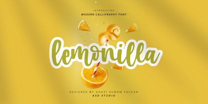 Introducing Lemonilla by Asd Studio Lemonilla is a calligraphy font. Whatever the topic, this font will be a wonderful asset to your font library, as it has the potential to enhance any creation. What's Included? :: Uppercase & Lowercase :: Numbers & Punctuation :: Multilingual Support Enjoy our font, thank you.
 - Angelicy by Stringlabs Creative Studio,
$25.00 Angelicy is a script font with textured hand brush style. The Angelicy font made with digital hand brush pen strokes that making this font look authentic and unique concept. This font is perfect for fashion brand, wedding invitation, business card, logo brand, and then calligraphy project.
 - Comic World by Fox7,
$12.00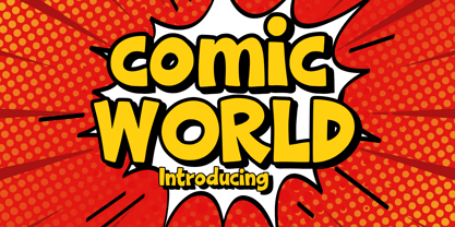 Comic World is a cool, vintage styled display font. It is the perfect font for titles or words needing a more dramatic emphasis. Whatever the topic, this font will be a wonderful asset to your font library, as it has the potential to enhance any creation.
 - Cash Point Mono by Matthias Luh,
$2.00 A very straight, geometric font which reminds me of the font on a display of a cash desk. Like most of the fonts at these display, this font is made up of a 6x10 matrix (capitals: 5x7). Hint: Insert Æ or ∂ to create a filled character (6x10).
 - Orange Mochi by RA Studio,
$14.00 Flying, elegant, handwritten font Orange Mochi. The font is built on the basis of personal handwriting, has narrow and wide glyphs, brave external elements, alternative letters and funny ligatures. The font works well in an array of text, titles and logos. Display font Extended latin & cyrillic
 - Harlon by Larin Type Co,
$14.00 Harlon This is a display font in two headings, sharp corner and rounded corners. This font is perfect for titles, book covers, logos, T-shirt printing, packaging and much more, and also this font includes stylistic alternates.This font is easy to use and has OpenType features.
 - Batang by Microsoft Corporation,
$129.00Batang™ Korean font features a mincho (serif) stroke style. This Batang font file is 6.9 MB in size. Batang is a registered trademark of the Microsoft Corporation. Batang font Character Set: Latin 1, Korean code page 949. Batang is available in TrueType and OpenType font formats. - Grandix by ZetDesign,
$15.00 Grandix is a very elegant handwritten font. created with original handwriting in mind for a flexible and beautiful font. The font is equipped with an open type feature for easy creation. These fonts are also created in several families to give the user the choice they want.
 - Moondays by Greentrik6789,
$18.00 Moondays Font is a unique and contemporary serif font that adds a distinctive aesthetic to your design projects. This versatile display font is perfect for creating eye-catching headlines, titles, and logos. Discover the beauty of Moondays Font and elevate your designs to the next level.
 - Preissig Antikva Pro by Storm Type Foundry,
$39.00 This vintage, iconic typeface of original Czech letter-founding has been faithfully revised, extended and newly rendered in 2012. The majority of Vojtěch Preissig’s type faces have been, from their very creation, subject to controversial evaluations which might perhaps fill more pages than have been set in these type faces so far. The considerable technological backwardness of Czech typography between the world wars intensified the author’s creative effort even more. He had been devoting thought to his Antikva type face from 1912 onwards and dozens of hardly perceptible nuances of the same design have been preserved in his drawings. It was his only book type face, but it shows no signs of any hard struggle in creating it. Its extraordinary vividness and elegance are really surprising. It may be still indebted to the forms of Art Nouveau, which was withering away at that time, but its proportions, colour and expression inspire other Czech type designers. Preissig’s Antikva, Menhart’s Figural (and also Růžička’s Fairfield) and Týfa’s Antikva represent a clear line of development, very far away from the soft aesthetics of Tusar, Dyrynk or Brunner. The co-author of the modification for computer composition is Otakar Karlas. Without his experience the work would remain only a shadow of Preissig’s design. Our aim was to produce a large family of type faces for the setting of both books and jobbing works. The digital transcription of Preissig’s Antikva came into existence from summer till winter 1998. The direct model for this type face is the most successful, two-cicero (24 pt.) design dating from 1925. The designs of other sizes (12 pt., 14 pt., 16 pt. and then 36 pt. and 49 pt.) lack vividness and are the source of the widespread mistaken belief that Preissig’s Antikva consists of straight lines. That is, unfortunately, how even Muzika and Menhart describe it. Neither is it a Cubist type face as many of the semi-educated think today. Special attention had to be paid to italics. It is apparent that their design is not as perfect as that of Preissig’s Antikva. In contradistinction to the original we have deleted almost all lower serifs in the lower-case letters, enlarged the angle of inclination and completely redesigned the letters a, e, g, s, k, x, ... All crotches have been lightened by marked incisions. In other words, none of the italic letters corresponds to Preissig’s model. The signs which were missing have been supplemented with regard to the overall character of the alphabet. Preissig did not deal with bold designs, but the crystal-clear logic of his “chopping-off” of the round strokes enabled us to complete the type face family without any greater doubts. An excessively fragile type face, however, cannot be used for setting in smaller sizes; that is why we have prepared a separate family of text designs which has shortened ascenders, normal accents, slightly thickened strokes, and is, in general, optically more quiet and robust. We recommend it for sizes under 12 points. By contrast, the elegance of the basic design will be appreciated most in the sizes used for headlines and posters. Preissig’s Antikva is suitable not only for art books and festive prints, but also for poetry and shorter texts.
 - Mr Eaves Modern by Emigre,
$59.00 Mr Eaves is the often requested and finally finished sans-serif companion to Mrs Eaves, one of Emigre’s classic typeface designs. Created by Zuzana Licko, this 2009 addition to the Emigre Type Library expands the versatility of the original Mrs Eaves with two complimentary families: Mr Eaves Sans and Mr Eaves Modern. Mr Eaves was based on the proportions of Mrs Eaves, but Licko took some liberty with its design. One of the main concerns was to avoid creating a typeface that looked like it simply had its serifs cut off. And while it matches Mrs Eaves in weight, color, and armature, Mr Eaves stands as its own typeface with many unique characteristics. The Sans version relates most directly to the original serif version, noticeably in the roman lower case letters a, e, and g, as well as in subtle details such as the angled lead in strokes, the counter forms of the b, d, p, and q, and the flared leg of the capital R, the tail of the Q. The distinctly loose-fitting letter spacing of Mrs Eaves was applied also to the Sans version. This, together with generous built-in line spacing due to a small x-height and extended ascenders and descenders, renders the same kind of lightness and airiness when setting text that is so characteristic of Mrs Eaves. Deviations from the original Mrs Eaves are evident in the overall decrease of contrast, as well as in details such as the flag and tail of the f and j, and the finial of the t, which were shortened to maintain a cleaner, sans serif look. And the lower case c had to be balanced out differently after it lost its top ball terminal. And with the loss of serifs, Mr Eaves set width is slightly narrower. Mr Eaves Italic also carries over many forms from its Mrs Eaves model, most notably the v, w, and z, which are unusually flamboyant for a sans italic design. It also utilizes lead in and terminal tails that are reminiscent of the serif italic. The biggest departure here is the width of the characters. The extra narrow gauge and delicate features seemed more appropriate for the Serif than the Sans. To allow for a comfortable fit, Mr Eaves Italic has a more robust design and wider character width. Meanwhile, the Modern family provides an overall less humanistic look, with simpler and more geometric-looking shapes, most noticeably in the squared-off terminals and symmetric lower case counters. This family has moved furthest from its roots, yet still contains some of Mrs Eaves’ DNA. The Modern Italic is free of tails, and overall the Modern exhibits more repetition of forms, projecting a cleaner look. This provides stronger differentiation from the serif version whenever a more contrasting look is desired. Each version (Sans and Modern) contains its own set of alternates providing unique options for applications such as headlines, word logos, letterheads, pull quotes, and other short text settings. Both the Sans and Modern come in six weights. The simpler forms of a sans-serif provide the opportunity of more weights than do serif letter forms, which are more complex in structure, making it difficult to accommodate additional weight without distortions. Regular and Bold match the original Mrs Eaves weights, while the Heavy provides an additional weight for extra emphasis.
 - Mr Eaves Sans by Emigre,
$59.00 Mr Eaves is the sans-serif companion to Mrs Eaves, one of Emigre’s classic typeface designs. Created by Zuzana Licko, this 2009 addition to the Emigre Type Library expands the versatility of the original Mrs Eaves with two complementary families: Mr Eaves Sans and Mr Eaves Modern. Mr Eaves was based on the proportions of Mrs Eaves, but Licko took some liberty with its design. One of the main concerns was to avoid creating a typeface that looked like it simply had its serifs cut off. And while it matches Mrs Eaves in weight, color, and armature, Mr Eaves stands as its own typeface with many unique characteristics. The Sans version relates most directly to the original serif version, noticeably in the roman lower case letters a, e, and g, as well as in subtle details such as the angled lead in strokes, the counter forms of the b, d, p, and q, and the flared leg of the capital R, the tail of the Q. The distinctly loose-fitting letter spacing of Mrs Eaves was applied also to the Sans version. This, together with generous built-in line spacing due to a small x-height and extended ascenders and descenders, renders the same kind of lightness and airiness when setting text that is so characteristic of Mrs Eaves. Deviations from the original Mrs Eaves are evident in the overall decrease of contrast, as well as in details such as the flag and tail of the f and j, and the finial of the t, which were shortened to maintain a cleaner, sans serif look. And the lower case c had to be balanced out differently after it lost its top ball terminal. And with the loss of serifs, Mr Eaves set width is slightly narrower. Mr Eaves Italic also carries over many forms from its Mrs Eaves model, most notably the v, w, and z, which are unusually flamboyant for a sans italic design. It also utilizes lead in and terminal tails that are reminiscent of the serif italic. The biggest departure here is the width of the characters. The extra narrow gauge and delicate features seemed more appropriate for the Serif than the Sans. To allow for a comfortable fit, Mr Eaves Italic has a more robust design and wider character width. Meanwhile, the Modern family provides an overall less humanistic look, with simpler and more geometric-looking shapes, most noticeably in the squared-off terminals and symmetric lower case counters. This family has moved furthest from its roots, yet still contains some of Mrs Eaves' DNA. The Modern Italic is free of tails, and overall the Modern exhibits more repetition of forms, projecting a cleaner look. This provides stronger differentiation from the serif version whenever a more contrasting look is desired. Each version (Sans and Modern) contains its own set of alternates providing unique options for applications such as headlines, word logos, letterheads, pull quotes, and other short text settings. Both the Sans and Modern come in three weights. The simpler forms of a sans-serif provide the opportunity of more weights than do serif letter forms, which are more complex in structure, making it difficult to accommodate additional weight without distortions. Regular and Bold match the original Mrs Eaves weights, while the Heavy provides an additional weight for extra emphasis.
 - Lankie by Gerald Gallo,
$20.00 Lankie is a clean, contemporary, geometric, condensed sans serif font. The font is ideal for headlines, titles, branding, small blocks of text or wherever a fresh font is desirable.
 - Numbers Style One by Gerald Gallo,
$20.00 Each style includes 6 fonts of 100 characters each of circle, square, and diamond in positive and negative. For ordering purposes, each style (6 fonts) counts as 1 font.
 - Kris Kringle by Sealoung,
$15.00 Kris Kringle is a bold and chunky lettered display font. Add this font to your creative ideas and notice how it will make them stand out! All caps fonts.
 - Rheina by Phoenix Group,
$12.00 Rheina font is a font that depicts creative power, this font is made with memories of past disappointments that have been passed, and trying to move on in life.
 - Diet Riot by PizzaDude.dk,
$15.00A crunchy comic font, suitable for both small and large typing. At small sizes the font appears as a "simple" handwriting font, but at larger points the crunchiness appears! - Numbers Style Two by Gerald Gallo,
$20.00 Each style includes 6 fonts of 100 characters each of circle, square, and diamond in positive and negative. For ordering purposes, each style (6 fonts) counts as 1 font.
 - Kemuning by Phoenix Group,
$9.00 Kemuning font is a traditional handwriting style font with thin and beautiful lines, this font is a reflection of naturalism, and the beauty that exists in the surrounding environment.
 - Numbers Style Three by Gerald Gallo,
$20.00 Each style includes 6 fonts of 100 characters each of circle, square, and diamond in positive and negative. For ordering purposes, each style (6 fonts) counts as 1 font.
 - ITC Avant Garde Gothic by ITC,
$42.99 ITC Avant Garde Gothic is a font family based on the logo font used in the Avant Garde magazine. Herb Lubalin devised the logo concept and its companion headline typeface, then he and Tom Carnase, a partner in Lubalin’s design firm, worked together to transform the idea into a full-fledged typeface. The condensed fonts were drawn by Ed Benguiat in 1974, and the obliques were designed by André Gürtler, Erich Gschwind and Christian Mengelt in 1977. The original designs include one version for setting headlines and one for text copy. However, in the initial digitization, only the text design was chosen, and the ligatures and alternate characters were not included. The font family consists of 5 weights (4 for condensed), with complementary obliques for widest width fonts. When ITC released the OpenType version of the font, the original 33 alternate characters and ligatures, plus extra characters were included. ITC Avant Garde Gothic® font field guide including best practices, font pairings and alternatives. Featured in: Best Fonts for Logos, Best Fonts for Websites, Best Fonts for PowerPoints
 - Hand Stamp Wood by TypoGraphicDesign,
$9.00 The typeface Hand Stamp Wood is designed from 2020 for the font foundry Typo Graphic Design by Manuel Viergutz. The display font based on original old wood letter, stamps, DIY and is inspired in the past and present. 4 font-styles (Rough, Mix, Circle, CircleMix) with 370 glyphs (Adobe Latin 1) incl. decorative extras like arrows, dingbats, emojis, symbols, geometric shapes, decorative ligatures (type the word #LOVE for ❤ or #SMILE for ☺ as OpenType-Feature dlig) and stylistic alternates (2 stylistic sets). For use in logos, magazines, posters, advertisement plus as webfont for decorative headlines. The font works best for display size. Have fun with this font & use the DEMO-FONT (with reduced glyph-set) FOR FREE! Font Specifications ■ Font Name: Hand Stamp Wood ■ Font Weights: 4 (Rough, Mix, Circle, CircleMix) + DEMO (with reduced glyph-set) ■ Font Category: Display for headline size ■ Font Format:.otf (Mac + Win, for Print) + .woff (for Web) ■ Glyph Set: 370 glyphs (Adobe Latin 1) incl. decorative extras like arrows, dingbats, emojis, symbols ■ Design Date: 2020 ■ Type Designer: Manuel Viergutz
 - Dakota Magic by Scratch Design,
$14.00 Dakota Magic Glowing is a new font duo with handwritten style. Dakota magic font using a hand brush style, this font will look artistic & modern as a brushed font, and Glowing Signature font is a monoline handwritten style, and this font looks like a very natural signature. This font pair that already matched up and ready to be used together for many of your projects. Here’s a run through everything included in this product: Dakota Magic! features 19 ligatures giving you the options to look totally custom and natural. Font also includes a full set of uppercase and lowercase letters, multilingual symbols, numerals, punctuation & swash. Glowing Signature features 37 ligatures giving you the options to look natural fast hand signature. Font also includes a full set of uppercase and lowercase letters, multilingual symbols, numerals, punctuation & swash. All fonts are available for Multi Languages Support. You can check your language by typing characters in the text box above. Dakota Magic Glowing Font Duo has a natural shape and texture, so would be perfect for all types of printing techniques. Enjoy it!
 - Nor Tidal by IbraCreative,
$17.00 Nor Tidal – A Modern Serif Font Nor Tidal is a contemporary serif font that seamlessly merges timeless elegance with a sleek, modern aesthetic. Designed to exude sophistication and readability, Nor Tidal strikes a perfect balance between tradition and innovation. Its well-defined serifs lend a touch of classic refinement, while subtle tweaks and clean lines bring a distinctly contemporary flair. The font’s versatile nature makes it suitable for a wide range of applications, from editorial design to branding, offering a timeless yet fresh typographic solution that captivates with its graceful curves and crisp, professional demeanor. Nor Tidal is perfect for branding projects, logo, wedding designs, social media posts, advertisements, product packaging, product designs, label, photography, watermark, invitation, stationery, game, fashion and any projects. Fonts include multilingual support for; Afrikaans, Albanian, Czech, Danish, Dutch, English, Estonian, Finnish, French, German, Hungarian, Italian, Latvian, Lithuanian, Norwegian, Polish, Portuguese, Slovak, Slovenian, Spanish, Swedish.
 - All Is Quiet by Kitchen Table Type Foundry,
$15.00 The year 2022 went and 2023 came. I can honestly say that last year was a horrible year and I am happy it ended a couple of days ago. The first week after New Year’s Eve always fills my head with the U2 song ‘New Year’s Day’ - so I named this font after a line from the lyrics. I also happened to watch a fantastic movie called ‘Im Westen Nights Neues’, directed by Edward Berger, but based on a book by Erich Maria Remarque, which, in English, was published as ‘All Quiet On The Western Front’. So there you have it: naming a font in 2 easy steps! ;-) All Is Quiet is a lovely brush font, which I created using my father in law’s Chinese pencil and ink. I can suggest some uses here, but I am convinced you can come up with that yourself.
 - Anbenduk by Twinletter,
$17.00 The Anbenduk typeface is ideal for projects that require an elegant classic modernist serif feel. This font’s distinct and attractive design will make your writing stand out and appear professional. Anbenduk has wonderful features like ligatures and alternates that will provide a creative touch to your creations. Aside from that, this font supports a wide range of international languages, making it ideal for multilingual projects. Don’t make your design appear boring or corny. Use Anbenduk to add a creative and professional touch to your designs. Get Anbenduk immediately and transform your project! What’s Included : - File font - All glyphs Iso Latin 1 - Alternate, Ligature - Simple installations - We highly recommend using a program that supports OpenType features and Glyphs panels like many Adobe apps and Corel Draw so that you can see and access all Glyph variations. - PUA Encoded Characters – Fully accessible without additional design software. - Fonts include Multilingual support
 - Cairo by Viswell,
$19.00 CAIRO is a modern and sleek font that exudes simplicity and sophistication. This minimalist sans-serif font features clean, crisp lines with subtle contrasting strokes, adding just the right amount of edge to its overall design. The font's simple and unassuming style makes it a versatile choice for a wide range of design projects, from branding and advertising to editorial layouts and web design. The font comes in two styles: Regular and Oblique. The Regular style is perfect for headlines and titles, while the Oblique style adds a touch of elegance. The Oblique style is also ideal for creating emphasis and drawing attention to key elements within a design. CAIRO's design is inspired by the contemporary architecture. Its clean, minimalist look reflects the modern and forward-thinking nature of the city, making it a perfect choice for designers who want to create a bold, sophisticated look for their projects.
 - Golane by Craft Supply Co,
$20.00 Introduction to Golane Introducing Golane, a Geometric Sans Serif font, it exemplifies a sleek, modern design. Firstly, its geometric styling enhances visual appeal. Importantly, this font is perfect for lengthy texts, offering remarkable readability. Additionally, its simplicity appeals to a broad audience, from novices to seasoned professionals. Design and Aesthetics Focusing on design, Golane is deeply rooted in geometric principles. Each character is meticulously crafted, ensuring a balanced and harmonious appearance. Furthermore, its clean lines and shapes exude a contemporary vibe. Consequently, the font masterfully combines form and function, making it highly versatile for diverse applications. User-Friendly Features Regarding user experience, Golane stands out for its user-friendly qualities. It’s notably easy to read, which greatly enhances the legibility of extended texts. Moreover, the font’s adaptability is evident, as it fits seamlessly in various contexts. Whether used in print or digital formats, Golane consistently maintains its clarity and effectiveness.
 - Vrångö - 100% free

- Christmas Deer by Arttype7,
$15.00 We just launched a new product font. charming fonts with a pretty christmas look, named "cristmas deer font". This font is inspired by deer antlers. has 3 beautiful swash variations. and also has more than 650 glyphs. This font also has a stylistic alternative for multilingual support. Perfect for logos, Christmas greeting cards, wedding invitations, web, t-shirts, souvenirs, quotes, graphic watermarks. thank you regards
 - Cartoon Family by Ake,
$12.00 Cartoon Family Font is a cool and friendly display font that brings a playful and authentic vibe to your designs. This fun font is perfect for children activities, school projects, storybooks, posters, and more. With its chunky letter style, Cartoon Family Font adds a touch of liveliness and personality to any design. Let your creativity soar and watch your designs come alive with this captivating font.
 - Bring Me The Horizon by Struggle Studio,
$20.00 BringMeTheHorizon is a modern handwritten display font. With Brush strokes, scribbled characters. To give you extra creative work. BringMeTheHorizon font supports multilingualism of more than 100+ languages. This font is great for logo designs, social media, Movie Titles, Book Titles, short text even long text letters and great for your secondary text font in sans or serif. Create stunning works with the BringMeTheHorizon font.
 - Cyhiru by Twinletter,
$13.00 Introducing "Cyhiru Font" - The Artistry of Handwriting Meets Contemporary Design. Cyhiru Font is your gateway to infusing a personal and distinctive touch into your creative projects. This font seamlessly marries the warmth of handwritten text with a modern aesthetic. What’s Included : File font All glyphs Iso Latin 1 Alternate, Ligature Simple installations PUA Encoded Characters – Fully accessible without additional design software. Fonts include Multilingual support
 - MS Mincho by Microsoft,
$39.00MS Mincho™ Japanese font features serifs at the end of its strokes, and can be used for a variety of uses from screen display to publications. This font file is 5.3 MB in size. MS Mincho Japanese font is a trademark of Microsoft Corporation. MS Mincho font Character Set: Latin-1, Japanese (code page 932). MS Mincho is available in both TrueType and OpenType font formats.
