10,000 search results
(0.061 seconds)
- Calton Hosvesk by UICreative,
$23.00 Introducing our new product the name is Calton Hosvesk Stensil Sans Serif Font Family comes with 9 different weights. Modern Serif font that feels beautiful classy, elegant, and modern. This font is perfectly suited for a wide variety of projects, such as signature, stationery, logo, wedding, typography quotes, magazine or book cover, website header, clothing, branding, packaging design, and more. Also for fashion-related branding or editorial design and displays both masculine and feminine qualities.
 - Suffragette by muccaTypo,
$33.00 Suffragette, an all-caps typeface introduced for the branding of the Hermitage Hotel in Nashville, is inspired by the Hotel’s Beaux-Arts architecture injected with a healthy 2020’s aesthetic. This unique roman capital design, with its sans serif-medium contrast shapes and slightly pronounced serifs, is the perfect match for luxury packaging and high-end couture. If your brand wants to project elegance with a playful edge, Suffragette is the font for you!
 - Bangfel by Muksal Creatives,
$12.00 Bangfel is a modern font that is both memorable and stylish. The smooth curves of the a and the curved stems of the ascending letters make for a unique font. It's a mix between a classic serif and a futuristic sans serif. Bangfel comes with a full uppercase, lowercase, numbers and punctuation + European language support. This font is perfect for fashion related branding or editorial design and displays both masculine and feminine qualities.
 - Nostalgic Whispers by UICreative,
$23.00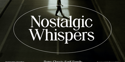 Introducing our new product the name Nostalgic Whispers Serif Font Family comes with 9 different weights. Modern Sans Serif font that beautiful classy, elegant, and modern. This font is perfectly suited for a wide variety of projects, such as signature, stationery, logo, wedding, typography quotes, magazine or book covers, website headers, clothing, branding, packaging design, and more. Also for fashion-related branding or editorial design and displays both masculine and feminine qualities.
 - Brother Garage by Edignwn Type,
$18.00 Introducing Brother Garage, the ultimate vintage motorcycle-inspired font collection designed to bring the spirit of the garage to your designs. This combines the best of stencil serif and sans serif fonts. With three unique styles - regular, rough, and stamp - Brother Garage offers authenticity, allowing you to effortlessly bring your designs with the rustic and classic looks. But that's not all! Alongside the Brother Garage fonts, you'll receive a fantastic bonus of 13 crafted illustrations.
 - MC Karnet by Maulana Creative,
$15.00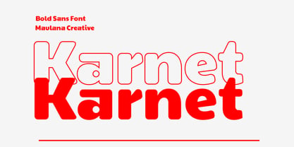 Karnet is a unique sans serif font. Bold stroke, fun character with a bit of ligatures and alternates. To give you an extra creative work. Karnet font support multilingual more than 100+ language. This font is good for logo design, Social media, Movie Titles, Books Titles, a short text even a long text letter and good for your secondary text font with script or serif. Make a stunning work with Karnet font. Cheers, Maulana Creative
 - Konung by Dima Pole,
$23.00 Konung (konge, koning, ~king) – appointed guardian who is trusted to transfer the Wisdom (Kon) to a new land. Konung is a friendly type, which is an amalgam of several writing culture. It offers re-unite originally of kindred peoples and their Outlook on life. Konung type is soft and elegant, it includes 925 glyphs, Slavic and European alphabets, over 20 Opentype features, small caps, serif and sans-serif styles and so on.
 - Ponzu by Mint Type,
$40.00 Ponzu is an elegant stencil-style display sans-serif. Its shape is defined by the sharp endings created by stems that vanish in infinite contrast. It is a hybrid typeface that features beautiful terminals typical for serif fonts. It is perfect for display use in editorial, branding, posters, screen applications etc. Ponzu comes in 9 weights each with complimentary stylish italics. Each style supports multiple languages including Cyrillic script and is packed with OpenType features.
 - Heyday by Hemphill Type,
$30.00 Heyday is a font in its prime! This font was inspired by vintage style typography with the use of thick rounded serifs, while the shape of the letterform has a contemporary edge which brings it into the modern day. This combination of classic and modern creates a unique look and feel that enables the font to feel at home in any era. The Heyday family consists of a serif and sans weight.
 - Gelion by Halbfett,
$30.00 Gelion is a large family of geometric sans serif fonts. It ships both as two Variable Fonts or as 16 traditional fonts. Those static fonts span eight different weights, ranging from Extralight to Black. Each has an upright and an italic font on offer. The italics are carefully crafted, with an 8° slope. Gelion is inspired by 20th-century geometric sans serifs and classic neo-grotesque designs from the late 19th century and the middle of the 20th century. Its forms remain true to the gracefully geometric look of its classic predecessors, which will surely tick off any client’s long list of branding requirements. Letters in all of Gelion’s weights are drawn with virtually monolinear strokes. Its lowercase letters have a tall x-height. Yet, that still leaves enough room for the fonts’ diacritical marks. Gelion’s default “a” and “g” each have single-storey forms by default. The dots on the ‘i’, ‘j’, and diacritics are round, as are the punctuation marks. Gelion is an excellent choice for both corporate design and editorial design projects, thanks to its range of weights and its legibility in text. The fonts include a lot of ligatures, some monochromatic emoji, a set of arrows, lovely Roman Numerals, and more. Thanks to Gelion’s stylistic alternates, if a project comes up where you do not need a geometric vibe, you can activate Stylistic Set 1. That will replace many of the fonts’ letters with more humanistic-sans alternates, giving your text the feeling of a whole other type design with just one click. Last but not least, the descending “f” available in Gelion’s italics is a nice typographic trait.
 - Mirava by Din Studio,
$25.00 Hi, Everyone! Ready to make your branding spark? If you need to create a big, bold logo for your business, work on a poster for an event, or whatever your project may be-then this is the perfect font for you. Mirava Sans-A Sans Serif Font Family If we can give you many options then why not? Mirava San is a package that will delight you. With this family you will get many options to maximize your designs with stylish fonts. This font designed to bring your branding to life and add a touch of modernity, fun and style. Mirava paves the way for you to write the information you need to send out to your audience. Perfect to create amazing headings, logos, menus, social media graphics, and many more. Our font always includes Multilingual Support to make your branding reach a global audience. Features: Multilingual Support PUA Encoded Numerals and Punctuation Thank you for downloading premium fonts from Din Studio
 - Altertypo by Popskraft,
$12.00 Altertypo, a font family on a never-ending quest for the "perfect" sans-serif style. Inspired by the early 20th-century pioneers like Gill Sans and Johnston Sans, Altertypo seamlessly blends their classic elegance with contemporary flair. This unique typeface is your passport to creative freedom in graphic design, serving a multitude of purposes from editorial and corporate to web and interaction design. This font allows you to craft compelling designs that transcend the ordinary, providing the versatility and innovation you seek. It invites you to explore a world of creative possibilities, where every character is thoughtfully placed to ensure a smooth, organic flow of words. Step into the realm of Altertypo, and leave behind the constraints of conventional fonts. It's your gateway to exceptional design, where each letter harmonizes effortlessly to deliver a captivating visual experience. Say goodbye to the limitations of standard fonts and embrace the boundless potential that Altertypo offers.
 - Anisha by 38-lineart,
$13.00 “Anisha”. This font is the Great choice for brand identity, branding and just branding ... we have studied various branding of modern products and we found a very interesting style, which is a combination of "calligraphy signature and clean sans". This is like combining two different elements and together in a composition that is very luxurious and elegant. Anisha calligraphy, bold and thin sans, all of which consist of regular and slant versions, so the number of fonts in this package consists of 6 fonts, the more choices the more design combinations you can make. Anisha is a beautiful high fashion font that makes for gorgeous logos, posters, blog posts, social media, and more! I love using them together with layer masks in Photoshop, so it looks like the script is running through the lines of the sans serif. Anisha Script includes 2 alternates for uppercase and 4-5 alternates for lowercase, and additional ligatures to make everything look totally hand-done.
 - ATF Franklin Gothic by ATF Collection,
$59.00 ATF Franklin Gothic® A new take on an old favorite Franklin Gothic has been the quintessential American sans for more than a century. Designed by Morris Fuller Benton and released in 1905 by American Type Founders, Franklin Gothic quickly stood out in the crowded field of sans-serif types, gaining an enduring popularity. Benton’s original design was a display face in a single weight. It had a bold, direct solidity, yet conveyed plenty of character. A modern typeface in the tradition of 19th-century grotesques, Franklin Gothic was drawn with a distinctive contrast in stroke weight, giving it a unique personality among the more mono-linear appearance of later geometric and neo-grotesque sans-serif types. Franklin Gothic has been interpreted into a series of weights before, most notably with ITC Franklin Gothic. But as the original type was just a bold display face (later accompanied by a few similarly bold widths and italics), how Benton’s design is expanded to multiple weights and styles as a digital type family can vary significantly. Benton designed several gothic faces that harmonize with one another, including Franklin Gothic, News Gothic, and Monotone Gothic, that can serve as models for new interpretations of his work. With ATF Franklin Gothic, Mark van Bronkhorst looked to Benton’s Monotone Gothic—originally a single typeface in a regular weight, and similar to Franklin Gothic in its forms—as the basis for lighter styles. ATF Franklin Gothic may appear familiar given its heritage, but is a new design offering a fresh take on Benton’s work. The text weights are wider and more open than some previous Franklin Gothic interpretations, and as a result are quite legible as text, at very small sizes, and on screen. ATF Franklin Gothic maintains the warmth and the spirit of a Benton classic while offering a suite of fonts tuned precisely for contemporary appeal and utility. The 18-font family offers nine weights with true italics, a Latin-extended character set, and a suite of OpenType features. Download the PDF specimen for ATF Franklin Gothic.
 - Tablet Gothic by TypeTogether,
$35.00 Graphic designers of any nationality and background know very well that the art of composing titles correctly is not easy, Especially when it comes to periodical publications where there is need for both flexibility and graphic coherence. Tablet Gothic was originally engineered as a titling type family, meant to help designers working on publications that require output as hard copies and a variety of digital platforms at the same time. As such, it is a grotesque sans serif that looks to the future of publishing with a clear understanding of its history, and reminiscences that go back to nineteenth century Britain and Germany. Tablet Gothic delivers the sturdy, straightforward and clean appearance expected from a grotesque, but it allows itself a good measure of personality to make it stand out on the page. Its 84 styles –six series of condensation and seven weights in each series plus obliques– guarantee that, whatever the publication format is, there's a Tablet Gothic font that will do the job and perform well both technically and aesthetically. Furthermore, the rounder styles, Tablet Gothic Wide, Normal and Narrow achieved amazing results at very small sizes, producing a beautiful texture and highly readable text blocks. Tablet Gothic fonts can be purchased individually, by series or as a complete bundle (best value!)
 - Maginors by Sarid Ezra,
$15.00 Love Blackpast? This is the serif version of it. Introducing, Maginors, a modern serif logo font with alternates! Maginors is a serif based font with unique lowercase that will make your design looks stylish and modern. With magic touch, this font will make your project stunning and magical. You can use this font for any purpose, especially to make logotype. You can mix and match the uppercase and lowercase to make your logo more special. This font also have special alternates that will make your design more stand-out!
 - Instance by preussTYPE,
$55.00 German type designer Ingo Preuss created this family between 2014 and 2016. Instance is a new classic built on the foundation of over two centuries of history. Fresh and contemporary, while feeling familiar. This typeface is a high contrast sans serif typeface family and was designed for contemporary typography, especially for use in headlines and on posters, but also for reading purposes. A flexible, medium to high contrast, sans serif less about designing a stylish decorative design and more about applying contrast onto a neo-grotesk skeleton. Instance is more than just chopping off the serifs. The classical proportions of the capitals and x-heights were maintained, but the letterforms were rebalanced for use without serifs. Contemporary modifications were made to some widths, as well as an all new Light weight was created. Please note: Instance STD Office Packages is only as TrueType (* .ttf) and Standard-Version. Also, the character set has been reduced to Standard (without OpenType-Features, SmallCaps, old style figures, etc.). Ideal for testing and for Microsoft Office applications.
 - Divine Beauty by Letterhend,
$12.00 The Devine Beauty font is characterized by its simplicity and modernity. The clean lines and balanced proportions of the sans-serif font complement the elegant curves and flourishes of the serif font, creating a harmonious and visually appealing pairing. Overall, Devine Beauty is a stylish and refined font that is perfect for adding a touch of sophistication to any design, especially in logo, and the other various formal forms such as invitations, labels, logos, magazines, books, greeting / wedding cards, packaging, fashion, make up, stationery, novels, labels or any type of advertising purpose. Features : Uppercase & lowercase Numbers and punctuation Alternates & Ligatures Multilingual PUA encoded We highly recommend using a program that supports OpenType features and Glyphs panels like many of Adobe apps and Corel Draw, so you can see and access all Glyph variations.
 - Pompeijana by Linotype,
$29.99Pompeijana is a part of the 1990 collection Type before Gutenberg 2’, which includes twelve contemporary typefaces each representative of a particular era. Pompeijana is Adrian Frutiger’s contribution to the project Type before Gutenberg’. He based the forms of this capital typeface on the writing of the Romans in Pompei. The decorative look of the alphabet is achieved by purely graphic means, placing the emphasis of the top and foot of the letters with heavy horizontals and diamond-shaped serifs. Frutiger completed his typeface with the weight Borders, a font consisting of numerous ornaments true to the style of the alphabet. The ornaments can be combined to form different borders and offer an optimal addition to the elegant Pompeijana. Pompeijana is best combined with modern sans serif typefaces. - Engel New by The Northern Block,
$30.36 EngelNewSans is sans serif family of 12 weights and an upgrade of the typeface Engel also published by Die Gestalten Verlag. The project began with an extension to the original Engel character set and freshening up the typeface to suit the OpenType format. EngelNewSerif came about as a sibling to EngelNewSans as a corresponding serif family also of 12 weights, matching those of EngelNewSans. Both families are designed for a wide usage in running text and headlines. EngelNewSans is an evolved version of the original Engel typeface, which undergone improvements to the individual letterforms and the overall look which resulted in this sans serif type family with a more mature confident character and with softer, rounder and more harmonious shapes. The characteristics between the two could perhaps, very fittingly, be compared to a person showing different sides to their personality at different stages in life. With EngelNewSans portraying the more mature role while the original Engel shows traits of a cool teenager with rough edges, not yet fully developed. To make the light weights function with serifs attached for EngelNewSerif, the same low stroke contrast as seen in EngelNewSans was applied. Further discovery found that the serifs and the stem width had to be optically similar for the light weights not to appear too fragile. In the heavy weights however, the stroke contrast was higher than in the Sans versions, this was done to open up the counters and make room for the serifs to breathe. The intention of the families is to motivate an element of play and give the designer a larger selection to work with.
 - Frutiger Arabic by Linotype,
$149.00 Neue Frutiger Arabic was created by Nadine Chahine and a team of designers and font engineers from the Monotype Studio, under the direction of Monotype type director Akira Kobayashi. The family is available in 10 weights from Ultra Light to Extra Black. Neue Frutiger Arabic embodies the same warmth and clarity as Adrian Frutiger's original design, but allows brands to maintain their visual identity, and communicate with a consistent tone of voice, regardless of the language. It is part of the Neue Frutiger World collection, offering linguistic versatility across environments – suited to branding and corporate identity, advertising, signage, wayfinding, print, and digital environments.
 - Andes by Latinotype,
$29.00 Andes, designed by Daniel Hernández, is a display typeface that has neo-humanist characteristics. Its different terminals, among other elements, give it a look of mixed typography. Andes is a typeface with 10 Upright weights, 10 Italics & Condensed version , ranging from Ultra Light to Black, each of the same x-height. This typeface contains additional italic glyphs (a, y, z, g) that help to emphasise text or words. Andes is based on the design of Merced and both of them share several features. This type is well-suited for use in retail, magazines, logotypes, books, etc.
 - Troika by ArtyType,
$24.00 Naming this typeface Troika, the Russian word meaning "group of three", seemed apt because the starting point in this design process was a three sided letter 'O'. This triangular type styling became a template guide for the rest of the character set. Troika is a highly distinctive, ultra modern typeface with idiosyncratic letterforms that make for striking headlines, particularly at large display sizes. Challenging, futuristic and experimental, always unique, and with caps as characterful as the lower case. Troika being derived from the French 'Triangle' and the Latin 'Triangulus' it seemed only fitting to design three weights: Light, Medium & Bold.
 - Andes Italic by Latinotype,
$29.00 Andes, designed by Daniel Hernández, is a display typeface that has neo-humanist characteristics. Its different terminals, among other elements, give it a look of mixed typography. Andes is a typeface with 10 Upright weights, 10 Italics & Condensed version, ranging from Ultra Light to Black, each of the same x-height. This typeface contains additional italic glyphs (a, y, z, g) that help to emphasise text or words. Andes is based on the design of Merced and both of them share several features. This type is well-suited for use in retail, magazines, logotypes, books, etc.
 - Rachele by Resistenza,
$39.00 Rachele is a mono line based script thin font. Inspired on the cute “Italian Bella Scrittura” handwriting but influenced by Spencerian. Ornaments and ligatures make this hand more expressive offering round stroke endings and a flowing shape. Rachele is a big family, its stroke expand into extra light till medium and passing through a calligraphic/ribbon effect. At the same time the width varies, that’s make this script even more flexible, from Ultra Condensed to Super Extended. Enjoy it. Check out also Check out also ‘Mentha’ based on Rachele’s skeleton. We recommend to combine Rachele with: Turquoise
 - Andes Rounded by Latinotype,
$29.00 Andes Rounded, designed by Daniel Hernández, is a display typeface that has neo-humanist characteristics. Its different terminals, among other elements, give it a look of mixed typography. Andes is a typeface with 10 Upright weights, 10 Italics & Condensed versions, ranging from Ultra Light to Black, each of the same x-height. This typeface contains additional italic glyphs (a, y, z, g) that help to emphasise text or words. Andes is based on the design of Merced and both of them share several features. This type is well-suited for use in retail, magazines, logotypes, books, etc.
 - Neue Frutiger Vietnamese by Linotype,
$29.00 Neue Frutiger Vietnamese''' was developed by a team of designers and font engineers from the Monotype Studio under the direction of Monotype type director Akira Kobayashi. The family is available in 10 weights from Ultra Light to Extra Black, with matching italics. Neue Frutiger Vietnamese embodies the same warmth and clarity as Adrian Frutiger's original design, but allows brands to maintain their visual identity, and communicate with a consistent tone of voice, regardless of the language. It is part of the Neue Frutiger World collection, offering linguistic versatility across environments – suited to branding and corporate identity, advertising, signage, wayfinding, print, and digital environments.
 - Neue Frutiger Arabic by Linotype,
$79.00 Neue Frutiger Arabic was created by Nadine Chahine and a team of designers and font engineers from the Monotype Studio, under the direction of Monotype type director Akira Kobayashi. The family is available in 10 weights from Ultra Light to Extra Black. Neue Frutiger Arabic embodies the same warmth and clarity as Adrian Frutiger's original design, but allows brands to maintain their visual identity, and communicate with a consistent tone of voice, regardless of the language. It is part of the Neue Frutiger World collection, offering linguistic versatility across environments – suited to branding and corporate identity, advertising, signage, wayfinding, print, and digital environments.
 - Bergie Seltzer by Hanoded,
$15.00 It could be you’ve never heard of Bergie Seltzer - and neither had I. Basically, Bergie Seltzer is the fizzing sound an iceberg makes when it melts. We are having a bit of a heat wave right now, so I needed to give this font a ‘cool’ name! Bergie Seltzer font is a cool, all caps display font. It has a slightly eroded look (like a melting iceberg if you will) and a laid back attitude. Use it for your summer magazines, your ultra-cool websites and your bottles of fizzy drink! Just don’t melt the polar cap!
 - VLNL Brokken by VetteLetters,
$35.00 'Brokken’ is the Dutch word for ‘chunks’. They are the hearty specialty of the house, prepared by the ship’s cook Donald DBXL Beekman. Nice'n'greasy and monospaced, you'll always find a decent way to cram the letters in. Brokken is straightforward, straight-lined with beveled corners, and all caps. For the ones who have to watch their weight, or who simple don’t like their fonts to be too fatty, DBXL designed a diet version called Brokken Light. With their big contrast, both weights combine very well and are great for making ultra-compact ribbon headlines or stacking vertically.
 - Bergsland Round by Hackberry Font Foundry,
$24.95 This is a version of the Bergsland Fashion stylized sans serif font family that is very high-waisted and sleek with rounded terminals called Bergsland Round. Round is my favorite out of the group as it is looser and friendlier. This four-font set has a Regular and a Black plus the italics. The stroke is only slightly modulated. The letterforms are higher, with a more open aperture, and sprinkled with breaks to add light and sparkle. This an attempt at a readable sans serif for text. It has many OpenType features and 465 characters per font: Caps, lower case, small caps, old style figures, numerators, denominators, accents characters and so on.
 - Postale by Dear Alison,
$24.00 I recently came across an old travel journal I’d misplaced, and in it was a really rough sketch of an Italian post office. The sign lettering caught my eye while flipping through the pages, and while not my forte, I thought I’d take my stab at recreating sans-serif lettering as a font. The Postale family recaptures that old post signage and the vintage flair that appeals to me. A little reminiscing is always a good thing. You’ll find the Stylistic Alternates feature changes up the retro styled letters to a more modern sans serif styling for a handful of letterforms, if the vintage style of certain letters isn’t your cup of tea.
 - Rundigsburg by Ingrimayne Type,
$9.95 Is Rundigsburg a calligraphic face morphing into sans serif or sans serif reverting back to a medieval, calligraphic face? The letters are angular and some retain traces of older letter forms, but the ornamentation is gone. Rundigsburg is decorative but also very legible, suitable for both display and some text purposes. The family has four weights, each with an italics style. There are two shadowed versions and each has an "inside" style designed for uses in layers with its shadowed style to add color. These "inside" style are similar to the light style but the spacing matches its shadowed complement. Among Rundigburgs OpenType features are a few basic fractions and some alternative letter forms.
 - Disco Rendezvous by Wing's Art Studio,
$20.00 Disco Rendezvous: An Adaptive Font Pair Inspired by Neon Soaked Club Culture Combining an elegant script and a tall sans serif font, Disco Rendezvous is a perfectly contrasted design that evokes the golden-age of disco, inspired by neon soaked night clubs and epic dance floor hits. The superstar of this show is the highly customisable script that takes full advantage of OpenType features to offer countless creative options via alternative characters and automatic ligatures, giving your headers and title designs an authentically hand-made look. It features a complete set of uppercase and lowercase characters, along with numerals, punctuation and language support, and used with the included Sans Serif font pair you have a perfectly matched type treatment.
 - High Billion by Haksen,
$15.00 Introduce Excellent combination modern font duo in High Billion the stylish modern and natural fonts combination with casual chic flair. These are perfect for branding, wedding invites and cards, and more option for your requirement.High Billion include two font styles with full set of natural hand draw for script and elegant with all uppercase letters for sans serif. Numerals, a large range of punctuation and ligatures giving realistic hand-lettered style. In order to use the beautiful ligatures for script also all uppercase for sans serif, you need a program that supports OpenType features such as Adobe Illustrator CS, Adobe Photoshop CC, Adobe Indesign and Corel Draw. Thanks and have a great day :) Haksen
 - Accia Flare by Mint Type,
$39.00 Accia Flare is an elegant glyphic typeface with large x-height and low contrast. Its subtle curviness will create a tender but notable image in packaging applications. The font family contains 8 weights from Thin to Extra Bold, with matching true italics. It supports extensive language support including Cyrillic, as well as numerous OpenType features such as small caps, ligatures, several sets of figures, case-sensitive punctuation, ordinals. Accia Flare is a member of Accia Type System. It encompasses five typefaces ranging from sans-serif to expressive serif, giving you the possibility to create sophisticated cohesive designs. Accia Type system consists of Accia Sans, Accia Flare, Accia Piano, Accia Moderato, and Accia Forte.
 - BR Nebula by Brink,
$30.00 BR Nebula is a geometric sans serif that builds on the foundations of early geometric designs such as Paul Renner’s Futura, and later works such as Avant Guarde. BR Nebula takes inspiration from these early explorations in sans serif design and re-imagines them for the modern age. Distinctive geometric letterforms have been refined and simplified with opened terminals to achieve a clear, legible and modern aesthetic. BR Nebula is available in 20 contemporary styles, with weights ranging from Hairline to Super. The fonts also provide advanced typographic support with OpenType features such as case sensitive forms, stylistic alternates, slashed zeros and multiple figure sets. Also containing advanced language support as standard. For custom enquiries please contact: mail@brinktype.com
 - Alternate Gothic by Linotype,
$20.99 Alternate Gothic was designed by Morris Fuller Benton for American Typefounders Company in 1903. All three weights of Alternate Gothic are bold and narrow. In fact, this face is essentially a condensed version of Benton’s other well-known sans serif types, Franklin Gothic and News Gothic. In the early twentieth century, the modern concept of type “families” had not yet been formed — and though Benton designed these sans serifs to harmonize with each other, the foundry gave them different names. Robust, dark, and coolly competent, Alternate Gothic is a good choice when strong typographic statements must fit into tight spaces. As a modern usage, it is currently the font of YouTube’s homepage logo.
 - Beletrio by Storm Type Foundry,
$29.00 Beletrio was made as companion to Beletria, it has many shapes in common. We already have plenty of sans-serif fonts with classical proportions in the Stormtype library, such as John Sans, Sebastian or Andulka, but Beletrio is certainly the most peaceful of the bunch – it shares not only the feel of its serif originator, but its soft curves provide lovely visual caress as well. The smooth endings are not visible at first, they are balanced for easy reading as they solve some critical relations such as "rv, ry, rt", but in larger sizes you'll fully enjoy the picturesque details. It handles the smallest point sizes as well as large billboards, fashion magazines and philosophic tractates.
 - Berringer by Hustle Supply Co,
$20.00 Introducing Berringer A Vintage Type Family Berringer is a vintage sans serif family including Textured, Rough & Clean versions as well as Oblique versions of each. Click on the "View All Glyphs Below" image to see every glyph included in each font file. Berringer includes western european characters. Berringer is a versatile sans serif typeface that gives a vintage aesthetic. With it's unique & distinct characteristics it sets itself apart, while also maintaining a strong timeless appeal overall. Rough & Textured versions allow Berringer to be a complete set without the need for 3rd party effects to create a printed look, eliminating a step in the process of finalising your piece. Thank you for checking this out! Jeremy