10,000 search results
(0.02 seconds)
- Deco Experiment 6 by Intellecta Design,
$11.00a naive family of art deco inspiration - Spaceboy by Prototype Fonts,
$20.00Inspired by 80's Japanese pop culture. - Zyncho by Emboss,
$14.00 Inspired by fortune tellers and tarot cards.
 - Verie by Prototype Fonts,
$20.00Inspired by digital displays and mass transit. - Decline by Prototype Fonts,
$20.00Inspired by 80's Japanese pop culture. - Zooth by Intellecta Design,
$23.90inspired in 1800"s journal headers typography - Temeraire by TypeTogether,
$49.00 Quentin Schmerber’s Temeraire serif font family was not designed to be invisible. It is a typographic exploration meant to be seen — with its beauty, one could even say beheld. While some fonts aim to be as easily ignored as possible, Temeraire is offered as a gift to wide-eyed readers with its anything-but-boring character and its conspicuous inconsistency in styles. Most type families increase the weight of each character to expand the family. Instead, research into 17th century sources produced Temeraire’s wide range of letterforms, from the predictable to the odd and loosely related through time. Each style is designed to work alongside the others but are also standalone homages to specific parts of English lettering tradition: gravestone cutting, writing masters’ copperplates, Italiennes, and others. Temeraire’s Regular style is a contrast-loving Transitional Serif with vertical stress, making it great for period and classic works, ironic pieces, and modern throwbacks. The weight of the Bold squares off the ends of each glyph to give it stability, and the italic style rings true: flowing, contrasting, and purposefully inconsistent. Temeraire’s Display Black style is one salvaged from expressive gravestone artistry. The details most easily noticed are the ‘g’ with its descending bowl that has been pressed back up in the centre, and the additional serif on the ‘t’ crossbar that holds its neighbouring character at bay. (The ‘g’ and ‘Q’ have loopless alternates.) The final style is the Italienne, the horizontally stressed counterpoint to the family. By design its characters flow and bend in ways not in step with the rest of the family. All the weight has been pushed to either hemisphere within each glyph, resulting in a display style that demands space and peacefulness around it so its presence can impress. As with all TypeTogether families, Temeraire meets the current designer’s needs. Not only does its five styles shine in print work, it includes alternates for when the defaults are too boisterous and has been expertly crafted for screens. The Temeraire serif font family is resurrected from echoes in time and finds its family relation through impeccable taste.
 - FS Me Paneuropean by Fontsmith,
$90.00Mencap When most of us go about everyday tasks, we take for granted the reading that’s involved, on instructions, labels and so on. For people with learning disabilities, reading is made much harder by certain fonts. FS Me is designed specifically to improve legibility for people with learning disabilities. The font was researched and developed with – and endorsed by – Mencap, the UK’s leading charity and voice for those with learning disabilities. Mencap receive a donation for each font license purchased. Every letter of FS Me was tested for its appeal and readability with a range of learning disability groups across the UK. Inclusive Fontsmith were determined to design a font that was accessible to those with learning disabilities without standing out as such – one that was inclusive of all readers. It should comply with accessibility guidelines and work best at 12pt, but still have a character of its own that was warm and approachable. “So much accessible design is done separately to the main body of brand work,” says Jason Smith. “We wanted to make a typeface that covered both brand tone and neutrality, and that could be used legitimately as a brand font as well as in accessible design.” Me, you, everyone FS Me is about design that doesn’t patronise. People with learning disabilities are often treated as inferior by childlike design. FS Me is designed for adults, not children – a beautifully-designed font for everyone. Its features include very subtle distinguishing elements of each letter to aid the reading and comprehension of texts, and tails, ascenders and descenders that have been extended for extra clarity. What the people said... Here is a sample of comments from the extensive research groups that helped to shape the letterforms of FS Me: “I want something round, clear and friendly.” “We like movement in the letters but don’t want anything childish.” “The ‘b’ and ‘d’ need to be different as they can be confused.” “I prefer the handwriting-style ‘a’.” “It’s important to have an accessible ‘a’ and ‘g’. Teachers sometimes complain that learners cannot read or understand the inaccessible ‘a’ and ‘g’.” - Courage by Positype,
$35.00 High-contrast? High impact? Have Courage? Eye-catching and (extra, extra) bold, Courage balances ultra-high stroke weight, delicate details, and unique letterforms with a self-indulgent passion that will make you feel a little guilty using it. Honestly, use it large and don’t try to force it into a small space, because these fearless letterforms need room to move. Flavored with both upright and italic styles, each font includes an indulgent level of alternates, swashes and titling options, visual elements and more. A backstory with a different name Years ago, I was commissioned to take my Lust typeface and produce something unique to use for large format graphics for an event…cool. It needed to be hyper-contrast with a lot of over-the-top details. With a tight turnaround, I looked for primers within my development catalogue to help me, and settled on some early work on a typeface I had drawn called Hedonist. I used those sketches and its conventions to retrofit and build out Lust Hedonist (only to see the project go bust on the client’s end). I intended to go back shortly after the Lust Hedonist release to finalize a retail version of the OG Hedonist, but I never could settle on the look of the 'g' or the numerals, got distracted with other projects, and never picked it back up… until last year. After randomly doodling a fat, flat ‘g’ with an extremely tilted counter axis, I knew immediately how it could be used and that (re)set things in motion. Only problem was, in the process of refining the letterforms I began truly dissecting the pieces, rediscovering all of the recklessness within Hedonist, and decided on fundamentally rewriting the approach to the typeface… literally flaying it to the bone. I’m much, much happier with this finished typeface now, but the name no longer fit the moniker given to the first, adolescent approach—there’s far more audacity and cleverness in these letterforms, tenacious in their resolution now. As a result, the name Courage fit the mettle of this typeface so much more, so I kept it.
 - FS Me by Fontsmith,
$80.00 Mencap When most of us go about everyday tasks, we take for granted the reading that’s involved, on instructions, labels and so on. For people with learning disabilities, reading is made much harder by certain fonts. FS Me is designed specifically to improve legibility for people with learning disabilities. The font was researched and developed with – and endorsed by – Mencap, the UK’s leading charity and voice for those with learning disabilities. Mencap receive a donation for each font license purchased. Every letter of FS Me was tested for its appeal and readability with a range of learning disability groups across the UK. Inclusive Fontsmith were determined to design a font that was accessible to those with learning disabilities without standing out as such – one that was inclusive of all readers. It should comply with accessibility guidelines and work best at 12pt, but still have a character of its own that was warm and approachable. “So much accessible design is done separately to the main body of brand work,” says Jason Smith. “We wanted to make a typeface that covered both brand tone and neutrality, and that could be used legitimately as a brand font as well as in accessible design.” Me, you, everyone FS Me is about design that doesn’t patronise. People with learning disabilities are often treated as inferior by childlike design. FS Me is designed for adults, not children – a beautifully-designed font for everyone. Its features include very subtle distinguishing elements of each letter to aid the reading and comprehension of texts, and tails, ascenders and descenders that have been extended for extra clarity. What the people said... Here is a sample of comments from the extensive research groups that helped to shape the letterforms of FS Me: “I want something round, clear and friendly.” “We like movement in the letters but don’t want anything childish.” “The ‘b’ and ‘d’ need to be different as they can be confused.” “I prefer the handwriting-style ‘a’.” “It’s important to have an accessible ‘a’ and ‘g’. Teachers sometimes complain that learners cannot read or understand the inaccessible ‘a’ and ‘g’.”
 - Ouija and Whiskey by Fonts of Chaos,
$10.00 Experimental font with spiritism inspiration in 103 characters.
 - OricNeo by The Northern Block,
$12.80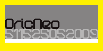 A computerized typeface inspired by the Matrix trilogy.
 - Alcira by Andinistas,
$27.95 Inspired in one of my fonts called Rosadelia.
 - Intellecta Bodoned by Intellecta Design,
$15.95a complete family of Bodoni style inspired typeface - Draft Beer Classic by FontMesa,
$25.00Inspired by the old fashioned Miller Beer logo. - Lions Den by Jesse Tilley,
$19.95 A font inspired by 40s movie posters. Enjoy!
 - Wire Clip by Intellecta Design,
$14.00a naive fancy font inspired in metal paperclips - KG Somebody That I Used To Know by Kimberly Geswein,
$5.00 Narrow, playful, jaggedy letters inspired by a typewriter.
 - Josefina by Andinistas,
$27.95Inspired in one of my fonts called Alcira. - Starring by Jesse Tilley,
$19.95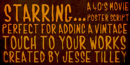 Another font inspired by 40s movie posters. Enjoy!
 - Grob by bb-bureau,
$60.00 Grotesk freely inspired by a specimen for Monument.
 - Egiptian Ornamented by Intellecta Design,
$13.90inspired in the classical wood tye egiptian fonts - As of my last update in April 2023, there isn't a widely recognized font named "Spaceman" within major font libraries or among widely used typefaces. However, let's imagine what a font aptly named "S...
- Teimer Std by Suitcase Type Foundry,
$75.00Typographer and graphic designer Pavel Teimer (1935-1970) designed a modern serif roman with italics in 1967. For the drawing of Teimer he found inspiration in the types of Walbaum and Didot, rather than Bodoni. He re-evaluated these archetypes in an individual way, adjusting both height and width proportions and modifying details in the strokes, thus effectively breaking away from the historical models he used as a starting point. Teimer's antiqua has less contrast; the overall construction of the characters is softer and more lively. The proportions of the italics are rather wide, making them stand out by their calm and measured rhythm. This was defined by the purpose of the typeface, as it was to be utilised for two-character matrices. The long serifs are a typical feature noticeable throughout the complete family of fonts. In 1967, a full set of basic glyphs, numerals and diacritics of Teimer's antiqua was submitted to the Czechoslovak Grafotechna type foundry. However, the face was never cast. At the beginning of 2005 we decided to rehabilitate this hidden gem of Czech typography. We used the booklet "Teimer's antiqua - a design of modern type roman and italics", written by Jan Solpera and Kl‡ra Kv’zov‡ in 1992, as a template for digitisation. The specimen contains an elementary set of roman and italics, including numerals and ampersands. After studying the specimen, we decided to make certain adjustments to the construction of the character shapes. We slightly corrected the proportions of the typeface, cut and broadened the serifs, and slightly strengthened the hair strokes. In the upper case we made some significant changes in the end serifs of round strokes in C, G and S, and the J was redrawn from the scratch. The top diagonal arm of the K was made to connect with the vertical stem, while the tail of Q has received a more expressive tail. The stronger hairlines are yet more apparent in the lower case, which is why we needed to further intervene in the construction of the actual character shapes. The drawing of the f is new, with more tension at the top of the character, and the overall shape of the g is better balanced. We also added an ear to the j, and curves in the r have become more fluent. To emphasise the compact character of the family, the lining numerals were thoroughly redrawn, with the finials being replaced by vertical serifs. The original character of the numerals was preserved in the new set of old-style figures. To make the uppercase italics as compact as possible, they were based on the roman cut rather than on the original design. The slope of lowercase italics needed to be harmonised. The actual letter forms are still broader than the characters in the original design, and the changes in construction are more noticeable. The lower case b gained a bottom serif, the f has a more traditional shape as it is no longer constricted by the demands of two-matrice casting, the g was redrawn and is a single storey design now. The serifs on one side of the descenders of the p and q were removed, the r is broader and more open. The construction of s, v, w, x, y, and z is now more compact and better balanced. Because Teimer was designed to make optimal use of the OpenType format, it was deemed necessary to add a significant amount of new glyphs. The present character set of one font comprisess over 780 glyphs, including accented characters for typesetting of common Latin script languages, small caps and a set of ligatures, tabular, proportional, old style and lining, superscript and fraction numerals. It also contains a number of special characters, such as arrows, circles, squares, boxed numerals, and ornaments. Because of its fine and light construction, the original digitised design remained the lightest of the family. Several heavier weights were added, with the family now comprising Light, Light Italic, Medium, Medium Italic, Semibold, Semibold Italic, Bold, and Bold Italic. - Shabby Brush by Pavel Boog,
$14.00 Shabby brush - creating this font Pavel was inspired by the past and visualized a good future. Erasing lines of letters, like memories that have passed through years. The long-lasting brush continues to create and inspire with all its strength
 - Camp Wendigo by Dear Sue,
$12.00 Camp Wendigo is a textured, hand-painted brush display font inspired by national parks, and camping in the great outdoors. Explore your logo designs, school displays, posters, signs, inspirational quotes, merch and packaging with these fun, woodsy letters! Caps Only Fonts.
 - FF Pastoral by FontFont,
$50.99 A sturdy workhorse with the grace of a gazelle, the FF Pastoral typeface family marries pure craftsmanship with rapturous excesses of form. With his fifteenth release under the FontFont brand, prolific French designer Xavier Dupré has filled a typographic toolbox with plentiful options ranging from a tender, feathery Thin to a robust, healthy Black. At a glance, FF Pastoral appears deceptively simple, particularly in the middle weights. That surface serenity is intentional and allows for easy reading and quick comprehension of short blocks of copy. Upon closer inspection, FF Pastoral is complex and nuanced, carrying a balanced tension in its forms. This plays particularly well in magazine spreads and corporate logos, where uniqueness is a virtue. In creating his latest design, Dupré drew inspiration from a tasteful mix of references, combining diverse elements with a deft hand. While its letter shapes were informed by humanist-geometric hybrid Gill Sans, FF Pastoral’s proportions have been optimized for contemporary typography. Slightly condensed but generously spaced, FF Pastoral features a tall x-height, open counters, and subtle, sprightly italics slanted at just 5°. Proportional oldstyle figures are the default in the family, with tabular and lining numbers and fractions accessible through OpenType features. Elegant details evocative of calligraphy judiciously pepper the FF Pastoral glyph set. The ‘e’ bears an oblique crossbar, while the right leg of the ‘K’ and the ‘R’ are insouciantly curved in both the upright and italic variants. Further flourishes appear throughout the italics, notably in the ‘T’ and the ‘Z’, the gloriously looped tail of the ‘G’, and an extraordinary ampersand. Sharp-eyed fans of Dupré’s work may feel like they’re in familiar territory, and they would be right. An early version of FF Pastoral sprang to life in 2017 as Malis, a family in four weights on the heavier side of the spectrum. Over time, Dupré refined his original design, expanding it with four lighter styles and including true italics for all. The lightest weights are ethereal, with exquisitely delicate strokes drawing the eye in and across a line of type. The most substantial styles are tremendous in their power, allowing text to make a deep impression in print or on screen. Fully fleshed out, FF Pastoral works sublimely in a vast array of text and display settings. Dupré sees his latest FontFont offering as a ‘cultural’ typeface, perfect for the pages of an oversized coffee-table book or business communications where warmth and informality will win the day. Born in Aubenas, France (1977), Xavier Dupré is a gifted user of type as well as an award-winning type designer and lettering artist. After training in graphic design in Paris, Dupré studied calligraphy and typography at the Scriptorium de Toulouse. Since releasing FF Parango in 2001, Dupré has published such FontFont classics as the FF Absara and FF Sanuk superfamilies, FF Megano, FF Tartine, and FF Yoga. A designer of Khmer fonts as well as Latin typefaces, Dupré splits his time between Europe and Asia.
 - Nevoa by Océane Moutot,
$32.99 Nevoa is a typeface inspired by the vernacular calligraphy from the streets of Brazil. While walking in the streets of some small towns, I felt so inspired by those rounded letters painted on the walls. That is what inspired Nevoa. Nevoa is a soft and smooth serif typeface, with dynamic curves. It is available in Condensed, Semi Condensed, Regular, Semi Extended and Extended to adapt to various uses, such as visual identity, magazine, branding, ...
 - Pedroc by Craft Supply Co,
$20.00 Introducing Pedroc – Display Typeface Future-Inspired Geometric Blocks Pedroc is a Future-Inspired Display Typeface, a captivating Display Typeface, is born from the inspiration of future technology, thus infusing an industrial touch into its design. Sleek and Futuristic Aesthetics Pedroc’s design is a testament to sleek and futuristic aesthetics. This makes it a standout choice for modern and tech-inspired projects. Versatility for Contemporary Design This font’s adaptability shines in various contemporary design contexts. As a result, it’s suitable for a range of creative endeavors, from branding to posters. Engaging and High-Tech Future-Inspired Display Typeface guarantees your content remains engaging and high-tech. Consequently, it captivates your audience with its modern industrial charm, ensuring your message resonates. In Conclusion In summary, Pedroc – Display Typeface is the font for those seeking a futuristic, industrial touch. Its sleek and versatile design ensures it fits seamlessly into contemporary creative projects. Whether it’s for tech-inspired branding, posters, or other modern designs, Pedroc is the font that keeps your content engaging and high-tech, appealing to a diverse audience with its modern industrial charm.
 - Waleed by GrafikarFonts,
$69.00 Waleed est une police de caractère Arabe, et latin inspirée du Naskh
 - Contouration by Intellecta Design,
$19.90inspired by and advertise lettering publishing from 1920's - Neue Werner Paperclip by Funk King,
$5.00 Neue Werner Paperclip is inspired by the 70s classic.
 - KG Next To Me by Kimberly Geswein,
$5.00 Hand sketched lettering in a chalkboard, Pinterest inspired style.
 - KG Second Chances by Kimberly Geswein,
$5.00 Hand sketched lettering in a chalkboard, Pinterest inspired style.
 - Deutsche Poster by Intellecta Design,
$19.95a naive font inspired in a vintage publicity poster - Martial Arts JNL by Jeff Levine,
$29.00 The 1946 foreign publication entitled "100 Alphabets Publicitaires" ("100 Advertising Alphabets") collects a number of interesting and attractive lettering samples for design inspiration. One such example is Asian-inspired and was re-drawn as the digital type face now named Martial Arts JNL.
 - Nijikon Japan by Letterara,
$14.00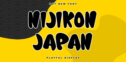 Nijikon Japan is a cool and friendly display font, inspired by Japanese cartoons. Get inspired by its childlike charm and use it to create fun designs. This font is PUA encoded which means you can access all of the cute glyphs with ease!
 - AngloAngkor by Parquillian Design,
$39.00 AngloAngkor is a display face of Western characters inspired by the elegant “round script” style of the Khmer alphabet of Cambodia. It is the first of a projected series inspired by some of the beautiful lesser-known native scripts of Southeast Asia.
 - PykesPeakZero - 100% free

- Everglow by Dismantle Destroy,
$19.00 This font was inspired by music from the band Mae.
