8,172 search results
(0.014 seconds)
- Pekin by HiH,
$15.00 Pekin is an unusual design with an oriental flavor. It was originally designed by Ernst Lauschke and released by The Great Western Type Foundry of Chicago as “Dormer,” which is similar to the French verb ‘to sleep,’ not exactly a marketing triumph. Barnhart Bros. And Spindler (independently-operated subsidiary of ATF since 1911) bought Great Western in 1918. According to McGrew, AMERICAN METAL TYPEFACES of the TWENTIETH CENTURY, BB&S renamed the typeface prior printing their 1925 specimen book — guess they wanted something just a tad more exciting. Quirky, distinctive and fun. Pekin ML represents a major extension of the original release, with the following changes: 1. Added glyphs for the 1250 Central Europe, the 1252 Turkish and the 1257 Baltic Code Pages. Added glyphs to complete standard 1252 Western Europe Code Page. Special glyphs relocated and assigned Unicode codepoints, some in Private Use area. Total of 415 glyphs (compared to 218 glyphs in the original release). 2. 652 Kerning Pairs. Note: Ag, Aj and gj will cross unless kerned. Alternative A may also be used. 3. Added OpenType GSUB layout features: onum, salt, liga, dlig, hist, ornm and kern. 4. Revised vertical metrics for improved cross-platform line spacing. 5. Refined various glyph outlines, based on improved scans. 6. Added set of Tabular Numbers at cap height, based on original design; added Old-Style Numbers based on default design. 7. Added a bunch of alternative characters: 18 upper case letters, 10 lower case letters, 1 ampersand and 1 bullet. The alternate c is actually the original design, but I don't like it - easily confused with e. Alt E H M h m n r t are from the original design. I added the rest. 8. 7 Ligatures, 4 Ornaments, 18 Geometric Shapes, 6 Arrows and 12 Misc. Symbols. The zip package includes two versions of the font at no extra charge. There is an OTF version which is in Open PS (Post Script Type 1) format and a TTF version which is in Open TT (True Type)format. Use whichever works best for your applications.
 - XChessNut by Ingrimayne Type,
$5.00 XChessNut contains two chess fonts that resemble actual chess pieces. The key layout is a bit complicated; see the key guide for detailed information on how to position pieces correctly.
 - Kanji OC by Okaycat,
$29.95 Kanji OC is a latin font with a kanji character in place of each letter. The key chart in the gallery section shows the relationship between keyboard keys and kanji.
 - Shinn Kickers JNL by Jeff Levine,
$29.00 Conrad X. 'Cobb' Shinn (Sept. 4, 1887- Jan. 28, 1951) was a Fillmore, Indiana-born post card illustrator who sold a series of successful novelty postcard lines which included (among others) Charlie Chaplin, automobiles and the Dutch culture in the beginning years of the 20th Century. After serving in World War I, Shinn found the market for novelty postcards dwindling, and he also lent his artistic skills to cartoon features and illustrating many children's books [including his own, under the nickname 'Uncle Cobb'] which taught easy step-by-step drawing methods. Some time in the 1920s, he eventually migrated into the field of supplying electrotypes and stereotypes of 'stock cuts' of photos and line art to the printing trade. In the days of letterpress printing, this was the forerunner of paper clip art and its successor, electronic clip art. Purchasing many of his designs from 'journeyman' artists of the time, the diversity of Cobb Shinn's stock cuts library grew with the passing years, reflecting changing times, styles and topics. Some of the illustrators whose signed works were presented in Shinn's 'CUTalogs' [as he called his stock cuts catalogs] include Mary Clemmitt, Louis H. Hippe, E.C. Klinge, Nelson White, Harvey Fuller, Bess Livings, Lois Head, Harvey Peake and Van Tuyl. Upon his passing in 1951, it's not known how long the Indianapolis-based company existed before finally closing its doors. One of the more popular series of cartoons were the line illustrations of men and women affectionately called 'little big head guys' by many modern fans of these cuts because the heads of the characters were drawn somewhat larger than the rest of their bodies. Shinn Kickers JNL is a collection twenty-six of these illustrations, and just like a kick in the shin (as the pun in the name implies), these charming cartoons get your attention.
 - Earth Encounters by Scrowleyfonts,
$24.00 When my Taiji teacher gave all of his students a handwritten card with their name on I noticed that he had an unusual and beautiful handwriting. I persuaded him to write out each of the standard glyphs for me in return for me doing some repairs to his trousers! Earth Encounters Family is the result. The regular font and the light version include OpenType coding to offer the option of different versions of the same letter in words, giving the effect of real handwriting. Earth Encounters also comes with a Shadow style.
 - Koren Siddur by Masterfont,
$59.00 This is a unique design by Elyahu Koren. He wanted to design another version of his Koren Tanakh sacred font that was for Biblical use only. So he designed Koren Siddur to be used for page numbers etc. OpenType Pro Excellent support for Niqqud (Vowels). All marks are programmed to fit each glyph's shape and width. OpenType Pro includes new advanced features like Dagesh Hazak, ShevaNa, Qamatz Katan, Holam Haser and wide letters. Best used with Adobe InDesign CC that support complex Hebrew text. Please check these advanced features in this link: tinyurl.com/2fbkuy95
 - ITC Bailey Sans by ITC,
$39.00ITC Bailey Sans is the first typeface family created by Kevin Bailey, a graphic designer in Dallas, Texas. He was once looking for an understated block serif for a design project and could find nothing suitable. Bailey began working on his own serif face but then found that the basics of his new design worked well as a sans serif and continued on that track. ITC Bailey Sans font is available in four weights: book, book italic, bold and bold italic and even has a companion serif display font, ITC Baily Quad Bold. - Architype Ingenieur by The Foundry,
$50.00 Architype Ingenieur was inspired by Wim Crouwel’s late 1950s exhibition catalogues and posters, for which he had created a few geometrically constructed, simplified letterforms. In the 1960 Venice Biennale Dutch entry poster, he drew grid-based letters with 45-degree angles for ‘olanda’, the style influenced by his boyhood fascination with naval lettering. A subtle variation appeared in the Stedelijk Museum catalogue for painter Jean Brusselmans. Several dot matrix versions followed. The themes and systems in these early letterforms are encapsulated in this new four weight family Architype Ingenieur.
 - P22 Goudy Aries by P22 Type Foundry,
$24.95 Frederic W. Goudy (1865-1947) created over 100 typefaces during his lifetime. Like most type designers, he is known principally to most people only through his eponymously titled faces such as Goudy Modern, Goudy Old Style etc. This set includes one of Goudy's rarest Arts & Crafts styled faces, a font known as Aries. The font was originally created by Goudy for a private press in Eden, New York in 1926. Also included in this set are two decorative fonts: one font of 52 decorative Ornaments & one font that contains 52 Ampersands.
 - Architype Schwitters by The Foundry,
$99.00 Architype Konstrukt is a collection of avant-garde typefaces deriving mainly from the work of artists/designers of the inter-war years, whose ideals have helped to shape the design philosophies of the modernist movement in Europe. Due to their experimental nature character sets may be limited. Architype Schwitters was developed from the phonetic experiments made by Kurt Schwitters with his 1927 universal alphabet, where he attempted to link sound and shape. He ‘played with’ using heavier, wider, rounded forms to convey the vowels, creating a unique visual speech texture.
 - Keystoned by TypeArt Foundry,
$45.00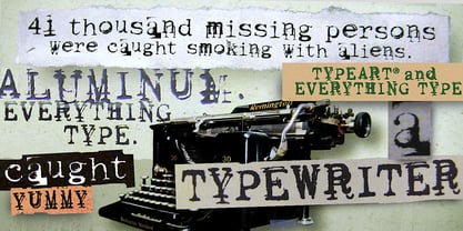 Typewriter with problem keys.
 - Ariata by Monotype,
$50.99 Ariata™, from Malou Verlomme, is three typefaces in one. Like phases of the moon, they gracefully meld from one to the other. The “Text” weights are sturdy designs that perform as well in blocks of copy as they do in the occasional headline. The “Display” versions of Ariata are delicate but confident designs that shine in large sizes, while the “Stencil” typefaces are eye-catching and provocative. Each version is available in four weights, from a forthright regular to a robust black, making for a family that is comfortable taking on a wide variety of tasks. The individual designs can be combined with each other to create a distinctive, yet cohesive typographic statement, or stand on their own as confident communication tools. If you want a little more variety, Ariata’s solid glyphic shapes will serve as a dynamic counterpoint to just about any Humanistic sans. Space economical and distinctly original, Ariata easily creates commanding headlines, pull-quotes and subheads. Packaging, game branding, posters, book jackets and advertising design are all also within its comfort zone. While primarily intended for print applications, Ariata’s full-bodied x-heights, generous counters and clear apertures make for a design that is also at home in many digital environments. Verlomme is an award-winning Senior Type Designer at Monotype. He has a degree in graphic design from l'École Duperré in Paris, and an MA in Typeface Design from the University of Reading. He taught type design at several universities in Paris and still occasionally lectures and gives workshops. His typeface Camille has the honor of being part of the collection at France’s Centre National des Arts Plastiques (CNAP). Verlomme also designed Placard® Next, Madera™ and Johnston100, London’s new underground branding typeface. Click here to see all of https://www.monotype.com/studio/malou-verlomme Malou Verlomme’s typeface designs.
 - Wakame by Stabenfonts,
$30.00 Wakame is a friendly, playful, all uppercase font for book cover, display, packaging, poster, or whatever you can imagine. Each letter has three variations, which are automatically changed, when repeated. Hey, not only when side-by-side, but also if there are up to ten characters in between. Spice up your font menu with Wakame and stabenfonts!
 - Abecedarian by The Type Fetish,
$10.00 Chank claims to have the fastest type design, we think we have the youngest. Samuel was merely four years old when he wrote out his first face. We are expecting many more brilliant typefaces from this upcoming designer. Please note that this font has no numbers or punctuation symbols; Samuel just did letters at that time.
 - Ambriel by Type Innovations,
$39.00 Ambriel is a fancy neoclassic delight—typographic "eye candy" for the senses. Alex Kaczun embelished one of his earlier typefaces, Kaczun Oldstyle Italic, and infused it with many decorative elements including extravagant ball terminals along with many additional whimsical touches throughout. And, what he created is a truly unique display font reminiscent of the ornately decorated Victorian era.
 - Kamaboko by Fype Co,
$14.00 Hey guys! Today I want to present to you with Kamaboko decorative display font, this fun font is a perfect choice if you want to give your design a playful and childish look. This is a cute font that would be perfect for the cutest cards, posters, flyers, calendar, packaging, T-shirts, invitations and so much more!
 - Benderville by Patricia Lillie,
$39.00Benderville comes with a solid construction, an ample x-height, an angular edge, and an attitude to match. A sort of rangy slab-serif with a voice all its own -- a voice that seems to holler "Hey! What you lookin' at?" Its sturdy single weight has a complete character set, including ligatures, diacriticals, and other symbols. - Kalligraphia by Linotype,
$40.99Otto Weisert was a German type founder who ran his own foundry in Stuttgart during the early years of the 20th Century. In 1902, he created Kalligraphia, a cursive Art Nouveau display script face. Kalligraphia has a unique stroke contrast model; the tops and bottoms of its letterforms are thicker than the verticals on its sides. - Chocolate Peaches by PeachCreme,
$12.00 Hey guys! So happy to introduce you our new font “Chocolate Peaches”! It is great for projects that have a playful or cute theme, whether for labels, signage, packages, stickers, etc. Along with being legible due to its bold letters, this typeface can make a lovely addition to boho designs that incorporate natural elements, patterns, texture and many colors.
 - Mouse Paw by Alexander Sharkov,
$5.00 My home mouse, Hector, drew this wonderful font for kids. He tried very hard and hopes that you will like the result of his work! This font is perfect for advertising various children's brands, decorating children's books, and generally any children's projects! Hector and I believe that the font Mouse Paw will help you in any business.
 - FS Aldrin by Fontsmith,
$80.00 Elegant and round Having harboured a desire for a rounded font within the Fontsmith library for some time, Phil Garnham recognised that FS Emeric offered the perfect skeleton around which to design it. Most new rounded fonts rely on scripts or other in-app automation to form their characters. For all their warmth and approachability, they too often conjure images of jelly sweets and sausages. Not so FS Aldrin, where every curve and transition has been crafted by hand, giving a distinctive look and elegant feel. Design highlights FS Aldrin enjoys wide-open ‘lunar’ counters and soft, tube-like terminals. These improve legibility, especially on backlit signage and screens. The open proportions and circular strokes are juxtaposed against a more serious technical aspect that exists within each counter shape. The lighter weights feel precise and efficient, perfect for notes on blueprints or technical drawings. The heavy weights are equally crafted but more playful by their rotund nature, and are perfect for strong headlines or packaging projects. UI icons A suite of 268 icons complement the typeface beautifully and extend the design language in all directions. They cover a range of commonly used applications and themes ranging from ecommerce to weather, and also serve as a solid starting point for a bespoke brand icon set or UI. In addition, born of FS Aldrin’s astronomical theme and playful nature is a special collection of space-themed icons, including rockets, shuttles and lunar modules (hint: if you type the word BUZZ with ligatures enabled, an astronaut appears). Earth to Buzz Buzz Aldrin was the pilot of Apollo 11’s lunar module, the one that put man on The Moon for the very first time. Early on in the project’s life, FS Aldrin emerged as the ideal hook on which to hang the font’s space helmet (hardly surprising given Phil’s fascination with space travel and astronomy). An approach was made to Buzz’s management to see if he would sanction the association. Not only was the great man himself happy to see his name on a typeface, he also asked to use it in his upcoming keynote talks, book launches and online projects.
 - Bayer Sans by Victory Type,
$20.00Bayer Sans, is based on the typography of the Austrian-born artist Herbert Bayer. Bayer worked as a teacher and graphic designer at the Bauhaus, a revolutionary German art school, during the 20's. His specialty was commercial art and he had many "radical" views on typography and its interaction with society. Bayer felt that written language should be merely a graphic version of spoken language. Thus, he advocated a single alphabet without majuscules and miniscules. Bayer's designs are simple, geometric letterforms that lend themselves to lowercase form. This font, based on the typography of Bayer and his students at the Bauhaus Werkstatt (studio), was digitally modeled by Noah Rothschild. Bayer Sans features a complete character set including European characters, alternate letters with adjusted widths and designs and ligatures. Included are the "f" characters and a special linked double-o. - Andada - 100% free

- Stripelane - Personal use only

- Future Brake - 100% free

- Polymoda - Personal use only

- Hertzace - Personal use only

- Gravitron - Personal use only

- Lamenta by Dawnland,
$13.00 All that remains from this once so proud and glorious antiqua are steel skeletons. Destroyed. Distorted. Ruins. The main focus and usage of LamentaX are headlines, posters for event graphics and music/media/game packaging. Lamenta X was revised 2012 and now hold a full character set of basic english/latin letters and west european diacritics!
 - Correntino Railway by Fabio Ares,
$- Correntino Railway is a product of argentine typographic archeology project called “Tipografía Histórica Ferroviaria” (Fabio Ares & Octavio Osores, since 2012). Is about the signboards of the stations of the line of the Argentine Correntino Economic Railway (1892-1969). The letter of this signboards can be described as display type, with elementary geometric shapes, vertical line modulation and slight contrast.
 - Chuck by Parkinson,
$20.00 Chuck. Designed in 2004 by Jim Parkinson. Originally released as a Type 1 font, Chuck was refreshed (version2) and re-released as simple Open Type in 2012. The models for this massive Deco typeface appear on a bronze plaque on the South Tower of the Golden Gate Bridge. The plaque commemorates the builders of the bridge.
 - Awe by Dawnland,
$13.00 An awe inspiring nightmarish font for use wherever you need to add unease or fear to your artwork. The main focus and usage of AweX are headlines, posters for event graphics and music/media/game packaging. AweX was revised 2012 and now hold a full character set of basic english/latin letters and west european diacritics!
 - Display Uncanny by Gerald Gallo,
$20.00 Display Uncanny is a display font not intended for text use. It was designed specifically for display, headline, logotype, branding, and similar applications. The same A to Z characters are located under the shift+character set and character set keys with the ones under the character set keys reduced in size. There are numbers and punctuation located under their respective keys.
 - Initial Seals JNL by Jeff Levine,
$29.00 Initial Seals JNL was created by utilizing the typeface from Gummed Letters JNL and one of the decorative dingbats from Miscellany JNL. On the capital A-Z keys, the letters are black on a white on black seal design, while the lower case a-z keys have a seal version in solid black with white letters. Corresponding blank versions of the seals are on the left and right parenthesis keys, and the period key has a fill oval for overlaying background colors onto the black and white set.
 - Gristwood JNL by Jeff Levine,
$29.00 The rustic lettering which also served as the model for Grist Mill JNL is the basis for Gristwood JNL. Another set of vintage wood type has the letters reversed out of blocks, making for a specialty titling font. Decorative end caps are located on the greater and less than keys and also on the plus and equal keys. A blank block for regular word spacing is on the underscore key, along with a wider blank box on the backslash key. This typeface has a somewhat limited character set.
 - Charlonka by PleasureFonts,
$22.00 I‘d like to introduce “Charlonka“ to you. When my daughter finished high school, she wanted to get rid of her entire school stuff. So I saved a few sheets of her beautiful handwriting and promised her to create a typeface out of it. That‘s how the idea of Charlonka was born, a typeface family out of Charlotte‘s handwriting (by the way: that‘s her name). Some characters of Charlonka have extended crossbars, like in upper case A or H, and reduced descenders, like in lower case g or y.
 - Koufiya by Linotype,
$187.99 Koufiya is designed by Nadine Chahine in 2003 as part of her MA project at the University of Reading, UK and later released by Linotype in 2007. It is the first typeface to include a matching Arabic and Latin designed by the same designer at the same time with the intention of creating a harmonious balance between the two scripts. The Arabic part is based on the Early Kufi style popular in the 7th to 10th century AD. It is characterized by a strong horizontal baseline, horizontal stacking order, clear and open counters, and a general open feeling. Though based on the earliest styles on Arabic manuscript, the design paradoxically appears quite modern and fresh. The Latin part of Koufiya recalls a Dutch influence in its shallow top arches and rather squarish proportions. Both Arabic and Latin parts have been carefully designed to maintain the same optical size, weight, and rhythm. However, no sacrifices were made to make them appear closer to each other. They are designed so that they work well together on the printed page, and to make sure that the two scripts are harmonious when they are mixed together even if within the same paragraph. The font includes support for Arabic, Persian, and Urdu. It also includes proportional and tabular numerals for the supported languages.
 - LiebeLotte Swell by LiebeFonts,
$29.90 Have you heard? It’s in the stars: next July we collide with Mars! But until then, there are plenty of good reasons to treat yourself to this swell typeface. LiebeLotte Swell is a great investment for letter lovers who design beautiful things for their friends and family and also for designers who love their clients: Your next birthday invitation? Check. That photo album you’re making for your mom? Check. The business cards you’re designing for your friend who runs a deli? Check. There are so many nice things that want to be designed, and LiebeLotte Swell wants to be your assistant in the old-fashioned way: polite and friendly. Just like her monolinear siblings in the LiebeLotte family, charming LiebeLotte Swell knows how to impress with her perfectly drawn curves and her perfectly connected loopy letterforms. Of course LiebeLotte Swell comes with a state-of-the-art character set. She also sports a variety of ligatures and alternative forms, available through OpenType features. (Please make sure your software supports ligatures for the letter connections and OpenType if you wish to use the advanced features.) Advanced designers, check out the complete LiebeLotte family with six weights of monolinear loopiness. You may also want to take a look at our best-sellers LiebeErika and LiebeKlara, they get along great with LiebeLotte Swell.
 - Autumn Leaves by Matthias Luh,
$15.00 These modern, handwritten letters can be used for fancy headings or images. The characters aren't oriented straight or orderly, but a bit random. So they look like they were written by a human.
 - Mirror Display Bold by Mom,
$19.00 Mirror Display is based on the condensed sans. Developed to 'double view' to give readers the same feeling they have when looking to a work of art they don't understand at first glance.


