10,000 search results
(0.032 seconds)
- Floe by Jolicia Type,
$20.00 This is the one and only Floe designed by Jolicia Type in 2021 every single letters have been carefully crafted to make your text looks value typhography
 - Hosbela by Nissa Nana,
$22.00 Hosbela is a beautiful script font. It has a classy, elegant, and modern look that works perfectly in any design projects in need of a handwritten touch.
 - Forward Passed JNL by Jeff Levine,
$29.00 Some Impko decal letters and numbers with a "college look" from the 1960s were the inspiration for designing "Forward Passed JNL"; Jeff Levine's second sports-themed font.
 - Insektogram by PizzaDude.dk,
$15.00This baby's got a fancy look to it. I personally used it for the nameplate at my frontdoor. You oughta do the same for your frontdoor too! - Caroni by Franzi draws,
$- Caroni is a cute handmade typeface, which was originally created in 2018 as a free font. It has a simple and clean look, and works great for longer texts. Caroni has already been used in numerous children's books, so now it was time to extend Caroni's look, and add more styles. The Caroni Family at a glance If you like Caroni, you will love the Caroni font family! Caroni now comes in bold and italic, and it has nine awesome siblings: Avenue (all dressed up with stylish serif strokes) Lime (the skinny version of Caroni) Avenue Lime (the skinny version of Caroni Avenue) Tabanca (dark and heavy, this is Caroni's brush version) Doubles (enhanced with fine lines) Fete (with fun little dots) Coconut (Caroni's outline style) Soursop (Outline with dots, a great display font) Carnival (a quirky and fun all-caps version) Caroni was created while staying with a friend in Trinidad, hence the names :) Languages supported: Afrikaans, Albanian, Asu, Basque, Bemba, Bena, Bosnian, Catalan, Cebuano, Chiga, Colognian, Cornish, Corsican, Croatian, Czech, Danish, Dutch, English, Estonian, Faroese, Filipino, Finnish, French, Friulian, Galician, Ganda, German, Gusii, Hungarian, Icelandic, Ido, Inari Sami, Indonesian, Interlingua, Irish, Italian, Javanese, Jju, Jola-Fonyi, Kabuverdianu, Kalenjin, Kinyarwanda, Kurdish, Latvian, Lithuanian, Lojban, Low German, Lower Sorbian, Luo, Luxembourgish, Luyia, Machame, Makhuwa-Meetto, Makonde, Malagasy, Malay, Maltese, Manx, Maori, Morisyen, North Ndebele, Northern Sami, Northern Sotho, Norwegian Bokmål, Norwegian Nynorsk, Nyanja, Nyankole, Occitan, Oromo, Polish, Portuguese, Romanian, Romansh, Rombo, Rundi, Rwa, Samburu, Sango, Sangu, Sardinian, Scottish Gaelic, Sena, Shambala, Shona, Slovak, Slovenian, Soga, Somali, South Ndebele, Southern Sotho, Spanish, Swahili, Swati, Swedish, Swiss German, Taita, Taroko, Teso, Tsonga, Tswana, Turkish, Turkmen, Upper Sorbian, Vunjo, Walloon, Welsh, Western Frisian, Wolof, Xhosa, Zulu
 - Quirky by Scholtz Fonts,
$19.95 The idea for Quirky was born while I was looking at a book of etchings by British artist Graham Clarke. His signature, crawling spider-like across the page, fascinated me with its casual, almost messy, inky dark and light drama. I started scribbling the alphabet as I imagined he would write it, based on his signature, then continued, adding curls, making the characters more angular, and refining the dramatic play between dark and light. Finally, Quirky appeared. Apparently casual, Quirky is, in fact, a true connected script. Quirky is characteristic of contemporary handwriting: It appears loose, angular, unstructured, and free, while maintaining good form and legibility. Its baseline is varied, creating an impression of impatient handwriting, without losing legibility. Quirky comes in five styles: condensed -- the most dramatic form, with great drama between thick and thin condensed black -- as with condensed but allows the user to provide exceptional emphasis wide -- increased readability wide black -- increased readability and emphasis splat -- messy and ink-blotted -- a hint of grunge Use Quirky for advertising, for humorous greeting cards, for a funky fashion look or tongue-in-cheek spooky media. Quirky is a fully professional font with extensive use of OpenType Ligatures. For example: most common double letter combinations such as "ee" are rendered as two, slightly different shaped "e"s. This variation in letter shapes removes the cues by which the reader identifies that he is viewing a FONT and thus conveys a strong sense of hand-lettered text. Language support includes all European character sets and has been designed to be used with the following languages: Afrikaans, Albanian, Basque, Bemba, Cornish, Danish, Dutch, English, Estonian, Faroese, Filipino, Finnish, French, Galician, Ganda, German, Icelandic, Indonesian, Irish, Italian, Kinyarwanda, Luo, Malagasy, Malay, Manx, Morisyen, North Ndebele, Norwegian Bokmål, Norwegian Nynorsk, Nyankole, Oromo, Portuguese, Romansh, Sango, Shona, Somali, Spanish, Swahili, Swedish, Swiss German and Zulu.
 - Sharp End by Asritype,
$18.00 Sharp End fonts support Latin Based Languages only (see Tech Specs). Sharp End's creation is inspired by Gothic sharpness shape but only applied to the ends of normal letters. Make the font look beautiful and elegant, look as semi-serif, as calligraphic touch or others. The base of the Capital Characters is set a little bit lower than the small cases/lowercases. On small/normal size typing, the difference is less visible (obscure), but will be more visible/more clear as the typing set larger. Thus, Sharp End fonts will work well for both text and display. The fonts has also character variants. The character variations (in PUA) set in 5 stylistic sets ss01 ... ss05 (see Sharp End opentype features poster). So, these character variations will be easier accessible in more common application such as MS Words, Text Edit or the others. The glyphs may also be accessed via Character Map, Character viewer, insert character, insert symbol or other similar tools. You can use Sharp End for most of typing and design means such as: greeting, invitation, wedding and other cards; books, magazines, news, banners, logos, Pamphlets, advertising etc., for printing or digital/web display. As addition, with 3 weight variants, the regular will fit for longer text for normal use, while the bold and semi-bold is more suited for the covers, impressions, titling, Logos, design or other usage. With its smoothness curve and sharp ends, Sharp End will pairs well to most fonts of various kinds: Sans Serif, Serif, Handwritten, Scripts and others. As the example in one poster, Sharp End is paired with Astonice and Apresia Script (ornamented script font, one of the richest letter variations and ornaments). Thank you for visiting. Again, thank you very much for downloading this awesome fonts.
 - Adelle by TypeTogether,
$52.00 While Adelle is a slab serif typeface conceived by Veronika Burian and José Scaglione specifically for intensive editorial use, mainly in newspapers, magazines, and online, its personality and flexibility make it a true multipurpose typeface. Adelle’s superior screen rendering and cross-platform consistency has also made it one of our most popular webfonts. The intermediate weights deliver a neutral look when used in text sizes, providing the usual robustness expected in a newspaper font. The unobtrusive appearance, excellent texture, and slightly dark colour allow it to behave flawlessly in continuous text, even in the most unforgiving editorial applications. As it becomes larger in print, Adelle shows its personality through a series of measured particularities which make it easy to remember and identify. Its energetic character, so inherent to slab serif fonts, becomes evident when used for subheadings and headlines. A condensed series of seven weights with matching italics expand Adelle’s possibilities. This extension provides flexible solutions in situations where saving space is vital but losing legibility is not an option. The new condensed series shares the same personality, proportions, and skeleton of the Adelle family, creating an harmonious texture when combined. Be sure to check out the companion to Adelle, Adelle Sans, to complete the look of your design with the intended personality and flexibility. Awards – Third prize for Latin text typeface in the 2009 Granshan Type Design Competition – Won Gold for Original Typeface in the 2010 European Design Awards – Selected in the first Ukrainian typeface competition in 2010 – Exhibited at the Rutenia Calligraphy & Typography Festival (http://rutenia.org.ua/en/index_u.html) in Kyiv, 2010 – Selected in the 2011 Type Directors Club Tokyo Exhibition – Selected in Communication Arts 2011 Typography Annual – Selected in Yearbook of Type I, 2013 – Part of the exhibition «Call for Type» and subsequent book Neue Schriften (New Typefaces)
 - Nusaibah by Eyad Al-Samman,
$20.00 “Nusaibah” is the first name of an early convert woman to Islam, and the first female to fight in defense of the Islamic religion. Her full name is Nusaibah bint Kaíab Al-Maziniyyah and she took part in the Battles of Uhud, Hunain, Yamama and the Treaty of Hudaibiyah with Islam’s prophet Muhammad (pbuh). Nusaibah is best known for her brave and heroic feat during the Battle of Uhud - fought on March 19, 625 - when she entered the battle carrying a sword and a shield to protect the prophet Muhammad (pbuh) from the arrows of the enemy, and she accordingly received several wounds while fighting and these wounds were not healed until the following year. The prophet Muhammad (pbuh) mentioned her distinct courage by saying that in whichever direction he turned in the battlefield, he could see her defending and protecting him. "Nusaibah" is a modern, geometric, and headline Arabic display typeface. The main trait of this typeface is the novel symmetrical design of its letters which renders it as one of the modern stylish typefaces used for headlines and titles. This is can be noticed in its letters such as “Theh”, “Jeem”, “Ain”, “Sheen”, and others. Moreover, “Nusaibah” font has a character set which supports Arabic, Persian, Urdu, and Latin letters and numerals with a limited range of specific Arabic and Latin ligatures. This font comes in two weights (i.e., regular and bold) with nearly 643 distinctive glyphs. Due to its geometric and linear design, “Nusaibah” typeface is appropriate for heading and titling in Arabic, Persian, and Urdu magazines, posters, and surfaces of different equipment. It is also elegantly suitable for signs, books’ covers, advertisement light boards, products’ and services’ names, and titles of flyers, pamphlets, novels, and books of children. “Nusaibah” typeface is one of the Arabic typefaces that has a novel and modern-day design which can be used in versatile graphic, typographic, and artistic works in different languages for diverse cultures.
 - Abesif by Twinletter,
$12.00 Introducing Abesif sans serif font. This font is stretched from the normal theme, it is boring, while different, it seems strange. from there we design the appearance of this font that is not normal so that it is not boring and we display it differently but not look strange. so if you use this font it will look different from the others but it doesn't look strange because it has a normal design. so that it creates an impression that is easy for each of your audience to remember when they first see your project. This font is very suitable as text with displays for various kinds of branding, advertisements, posters, banners, packaging, news headlines, magazines, websites, logo design, banners, social media design and of course you can use a lot more.
 - Birdfrey by Grappix Studio,
$15.00 More information about this Font Introducing our new modern serif retro bold display font "Birdfrey" Birdfrey is a modern serif font with a fresh and beautiful look. It has a modern and vintage look. It has extra glyphs to give more options for crafters in designing. Swirly extras will make it look classy and elegant. Birdfrey is perfect for any project, for modern or even retro vintage design. It's covering a wide range of project types, from bold magazine imagery, to wedding invitations, to branding, poster design and so much more. Font Features: Uppercase and Lowercase Numeral and Punctuation Can be used in any software, like Adobe Photoshop, Illustrator, Silhouette Studio, even Microsoft Word, PowerPoint and others. Let me know if you have any questions at all :) Thank You! Grappix Studio
 - Allonges by Nathatype,
$29.00 Looking for a font that will make your branding stand out? Do you sometimes have an appetite for a bit more wholesome typography? Looking for a fabulous, stylish, and adventure font? We've got what you want. Allonges -A Script Font Alllonges script is suitable for today's growing market design, this font has a model trendy, natural and soft, with this font you can take advantage of an occasion in every moment. Allonges is a new modern script font with an irregular base line. Style trendy and feminine. Allonges looks beautiful for branding, logos, wedding goods, greeting cards, fashion, lookbook, marketing promotions. Our font always includes Multilingual Support to make your branding reach a global audience. Features: Ligatures Stylistic Set Swahes PUA Encoded Numerals and Punctuation Thank you for downloading premium fonts from Natha Studio
 - Monvar by Flavortype,
$15.00 Monvar, A new Cooper with layered typefaces. It’s Simple, Bold, Versatile, and Friendly feel that you get in Monvar Typefaces. Monvar comes with 5 Layers : (that you can mix and match the looks as you like) Base Inset Outline Shadow 1 Shadow 2 Monvar Created with an All Caps that the uppercase are using an initial swashes. Perfect fitted layer to give you a more contrast, more bold look of the title. Every glyphs including the alternate characters are curated for the best and possible without eliminate characteristic of this fonts. Our creation on the display to give you a reference what it looks like on your project. such as Branding, Header, Logotype, Poster, Magazine, Packaging, Food Menus, and etc. It shows that Monvar clearly can accommodate various design style.
 - Millie by Kyle Wayne Benson,
$10.00 Millie is a stressed, geometric script who spends her days as industrial lettering and her nights paired with blackletter on the patches of motorcycle gangs. Millie was weighted by the conventions of broad nib calligraphy, inspired by the Milwaukee Tools logo, and finds herself best used in logos and titles. She was designed to be used on about a 20 degree angle, though she looks just fine on a level plane. By using opentype, many ligatures, and two sets of stylistic alternates, Millie was developed to look great with any string of letters. Access the first stylistic set for a disconnected script look, and the second set for even more connections and fluid script than standard. Millie Round takes the edge off a bit, giving the entire set a more approachable and versatile feel.
 - Nekluch by Twinletter,
$17.00 The Nekluch font is the perfect reflection of the classic elegance that designers desire. With a charming Vintage Display style, this font brings an invaluable retro feel to every project. This is the perfect solution to create a classic look and a strong, nostalgic visual branding design. What makes Nekluch truly special is its variety of features. There is a complete family that includes regular, shadow, slant, blur, outline, and shadow slant, allowing you to express your creativity with a variety of typographic styles. Also, don't miss the ligatures and alternates that add a unique feel to each letter. Multilingual support ensures that you can reach a global audience. So, if you are looking for a font that not only looks beautiful but is also easy to use, Nekluch is a wise choice.
 - Saratoga Slim AOE by Astigmatic,
$19.95He's rough around the edges, but he's an outlaw from the Old West, what did you expect? He's Saratoga Slim, a playful shaken up dust devil of a typeface. With a shaken appearance and rough hewn letters, he steps onto the scene, yet is clearly legible to read. He's alot like a one of those ruffigans that is crude around the edges, but when he looks at you and says, "Get what I'm saying partner?", you know exactly what he means. Put some rough and tumble type into your designs with Saratoga Slim. He's been through the ringer a few times but keeps coming back for more. Isn't that what you look for when you create a design...durability...? Here it is, Saratoga Slim, looking at you! Get it today! - Technik by CarnokyType,
$25.00 Technik is a constructed typeface, which is almost strictly designed from basic geometrical elements consisting of mainly circles, also squares and diagonal shapes. Another characteristic is the connection of diagonals, verticals and diagonals, and also of some circle shapes touching each other at one point. It gives this type an original look, and prevents the problematic dark places in some letters. The technical feeling of the type (mainly in uppercase letters) is balanced by the design of lowercase which looks more friendly and fresh. Technik is not designed as a text typeface, it is recommended mainly for display typesetting. You can use it for example in fashion industry or in branding typography, or everywhere where you need the technical feeling of the constructed typefaces to look less cold and more friendly.
 - Autentico realistic handwriting by Redy Studio,
$19.00 Beautiful and sexy handwriting types. You will love the look of this font. Autentico font was inspired by modern calligraphy, but with a more crushed look, making it perfect for wedding invites, greeting cards, or logos. Use the upper case letters to add elegance to images or give your design some style. We included a full set of lower and upper case letters, numbers, punctuation marks, and 93 ligatures to take your design to the next level. Authentico features: A full set of upper & lowercase characters Numbers & punctuation 93 Gorgeous ligatures Alternates in lowercase Multilingual symbols PUA Encoded Characters – Fully accessible without additional design software. Feel free to give me a message if you have a problem or question. Thank you so much for taking the time to look at one of our products.
 - Typewriter DirtY by Matthias Luh,
$32.00 Typewriter DirtY is related to the Typewriter BasiX and Typewriter Revo fonts. While Revo has a very clean and simple outline, BasiX is a bit washed out and looks worn. DirtY goes a step further and has a very dirty, worn, fuzzy, grungy vintage look – even more so than BasiX. Typewriter DirtY is especially suitable for headlines, logos, covers, slogans and much more. BasiX and Revo are recommended for longer texts. Although Typewriter DirtY looks good even in small font size, it is a bit more complex to render because of its detailed outlines. Typewriter Revo, BasiX and Dirty are monospaced typewriter fonts, which are matched to each other. They have the same dimensions and generally somewhat similar contours. Therefore, they can be perfectly mixed and matched with each other.
 - Oceanwide Pro by California Type Foundry,
$47.00 A font perfect for not just one, but many projects! Introducing Oceanwide Pro, a sans that loves to be used in just about any situation! Designed with ultra clean lines and versatility in mind, Oceanwide wants to be your new favorite sans! Oceanwide’s ultra clean letters work anywhere you want to communicate orderliness and competence, and designed to build trust and rapport with your audience. Its wide proportions make it ideal for display and logo use. Oceanwide especially shines for white/bright letters on black/dark backgrounds! That’s because the inside shapes are nearly perfect circles in many weights. Here's a quick video tour of Oceanwide Pro by Dave Lawrence, including all the great things Oceanwide can be used for! We've tested Oceanwide for these industries, with stunning results!: Tech Arts Fashion & Style Business & Branding Corporations Logistics Architecture Food and many more... Oceanwide can be used for: Headers Subheadlines Logos Even body text, if tracked. Print & Screen The styles it can take are also many. It's great for: Modern/minimalist design Flat design Cut out design User Interface (UI) Technical designs In combination with text effects, even for grunge and other situations. And many others... DESIGN FEATURES Simplicity Tall x-height Hand-sloped obliques (italics) Narrow spacing Semi-wide proportions Expert kerning Well proportioned, usable lights & extra lights Large caps Great ALL CAPS MODE Uppercase punctuation Uppercase spacing with California Type Foundry’s Smart Tracking™ Advanced fraction support Proportional lining figures Thick joins Smooth curves Sturdy—great for textures and effects Variable font available Latin Pro character set for Central European languages. That's the writing for over 782 languages and transliterations worldwide! DESIGN STORY—THE FORGOTTEN SANS by Dave Lawrence, Lead Designer, California Type Foundry Adrian Frutiger was the 20th century master of sans, but I didn't realize he had made—not one—but TWO geometric sans! It wasn't until I had purchased the book “Adrian Frutiger: Typefaces”. I had hoped to someday meet Adrian Frutiger, but he passed away that very same year. Here is the story of Frutiger's forgotten sans. Back in 1968, Frutiger was approached by Pentagram to make a design for British Petroleum. They wanted a "new version of Futura". However, they wanted him to make a couple adjustments. First, they felt that Futura was "too fiddly." By this, they meant that it narrowed too much at the joins. (Joins are for example where the round and straight parts of the 'd' meet.) This is something that is necessary for small print text (to prevent ink clogging), but is not necessary at large sizes. Second, they wanted it to be entirely geometric, using the circular shape with minimal optical corrections. Unfortunately this font was not even used very consistently in the BP brand. A haphazard mix of Futura and Frutiger's BP font ensued. It was then replaced by another font design very soon after. My design is different in several ways. First, the commas and quotes are a more modern style. I tried his original commas, but these just didn’t work to 21st century eyes. Second, in his drawings, Frutiger went for a more standard u with a downstroke on the right. However, Oceanwide has a simpler u. Third, I made more optical adjustments. At the direction of his employer, Frutiger reluctantly put no font optical corrections into the letters. So I think my optical adjustments are similar to what Frutiger would have wanted. Fourth, I extended the weight into the light and extra light ranges. Fifth, the rest of the font I created according to the principles of Adrian Frutiger, but with no sources for inspiration. Here is Frutiger’s design philosophy, in his own words: “If you remember the shape of your spoon at lunch, it has to be the wrong shape. The spoon and the letter are tools; one to take food from the bowl, the other to take information off the page... When it is a good design, the reader has to feel comfortable because the letter is both banal and beautiful.” The words about the spoon were the ones I kept in my mind as I tried to make the curves ultra smooth, and the shapes ultra simple. Hopefully this font is a worthy successor to the font that inspired it. Released on the 93rd birthday of Adrian Frutiger, to celebrate the life and achievements of this amazing designer. ——————— Simplicity. Versatility. Oceanwide.
 - The font Sofachrome, crafted by the renowned typeface designer Ray Larabie, is a glimpse into the future through the lens of the past. It's a font that embodies the spirit of the high-speed, technolo...
- As of my last knowledge update in early 2023, Astro 869 isn't a recognized or widely known font within the graphic design industry or among typography enthusiasts. This could suggest that Astro 869 m...
- Selopaty Campble by Rastype Studio,
$18.00 Selopaty Campble is a beautiful and cool handwritten signature font. Looks amazing on branding, quotes, business cards and other designs. The font includes multiple language support. Happy Designing!
 - Eerie House by Seemly Fonts,
$12.00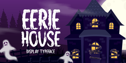 Eerie House is a creepy and dark-looking display font. It is perfectly suitable for any Halloween-related project or crafty idea! The only limit is your imagination.
 - Dreary Home by Seemly Fonts,
$14.00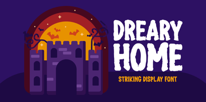 Dreary Home is a casual and creepy-looking display font. It is perfectly suitable for any Halloween-related project or crafty idea! The only limit is your imagination.
 - Lesham by Saxofont,
$18.00 Lesham fonts include uppercase, lowercase, numbers, alternative, and puch. This modern look typeface is made for posters, web design, branding, illustrations, badges, shirt designs and several other works.
 - Willow Pumpkin by Seemly Fonts,
$14.00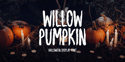 Willow Pumpkin is a creepy and dark-looking display font. It is perfectly suitable for any Halloween-related project or crafty idea! The only limit is your imagination.
 - Ghost Flames by Letterafandi Studio,
$14.00 Ghost Flames is a bold and spooky decorative font. Add it to your Halloween crafts, horror movie posters, t-shirts and anything else that requires a spectacular look.
 - Lisboa Sans Tamil by Vanarchiv,
$75.00 The design approach from this humanist sans-serif is much more simple and neutral than Lisboa Tamil (lacks the hook-head terminals). Latin transliteration characters were also included.
 - Scary Envision by Seemly Fonts,
$14.00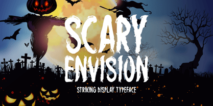 Scary Envision is a casual and creepy-looking display font. It is perfectly suitable for any Halloween-related project or crafty idea! The only limit is your imagination.
 - KG Royals by Kimberly Geswein,
$5.00 Fun bunting style lettering. Best when used with multiple layers to create a stacked, dimensional look. Use () {} [] to create end pieces and _ (underscore) to connect the end pieces.
 - Rolsting Script by Rastype Studio,
$18.00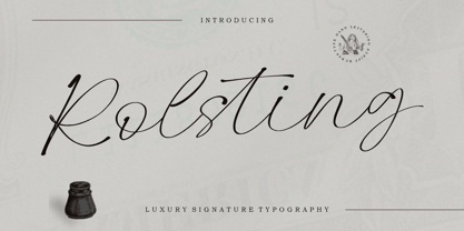 Rolsting Script is a beautiful and cool handwritten signature font. Looks amazing on branding, quotes, business cards and other designs. The font includes multiple language support. Happy Designing!
 - All Over Again by Hanoded,
$20.00 All Over Again is a messy, scratchy script that looks like someone wrote a lengthy letter, realized he had screwed up and had to start all over again.
 - Space 51 by Mightyfire,
$10.00 Space 51 is a font with modern, clean and minimalist looks. If you want to write something related to technology or digital things, Space 51 is perfectly suitable.
 - Christmas Weekday by Letterafandi Studio,
$14.00 Christmas Weekday is a lovely, cute, and fun display font. This original look will appeal to a wide range of crafty ideas, from letterheads and titles to stationery.
 - Schlub by Typadelic,
$19.00Schlub is just plain weird. It looks like it was drawn with the left hand of a right-handed person using a gloppy pen yet remains very legible. - Feeling Scared by Seemly Fonts,
$14.00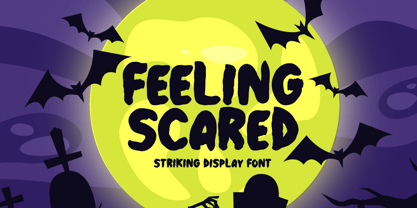 Feeling Scared is a casual and creepy-looking display font. It is perfectly suitable for any Halloween-related project or crafty idea! The only limit is your imagination.
 - Curlz by Monotype,
$40.99Curlz is designed to look like bent, twisted metal. The Curlz font is best used for impudent, carefree titles. Curlz is appropriate for menus, signage and greetings cards. - Xova Rounded by Cerri Antonio,
$30.00 Xova Rounded is a geometric rounded typeface. The use of perfect round shapes and quite a low ascender height makes it a very stable, yet playful looking typeface.
 - Kaila by ArimaType,
$18.00 Kaila is a bold but elegant serif font. Its elegance and simplicity make this font look absolutely stunning on a variety of design ideas, both formal and informal.