10,000 search results
(0.043 seconds)
- Wind Soul by Nathatype,
$29.00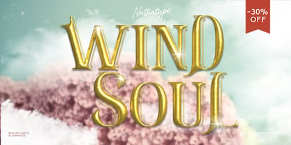 Wind Soul is a whimsical display font that floats into the visual realm with an airy charm. Crafted in uppercases and playful design elements, Wind Soul is a delightful typeface that brings a sense of lightness and joy to any creative project. This is ALL CAPS font. The characters in Wind Soul are generously sized, enhancing the font's playful and larger-than-life aesthetic. The thick font weight adds a comforting solidity, while the design, reminiscent of a balloon's roundness, infuses a sense of fun and lightheartedness into each letter. Enjoy the features here. Features: Alternates Stylistic Sets Multilingual Supports PUA Encoded Numerals and Punctuations Wind Soul fits in headlines, logos, posters, flyers, branding materials, greeting cards, print media, editorial layouts, and many more designs. Find out more ways to use this font by taking a look at the font preview. Thanks for purchasing our fonts. Hopefully, you have a great time using our font. Feel free to contact us anytime for further information or when you have trouble with the font. Thanks a lot and happy designing.
 - De Fonte Plus by Ingo,
$39.00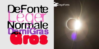 A variation of ”Helvetica according to the blur principle.“ The underlying typeface is ”Helvetica“, the only true ”run-of-the-mill“ typeface of the twentieth century. The distortion principle used simulates the photographic effect of halation and/or overexposure. The light weight, »DeFonte Léger«, nearly breaks on the thin points, whereas on those points where the lines meet or cross, dark spots remain. The characters are ”nibbled at“ from the inner and outer brightness. On the normal and semibold typestyles, »DeFonte Normale« and »DeFonte Demi Gras«, the effect is limited almost exclusively to the end strokes and corners, which appears to be strongly rounded off. The bold version »DeFonte Gros« is especially attractive. As a result of ”overexposure“, counters (internal spaces) are closed in, while characters become blurred and turn into spots; new characteristic forms are created which are astoundingly legible. The fat version »DeFonte Gros« is particularly appealing. “Overexposure” leads to drifted counters, letters blur into spots; new characteristic forms emerge, which are surprisingly easy to read.
 - Core Slab M by S-Core,
$25.00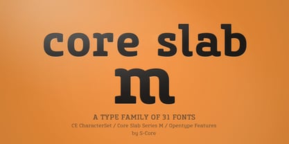 Core Slab M is the serif companion to Core Sans M (Text family of the month. May, 2013). This font family has open and square letter shapes, and overall rounded finishes and serifs provide a soft and friendly appearance but also it is strong in headline. Simple and modern shapes with a tall x-height make the text legible and the spaces between individual letter forms are precisely adjusted to create the perfect typesetting. Core Slab M Family consists of 2 widths (Condensed, Normal), 7 weights ExtraLight, Light, Regular, Medium, Bold, ExtraBold, Heavy), and Italics for each format. Combination fonts such as Core Slab M Ice, Berg and Iceberg are also available. Each font includes support for Superiors and Inferiors, Fractions, Tabular numbers, Arrows, Box drawings, Geometric shapes, Block elements, Mathematical operators, Miscellaneous symbols and Opentype Features such as Proportional Figures, Tabular Figures, Numerators, Denominators, Superscript, Scientific Inferiors, Subscript, Fractions and Standard Ligatures. We highly recommend it for use in books, web pages, screen displays, and so on.
 - Serenata Vantages by Fikryal,
$23.00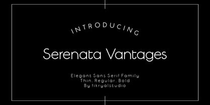 Serenata Vantages is a sophisticated and elegant sans-serif font that exudes modernity and refinement. With its clean lines and well-proportioned letters, this font is perfect for a wide range of design projects, from branding and advertising to editorial and web design. The font features a range of weights, from thin to bold, giving you the flexibility to create both delicate and bold designs. The characters are beautifully crafted with subtle curves and angles, creating a sense of fluidity and balance. Serenata Vantages is perfect for designs that require a touch of class and sophistication, such as luxury branding, high-end fashion, and editorial publications. It is also ideal for websites and digital interfaces that need a modern and clean look. Overall, Serenata Vantages is an elegant and versatile font that can elevate your designs to new heights, making it a must-have for any designer’s toolkit. Features : Serenata Vantages Light Serenata Vantages Regular Serenata Vantages Bold Multilingual Support If you have any questions please don’t hesitate to contact me follow my Instagram: @fkryall Thank you
 - Core Sans BR by S-Core,
$20.00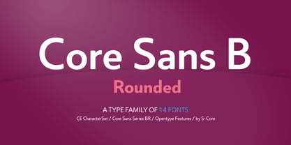 The Core Sans BR Family is a part of the Core Sans Series, such as N, NR, N SC, M, E, A, D, G, R and B. The Core Sans BR Family is designed with rounded stroke endings for visual comfort. This family has very small x-heights and large ascenders(descenders) which give an elegant feeling in body text. It is a sans-serif family but it’s structure is similar to serif fonts, so you can make paragraph beautiful with this font family. It is very legible and readable even in small size because of its open counters and distinctive shapes. This font family consists of 7 weights (Thin, Light, Regular, Medium, Bold, Heavy, Black) and Italics for each format. Core Sans BR supports complete Basic Latin, Cyrillic, Central European, Turkish, Baltic character sets. Each font includes proportional figures, tabular figures, oldstyle figures, numerators, denominators, superscript, scientific inferiors, subscript, fractions and case features. We highly recommend it for use in books, web pages, screen displays, and so on.
 - Bodoni Sans by J Foundry,
$25.00Bodoni Sans is a new classic built on the foundation of two centuries of history. Fresh and contemporary, while feeling familiar. Stylish and sophisticated, confident and elegant. Bodoni Sans is more than just chopping off the serifs. The classical proportions of the capitals and x-heights were maintained, but the letterforms were rebalanced for use without serifs. Contemporary modifications were made to some widths, as well as an all new Light weight was created. High contrast is the key feature of Bodoni Sans. To maintain this contrast over a wide range of sizes, three optical sizes were drawn: Standard, Display and Text. Contrast adjustments were made for each optical size for optimal performance. The Standard was designed for the mid range of 12 to 60pt, Display for 48pt and above, and Text for 6 to 12pt. Web/Digital use was also considered while developing Bodoni Sans. The fonts were tested as web formats, and examined on a variety of screens, to ensure seamless use in both print and digital applications. - Raqmi by Arabetics,
$45.00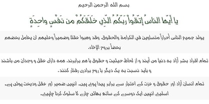 Raqmi was designed as a serif like font with relatively uniform glyph thicknesses, perfect simplified straight lines and curves, and emphasized isolated letters. This font family supports all Arabetic scripts covered by Unicode 6.1, and the latest Arabic Supplement and Extended-A Unicode blocks, including support for Quranic texts. It includes two weights: regular and light, each of which has normal and left-slanted Italic versions. The script design of this font family follows the Arabetics Mutamathil Taqlidi style utilizing varying x-heights. The Mutamathil Taqlidi type style uses one glyph per every basic Arabic Unicode character or letter, as defined by the Unicode Standards, and one additional final form glyph, for each freely-connecting letter of the Arabic cursive text. Raqmi includes the required Lam-Alif ligatures in addition to all vowel diacritic ligatures. Soft-vowel diacritic marks (harakat) are selectively positioned with most of them appearing on similar high and low levels—top left corner—, to clearly distinguish them from the letters. Tatweel is a zero-width glyph.
 - Core Sans DS by S-Core,
$20.00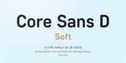 Core Sans DS is a rounded version of Core Sans D and a modern interpretation of condensed sans-serif typeface designed by S-Core and the whole family consists of 2 widths (Condensed, Normal), 7 weights (Thin, Light, Regular, Medium, Bold, Heavy, Black) with their corresponding italics. Core Sans DS features a condensed geometric construction and has a large x-height which enhances legibility. The family is ideal for signage, headline as well as body text. Core Sans DS is a part of the Core Sans Series such as Core Sans N SC, Core Sans N, Core Sans NR, Core Sans M, Core Sans G,Core Sans A, Core Sans GS and Core Sans ES. Letterform in this type family is simple, clean and highly readable. The spaces between individual letter forms are precisely adjusted to create the perfect typesetting. Core Sans DS supports complete Basic Latin, Cyrillic, Central European, Turkish, Baltic character sets. Each font includes proportional figures, tabular figures, numerators, denominators, superscript, scientific inferiors, subscript, fractions and case features.
 - ITC Garamond Handtooled by ITC,
$34.99Claude Garamond (ca. 1480-1561) cut types for the Parisian scholar-printer Robert Estienne in the first part of the sixteenth century, basing his romans on the types cut by Francesco Griffo for Venetian printer Aldus Manutius in 1495. Garamond refined his romans in later versions, adding his own concepts as he developed his skills as a punchcutter. After his death in 1561, the Garamond punches made their way to the printing office of Christoph Plantin in Antwerp, where they were used by Plantin for many decades, and still exist in the Plantin-Moretus museum. Other Garamond punches went to the Frankfurt foundry of Egenolff-Berner, who issued a specimen in 1592 that became an important source of information about the Garamond types for later scholars and designers. In 1621, sixty years after Garamond's death, the French printer Jean Jannon (1580-1635) issued a specimen of typefaces that had some characteristics similar to the Garamond designs, though his letters were more asymmetrical and irregular in slope and axis. Jannon's types disappeared from use for about two hundred years, but were re-discovered in the French national printing office in 1825, when they were wrongly attributed to Claude Garamond. Their true origin was not to be revealed until the 1927 research of Beatrice Warde. In the early 1900s, Jannon's types were used to print a history of printing in France, which brought new attention to French typography and the Garamond" types. This sparked the beginning of modern revivals; some based on the mistaken model from Jannon's types, and others on the original Garamond types. Italics for Garamond fonts have sometimes been based on those cut by Robert Granjon (1513-1589), who worked for Plantin and whose types are also on the Egenolff-Berner specimen. Linotype has several versions of the Garamond typefaces. Though they vary in design and model of origin, they are all considered to be distinctive representations of French Renaissance style; easily recognizable by their elegance and readability. ITC Garamond? was designed in 1977 by Tony Stan. Loosely based on the forms of the original sixteenth-century Garamond, this version has a taller x-height and tighter letterspacing. These modern characteristics make it very suitable for advertising or packaging, and it also works well for manuals and handbooks. Legible and versatile, ITC Garamond? has eight regular weights from light to ultra, plus eight condensed weights. Ed Benguiat designed the four stylish handtooled weights in 1992." In 1993 Ed Benguiat has designed Handtooled versions. - Ingeborg by Typejockeys,
$70.00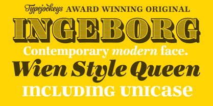 The Ingeborg family was designed with the intent of producing a readable modern face. Its roots might well be historic, but its approach is very contemporary. Ingeborg’s Text Weights are functional and discreet. This was achieved without losing the classic characteristics of a Didone typeface, which are the vertical stress and the high contrast. The Display Weights on the other hand are designed to fulfil their job and catch the reader’s eye by individual form language and a whole lot of ink on the paper. Nevertheless both are of one origin and work together in harmony.
 - Berndal by Linotype,
$29.99Bo Berndal, the master Swedish typographer, is the eponymous designer of Berndal, a contemporary text family with five different styles. This family represents a new achievement for Bo Berndal, who has spent many years working to optimize text legibility in the printed media. Several small tricks make the Berndal family an interesting milestone in legibility. Berndal's letterforms contain large x-heights. Large x-heights open up the counterforms of letters, making text appear lighter on a page, but their correspondingly shorter ascenders and descenders can hinder legibility. This does not occur in Berndal at all! Coupled with this experiment, Berndal's various font weights display a certain softness and roundness. The letterforms themselves are relatively wide, with an overall consistency in width. The calligraphic nature of the strokes has been minimized, yet a contrast stroke-thickness is still to be noticed within the alphabet. Berndal's five styles offer almost everything that one could want from a good text family. The Regular weight may be paired with Small Caps, Italic, Bold, and Bold Italic. All styles ship in the OpenType format, and include tabular and old style figures. The two italic weights are made up of true italics, not obliques. The Berndal family is a part of the Take Type 5 collection from Linotype GmbH." - Quasar by VP Creative Shop,
$12.00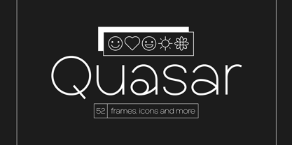 Introducing the delightful Quasar sans serif font – a true gem in the world of typography! With its clean and modern design, Quasar brings a touch of elegance to any project. This font family consists of not one, but six distinct weights, offering you a versatile range of options to choose from. Whether you're aiming for a bold and impactful statement or a more subtle and refined look, Quasar has you covered.
 - Argent by Device,
$39.00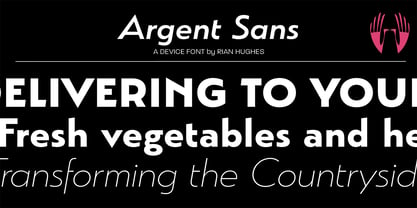 An elegant sans with a low lower-case x-height, diamond-shaped dots and a reweighed complimentary italic with subtle calligraphic touches. With its generous spacing and leading, Argent is very readable in extended text settings, appearing warm and open. The wide range of weights, from thin to heavy, provide all the necessary options for headline and text, the basis of any comprehensive design system. Perfect for brochures and magazines.
 - Organon Serif by G-Type,
$60.00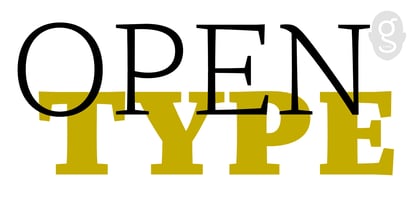 The six weight Organon Serif typeface is a stylish and feature-laden OpenType family which complements its sister Organon Sans, both components working in tandem to create an elegant, legible and thoughtfully designed suite of fonts which share similar cap & x heights, stem widths and ascender/descender values. Organon Serif mixes slab and calligraphic traits to create a truly impressive modern serif face fully loaded with typographic options.
 - Radio Days NF by Nick's Fonts,
$10.00This Deco delight is based on logotype lettering for Crosley Radios from the 1930s. By aLtErNaTiNg upper and lowercase letters (brackets and braces, too), you can maintain the flow of the lightning bolts through the letters. Additionally, inline hyphens can be found at the ASCII circumflex and ASCII tilde positions. This font contains the complete Latin language character set (Unicode 1252) plus support for Central European (Unicode 1250) languages as well. - Mr Porter by Pelavin Fonts,
$20.00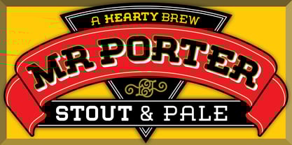 A robust, mono-weight typeface with gently rounded slab serifs, Mr. Porter harkens back to celebrated roots in late 17th Century England. Not for the meek or faint-of-heart, it lends a nutty, chocolaty, toffee flavor to both a stout and pale variety, with lots of malty goodness. Rich and full-flavored with notes of coffee, licorice and molasses, it promises delightful pairings for an infinite variety of typographic solutions.
 - Sebino by Nine Font,
$25.00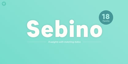 Sebino family is a neutral sans-serif type family with 9 weights, from thin to black, with corresponding italics. Sebino has a large x-height with open apertures which make texts more legible at small sizes. Each font includes opentype features such as Proportional Figures, Tabular Figures, Numerator, Superscript, Subscript, Case-Sensitive, Denominators, Scientific Inferiors, Ordinals, Ligatures and Fractions. Sebino will make your artworks better with its clean & clear shapes.
 - Fathom by Device,
$39.00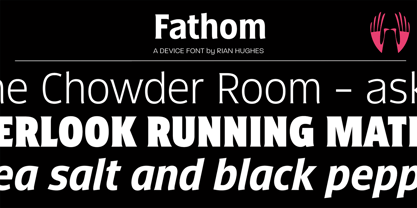 Fathom is a refined flared-serif face that is elegant and robust, modern yet suggests a legacy. The generous lower-case x-height make it worm and readable. Seven weights, plus matching italics, cover all headline and text requirements. The addition of old-style numerals and tabular numerals for charts make it a versatile family for brochures, corporations, heritage projects, packaging, book covers, reports, signage, magazines and more.
 - Firelli by Typejockeys,
$60.00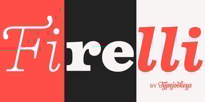 Firelli is an original family of 14 styles including 7 weights and Italics. Delighting from thin to black, Italic swash caps, ligatures, and neat alternate characters. Big headlines will love Firelli’s incorruptible details. Longer texts will benefit from a wide-ranging family with its solid posture. Go, use everything Firelli has to offer, to design your contentful magazines, powerful annual reports, or even bedtime stories and fairy tales.
 - Honeyvoid by PizzaDude.dk,
$20.00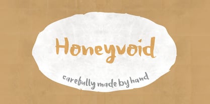 Honeyvoid is my handwritten font, and it is perfect for invitations, greetingcards, prints, logos and decorative sayings or headlines. The letters vary beautifully in both height and weight. Using contextual alternates, the font cycles with 5 different versions of each letter - and that’s a sweet trick to make your text look excactly like you did all the brushstrokes! Honeyvoid comes with a large amount of accents, for many languages!
 - Dazzle Unicase by Device,
$39.00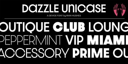 An elegant, stylish unicase font with alternative lower-case letter-forms designed to fit the capital’s X-height. The lower-case forms are available in many of the lower-case keystrokes, with even more available as “stylistic alternates” or a “stylistic set”, which can be activated in Adobe apps. Eye-catching, sophisticated and contemporary. Available in five weights. A more sober companion to the original op-art version of “Dazzle” .
 - Blauth by Latinotype,
$29.00 Blauth—a versatile and contemporary sans serif typeface—comes in 8 weights, ranging from Thin to Black, with matching italics and contains a set of alternate characters. Its small x-height gives it an elegant feel that reminds us of classic typefaces. Blauth is well-suited to continuous text and its uppercase set is ideal for high-impact headlines while its softened corners give your designs a warm and contemporary look.
 - Wiesbaden Swing by Linotype,
$29.99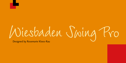 German designer Rosemarie Kloos-Rau created Wiesbaden Swing in 1992 for Linotype. This light, informal typeface is based on her own handwriting, and the strokes have a feeling of spontaneity and energetic flair. Characters like the D, O, W, g, n and y really do swing with unbridled confidence and joy. Kloos-Rau says about her typeface: “From the experience with my design company I recognized the need for fonts with personality. Wiesbaden Swing is my contemporary contribution to the field of calligraphy, a headline font which offers a fresh and unconventional approach to typography.” This family has both regular and bold weights, and a set of Dingbats. The Dingbats are light-hearted and zippy symbols for holidays, children’s products, menus, and more. Wiesbaden Swing will add zest to packaging, catalogs, menus, websites, greeting cards, and magazine layouts.
 - M Gentle PRC by Monotype HK,
$523.99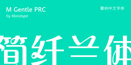 The design concept of M Gentle is inspired by the aesthetics of ribbon gymnastics and the tenderness of orchids. The beauty of the two are combined in one typeface. Keeping the characters in right proportion and standard structure, its horizontal and vertical strokes (橫、豎) are generally straight. The linkage among dots (點), downstrokes and the ticks (剔) to the right represent a sense of movement and fill the typeface with liveliness and humanity. While M Gentle Light shows purity and softness, Medium and Bold fonts have their own personalities. They are all legible and suitable for a wide range of purposes, make the family a popular choice in the advertising industry.
 - M Gentle HK by Monotype HK,
$523.99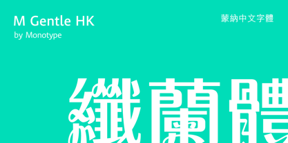 The design concept of M Gentle is inspired by the aesthetics of ribbon gymnastics and the tenderness of orchids. The beauty of the two are combined in one typeface. Keeping the characters in right proportion and standard structure, its horizontal and vertical strokes (橫、豎) are generally straight. The linkage among dots (點), downstrokes and the ticks (剔) to the right represent a sense of movement and fill the typeface with liveliness and humanity. While M Gentle Light shows purity and softness, Medium and Bold fonts have their own personalities. They are all legible and suitable for a wide range of purposes, make the family a popular choice in the advertising industry.
 - Atomgeek by PizzaDude.dk,
$20.00Atomgeek is inspired by old arcade games. Use it for your comics - especially the ones with superheroes and their counterparts! The capital letters have lightning flaming out of the left side, and if you want them flaming out of the right side then just use the Open Type Stylish Alternates! You will need to use OpenType supporting applications to use the autoligatures. - Huggy by Typogama,
$19.00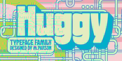 Huggy is a display typeface designed by Michael Parson and inspired by the work of Heinrich Heinz. Full of Art Nouveau flair, this two weight typeface is bold forceful but full of subtle features that give the design a unique personality. With a narrow width and tall aspect, it is perfect for setting text in tight spaces like posters or other titling situations.
 - Moony by Brave Lion Fonts,
$9.99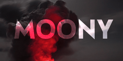 Moony combines edgyness with softness and was made to look elegantly strong. The typeface is great for big headlines and impressive titles. Yet a reduced sans serif font, Moony brings it own character with it. With eight styles in different weights you can easily combine it with other typefaces, like scripts. Use Moony to bring a statement in neutral designs.
 - WBP Ripples by Studio Jasper Nijssen,
$20.00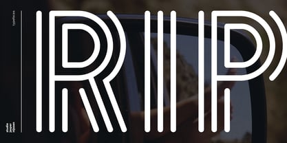 Stone skipping creates water ripples. This font expands by the same principle. A small, narrow base growing to the top, right, bottom and left until it reaches the shores. In this case: from the mean line to the baseline and caps height with a max. of three lines. WBP Ripples is a beautiful, friendly looking and playful display font for everyday use.
 - Merry Old Soul NF by Nick's Fonts,
$10.00This jaunty display face was discovered in one of the many books on sign writing produced by Eric Matthews. The work was signed “King Cole", hence the font’s name. This typeface’s large x-height and tight spacing make it highly suitable for attention-grabbing headlines. Both versions of this font include the complete Unicode Latin 1252 and Central European 1250 character sets. - Suomi Sans by Suomi,
$25.00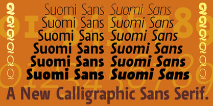 There are many sans serif typefaces with calligraphic tendencies, but Suomi Sans is different: the outside forms are fairly basic, fairly narrow sans serif style, but the counter forms have a strong calligraphic flair with accented upper left and lower right hand corners. With six weights in Roman and italic, Suomi Sans works well for both headline and text use.
 - Ricotta Script by Sudtipos,
$49.00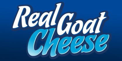 Another unmistakable Koziupa/Paul production, Ricotta has very little baby fat for a sturdy brush script. What movement it shows is effective and integral to its expression, which is at once compact, lush and eye-catching. Ricotta, and its subtle details in just the right places, should feel at home among the bright and cheerful colors of dairy product and pizza packaging.
 - A Likely Story by Comicraft,
$39.00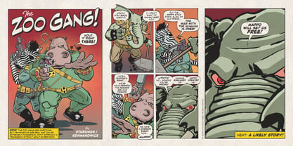 Finally an animated alphabet with a tall tale to tell -- perfectly suited to putting words in the mouths of mutts, talking tigers and anthropomorphic animal characters of all kinds. The precise thick and thin pen strokes of these eight versatile weights are well suited to gag strips, classic cartoons and maybe even that internet meme you've been thinking about for weeks!
 - Bandera Display Cyrillic by AndrijType,
$21.00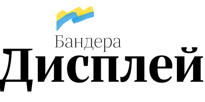 This contrast serif typeface is good for display use. Bandera Display Cyrillic has six weights with original italics. It catches attention in headlines of posters and magazines. It works well with Bandera Cyrillic (slab serif), Osnova Cyrillic (sans serif) and Bandera Text Cyrillic (serif) fonts. Bandera is Spanish for 'flag'. And Bandera is a symbol of Ukrainian fighting for freedom for many years.
 - Carnero Variable by Monotype,
$209.99Carnero™ is a feisty hybrid of precise geometry and calligraphic flair; a design that walks that fine line between being sensible and a standout. In an increasingly monotone typographic landscape – Carnero has a unique pulse that moves the reader along with a new energy. Carnero gives life to simple utility with kinetic letter shapes, open apertures, and generous counters Drawn by Steve Matteson for the Monotype Studio, Carnero’s versatility is its strength. From digital ads and applications to packaging and branding, Carnero is comfortable and contemporary. The lightest and boldest weights create inviting headlines, while the middle weights read well for body copy. Used together, they build a lively brand and a clear hierarchy. Matteson infused Carnero with a modernist exterior resting on a 10th century calligraphic foundation. Delightful flourishes on the capital R and K, and lowercase a, k and l, give the design a distinctive demeanor; while the alternate italic swash caps are a saucy nod to the scribes. The result is a design that is warm, approachable – and a bit lighthearted. Matteson describes Carnero as, “transcending the static posture of the geometric sans genre.” The Carnero family is a compact collection of six distinct weights, ranging from an engaging light to an authoritative black, each with an italic counterpart. Its extended Latin character set ensures worry-free localization for eastern/western European languages. This is a design that will prove its value many times over. Matteson has drawn over 80 distinctive typeface families for major corporations, branding firms and retail sales. His passions for the outdoors and performing music balances an intense focus on work – and subtly finds its way into typefaces like Carnero. Matteson has designed custom fonts for three generations of the Microsoft Xbox® game console, the original core fonts for the Android® mobile-phone platform, in addition to branding typefaces for Toyota®, Rocket Mortgage®, and Google®. He also drew the Kootenay™ family, Monotype’s proprietary branding typeface. Matteson’s retail designs range from the elegant and utilitarian Open Serif™ (a companion to Google’s Open Sans), to a growing series of Frederic Goudy revivals. Carnero Variables are font files which are featuring one axis and have a preset instance from Light to Black. - Carnero by Monotype,
$50.99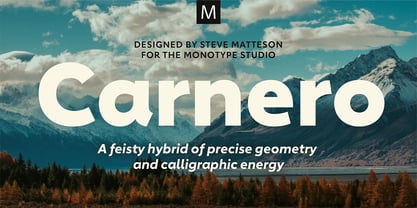 Carnero™ is a feisty hybrid of precise geometry and calligraphic flair; a design that walks that fine line between being sensible and a standout. In an increasingly monotone typographic landscape – Carnero has a unique pulse that moves the reader along with a new energy. Carnero gives life to simple utility with kinetic letter shapes, open apertures, and generous counters. Drawn by Steve Matteson for the Monotype Studio, Carnero’s versatility is its strength. From digital ads and applications to packaging and branding, Carnero is comfortable and contemporary. The lightest and boldest weights create inviting headlines, while the middle weights read well for body copy. Used together, they build a lively brand and a clear hierarchy. Matteson infused Carnero with a modernist exterior resting on a 10th century calligraphic foundation. Delightful flourishes on the capital R and K, and lowercase a, k and l, give the design a distinctive demeanor; while the alternate italic swash caps are a saucy nod to the scribes. The result is a design that is warm, approachable – and a bit lighthearted. Matteson describes Carnero as, “transcending the static posture of the geometric sans genre.” The Carnero family is a compact collection of six distinct weights, ranging from an engaging light to an authoritative black, each with an italic counterpart. Its extended Latin character set ensures worry-free localization for eastern/western European languages. This is a design that will prove its value many times over. Matteson has drawn over 80 distinctive typeface families for major corporations, branding firms and retail sales. His passions for the outdoors and performing music balances an intense focus on work – and subtly finds its way into typefaces like Carnero. Matteson has designed custom fonts for three generations of the Microsoft Xbox® game console, the original core fonts for the Android® mobile-phone platform, in addition to branding typefaces for Toyota®, Rocket Mortgage®, and Google®. He also drew the Kootenay™ family, Monotype’s proprietary branding typeface. Matteson’s retail designs range from the elegant and utilitarian Open Serif™ (a companion to Google’s Open Sans), to a growing series of Frederic Goudy revivals. Carnero Variables are font files which are featuring one axis and have a preset instance from Light to Black.
 - Mynaruse Flare by insigne,
$39.99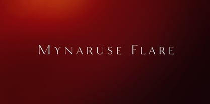 Mynaruse Flare is a new version of the Mynaruse superfamily. This version eliminates the elongated serifs of the original, and instead stems end with a flare. You will find that the thinner weights are delicate and beautiful, while the heavier weights provide impact and strength. Mynaruse is inspired by the elegant and regal Roman inscriptional types. The face shines in environments that require elegance and splendor. The eight weights of Mynaruse flare range from a subtle, delicate thin to a heavy and powerful Black weight. Mynaruse Flare includes many useful OpenType features, including a set of swash alternates, alternate titling forms, ligatures and miscellaneous alternates. OpenType-capable applications such as Quark or the Adobe suite can take full advantage of the automatically replacing ligatures and alternates. This family also includes the glyphs to support a wide range of languages. This is a titling font that is ideal for logotypes, posters or other high-end luxury applications.
 - Aspire SmallCaps by Grype,
$18.00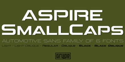 Geometric/Technical style logotypes have been developed for car chrome labels since the early 1980's. Many of these sleek logotypes are lacking an expansive family to enhance and express their brand in a richer sense, becoming true brand workhorses. The Aspire SmallCaps family finds its origin of inspiration in the ACURA automotive company logo, and from there expands to an 6 font family of weights & oblique styles, striving to become a workhorse. Aspire SmallCaps is perhaps the most true to form tribute to the original all capitals inspiration logotype. It maintains all capital forms (whether standard or smallcaps) and yet is still strikingly powerful in its presence and readability including numerals, and a comprehensive range of weights, creating a straightforward, uncompromising collection of typefaces that lend a solid foundation and a broad range of expression for designers. Here's what's included with the Aspire SmallCaps Family bundle: - 438 glyphs per style - including Capitals, Small Caps, Numerals, Punctuation and an extensive character set that covers multilingual support of latin based languages. (see the 6th graphic for a preview of the characters included) - Stylistic Alternates - alternate characters that remove the angled stencil cuts for a more standardized text look. - 3 weights in the family: Light, Regular, & Black. - 3 obliques in the family, one for each weight: Light, Regular, & Black. - Fonts are provided in TTF & OTF formats. The TTF format is the standard go to for most users, although the OTF and TTF function exactly the same. Here's why the Aspire SmallCaps Family is for you: - You're in need of automotive sans font family with a range of weights and obliques - You're love that ACURA letter styling, and want to design anything within that genre - You're looking for an alternative to Eurostile with more stylized letterforms. - You're looking for a battle-tech typeface for your futuristic war chest labelling. - You just like to collect quality fonts to add to your design arsenal
 - Aspire by Grype,
$18.00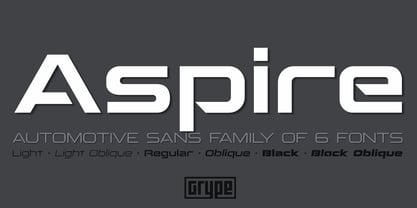 Geometric/Technical style logotypes have been developed for car chrome labels since the early 1980’s. The styles are loaded with inspiration for great font families, but surprisingly, many of these sleek logotypes are lacking an expansive family to enhance and express their brand in a richer sense, becoming true brand workhorses. The Aspire family finds its origin of inspiration in the ACURA automotive company logo, and from there expands to an 6 font family of weights & oblique styles. Aspire pays homage the techno display styling of the inspiration logotype, further evolving beyond its brand inspired origin to give birth to a font family that pulls on modern and historical styles. It adopts a sturdy yet approachable style with its uniform stroke forms and curves, and goes on to include a lowercase, numerals, and a comprehensive range of weights, creating a straightforward, uncompromising collection of typefaces that lend a solid foundation and a broad range of expression for designers. Here’s what’s included with the Aspire Family bundle: 477 glyphs per style - including Capitals, Lowercase, Numerals, Punctuation and an extensive character set that covers multilingual support of latin based languages. (see the 6th graphic for a preview of the characters included) Stylistic Alternates - alternate characters that remove the angled stencil cuts for a more standardized text look. 3 weights in the family: Light, Regular, & Black. 3 obliques in the family, one for each weight: Light, Regular, & Black. Fonts are available in TTF & OTF formats. The TTF format is the standard go to for most users, although the OTF and TTF function exactly the same. Here’s why the Aspire Family is for you: - You’re in need of automotive sans font family with a range of weights and obliques. - You’re love that ACURA letter styling, and want to design anything within that genre. - You’re looking for an alternative to Eurostile with more stylized letterforms. - You’re looking for a clean techno typeface for your starship console labelling. - You just like to collect quality fonts to add to your design arsenal.
 - European Soft Pro by Bülent Yüksel,
$19.00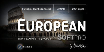 EUROPEAN SOFT PRO ABOUT FAMILY: What makes "European Soft Pro" elegant, friendly and contemporary is its very rounded curves with very open terminals. "European Soft Pro" has been designed with a higher "x-height" than other fonts in its class to make tiny readability more obvious in any use situation. It will be ideal for use in small sizes such as business cards or mobile applications. This typeface is also equipped with powerful OpenType features to satisfy the most demanding professionals. It has solid features like case sensitivity, small, true capitals, full ligatures, tabular figures for tables, old style figures to elegantly insert numbers into your sentences and more alternative characters to give personality to your projects. The extended, "European Soft Pro" supports around 85 languages in the Latin, Cyrillic and Greek scripts, and its non-Latin components were developed with native consultants. With over 1200+ glyphs per style, "European Soft Pro" cares about localised letterforms and has the OpenType features to match. FEATURE SUMMARY: - 9 weights: Thin, ExtraLight, Light, Book, Regular, Medium, Bold, ExtraBold, and Black. - 4 widths: Normal, Narrow, Condensed, and Extra Condensed. - Matching italics (12º) for all weights and widths . - Matching small caps for all weights and widths. - Lining and old style figures (proportional and tabular). - Alternate characters (A, G, M, N, R, U, a, g, l, m, n, u, y). - Unlimited fractions. - Automatic ordinals (1st, 2nd, 3rd, etc.). - 24 Dingbats + 19 Social Media and Block Chain icons. - Extended language support: Most Latin-based scripts (including Vietnamese), Cyrillic, and Greek. - Extended currency support. You can contact me at buyuksel@hotmail.com, pre-purchase and post-purchase with questions and for technical support. You can enjoy using it.