10,000 search results
(0.035 seconds)
- JH Oleph var by JH Fonts,
$200.00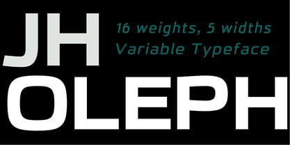 JH Oleph is a modern neo sans humanist Typeface. It includes eight weights and five widths, total of forty weights and another forty italics. JH Oleph may be used as screen display and text type.
 - JH Oleph by JH Fonts,
$9.00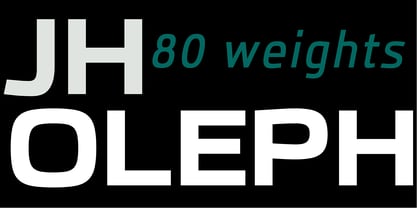 JH Oleph is a modern neo sans humanist Typeface. It includes eight weights and five widths, total of forty weights and another forty italics. JH Oleph may be used as screen display and text type.
 - Core Serif N by S-Core,
$20.00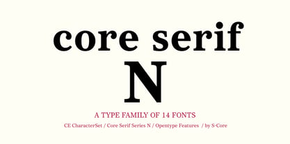 Core Serif N is a modern serif family with neutral design elements. Letters in the Core Serif N has designed with large x-heights and simple serifs for legibility at small sizes. The spaces between individual letter forms are precisely adjusted to create the perfect typesetting. Core Serif N Family consists of 7 weights (Thin, Light, Regular, Medium, Bold, Heavy, Black), and Italics for each format. Core Serif N Thin is designed such as a frame of Core Serif N Family, so its serif shapes are slightly different with other weights. But all weights of Core Serif N work in harmony because they are sharing same structure. It supports complete Basic Latin, Cyrillic, Central European, Turkish, Baltic character sets. Each font includes support for proportional figures, tabular figures, oldstyle figures, numerators, denominators, superscript, scientific inferiors, subscript, fractions and case features. We highly recommend it for use in books, magazines, editorial and publishing as well as logo, branding, and so on.
 - Klint by Linotype,
$40.99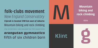 Type designer Hannes von Döhren created Klint. A sans serif typeface with a technical appearance and humanistic streak. The family includes five weights; each weight ships in three widths: condensed, regular, and extended. All of the 15 Klint variants have a companion Italic, rounding out family at 30 fonts. Klint's large x-height makes the design especially legible at small point sizes. In today's day and age, appliance manufacturers and/or companies in the mobile phone, computer hardware and software or Internet sectors are becoming ever more important. Klint fills the rising need for superfamilies with a technical feeling that are also legible in both text and display settings. Through conspicuous letters like R, K, k, or g, as well as the independent nature of its Italic, Klint exudes an ethos that separates it from the competition. Longer text passages in brochures, catalogs, or magazines would be well served by Klint's Light, Regular, and Medium weights. The heavier cuts are optimized for poster settings and headlines."
 - Nora Slab by vve.type,
$34.99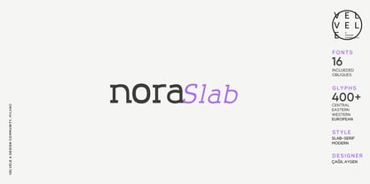 Nora Slab blends a geometric inspiration with warm humanist elements, making it the perfect choice for when you need a fresh, contemporary slab serif typeface. The companion Nora Grotesque makes the Nora family a real workhorse for any use, including web, digital, print, branding and signage. Nora Slab has a large x-height and open counterforms, making it easily readable. It supports multiple languages: Central and Eastern European as well as Western European languages. It has eight weights with related obliques.
 - Dismedia by Lee Mounsey,
$13.95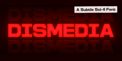 Dismedia: A Bold Display Typeface with a Subtle Retro Sci-Fi Aesthetic. While a lot of futuristic, cyberpunk and techno themed typefaces can often be over-the-top, unreadable or cheesy, Dismedia takes a more subtle approach with its design. Inspired by the wide futurist fonts of the 1970’s and 80’s, its rounded corners and bold linework was built to invoke the atmosphere of a future envisioned by the past. Whether on VHS covers in 1984; nightclub signs in 2084; or spaceship insignia in 2184, Dismedia will upgrade your design into a brand new era. [ Feature Set Includes: ] A Display Typeface A Bold Sans Serif with Rounded Corners 430+ Glyphs Ligatures & Stylistic Alternatives Extended Mathematics & Currency Symbols Language Support for 90+ Latin Languages Including: Afrikaans, English, French, Italian, Spanish & Swedish.
 - Gik by Serebryakov,
$39.00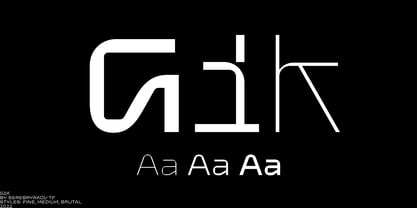 Gik is sans serif font family with modular aesthetic and the elegance of contemporary typography. Its compositional and plastic solution combines echoes of (de)constructivism, brutalism, de Stijl and other manifestations of 20th century antiquity + techniques characteristic of italics. But this does not make the font old-fashioned — on the contrary, it helps to understand how to use it. Gik is a product of the metamodernism era — it is on the border between modernist enthusiasm and postmodernist mockery, between simplicity and awareness, wholeness and cleavage, clarity and ambiguity — a kind of conceptual oxymoron. Looking at Gik, you could imagine it at Fashion Week, if there was one for typography. Gik has a message for both the designer and the viewer, it stimulates the imagination, it is the anthology of all fonts of the future.
 - Stevie Sans by Typefolio,
$29.00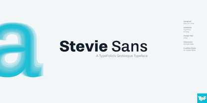 Some years ago I had my first contact with a grotesque typeface, when handling a sample catalog of typographic specimens from the age of phototypesetting. The style eventually settled in my memory waiting for the work of time. Behind its apparent neutrality, there is a complex balance game, that almost leads to the basic principles of design which deliver such power to the grotesque style. Stevie Sans is the answer to the action of time. A bridge that allows the designer to go into the past, while being in the present and looking towards the future. It is what it’s expected from a grotesque designed in the 21st century. With 7 roman styles ranging from thin to black, support to many languages and essential opentype features, Stevie Sans is the ideal choice for your project.
 - Nt1972 by Harvester Type,
$20.00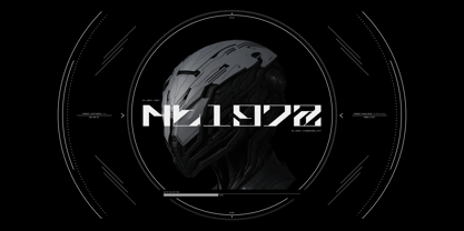 NT1972 is a display font from the future. Font in the era of cyborgs and cyberpunk. This is a sharp, brutal font with futuristic shapes. It combines style and functionality, so the font will look great in your futuristic design in any environment, be it a logo or a merchandize. The angle of inclination in each glyph is 50 degrees, all glyphs also have the same stem sizes to create a good font system. All this is done to get a good futuristic cyberpunk font that will give style to your design, be it a logo, poster, banner, merchandize, title, packaging or product design. In addition to all this, there is support for many languages and alternative characters. In case of any questions, problems or suggestions, please email: bunineugene@gmail.com
 - Tiqqun by Harvester Type,
$20.00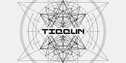 Tiqqun appeared as a font for a monumental, but at the same time futuristic design. During the creation process, many variations for each glyph came to mind. Therefore, it was decided to create an entire system of alternative options. As a result, we have more than 130 alternative characters and as many as two full-fledged alternative sets. The font contains monumentality, brutality, futurism, rigor and uniqueness of some forms. As a result, Tiqqun has become a font system that can cover a large range of your design needs: Prints on clothes, logo, packaging, banner, title, text, poster, merchandising, identity, branding or product design. - 360+ Glyphs - 130+ Alternative Glyphs - Supports 80+ Languages - Special Symbols and Features - 2 Full Alternative Set - OT Features: aalt, case, kern, ordn, salt, sups, ss01-09
 - Raph Lanok by Alit Design,
$12.00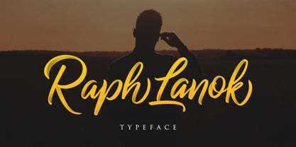 Introducing Raph Lanok Typeface which has a elegant hand lettering brush style. So it looks natural like a handmade, because Raph Lanok family have a more choice characters. This font is best used for your design project that have the concept of fun, brave and sporty. Can also be applied to the design of a logotype, header website, making some lettering for a quote, t-shirt design etc. Raph Lanok has three font styles that are similar but with a different character, named Raph Lanok Future and Raph Lanok Rusty but that you also get Raph Lanok Swash with a line fast brushed of a used font. Raph Lanok Typeface deserve to be in your fonts collections, because it is unique and has many options of alternative glyphs. Thank you and enjoy :)
 - Varstate Slab by Alphabet Agency,
$15.00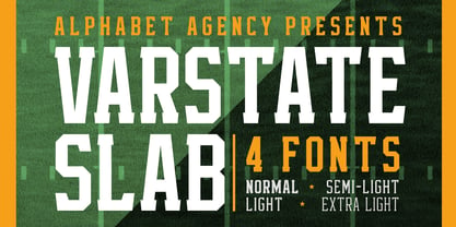 Varstate Slab font family is a collection of fonts inspired by the varsity sports team name's lettering seen on apparel such as Letterman jackets, t-shirts and hoodies. The fonts can be used in combination to provide a variety of design options and different looks in genres such as sports, leisure and industry. The font family consists of fonts in 4 weights; Normal, Semi Light, Light and Extra Light. Each font includes Latin basic characters which includes uppercase, lowercase, numbers, punctuation and much more.
 - Varstate Rounded by Alphabet Agency,
$15.00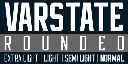 Varstate Rounded font family is a collection of fonts inspired by the varsity sports team name's lettering seen on apparel such as Letterman jackets, t-shirts and hoodies. The fonts can be used in combination to provide a variety of design options and different looks in genres such as sports, leisure and industry. The font family consists of fonts in 4 weights; Normal, Semi Light, Light and Extra Light. Each font includes Latin basic characters which includes uppercase, lowercase, numbers, punctuation and much more.
 - Paradise Point by Swell Type,
$20.00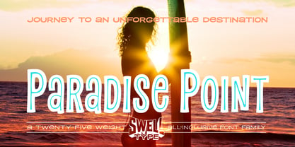 Surf's up! Take an unforgettable adventure to the sparkling shores of Paradise Point. Ride our 25 majestic weights, from tranquil tall & thin to thunderous wide & heavy. Expand your horizons with the versatile Variable font to select any spot between. One-of-a-kind activities: Drop in a thrilling Inline weight for stylistic flair. Overlay with the matching Heavy for striking color effects. Discover hidden wonders! Stylistic Alternates will take you to the scenic heights of uppercase in a friendly lowercase style. Or immerse your text in interlocking Discretionary Ligatures for an authentic Tiki Type island experience. Enchanting views: Two versions of each letter and number automatically rotate for a natural, hand-drawn appearance. The Light weights have round ends to simulate a single pen stroke, which matches the center of the Inline weights for a perfect pairing. Explore! If you venture into unknown territory, each weight of Paradise Point contains 775 glyphs for stress-free support of over 200 languages. An all-inclusive getaway: Each weight of Paradise Point includes the features above, and can set readable body text as well as create striking logos and headlines. Use it for restaurant menus, surf and skate brands, or any design project where you want to convey lively, friendly, stress-free fun.
 - Caride Script by Krafted,
$10.00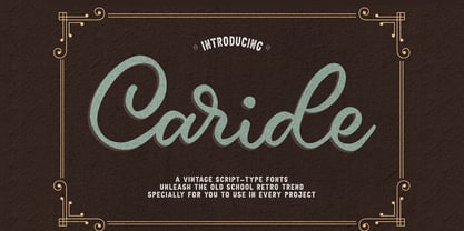 Look back to learn how to look forward - Joe Girard Find yourself and share your purpose with the Caride Script. With its bold vintage script type, sometimes you need to remind others that we must look to the past to pave a better way for our future. It’s time for you to unleash the old school retro trend again. Leather jackets? Making a comeback. Pompadour hairdos? Definitely cool. 70s music? They’re sampled in the music all over our radio stations! The magnificence of the past will surely help you give a new and fresh breath of life to your projects. This font was designed for you to use in any kind of projects that you might have! They were specifically designed to fit in anywhere you want them to be. We assure you that there will be no awkwardness in the relationship between your text and your designs, they’ll get along well like old-timey partners! The Caride Script is the perfect addition to bring your perspective to the world. Have the world see you and your encompassing view of the human experience with your creations!
 - Rot by MKGD,
$13.00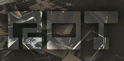 Rot is clunky, clumsy, and utilitarian. It comes straight from a second rate oracle’s prognostications of a not-so-distant dystopian future. A place where film noir meets twenty first century computer cards; and rainy melancholy nights meet global warming. It speaks of a world that welcomes everyone; provided that they are romantically inclined to living life at the short end of the stick. Metaphorically, Rot is a shot of hard liquor served in a dirty glass. Rot has a glyph count of 388 and supports the following languages Afrikaans, Albanian, Asu, Basque, Bemba, Bena, Bosnian, Catalan, Chiga, Colognian, Cornish, Croatian, Czech, Danish, Embu, English, Esperanto, Estonian, Faroese, Filipino, Finnish, French, Friulian, Galician, German, Gusii, Hungarian, Icelandic, Indonesian, Irish, Italian, Kabuverdianu, Kalaallisut, Kalenjin, Kamba, Kikuyu, Kinyarwanda, Latvian, Lithuanian, Low German, Lower Sorbian, Luo, Luxembourgish, Luyia, Machame, Makhuwa-Meetto, Makonde, Malagasy, Malay, Maltese, Manx, Meru, Morisyen, North Ndebele, Norwegian Bokmål, Norwegian Nynorsk, Nyankole, Oromo, Polish, Portuguese, Romanian, Romansh, Rombo, Rundi, Rwa, Samburu, Sango, Sangu, Scottish Gaelic, Sena, Shambala, Shona, Slovak, Slovenian, Soga, Somali, Spanish, Swahili, Swedish, Swiss German, Taita, Teso, Turkmen, Upper Sorbian, Vunjo, Walser, Zulu
 - Cinta by Tipo Pèpel,
$21.00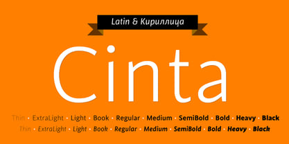 We are really happy to introduce you to Cinta, a brand new elegant sans serif font designed for text. It has a humanistic skeleton, dressed up with a hand-made mechanical suit, which made it rush, audacious. A dedicated tribute to the breakdown of mestizo music rhythm, bright, dreamy but completely real. Full of a broad variety of weights and versions, it’s able to produce subtle changes in the typographic stain. Perfect to make delicate hierarchy both in web and text and show the world their family background undoubtedly. Prudent and thrifty, condensed forms and with a generous x-height, it almost accidentally saves space and avoids being a spendthrift. Discreet even in the italic, slightly slanted to produce a subtle change of look on web use, will make a delightful for the most exquisite users with the audacity of modernity. Classic but not silly. Generous in abundance, with small caps, old numerals, denominators and numerators, fractions, ligatures, all you need to survive in the new modern life of Opentype with elegance. Polyglot, with support for Latin languages, Central European and Cyrillic. A delicate friend who will delight ladies and gentlemen who are discerning and cosmopolitan.
 - Red October - Personal use only

- Quick Rest by wearecolt,
$19.00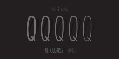 Quickrest is a tall & quirky type with slight irregularities, Quickrest does not do conformity - each character is entirely individual. A fun looking family with its heart set in the handmade / crafty scene. The Quickrest family features five weights and slanted versions.
 - *Reacting to Reactor Sans!* In an imaginary world where fonts are not just mere letters but beings with personality and purpose, Reactor Sans would surely be the cool, energetic, and slightly edgy ...
- Permanence by Typodermic,
$11.95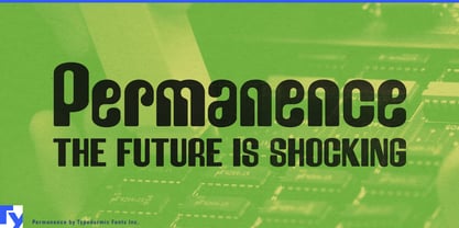 Welcome to the world of Permanence, where the past meets the future. Inspired by the iconic cover of Alvin Toffler’s groundbreaking hardcover, “Future Shock” from 1970, Permanence is the perfect typeface to transport you to a world of limitless possibilities. With its bold, clean lines and sleek design, Permanence captures the essence of the retro-futuristic style. Its crisp, angular shapes and unique curves evoke a sense of progress and innovation, harking back to a time when anything was possible. Permanence is more than just a typeface—it’s a vision of a better tomorrow. Its timeless design captures the optimism and hope of a bygone era, while still feeling fresh and modern. Why settle for the ordinary when you can experience the extraordinary with Permanence? Most Latin-based European writing systems are supported, including the following languages. Afaan Oromo, Afar, Afrikaans, Albanian, Alsatian, Aromanian, Aymara, Bashkir (Latin), Basque, Belarusian (Latin), Bemba, Bikol, Bosnian, Breton, Cape Verdean, Creole, Catalan, Cebuano, Chamorro, Chavacano, Chichewa, Crimean Tatar (Latin), Croatian, Czech, Danish, Dawan, Dholuo, Dutch, English, Estonian, Faroese, Fijian, Filipino, Finnish, French, Frisian, Friulian, Gagauz (Latin), Galician, Ganda, Genoese, German, Greenlandic, Guadeloupean Creole, Haitian Creole, Hawaiian, Hiligaynon, Hungarian, Icelandic, Ilocano, Indonesian, Irish, Italian, Jamaican, Kaqchikel, Karakalpak (Latin), Kashubian, Kikongo, Kinyarwanda, Kirundi, Kurdish (Latin), Latvian, Lithuanian, Lombard, Low Saxon, Luxembourgish, Maasai, Makhuwa, Malay, Maltese, Māori, Moldovan, Montenegrin, Ndebele, Neapolitan, Norwegian, Novial, Occitan, Ossetian (Latin), Papiamento, Piedmontese, Polish, Portuguese, Quechua, Rarotongan, Romanian, Romansh, Sami, Sango, Saramaccan, Sardinian, Scottish Gaelic, Serbian (Latin), Shona, Sicilian, Silesian, Slovak, Slovenian, Somali, Sorbian, Sotho, Spanish, Swahili, Swazi, Swedish, Tagalog, Tahitian, Tetum, Tongan, Tshiluba, Tsonga, Tswana, Tumbuka, Turkish, Turkmen (Latin), Tuvaluan, Uzbek (Latin), Venetian, Vepsian, Võro, Walloon, Waray-Waray, Wayuu, Welsh, Wolof, Xhosa, Yapese, Zapotec Zulu and Zuni.
 - Rexton by Rook Supply,
$17.00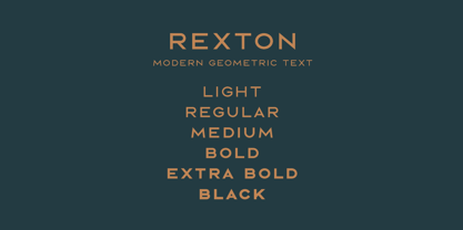 Rexton is a light, clean, geometric typeface of 6 weights. The contemporary typeface aims to have a timeless and modern vibe. Designed for optimum legibility, its clean, geometric look is perfect for logos, headers, titles and brochures.
 - JH Mabel by JH Fonts,
$40.00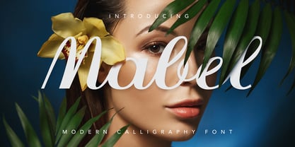 JH Mabel is a modern cursive typeface; it has three weights: light, medium and bold. It is a smart type and consists of extra characters to simulate real handwriting. Typical use: branding, greeting cards, long runing text.
 - Galeb by Tour De Force,
$25.00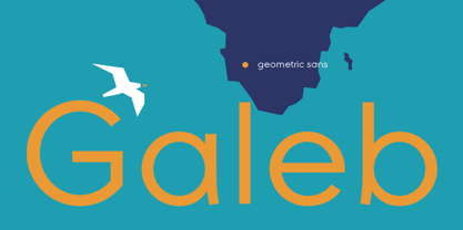 Galeb is simple geometric sans font family in 4 weights - Light, Regular, Bold and Black, ideal for corporate and editorial projects. With angled stem endings, Galeb gives enough impression to be used as display font as well.
 - Abdo Screen by Abdo Fonts,
$49.50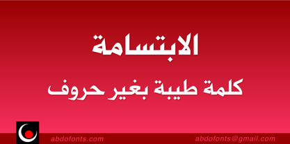 Abdo Screen is a very simple Naskh font for satellite channels, presentations, videos and advertisements. it comes in sixth weights Thin, Light, Regular, Medium, Bold and Black. This font also contains some of Stylistic Sets and Ligatures.
 - Leenyx by ActiveSphere,
$30.00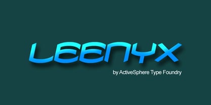 Leenyx is a geometric display font family and works best in display applications, such as posters, signage, logos and label. The Leenyx family comes in 2 versions: Leenyx AX and Leenyx BX. Leenyx AX has lines of even width and no serifs. Leenyx BX has lines of even width with slight curve on the ends of the strokes. Each Leenyx font version has two weights: regular and bold, each available in italic, making a total of eight styles for. Each style has a full upper and lower-case, accents, punctuation and a selection of monetary symbols.
 - Constellation Pro by Tilde,
$39.75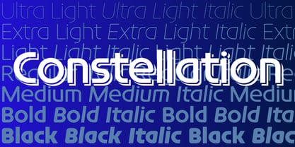 Constellation started with a simple geometric concept in the manner of Art Deco which gradually developed to a complete typeface, both upright and italic, total of seven weights. The concept allowed the font to be designed from Ultra Light in both very light and quite black styles. This Pro font is packed with all European and Cyrillic alphabets, small caps, variable figure sets and features .
 - VLNL TpLlum by VetteLetters,
$35.00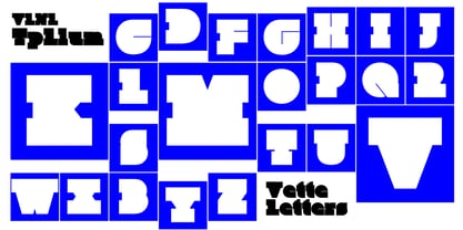 TpLlum is a typeface designed by TwoPoints for a festival in Barcelona called ‘Montjuïc de Nit’. Llum means light in Catalan. In the Montjuïc de Nit project the font was used in white over a dark grey background, letting the light of a backlit poster shine through. For this purpose the typeface had to be very bright, which was made possible by its heavy cut.
 - Grayfel by insigne,
$-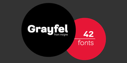 As designers, we seek perfection and originality. The more we step back and look at our work, the more changes we tend to find necessary. Drastic modifications are inevitable. The same is true of Grayfel. Grayfel began as an exercise at insigne to explore the crowded space of neutral sans. While the world of sans serifs is admittedly crowded, I still managed to find something new and different. The final Grayfel consists of 42 full-featured OpenType fonts containing three widths: Regular, Condensed, and Extended. Every width consists of 14 fonts--seven weights with matching italics, making it a good companion for setting clear text and headlines for print and screen. OpenType features are also available. There’s figure choices, such as proportional and old style figures. Additionally, Greyfel includes sophisticated typographic attributes: ligatures, fractions, alternate characters, small caps, superscripts and subscripts. Its extended character set supports Central, Western and Eastern European languages. Optical compensations also mean the outcome of this family is a hybrid of humanistic proportions. It’s a well-finished design with optimized kerning gives it a friendly look. If you like sans serifs within the tradition of Futura, Helvetica, Avant Garde and Avenir, then you’ll love Greyfel, too. Grayfel works well in a variety of applications. Subtly neutral yet fun, it’s suitable for headlines of all sizes as well as for text. Put it to the task for marketing, packaging, editorial work, branding and even on-screen projects. Try it out: it’s not just fun and playful; it’s Grayfel.
 - Romanica by K-Type,
$20.00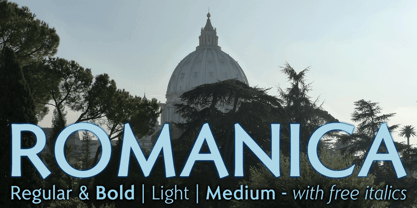 ROMANICA is a relaxed humanist sans with subtly curved corners and slightly flared glyphic terminals that are expressively angled where appropriate. Romanica has the authority of the ages without the harshness of many classically inspired typefaces. All eight fonts include a full complement of Latin Extended-A characters, Welsh diacritics, Irish dotted consonants, and additional oldstyle numerals. ROMANICA is available in three packages - • Basic Family (Regular, Italic, Bold & Bold Italic) • Light (Light & Light Italic) • Medium (Medium & Medium Italic)
 - Slatz by CozyFonts,
$20.00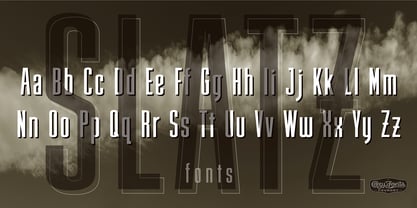 The Slatz Font Family is Vertical. It has a slender, consistent weight that is best used in limited, left to Right, space limitations as to maximize font height. Slatz font variations all have extremely clean edges and even the serif versions are crisply defined with a flat-pointed serif for an added unique character. The designed intent was for a tight kern, however evenly letterspacing these family members give a distinct personality and continues to command the negative space just as in tight kerned examples. The compatible relationship of these font family members, serif to sans serif, and regular to italic is seamless and the overall design coloring of words as sentences is well balanced and extremely legible. The Slatz Family fonts are matching members glyph to glyph yet there is a noticeable difference between the serif and sans serif members. The sans serif works in contemporary and vintage settings. The serif members work particularly well in vintage, period applications. The Bold and Drop versions of Slatz also fit the above descriptions and also work on their own.
 - Mensa by AVP,
$19.00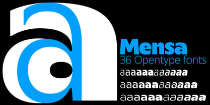 A large x-height, open forms and colorful weight variations make Mensa an extremely legible body face particularly where space is at a premium. The three widths and six weights together with italics provide plenty of options for setting magazines, books and web pages.
 - Antona by exljbris,
$-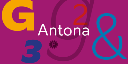 Antona is a modern, friendly geometric sans serif. It comes in eight weights, with italics, 16 fonts in total.
 - Flink Neue by Identity Letters,
$45.00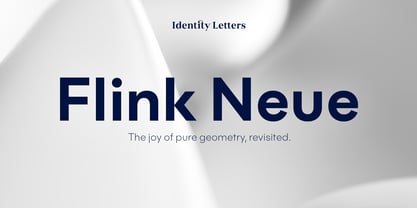 Geometric typefaces are a staple in every typographer’s toolbox since the 1920s. It was a time when iconic faces such as Futura, Erbar, and Kabel appeared on the scene and turned the world of type upside-down. Inspired by those early giants as well as later epigones with a legacy of their own (such as 1970’s Avant Garde Gothic), Flink Neue is the Identity Letters take on this genre, characterized by a clean and focused appearance. With neat shapes and the look of pure geometry, Flink Neue adapts to a vast range of applications and topics, from the fine print in contract to website body copy to logo design to billboard-size slogans. Its x-height is considerably larger than in classic geometric sans-serif fonts; its proportions are harmonized as opposed to strictly constructed. This makes for a more contemporary look, setting it apart from the classics. With three different widths, Flink is a true all-rounder. Geometric fonts are usually quite wide, which often leads to text-settings problems with headlines or small print. The Condensed and Compressed variants of Flink Neue solve this problem easily. This font family comes along in 18 weights from Thin to Black with matching Italics. There are almost 1400 characters per style, including nine stylistic sets that offer variations to the look and feel of Flink Neue, making it even more versatile. Besides the default mood of Flink Neue, there is also a Text and Bauhaus variant, where different letters have been changed to create a new mood. In theory, you just need one single font file to change between all three moods, but to make it easier for you, we also exported each mood within a separate file. Plenty of additional Open Type Features like ligatures, small caps, case sensitive forms, old-style figures, tabular figures and symbols make Flink Neue a valuable tool for the discerning typographer. Flink Neue is the reimagination of a classic genre, designed to suit the needs of our time.
 - Aeonis by Linotype,
$29.99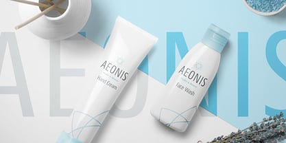 After Generis™, Aeonis™ is the second large family of typefaces by Erik Faulhaber. The basic Aeonis sans-serif form references Ancient Greek lapidary inscriptions from the 9th century BC. Between the poles of antiquity and modernity, a deliberate contradiction of round and rectangular forms gave way to a new and energised font: Aeonis. Aeonis is available in three widths and seven weights, all of which have been carefully coordinated in terms of their proportions. The clear contrast in the bold stroke intensity emphasises the organic nature of the font and creates exciting aesthetics. In light of their open forms, the letters guarantee a good level of readability, even in small point sizes. Given that the dynamic individual forms of Aeonis also fit perfectly in a functional image, this typeface is ideal both for complex, text-heavy documents as well as for logos and display text settings. Particular attention was paid to ensuring carefully coordination proportions: all styles and weights have the same cap height, as well as identical ascender heights, x-heights, and descender lengths. The widths of all figures, currency symbols, mathematical operators, and special characters have been carefully aligned for tablular settings. Aeonis is an extremely systematic design. All of its widths and weights may be combined with one another, without restrictions. For users who do not like the open A, an alternate A with a crossbar is included in each font as well.
 - Caturrita Display by Armasen,
$18.00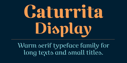 Caturrita Display is a new version of Caturrita. Better for titles and small pieces, with a large contrast in the heavy weights. It preserves the same structure of Caturrita, but with a more calligraphic touch, in the ligatures and almost all the characters. It comes in five weights, giving more elegance in the light ones, and strongly and expressive in the heavy tones.
 - Block by Stefan Stoychev,
$29.88 Block Font Family is display font inspired by the forms of communist mass housing architecture (called blocks - resembling straight geometric shapes arranged symmetrically) started in the mid 70's in the 20th century. It comes in 4 weights and its matching italics and rounded options. The Light weight is a free of charge, so you can used to your projects.
 - Luxury Home by Fo Da,
$5.00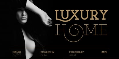 Luxury Home is a slab serif typeface of 9 weights from Extra Light to Extra Black and can be used as both a headline and text face. "Luxury Home" is recommended for using in long-form writing and articles, since a serif is far more readable for longer passages of text. The typeface has a carefully crafted weight range, with ligatures .
 - Detori by Joe Hewitt Design,
$12.99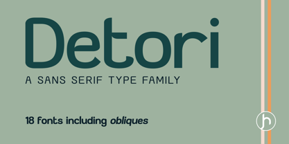 Detori makes its appearance offering you a clean and unpretentious typeface. It embraces a dreamy quality owing to its slightly wider apertures, creating a more informal look for your writing. Available in 9 weights (all with matching obliques), Detori has you covered for all uses, including modern-looking discrete thin and light weights to Bold and Black where extra emphasis is required.
 - Mymoon by Tour De Force,
$25.00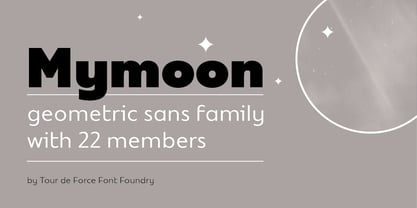 Mymoon is geometric modern sans serif family that comes in 22 weights. Aimed for universal use, in any size and in any media. It has slight retro characteristics and mostly neutral overall impression. With wide range of thickness, from Thin to Heavy, all weights are well synchronized to match ideally. Contains extended Latin character set with OT features such as OldStyle and Tabelar numerals and fractions.
