10,000 search results
(0.092 seconds)
- Bubble Boom by Blankids,
$18.00 Bubble Boom is inspired by graffiti, and fits well for themes such as graffiti posters, Hip Hop music, kids posters, flyers, children books, cartoons, comics, and more. Features included: Uppercase Lowercase Number Punctuation Multilingual PUA Encode OpenType
 - Looking Flowers by Sudtipos,
$49.00 Lu Nolasco, also known as Lunol, is a fresh representative of a new generation of Souther American lettering artists. She was born in Lima, Peru. After learning from some of the region’s best teachers and exploring the pointed nib on her own, she became a prolific lettering workshop instructor herself. Miraflores is one of Lima’s main tourist attractions. An upscale district with a great window on the Pacific ocean, it is the place where Lu looks for inspiration. It particularly inspired this “Looking flowers” (Miranda las flores), Lunol’s first typeface, designed in collaboration with Ale Paul. It is a comprehensive informal script that comes with many alternates, swashes and ligatures, along with small cap and quite a few ornaments. The fonts cover an expansive range of Latin languages, and are intended for use in stationery, menus, packaging, and general design where the main objective is to relay a sense of fun, playfulness and sensibility.
 - TT Nooks by TypeType,
$39.00 TT Nooks useful links: Specimen | Graphic presentation | Customization options TT Nooks is an experimental font family that includes a high contrast serif, TT Nooks, and an upright italic, TT Nooks Script. Despite the difference in style, both subfamilies get along well, which is partially thanks to their similar proportions. Each of the subfamilies includes 4 weights: Light, Regular, Bold and Black. The main subfamily is TT Nooks—a stylish high-contrast serif with a light touch of self-centeredness. If TT Nooks were a person, it would be an elegant lady with an independent and firm personality. In the original sketches of TT Nooks there were traces of a broad pen, but in the course of further evolution the typeface moved away from this style, retaining only the high contrast of strokes. In addition, in the process of design searches TT Nooks has obtained a touch of geometricity. The serifs in TT Nooks stand out especially visibly thanks to their geometric shape that resembles slippers. In addition to their peculiarity, such serifs add stability to the font and allow better compensation of the black and white ratio within the letters. TT Nooks has small capitals for Latin and Cyrillic alphabets, as well as a set of stylistic alternates (including some figures) that makes the typeface a bit more geometric. In addition, we have drawn more than 25 ligatures, including ligatures for capital letters, slashed zero and many other useful OpenType features. TT Nooks Script is a complementary family designed to harmoniously extend the main family and expand its scope. The forms of the characters in bold and light fonts of TT Nooks Script are quite different. For example, Black & Bold have high contrast strokes and an open aperture, and in Regular & Light the aperture of the characters is closed. TT Nooks also has small capitals for Latin and Cyrillic alphabets, ligatures, oldstyle figures and other OpenType features. In light faces, TT Nooks Script is more humanist and has artifacts inherent to the continuous movement of a flat pen. In bold faces, TT Nooks Script has a very dense and dynamic typing rhythm, and the shape of the letters begins to geometrize. We had had the difficult task of preserving the continuity of forms between bold and light faces, and we have managed to solve it thanks to the found rhythm, which united different fonts, and proximate stylistic solutions.
 - Helinda Rook by Monotype,
$29.99The Helinda Rook font is a popular choice in advertising, invitations, greeting cards, and wherever a formal hand-lettered or engraved look is desired. Helinda Rook is an elegant connecting alphabet font based on formal handwriting. - Crooked Hooks by Sarid Ezra,
$15.00 Crooked Hooks is all caps font with street style brush. It's contain uppercase and lowercase in different style, number, symbol, and also with multilingual support! Caps Only Fonts. There is a lot of stylistic ligatures in this font. This font also contain opentype feature for adding line under a word, You can access it from ligature, simply type underscore + number (1-3) in the middle of the text. For example: Mar_3ker. You can use this font for any project such as a branding, poster, or quotes! Happy Creating!
 - News Nook by Mix Fonts,
$13.00 Introducing NEWS NOOK – a font family that captures the essence of newspaper headlines and front pages, with a rugged twist. This versatile sans-serif pairing is perfect for creating a modern, professional look that is both eye-catching and easy to read. With its unique ruggedness, it makes it stand out and suitable for outdoor designs. The font family includes two distinct styles: NEWS NOOK, a bold headline font, and NEWS NOOK MINI, a thin and stout sans-serif font. Together, they provide a range of options for creating headlines, subheadings, and body text that are sure to grab attention. The headline font is particularly great for creating bold and sturdy design elements. Inspired by the traditional newspaper style, NEWS NOOK brings a touch of nostalgia to any design project. But this font family is not just a replication of traditional newspaper style, it’s more of a modern take on publishing type with a handwritten spin. This makes it perfect for any print project, including magazines, newspapers, and more, creating a polished and professional look that is suitable for outdoor designs. NEWS NOOK (Regular) comes with the following glyphs: ABCDEFGHIJKLMNOPQRSTUVWXYZ abcdefghijklmnopqrstuvwxyz 0123456789 !@#$%^&*()`~♥❤✿•· ÷×+−±≈=≠≥≤[]:;’”,.|/?{}“”‘’-–—_ …‚„©®™‹›«»°¹²³ªº¡¿₱¢€£¥¶§№† ÁÀÂÄÃÅĂĀĄÆĆĈČĊÇÐĐÉÈÊËĖĒĘḞǴĜǦḠĠĤȞḦḢIÍÌÎÏĪĮĴḰǨŁḾṀŃÑŇ ÓÒÔÖÕŌŐØŒṔṖŔŘṘŚŜŠŞȘŤṪȚÚÙÛÜŨŮŬŪŰŲẂẀŴẄẆÝŶŸŹẐŽŻƵ áàâäãåăāąæćĉčċçðđéèêëėēęḟǵĝǧḡġĥȟḧḣıíìîïīįĵḱǩłḿṁńñň óòôöõōőøœṕṗŕřṙśŝšşșťṫțúùûüũůŭūűųẃẁŵẅẇýŷÿźẑžżƶ NEWS NOOK MINI comes with the following glyphs: ABCDEFGHIJKLMNOPQRSTUVWXYZ abcdefghijklmnopqrstuvwxyz 0123456789 !@#$%^&*()`~♥❤✿•· ÷×+−±≈=≠≥≤[]:;’”,.|/?{}“”‘’-–—_ …‚„©®™‹›«»°¹²³ªº¡¿₱¢€£¥¶§№† ÁÀÂÄÃÅĂĀĄÆĆĈČĊÇÐĐÉÈÊËĖĒĘḞǴĜǦḠĠĤȞḦḢIÍÌÎÏĪĮĴḰǨŁḾṀŃÑŇ ÓÒÔÖÕŌŐØŒṔṖŔŘṘŚŜŠŞȘŤṪȚÚÙÛÜŨŮŬŪŰŲẂẀŴẄẆÝŶŸŹẐŽŻƵ áàâäãåăāąæćĉčċçðđéèêëėēęḟǵĝǧḡġĥȟḧḣıíìîïīįĵḱǩłḿṁńñň óòôöõōőøœṕṗŕřṙśŝšşșťṫțúùûüũůŭūűųẃẁŵẅẇýŷÿźẑžżƶ
 - FWD Zooks by Fontwright Design,
$29.00 FWD Zooks is a very casual pen style OpenType LatPro font containing 411 characters. This font contains a full complement of characters including many extra ligatures and OpenType alternates. FWD Zooks was designed directly from hand lettered notes with a few uniquely creative features added yielding a truly individual and recognizable typeface. FWD Zooks is perfect for your personalized casual text across numerous document types. FWD Zooks was designed with a natural bounce to provide a more personalized, hand lettered appearance. For instance, while FWD Zooks is great for Cartoons and Comics, it is also an excellent choice for Invitations, Cards, Posters, Book Covers, Personalized Letters and much, much more!
 - Fouras by Prime Graphics,
$45.00 - Nirma by madeDeduk,
$15.00 Introducing Nirma Display Typeface, use this font for any branding, product packaging, invitation, quotes, t-shirt, label, poster, logo etc. Feature Uppercase & Lowercase Number & Symbol International Glyphs Multilingual support Feel free to drop us a message any time and follow my shop for upcoming updates Shoot me on email at: dedukvic@gmail.com and find more previews on my Instagram here : https://www.instagram.com/acekelgondolayu/?hl=en Hope you enjoy it.
 - Nomadic by Heyfonts,
$15.00 Nomadic Blackletter font, also known as Gothic or Old English font, is characterized by its bold, ornate and decorative style with thick vertical and thin horizontal strokes. They are highly ornamental and are distinguished by their black, high-contrasting nature. Features of Nomadic Font: Ornate and Decorative: Nomadic fonts are highly ornamental, artistic and decorative, making them ideal for titles, headlines, logos, and other design applications where a touch of sophistication, elegance, and class is required. Strong and Bold: Due to its bold strokes, Nomadic fonts exude strength and power, making them the perfect choice for logos and branding, especially in fields such as music, fashion and sporting industries. High Contrast: Nomadic font creates a high contrast between the thick and thin strokes, creating a unique visual appeal that is not found in other fonts. Gothic Style: Nomadic font originates from the Gothic period where it was commonly used in manuscripts and inscriptions. This style has persisted through the centuries and is still popular today. Use of Capitals: Nomadic fonts make use of stylized capital letters with exaggerated loops and curves, adding to the uniqueness of the font. In summary, They are excellent for logos and headlines, providing a touch of elegance and sophistication. However, their complexity limits their use in large amounts of text.
 - Coral by Scholtz Fonts,
$17.00Coral had its origins in the font Leah. I had requests from users that I create a cursive version of Leah. (In a cursive font the letters are joined together as in handwriting). In the process of development it changed sufficiently that I decided to release it under its own name. Hence "Coral". Coral is relaxed but very readable. It is, perhaps, a tad more formal and regular than Leah but not sufficiently so as to detract from its relaxed quality. The font is fully professional: carefully letterspaced and kerned. It contains over 235 characters - (upper and lower case characters, punctuation, numerals, symbols and accented characters are present). (It has all the accented characters used in the major European languages). - Normies by Gassstype,
$25.00 Introducing NORMIES It's Sans Display Typeface is a Textured Natural Style and Authentic Classy Style, this font is great for your creative projects such as watermark on photography, You can activate 9 Alternate glyphs OpenType panel.
 - Noman by Arendxstudio,
$15.00 Noman - Bold Display Fontl, retro looking display font. Whether you use it for cartoon related designs, children games or just any creation that requires a lovely touch, this font will be an amazing choice. Features : • Character Set A-Z • Numerals & Punctuations (OpenType Standard) • Accents (Multilingual characters) Ligature
 - Norca by Holis.Mjd,
$10.00 Norca is a typeface available in 4 types of styles, regular/clean, round, rough and textured. Available in all caps mode, suitable for designs with classic, vintage, and retro styles.
 - Morality by Sensatype Studio,
$15.00 Morality is a Modern Elegant Sans Serif Font that perfect for branding, logotyp, poster design, etc A new San Serif Font that we created special for Headline, Title and more stand out typography needs. It's so perfect to add your style and headline overview. And specially for Headline font, we crafted for unique style and modern feels so enjoy to create any project that will show your main idea out. Morality Modern Elegant Sans Serif Font ready with: Any options to get creative variations Preview as a inspirations that you can do with Morality font Ready with All characters Wish you enjoy our font. :)
 - Nxrma by NXRMALIST,
$20.00 Nxrma is a font designed by Nxrmalist. This font has a design that combines calligraphy, modern, and geometry. This font is designed to make it easier for designers to create custom typefaces, logos, or for decoration. The neat design makes it easy for designers to create cool works.
 - Nomad by Coniglio Type,
$20.02 NOMAD —Regular is a stand alone font. Nomad -Regular is a clean, interesting revival font. It is a Display font. Nomad, now exclusively in OpenType .oft by Joseph V Coniglio of Coniglio Type. It is a narrow boldfaced font. Its analog source was comprised of an extremely limited die cut, truly generic, craft, peel-and-stick vinyl set of capital letters of ascenders and numbers. It was purchased at a five & dime stores, hardware department from the 1970's. My father owned an original set of characters: Nomad-Regular is nicely expanded to meet the needs of OpenType. The original adhesive labels adhered to the bows of that small boats so fisherman wouldn't get turned away at the Canadian border for not having their vessels tagged and listed with the appropriate license name and numbers, recorded by customs. It was a required serialization of letters and numbers marked on the side of their vessels. On the other hand, most beer and whisky drinking fishers, card players and bait casters would rather not deal with it, but the boat could not cross over the border without them. (Once part of Market LTD from the 1990's, a collection of limited faces, mostly alpha-numeric and some just plain numeric, used primarily in retail and display situations and titling.) Designer: Joseph V Coniglio Author: Coniglio Type
 - Comalle by Latinotype,
$49.00 Comalle is an organic typeface that rescues some elements of handwritten script, but its stroke does not necessarily answer to a literal calligraphy structure. So Comalle could produce a powerful impact on the page, it was designed with thicker strokes than its counter forms. The objective is that the black of the letter fills the page and causes a fastest visual impact than typographies that balance blacks and whites. One of the most important tasks of the Comalle design was to think of how to handle the unequal percentages of blacks and whites in the typeface. The peculiar thing, is that the precision work of the letter does not make the blacks, but the whites; this is the reason why in one first instance it was very valid to start off designing in a very gross way, nevertheless, the majority energies are put in the details of the design of counter space. From the drained filling concept of forms Comalle was born, a typeface that pretends to enchant with its delicate counter space design and to impact with the heavy outlines which compose its form.
 - Library Book Initials JNL by Jeff Levine,
$29.00 Library Book Initials JNL was modeled from examples of Sidney Gaunt's Publicity Initials; originally sold in metal type by Barnhart Brothers and Spindler as a companion to the Publicity Gothic typeface. The smoothed-down lines of the original characters allow for these initials to balace better when set against complementary type faces. A regular version is on the upper case keys, with an oblique version on the lower case keys.
 - Dutch Mediaeval Book ST by Canada Type,
$39.95 Dutch Mediaeval Book ST is a special version of the popular Dutch Mediaeval Book text fonts, engineered specifically for science writing. It is equipped with SciType, a combination of additional characters and OpenType programming included in the fonts to help in typesetting science text. For more information about SciType, please consult the SciType FAQ available in the Gallery section of this page. The Dutch Mediæval design is the historically renowned one made in 1912 by S. H. de Roos. It stands out as one of the most classic Dutch text faces. This Book version comes in two weights and an italic, optimized for body copy use between 8 and 12 pt. Aside from the SciType additions, all the fonts contain OpenType features for ligatures, ordinals, automatic fractions, eight kinds of figures, and a few ornaments. For details about the functionality of Dutch Mediaeval Book ST, please consult its Access Chart PDF available in the Gallery section of this page.
 - KR Boo! - Unknown license

- Angel Boos by Struggle Studio,
$12.00 Angel Boos is a very quirky handwritten font right now, it has 200+ extravagant Glyphs of variety, making this font really cool. Angel Boos Can be used for various purposes. such as logos, product packaging, wedding invitations, branding, headlines, signage, labels, signatures, book covers, posters, quotes, and many more.
 - Bat Boo by AEN Creative Studio,
$15.00 Bat Boo is a cool and spooky display font. This font is PUA encoded which means you can access all of the glyphs and swashes with ease! Add it confidently to your favorite creations and let yourself be amazed by the outcome generated.
 - Dysiu Boo by Intellecta Design,
$24.90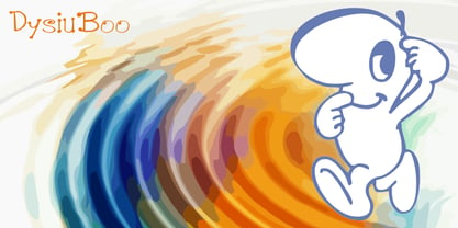
- Baby boo by Sipanji21,
$13.00 Nala Junior is a chubby, fun and charming display font. Its simple and friendly style makes this design incredibly versatile, fitting a wide variety of creative ideas.
 - Futura Headline EF Pro by Elsner+Flake,
$103.00 The design of Futura seems to be timeless. This typeface family which had been developed in 1926 by Paul Renner for the Bauer Type Foundry in the style of constructivism and as part of the Bauhaus movement, experienced, however, in the course of the past 90 years, repeated time-appropriate revivals which guaranteed its on-going popularity. The version of the Futura EF Pro contains the original character constructions which Dennis Megaw described as the “first designs of Futura” in 1938 in “20th century sans serif types, Typography no. 7” (See: Dr. Christopher Burke: Paul Renner, Princeton Architectural Press, New York 1998). What makes it exceptional is the extension into three weights: “Text”, “Headline” and “Index” which came about as part of a degree dissertation at the Hochschule für Bildende Künste (HFBK) in Hamburg. In this context, the accompanying documentation “Die Kritik der reinen Futura” (“The Critique of the Pure Futura”) by Katharina Strauer was published by the Materialverlag, Hamburg, in 2003. Some copies are still available at Elsner+Flake.
 - Futura Text EF Pro by Elsner+Flake,
$103.00 The design of Futura seems to be timeless. This typeface family which had been developed in 1926 by Paul Renner for the Bauer Type Foundry in the style of constructivism and as part of the Bauhaus movement, experienced, however, in the course of the past 90 years, repeated time-appropriate revivals which guaranteed its on-going popularity. The version of the Futura EF Pro contains the original character constructions which Dennis Megaw described as the “first designs of Futura” in 1938 in “20th century sans serif types, Typography no. 7” (See: Dr. Christopher Burke: Paul Renner, Princeton Architectural Press, New York 1998). What makes it exceptional is the extension into three weights: “Text”, “Headline” and “Index” which came about as part of a degree dissertation at the Hochschule für Bildende Künste (HFBK) in Hamburg. In this context, the accompanying documentation “Die Kritik der reinen Futura” (“The Critique of the Pure Futura”) by Katharina Strauer was published by the Materialverlag, Hamburg, in 2003. Some copies are still available at Elsner+Flake.
 - Futura Black Art Deco by URW Type Foundry,
$39.99 - Futura Now for Leica by Monotype,
$53.99For nearly 90 years, Paul Renner’s Futura has been as popular as it is versatile—from children’s books to fashion magazines to the plaque on the Moon. Futura is a typographic icon. Futura Now offers designers a chance to see Futura with fresh eyes. It’s more truly Futura-like than any digital version you’ve ever worked with. “It brings some much-needed humanity back to the world of geometric sans serifs,” says Steve Matteson, Monotype’s Creative Type Director who led the design team. “Despite its reputation as the ultimate modern typeface, Futura Now is surprisingly warm,” he explains. “It’s just as at home set next to a leafy tree as it is next to a stainless-steel table, because it skillfully navigates the border between super-clean geometry and humanist warmth.” Futura Now—the definitive Futura—contains 102 styles, including: new Headline and Text weights; new Script and Display weights and styles; and new decorative variants (outlines, inlines, shadows, and fill). Its contemporary alignment of names and weights makes the family easier to understand and use, and its comfortable Text and judicious Headline subfamilies provide instantly refined spacing. With a large Latin, Greek, and Cyrillic character-set, Futura Now serves a wider international creative community. Futura Now is available both as individual OpenType fonts and as a set of Variable fonts, delivering limitless styles in a tidy digital footprint. - Pep O Mint Normal - Unknown license

- Gothic Special Normal Italic by Wooden Type Fonts,
$15.00 A revival of one of the popular wooden type fonts of the 19th century, suitable for text or display, short descenders, tall ascenders, the narrow, italic version, completing the Gothic Special family of 5 fonts in total, sans serif.
 - Formal Notice JNL by Jeff Levine,
$29.00 Samuel Welo’s “Studio Handbook for Artists and Advertisers” was a popular book of inspiration for sign painters, graphic artists and designers from the 1920s through the 1960s. Many digital revivals of Welo’s hand lettered typography have been made available. Formal Notice JNL is one such revival, and is available in both regular and oblique versions.
 - Cross Stitch Formal by Gerald Gallo,
$20.00 Cross Stitch Formal is based on upper case characters 20 stitches tall and contains upper case characters A-Z. All characters are linked by at least one stitch.
 - Nouveau Formal JNL by Jeff Levine,
$29.00 Lettering found on the cover of 1915 textbook pamphlets from the Woman’s Institute of Domestic Arts and Sciences, Inc. [of Scranton, PA] inspired the creation of Nouveau Formal JNL. This attractive serif typeface is available in both regular and oblique versions.
 - Formal Dance JNL by Jeff Levine,
$29.00 A vintage Canadian-published music book circa the 1940s had the title "Strauss Waltzes" hand lettered in a bold Art Deco sans serif that featured block style letters with rounded corners. This was the working model for Formal Dance JNL, which is available in both regular and oblique versions.
 - Formal Invite JNL by Jeff Levine,
$29.00 The thin, condensed serif lettering found in a 1937 magazine ad for Chris Craft boats inspired Formal Invite JNL, which is available in both regular and oblique versions.
 - David Hadash Formal by Monotype,
$50.99Monotype Imaging is pleased to present David Hadash (New" David), the full family of typefaces by Ismar David, in its intended authentic form. The Estate of Ismar David has sought to revive this jewel of Twentieth-Century design by granting an exclusive license to Monotype Imaging to implement it in industry-standard format. Never before has the typeface in its full set of sub-styles been made available to the design community. David Hadash consists of three style families, Formal, Script, and Sans. Each of these appears in three weigths: regular, medium, and bold. Originally devised as a companion to the upright Formal style, the Script style has a beauty and grace all its own that allows it to be used for full-page settings also. While it is forward-leaning and dynamic, it does not match any of the existing cursive styles of Hebrew script. Ismar David created an eminently readable hybrid style which is like no other by inclining the forms of the upright while blending in some features of Rashi style softened with gentle curves. One can say that the Script style is the first truly italic, not just oblique, typeface for Hebrew script. Although the proportions of the Sans style are very similar to those of the Formal style, its visual impression is stunningly different. If the Formal style is believably written with a broad-point pen, the Sans is chiseled in stone. Rounded angles turn angular and stark. The end result is an informal style that evokes both ancient and contemporary impressions. David Hadash (Modern) supports the writing conventions of Modern Hebrew (including fully vocalized text) in addition to Yiddish and Ladino. David Hadash Biblical is a version of the Formal style that supports all the complexities of Biblical Hebrew, including vocalization and cantillation marks. " - Formal Event JNL by Jeff Levine,
$29.00 The hand lettered actors’ credits on a title card from the 1937 film “Shall We Dance” served as the model for Formal Event JNL – an Art Deco sans serif font available in both regular and oblique versions.
 - Faltura Animals - Personal use only

- Faltura Guerra - Personal use only


