10,000 search results
(0.095 seconds)
- Fruitypops by Set Sail Studios,
$16.00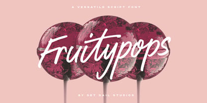 Introducing Fruitypops! A friendly, versatile script font ready for any project. Hand drawn with a real marker pen on paper, Fruitypops is bold and standout yet maintains large counter spaces with its large loops and carefully crafted letterforms. With 56 ligatures, a full set of unconnected lowercase alternates, and a bold version included, it’s designed to be a go-to script font for any design brief in need of a personal touch. The Fruitypops family includes; 1. Fruitypops Regular • A handwritten script font containing upper & lowercase characters, numerals and a large range of punctuation. 2. Fruitypops Bold • A bold version of Fruitypops with thicker letterforms, great for use at smaller sizes. Lowercase Alternates • A full set of a-z lowercase alternates are included with unconnected strokes. These can be accessed by turning on ‘Stylistic Alternates’, via a Glyphs panel, or pasted via Font Book/Windows Character Map. 56 Ligatures • 56 ligatures are included for lowercase letters (see image). These are uniquely designed double and triple letter combinations designed to create realistic handwriting and fix tricky character pairings. These can be accessed by turning on ‘Standard Ligatures’, via a Glyphs panel, or pasted via Font Book/Windows Character Map. Language Support • English, French, Italian, Spanish, Portuguese, German, Swedish, Norwegian, Danish, Dutch, Finnish, Indonesian, Malay, Hungarian, Polish, Croatian, Turkish, Romanian, Czech, Latvian, Lithuanian, Slovak, Slovenian.
 - Raclette by Linotype,
$29.99Raclette grills are an ingenious Swiss invention. This tabletop grill is used to cook raclette cheese, a unique sort of cheese produced by the happy cows of Valais. Swiss designer Michael Parson created a typeface in 2002 that speaks endearingly to his hearty homeland tradition - endearingly enough, he named it Raclette. Raclette most likely started out as a bold, condensed sans serif. But then, just as one pulls little trays off of a raclette grill, Parsons quickly removed many rectilinear bits from the edges of each letter. Text set in Raclette looks like an old brick wall, or perhaps like a raclette party for several hundred people, that ended an hour ago! Raclette is one of ten of Michael Parson's experiments in type design featured in the Take Type 5 collection from Linotype GmbH." - RF Rostin by Russian Fonts,
$26.00Rostin is a modern monospaced typeface with half-open forms of characters. Contains 8 fonts. 4 regular and 4 true italic. Weights from ultralight to bold. Including modern and futuristic stylistic alternates. The typeface was designed to read well in small sizes (from 15px) and be bright in large sizes. With these characteristics and a wide palette of weights Rostin has a huge potential area for usage. Ideally suited for musical covers, posters, logos, street wear, movie titles, packaging, editorial, web and applications - here he will always be gorgeous. With a wide variety of alternate characters you can make your design bright, memorable and modern. Opentype features: old-style figures, fractions, stylistic alternates, superscript and subscript.Multilingual support: Latin, latin extended, cyrillic and cyrillic extended (more than 75+ languages) - Athens by EllenLuff,
$38.00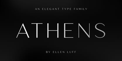 Athens is an elegant typeface of contrast. Designed for branding, headlines and titles. The family offers class and clarity at larger and smaller sizes. Its a modern take of the old didone genre, confidently playing with extremes of thick strokes and whisper-thin curves, but removing the serifs, planting it firmly in modern day design. Its a careful collaboration between beauty and function. FEATURES 10 Fonts (4 weights + inline + matching italics) Supports ALL Latin based languages. (657 Glyphs per font) 2 options of numbers (Basic and stylistic) Athens features upper and lower cases, USE Each font offers something different and are all crafted to work harmoniously together. Athens Light, Regular, Bold and inline is designed specifically for headlines, titles and branding. Athens Book is optically designed for use in smaller sizes, making great body copy.
 - Cooraline by Scratch Design,
$9.00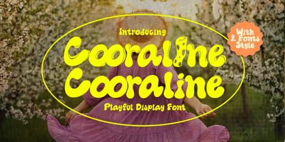 Introducing to you, Cooraline! Comes with 2 fonts style! Cooraline it's retro, psychedelic, bold, playful, and really unity together in your design to give it that retro feel. This font has an authentic groovy style that is perfect for making any project like a header, logo, quote, layout magazine, poster, packaging and label design, etc. Better which is use it on the 60s until 80s design project, this font will give some old-school touch to your design projects. Back in the psychedelia era Cooraline came with open-type features such as ligatures and extra clip art, and the other alternative Cooraline Shadow consists of underwater elements that suit with underwater atmosphere, so you can combine these two fonts to make an amazing retro, psychedelic with undersea vibes in your project designs.
 - Luce Stilren by Objectype,
$20.00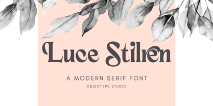 Luce Stilren is a serif font with a modern and geometric design from Objectype Studio. With clean lines and bold shapes, this font adds a professional and contemporary touch to any design project. The main feature of this font is its flexibility. Whether you’re working on a branding project, logo design, magazine headlines, or wedding invitations, Luce Stilren is the perfect choice. This font is designed to provide reading comfort, making it a great choice for both print and digital publications. Luce Stilren supports various languages and includes various typographic features such as ligatures, old-style numbers, and letter-style variations. With these possibilities, you can customize the font according to your needs. With Luce Stilren, you can take your designs to the next level. Get it now and start creating!
 - Forjada by Latinotype,
$26.00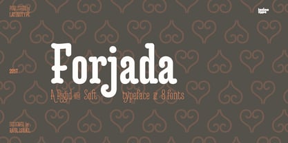 Forjada—designed by Raúl Israel—is a monolinear, rounded and condensed typeface, belonging to the slab serif classification, inspired by wrought iron window and door grills on facades of historic buildings in America and Europe. Forjada is a rigid yet softly curved font with exquisite ornaments and optimized for great legibility. Forjada Family comes in 3 weights—Light, Regular and Bold—with matching italics and includes alternate swash caps and ligatures plus Ornaments and Catchwords sets that provide a wide range of choices for creating the most beautiful designs. The font character set supports 212 languages. Forjada is well-suited for branding, packaging, food & drinks menus, wedding invitations, party invitations, guidebooks to old cities or any glamorous design you want to add a fresh and modern touch to!
 - Ankormati by Taznix Creative,
$17.00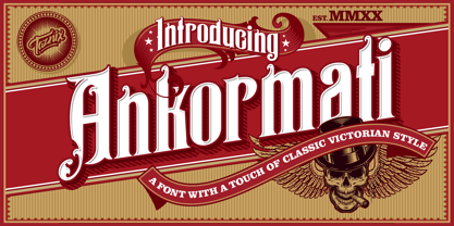 Ankormati Is a font with a touch of classic Victorian era style with bold letters wrapped in small ornaments that add to the feel of the Victorian era, but here it makes the look of this font with a colorful retro feel, not really like the old Victorian era design. But this can be tailored to the desires of your design needs, This font fits perfectly with the retro vintage style which will add classic value to your designs. What's Included : Standard glyphs Ligature Works on PC & Mac Simple installations Accessible in the Adobe Illustrator, Adobe Photoshop, Adobe InDesign, even work on Microsoft Word. PUA Encoded Characters - Fully accessible without additional design software. Fonts include multilingual support for; ä ö ü Ä Ö Ü ß ¿ ¡ Hope you enjoy with our font! Taznix
 - Canyon Slab by Hipfonts,
$17.00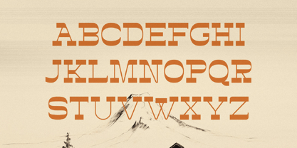 Saddle up and venture into uncharted typographic territory with Canyon Slab, a wild west-inspired serif slab typeface that beckons you to explore the untamed frontiers of design. Like the rugged canyons that have withstood the test of time, this font's bold serifs and sturdy letterforms exude a sense of strength and adventure. Canyon Slab captures the spirit of the old west, where legends were born and tales of grit and determination echoed through the canyons. As you wield this powerful typeface, you'll feel the dust of the trail beneath your feet, hear the echo of revolvers in the air, and taste the thrill of unbridled exploration. Channel the untamed spirit of the wild west with Canyon Slab, and let your designs ride into the sunset of creativity.
 - Outright by Sohel Studio,
$16.00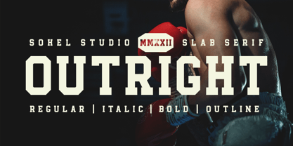 Outright slab serif inspired by sporty design, vintage style with a touch of classic style. There are 4 different styles that you can apply in your design projects. This font is built with solid foundations, strong visuals, old-school movement, and a modern minimalist style. Outright is perfect for , Jersey , athletic, poster, branding projects, Logo design, Clothing Branding, product packaging, for magazine titles. for something with the theme of sports, album title, etc Outright Features: · 4 Weights font (Regular,Italic,Bold,Outline) · Numerals & Punctuation · Accented characters · Multilingual Support · PUA Encoded While using this product, if you encounter any problem or spot something we may have missed, please don't hesitate to drop us a message. We'd love to hear your feedbacks in order to further fine-tune our products. Thanks and have a wonderful day
 - Tusker Grotesk by Lewis McGuffie Type,
$35.00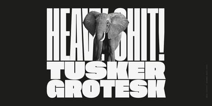 Tusker Grotesk is a headline typeface designed for robust and high-impact use. The initial inspiration for Tusker came from postwar typefaces like Haettenschweiler, Impact and Helvetica Inserat which use very high x-heights. Other influences in the condensed end of the Tusker family are old grotesques like Folio Extra Condensed and Stephenson Blake Elongated Sans No.1 with their flat terminals and closed-up apertures. Then as the widths in Tusker grow, the lettering takes some more inspiration from gothic style sans such as Inland Type's Title Gothic No.8, while maintaining the optical weight established in the narrow end of the family. Each width set is duplexed, stackable and is ideal for headlines, logos and bold attention-grabbing editorial design. Tusker has extended latin coverage ideal for western, central and eastern European languages.
 - Matchbox Font Collections by Adam Fathony,
$12.00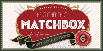 Matchbox Font Collections Inspired by a vintage book, old style design, a classic casual vintage look fonts. Minimal decoration on the fonts made it more casual look. The fonts are very versatile, even it works also on modern design but still keep the classic look. Created 6 Fonts that can be combined each other. Like on the Preview images, I've been created from the victorian style to the minimalist badges. It's still blend to each other. What's inside : Matchbox Linea - Bold, Sharp, Standout with inline cut. Matchbox Lettre - Popular Vintage Sign Style. Matchbox Deco - As it names, Art Deco Style. Matchbox Scriptura - Casual Script Fonts, Good for Pair or on a small details. Matchbox Ornato - The Only fonts with a touch of vintage decorations. Matchbox Graso - Little touch of a Fat, Fun and Casual.
 - RePublic by Suitcase Type Foundry,
$75.00In 1955 the Czech State Department of Culture, which was then in charge of all the publishing houses, organised a competition amongst printing houses and generally all book businesses for the design of a newspaper typeface. The motivation for this contest was obvious: the situation in the printing presses was appalling, with very little quality fonts existing and financial resources being too scarce to permit the purchase of type abroad. The conditions to be met by the typeface were strictly defined, and far more constrained than the ones applied to regular typefaces designed for books. A number of parameters needed to be considered, including the pressure of the printing presses and the quality of the thin newspaper ink that would have smothered any delicate strokes. Rough drafts of type designs for the competition were submitted by Vratislav Hejzl, Stanislav Marso, Frantisek Novak, Frantisek Panek, Jiri Petr, Jindrich Posekany, and the team of Stanislav Duda, Karel Misek and Josef Tyfa. The committee published its comments and corrections of the designs, and asked the designers to draw the final drafts. The winner was unambiguous — the members of the committee unanimously agreed to award Stanislav Marso’s design the first prize. His typeface was cast by Grafotechna (a state-owned enterprise) for setting with line-composing machines and also in larger sizes for hand-setting. Regular, bold, and bold condensed cuts were produced, and the face was named Public. In 2003 we decided to digitise the typeface. Drawings of the regular and italic cuts at the size of approximatively 3,5 cicero (43 pt) were used as templates for scanning. Those originals covered the complete set of caps except for the U, the lowercase, numerals, and sloped ampersand. The bold and condensed bold cuts were found in an original specimen book of the Rude Pravo newspaper printing press. These specimens included a dot, acute, colon, semicolon, hyphens, exclamation and question marks, asterisk, parentheses, square brackets, cross, section sign, and ampersand. After the regular cut was drafted, we began to modify it. All the uppercase letters were fine-tuned, the crossbar of the A was raised, E, F, and H were narrowed, L and R were significantly broadened, and the angle of the leg and arm of the K were adjusted. The vertex of the M now rests on the baseline, making the glyph broader. The apex of the N is narrower, resulting in a more regular glyph. The tail of Q was made more decorative; the uppercase S lost its implied serifs. The lowercase ascenders and descenders were slightly extended. Corrections on the lower case a were more significant, its waist being lowered in order to improve its colour and light. The top of the f was redrawn, the loop of lowercase g now has a squarer character. The diagonals of the lowercase k were harmonised with the uppercase K. The t has a more open and longer terminal, and the tail of the y matches its overall construction. Numerals are generally better proportioned. Italics have been thoroughly redrawn, and in general their slope is lessened by approximatively 2–3 degrees. The italic upper case is more consistent with the regular cut. Unlike the original, the tail of the K is not curved, and the Z is not calligraphic. The italic lower case is even further removed from the original. This concerns specifically the bottom finials of the c and e, the top of the f, the descender of the j, the serif of the k, a heavier ear on the r, a more open t, a broader v and w, a different x, and, again, a non-calligraphic z. Originally the bold cut conformed even more to the superellipse shape than the regular one, since all the glyphs had to be fitted to the same width. We have redrawn the bold cut to provide a better match with the regular. This means its shapes have become generally broader, also noticeably darker. Medium and Semibold weights were also interpolated, with a colour similar to the original bold cut. The condensed variants’ width is 85 percent of the original. The design of the Bold Condensed weights was optimised for the setting of headlines, while the lighter ones are suited for normal condensed settings. All the OpenType fonts include small caps, numerals, fractions, ligatures, and expert glyphs, conforming to the Suitcase Standard set. Over half a century of consistent quality ensures perfect legibility even in adverse printing conditions and on poor quality paper. RePublic is an exquisite newspaper and magazine type, which is equally well suited as a contemporary book face. - Urbax by Eko Bimantara,
$16.00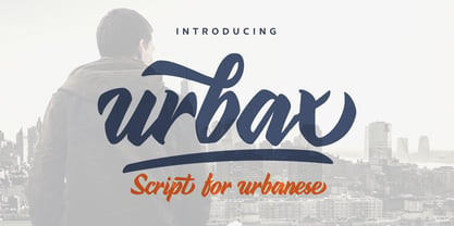 Urbax; Bold expressive script for urban people and urban projects. Fit for Logo, Brand, Titling, Shirt, Hoodie, Products, Signage, Prints and Various Creative Projects. Contain 5 stylistic sets with lot of alternates. Contain basic latin multilanguage support.
 - Black Street by Jehansyah,
$9.00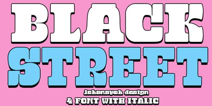 Black Street This is a large and bold font, it is very suitable for all design work, it looks elegant and clear and dares to display a unique impression in it for magazines, clothing posters and others.
 - Cheedo by Aah Yes,
$7.95Cheedo is a bold funky font with a white internal stripe, with two variations - one having occasional outline stars, the other without. The packages contain both OTF and TTF versions -install either OTF or TTF, not both. - Trunk by Daily Studio,
$13.00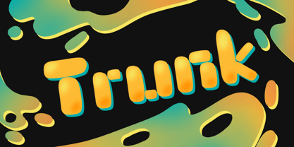 Trunk is a bold and simple font published by Daily Studio. This is a decorative font design suitable for headlines, invitations, quotes, business card, posters, etc. This font includes full uppercase, lowercase, punctuation, and standard multilingual support.
 - Display Magazine by Letterena Studios,
$10.00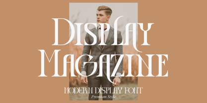 Display Magazine is a bold, distinct and assertive serif font. This font is imposing and features uniquely shaped letters, and as a result, it will easily match a wide range of creations that require a distinct touch.
 - Grostique by Aftertime Studio,
$20.00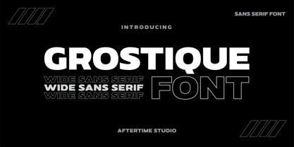 Grostique is a bold and solemn sans serif font, perfectly suitable for daring projects that need an outstanding appearance. It works best on streetwear designs, logo branding, editorial designs, music posters, modern advertising campaigns, and many more.
 - Kiara by RodrigoTypo,
$25.00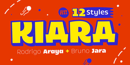 Kiara typeface is a typeface designed for informal titles with very expressive letters. It also contains more than 12 variants (Thin, Light, Regular, Bold, Black) as letter alternatives and options such as "Black Shadow-Black Shadow Alternative".
 - Teselka by Okaycat,
$29.95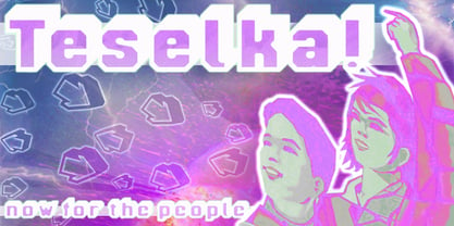 Teselka stands bold with sharp angular distinction. Deep 3D extrudes and thickly styled outlines for high impact. Teselka features extruded arrows (both directions), extended characters, and contains West European diacritics & ligatures. Highly suitable for international environments & publications.
 - Brithny by Sealoung,
$10.00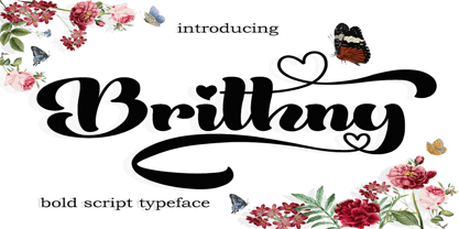 Brithny is a sweet and bold script font with alternates and lovely swashes. It has an incredible alternates and love swashes. Use it to add that special retro touch to any design idea you can think of!
 - Cute Lime by Sipanji21,
$10.00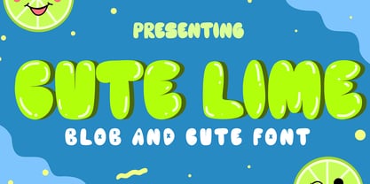 Cute Lime is a bold and colorful display font. Its friendly feel makes this font incredibly versatile, fitting a wide range of contexts. Add it to your creative ideas and notice how it makes them stand out!
 - Ashgabat by GlyphStyle,
$16.00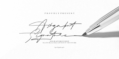 Ashgabat is a signature style font that looks natural with a pen stroke-like texture. A bold and elegant looking font like the original signature style. Font feature Uppercase, Lowercase, Numerals & Punctuations, Stylistic Alt, Swash Ligature, Multilanguage
 - Heywood by Elemeno,
$25.00Named for Algonquin Round Table wit Heywood Broun, Heywood is bold, but playful. The simplicity of the letters combined with the shifting baseline make this the least formal and most fun of The Algonquin Collection of fonts. - Antique Two by Wooden Type Fonts,
$15.00A revival of one of the popular wooden type fonts of the 19th century, condensed, bold, square serifs, a very useful design for display, upper and lower case, in the antique family but with a squared design. - Kallio Brush by Fenotype,
$19.00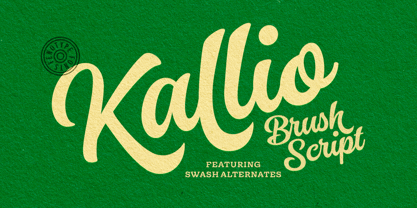 Kallio is a Bold Brush Script with roots in American sign painting culture. Kallio is Finnish and means rock or cliff. Kallio is equipped with Contextual Alternates for smooth connections and Swash Alternates for every standard letter.
 - Gleamore by GlyphStyle,
$17.00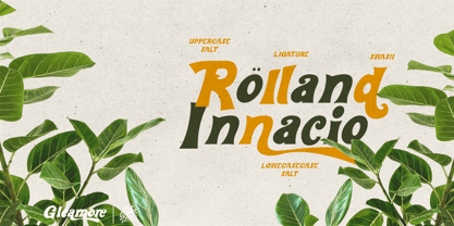 Gleamore is a decorative display font, looks stylish. The bold shape combined with the unique curve shape makes this font easy to read and looks beautiful. - Font feature Uppercase, Lowercase, Numerals & Punctuations, Stylistic Alt, Swash Ligature, Multilanguage
 - Boldka Script by Solidtype,
$14.00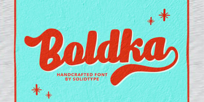 Boldka Script is a bold connected script. fresh, casual and fun. Great font for creating headlines, logos & posters and more. Features Open type feature, including stylistic alternates, ligatures and International support for most Western Languages is included.
 - Big Limbo BT by Bitstream,
$50.99This freeform exercise in typographic design echoes the looseness of early 1960's advertising. Brian breaks almost every typographic rule we can think of — but so what? The bold letterforms of Big Limbo are anything but stuck! - Anboug by ahweproject,
$14.00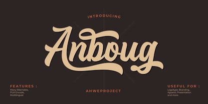 Anboug is a gorgeous and bold handwritten font, crafted to give your headlines and logotype projects a retro touch. This font reads as strong, confident, and dynamic and can add tons of nostalgic character to your designs.
 - Bay Area Nouveau JNL by Jeff Levine,
$29.00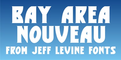 Bay Area Nouveau JNL is an ultra bold, Art Nouveau headline font inspired by hand lettering on the cover of a piece of 1911 sheet music entitled "The Only Pal I Ever Had Came from 'Frisco Town'".
 - Toy Letters JNL by Jeff Levine,
$29.00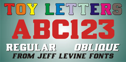 A vintage set of die-cut letters and number by Village Toys (circa 1930s or 1940s) featured a playful, bold serif typeface. This is now available digitally as Toy Letters JNL, in both regular and oblique versions.
 - Metalmark Stencil JNL by Jeff Levine,
$29.00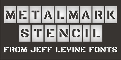 A lot of interesting variations in lettering style can be found in sets of antique tin or brass marking stencils. One such set was the model for Metalmark Stencil JNL, a bold sans with a chamfered look.
 - Instabread by Motokiwo,
$12.00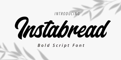 Instabread, a bold script font that is suitable for headline, logotype, apparel, invitation, branding, packaging, advertising etc. This typeface is comes in uppercase, lowercase, large range of punctuation, symbols & numerals, contextual alternates and ligatures, also support multilingual.
 - Oro De Maya by Fat Hamster,
$25.00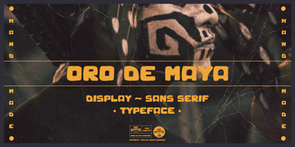 Oro de Maya is a hand drawn ancient sans serif / display typeface. Oro de Maya font was inspired by the Maya civilization culture, their marvelous art, architecture and glyphs. This fantastic ancient font has a bold character.
 - Zeogari by Phoenix Group,
$13.00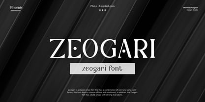 Zeogari is a classic style font that has a combination of serif and sans-serif forms, this font depicts a sense of love and loneliness, in addition, the Zeogari font has a bold shape with strong characters.
 - F2F OCRBczyk by Linotype,
$29.99The original OCR B was designed for optical character recognition systems and was therefore monospaced. Designer Alexander Branczyk made a more typographically tuned and fitted version, with both regular and bold weights, and called it OCRBczyk™. - Katigert by Oleg Gert,
$20.00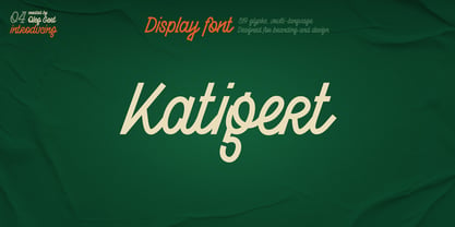 Katigert – is a rather friendly italic with a touch of measured severity, combines very sharp angles and bold shapes. The font works best for display. The font includes extended Cyrillic and Latin alphabets, punctuation marks and currencies.
 - Galeb by Tour De Force,
$25.00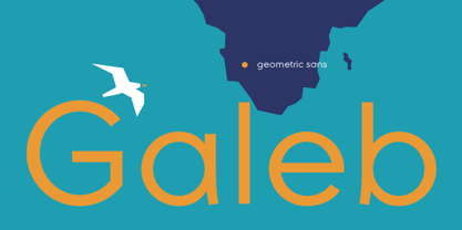 Galeb is simple geometric sans font family in 4 weights - Light, Regular, Bold and Black, ideal for corporate and editorial projects. With angled stem endings, Galeb gives enough impression to be used as display font as well.