10,000 search results
(0.057 seconds)
- Browking by Letterara,
$18.00 Browking is a bold, distinct and elegant blackletter font. This font is imposing and features uniquely shaped letters, and as a result, it will easily match a wide range of creations that require a distinct touch. Use it for product packaging, branding, or other projects that need bold and daring typography! It is PUA encoded which means you can access all of the glyphs and swashes with ease! Add it confidently to your projects, and you will love the results.
 - Ceramika by Santi Rey,
$25.99 Ceramika is a modern tribute to Old Style typefaces. This design is inspired by the letterforms of the serif faces found in history books from the beginning of the 20th-century. Its sturdiness and generous X-Height makes it bold and compact; while the high-contrast strokes and recognisable shapes makes it extremely readable. All this makes Ceramika a really versatile font, perfect for logos, headlines and even body copy. It comes in 6 different weights and 2 styles — Standard and Italic.
 - Ratieka by Yukita Creative,
$12.00 Ratieka is a stylish, modern font that is perfect for use in fashion-related design projects. Its elegant letterforms make it ideal for branding and logo design, while its high level of legibility makes it perfect for use in websites, advertising, and other types of communication. Features. Supports all languages in the world (37) Versatile Single Font. One font for all needs. OTF File Ratieka is perfect for modern fashion brands or any projects that require a high-end feel.
 - XXII GoreGrinder by Doubletwo Studios,
$25.99 The face of horror – The GoreGrinder is an extreme logo font designed for extreme music. If you’re in love with deathmetal, grindcore and the horror movie scene, you may find pleasure in using this font. It comes with an upper- and lowercase characterset, numerals, some punctuation and a bunch of drips and stuff used in the genre. Use it in your graphic-editing-application and be creative, play with it and find out what’s possible. Find out more about using it on Behance.net
 - Spiraling Down by Hanoded,
$15.00 I was listening to an Opeth album called Blackwater Park. By the time I had decided that this font needed some swirls, the band was playing a song called The Drapery Falls - which has the word ‘spiraling’ in it (see poster 2) - and the name was born. Spiraling down is a surprisingly elegant font (given its roughness). I probably wouldn’t set a whole text in it, but it will really stand out as a titling font for packaging or book covers.
 - Arapix by Anatoletype,
$69.00 Arapix is a 12 pixel high multilingual Latin-Arabic pixel font with incredible capabilities. The Arapix is an almost traditional Naskh. It is elegant and easy to read even in very small sizes. It includes almost every feature you would expect from a high range Naskh font. Its humanistic look and feel fit perfectly to its Latin counterpart. Arapix was originally designed for a web project that didn't see the light a few years back. It started with the idea of fitting both Latin and Arabic into a 12 pixel vertical grid. The latin glyphs fit properly within the vertical limits, but when it came to the arabic glyphs, it proved to be more challenging. Arabic letters with lower diacritic dots like the (Yeh-fina) or letters with accents above like the (Alef-Hamza-above) need much more space than any Latin letter. Add to this the fact that accents needs to be positioned above and below the glyphs. It is technically impossible to fit a (Yeh-fina-kasratan) or a (Alef-Hamza-above-shadda-damma) into 12 pixels. Initially the accents were dropped and not included in the design. Although it seemed impossible at the start, Sylvain found a solution in the end, including as many contextual alternates and contextual kerning as needed to avoid every collision between letters and diacritics, letters and accents, and diacritics and accents. The contextual kerning was added to achieve an even letter and word spacing in longer text. Arapix is amazingly legible in small size on screen and in print. On the other hand, it also works perfectly as display titling font due to its unique and contemporary pixel approach. It can be used for screens with very low resolution as well as for high resolution screens and prints. The new Arapix comes with various new features and new glyphs including Persian and Urdu letters, stylistic set, old style figures, contextual kerning, contextual alternates and a few icons too. Enjoy the new Arapix and have fun with it.
 - Stars & Love by Roland Hüse Design,
$22.00 Stars & Love is a bold, cursive brush calligraphy font, influenced by retro script style with a friendly rounded look and flourished elegance. It features stylistic alternates, contextual alternates, standard ligatures and terminal forms (beginning and ending characters are a bit different) that ensures multiple options for you to choose from for your design work. This font comes in two instances, a Bottom Heavy and a Regular version. Being friendly yet elegant in its visual presence, Stars & Love is perfect for Love theme designs, premium packaging, stationery design, invitations, posters, logos, custom products and more. The Character set covers most Latin languages. Font Guide PDF Font presentation video For feedback, customisation or extra character request please email me at fonts@rolandhuse.com Font Features: • Latin character set: Uppercase & Lowercase A - Z • Stylistic Alternates (up to 3 Sets) • Contextual Alternates (Initial and Final Forms) • Standard Ligatures • Underline Swashes (Stylistic alternates for underscore) • Numerals & Punctuation • Accented Characters • Symbols (Currencies and basic symbols such as @ # % etc.) Please refer to the Font Guide pdf for more details. To access all features of Stars & Love such as stylistic alternates etc., it's highly recommended to use professional design software such as Adobe Illustrator, Adobe Photoshop, Adobe InDesign or Procreate (via 'add text' feature).
 - Kaat by ChrisNuijen.com,
$29.00 Kaat is a new type (2013). It was designed by Chris Nuijen and named after his daughter Kaat. It represents the period in which everyone has their face behind the latest mobile phone screen or interactive games console. "Kaat"is slick, modern and progressive, to reflect our busy immediate life style, whilst providing the essentials in a period where people can be judged on television. Kaat is here to stay and to evolve. Everyone wants to try to be that little bit different, but essentially we are all the same, with the same inherent needs, just like babies or children. We need to be fed, watered, nurtured and loved, the only difference is in today's world you can do all that from behind a screen. "Kaat" bridges that gap, transcending the basic needs of type, with the sophistication and fast paced sharpness of today, everyone wants to be different but we all stay the same, this is a reflection in the thickness and shape of each glyph. The font represents how we are molded and cast differently in yet we still stay the same, because we need the repetition! Everything needs to be done quicker, simpler and cheaper. We eat we sleep we communicate.
 - Feelin Sweet - Unknown license

- Chasing Miracles - Unknown license

- Aesthetikos - Personal use only

- Rachelle Sapphire - Personal use only

- Blantick Script - Personal use only

- Romantyc Paradise - Personal use only

- Little Cupcakes - Unknown license

- Last Dream - Personal use only

- Scream Ghost - Personal use only

- Anttariksa by Stringlabs Creative Studio,
$25.00 Anttariksa is a casual, fun script font, created by using a brush pen. Clean and a little bit quirky, this font is the perfect fit for all of your logos, branding, social media, and crafty DIY projects.
 - Coppola by Palmer Type Company,
$45.00 Coppola is a brand new typeface that combines a little bit of Didot, a pinch of Art Nouveau, and a dash of Italian mafia. A-Z, a-z Numbers Alternates Ligatures Multi-language support Symbols Special characters
 - Grayson by Rillatype,
$15.00 Introducing, Grayson Serif. Grayson is a swash serif font that have an unique look to give your design a little bit of elegant but still feminine. this font is perfect for magazine, headline, editorial, instagram pst, etc.
 - Beta Dance - Unknown license

- Hooper dooper - Unknown license

- MGN Debris by Morgana Studio,
$17.50 This design is characterized by its futuristic and modern aesthetic. The clean lines and minimalist approach create a sleek and sophisticated look, while the unique touches and use of the MGN Debris font give it a bold and edgy vibe. It is a perfect example of how a modern design can also be unique and innovative, with elements that set it apart from traditional designs. This style is perfect for businesses and organizations that want to convey a sense of innovation and cutting-edge technology. The MGN Debris font used in this design adds to its modern and futuristic feel. The font is bold and sharp, with a unique style that makes it stand out. It complements the overall design perfectly and adds to the edgy and unique vibe. This font is perfect for businesses and organizations that want to convey a sense of innovation and forward-thinking, and it pairs well with modern designs. Overall, this design is a great example of how a modern and futuristic style can be unique and captivating, with the use of the MGN Debris font adding an extra element of boldness and edge.
 - Bronkey by Alit Design,
$15.00 BRONKEY Typeface is a sans serif font that has a bold, sporty feel to it. It comes in several styles, including regular, italic, outline, square, and rough, providing a versatile range of options for designers. The font has a high body, making it stand out when used in large sizes, such as for headlines or titles. It contains 700 glyphs, including ligatures and alternates, allowing for greater flexibility and creativity in designing. Additionally, it supports PUA codes and is multilingual, making it accessible to a broad range of users. Overall, BRONKEY Typeface is an excellent choice for those looking for a modern, bold font with a range of styles and features. Its sporty feel and high body make it a great choice for projects related to sports, fitness, or any project that requires a dynamic, attention-grabbing font. Language Support : Latin, Basic, Western European, Central European, South European,Vietnamese. In order to use the beautiful swashes, you need a program that supports OpenType features such as Adobe Illustrator CS, Adobe Photoshop CC, Adobe Indesign and Corel Draw. but if your software doesn't have Glyphs panel, you can install additional swashes font files.
 - Rockinstead by PintassilgoPrints,
$35.00 Rockinstead counts 1, 2, 3, 4, 5, 6, 7, 8... Eight variations per letter, plus alternates for numbers and even for punctuation marks! It is equipped with some clever OpenType programming to make substitutions on-the-fly: the Contextual Alternates feature, with the help of a very careful kerning table, takes care of cycling the alternates in an amazing random-like way, impressively mimicking a true handwritten text. The Discretionary Ligatures feature manages the substitution of handy cursive catchwords, adding that charming twist. To put it more bluntly, this font AUTOMATICALLY alters your typing so that it substitutes glyph variations while you do nothing but type away! No need to use PopChar here to do the substitutions manually, the font itself takes care of that for you. This typeface was originally painted on paper, drawing inspiration from Ralph Steadman’s seminal lettering style. On a first glance it may look quite wild - and it proudly is, indeed. But look again: it is stylishly wild, it is strong, unpredictable, full of attitude and good energy. This multifaceted font will certainly strike its way for free-spirited design applications. Just please be warned: it’s seriously addictive!
 - Coil by Brownfox,
$44.99 Coil feels comfortable like a well-worn pair of shoes. It could easily pass for an assertive industrial European sans serif of the early 1960s with its slight reverse contrast, monotonous proportions, and squared-off curves, if not for its less predictable side. What appears initially as ellipses upon closer inspection turns out to be irregular shapes, closer to an inverted egg than an oval. The s looks topsy-turvy with its higher curve that is larger than the lower. Some terminal strokes overhang the bowl (as in the a), others open flat (as in the Q, the f, the j, and the t). The resulting effect shakes up this seemingly “retro” face just to make it new. Our midcentury recollections are slightly distorted and reinterpreted by this ironic typeface making it fresh while deceptively cozy and familiar. Coil’s high x-height and even texture make it readable even in small sizes despite its tight apertures. Available in four weights with their italics, with two sets of figures, fractions, and alternates for Extended Latin and Cyrillic scripts. Designed by Vyacheslav Kirilenko and Gayaneh Bagdasaryan, 2020-21.
 - Gutta Percha by HiH,
$8.00 Gutta Percha is a font for golfers. It takers its name from a hard, resilient natural substance that comes from the sap of trees grown in southeast Asia and which was used for the hard core of golf balls well into the twentieth century, when it was gradually replaced with synthetic material. It therefore seemed an appropriate name for a font using the image of a golfer of the 1920s. The letters are from our font Besley Clarendon, reduced to 70%. That means that Gutta Percha set at 40 points will have the same size letters as Besley Clarendon set at 28 points. However, it should be noted that the two fonts have different baselines. If you use them together you will have to manually adjust the vertical alignment. Gutta Percha is obviously a very specialized font, both because of the subject matter and because the uppercase is designed for use as dropped caps. There may not be many uses for it, but when it is right, it will be really right. Whether you are publishing a book about the history of golf or a clubhouse bulletin, Gutta Percha will surely be noticed.
 - Magedov Military by Mans Greback,
$69.00 The Magedov Military font is a strong and robust font that exudes power and authority. It has a sharp, geometric design with bold, hard edges that gives it a strict, army-inspired feel. In a blend of sans and slab serif styles, its unique and versatile look can be utilized for a wide range of projects. This font is perfect for university or college projects, as its straight and clear-cut design gives it an academic, high-school or college feel. It is also ideal for projects that require a strong and tough look, such as law enforcement, university or sports logos. Use the parenthesis symbols ( ) [ ] { } to make decorative elements. Example: United]States The Magedov Military family consists of four high-quality fonts: Regular, Italic, Bold and Bold Italic The font is built with advanced OpenType functionality and has a guaranteed top-notch quality, containing stylistic and contextual alternates, ligatures and more features; all to give you full control and customizability. It has extensive lingual support, covering all Latin-based languages, from Northern Europe to South Africa, from America to South-East Asia. It contains all characters and symbols you'll ever need, including all punctuation and numbers.
 - Electric Cable by Harald Geisler,
$39.00 ''Sometimes, you fall in love with someone, and, sometimes, you fall in love with something. I fell in love with the work of Harald Geisler. Harald and I met through our work on a couple of Kickstarter projects (Typographic Wall Calendar and The Montserrat Typeface). We sympathised immediately with each other, and that lead us to start a new project. The electricity we felt was captured in Electric Cable (that’s what we named it), a typeface designed in our own image and likeness. Electric cable is connected, and that power leads it to write unexpected things. It’s a letter for the flâneur: it carries within itself a high voltage that makes it lively. It has energy and spark. That’s exactly what we would like in a person. It is a display typeface, current and contemporary. It is based on the connection of two friends who felt the need to create a common language even without speaking the same language. In editorials use, your words will become strikingly beautiful. Electric Cable features geometric, humanistic qualities,and also some script, but ,above all, it has a sense of humor.’’ Julieta Ulanovsky (Usage tip: Use the “
 - Monbloc by Rui Nogueira,
$6.99 Monbloc is a typeface inspired by geometry and lines. It intends to be a practical font wich gives the designer the freedom to incorporate it in his wildest designs.
 - Linotype Freytag by Linotype,
$29.99Linotype Freytag is a condensed display face with simple, geometric shapes. With its highly readable and trendy letterforms, it is perfect for flyers, advertising, packaging, posters and magazine headlines. - Motherblood by Letterafandi Studio,
$10.00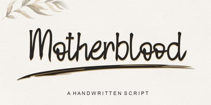 Motherblood is a sweet and friendly handwritten font. Its natural and unique style makes it incredibly fitting to a large pool of designs. The only limit is your imagination!
 - ITC Serif Gothic by ITC,
$29.99 ITC Serif Gothic font is the joint effort of Herb Lubalin and Antonio DiSpigna. Its distinguishing feature is its uniquely designed serifs, combining gothic simplicity with traditional roman elegance.
 - Bobila by Rashatype,
$10.00 Bobila is a cool and casual display font. It will look stunning on any poster flyer or print. Use this font for your designs and explore its endless possibilities.
 - Flintoye by Illushvara,
$10.00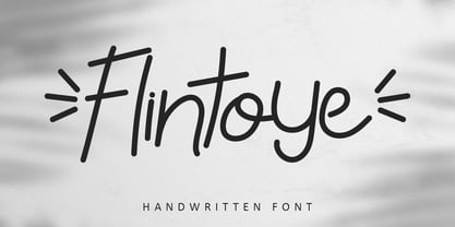 Flintoye is a sweet and friendly handwritten font. Its natural and unique style makes it incredibly fitting to a large pool of designs. The only limit is your imagination!
 - WalcomeOne by Ingrimayne Type,
$7.95 WalcomeOne simulates sloppy, messy hand printing. Despite being irregular and childlike, it is quite legible even at small sizes. It comes in four weights, each with an oblique style.
 - Display Chamfer by Gerald Gallo,
$20.00 Display Chamfer is a display font not intended for text use. It was designed specifically for display, headline, logotype, branding, and similar applications. It has caps, lowercase and numbers.
 - Sentry by Solotype,
$19.95Here's a good old Victorian job printing font. Faithful to the original issued by Barnhart Bros. & Spindler about 1880. Nothing wildly decorative about it, yet it clearly looks old. - Agoxes Game by Sealoung,
$10.00 Agoxes Game is an awesome display font. It features an authentic style that makes it perfect for games, posters, movies, magazines and any design that requires a great look!
 - Cul De Sac by Hanoded,
$25.00 Cul De Sac is a beautiful cartoon-like font. It was hand drawn, using an old fashioned pen and India ink. Use it for your ads, posters and websites.


