10,000 search results
(0.033 seconds)
- Trinidad Neue by Sudaca Type Design Studio,
$40.00 Trinidad Neue™️ is a geohumanistic typeface developed by the Chilean Type Design Studio Sudaca. The origin of this work lies in an exercise of comparing classic Roman proportions (Trajan Columns) with the capital letter set of Futura by Paul Renner. I wanted to create my own Sans Serif interpretation of classic proportions. I started working with letters A, H, N, O, R and S. When I finished the uppercase set, this exercise transformed itself into a project. I started to develop a set of lowercase letters choosing as direct references Futura and Kabel by Rudolph Koch; always having in mind that the objective was to find a balance between the humanist and the rational or geometric. Here is when this group is formed, giving its name and identity to this family: Paul, Rudolph & Alexis. The result is a typeface with an elegant, modern and versatile aspect. Its seven stylistic sets make Trinidad Neue™️ into a Swiss army knife to compose short and medium texts for editorial design, branding, exhibitions, motion graphics, etc. The family consists of nine weight variants and its corresponding oblique versions. It counts with many OpenType characteristics in each variant, including small caps, seven stylistic sets that can be combined, standard ligatures and discretionals ligatures, proportional numerals, tabular numbers, fractions, superscript, subscript, normal punctuation and also aligned to small caps and capital letters, arrows, emojis and more. With more than 1000 glyphs, this typeface has a wide idiomatic range that includes more than 190 Latin languages. Trinidad Neue™ is the new and alternative version of LC Trinidad™.
 - Deco Revival JNL by Jeff Levine,
$29.00 Some time back, a few basic characters were drawn out (possibly inspired by some vintage sheet music) and set aside for a future font project. Despite being incomplete for a few years, this once-forgotten design is now available as Deco Revival JNL, in both regular and oblique versions.
 - Slaughter by Zamjump,
$17.00 Slaughter is a display font that includes uppercase letters, numbers, multilingual and punctuation. ou can perfectly customize it for your own designs, suggestions for creating logos, emblems, posters. Slaughter is very stylish, perfect for strong moods, future technology and innovative products! Uppercase Lowercase Numbers Punctuation multi language support
 - Miometry by HakanPolatovic,
$20.00 GEOMETRICAL PERFECTNESS Every letter of miometry has a ratio to one another SHARPNESS Due it's design,it has a elegant look at first sight RATIONALITY It can even be used in every kind of rational system like patterns etc INSPIRED BY Concepts like futurism,transhumanism,cyberpunk,cyberworld etc
 - Paneuropa 1931 by ROHH,
$19.00 Paneuropa 1931™ is a faithful recreation of XX-century Polish classic, made by Idzikowski foundry in Warsaw, 1931. Original Paneuropa was a renowned and highly popular typeface in XX-century Poland, and was widely used in all kinds of design, editorial use and printed materials for decades. Paneuropa is a geometric, clean and versatile font family inspired by Paul Renner's famous Futura - it is a bit narrower, with different proportions and details in drawing, completely different figures and punctuation shapes than Futura. It is an interesting and refreshing alternative to Futura with its own distinct personality and a subtle authentic vintage flavour. Paneuropa 1931 contains separate styles for display and large sizes as well as styles for small text sizes - differing in spacing and the softness of letterforms. The family features an original Paneuropa Double font - a beautiful inline style for headlines and display use. The whole family is completed with added missing inbetween styles as well as italics. The original subfamily set is available for purchase and it contains solely the original Paneuropa styles (Thin, Regular, Bold, Text Regular, Text Italic, Double). Paneuropa 1931 characteristics: letter shapes and proportions are very faithful to the original, keeping its idiosycrasies and inconsistencies spacing and kerning are carefully adjusted in order to achieve the colour of the original fonts, keeping maximum possible consistency - a compromise between authentic vintage feel and legible consistent text colour (for hardcore users: just turn off the kerning) weights precisely matching the original (Thin, Regular, Bold, Text Regular, Text Italic, Double), inbetween weights were added (Light, Demi Bold, as well as missing italic styles) italic angle faithful to the original (8 degrees) softened corners help achieving the character of old imprecise printed display styles for big sizes are sharper and have tight spacing, text styles have softer shapes (recreating small print imperfect print) and broader spacing for use in paragraph text (spacing in both display and text styles matches the original as well) original style names in Polish for devices with Polish set as their primary language The family is very versatile. The Inline style as well as bold and thin weights are perfect for headlines and display use, other styles works wonderfully as paragraph text. Paneuropa 1931 consists of 18 fonts - 5 display weights with corresponding italics + 3 text weights with corresponding italics + 2 inline styles (for big and small print sizes). It has extended support for latin languages, as well as broad number of OpenType features, such as case sensitive forms, fractions, superscript and subscript, ordinals, currencies and symbols.
 - Reisar by Konstantine Studio,
$17.00 Reisar is inspired by the vintage sign of motels, automotive logos, and badges, mixed up with urban modern cross-culture of contemporary visuals and brutalism. It makes Reisar born with a fresh vibe combined with the past and future for your visual graphic design needs. Perfectly fit for your logo, branding, clothing, apparel, merchandise, music project, album artwork, cover, book, music video, serial title, movie title, poster, animation, stickers, event, festival, magazine, and many more.
 - Enforcer by Tour De Force,
$25.00 Modern simple typeface expressing sharp and bright words without need for writing something really smart. Made by Dusan Jelesijevic one day when he left without anything smart to say or write, so he just grabbed a pencil and forced the paper to be cooperative. Someone said that this typeface looks like the ancient Greeks went in present future and used contemporary equipment for writing those letters. It is ideal for branding and avantgarde identities.
 - Delux by Barnbrook Fonts,
$30.00 Dynamic and urgent in style, Delux draws influence from '50s science fiction pulp magazines and hand-painted military letterforms. Delux evokes an era when the future was neo-plastic, solid-state, isotopic bright (and everything was better with fins and chromium plating). Both retro-futuristic and nostalgic, Delux embodies a time when there was no melancholic longing for the past, just a naive burning optimism that 'things to come' would be better.
 - Bilya Layered by Cerri Antonio,
$30.00 Since 2010 I started my research and experimentation in layered fonts, and I immediately understood that the future of creative graphic fonts is precisely the exploration of it. Over the years I have tried different expressions on the use of the layered system ... but I realized that my propensity to use colors in the font led me to the creation of BILYA. The real creative cue of BILYA is the wonderful childhood memories where nostalgia for them generated the creation of it, which I dedicate to all lovers of glass marbles classic game and beyond. BILYA Base, Outline, Color One, Two, Three, Four, Five and Color Six is a 8 font system that can be layered in different ways to create infinite title effects used commonly in poster and logo design, in flat gradient color style for spectacular 3D emboss styles or realistic 3D logos design projects. BILYA’s layer combinations give you complete control in producing styles like, modern, 3D, beveled. It can be used alone and/or in layered and allows you adjust leading and kerning. Each font contains the similar metrics, so when your title is set, copy and paste in same position to create different layers styles combinations to build out your desired effect. BILYA works great in any graphics application that allows you to utilize layers or 3D graphics effects.
 - Pentagram by Fauzistudio,
$12.00 Pentagram is a typeable three-letter Pentagon monogram font. You can type Monogram a pentagram with a mapped border on the numbers 0-9. With the support of alternative contextual features It works automatically so all you can do is just type. If you liked this feel free to show your appreciation by giving this project a simple like, I will be making a font with a similar feature in the future. Hope you enjoy. Intuisi Creative
 - Via Sans by Latinotype,
$26.00 Via sans is a font inspired by classics like Steile Futura and Din 1451, with neo-humanist characteristics. It was designed as a font for fast reading from a distance, which saves horizontal space in the text composition, making it a very good alternative when composing long phrases in reduced spaces, with high readability in various sizes due to its ample counters. With round corners that reduce the irradiation that reflective materials in signs produce. This family is composed by 8 fonts, 4 weight variations and 4 inclination variations, which include European accents marks, ligatures, fractions, ordinals and tabular numbers, in addition to a pictogram set that complement applications for wayfinding and maps.
 - Urbane Rough by Device,
$39.00 Urbane Rough is a distressed version of Urbane, giving it an urgency and immediacy reminiscent of photocopied flyers or inky printing. A versatile all-purpose sans-serif family of six weights plus italics, it explores the same idea-space as early geometric modernist sans such as Futura, Erbar, Spartan and Elegant Sans, with a single-story a, a contemporary high x-height and very slightly condensed bowls. Perfect for headlines and running text, it is clear, classic and authoritative. Unusually for a geometric moderne sans, letter-widths are optically balanced, giving an even colour in setting. Includes a full international character set, lining, tabular and old-style numerals.
 - Basika by NOS,
$15.00 Basika is a Display proto-typeface, a bridge from the past into the future of experimental typeface design. It’s a powerful communication tool for designers who want to create unique projects. The concept of Basika has been developed over many years and became a typeface throughout 2019. Basika was released in December of the same year. Basika comes in three styles, includes discretionary ligatures and stylistic alternates. Don't hesitate to get in touch at nos.ink. Basika current version: 1.2 - released in April 2022.
 - Spacerace by Joe Hewitt Design,
$11.99 Spacerace is here to infuse a touch of the future into your projects. It is a modern, clean, multi-weight typeface heavily inspired by Science Fiction. It brings a sleek aesthetic to various design projects and conveys a sense of competition and progress. The geometric elements give the impression of space and exploration. Most glyphs have 'sliced through' alternatives for you to mix and match with the standard style. Available in Light, Regular, Medium, Semibold and Bold weights, all with matching oblique versions.
 - Maggiore by Mysterylab,
$17.00 Maggiore Font is a versatile and unique display typeface with a style all its own. The convex strokes and concave stroke ends set up a singular interplay of blade-like sharpness and plump softness. Maggiore can work very well in loads of different contexts and applications: product labeling and branding, cosmetics, fashion, social media banners, the performing arts, t-shirt logos, and even quaint vintage futurism. Combining the unique with the highly legible, Maggiore will be a great addition to any font menu.
 - Gin by Bykineks,
$12.00 Gin is a futuristic decorative font that combines calligraphy, graffiti and typography. This font is inspired by the street art called calligraffiti where it is abstract and elegant. This font is suitable for those who are anti mainstream and out of the zone, this is a new face in the world of fonts, for those who are against this font it will be considered broken but for those who are from the future, this font is an answer to futuristic design needs
 - Neuropol Nova by Typodermic,
$11.95 Neuropol Nova is more than just a typeface, it’s a portal to a world of hard sci-fi design. Inspired by Neuropol X, this typeface transports us to a chilling and distant future, one where letterforms are stripped down to their most essential components. The stark, almost clinical aesthetic of Neuropol Nova is reminiscent of a high-tech laboratory or the sterile environment of a spaceship’s bridge. Neuropol Nova pushes the boundaries of letterform recognition to levels that are truly ultra-futuristic. The sparsely connected patterns that make up the letters evoke a sense of ancient cuneiform markings, or perhaps even the language of a highly advanced alien civilization from a distant, unknown future. The choice of three widths, three weights, and italics only adds to the versatility of this incredible typeface. With its strategic overtones, Neuropol Nova is ideal for any designer looking to create a design that screams of a dystopian future. Whether you’re working on a sci-fi novel cover or a video game interface, Neuropol Nova is the perfect typeface to transport your audience to a world of cutting-edge design. In conclusion, Neuropol Nova is more than just a typeface, it’s a masterful creation that seamlessly blends the past, present, and future of typography. So if you’re looking for a font that will truly set your design apart, look no further than Neuropol Nova. Most Latin-based European writing systems are supported, including the following languages. Afaan Oromo, Afar, Afrikaans, Albanian, Alsatian, Aromanian, Aymara, Bashkir (Latin), Basque, Belarusian (Latin), Bemba, Bikol, Bosnian, Breton, Cape Verdean, Creole, Catalan, Cebuano, Chamorro, Chavacano, Chichewa, Crimean Tatar (Latin), Croatian, Czech, Danish, Dawan, Dholuo, Dutch, English, Estonian, Faroese, Fijian, Filipino, Finnish, French, Frisian, Friulian, Gagauz (Latin), Galician, Ganda, Genoese, German, Greenlandic, Guadeloupean Creole, Haitian Creole, Hawaiian, Hiligaynon, Hungarian, Icelandic, Ilocano, Indonesian, Irish, Italian, Jamaican, Kaqchikel, Karakalpak (Latin), Kashubian, Kikongo, Kinyarwanda, Kirundi, Kurdish (Latin), Latvian, Lithuanian, Lombard, Low Saxon, Luxembourgish, Maasai, Makhuwa, Malay, Maltese, Māori, Moldovan, Montenegrin, Ndebele, Neapolitan, Norwegian, Novial, Occitan, Ossetian (Latin), Papiamento, Piedmontese, Polish, Portuguese, Quechua, Rarotongan, Romanian, Romansh, Sami, Sango, Saramaccan, Sardinian, Scottish Gaelic, Serbian (Latin), Shona, Sicilian, Silesian, Slovak, Slovenian, Somali, Sorbian, Sotho, Spanish, Swahili, Swazi, Swedish, Tagalog, Tahitian, Tetum, Tongan, Tshiluba, Tsonga, Tswana, Tumbuka, Turkish, Turkmen (Latin), Tuvaluan, Uzbek (Latin), Venetian, Vepsian, Võro, Walloon, Waray-Waray, Wayuu, Welsh, Wolof, Xhosa, Yapese, Zapotec Zulu and Zuni.
 - Futuristic Ballad by Chekart,
$17.00 Futuristic Ballad is a modern, stylish and elegant font. It comes with uppercase and lowercase characters, a set of punctuation marks, numbers, Cyrillic characters, an alternative set of latin and cyrillic, ligatures and multilingual support. This font is suitable for use in future technology projects, branding, logos, posters, product packaging, etc.
 - Qomarun by Wildan Type,
$14.00 Introducing new typeface. Qomarun- A modern, luxury, fashionable display serif font. It has unic construction for future style. Qomarun perfectly used for product presentation, elegant logo design, packaging or invitation cards or heading text. it is allcap with symbol and multilingual support Features Two style/ Numbers & Punctuation / Extensive Language Support/ligature
 - Shelldon - Personal use only

- Movella by Greater Albion Typefounders,
$8.00 Remember those 1970s science fiction dramas which had such charming futuristic sets and backdrops? Remember the intriguing future lettering and signage the set designers would devise-often coupled with interesting futuristic spellings? Movella is a family of three typefaces inspired by that design ethos. The three faces- regular, italic and the 3D solid form are all capitals faces which combine a feeling of retro-futuristic design with easy legibility. Take your next project into the age of the Apollo Launches, sci-fi action drama and fun!
 - Spacepod by astroluxtype,
$20.00 astroluxtype’s Spacepod is a headline display font set. The font contains uppercase and lowercase letterforms with a minimum glyph set. The style suggests weird sci fi from the 1970’s or the far future... you decide? Is this the font for your sci fi western book cover title with a nod to The Matrix in the story or a poster for the movie remake of Westworld? Wherever your ship takes you in the universe Spacepod should be the letterforms on the side of your craft that states, “No rides for damn dirty apes!”
 - Envisage by Type Innovations,
$39.00 Envisage is a distinctive new grotesk design by Alex Kaczun. Characterized by distinct details throughout as particularly visable in the capitals A, H and N. There is a more organic and natural feel to the overall design as in the sutle curves introduced in many of the lower case letter forms, specifically the a, h, m and n. And, especially evident in the warm overall curves within the l‘case g. In addition, incorporating flexibility in form and function, Alex has also included alternate letter forms in this OpenType font; allowing the graphic designer a choice in the overall look and feel. Envisage has impact and zeal. It's a wonderful choice for a distinctively unique headline treatment, and works equally well in text in a large range of point sizes. Use this friendlier sans serif as an alternate to Futura and Gill Sans. We think you will like what you see. The large Pro font character set supports most Central European and many Eastern European languages.
 - CYRON by Tadiar,
$27.00 CYRON Tech Serif is unique serif font combines hi-tech cyberpunk and futuristic atmosphere and classic serif's style. There are Uppercase and Lowercase letters done the way they ideally connect with each other. Multilingual support (Latin extended). It is designed for header and text both. Use it in your projects in such areas as robots & androids, cyberpunk, hi-tech, future, virtual reality, space, army, games and many others.
 - Cuanky by Kereatype,
$14.00 Cuanky is a super fun, retro-style sans serif font with subtle serifs. It possesses a recognizable flair and evokes a sense of warm nostalgia. Available in both regular and italic styles, Cuanky also features a playful hint of the future. Cuanky is perfect for headlines or food-related designs, such as pizza, burgers, and restaurant themes. Additionally, it's well-suited for creating eye-catching posters with a cool aesthetic.
 - Marco Polo by Linotype,
$29.99Franko Luin, Marco Polo's designer, on this typeface: Marco Polo is a 'massacrated' oldstyle typeface that can be used in the same way as, e.g., Caslon Antique. I designed it - if the word design is appropriate in this case - to give the users an alternative so that they are not always directed to the same choice. For the same reason I made Marco Polo rounder. The name comes from the famous Venetian globetrotter, who has nothing at all to do with the typeface, since printing and punchcutting were still an invention of the future. - Ames' Roman by Greater Albion Typefounders,
$16.00 Ames’ Roman is a stylish ‘New-Style’ Didone Roman family offered in divers weights and widths. It is designed to embody clarity combined with dramatic contrast between horizontal and vertical strokes. All typefaces include small capital forms, new and old style numerals (and indeed ‘small capital’ numerals for consistency). Ames’ is a Roman with the charm of the past and the spirit of the future! It’s ideal for headings and titles and anywhere else you need text of distinction. Watch out for the forthcoming Ames’ Text…
 - Hearts - Unknown license

- Fonstery by Miracledsign,
$9.00 Fonstery is a font that is inspired by modern life with all the sophistication and excellence in the field of technology that makes fontstery very elegant and modern with style and full of future accents. Fonstery is formed and made by combining the contours and anatomy of a strong and sharp letter by highlighting the modern side so that it has extraordinary value when used in a template, game font, or your selling product which of course will be very interesting for those who see it and will certainly make the product. you look more elegant, modern and will add value to your product and add value to your product.
 - Anvil by Tim Rolands,
$29.00 Lend some weight to your words with Anvil! A bold, extended display face, Anvil is ideal for posters and other large design work as well as identity and logo work. This cross-platform OpenType font contains a number of ligatures, fractions, superior and inferior numerals, alternate forms and accented characters -- nearly 300 glyphs in all. Use it with an application like Adobe InDesign to access all the advanced features. Enjoy the future of typography now with this original design!
 - Lemon Milk Pro by Marsnev,
$16.99 Wait no more. Meet Lemon Milk Pro™, your new go-to typeface. After a long journey, the widely known Lemon Milk has now became pro fonts. It finally has lowercases, covering extended Latin, Cyrillic, and Greek. Moreover, developed from the original version in 2014, it is now future proof: more opentype features + variable fonts. With such styles, this famous geometric typeface with sharp edges is perfect for every display! Lemon Milk Pro: Beyond a typeface, it's a culture.
 - VakaDi by Tadiar,
$15.00 vakaDi is stylish futuristic tech font designed for such areas as hi-tech, future, sport, space, army, games and many others. In the process of creating the font, we faced the choice of which letters are better - this or that... Each of them was beautiful in its own way and so we decided to include them all!:) Some you will find in upper case, others in lower case. Multilingual support (Latin extended). It is designed for header and text both.
 - NTF Fragma by Noble Type Foundry,
$20.00 A futurist headline typeface exploring the concept of sub-baseline interconnectivity and flow. Boasting over 450 glyphs, this typeface comes with an enormous amount of ligatures to achieve optimum flow between letterforms. Its sources of inspiration are endless (old science fiction, Arabic letterforms and 90s UK garage/rap album artwork featuring futurist custom type.) The typeface is best suited to headlines and larger type. Currently available in Bold with an Italic version coming in the not too distant future. Enjoy!
 - Monotype Bernard by Monotype,
$40.99In the early years of the twentieth century a number of romans with a soft and slightly script like quality were evolved. Although they did not represent the future in terms of the major design influences that were to appear after the First World War, they were a break with the past, and were developed further in the nineteen twenties and thirties. Monotype Bernard Condensed is closely associated with this period, a condensed roman evoking an easy charm. The Monotype Bernard Condensed font offers many display applications where warmth and friendliness is required. - AT Bubley by Amera Type,
$20.00 Inspired by the archive of music flyers and skateboarding magazine created in the early 90s. Bubbley is made for the purposes of making posters, magazine headers, book titles, flyers and other print media. Bubbley is made for digital needs that are more modern but still have a vintage feel Every line and curve in letterform is made for the needs of the future industry, the latest version in the modern lettering industry. Bubbley is very suitable to be combined with the illustrations that we provide for free, to complete your needs
 - FF Mark Paneuropean by FontFont,
$79.00Geometric sans fonts in the Bauhaus tradition were the inspiration for the design of FF Mark®, for example the Universal font by Herbert Bayer, Erbar® Grotesk, Kabel®, Neuzeit Grotesk and of course Paul Renner's Futura®. From an aesthetic point of view, FF Mark is a descendant of these classics of German typeface design that intends to meet the needs of modern communication. Hannes von Döhren and Christoph Koeberlin had the support of the entire FontFont Type Department in the design of FF Mark, including Erik Spiekermann, who took over the artistic direction of the project. The teamwork resulted in carefully planned, balanced forms, which are responsible for the harmonious overall impression of the font. The capitals are not based on Roman square capitals; rather, they have a uniformly wide letter form in a comfortable ratio to the x-height. Thanks to the x-height, which is significantly larger compared to the historical models, FF Mark is also very legible in small sizes. This makes it a very flexible font in terms of its range of applications. A contrast in the stroke width is barely noticeable. At the same time, light modulation supports readability, especially in the bold styles in small sizes. The uniform line ends are obvious for a contemporary sans family nowadays (unlike some of the historical precedents, which evolved over years). Other details from the predecessors are consciously maintained and provide for added individuality in FF Mark. For example, the limbs in the uppercase "K" and "R" are offset slightly from the stem. Alternative characters with crossbars are available for the numbers "0", "1", "7" and the uppercase "Z" and the lowercase "a" also has an alternative with an open form. German typesetters have the option of uppercase umlauts with points that are set lower, as well as a long "s" from the Fraktur. And last but not least, FF Mark has the very characteristic ft-ligature of Futura. FF Mark is available in ten finely tuned weights ranging from Hairline to Black. A Book style for text setting further emphasizes the well-rounded features of this contemporary typeface. When the font was published, it also included ten carefully designed cursives for all weights. Users also have the option of various numeral sets with old-style and uppercase numbers as well as small capitals. FF Mark also has some geometric shapes and arrows based on the features of Futura. FF Mark is a modern, full-featured, geometric sans serif that you can use without hesitation for large projects in headlines as well as in texts. FF Mark's design is a nod to the historical models and transports their charm, elegance and in some cases unusual design applications into a modern font family equipped with the most current typographical features. NEW: the new FF Mark W1G versions features a pan-European character set for international communications. The W1G character set supports almost all the popular languages/writing systems in western, eastern, and central Europe based on the Latin alphabet and also several based on Cyrillic and Greek alphabets. - 35-FTR by ILOTT-TYPE,
$29.00 35-FTR was custom drawn specifically for the book Analogue Photography which required the timeless elegance of Futura and the compact utilitarian typesetting of Helvetica. It combines the best of both with the foundation of a geometric sans but the proportions and rhythm of the Swiss classic. The result is a versatile font that bridges the gap between information design and high-end sophistication. 35-FTR can effortlessly traverse the spectrum of friendly and approachable to aspirational exclusivity. This functional elegance excels in the bolder weights and is perfect for setting display and readable body copy. Version 2.1 includes refinements to the two-story "a" and "g", new superior and inferior figures and improved kerning for German text. Original features: 7 weights with obliques, open type features, European characters, symbols, transit icons, circled figures, old style figures, tabular figures, proportional figures fractions, arrows.
 - Salvatore by W Type Foundry,
$25.00 Salvatore is the neo-grotesque younger brother of Nutmeg type family. It comes with 36 weights that have been separated in two flavours. The first half is Salvatore normal, which has more neutral features; and the second one is Salvatore Roman, which has more versatility at the end of the characters. The name comes from the Mad Men character Salvatore Romano, who was a publisher in the mid 60s. In that period, grotesques typefaces ruled advertising, nevertheless, there wasn't a typeface that represented publishers as Salvatore Romano, that’s why we gave birth to this project. Designed with powerful OpenType features in mind, each weight includes alternate characters, ligatures, fractions, special numbers, arrows, extended language support and many more… Perfectly suited for graphic design and any display/text use. The 36 fonts are the first part of a larger Salvatore family. We’re proud to introduce: Salvatore.
 - Violetdays by Illushvara,
$12.00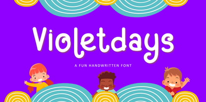 Hello, Present a new font Violetdays a handwritten font special for the kids theme promotion. Violetdays is perfect for product packaging, branding project, magazine, social media, wedding, or just used to express words above the background. Enjoy the font, if you have any question don’t hesitate to contact me comment or feedback, send me PM or email. Happy Designing! Thank you, Bayu Suwirya
 - Steampipe by Just My Type,
$25.00 Jules Verne. Wild, Wild West. Tomorrowland. The Past’s extrapolation of the Future. So it was wrong, it’s still romantic. Steampipe is a font constructed of bits and pieces, reminiscent of the ironwork construction of the Crystal Palace or the inner workings of The Time Machine. Although it works fine as is, it comes alive with some Photoshop Layer Styles. Steampipe has the most extensive kerning of any font I've designed, just so (most) letters fit together as if they were constructed as a unit; use them in a program that supports special kerning.

