10,000 search results
(0.037 seconds)
- Android by Type Innovations,
$39.00Android is an experimental 3D shadow outline font developed by the American type designer Alex Kaczun. The unique lighting created by the beveled edge in combination with an outline font was particularly difficult to create. But the result was worth the effort. Android makes for a powerful headline display that virtually pops off the page. There is a true three dimensional quality to this innovative new typeface. Use the regular Android when setting tight leading for smaller point sizes, and use Android Tall which has taller capitals for larger headlines. By experimenting with Type Effects in Illustrator or PhotoShop you can achieve some spectacular additional 3D effects. - Troutbeck by Hanoded,
$15.00I used to live in the English Lake District - in a town called Ambleside to be precise. It was a nice time in my life, as living in the Lake District gave me the opportunity to go out every day and enjoy the beautiful nature! Troutbeck is a small, old fashioned village on the narrow and hilly road from Windermere to Penrith. If you ever make it there, you will discover that the area is a walhalla for hikers! Troutbeck font is a pleasing, handmade all caps font. It would look great on product packaging or book covers, or maybe postcards reading ‘Greetings from the Lake District’. - Wavespired by Invasi Studio,
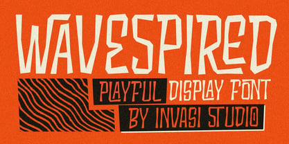
$19.00Wavespired is a unique font that combines the playful and jazzy lettering of the 1950s cartoon modern style with a modern and sleek design. This font is perfect for creating eye-catching logos and headings that will stand out in any design project. The font is influenced by the retro vibes of the fifties, but with a fresh and modern twist that makes it ideal for today's design needs. The font is legible and easy to read, making it perfect for headlines, titles, and other design elements that need to be easily understood. The font is perfect for any project that requires a fun, retro-inspired design with a modern twist. - Frank Ruehl BT by Bitstream,
$29.99Frank-Rühl (or Ruehl) is the ubiquitous Hebrew text font style. There are many fonts that belong to this style, and all are based on an early 20th-century design by Raphael Frank. Some of the fonts are actually called Frank-Rühl (or Ruehl) and some are not. It was originally designed in a single weight. Bitstream developed Frank Ruehl for the Microsoft Windows operating system. The font is encoded with a Microsoft defined Hebrew character set, Hebrew Code Page 1255. Within the TrueType fonts, the characters are assigned Unicode character IDs. The font includes Hebrew characters, and Latin glyphs from Dutch 801 bold. - Dequindre by Alex Jacque,
$30.00Dequindre is a monolinear blackletter typeface, and was drawn as if grade school handwriting practice sheets came in a blackletter variety. Dropping the thin/thick calligraphic contrast of traditional blackletter glyph construction and instead sticking to the bare skeleton of the typeface, Dequindre manages to bring forth a delicate, contemporary aesthetic that plays off of a core blackletter form. Overall portrayed with a softer, more friendly take on the angular, severe forms of 16th century blackletter style, and through pulling some of the curvier, smoother stroke qualities of Antiqua while still maintaining the overall construction and flourish of Fraktur, Dequindre sits in a unique space in the pantheon of blackletter typefaces. - Belphebe by Scriptorium,
$18.00Someone recently pointed out that May and June are the wedding season months, and that while we have some excellent fonts for non-traditional weddings (celtic and renaissance styles work well), we don't have a straightforward, elegant engraver style font. That's the kind of shortcoming we can remedy, hence our Belphebe font, which is in the tradition of popular wedding invitation fonts like Rook, but has some antique characteristics which are in the Scriptorium tradition. The kerning on this font was a real challenge, because we wanted all the characters to fit together for a flowing, hand-lettered look, but the results are worth it. - Vendetta by Emigre,
$69.00The famous roman type cut in Venice by Nicolas Jenson, and used in 1470 for his printing of the tract, De Evangelica Praeparatione, Eusebius, has usually been declared the seminal and definitive representative of a class of types known as Venetian Old Style. The Jenson type is thought to have been the primary model for types that immediately followed. Subsequent 15th-century Venetian Old Style types, cut by other punchcutters in Venice and elsewhere in Italy, are also worthy of study, but have been largely neglected by 20th-century type designers. There were many versions of Venetian Old Style types produced in the final quarter of the quattrocento. The exact number is unknown, but numerous printed examples survive, though the actual types, matrices, and punches are long gone. All these types are not, however, conspicuously Jensonian in character. Each shows a liberal amount of individuality, inconsistency, and eccentricity. My fascination with these historical types began in the 1970s and eventually led to the production of my first text typeface, Iowan Old Style (Bitstream, 1991). Sometime in the early 1990s, I started doodling letters for another Venetian typeface. The letters were pieced together from sections of circles and squares. The n, a standard lowercase control character in a text typeface, came first. Its most unusual feature was its head serif, a bisected quadrant of a circle. My aim was to see if its sharp beak would work with blunt, rectangular, foot serifs. Next, I wanted to see if I could construct a set of capital letters by following a similar design system. Rectangular serifs, or what we today call "slab serifs," were common in early roman printing types, particularly text types cut in Italy before 1500. Slab serifs are evident on both lowercase and uppercase characters in roman types of the Incunabula period, but they are seen mainly at the feet of the lowercase letters. The head serifs on lowercase letters of early roman types were usually angled. They were not arched, like mine. Oddly, there seems to be no actual historical precedent for my approach. Another characteristic of my arched serif is that the side opposite the arch is flat, not concave. Arched, concave serifs were used extensively in early italic types, a genre which first appeared more than a quarter century after roman types. Their forms followed humanistic cursive writing, common in Italy since before movable type was used there. Initially, italic characters were all lowercase, set with upright capitals (a practice I much admire and would like to see revived). Sloped italic capitals were not introduced until the middle of the sixteenth century, and they have very little to do with the evolution of humanist scripts. In contrast to the cursive writing on which italic types were based, formal book hands used by humanist scholars to transcribe classical texts served as a source of inspiration for the lowercase letters of the first roman types cut in Italy. While book hands were not as informal as cursive scripts, they still had features which could be said to be more calligraphic than geometric in detail. Over time, though, the copied vestiges of calligraphy virtually disappeared from roman fonts, and type became more rational. This profound change in the way type developed was also due in part to popular interest in the classical inscriptions of Roman antiquity. Imperial Roman letters, or majuscules, became models for the capital letters in nearly all early roman printing types. So it was, that the first letters in my typeface arose from pondering how shapes of lowercase letters and capital letters relate to one another in terms of classical ideals and geometric proportions, two pinnacles in a range of artistic notions which emerged during the Italian Renaissance. Indeed, such ideas are interesting to explore, but in the field of type design they often lead to dead ends. It is generally acknowledged, for instance, that pure geometry, as a strict approach to type design, has limitations. No roman alphabet, based solely on the circle and square, has ever been ideal for continuous reading. This much, I knew from the start. In the course of developing my typeface for text, innumerable compromises were made. Even though the finished letterforms retain a measure of geometric structure, they were modified again and again to improve their performance en masse. Each modification caused further deviation from my original scheme, and gave every font a slightly different direction. In the lower case letters especially, I made countless variations, and diverged significantly from my original plan. For example, not all the arcs remained radial, and they were designed to vary from font to font. Such variety added to the individuality of each style. The counters of many letters are described by intersecting arcs or angled facets, and the bowls are not round. In the capitals, angular bracketing was used practically everywhere stems and serifs meet, accentuating the terseness of the characters. As a result of all my tinkering, the entire family took on a kind of rich, familiar, coarseness - akin to roman types of the late 1400s. In his book, Printing Types D. B. Updike wrote: "Almost all Italian roman fonts in the last half of the fifteenth century had an air of "security" and generous ease extremely agreeable to the eye. Indeed, there is nothing better than fine Italian roman type in the whole history of typography." It does seem a shame that only in the 20th century have revivals of these beautiful types found acceptance in the English language. For four centuries (circa 1500 - circa 1900) Venetian Old Style faces were definitely not in favor in any living language. Recently, though, reinterpretations of early Italian printing types have been returning with a vengeance. The name Vendetta, which as an Italian sound I like, struck me as being a word that could be taken to signifiy a comeback of types designed in the Venetian style. In closing, I should add that a large measure of Vendetta's overall character comes from a synthesis of ideas, old and new. Hallmarks of roman type design from the Incunabula period are blended with contemporary concerns for the optimal display of letterforms on computer screens. Vendetta is thus not a historical revival. It is instead an indirect but personal digital homage to the roman types of punchcutters whose work was influenced by the example Jenson set in 1470. John Downer. - McKnight Kauffer by K-Type,
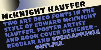
$20.00McKnight Kauffer is a casual sans derived from poster and book cover lettering by the American designer, Edward McKnight Kauffer, who mainly worked in England through the 1920s and 1930s. The style owes much to Louis Oppenheim's Fanfare of 1927, but without the Germanic blackletter inflection. The two display fonts, regular and outline, have a playful art deco feel, and share spacing and kerning so can be overlapped for bicolor effects. - Presidio by Woodside Graphics,
$19.95Presidio is a stylized version of the hand-lettered calligraphy typical of the Mission era of early California. This lettering was often unique to an individual hand, but the characters shared a common style, and had their roots in the Middle Ages when monks and scholars copied whole books one letter at a time. "Presidio" replicates this style with subtle variations in each character, giving the font its authentic charm. - Olympian by Linotype,
$29.99After the Second World War, the Ionic style replaced Modern Face as the favored typeface for newsprint. A couple decades later, it was in turn replaced by the next generation of newspaper fonts, a mix of Old Face, Transitional and Modern Face forms. Olympian itself tends toward the Old Face style but is nevertheless an example of this new generation, a result of a time of change and experimentation. - Tea Dance by Studio K,
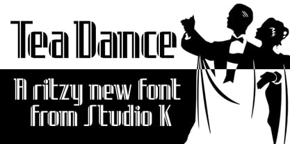
$45.00If you think nostalgia isn't what it used to be, this will change your mind. A ritzy new font family from Studio K that will transport you back to the era of afternoon tea dances performed to the strains of the Palm Court Orchestra or the Bath Pump Room Quartet: a celebration of the golden age of dance from Busby Berkeley to Fred Astaire and Ginger Rogers. Enjoy! - Craw Modern by GroupType,
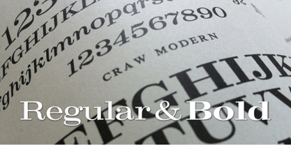
$19.00Craw Modern was designed by Freeman Craw in 1958 and first released by The American Typefounders Company, (ATF). In typography, 'Modern' is a style of typeface (classification) developed in the late 18th century that continued through much of the 19th century. Characterized by high contrast between thick and thin strokes and flat serifs. Bodoni is among the most popular of the Moderns. Moderns are also known as Didone and New Antiqua. - Titanium by Ascender,
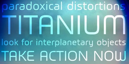
$29.99Titanium is a geek-ed out, über-technoid specimen of plasma-type. Designed by Steve Matteson, this typeface is the perfect display font for your star cruiser or the weekend interplanetary lander. Like its namesake, Titanium is the strongest design for its weight capable of withstanding the jump to lightspeed without paradoxical distortions. Titanium is now available for use on home world computing devices to capture the essence of galactic travels. - Kesto by Valentino Vergan,
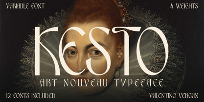
$16.00Kesto is an elegant Art Nouveau style typeface. The idea for the Kesto came from the early Nouveau type designs. Kesto is designed with creative letters, which makes it perfect for creating nostalgic and retro designs such as: posters, magazines, logos and much more. Kesto also has a variable version, which makes it easy to manually adjust the weight and slant. I hope you enjoy using the Kesto typeface. - Kuunari Rounded by Melvastype,
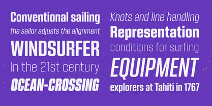
$16.00Kuunari Rounded is the rounded version of Kuunari. it is a structured square sans type family of 42 fonts. It has three widths and seven weights in both upright and italic versions. The base form is a round-cornered rectangle, and this form constructs the glyphs throughout the fonts. Kuunari Rounded is a straightforward sans serif. It doesn't make any fuss about itself; it just does the job proudly and confidently. - Pontifica by Scriptorium,
$18.00Pontifica is based on ‘protogothic’ calligraphy, a style developed at the monastery of St. Gall in the 12th century to replace Carolingian minuscule with a more efficient and compact system of lettering. Ultimately it became the progenitor of the gothic lettering styles of the late Medieval period. Also available to go with this font is a special swash version with a very different style, but compatible overall appearance. - Altersan by Eko Bimantara,
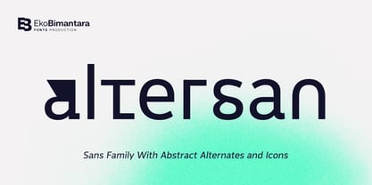
$24.00Altersan is sans serif font family with extraordinary abstract alternative glyphs and icons. The initial style is humanist grotesk sans which fit for various design purposes. The complete family consist of 8 styles from thin to black with each matching obliques. Its contain 477 glyphs which covered broad latin languages. The alternative glyphs can be accessed by activating the opentype feature; Stylistic Alternates and also by opening the glyphs panel. - Trilight by Pelavin Fonts,
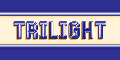
$12.00Trilight is a result of my fascination (obsession?) with how the appearance of a typeface can impact on the tactile as well as visual sense to strengthen and guide its imapct. It consists of simple block characters with a triple highlight to give the effect of dimension. The Trilight family consists of both highlighted and solid characters to provide a two color display without the need to convert characters to outline. - Notebook BH by BluHead Studio,
$20.00Notebook BH Black was inspired by the block lettering we used to draw on our school binders. Notebook is a unicase design, with the lowercase drawn to the cap height, and each "case" having a distinctly different flavor. The fun and seemingly unlimited combinations of the upper and lowercase forms make it difficult to stop typing innocuous phrases and, if you're mobile, can even make boring lectures tolerable! - Artigo by Nova Type Foundry,
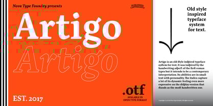
$42.00Artigo is an old style inspired typeface system for text. It was inspired by the handwriting aspect of the first roman types but it intends to be a contemporary interpretation. Its abilities are in small text with personality. The italics capture a lot of its dynamic feeling even more expressive on the display version that stands as the most handwritten one. It gives text a lot of personality and great readability. - Kidsnote by Luxfont,
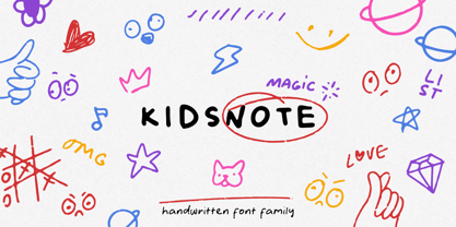
$20.00Meet Kidsnote, where each letter is like a letter in the margins of the page, written with a ballpoint pen. This dissimilar family of different fonts is framed by the atmosphere of handwritten notes. From block and cursive letters to underlining and mini-doodles, every typeface captures the feeling of writing with a real pen. Like the pages of a notebook, written in small handwriting. Features: - Extras - Kerning - Asian Scroll by Okaycat,
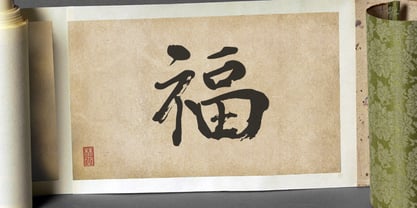
$29.50Asian Scroll contains many kanji symbols laid out in the regular English keyboard layout for easy access to these special characters. In your capitals, you'll see each symbol here is subtitled with a small English translation indicating the meaning of the symbol. Asian Scroll brings these symbols to you in dry brush and wet. Please see the gallery picture to see which keys are used to access the kanji symbols. - Tent Show JNL by Jeff Levine,
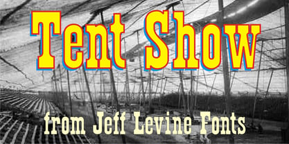
$29.00Call the lettering French Clarendon Condensed, call it circus lettering, wanted poster type or Old West letters, the style of this typeface is one of the most recognizable and evokes all of the above images and more. Tent Show JNL was re-drawn from examples of a vintage set of wood type, and contains all of the eccentricities that are present in these hand-routed classic letter forms. - Portland by Fenotype,
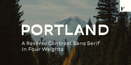
$25.00Made you look? There’s a peculiar feel to the letters – achieved by the reversed contrast. Perfectly legible yet there’s something about the characters that makes them stand out. As Viktor Shklovsky once coined, ”Habitualization devours objects” – the everyday world becomes invisible until we are forced to see it otherwise. The Portland font family is a tool of choice when you want to effortlessly make your designs stand out. - Shaltai by ParaType,
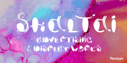
$25.00Decorative font Shaltai was developed by young Russian designer Katya Galuyan. The letters slightly resemble rolling, falling and broken eggs. Egg-shaped appearance of the characters determines the name of the font. Shaltai Boltai is a Russian cousin of English Humpty Dumpty, French Boule Boule and Swedish-Norwegian Lille Trille. The font can be used for advertising and display works, children books and so on. Released by ParaType in 2008. - Old Softy NF by Nick's Fonts,
$10.00The pattern for this friendly face was found within the Keystone Type Foundry's 1884 specimen book, under the rather prosaic name of Round Gothic. This version retains all of the original's warmth and charm, while updating it to twenty-first century standards. Both versions of this font include the complete Latin 1252, Central European 1250 and Turkish 1254 character sets, along with localization for Lithuanian, Moldovan, Romanian and Turkish. - Rounded, Two. by Siren Fonts,
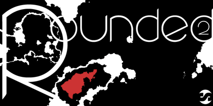
$10.00Rounded, two was designed with a simple idea in mind: the basis for the majority of the characters is a perfect circle. That circle is then intersected and cropped to make unique, modern and stylish letterforms. Rounded, two is an improved version of my initial experimentation. The font looks good at all sizes, but particularly for large displays where the elegant simplicity of each character can be appreciated. - Old Claude LP by LetterPerfect,
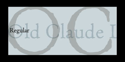
$39.00Old Claude was drawn by Paul Shaw to simulate an old cut of the classic (Claude) Garamond type designs of the 16th & 17th centuries. The pronounced rough edges and coarse letter shapes create the effect of letterpress printing with old foundry type onto handmade paper. The companion Old Claude Expert includes small caps and old-style figures. This "antiqued" design works equally well for both text and display. - Tecna by Corradine Fonts,
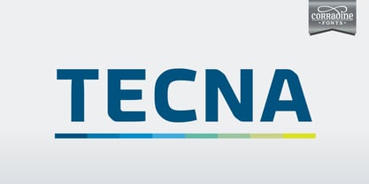
$24.95Tecna is a modern sans typeface with straight cuts, rounded angles and curved thinnings at the endings that make the letter shapes fresher. The rounded characters are squarish giving to the layout a very structural appearance. Its wide proportions give big impact to the texts. It has a tall x-height that enhances its legibility in smaller sizes. Its character set has coverage for Western and Central European languages. - We Love Nature Autumn Leaves by kapitza,
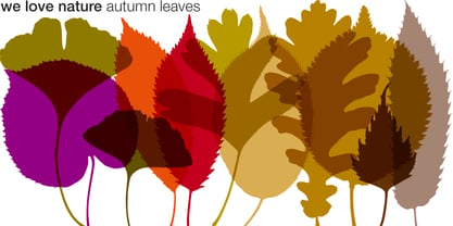
$69.00We really enjoy going for long walks in the park in autumn, and the beautiful colours and shapes of the fallen leaves inspired us to create this font. We Love Nature Autumn Leaves is a picture font consisting of 52 highly detailed, hand drawn illustrations. The illustrations can be used on their own to create beautiful designs, or in combination with other illustrations in the We Love Nature font collection. - Thorowgood Wide by Wooden Type Fonts,
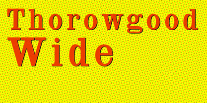
$20.00One of the original Clarendon types, an English design, here derived from a specimen taken from an American foundry, no identifying marks. With a tall x-height, wide version, unlike more traditional Clarendons, not a square serif but bracketed. Unique to this Clarendon are the rounded openings at the points where the horizontal and vertical stems meet in the capital B, D, P and R, not common in other Clarendons. - Manganese by Comicraft,
$29.00The entire Headquarters Building of Active Image Comicraft has been ripped from the ground by a giant lizard monster which has unexpectedly risen from the sea! It has the power of bodily transformation! By merely willing it, it can transform its atomic structure into any form and shape. It is completely hostile. It regards our entire island nation as its enemy. Run! RUN! Run from the Giant Monster! - Elisabetha by Unitype Studio,
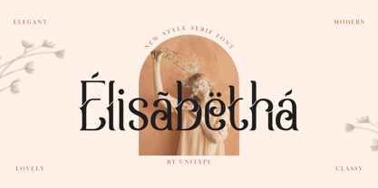
$29.00Introducing the "Elizabeth Font" – an exquisite typographical masterpiece that gracefully bridges the realms of modernity and classic elegance. With each letter crafted as if by the stroke of a calligrapher's quill, this font exudes an air of refined sophistication that captivates the eye and enchants the mind. This font comes with a lot of language support, this font is perfect for you. Thanks for purchase and I hope you enjoy it! - Calamity Jane NF by Nick's Fonts,
$10.00This typeface is an amalgam of Edwardian and Art Deco letterforms: the lowercase letters come from a turn-of-the-twentieth-century typeface named Amsterdam, and the uppercase letterforms come from a 1930s logotype for the Théâtre Moderne in Paris. Like its namesake, this typeface is not easily overlooked. This font contains the complete Latin language character set (Unicode 1252) plus support for Central European (Unicode 1250) languages as well. - ITC Odyssée by ITC,
$29.99ITC Odyssée is the work of French designers Roselyne and Michel Besnard, who were inspired by the digital imagine of type which opened up possibilities for new visual illusions. The serifs of this font recreate the virtual lines formed by optical residue" on TV screens, looking like horizontal serifs trailing off to the right. ITC Odyssée is a clear and legible typeface which features a simplicity and grace in its forms." - Allissona GT by Gartype Studio,
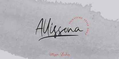
$15.00Seeing the need of visual minimalism and luxury so we are inspired to makeup this Allissona GT calles font, the font in the form of a signature that is suitable for the needs of course a case of signatures, logos, letters, ads, products, digital printing, to digital ads. Allissona GT equipped with a swash to complete the impression of your design signature design course and add a sense of luxury - Library Book Initials JNL by Jeff Levine,
$29.00Library Book Initials JNL was modeled from examples of Sidney Gaunt's Publicity Initials; originally sold in metal type by Barnhart Brothers and Spindler as a companion to the Publicity Gothic typeface. The smoothed-down lines of the original characters allow for these initials to balace better when set against complementary type faces. A regular version is on the upper case keys, with an oblique version on the lower case keys. - DR Krapka Round by Dmitry Rastvortsev,
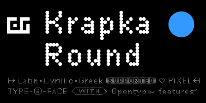
$29.99In the DR Krapka Round typefamily, the pixel has a round shape. The font supports OpenType features and contains small capitals, ligatures, oldstyle figures, terminal forms, historical forms, stylistic sets. The dingbats, arrows, emoji are also present. For small texts, it is recommended to use DR Krapka Round-FontSize10px in the font size 10 px. DR Krapka Round typefamily supported European languages based on Latin, Cyrillic and Greek scripts. - Bernound by 38-lineart,
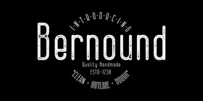
$8.00The Bernound is an amazing typeface which comes in three weights. The clean weight comes with rounded corners and a slim shape that presents a minimalist impression. The outlined weight has a fancy feel when displayed on its own, and the rough weight has a vintage, rustic, and grunge look. All weights can be combined perfectly which gives you the opportunity to create endless unique designs with just this one download. - Egg Farm JNL by Jeff Levine,
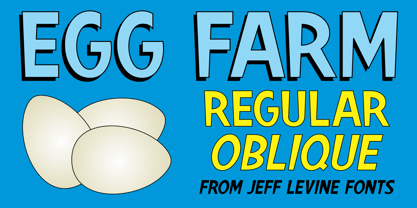
$29.00The opening titles and credits of the 1947 film comedy “The Egg and I” were done in a hand lettered casual sans serif typeface which inspired the digital font Egg Farm JNL; available in both regular and oblique versions. “The Egg and I” introduced audiences to Ma and Pa Kettle as portrayed by Marjorie Main and Percy Kilbride, who went on to do a number of additional films as those characters.

