10,000 search results
(0.158 seconds)
- Reon Sans by Fatchair,
$9.95 A humanist sans serif ideal for advertising and design.
 - Key West by BA Graphics,
$45.00A sans serif casual gothic. Works for many applications. - BF Fiona Slab by BrassFonts,
$36.00See also BF Fiona Serif and BF Fiona Script. - Logotype by Gerald Gallo,
$20.00 Logotype is a sans serif contemporary all caps font.
 - Antique 7 by Wooden Type Fonts,
$15.00 An Egyptian unbracketed heavy serif font, largely for display.
 - Title Gothic Light by BA Graphics,
$45.00A very thin light line gothic, great headline face. - Pantext by Jonahfonts,
$25.00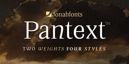 An unusual serif font with a slightly unconventional atmosfere.
 - Gyant by Typotheticals,
$8.00Developed from an earlier sans serif font called Mechanihan. - Looking Glass by SoftMaker,
$9.99 Looking Glass is a serif typeface published by SoftMaker.
 - Mayfield by Typadelic,
$19.00Mayfield could be anybody's handwriting. Very clean and legible. - Dooddle by Gerald Gallo,
$20.00 Dooddle is a casual hand-lettered serif outline font.
 - BF Fiona Script by BrassFonts,
$36.00See also BF Fiona Serif and BF Fiona Slab. - Nagato by Ezequiel Filoni,
$10.00 Nagato, simple, clean and elegant sans serif, pseudo-stencil.
 - Sqweash by PizzaDude.dk,
$20.00Sqweash, although very jumpy and uneven, is surprisingly legible. - Happyjamas by PizzaDude.dk,
$20.00Happyjamas is a playful serif font - the pizzadude way! :) - Mikraot MF by Masterfont,
$59.00 Serif super classic font, high legibility and subtle contrast.
 - Daily Sans by Up Up Creative,
$15.00 Introducing Daily Sans, a complete sans serif font family with 10-weights, plus italics (20-fonts total). Daily Sans was designed to be an everyday-use geometric typeface with excellent legibility and a neutral tone. It's a perfect go-to for branding, web, and print design projects and can stand out on its own or play a supporting role in font pairings. It’s great for body/paragraph type as well as for larger display type. Because the goal was to create a font you can truly use for any project, purpose, or occasion, Daily Sans includes a wide range of weights starting from the very thin Hairline all the way through to the very bold Heavy. This means that you’re always able to find just the right weight for your needs, and it makes creating type hierarchies a breeze. Daily Sans comprises 20 fonts, each with approximately 450 glyphs - including 16 standard and discretionary ligatures, three ampersand variants, a full set of arrows, and more - and supports over 200 languages. The OpenType features can be very easily accessed by using OpenType-savvy programs such as Adobe Illustrator and Adobe InDesign. (To access these awesome features in Microsoft Word, you'll need to get comfortable with the advanced tab of Word's font menu.) PLEASE ENJOY! I can't wait to see what you make with Daily Sans. Feel free to use the #upupcreative and #dailysansfont tags to show me what you've been up to.
 - Charpentier Renaissance Pro by Ingo,
$42.00 A very legible Renaissance Antiqua This typeface is based on the desire to create an Antiqua like those which might have existed at the beginning of the »printing age« — the basic form oriented on the classical Roman and early Middle Ages models, the ductus defined completely by writing with a wide pen and much individual expression in detail. In the spring of 2005 I had the opportunity to closely examine a few pages in the famous book »Hypnerotomachia Poliphili« from 1499. The script used here from Aldus Manutius is exemplary. Most of the book, however, is not very carefully printed. The characters do not stay on the line; the print is at times too strong and at times much too weak. And on these imperfect pages the true character of the letters is recognizable; that is, that they are cut with lively detail which is a result of the patterns provided by full-time writers. After all, around 1499 script was written as a rule and the printed type was oriented on this pattern. I prefer the typeface on the lightly printed pages. The characters are not placed neatly on the line, but the distinct and emerging lively ductus of the individual characters automatically presents harmonious word formations in the eye of the beholder, with the non-perfect line stepping into the background. Also in Charpentier Renaissance, the strokes of the wide pen are still noticeable. The font has very defined softly bent serifs. The forms are powerful and stand solidly on the baseline. Charpentier Renaissance is very legible and yields a solid and yet still lively line formation. The accompanying italic, like its historical models, has almost no inclination. The lower case characters of Charpentier Renaissance Oblique have such idiosyncratic figures that they can also form a font of their own. Please visit www.ingofonts.com
 - TT Ricordi Allegria by TypeType,
$29.00 Please note! If you need OTF versions of the fonts, just email us at commercial@typetype.org TT Ricordi Allegria useful links: Specimen | Graphic presentation | Customization options TT Ricordi Allegria is a sleek and intelligent contemporary Florentine grotesque inspired by the half-erased lettering in Basilica di Santa Croce, Florence. TT Ricordi Allegria was drawn by Antonina Zhulkova and reflects in its graphics the transitional stage between the classic serif with varying proportions, gravitating towards the Roman capital type, and the Florentine sans serif. The font is characterized by variability in the proportions of characters, contrast between strokes, wedge-shaped triangular characters, and the absence of traditional serifs. The main visual feature of the typeface is its diversity and the ability, using different stylistic sets, to completely change the character and perception of the typeface. The drawing of the characters from the main set is strict, thanks to which the font looks stern, as if the inscription in the font was really carved out of stone. And with the help of another set, we can add roundness, or even smoothness, to the font. This is due to the fact that the letters (E R K Q J Y in Latin, and Л К Ж Э in Cyrillic) from the second set have either very noticeable "curls" or smooth, rounded "legs". In addition, the typeface includes a set of beautiful ligatures for use in display inscriptions, such as large headlines. An interesting moment when working on the typeface was the creation of the Cyrillic typeset, since the Cyrillic alphabet does not so easily fit into the concept of the Florentine grotesque and stressed semi-serif. The most difficult thing in working on the Cyrillic alphabet was to create a system of spacing for characters, as it was done in the Latin alphabet, and to make sure that when typing in Cyrillic, the drawing of the text remained beautiful. That is why the letters Д Л У Ы appearing in the font family are somewhat unusual to the eye, and the proportions of other characters in Cyrillic are not quite “classic” either. In general, the Cyrillic set looks more display than its Latin prototype, but at the same time it lacks the sense of historicity or legacy of the Soviet past, which often comes to the foreground when working on the design of the Cyrillic alphabet in this type of serifs. TT Ricordi Allegria consists of two weights (Regular and Bold) and one variable font. Each style includes over 750 characters, as well as 19 OpenType features. Interesting features of the typeface include three stylistic sets that greatly change the perception of the font, a set of bright display ligatures, a few neat icons that are suitable for breaking text and will emphasize the visual language of the font. Please note! If you need OTF versions of the fonts, just email us at commercial@typetype.org FOLLOW US: Instagram | Facebook | Website
 - Ranelte by insigne,
$- The beauty of a classic is that it never really goes out of style. The pure, simple elements which define its greatness only strengthen and solidify with time and exposure--elements like those that inspired Ranelte, the new sans serif from insigne design. While it pays homage to the enduring DIN series of the early-20th century, the new Ranelte is far from outdated. The classic style happily connects with its more modern side, incorporating a more pronounced curve than many of its contemporaries do. This accentuated curve helps pad the type against being cold or overly technical, especially with its inherent semi-modular form and geographic feel. In short, you end up with a good vibe at the intersection of high-tech and friendly. A versatile typeface, Ranelte is designed for headline use as well as print and web copy. Within this family’s three widths and eight weights (along with italics), the letter proportions remain easily readable through their tendency toward equalisation, while still avoiding strict monospacing. The typeface also features sophisticated typographical help in the form of OpenType features. Included in the set are case-sensitive types, fractions, super- and subscript characters, and stylistic alternates. It comes using a comprehensive array of old style and lining figures. All features comprehensively cover the Latin-based languages. Thinking about it again, a classic may never go out of style, but that doesn’t mean you can’t improve on it. A little adjustment can have a beauty all its own. So discover the tuning of Ranelte, and enjoy all the new things you can do with a classic.
 - Brown Chunkers by Letterhend,
$19.00 Brown Chunkers is an unique serif based display typeface containing many alternates, swashes, ligatures that can make your lettering/logotype become more interesting. The clean and neat of a serif combined with the swirl swashes makes this font one of a kind.
 - IC Havolane by Ironbird Creative,
$7.00 Havolane, A display serif font with a modern vintage twist, ideal for branding, headlines, and packaging. Havolane offers two styles, "Regular" and "Inked," to add versatility and depth to your designs. Perfectly complements sans-serif fonts, making your creations stand out effortlessly.
 - Antik by Sulthan Studio,
$10.00 A fun font that is truly extraordinary, handwritten as it is, a combination of lowercase and uppercase letters, really cool, has a playful impression but is very amazing, very suitable for all jobs because this font has its own free style and courage.
 - Love Princes by Sulthan Studio,
$10.00 Love Princes is a handwritten script font that was written using a marker on paper and then I made it into a charming and very natural font, with two very cool writing characters if paired or used in one of your works
 - SK Reykjavik by Salih Kizilkaya,
$12.99 SK Reykjavik is a modern geometric font family with sans serif and slab serif characters. Supports all typographic elements you will need in Latin, Cyrillic, Greek, Turkish and Baltic alphabets. It contains 32 fonts and 26,208 glyphs and offers full support for ligatures.
 - Iron Heart by SSI.Scraps,
$24.00 Iron Heart is a unique hand brush font that suits very well for your modern grunge vintage design. its texture was very interesting. use it for your special design and brilliant project such as Apparel, Web project, youtube content, logo, and many more.
 - Gurland by Sans And Sons,
$19.00 Meet our Gurland - Bold Retro Elegant Serif Font A captivating blend of boldness and timeless charm. This font exudes an elegant, vintage vibe with its strong, distinctive serifs and bold strokes. Perfect for making a statement with a touch of retro sophistication.
 - Leyton Hills by Rachel White Art,
$16.00 Say hello to Leyton Hills! It's a heavy, smooth script, with double letter ligatures and some fun alternates to play with. Perfect for making a very bold statement. The lowercase letters are compact and cuddle close together, making this a very cute font.
 - Eingrantch Mono by Harmnessless Type,
$30.00 Eingrantch Monospaced is a monospaced sans serif based typeface, inspired by an old Continental typewriter in sans serif version. Available in 7 weights from thin to black. Well suited for modern logotypes, branding, editorial design as well as web and screen design.
 - Nünooska by Okaycat,
$29.00 Nünooska is a sans serif type designed by Luke Turvey in 2014. The minimalist charm of Nünooska offers a soft unique style while remaining legible and clean. This rounded geometric sans serif is designed to look excellent for display or printed publication.
 - Valentine Style by Yoga Letter,
$14.00 "Valentine Style" is a display font decorated with heart-shaped letters and is very easy to use. This font is equipped with uppercase, lowercase, ligatures, numerals, punctuations and multilingual support. Very suitable for valentines, weddings, stickers, romantic moments, spring, winter and others.
 - Narziss by Hubert Jocham Type,
$39.00 Since Mommie I gradually got more into swirly ornaments. The massive contrast in the neoclassic style is perfect for thin swirly extensions to the characters. Even in an upright typeface. Narziss is very elegant in big headline sizes. Use it only very big.
 - Brushtip C by JOEBOB graphics,
$19.00 Slightly erratic straight up brush tip handwriting script that was written with an ‘intoxicated’ hand, with a lot of very unique characters as a result. The overall font looks wild yet very readable. It includes all eastern European, Baltic, Scandinavian and Turkish characters.
 - Town Meeting JNL by Jeff Levine,
$29.00 Town Meeting JNL (available in both regular and oblique versions) is a modified version of Mud Creek JNL (which was based on Tuscan Egyptian – a classic wood type). The side spurs were removed and the split serifs were replaced by slab serifs.
 - Cute Molly by MJB Letters,
$9.00 Cute Molly is a very cute handwritten font created with great attention to produce beautiful, funny and stunning works. Your project will definitely look very cool with this font which has 3 weights: regular, thin and bold. Grab it fast and happy designing!
 - Roble by Latinotype,
$26.00 Roble is a Slab Serif Font, from a mix between Andes and Sanchez, following a harmony with both fonts one sans and one serif with a fresh and dynamic result. Roble is a family of 16 display fonts 8 weights plus italics.
 - Practice Sketch by Jehansyah,
$9.00 Practice Sketch This sketch font is perfect for your needs to look elegant and dignified, a luxurious impression will be seen when you use it, aesthetic and modern, very suitable for types of designs that want to look stylish. Thank you very much
 - Koska Esko by Jehansyah,
$9.00 Koska Esko This is a font with a very bold and elegant look, perfect for designs with a modern look it's time for you to try a new style for a new design include : numeric latin ligatures alternate And Thank you very Much
 - Canabi by Avchi,
$12.00 CANABI - A classic serif font designed for logo, headline, and suitable for classic design. Combination between serif and condensed style! This is our first product and we will give you the best experience! Multilinguals Numbers & Punctuactions Ligatures Thank you for supporting us!
 - Lust Slim by Positype,
$50.00 Check out the new Lust Pro & Lust Pro Didone to see how the series has grown and evolved. Confident and versatile, Lust is an exercise in indulgence—an attempt to create something over the top and vastly useful. If Lust Slim seems both new and familiar, that’s because it is. The series unapologetically channels Herb Lubalin, but produced with a deliberate, contemporary twist. There is an intentional slyness infused in the letterforms—the extreme thick and thin lines flow effortlessly without becoming gratuitous. It’s always just enough, not too much. What makes the type series so appealing? The curves. When asked to describe the letterforms, most people unwittingly allude to the human form, using adjectives usually reserved for describing physical traits… creating all-too-familiar comparisons. Summerour has grown to accept this as unavoidable and reasonable given his acknowledgement of its influences and has provided nuances within the letterforms to accentuate that. Intended to be set large, the typeface has both Standard (Lust, Lust Didone and a single unified Italic) and Display variants making it perfect for editorial use and a flexible solution for any display need.