5,503 search results
(0.021 seconds)
- ITC Johann Sparkling by ITC,
$29.99ITC Johann Sparkling is the work of Austrian designer Viktor Solt, a perfect imitation of the handwriting of an educated person of the 18th century. ITC Johann Sparkling is intended to close the gap between highly formal copperplate scripts and the scribbled look of 'true' handwriting," says Solt. "I am not very interested in highly formal and perfect calligraphy, but rather in quick, personal-looking scripts. Usually I start with some historical samples in mind, but I do not try to copy these sources. Instead, I incorporate them into my own handwriting. It takes up to two weeks, and many sheet of paper, before the respective script becomes my own. Of course, this would not be an economic approach for individual lettering jobs, but I can conserve the custom script for future use by digitizing it." ITC Johann Sparkling should be used in fairly large point sizes and its capitals only as initials. - Deco Sans by Alan Ronn,
$30.00This font was created while looking at the various shapes my handwriting consistently took, especially in the ways that letters would have breaks in them. Over the course of a few months I continually tweaked the letter forms and shapes, and lo and behold, I developed Deco Sans. This family currently only includes a thin weight, as I'm only one person, and very busy with college. I'm continuing work on a regular, bold, and possibly a future italic weight, but these may not be released for many months to come. As this is a very thin font, it should be used at sizes no smaller than around 16 or 18pt as it tends to get lost in whitespace, and looks best at large sizes. As such, this weight should be considered more of a display font than a text font, however, I predict a regular weight to be very readable and much more useable for the everyday. - Espinosa Nova by Estudio CH,
$- Espinosa Nova is a revival based on the types used by Antonio de Espinosa, the most important Mexican printer of the sixteenth century and very probably the first punchcutter anywhere in the American continent (1551). In 2010, its main fonts were awarded two certificates of excellence: one by TDC2 (Type Directors Club Typeface Design Competition), one by Tipos Latinos (Biennial of Latin American Typography). According to Robert Bringhurst, it is “an unusually intelligent family of type, reaching back to one of the most exciting moments in typographic history and reaching forward to the typographic future”. All of the fonts intended for setting text include small caps, five sets of figures (oldstyle and lining, both proportional and tabular, plus tabular small caps), many f and long s ligatures, and capital sharp S (U+1E9E). In addition, the Capitular fonts allow to create interesting effects by overlapping layers. This family feels very comfortable in books, but it can be used everywhere a touch of classic & elegance is required.
 - Gordita by Type Atelier,
$25.00 Gordita is a minimal sans serif typeface with a geometric foundation that has been built upon with modern details that result in an optically balanced, friendly typeface. When designing Gordita referring to features in Futura were influential as were the structural and harmonious strokes of Gotham. Forms have been optically compensated to appear natural and purely geometric. Joints are slightly tapered and ink traps feature in heavier weights with the purpose of achieving maximum legibility. Gordita has been tested in print and on screen in a wide range of point/pixel sizes. The family is equipped with OpenType features including alternate glyphs, fractions, case sensitive forms, small figures, arrows and symbols as well as old style and tabular figures. Now delivered in 7 weights with matching italics that slant at 15°. The italics are slightly lighter and narrower than the upright versions. The horizontal weighting in the italics have been reduced to compensate for the loss of vertical stroke thickness. With support for over two hundred languages with an extended Latin and Cyrillic character set, Gordita is ready to be put to work. Designed by Thomas Gillett, metrics and engineering by iKern (Igino Marini). The family has been recently updated to include two additional weights (Thin & Ultra + their matching italics) as well as slightly opened apertures for better legibility in the heavier weights, new glyphs and more opentype features.
 - Galano Grotesque by René Bieder,
$30.00 Galano Grotesque is a geometric sans in the tradition of Futura, Avant Garde, Avenir and the like. It has a modern streak which is the result of a harmonization of width and height especially in the lowercase letters to support legibility. Galano Grotesque aims to be a universal weapon not only because it works great in headlines, short and long copies but also because of its subtle neutrality. It comes in 10 different weights with matching italics and is equipped with a set of powerful opentype features including alternative glyphs, fraction, arrows, ligatures and many more. An extended character set, supporting Central, Western and Eastern European languages, rounds up the family. During the design process of the alternative glyph shapes of Galano Grotesque, the interest of creating a standalone version emerged rapidly. This was the birth of Galano Grotesque Alt. Not only because of the legible and unique character created by the alternatives, but also because this could be the small copy embracing stylistic companion to Galano Grotesque. In addition to the alternative glyphs, the height of descender and ascender was increased, supporting structure and rhythm. When finishing Galano Grotesque Alt, it turned out to not only work great in small and long copies but also to be a great performer in headlines and short copies. I'm proud to introduce: Galano Grotesque and Galano Grotesque Alt.
 - Gaulois by Canada Type,
$24.95 A couple of years before the second World War, Marcel Jacno, the popular French graphic designer who in the 1930s designed iconic posters for Gaumont and Paramount and famously illustrated the Gaulish helmet that first adorned the Gauloises cigarette packs in 1936, was asked by Deberny & Peignot to design a calligraphic typeface for the advertising market. Jacno's Scribe design, billed by D&P as a "virile ad writing" typeface, was released to some great fanfare in 1937, enjoyed some time of French spotlight, and was ready to make waves in the rest of Europe before the war broke out and snuffed its chances at international recognition. However, samples of it can still be found in some specialty post-war publications as an example of a trend that lasted a couple of decades, when Western European type manufacturers commissioned famous visual artists to design typefaces in order to capitalize on the artists' fame - the trend that brought us standards like Futura and the long list of Lucien Bernhard and Imre Reiner faces. This exclusive digital version of Jacno's design expands on the original concept with a large character set that includes plenty of alternates, a couple of different ways for seamless lowercase connections, three sets of figures, and extended Latin language support, adding up to over 540 characters in a one big, contextually-programmed font.
 - Core Sans G by S-Core,
$40.00 The Core Sans G Family is a part of the Core Sans Series, such as Core Sans N SC, Core Sans N, Core Sans NR, and Core Sans M. Core Sans G is constructed of straight, circular or square shapes. These geometric shapes are inspired by classic geometric sans (Futura, Avenir, Avant Garde etc.). Every stem is a rectangle or a straight line and every letter, lowercase or uppercase, seems to be in perfect geometric form and even weighted. The small x-height makes readability clean and clear. Core Sans G can be used equally well in headings or in body copy. The Core Sans G Family consists of 9 weights (Thin, Extra Light, Light, Regular, Medium, Bold, Extra Bold, Heavy, Black), 3 for rounded (Medium, Bold, Extra Bold) with matching Italics. It also includes 4 effects fonts (Outline, Neon, Shadow, Dimensional), Alternate Characters (a,g,t) and a bunch of ligatures. The Core Sans G provides a wide range of character sets to support (Cyrillic, Central and Eastern European characters) and advanced typographical support with features such as proportional Figures, tabular Figures, numerators, denominators, superscript, scientific Inferiors, subscript, fractions, standard ligatures, discretionary ligatures and stylistic alternates. Core Sans G is an ideal font family for use in magazines, web pages, screens, displays, and so on.
 - FF Bauer Grotesk Paneuropean by FontFont,
$40.99FF Bauer Grotesk is a revival of the metal type Friedrich Bauer Grotesk, released between 1933 and 1934 by the foundry Trennert & Sohn in Hamburg Altona, Germany. The geometric construction of the typeface, infused with the art deco zeitgeist of that era, is closely related to such famous German designs as Futura, Erbar, Kabel and Super Grotesk that debuted a few years earlier. However, FF Bauer Grotesk stands out for being less dogmatic with the geometry, lending the design a warmer, more homogenous feeling. The oval “O” is a good example of that, as well as characteristic shapes like the capital M or the unconventionally differing endings of “c” and “s” which make for a less constructed look. The design was started by Thomas Ackermann, and he collaborated with Felix Bonge to evolve his original ideas into this fresh, modern geometric typeface family. FF Bauer Grotesk contains 6 weights with accompanying italics, and a wide range of OpenType typographic features including small caps, figure styles, fractions and contextual alternates. NEW: the new FF Bauer Grotesk W1G versions features a pan-European character set for international communications. The W1G character set supports almost all the popular languages/writing systems in western, eastern, and central Europe based on the Latin alphabet including Vietnamese, and also several based on Cyrillic and Greek alphabets. - Pauline Script by insigne,
$39.00 Pauline Script is a Vintage inspired Monoline script. It's a contemporary script inspired by the past, now available to the Instagram era. Pauline Script is a follow up to the popular Pauline typeface. Pauline was one of my first typefaces, all the way back in 2008. Inspired by a variety of influences, from Art Deco signage, to a simple spice label, Pauline Script has very little stroke contrast and was inspired by Retro connected scripts. Over the course of its evolution, it started to take on more influence from geometric sans serif typefaces and lost the connectors. There's a strong geometric streak, derived from 1930s sans serifs like Futura. Tall ascenders and descenders give it a unique look. Now, this script version has now come full circle, utilizing the original sans serif face design and adding connectors back in, with an optically corrected dynamic slant. For invitations, signage, logos or other applications, Pauline Script is there when you need something that stands out with a touch of class and a sense of uniqueness. Turning on Contextual Alternates (non connecting ending forms) and Discretionary Ligatures (better letter connections) is highly recommended. There's a wide range of weights available. It's a playful typeface with options to either have everything connected, or alternate forms which allow for letter connections that still maintain the sense of flow of a script. Includes plenty of ligatures!
 - LC Trinidad by Compañía Tipográfica de Chile,
$34.00 Lc Trinidad is the result of a series of wonderings regarding geometric Sans Serif typography design, in particular; Futura of Paul Renner. A “conversation” arose between me and the designer – actually there was no conversation, it is an euphemism for “I saw his designs, I draw them and discussed with myself some of his decisions – that ended up being the origin of this font firsts glyphs: A, H, N, O, R and S. I started with uppercase letters, and here is when Rudolf Koch with Kabel and his “Das schreibbuchlein” joined the conversation. This is how I could develop some alternative lowercase letters so as to illustrate this imaginary discussion. The result is a sans serif, geometric, modern typeface with classical Roman proportion in the uppercase letters; two stylistic sets for lowercase letters (setKoch and setRenner), rational, open and sharp ends. It is ideal to form titles, medium length texts, branding, exhibitions and animations. The family consists of 9 weight variants and their corresponding oblique versions and small caps. With more than 900 glyphs, it covers more than 190 Latin languages and together with its Opentype functions it creates a modern and versatile family. Besides, it has powerful OpenType features for each style, including stylistic sets, extended language support, ligatures, contextual alternates, lining figures, oldstyle figures, small caps numbers, arrows, fractions, superscripts, subscripts and many more.
 - Stiletto - Unknown license

- Amurg - Personal use only

- CF Anarchy - Personal use only

- Fiolex Mephisto - 100% free

- VIDEO PIRATE - Personal use only

- Just The Way You Are - Personal use only

- silent witness - Personal use only

- InavelTetka Cyr - Unknown license

- Research Remix - Personal use only

- !Basket of Hammers - Unknown license

- KG Like A Skyscraper - Personal use only

- Barbies Jalous Sisters - Unknown license

- Zrnic Cyr - Unknown license

- Rumo Script by Bean & Morris,
$35.00 Rumo Script is a bright, breezy, free-flowing contemporary script to lighten the load when a change of pace is required to communicate freshness, fun, lifestyle and a general 'good feeling'. Designed so that some letters connect while others don't giving a spontaneous feel at the same time keeping it a 'considered' style. Rumo (pronounced Roo-mo) will enhance your graphics and give them that 'wow' look!
 - Mothra by madeDeduk,
$15.00 Introducing MOTHRA use this font for any branding, product packaging, invitation, quotes, t-shirt, label, poster, logo etc. Feature Uppercase & Lowercase Number & Symbol International Glyphs Multilingual support Feel free to drop us a message any time and follow my shop for upcoming updates Shoot me on email at: dedukvic@gmail.com and find more previews on my Instagram here : https://www.instagram.com/acekelgondolayu/?hl=en Hope you enjoy it.
 - Boshi by Tymime Fonts,
$30.00 Boshi is inspired by classic video games, but it can do more than that. Saturday morning cartoons, comic books and other logos that need to express fun are other ways this font can be used. It also includes several Tiki-style interlocking ligatures. Vastly improved over the original free version, already featured in several high-profile mobile games and even a toy, Boshi evokes retro goodness.
 - Relaxme by BonjourType,
$9.00 Relaxme can be used for personal or commercial projects, in logos, on items for purchase with unlimited sales. Font that is perfect for quotes, cool logos and social media images and quotes. Featured fonts: Uppercase, Lowercase, Numbers, Symbols, Accents, Alternative, Ligatures and also supports multilingual Enjoy the font, feel free to leave a comment or feedback, send me a PM or email bonjourtype@gmail.com. Thank you!
 - Nouveau Cartoon JNL by Jeff Levine,
$29.00 Samuel Welo’s “Studio Handbook – Letter and Design for Artists and Advertisers” was a go-to source of inspiration for generations of layout artists, graphic designers and sign painters. An interesting example of free-form pen lettering was found amongst the pages of one edition and it has now been recreated as a digital typeface called Nouveau Cartoon JNL; available in both regular and oblique versions.
 - Locke by North Type,
$- Locke is a stylish slab serif with a modern twist. Currently, it has 6 weights, ranging from ExtraLight to Bold. The presence of ball terminals on certain glyphs and its unusually high x-height give it a unique look, perfect for large titles or body copy. Locke has extensive multi-language support, counting over 390 glyphs per weight. Try out Locke Regular for free!
 - Toska by Locomotype,
$20.00 Toska is a geometric sans serif font. This font has a strong but friendly impression because the rounded corners make the eyes feel comfortable. Suitable for headings, poster titles, logotypes, signage, packaging and Toska can even be used for interesting paragraphs. Comes in eight weights, each weight having an italic version so you are free to pair various weights to make your typography more attractive.
 - Pixeloza 03 by Fontsphere,
$12.00 Pixeloza 03 is a pixel-style, grid-based, display typeface. Compared to Pixeloza 01&02 the lightest and clearly narrow version. The font is characterized by its simplicity, attention to detail, and original forms. You can use it in a wide variety of projects. It gives many possibilities for creating graphics. Pixeloza 03 is available in two options: Pixeloza 03 Regular (FREE) and Pizeloza 03 Skewo Regular.
 - Amperas by Allouse Studio,
$16.00 Amperas is a Graffiti Font. Amperas is perfect for product packaging, branding project, megazine, social media, wedding, or just used to express words above the background. Amperas also come with extras graffiti elements and underline style for your need to make them realistic. This font also come with multilingual support. Enjoy the font, feel free to comment or feedback, send me PM or email.
 - Diastema by Issam Type,
$22.00 Diastema is a modern ligature serif typeface comes with joining ligatures that give it a fancy and unique style. This font perfect for branding, logos, invitation, watermark and more. Diastema typeface comes with regular, italic, bold and bold italic font styles. Uppercase & lowercase letters, numbers, punctuation, ligatures, alternates Multilingual support. If you have any questions, please feel free to get in touch. Thank you
 - Motte by TypeClassHeroes,
$14.00 Introducing Motte is a tall and wide sans comes with classic casual family to get more stunning. Use this font family for any branding, product packaging, invitation, quotes, t-shirt, label, poster, logo etc. Character Set Uppercase & Lowercase Number & Symbol International Glyphs Ligatures Multilingual support Feel free to drop us a message or shoot me on message any time and follow my shop for upcoming updates
 - Catastrophist by Allouse Studio,
$16.00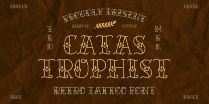 Catastrophist a Retro Tattoo Font that carefully crafted and will bring an cool impression to your project. Catastrophist is perfect for any titles, logo, product packaging, branding project, megazine, social media, wedding, or just used to express words above the background. Catastrophist also come with Multi-Lingual Support. Enjoy the font, feel free to comment or feedback, send me PM or email. Thank You!
 - Gush Kettel AT by madeDeduk,
$12.00 Gush Kettle is a distinct note font made manually with a pen contains 50+ ligatures with two alternative. Gush Kettle is great for branding, posters, logos, invitation, writing and headings. Feature Uppercase & Lowercase Number & Symbol International Glyphs Multilingual support Alternative Ligature Thanks so much for checking out my shop and feel free to drop us a message any time and follow my shop for upcoming updates
 - Onirom by Issam Type,
$17.00 Onirom is a Modern ligature serif font comes with joining ligatures that give it a fancy and unique style. This awesome font is perfect for branding, logos, invitation, watermark and so much more. Onirom typeface comes with regular and round font styles. Uppercase letters, numbers, punctuation, ligatures, alternates and multilingual support. If you have any questions, please feel free to get in touch. Thank you
 - Magica by K-Type,
$20.00 MAGICA is a book and display face that is both distinctive and legible – clear letterforms and a generous x-height make Magica a good choice for text or titles. The typeface has elegantly chamfered serifs and a confident, vivacious character that is equally suited to formal and informal usage. Magica is available in three weights – Regular, Medium and Bold – each supplied with a free italic.
 - Hillstate by Sabrcreative,
$25.00 Elevate your designs with the captivating charm of Billbest Brush Script Font. This versatile typeface combines the free-flowing elegance of brush strokes with a modern twist, making it a perfect choice for adding an artistic touch to your projects. Whether you're designing logos, branding materials, posters, or invitations, Billbest offers a seamless blend of lowercase and uppercase letters that create a harmonious and balanced visual appeal.
 - Hogback by Allouse Studio,
$16.00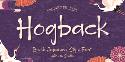 Proudly Presenting, Hogback a Brush Japanese Style Font that will bring an natural imression Asian Style for your need. Hogback is perfect for any tittles, logo, product packaging, branding project, megazine, social media, wedding, or just used to express words above the background. Hogback also come with Multi-Lingual Support. Enjoy the font, feel free to comment or feedback, send me PM or email. Thank You!


