1,327 search results
(0.016 seconds)
- Treifany by Attract Studio,
$18.00 Treifany is an elegant serif font family with an aesthetic style with beautiful ligatures, lots of alternative custom glyphs, and multilingual support. This stylish font family is timeless and cannot be missed in your font collection. Perfect for editorial projects, Logo design, branding, product packaging, magazine headlines or simply as a stylish text overlay onto any background image.
 - Brda by Linotype,
$29.99Brda originally designed by the Polish designer Franciszek Otto for the Powiat weekly newspaper. Powiat needed a new, dynamically drawn sans serif for its headlines, and Otto's Brda fit the bill. Combining traditional Grotesk letterforms with witty subtleties, like the notched-joint seen in the capital G, Brda displays a novel design that works best when set large. The typeface is named after the Brda river, which runs through Bydgoszcz, Poland, the city where Powiat is published. The Brda family includes three weights, each with a companion italic: Regular, Bold, and Extra Bold. The Brda family's Extra Bold weight was one of the winners selected in the 2003 International Type Design Contest, sponsored by Linotype GmbH. Franciszek Otto also teaches graphic design at the Secondary Art School in Bydgoszcz, where his typefaces rank among the students' favorites. - Bambino by Mindburger Studio,
$29.00 Bambino Font Family is a typography project by Milos Mitrovic and affiliates. Bambino has an influence of 1920s Futura-like fonts and art deco look and feel. Combining its vintage character with clean geometric form and organic flow, Bambino is shaped to fit modern aesthetics. There are 12 fonts (six weights with italics) included in the family. Bambino weight range spreads from almost hairline lightness to extreme bold style.
 - Gambling Resort JNL by Jeff Levine,
$29.00 Sheet music for the song "Beyond the Blue Horizon" from the motion picture "Monte Carlo" had the movie title in hand-lettering reminiscent of the Futura Black style, but with an inline stripe through each character. These few letter examples were the basis for Gambling Resort JNL and conjure up the Nouveau Riche spending their nights in Monte Carlo packing the roulette wheels, blackjack tables and slot machines.
 - Unicore by Halbfett,
$30.00 Unicore is a large family of geometric sans serif fonts. Design wise, it is inspired by classic 20th-century typefaces like Futura, Gill Sans, and Avenir. It fuses their aura with contemporary elements, like a unique harmonisation of width and height. You can see this in the lowercase letters especially and it helps support the fonts’ legibility. The regular weights in the family are optimised for body text.
 - Dinky Rink NF by Nick's Fonts,
$10.00Handlettering on a 1934 WPA poster promoting skating in Central Park provided the pattern for the uppercase letters of this typeface, while the lowercase letters take their inspiration from Paul Renner’s Steile Futura. The result is a warm, friendly face that is both quaint and modern. Available in Roman and Italic versions. Both versions of the font include 1252 Latin, 1250 CE (with localization for Romanian and Moldovan). - Air Factory by Khaito Gengo,
$22.00 Air Factory was originally designed for a merchandise company, and ordered to design iconic but plain forms. Air Factory is a very simple and modern sans-serif font inspired by early 1900’s typefaces, like Futura, and consisting of 5 weights and stencil type(free). This contemporary typeface would be good used for restaurant, retail, book, poster etc. Air Factory also features various ligatures, stylistic alternates, fractions, and languages as well.
 - MBF Reanimatic by Moonbandit,
$15.00 Reanimatic, a futuristic scifi font. This typeface is a modern display sans serif packed with a reimagination of a dark future technology. This font is perfect for a big size display or title and even logo.
 - Used Servers by AltaTech,
$17.99 Jump back to the future with both faces of the Used Servers family. This blocky titling font comes ready with ligatures and diacritics for all of your English, French, and German retro-future needs. Art Deco density combines with subtly-weighted horizontals for a slight 3D effect. As a retro omni-technical font with roots in OCR and n-segment displays, Used Servers is equally at home as: Titling in an 80s cassette-punk text adventure Environmental advertising in a cyberpunk megalopolis Art Deco filigree worked into a sacred orb Glyphs holding secrets from before time
 - Gluon by Harvester Type,
$10.00 Gluon is a font that is perfect for headlines, logos, posters, and much more. This font combines the minimalism, the futurism and aesthetics. We wanted you to feel the cosmos and its beauty when you look at the font. Three weights will help you choose the perfect combination with your design. Initially, the font was developed for the company's logo, but later the idea was slightly revised. The idea of the font is to convey the spirit of the future, but leave the beauty that we are used to seeing. The design was developed by Eugene Bunin and Beginskaya Christine.
 - Planetary Steam by PizzaDude.dk,
$15.00 Are you ready for the 1MB processing powerful performance? Step into the future with my wanna-be retro 8-bit powerful performance digital grafitti inspired computer font from the future...or rather...the past! I was inspired by old posters and commercials for old 8-bit computers from the late 70-ies and 80-ies. Despite the lack of powers (compared to computers and phones today) they seemed to be able to both rule the world and ease your everyday jobs. Well, the thought of all that, combined with my love for grafitti and comic text, inspired me to do this font!
 - Stamen by Wordshape,
$20.00 Stamen is the answer to a big question: What would happen if one tried to create a typeface that was ‘out of time’? If a type designer was to turn off the internet and put away the type specimens and just try to explore limbic, phantom history, what might that look like? No slavish explorations of the past. No gropings toward the future. No exhaustive core sample of the contemporary. Instead, using what one remembers of history and our collective vision of the future (usually a future imagined from the past) and channeling that into something that is, hopefully, new… The Bentons meet Frutiger for a Manhattan on a space station while Matthew Carter sways to the sweet sounds of the chorale that occasionally played through the halls of Stephenson Blake. This smear of implicit history expressed without explicit reference—this is Stamen: a family of 12 typefaces with a ton of alternate characters. The bold weight was designed for the LP “I Thought the Future Would Be Cooler” ( http://ittfwbc.com/ ) by the band YACHT in response to their request for a typeface that was ‘lost in time’, and refers to neither strict historical models nor purely futuristic forms. I built a small family out from there. It works well in text, but just as well for display setting. I think you’ll enjoy using it.
 - Resalaty by NamelaType,
$12.00 Resalaty is a cute and fashionable handwritten font, created to help you designing makes gorgeous logos, posters, wedding invitations, blog posts, social media, apparel and more! In the near future, the Arabic version will be released soon!
 - Outsize by Sanyukt Foundry,
$12.00 Bold Future is an extremely heavy font. It has numerous interesting characters, with the counter and aperture giving it a unique personality. Ideal for enormous titles, publicizing, naming, bundling and anything that needs a major, significant typeface.
 - Cool Crayon by Hanoded,
$15.00 Cool Crayon is a nice typeface I created with the black crayola from my 3 year old son's crayola box. It was broken (because he tends to throw them around), but I managed to get the glyphs onto a sheet of paper. Cool Crayon is similar to Crayon Crumble, but is rounder and thicker. Cool Crayon comes with extensive language support.
 - Fat Kitty Kat by Hanoded,
$20.00 Fat Kitty Kat is a hand made, rather bouncy and happy font. It was thought up, drawn and vectorized during an unusually long rainy period in a small Porto hotel room. Kitty Kat's glyphs are rather rough, but legible and fun to use. The font comes with extensive language support and a full range of alternates for the lower case letters.
 - Tarot by Great Lakes Lettering,
$25.00 Let Tarot wisp you away onto an enchanted journey. This whimsical serif typeface is perfect for headlines, small bodies of text, and feels like magic when paired with scripted type. Inspired partly by Helsing, Tarot features a similar essence, along with an alluring and spontaneous handwritten presence. Tarot is a charming font used to make anything created feel bewitched. Presto!
 - Walrus Gumbo NF by Nick's Fonts,
$10.00An unnamed alphabet from wacko lettering artist Otto Heim’s 1925 opus, Farbige Alphabete, provided the pattern for this delightful, if slightly deranged, typeface. Use it any time you want to add mirth and merriment to a project. Both versions include the complete Unicode Latin 1252, Central European 1250 and Turkish 1254 character sets, as well as localization for Lithuanian, Moldovan and Romanian. - Stay Golden by Rotterlab Studio,
$15.00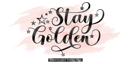 Introducing Stay Golden Script font in a smooth handwriting style and very pretty and classy. Stay Golden is perfect for branding projects, home appliance design, product packaging, use in business cards, invitation cards, etc. Simply as a stylish text overlay onto a background image or anything else that needs a touch of elegance. Thanks for checking! I really hope you enjoy it.
 - Salzburger Plakat NF by Nick's Fonts,
$10.00A poster by Otto Baumberger for an Austrian winter sports festival in 1907 inspired this charming confluence of medieval and Art Nouveau influences. As such, its appeal is timeless, and well suited for storybook romances of all stripes. Both versions of the font include complete Latin 1252, Central European 1250 and Turkish 1524 character sets, with localization for Moldovan, Romanian and Turkish. - Hupp Fraktur by RMU,
$25.00 Otto Hupp's blackletter font, released by Klingspor in 1911, took its inspiration from the then dominating Art Nouveau designs. Some of its capitals express this with their lovely swash forms, and make this fraktur font less stiff. Hupp Fraktur contains a bunch of usefull ligarures, and by typing 'N', 'o' and period you get an oldstyle numbersign by activating the Ordinals feature.
 - Forecast by Type Associates,
$30.00 Designed by Russell Bean between December 2020 and August 2023 as a pandemic project, Forecast takes cues from past geometrics notably Futura, Tempo even Avant Garde. ideal for a multitude of uses – text, display, web, wayfinding. The objective of Forecast is to present a practical, swiss-army, use-everywhere design where readability is paramount. Available in 7 weights with italics a total of 14 styles all kerned to perfection. LatPro encoded, supporting 90 languages.
 - Sandwich Shop JNL by Jeff Levine,
$29.00 A 1930s WPA (Works Progress Administration) poster promoting national parks depicts Native Americans overlooking the land with the tag line "his hunting ground of yesterday". The hand lettering of that text is reminiscent of Futura Black and similar Art Deco stencil-influenced type designs, but is rendered in an oblique lower case with no capitals. Re-drawn as Sandwich Shop JNL, the typeface is now available in both regular (vertical) and oblique versions.
 - Cosmata by MauldinType,
$15.00 Cosmata is geometric sans serif family of 10 fonts suitable for both display and reading use. Inspired by Futura, Cosmata developed its own complex, unique life. To that end, I've included alternate letterforms for a finely-tailored typographic experience. The rhythm, kerning, and spacing have been lovingly crafted for an elegant reading experience. I'm excited to share this release with you and hope you enjoy using it as much as I did creating it.
 - Extrakt by Hof3,
$25.00 The font EXTRAKT references the grotesque fonts and elementary typography as developed at the Bauhaus (ITC Bauhaus, Futura). Extract originated from a child's game: How many matches are needed to write the word EXTRAKT? (https://hof3.com/arbeitsweise/extrahieren) In the development of the typeface "EXTRAKT", the design principle of reducing the letters to the most necessary strokes was central. In addition to the reference to Bauhaus, EXTRAKT also has a futuristic feel. ("The Expanse")
 - Valvolina by Device,
$39.00 Valvolina is a bold headline font inspired by Italian Futurism and the Moderne graphic design of the inter-war period. It uses elementary geometric shapes to build its characters, lending it an energy and punch. Dramatic and contemporary.
 - Tschicholina by Type-Ø-Tones,
$40.00 Tschicholina is inspired by a project by Jan Tschichold dating back to 1929. It is a unicase "universal" font which has always been considered to have very little future; this is why we have it in our catalogue.
 - Metaphysica by Ayca Atalay,
$17.00 Metaphysica is an unorthodox futuristic typeface that provides otherworldly zest without overly compromising typographic aesthetics. Combining weird angular beams and junctions with soft and round forms, Metaphysica finds the middle ground between sci-fi futurism and friendly legible sans.
 - Boren by Lone Army,
$19.00 Revolutionary sans serif font BOREN with futuristic LiquidFlow style brings modernity and creativity. Crafted with precision, it captivates with smooth lines and high-tech aura, adding professionalism to projects. Choose BOREN for sophistication and futurism in your creative designs!
 - Epically by Zamjump,
$17.00 EPICALLY is a futuristic style font with a unique style and touch, inspired by the Modern theme while maintaining simplicity and unique shapes. Great to use in your projects related to games, future technology, space travel, virtual reality & more!
 - Speedblur by Greater Albion Typefounders,
$12.00 Speedblur - the name says it all really! Want a display typeface that suggests speed and motion? Well this is it. Ideal for all those retro-future designs, anything streamlined or the boy (or girl) racer in all of us!
 - Elle by Device,
$39.00 Elle is a geometric sans in three weights with rounded stroke terminals and circular forms. Classy, elegant and modern, with just a hint of the future. Inspired by a single-weight Typositor headline typeface from the early 1970s called Pipeline.
 - Shabby Brush by Pavel Boog,
$14.00 Shabby brush - creating this font Pavel was inspired by the past and visualized a good future. Erasing lines of letters, like memories that have passed through years. The long-lasting brush continues to create and inspire with all its strength
 - Punchado by MyAnvil,
$20.00 This font titled "Punchado" original was designed in light of its sharp angels and bold impact type. This font would theme in the realm of: engineering, technology, science fiction, science, futures, etc... This font could be described as energetic, and motivational.
 - Breaktime by Mightyfire,
$15.00 Step into the future with Breaktime, a cutting-edge digital futuristic font that seamlessly merges technology, innovation, and style. Inspired by the sleek aesthetics of tomorrow's digital landscape, Breaktime embodies a perfect synergy of form and function. Whether you're designing a tech-forward website, a space-age poster, or a forward-looking logo, Breaktime is your gateway to a digital tomorrow. Embrace the future of typography with this innovative font and let your creations resonate with the essence of tomorrow's possibilities. Breaktime – where technology meets typography in perfect harmony. We're proud and honored if Breaktime can be the part of your special projects. Thank you :)
 - Smallstep Pro by Evolutionfonts,
$- Smallstep - One geometric sans serif with a free spirit. If we presume that geometric typefaces play with the idea of what typography would look like in the future when all unnecessary elements would disappear, than most of their designers seem to envision the future in a rather metropolisque kind of way. We love geometric faces, but the cold and heartless feelings that most of them leave is just not our cup of tea. That is why we are happy to bring some optimism in that genre with our new typeface. We called it Smallstep. Smallstep is a typeface that follows the traditions of classic geometric sans serifs like “Futura”, but is at the same time friendly and whimsical. We took the liberty to deviate from the standard sans serif glyphs while drawing some characters (such as ”a” and ”r” ), others (“w” “k”) are completely redesigned. Probably the biggest trademark of this typeface is the way vertical lines in most lower case characters are “cut” so they end in a 60 degree angle. Smallstep is over all a expressive face, which means it brings some emotions to your design and feelings in itself, and should be used accordingly. Other than that, it is suitable for both headline and body text, print and web. So what kind of name is “Smallstep”? We view the type design process as a form of evolution: There can be no typeface that differs drastically from the current standards, since its characters would be unrecognizable and thus unreadable. But at the same time there are hundreds of faces that differ a little, and still manage to make a difference by moving with small steps towards better and more refined looks. Smallstep consist of 4 weights, that cover all the features, that are expected of a modern Opentype face: kerning pairs, ligatures, true italics and alternative characters, plus a set of symbols, that will help you start off your designs more easily.
 - Corkboard JNL by Jeff Levine,
$29.00Corkboard JNL is a bold, yet fun rounded-ends typeface that was popular in the 1970s and enjoying a revival amongst students and teachers via die-cut bulletin board letters. Five variations are offered—Regular, Slanted, Shadow, Shadow Slanted and Kiddies. Corkboard Kiddies JNL has a limited character set and eccentric spacing that emulates the way a child might put letters onto a bulletin board. - Kunstschau by Hanoded,
$15.00 The 1908 art exhibition in Vienna (Kunstschau 1908) featured works by Josef Hoffmann, Cark Otto Czeschka and Gustav Klimt, who showcased his famous painting 'The Kiss'. Kunstschau font was modeled on a stamp, designed by Austrian artist Bertold Löffler, for the 1908 exhibition. Kunstschau is a loose, handwritten font which comes with a distinct all caps upper and lower case, plus an extensive language support.
 - ITC Weidemann by ITC,
$29.99 The Weidemann typeface's original name was Biblica, which was designed for the collaborative publication of a Bible by the German Catholic and Protestant Churches. The mass of text which the face was intended to set required that the design allow many characters to fit onto one line without rendering the words illegible. Thus, narrow spacing does not compromise the legibility or the elegance of Weidemann.
 - Cut Along by Hanoded,
$15.00 I made Cut Along by stealing some red cardboard from my kids (red, because they didn’t have any black…) and cutting out the glyphs one by one with a pair of scissors. I then pasted the shapes onto white paper, scanned them and turned them into a font. Cut Along is a very nice font for ads, book covers, packaging and children’s books. Enjoy!