9,812 search results
(0.069 seconds)
- MARIAMNE by Type Innovations,
$39.00 MARIAMNE is an original design by Alex Kaczun. It is an elegant, modern and traditional interpretation based on and modeled after his successful "Contax Pro" and "New Age Gothic" typeface series. As such, it has generous proportions with clean, crisp lines—ideally suited for easy reading and long lines of copy. Alex felt that the skeleton for "Contax" was perfectly suited to transform the design into a modern version of 'old-style', somewhat reminiscent of German Black Letter. Numerous modifications where made to the body proportions, stems and shapes. True 'old-style' serifs and unusual 'cross-strokes' where added for a touch of distinction. The 'cross-strokes' where added at exactly visual mid-point on the overall heights. This gives the typeface a romantic, female-like quality to the overall design. Strong, yet delicate. Visually stimulating in appearance and function. The result is a truly unique transitional and modern design. Unlike other typefaces, MARIAMNE incorporates uniform stems throughout the capitals, lower case and figures. This gives the design a uniform appearance in overall color and strength. There is a perfect visual balance between inter-letter spacing, stem weights and proportions. The accents are equally large, bold and command attention. This font includes a large 'Pro' character set, which supports most Central European and many Eastern European languages. As a result, the design is ideally suited for display copy as well as text composition. In the near future, Alex plans to expand the typeface series to include a light and heavy weight, along with true italics.
 - Flamenca by Eurotypo,
$28.00 Flamenco is an Andalusian art. Who think in flamenco, think in Spain. Is the result of a cultural mix: Gypsies, Arabs, Jews and Christians mixed elements of their respective cultures with traditional Andalusian elements. It incorporate dance, song and guitar music. Known for its emotional intensity, flamenco is distinguished by the graceful arm movements, ferocious stomping’s flamenco dancer, deep groans and strumming guitar. Flamenco is an art of passion. Flamenca Regular and Flamenca Luz is a brush script inspired by the flamenco dance. Flamenca is an organic, modern and casual calligraphy family font that has preserved in its glyphs its original textured appearance for a more personalized effect even more authentic. As an exclusively Open Type release, with 747 glyphs, it has several special alternatives for all letters with lots of possibility an infinity of combinations. There are plenty of options to allow you to create something unique and special: standard and discretionary ligatures, several swashes, initial and terminal forms and stylistics alternates for each letter, catchwords, ornaments that can be added to the beginning or end of each letter, and much more. Ornaments has been created inspired in the bars of the Andalusian patios where flamenco is danced. These lovely fonts have already an extended character set to support Central and Eastern as well as Western European languages. As a whole, Flamenca was made to make your project more beautiful and attractive! Have fun with it! Flamenca is fancy, delicious & fresh!
 - Barcis by insigne,
$24.75 Take your reader far away to a tropical morning, where the inviting aroma of a fresh roast introduces them to a gentle breeze and the first, warm light of day. Take them there with Barcis. This organic face with its tall x-height and neo-humanist attributes shows its free spirit through unique terminals, calligraphy-inspired strokes, and a rich variety of OpenType alternates All insigne fonts are loaded with OpenType options. Barcis is geared up for pro typography. The font features many numeral sets, with fractions, old-style figures, superiors and inferiors. OpenType-capable programs like Quark or the Adobe suite allow you to quickly change ligatures and alternates. You can see these options shown in the .pdf brochure. Barcis also features the glyphs to aid a variety of languages, together with Central, Eastern and Western European languages. In all, Barcis supports around forty languages that utilize the Latin script, earning Barcis the pick for for multi-lingual publications and packaging. Barcis features three different widths and seven weights from exceptional Light-weight to dense Black. Each of these individual fonts offers its own authentic italics and alternate glyphs as well. With its high versatility, Barcis is without a doubt an amazing titling font, a great choice for journals, a solid option for web use, or even for clearly defining your mark in logotype. Bring Barcis into your library, and use it to carry your audience away.
 - Roos by Canada Type,
$24.95 The Roos family is a digitization and expansion of the last typeface designed by Sjoerd Hendrik De Roos, called De Roos Romein (and Cursief). It was designed and produced during the years of the second World War, and unveiled in the summer of 1947 to celebrate De Roos's 70th birthday. In 1948, the first fonts produced were used for a special edition of the Dutch Constitution on which Juliana took the oath during her inauguration as the Queen of the Netherlands. To this day this typeface is widely regarded as De Roos's best design, with one of the most beautiful italics ever drawn. In contrast with all his previous roman faces, which were based on the Jenson model, De Roos's last type recalls the letter forms of the Renaissance, specifically those of Claude Garamont from around 1530, but with a much refined and elegant treatment, with stems sloping towards the ascending, slightly cupped serifs, a tall and distinguished lowercase, and an economic width that really shines in the spectacular italic, which harmonizes extremely well with its roman partner. The Roos family contains romans, italics and small caps in regular, semibold and display weights, as well as a magnificent set of initial caps. All the fonts contain extended language support, surpassing the usual Western Latin codepages to include characters for Central and Eastern European languages, as well as Baltic, Celtic/Welsh, Esperanto, Maltese, and Turkish.
 - Tambau by Tipogra Fio,
$30.00 Tambau is a display typeface crafted by Matheus “Fio” Gonçalves, a Brazilian design student, still in college, inspired by Brazilian concert urban posters and wood type that I saw at the Oficina Tipográfica São Paulo. The font was first made for a magazine project in design school, making it beautiful on giant pages headlines, billboards, signs, etc. There’s no lowercase, the character set is dramatic and objective. The uppercase is actually expanded letterforms causing some eyes and breathing paths to the very condensed and very modular glyphs, which creates a quite interesting striped texture between form, counterform and spacing. The lots of ligatures come to give it more closure between the letters, when they try to form blank spaces. So do the diacritics, fitting in the space given to them by the dynamic letterforms, making dense rectangular blocks. You may use Tambau as big as you can or do a high tracking to it and still it will be pretty. The titles can be dynamic, just condensed or just large. It’s on your own. Don’t be afraid to play with Tambau, it’s an alive typography. Curiosity: For the magazine in design school, the pilot project of Tambau was cut in a MDF board, to print it with texture and paint. Later was added more characters, languages and special glyphs to it. Set: Tambau is a singular font typeface, with extended and condensed characters, numbers, ligatures, punctuation and symbols for Basic, Western, Central and South Eastern Latin languages.
 - Daito by insigne,
$29.99 It’s alive! Insigne’s new creation, Daito, is now functional, built to process your logos, business cards, magazine layouts, packaging and more without the slightest glitch. But this new slab serif is no heartless churn of the same factory nuts and bolts. Daito is designed to greet your reader with a friendly face. Inspired by types from the era of the Space Race, this new take on some old faces brings a contemporized, unique set of serif forms to the font race. Daito comes complete with a variety of weights to help you find the best settings for your current needs or moods. Need soft and playful? Daito light communicates its message gently with softened serif. Need a different feel with more authority? With the touch of a few buttons, engage the powerful Black or striking Bold. Additional features with Daito include stylistic alternates, ligatures, titling capitals and small caps among other typographic features. Please note: use magical OpenType-savvy applications such as Adobe Creative Suite, QuarkXPress, etc to keep your font from malfunctioning, shorting, attacking people, or attempting a world takeover. Daito also speaks Western, Eastern, and Central European languages. However, Japanese is not available for this edition. It’s not every day you find a top-of-the-line font like Daito. This machine can handle most anything on your list, short of folding your laundry (though it may make your laundry look nicer). Don’t wait. Order yours today while supplies last.
 - Galix Mono by Eclectotype,
$25.00 This monospaced version of Galix was commissioned in 2037 by the space exploration company Earth2, as part of a major overhaul of their branding, which had used, since 2021, a generic sans serif (much like every other company). Many specialists in both design and space exploration suggested that this very rebrand started a chain of events that concluded with the invention of time travel in 2041. Contrary to the perceived notion put forward in popular Science Fiction, time travel is only (as of now) possible in the digital realm. It was considered fitting that included among the first files sent back in time should be the Galix Mono typeface, which was remade in OTF format to ensure that it would work with the technology available in 2019. Earth2, for all their insight, did not foresee that the release of the typeface in September of 2019, would lessen the impact of their rebrand. What kind idiots would rebrand a forward looking company with a font that was, by then, almost 18 years old? The subsequent lacklustre response to the redesign didn’t inspire the tidal wave of R&D funding Earth2 had anticipated, and the company went into administration in the summer of 2039, having never invented the time travel which made the release of Galix Mono in 2019 possible. Experts believe that the files sent back in time, although their very sending made it impossible for them to be sent, remained as “time relics” of the future that might have been.
 - Sangli by insigne,
$- It started in 2007 with Chennai, the first of a three-part series of sans that I envisioned with slab serif counterparts. Each font would differ from the others in how the stem terminals were expressed. The initial font was extremely well received, and a revitalized and remastered Chennai made its appearance two years later, complete with new weights and new, novel OpenType features. Then came Madurai, a variation of Chennai based on the same core, only without the rounded stems. Chennai’s rounded stems made it distinctive and great for headlines but left it lacking appeal as copy--a problem that Madurai easily solved. And now comes Sangli, the final iteration of my original 2007 vision. Sangli is a happy medium. Like Chennai, it’s great for headlines--but not too distinct for copy. Sangli keeps the same core structure as the other two, but new less sharp forms give this latest font a friendlier look that’s more versatile than the original Chennai and less formal than Madurai. The font includes a whole range of six weights from light to black, along with condensed and extended options as well for a total of 54 fonts. There are plenty of OpenType features, including small caps. Alternates include normalized capitals and lowercase letters that include stems for when you want a more traditional look or when you’re writing copy. Sangli also supports over 70 languages that use the extended Latin script. Use Chennai, Madurai, and their slab serif variants interchangeably with Sangli, too, for even more options in your work. All three complement one another well. So when you need a balanced font that stands boldly on the page and commands your reader’s attention, look within and find your Sangli.
 - Crabs by Ardyanatypes,
$10.00 Crabs Slab Comes with a Slab Serif style typical of sturdy and elegant typography, which gives a modern, retro, and classic style but has a unique and elegant style that gives an extraordinary impression. Crabs Slab also comes with multiple languages enabling Crabs Slab to be used in all your projects. Crabs Slab is very suitable for use in various purposes or projects, including Sports, Posters, Products, Logos, Branding, and many more that you can apply with this Crabs Slab Typeface. Supports languages: Afrikaans, Albanian, Asu, Azerbaijani, Basque, Bemba, Bena, Bosnian, Breton, Catalan, Chiga, Colognian, Cornish, Croatian, Czech, Danish, Dutch, Embu, English, Estonian, Faroese, Filipino, Finnish, French, Friulian, Galician, Ganda, German, Gusii, Hungarian, Icelandic, Igbo, Inari Sami, Indonesian, Irish, Italian, Jola-Fonyi, Kabuverdianu, Kalaallisut, Kalenjin, Kamba, Kikuyu, Kinyarwanda, Latvian, Lithuanian, Low German, Lower Sorbian, Luo, Luxembourgish, Luyia, Machame, Makhuwa-Meetto, Makonde, Malagasy, Malay, Maltese, Manx, Meru, Metaʼ, Morisyen, North Ndebele, Northern Sami, Norwegian Bokmål, Norwegian Nynorsk, Nyankole, Oromo, Polish, Portuguese, Quechua, Romanian, Romansh, Rombo, Rundi, Rwa, Samburu, Sango, Sangu, Scottish Gaelic, Sena, Shambala, Shona, Slovak, Slovenian, Soga, Somali, Spanish, Swahili, Swedish, Swiss German, Taita, Teso, Thai, Turkish, Turkmen, Upper Sorbian, Vietnamese, Vunjo, Walser, Welsh, Western Frisian, Wolof, Yoruba, Zulu A guide to accessing all alternatives can be read at http://adobe.ly/1m1fn4Y Adobe Photoshop go to Window – glyphs Adobe Illustrator go to Type – glyphs Features: A – Z Character Set a – z Characters set Numerals & Punctuations (OpenType Standard) Multilingual Thank you and have a nice day
 - Black Goose by VP Creative Shop,
$15.00 Black Goose is a display typeface with regular, cut, styled, rounded, and reversed font styles. It adds elegance, modernity, playfulness, approachability, and intrigue to your designs. Supporting 87 languages, it ensures effective communication across diverse audiences. If you're looking for a more edgy and contemporary vibe, the cut style of Black Goose will be perfect for you. With its sharp angles and distinct cuts, it adds a bold and modern twist to your designs, making them stand out from the crowd. For those seeking a touch of playfulness and uniqueness, the styled variant of Black Goose offers decorative elements that enhance the overall design. It brings a sense of whimsy and creativity to your projects, making them visually captivating and memorable. Language Support : Afrikaans, Albanian, Asu, Basque, Bemba, Bena, Breton, Chiga, Colognian, Cornish, Czech, Danish, Dutch, Embu, English, Estonian, Faroese, Filipino, Finnish, French, Friulian, Galician, Ganda, German, Gusi,i Hungarian, Indonesian, Irish, Italian, Jola-Fonyi, Kabuverdianu, Kalenjin, Kamba, Kikuyu, Kinyarwanda, Latvian, Lithuanian, Lower Sorbian, Luo, Luxembourgish, Luyia, Machame, Makhuwa-Meetto, Makonde, Malagasy, Maltese, Manx, Meru, Morisyen, North Ndebele, Norwegian, Bokmål, Norwegian, Nynorsk, Nyankole, Oromo, Polish, Portuguese, Quechua, Romanian, Romansh, Rombo, Rundi, Rwa, Samburu, Sango, Sangu, Scottish, Gaelic, Sena, Shambala, Shona, Slovak, Soga, Somali, Spanish, Swahili, Swedish, Swiss, German, Taita, Teso, Turkish, Upper, Sorbian, Uzbek (Latin), Volapük, Vunjo, Walser, Welsh, Western Frisian, Zulu Mock ups and backgrounds used are not included. Thank you! Enjoy!
 - Polar by Daniel Uzquiano,
$150.00 Polar is a sans-serif grotesk with characteristic ink traps and rounded vertexes. Polar is a variable font. It is versatile, modern, elegant and neutral. It can be displayed in a range from 200 to 900 in its weight axe to play many different roles. The font has 5 predefined instances, Thin Display, Light, Regular, Bold and Heavy Display, in two styles, regular & italic, with 716 glyphs each of them. Polar has 25 OpenType features such as ligatures, fractions, stylistic alternates, localized forms, old-style figures, etc. It can be suitable for long texts. It also works great as a perfect display font for all caps headings, especially with its thin and heavy weight variants. Polar covers Latin, Central European characters & supports 101 languages: Afrikaans, Albanian, Asu, Basque, Bemba, Bena, Breton, Catalan, Chiga, Colognian, Cornish, Croatian, Czech, Danish, Dutch, Embu, English, Esperanto, Estonian, Faroese, Filipino, Finnish, French, Friulian, Galician, Ganda, German, Gusii, Hungarian, Igbo, Inari, Sami, Indonesian, Irish, Italian, Jola-Fonyi, Kabuverdianu, Kalaallisut, Kalenjin, Kamba, Kikuyu, Kinyarwanda, Koyraboro Senni, Koyra Chiini, Latvian, Lithuanian, Lower Sorbian, Luo, Luxembourgish, Luyia, Machame, Makhuwa-Meetto, Makonde, Malagasy, Maltese, Manx, Meru, Morisyen, Northern Sami, North Ndebele, Norwegian Bokmål, Norwegian Nynorsk, Nyankole, Oromo, Polish, Portuguese, Quechua, Romanian, Romansh, Rombo, Rundi, Rwa, Samburu, Sango, Sangu, Scottish, Gaelic, Sena, Serbian, Shambala, Shona, Slovak, Soga, Somali, Spanish, Swahili, Swedish, Swiss, German, Taita, Tasawaq, Teso, Turkish, Upper, Sorbian, Uzbek (Latin), Vietnamese, Volapük, Vunjo, Walser, Welsh, Western Frisian, Yoruba, Zarma, Zulu.
 - Bhontage by Picatype,
$12.00 Bhontage is a powerful multipurpose handwritten font script that is suitable for all types of projects. It contains 333 total glyphs and 148 alternative characters that are divided into several OpenType features such as Ligature, alternatives, swash, style sets and alternative styles that allow you to mix and match letter pairs that match your design. You can access all these alternative characters by using OpenType smart programs such as Adobe Illustrator and Adobe InDesign. Bhontage Script is available in 2 different styles (Regular and Italic) in the .OTF, TTF format. Bhontage Features : Multi-language Ligatures Alternates PUA Encoded Bhontage features OpenType stylistic alternates, ligatures and International support for most Western Languages is included. To enable the OpenType Stylistic alternates, you need a program that supports OpenType features such as Adobe Illustrator CS, Adobe Indesign & CorelDraw X6-X7, Microsoft Word 2010 or later versions. How to access all alternative characters using Adobe Illustrator: *https://www.youtube.com/watch?v=XzwjMkbB-wQ Bhontage is coded with PUA Unicode, which allows full access to all the extra characters without having special designing software. Mac users can use Font Book , and Windows users can use Character Map to view and copy any of the extra characters to paste into your favourite text editor/app. How to access all alternative characters, using Windows Character Map with Photoshop: *https://www.youtube.com/watch?v=Go9vacoYmBw If you need help or have any questions, please let me know. I'm happy to help :) Thanks & Happy Designing!
 - Michiana Pro by BluHead Studio,
$39.00 Michiana Pro is my new, hand-crafted connecting script! I've been hand lettering cards and envelopes to my wife and family in this type style for years and decided it was time to make a font based on it. I typically start with a single thin stroke for each letter, then build up the weight of the heavy stroke, so there ends up being a lot of charming variations in terms of style and color. The overall finish is rough, yet friendly. Perfect for invitations, place cards, love notes, and with its large x-height, it sets nicely for text. I grew up running around the dunes and beaches along Lake Michigan in northwest Indiana, and I think the shoreline and dune grass has inspired my aesthetic. Michiana Pro takes the name from a small area along the lake between the Indiana and Michigan state lines. There are a lot of nice, modest homes nestled in the duneland forests. Thinking about what it's like back there, it's like having a bowl of steaming hot comfort food. So I hope Michiana Pro feels that way to you too. Michiana Pro features include: + extended character set for Western European language support + 1,205 glyphs + lowercase beginning and ending swashes + contextual initial and final letterforms + alternates for L, R, Z, f, g, p, t and y + 140+ ligatures + superior and inferior figures for unlimited fractions + ordinals (st, nd, rd, th) + 4 ornamental swashes + available in both OTF and TTF formats
 - Esta Pro by DSType,
$26.00The multi award winning ESTA is back, renewed and improved in OpenType format. Now named Esta Pro, is available in Regular, Italic, Bold, Bold Italic, Display and Swashes. Includes plenty of features, like SmallCaps, Alternates, Ligatures and CE characters. - Visitation - Unknown license

- Berlewi FA by Fontarte,
$39.00 FA Berlewi is inspired by stencil lettering of a vanguard creator, Henryk Berlewi, who was a precursor of contemporary typography, a painter and a creator of the mechano-facture (Mechano-Faktura) theory. In 1924 he designed a poster for his mechano-facture one-man show in Warsaw Austro-Daimler car salon. An attention-grabbing composition with stencil lettering was doubtless a real innovation and according to Berlewi - the first typographic poster to be made in Poland.
 - SYN Nova by Borutta Group,
$- SYN NOVA is a digitisation project of SYN – futuristic typeface designed by Wojeciech Freudenreich, famous polish graphic designer. Our concept, besides giving it a digital form, was to expand the character set, design minuscule and opentype features for the typeface. Together with Wojciech Freudenreich we created 4 new weights. The complete family (5 styles & Variable Font Version) is distributed under open and free font license. Subsidised by the National Centre for Culture under the programme Kultura w sieci
 - Bunday Clean by Buntype,
$22.50 Bunday Clean is a minimalist and friendly font family with different moods. It drops everything unnecessary like spurs and ears and appears crisp and contemporary with a slightly squarish touch. Like the other members of the superfamily (Bunday™ Sans and Bunday™ Slab), Bunday Clean provides uprights, a second set of styles with characters that reference handwritten cursive. These curvy styles give words a distinct look and are especially attractive for use in display applications and logotype design. Bunday™ Clean is space-saving and creates a homogenous text color with good legibility. The font was manually hinted and contains extensive handcrafted kerning tables to ensure perfect appearance in all media. It ships with 9 standard, 9 upright, and the corresponding italic styles from a considerably thin hairline to a quite thick heavy. It supports at least 99 languages and provides OpenType® features for ligatures, alternative glyphs, localized forms, and much more. Feature Summary*: -4 Moods: Normal, Upright, Italic and Upright Italic -9 weights: Hair, Light, Thin, SemiLight, Regular, SemiBold, Bold, ExtraBold and Heavy -Supports at least 99 Languages incl. eastern european -Overall width: Narrow or Space-Saving -Advanced f- ligature set including fb -Discretionary s- and c- ligatures -Alternative Characters: a, e, f, g, l, t, y, A, E, F, L, and more -Capital German Eszett -Extra characters with Polish Kreska -Catalan Punt Volat -More than 570 characters per font * Some features may only be available in OpenType®-savvy applications Please, take a look at the other Bunday superfamily members: Bunday™ Sans Bunday™ Slab
 - Midkaiser by Konstantine Studio,
$19.00 Behold the allure of Midkaiser – where innovation converges with design mastery, creating an experience that transcends the ordinary. Prepare to be captivated by the future of typography! Midkaiser is not just a font; it’s a testament to visionary design. Elevate your creations with a futuristic allure that has already earned accolades across the design universe. Crafted with precision, Midkaiser boasts a seamless blend of boldness and sophistication. Empowers your brand to stand out, leaving an indelible imprint on your audience’s perception. Covers a wide variety of languages, included Vietnamese. See the details in the preview images. Ignite your creativity, transform your designs, and leave a lasting impression with Midkaiser – Your Gateway to Futuristic Tech Fonts!
 - Pumpkinseed by Three Islands Press,
$19.00 The tale of Pumpkinseed began with a bit of hand-printing I noticed on the dinner menu at a local restaurant. I took a menu home for future reference. Several months later, some similar hand-lettering on another dinner menu caught my eye. I became a sort of connoisseur of hand-done menu lettering. After tweaking and adjusting a few of these menu-inspired (uppercase) characters, I placed them -- along with some other designs -- in an online Type in Progress survey. They won. So I finished the caps, drew out the lower case from scratch, created three weights and oblique styles. The result: Pumpkinseed, a full-featured casual hand-lettering face. Comes in Light, Medium, and Heavy.
 - Last Date JNL by Jeff Levine,
$29.00 A typographic conundrum presented itself with the hand lettered title on the cover of the 1919 song "I Am Always Building Castles in the Air". The capitalized portion ["Castles in the Air"] was a hybrid mix of a few Art Nouveau-influenced rounded letters, yet along with this were squared letters with rounded corners (reflecting the upcoming Art Deco movement to take place in about another decade). As a complete alphabet, it didnít mix as well as in those few short words. What to do? It was decided to go with the squared look and save the rounder characters for a future project. The end result became Last Date JNL; available in both regular and oblique versions.
 - Barcore by Barkar Designs,
$12.00 This font was designed to create unique typography in graphic design. It consists of one style and only capital letters. It is deliberately complicated by the addition of styles and lines that are not traditional for the latin or cyrillic alphabet, which adds zest, makes you look closely. The uniqueness of this font also lies in the fact that it is made in a geometric style using only square angles or perfect rounding in glyphs. This font will add futurism to your project, the unusual font always looks stylish and memorable. I am sure that the font will come in handy for those who want to add something new, modern and unique to their work.
 - Komunikat FA by Fontarte,
$39.00 FA Komunikat is an experimental and geometrical typeface based on simple elements: a circle, it's parts and straight lines. The typeface communicate the spirit of future, dynamism and modernity. FA Komunikat design was based on the sketch of unique lettering from 1932 made by Władysław Strzemiński, Polish vanguard abstract painter, an artist and a typographer. Strzemiński claimed that modern economic letter forms should be standardized and based on lines and arches. He wrote that readability is a matter of habit and after a practice the new letter forms would be very well readable for everyone. In 2004 Artur Frankowski revived original design creating set of characters, widen up with numerals, punctuation marks and diactrics.
 - Stettinum Nicodemus Pro Sansum by Wardziukiewicz,
$20.00 Stettinum Nicodemus Pro is a project to revitalize lettering from tenement houses in Szczecin. The project includes the digitization of letter remains from ul. Kaszubska in Szczecin to form functional fonts. The main idea of the project was to preserve the disappearing remnants of Szczecin's typographic past, which, despite the span of glyphs limited by time, can be an inspiration for many future extensions of the already established family. Stettinum Nicodemus Pro Sansum is a family of typefaces consisting of 7 variations. The block structure with a regular structure and a relatively high minuscule allows for many different applications. Versions 700, 800 and 900 are intended for titles, headings and emphasis, typefaces 300 to 600 are text typefaces.
 - Rotato Sans by VIP Graphics,
$8.49 Rotato Sans is a geometric sans-serif typeface that brings a fresh, modern look to any design. This minimalist but distinctive font is defined by its crisp composition and symmetrical elements — designed for optimal legibility at all sizes. Available in three different weights, Rotato leaves an understated impression of elegance & futurism! Currently available in three standard weights (more coming soon): Rotato Sans Bold – Strong and futuristic Rotato Sans Regular – Clean and crisp Rotato Sans Light – Elegant and modern FEATURES Three (3) Font Weights + Italics Numbers & Punctuation Special Characters Rotato Sans is a dynamic font that works great across various applications: from branding & logos to technology & fashion — whether in a giant heading, or paragraphs of body text.
 - Meta Link by Logofonts,
$10.00 Meta Link is Sans Serif inspired by future techno and sport great for product logo, poster, headline, card logo, web, magazine, packaging, stationery and much more. Easily creates your own logo types with font. Meta Link have 4 weight fonts with italic style also has an Open Type feature to access a large selection of unique alternative letters and many ligatures to make it easier for you to create. Meta Link can be accessed perfectly on design applications such as Adobe Illustrator, Adobe Photoshop, Corel Draw, Affinity Designer but does not rule out the possibility that it can also be accessed using web-based applications such as kittl, canva, artboard studio and others.
 - Enemy Lines by Comicraft,
$19.00 You've been shot down over enemy territory and you've managed to survive for weeks thanks to your training and instincts*... but now you're being ruthlessly pursued by MAPPO's footsoldiers... The ELEPHANTMEN! Will your commanding officer go against orders in an attempt to rescue you or will his mission be abruptly aborted, stranding you behind ENEMY LINES? In order to survive, you may have to betray your own rebel forces, your allies and the entire free world! The future of mankind hangs in the balance! Failure is not an option! Bummer. *This font's modus operandi bears no relation to the story of any other font that may have been shot down behind enemy lines, real or imagined.
 - Spellcaster by Comicraft,
$19.00 Raven hair and ruby lips, it may have been a trick of the light but I'm sure sparks flew from her fingertips. I definitely heard echoed voices in the night, of a restless spirit on an endless flight. If I remember correctly she held me spellbound in the night, with dancing shadows and firelight. Yes, I think I did see a crystal ball on the table, showing the future, the past and I did drink the potion she offered me, when I really should have gotten out of there fast. And that's my story and I'm sticking to it, your honor. It was that girl with the white hair, I'm telling you. She has my wallet too.
 - Stalemate Pro by MAC Rhino Fonts,
$49.00 A clean sans serif, originally constructed as a proprietary font for a German IT-company. From the beginning it was designed to work both in print and on screen and experience shows that it performs well in both environments. First released as a commercial typeface with GarageFonts in 2002 and later with the Fountain Type Foundry (2004). During 2007-08 the family was expanded and upgraded into a full OpenType Pro package. The company Jura have since long used Stalemate as part of thier corporate identity. They have also licensed special versions with full support for Greek and Cyrillic languages. This will be available as a commercial option in the near future.
 - Areon Flux by DePlictis Types,
$33.00 The future is right here, today, and Areon Flux comes to point that out. It’s a font family consisting in three weights that makes it a notable choice for designers that have to do with techy, futuristic layouts or printing materials. The lettering design appeal as sharp, powerful, distinctive and kind of modular, remembering the upcoming space exploration opportunities that are ready to enlarge our horizons in the next years. Areon Flux family is designed and published in late ‘20/ early ’21 and has an established discount for more that 30% for all the weights buyed together that makes it a versatile fresh and modern display not to be missed by edgy designers.
 - Estefania Bold Script by Shaltype Co,
$12.00 Estefania is based on Retro Bold Script Typeface that could fit any Graphic Project. Using bold and contrast strokes to get eye-catchy and smooth looking, this project is just born and will come with other styles and more glyphs in the future. Drawn manually by hands, and reform into a clean Typeface. Natural stroke from original lettering. It can be used for Titles or even for writing. In this font, you will get : - TTF & OTF files - WOFF & WOFF2 - Over 299 Glyphs - 11 OpenType features - Support Multilingual languages Get Estefania now! It will be best used for any design requirement, many fonts will come with a unique concept. Thank you! Best Regards, FM-STCO.
 - Gilgamesh by ITC,
$29.99Gilgamesh is the work of British designer Michael Gills, based largely on his calligraphic experiments and named after a poem from Middle Eastern mythology, The Epic of Gilgamesh". Gilgamesh offers functionality with style and will give emphasis to any typographic design." - Surprise Pro by Naghi Naghachian,
$58.00 Surprise Pro is designed by Naghi Naghashian. It is a delicate decorative headline font. The character set of this Font supports most western languages including: Afrikaans, Basque, Breton, Catalan, Danish, Dutch, English, Finnish, French, Gaelic, German, Icelandic, Indonesian, Irish, Italian, Norwegian, Portuguese, Sami, Spanish, Swahili and Swedish. There are 17 additional symbol characters: euro, litre, estimated, omega, pi, partialdiff, delta, product, summation, radical, infinity, integral, approxequal, notequal, lessequal, greaterequal, and lozenge. It also includes the characters necessary to support the following central European languages: Croatian, Czech, Estonian, Hungarian, Latvian, Lithuanian, Polish, Romanian, Serbian (Latin), Slovak, Slovenian and Turkish.
 - Cerebri Sans by Hanken Design Co.,
$30.00 Cerebri Sans is a design inspired by early geometric and grotesque typefaces. Subtle humanist details provide an undercurrent of warmth that simmers just beneath the bones of its contemporary simplicity. Cerebri Sans’ concept involved the development of a hybrid appearance. Its soft elegance and finely-tuned legibility make it appropriate for a vast range of applications including headlines, editorials, publishing, advertising, corporate communications, white papers, educational texts, web content, and mobile applications. Cerebri Sans' multilingual support is extensive, covering Basic Latin, Western European, Euro, Baltic, Turkish, Central European, Romanian, Vietnamese, Pan African Latin, Pinyin and Igbo Onwu for global accessibility.
 - Uranos by Paweł Burgiel,
$38.00 Uranos is a serif type family with uncomplicated appearance and modern, geometric glyphs shapes. Available in three styles, include many stylistic alternates and automatic ligature creation. Character set contain the complete Unicode Latin 1252 (Western European; ANSI), 1250 Latin 2 (Central European), 1254 Turkish, 1257 Baltic. Supported OpenType features: Acces All Alternates, Capital Spacing, Case-Sensitive Forms, Contextual Alternates, Fractions, Kerning, Localized Forms, Ordinals, Proportional Figures, Slashed Zero, Small Capitals, Small Capitals From Capitals, Stylistic Alternates, Stylistic Set (1-20), Superscript, Tabular Figures, Titling. Kerning is prepared as single ('flat') table for maximum possible compatibility with older software.
 - Duckface by Raditya Type,
$15.00 Duckface. Fun display font. A cartoon font. Fonts for cheerful and explosive mood. Duckface consists of three font styles. Regular, outline and black. Bold and fun font display with lots of impact! Use it as a comic book font. Use it as a cartoon font. It's fun and powerful. Suitable for children's and children's equipment but still cool and unique for products with character bags. And impact! Create your own fantastic design! Perfect for designs including comic fonts or cartoon fonts. That's good!!! Multilingual Fonts Full uppercase characters. It is also multilingual and contains all standard Western, Central and Southeast European language support.
 - Cochocib Script Latin Pro by Saffatin.co,
$29.00 Introducing my Cochocib Script, with a soft style and has an elegant nuances, classy and natural. Perfect to get a more charismatic impression or unique touch to your projects and branding, greeting cards, wedding, banner, name card, lettering, fonts pairing, etc. Come with swash letter, ligatures, uppercase and lowercase alternates that you can combine every letter perfectly. Also easy to use with any program with opentype feature support. Including: - Cochocib Script Latin Pro OTF - Cochocib Script Latin Pro TTF This font support accent letters of Central Europa, Western (À Â Æ È Ë ã ä æ è...) Thank you!
 - Karolinus Fraktur by Cercurius,
$19.95 A slightly regularized digital version of a late Baroque Fraktur type, probably from the beginning of the 18th century, issued by the Norstedts type foundry in Stockholm in 56 point size as "Sju petit fraktur nr 2". This digital font is designed for rather large sizes, at least 30 points. The font includes accented letters for all Western languages, as well as a long s and the usual Fraktur ligatures, e.g. ch, ck, st, tz. The font can be used for logos, packaging, posters, restaurant menus, beer and wine labels etc. associated with traditional German and Scandinavian culture.
 - Lucky Duke by Keristyper Studio,
$14.00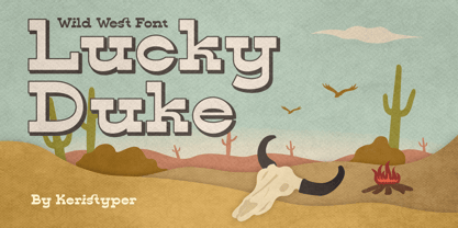 Introducing Lucky Duke font a western display typeface, inspired by cowboy wild west styles. This font is good for logo design, Social media, Movie Titles, Books Titles, short text even long text letters, and good for your secondary text font with sans or serif. **Featured:** * Standard Uppercase & Lowercase * Numeral & Punctuation * Multilingual : ä ö ü Ä Ö Ü ß ¿ ¡ * Alternate & Ligature * PUA encoded We recommend programs that support the OpenType feature and the Glyphs panel such as Adobe applications or Corel Draw. so you can use all the variations of the glyphs. Hope you enjoy our fonts!
 - Taranto by Antitype,
$11.90 Taranto was inspired by the typeface Domino by J. C. & M. Demarchi (published by Mecanorma in 1973). At its core, it follows the design language of Domino, but goes much further than its source of inspiration. (see fontsinuse.com for more info on Domino). The Taranto font family consists of 4 individual fonts (Thin, Regular, Black and Fill). Each font contains a glyph set of about 240 glyphs (Western European character set) and also contains alternates for some characters. Taranto Fill is designed as an underlay for the regular and thin cut. but also works fantastic as a very bold standalone.
