10,000 search results
(0.029 seconds)
- Branlerst by Uncurve,
$25.00 Branlerst is an aesthetic vintage typography font, inspired from the past, elegant signage, gold leaf , sign painting and old label product. Branlerst comes with alternates characters to make more eye cacthy . It is suitable for authentic logos, headings, sign painting, posters, letterhead, branding, magazines, album covers, book covers, movies, apparel design, flyers, greeting cards, product packaging, and more. You just cobine with the another font like script , serif or san serif font and adding some effect finally BOOM..!! you get a great design for your project.
 - Orange Baroon by Attype Studio,
$14.00 Orange Baroon - Inspired by typeface on 70s era, Orange Baroon has the vintage font & retro with stencil look. with 2 font style, It's super easy to use stencil effect with Orange Baroon family font. Two style Font: Regular & Display Orange Baroon is perfect for vintage & retro style product, branding, logo, invitation, stationery, product packaging, merchandise, monogram, blog design, game titles, cute style design, Book/Cover Title and more. Features : - Orange Baroon Family Font - Ligatures - Multilingual Support --- Hope you enjoy with our font! Attype Studio
 - Lets study by Jehansyah,
$9.00 Let's Study the font is this handcrafted font, with bold and round style which is very beautiful to use as a design font of choice for your project, its unique character will make this font design look very natural, there are some additions that let you make your creation more real, suitable for all designs, posters, magazines, covers, invitations, media stories, social media, novels, story books and many more, this font will support your feelings when you want to express something cheerful or enthusiastic about learning
 - Rigular Script by Gloow Studio,
$18.00 Rigular Script has inspirated from retro style and funky designs like signs and old poster. This font comes with an extra extrude to make the font look more retro/unique and save your time on making it. Font has an opentype features that allow you to modify it as you like as needed. Andala perfect for poster, logo, book covers, tshirt designs, packaging and more. Features : Uppercase Lowercase Number Punctuation Ligature Multilingual Language PUA encode Opentype Features Just enjoy with our product! Thank you
 - Reminder Notes by Sarid Ezra,
$15.00 A new handwriting font, Reminder Notes! Reminder Notes is a handwritten font that have special features. This font have ability to add the doodle/ correction line and underline in specific word. You can add the correction line for natural looks or add the underline to highlight some word. This font also including a unique lowercase and uppercase with alternates in some alphabet. You can use this font for quotes, your cover book or playing with words in your instagram post. This font also support multilingual!
 - Rocket Space by Fargun Studio,
$13.00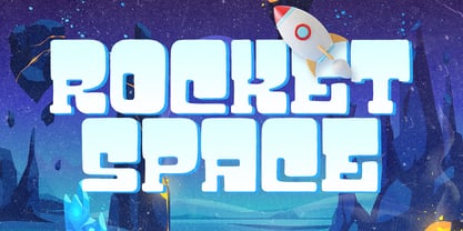 Rocket Space is unique and fun display font, It embodies playfulness and authenticity and is the perfect choice for a label, book cover, children’s book, comic, poster, banner, packaging, merchandise, logotype, and much more.
 - Bang Zoom by Midwest Type,
$29.00 Bang-Zoom! is a traditional comic book font based on lettering by award-winning illustrator and letterer Galen Showman. Its five weights and styles and smart OpenType features allow for professional comic book typesetting.
 - Section by Monotype,
$29.99The Section Bold Condensed font is patterned with lines dividing each letter into small sections. Section Bold Condensed is a headline face with uses ranging from book titles on technological subjects to embroidery books. - Pakenham by Typodermic,
$11.95 Pakenham is a typeface that truly exemplifies the transformative power of typography. Inspired by the timeless elegance of Steile Futura, a work of art by the legendary Paul Renner, Pakenham has taken the world of typography by storm with its innovative and captivating design. At its core, Pakenham is a sans-serif typeface that exudes an aura of modernity and sophistication. Its gently curved corners and generously scaled loops give it an effortlessly chic and trendy look, while its clean and sharp lines keep it rooted in the world of minimalist design. But Pakenham is not just a pretty face. It is a typeface that is brimming with oddities and anomalies that will add a unique and personal touch to your creations. Its superelliptical design is unlike anything you’ve seen before, making it perfect for designers who are looking to break free from the shackles of conventionality and embrace their creative freedom. With four different weights, two widths, italics, and special effect styles, Pakenham is a typeface that offers an unprecedented level of versatility. It is a true workhorse, capable of adapting to a wide range of design projects and styles. Overall, Pakenham is a typeface that is a must-have for any serious designer. Its combination of elegance, modernity, and versatility make it a true gem in the world of typography. So if you’re looking to take your design game to the next level, look no further than Pakenham. Most Latin-based European writing systems are supported, including the following languages. Afaan Oromo, Afar, Afrikaans, Albanian, Alsatian, Aromanian, Aymara, Bashkir (Latin), Basque, Belarusian (Latin), Bemba, Bikol, Bosnian, Breton, Cape Verdean, Creole, Catalan, Cebuano, Chamorro, Chavacano, Chichewa, Crimean Tatar (Latin), Croatian, Czech, Danish, Dawan, Dholuo, Dutch, English, Estonian, Faroese, Fijian, Filipino, Finnish, French, Frisian, Friulian, Gagauz (Latin), Galician, Ganda, Genoese, German, Greenlandic, Guadeloupean Creole, Haitian Creole, Hawaiian, Hiligaynon, Hungarian, Icelandic, Ilocano, Indonesian, Irish, Italian, Jamaican, Kaqchikel, Karakalpak (Latin), Kashubian, Kikongo, Kinyarwanda, Kirundi, Kurdish (Latin), Latvian, Lithuanian, Lombard, Low Saxon, Luxembourgish, Maasai, Makhuwa, Malay, Maltese, Māori, Moldovan, Montenegrin, Ndebele, Neapolitan, Norwegian, Novial, Occitan, Ossetian (Latin), Papiamento, Piedmontese, Polish, Portuguese, Quechua, Rarotongan, Romanian, Romansh, Sami, Sango, Saramaccan, Sardinian, Scottish Gaelic, Serbian (Latin), Shona, Sicilian, Silesian, Slovak, Slovenian, Somali, Sorbian, Sotho, Spanish, Swahili, Swazi, Swedish, Tagalog, Tahitian, Tetum, Tongan, Tshiluba, Tsonga, Tswana, Tumbuka, Turkish, Turkmen (Latin), Tuvaluan, Uzbek (Latin), Venetian, Vepsian, Võro, Walloon, Waray-Waray, Wayuu, Welsh, Wolof, Xhosa, Yapese, Zapotec Zulu and Zuni.
 - Drummer by Harvester Type,
$20.00 Drummer is a large futuristic font family inspired by the Expansion TV series, old science fiction book covers and Honda Prelude and Porsche logos. The family contains a large number of styles and a lot of language support. 54 styles, 6 in width (Ultra Condensed, Condensed, Normal, Expanded, Extra Expanded, Ultra Expanded) and 9 in weight (Thin, Extra Light, Light, Regular, Medium, Semi Bold, Bold, ExtraBold, Black). The font also has a variable version. 573 glyphs, including 40 alternate characters. A lot of work has been done on the font. The fillets on the symbols have been well worked out and tested for a better visual and practical experience. The font combines the monospacing of many characters combined with kerning, which makes it very convenient for many purposes, such as vertical typography. The font is good in all sizes, both small and large, which makes it possible to use it anywhere. Branding, logos, titles, posters, texts, covers, merch, prints, web, titles, banners, games and design in games and much more. In the near future, it is planned to add another axis of variability - the slant. Consequently, the family itself will increase. It is also planned to add a small case (capital). If you want to say something about the font or get a font in other formats, then write to the mail: bunineugene@gmail.com .
 - Berlewi FA by Fontarte,
$39.00 FA Berlewi is inspired by stencil lettering of a vanguard creator, Henryk Berlewi, who was a precursor of contemporary typography, a painter and a creator of the mechano-facture (Mechano-Faktura) theory. In 1924 he designed a poster for his mechano-facture one-man show in Warsaw Austro-Daimler car salon. An attention-grabbing composition with stencil lettering was doubtless a real innovation and according to Berlewi - the first typographic poster to be made in Poland.
 - SYN Nova by Borutta Group,
$- SYN NOVA is a digitisation project of SYN – futuristic typeface designed by Wojeciech Freudenreich, famous polish graphic designer. Our concept, besides giving it a digital form, was to expand the character set, design minuscule and opentype features for the typeface. Together with Wojciech Freudenreich we created 4 new weights. The complete family (5 styles & Variable Font Version) is distributed under open and free font license. Subsidised by the National Centre for Culture under the programme Kultura w sieci
 - Jungle Bones by Phat Phonts,
$10.00Fun font suitable for children's books. - Black Palm by Just Lett,
$17.50 Black Palm is handwritten font. Black Palm will be perfect for greeting cards, story books, posters, child books, handwritten notes, stand out brandings, and others. FEATURES: UPPERCASE lowercase Numeral and Puncuation Multilingual Accent Happy creating...
 - Scriptonite by Jonahfonts,
$30.00 A freehand OpenType face, including 20 ligatures as well as the most popular discretionary ligatures. (ft, ct and st) Usage recommendations: Posters, titles, book covers, books, greeting cards, packaging, invitations, magazine articles, titling and advertising.
 - Sky Clipper JNL by Jeff Levine,
$29.00 Sky Clipper JNL is a bold, Art Deco sans serif typeface derived from the hand lettered title on a 1940s-era “Big Little Book” entitled “Flying the Sky Clipper with Winsie Atkins”. The design is available in both regular and oblique versions. “Big Little Books” were published by the Whitman Publishing company and featured short stories printed in a tiny sized book format for young children.
 - Midkaiser by Konstantine Studio,
$19.00 Behold the allure of Midkaiser – where innovation converges with design mastery, creating an experience that transcends the ordinary. Prepare to be captivated by the future of typography! Midkaiser is not just a font; it’s a testament to visionary design. Elevate your creations with a futuristic allure that has already earned accolades across the design universe. Crafted with precision, Midkaiser boasts a seamless blend of boldness and sophistication. Empowers your brand to stand out, leaving an indelible imprint on your audience’s perception. Covers a wide variety of languages, included Vietnamese. See the details in the preview images. Ignite your creativity, transform your designs, and leave a lasting impression with Midkaiser – Your Gateway to Futuristic Tech Fonts!
 - Komunikat FA by Fontarte,
$39.00 FA Komunikat is an experimental and geometrical typeface based on simple elements: a circle, it's parts and straight lines. The typeface communicate the spirit of future, dynamism and modernity. FA Komunikat design was based on the sketch of unique lettering from 1932 made by Władysław Strzemiński, Polish vanguard abstract painter, an artist and a typographer. Strzemiński claimed that modern economic letter forms should be standardized and based on lines and arches. He wrote that readability is a matter of habit and after a practice the new letter forms would be very well readable for everyone. In 2004 Artur Frankowski revived original design creating set of characters, widen up with numerals, punctuation marks and diactrics.
 - Stettinum Nicodemus Pro Sansum by Wardziukiewicz,
$20.00 Stettinum Nicodemus Pro is a project to revitalize lettering from tenement houses in Szczecin. The project includes the digitization of letter remains from ul. Kaszubska in Szczecin to form functional fonts. The main idea of the project was to preserve the disappearing remnants of Szczecin's typographic past, which, despite the span of glyphs limited by time, can be an inspiration for many future extensions of the already established family. Stettinum Nicodemus Pro Sansum is a family of typefaces consisting of 7 variations. The block structure with a regular structure and a relatively high minuscule allows for many different applications. Versions 700, 800 and 900 are intended for titles, headings and emphasis, typefaces 300 to 600 are text typefaces.
 - Meta Link by Logofonts,
$10.00 Meta Link is Sans Serif inspired by future techno and sport great for product logo, poster, headline, card logo, web, magazine, packaging, stationery and much more. Easily creates your own logo types with font. Meta Link have 4 weight fonts with italic style also has an Open Type feature to access a large selection of unique alternative letters and many ligatures to make it easier for you to create. Meta Link can be accessed perfectly on design applications such as Adobe Illustrator, Adobe Photoshop, Corel Draw, Affinity Designer but does not rule out the possibility that it can also be accessed using web-based applications such as kittl, canva, artboard studio and others.
 - Enemy Lines by Comicraft,
$19.00 You've been shot down over enemy territory and you've managed to survive for weeks thanks to your training and instincts*... but now you're being ruthlessly pursued by MAPPO's footsoldiers... The ELEPHANTMEN! Will your commanding officer go against orders in an attempt to rescue you or will his mission be abruptly aborted, stranding you behind ENEMY LINES? In order to survive, you may have to betray your own rebel forces, your allies and the entire free world! The future of mankind hangs in the balance! Failure is not an option! Bummer. *This font's modus operandi bears no relation to the story of any other font that may have been shot down behind enemy lines, real or imagined.
 - Spellcaster by Comicraft,
$19.00 Raven hair and ruby lips, it may have been a trick of the light but I'm sure sparks flew from her fingertips. I definitely heard echoed voices in the night, of a restless spirit on an endless flight. If I remember correctly she held me spellbound in the night, with dancing shadows and firelight. Yes, I think I did see a crystal ball on the table, showing the future, the past and I did drink the potion she offered me, when I really should have gotten out of there fast. And that's my story and I'm sticking to it, your honor. It was that girl with the white hair, I'm telling you. She has my wallet too.
 - Stalemate Pro by MAC Rhino Fonts,
$49.00 A clean sans serif, originally constructed as a proprietary font for a German IT-company. From the beginning it was designed to work both in print and on screen and experience shows that it performs well in both environments. First released as a commercial typeface with GarageFonts in 2002 and later with the Fountain Type Foundry (2004). During 2007-08 the family was expanded and upgraded into a full OpenType Pro package. The company Jura have since long used Stalemate as part of thier corporate identity. They have also licensed special versions with full support for Greek and Cyrillic languages. This will be available as a commercial option in the near future.
 - Areon Flux by DePlictis Types,
$33.00 The future is right here, today, and Areon Flux comes to point that out. It’s a font family consisting in three weights that makes it a notable choice for designers that have to do with techy, futuristic layouts or printing materials. The lettering design appeal as sharp, powerful, distinctive and kind of modular, remembering the upcoming space exploration opportunities that are ready to enlarge our horizons in the next years. Areon Flux family is designed and published in late ‘20/ early ’21 and has an established discount for more that 30% for all the weights buyed together that makes it a versatile fresh and modern display not to be missed by edgy designers.
 - Discolicious by Hanoded,
$15.00 Put the needle in the groove and jive baby! Discolicious brings back the golden age of moustaches and sideburns, psychedelic tie-dyes and bell bottoms. Use this ‘bubblegum’ disco font for your product packaging, magazines and party posters and they’ll look off the hook! Comes with a primo amount of diacritics, so you can let it all hang out! Word!
 - Unlikely by PizzaDude.dk,
$20.00 This all started as a bunch of letter written using a squared paper as a guide. It all turned out fine, but there was something that wasn't quite right...it was boring! I took all the letters and grunge it all up and did all the drips as well - and suddenly that boring look was gone! That was an unlikely development!
 - Masculin by Graphicfresh,
$12.00 This font took a long time to create, because we spent a lot of time thinking about how to produce an original and real-looking signature font. As a result, we created Masculin! This real signature font is a clean script and has unique character! It's perfect for logos, name cards, magazine layouts, invitations, headers, or even large-scale artwork.
 - Santiago by Hipfonts,
$22.00 Santiago is a gorgeous handmade typeface. Each letter was decorated by hand. It took weeks to get everything right and looking beautiful. You can use Santiago for Mexican themed logos, restaurants, menus, business cards, posters, flyers, invitations, greeting card, advertising, apparel, magazines, etc. The possibilities are endless. If you're in need of a decorative Mexican culture typeface, then Santiago is for you!
 - Brookside JNL by Jeff Levine,
$29.00 The 1920s were part of an era in songwriting where snappy wordplay and clever (if not long) titles prevailed. The lettering on one such piece of sheet music with the song title "In A Shady Nook by A Babbling Brook" offered up a bold, condensed sans serif design which is now available digitally as Brookside JNL. Available in both regular and oblique versions.
 - Vivala Line by Johannes Hoffmann,
$16.00 Vivala Line is a real italic, and it was inspired by old Polish children's books with its charming hand drawn lettering titles. Fields of application are posters, magazines, packaging design, books, corporate design up to consolidating reading.
 - The Futurex Slab font, crafted by the innovative team at Apostrophic Labs, is a distinctive typeface that bridges the gap between the future-oriented aesthetics of the digital age and the robust, gro...
- Hamis Pro by Fo Da,
$9.00 Hamis Pro is a display font of 12 weights: Regular, Shadow, Solid, Book, Book Shadow, Book Solid & Italics. Hamis Pro is an advanced typographical support with features such as ligatures, case-sensitive forms, fractions, super and subscript characters, and stylistic alternates. It's ideally suited for advertising and packaging, festive occasions, editorial and publishing, logo, branding and creative industries, posters and billboards as well as web and screen design.
 - Buddy Slender by Hackberry Font Foundry,
$24.95 Buddy Slender is the narrower version of the companion sans for Contenu, the book font family designed for a book on book family design called Practical Font Design. It's a loose, free, easy to read sans, so when my wife suggested Buddy, it clicked. This is the 2-font Buddy Slender family of Regular & Bold. I made a new more limited feature set for these fonts due to their designed usage.
 - Kiddie Stencil JNL by Jeff Levine,
$29.00 At one time, the Hampton Publishing Company of New York specialized in producing reading and activity books for children. The “Letters and Numbers Stencil Book” (probably from the late 1940s or early 1950s) was the basis for Kiddie Stencil JNL. This bold sans serif type style replicates the handmade steel rule dies used for cutting the stencil pages of the book, and is available in both regular and oblique versions.
 - Neuzeit Office by Linotype,
$50.99 The Neuzeit Office family is designed after the model of the original sans serif family Neuzeit S™ , which was produced by D. Stempel AG and the Linotype Design Studio in 1966. Neuzeit S itself was a redesign of D. Stempel AG’s DIN Neuzeit, created by Wilhelm Pischner between 1928 and 1939. Intended to represent its own time, DIN Neuzeit must have struck a harmonious chord. DIN Neuzeit is a constructed, geometric sans serif. It was born during the 1920s, a time of design experimentation and standardization, whose ethos has been made famous by the Bauhaus and De Stijl movements in art, architecture, and design. Upon its redesign as Neuzeit S in the 1960s, other developments in sans serif letter design were taken into account. Neuzeit S looks less geometric, and more gothic, or industrial. Separating it from typefaces like Futura, it has a double-storey a, instead of a less legible, single-storey variant. Unlike more popular grotesque sans serifs like Helvetica, Neuzeit S and especially the redesigned Neuzeit Office contain more open, legible letterforms. Neuzeit Office preserves the characteristic number forms that have been associated with its design for years. After four decades, Neuzeit has been retooled once again, and it is more a child of its age than ever before. Akira Kobayashi, Linotype’s Type Director, created the revised and updated Neuzeit Office in 2006. His greatest change was to retool the design to make its performance in text far more optimal. Additionally, he created companion oblique to help emphasize text.
 - ITC Kabel by ITC,
$40.99 The first cuts of Kabel appeared in 1927, released by the German foundry Gebr. Klingspor. Like many of the typefaces that Rudolf Koch designed for printing use, Kabel is a carefully constructed and drawn. The basic forms were influenced by the Ancient Roman stone-carved letters, which consisted of just a few pure and clear geometric forms, such as circles, squares, and triangles. Koch also infused Kabel with some elements of Art Deco, making it appear quite different from other geometric modernist typefaces from the 1920s, like Futura. Linotype has two versions of Kabel in its library. Kabel has a shorter x-height, with longer ascenders and descenders, making it a bit truer to Koch's original design than the second version, ITC Kabel, which was designed by Victor Caruso. This version, also known in the United States as Cable, has a larger x-height, shorter ascenders and descenders, more weights ,and a diamond shaped i-dot. Typefaces in the same oeuvre include Avenir Next, ITC Avant Garde Gothic, Metrolite, Metromedium, Metroblack, and Erbar, just to name just a few."
 - Newspoint by Elsner+Flake,
$35.00 The design of the Newspoint typeface is based on the tradition of the American sans serif faces of the last century. This form expression was greatly influenced by the News Gothic type which was created by Morris Fuller Benton in 1908, and has, once again, become very popular. When the development of sans serif types such as Futura and Kabel by Renner and Koch began in 1925, the design of American sans serif types receded somewhat into the background. In the 1950’s, however, they experienced a renaissance which continues to this day. Thanks to its clean design and the relatively large x-height, the Newspoint is well suited for informative texts in newspapers, magazines, and brochures. In packaging design, as well, the Newspoint can display its strength in small print. Newspoint was developed as a customer-specific variation of the News Gothic. In contrast to the News Gothic, however, the face appears to be softer and more appealing thanks to the changed interpunctions. If so desired, the alternative characters give the typeface expanded individuality and a richness of design options.
 - Core Sans CR by S-Core,
$20.00 Core Sans CR family is a rounded version of Core Sans C; a part of the Core Sans Series, such as Core Sans N, Core Sans M, Core Sans E, Core Sans A, Core Sans D, Core Sans G, Core Sans R and Core Sans B. Core Sans CR is inspired by classic geometric sans (Futura, Avenir, Avant Garde etc.). It is based on geometric shapes, like near-perfect circle and square. It has a much higher x-height (height of lowercase letters), an effect which promotes readability especially at small print sizes. The Core Sans C Family consists of 9 weights (Thin, Extra Light, Light, Regular, Medium, Bold, Extra Bold, Heavy, Black) and Italics for each format. Core Sans C supports complete Basic Latin, Cyrillic, Central European, Turkish, Baltic character sets. Each font includes proportional figures, tabular figures, oldstyle figures, numerators, denominators, superscript, scientific inferiors, subscript, fractions and case features. Core Sans C is an ideal font family for use in magazines, web pages, screens, displays, and so on.
 - New Daily by URW Type Foundry,
$39.99 Marit Otto about New Daily: This typeface design has a modern but yet classic appearance. That is why she listens to the name New Daily. I took some elements from the Art Nouveau and Art Deco (type) styles. And modernized it by cultivating the beautiful curved features of both styles and playing with the stylish fluid lines and open structures. By adding a bit of the no-nonsense office look of a typeface like Nimbus Sans a new but familiar look occurs. This typeface is very readable and useful for many purposes. It has a playful distinguished character.
 - Steel Grrrder Script by ULGA Type,
$9.00 Steel Grrrder is an industrial-style joining script with a stencil effect, available in six weights ranging from Light to Black. Great for all kinds of display purposes including posters, film titles, book covers, magazines, advertising, signage, packaging, logos and tanks, this is a script with a sharp personality and a steely presence. However, if you’re searching for a “nice” script - sorry, bud - you’re looking in the wrong place. Steel Grrrder Script doesn’t entice the reader with voluptuous curves, flowing swashes or frisky letterforms, instead its sharp chiselled features compel the reader to pay attention. Characters muscle their way along like robotic bulldogs in steel-toe cap boots. Steel Grrrder Script is a veritable slab fest, best categorised as a constructivist joining script. Forged from carbon steel and wrapped in a layer of Graphene, this is a robust display typeface family able to withstand even the most demanding typographical situations. The Steel Grrrrder extended family also includes a six-weight sans-serif with corresponding italics and two display fonts, Groove & Nutjob - all designed to work with each other.