10,000 search results
(0.315 seconds)
- Stacked Letter by Putracetol,
$20.00 Stacked Letter – Display Font a bold, quirky display font with a fun, trendy street style vibe. Stacked Letter was hand-drawn, making its outlines somewhat irregular and quirky. It has an almost hand-lettered look; the characters jump around the baseline giving it a charming but urban look and feel. Stacked Letter suitables from posters designs to t-shirts and packaging, Stacked Letter will give your designs that alternative look and make your creative work look amazing. With a Stacked Letter , it will be very suitable for your project, which is related to fun, trendy street style vibe. Such as story books, illustrations, comic books, t-shirts, posters, greeting cards, logos, branding, stickers, svg, crafting. The alternative characters were divided into several Open Type features such as Swash, Stylistic Sets, Stylistic Alternates, Contextual Alternates, and Ligature. The Open Type features can be accessed by using Open Type savvy programs such as Adobe Illustrator, Adobe InDesign, Adobe Photoshop Corel Draw X version, And Microsoft Word. This font is also support multi language.
 - Ulga Grid Solid by ULGA Type,
$19.00 ULGA Grid Solid is the sharp, blockier sibling of ULGA Grid and ULGA Grid Rounded. The typeface consists of three weights, regular, medium and bold, with corresponding oblique styles. Every character in the extended ULGA Grid family shares the same width. Forged from a box full of ninja throwing stars – props from the now-forgotten 1976 Japanese film, Gridzilla, Revenge of King Gridorah – the solid shapes and sharp, chamfered corners give the characters a hard, cut-from-metal feel. A versatile display typeface that can be used for a wide range of purposes including CD covers, posters, packaging, advertising, nameplates for tractors, brochures and film titles. Mix and match with ULGA Grid and ULGA Grid Rounded, use the alternatives, sneak in an oblique style to spice things up, but most of all this is a fun typeface family. But, please, don’t use the characters as throwing stars. That’s just dangerous, someone will get hurt and you’ll regret it. The character set supports Western Europe, Vietnamese, Central/Eastern Europe, Baltic, Turkish and Romanian.
 - Jojo by Canada Type,
$24.95 A little more flower and a little less power, please. Fun, friendly, fashionable, and feminine to a fault, Jojo takes display typography to a whole new level, where eyes can’t help but appreciate the day and the design at hand. It takes a graphic designer very little imagination to see these letters on posters, book covers, clothes, and craft paraphernalia. Or how about a sign over a bakery? A music sleeve? A romantic comedy titling? Cosmetics products? Pretty much anywhere! Jojo takes its name from a Beatles song about getting back to where we once belonged. It also takes most of its shapes from vintage photo-setting days, when an art nouveau typeface called Spring, by B. Jacquet, was putting happy times back where they belonged, which was everywhere. The original photo-setting face came in just 26 letters and 10 numerals. This digital retooling optimizes the original forms and expands on them, for a full character set of over 430 glyphs, including ligatures and stylistic alternates, and support for the majority of Latin languages.
 - Clearstone by Nathatype,
$29.00 Your corporate design project is one of the factor of the business where you can attract the customers and get their first impression. Make the moment count by making it as stand out as your business. With Clearstone, you can showcase a delightful yet fancy viewing experience that may powerfully highlight your values and communicate well with your customers. Clearstone is a script font that resembles the actual handwriting style. This font is elegant, readable, and has a timeless quality that never goes out of style. Furthermore, this awesome font has fascinating features that allows you maximize your design. Features: Stylistic Sets Ligatures Multilingual Supports Numerals and Punctuations PUA Encoded It is perfect to be used for many design projects, such as poster, logo, book cover, branding, heading, printed product, merchandise, quotes, social media campaign, etc. Learn more about how to use it by seeing the font preview. Thank you for purchasing our fonts. Please don’t hesitate to contact us, if you have any further question or issues. We’re happy to help. Happy Designing.
 - Arlonne Sans Pro by Sacha Rein,
$27.84 Arlonne Sans Pro was conceived by Sacha Rein between 2015 and 2019 with a comfortable reading experience in mind. It's a humanist sans with neoclassical influences. Arlonne is a comprehensive font family with four weights and matching italics. It has a character set of about 1800 glyphs, including extended latin, small capitals, Cyrillic (with Bulgarian, Serbian, Macedonian and Ukrainian) and Greek (with Archaic and Polytonic), math symbols, figure styles and automatic fractions, ligatures, stylistic alternates and many more OpenType features. The goal was to achieve simplicity without sacrificing personality. The generous x-height and the contrast of strokes are increasing as the font gets bolder, resulting in relatively open counters even at the heaviest weight. This makes the font especially suitable for body text, even though the carefully designed characters work well for display purposes. The name Arlonne is derived from the small city of Arlon, a Walloon municipality of Belgium located in and capital of the province of Luxembourg. Spacing and kerning have been taken care of by Igino Marini's amazing iKern service.
 - Cinefile by Eurotypo,
$22.00 The 50’s were the golden years for cinema and consequently also for the artists who lettered on the posters. Cinefile is a brushed disconnected script included in a family font that evokes the soul of that vintage brush but with a modern touch. The main characteristics of Cinefile are soft and rounded shapes and a very high x-height, clean and easy to read. Cinefile Family includes 3 fonts: Cinefile, a very versatile script font with initial forms, and a generous complement of alternate characters, ligatures, ordinals, Cinefile Slab Serif and Cinefil Ornaments that combine perfectly and give you many options to your designs. Remember that to access to all additional characters, you must use software that is truly compatible with OpenType, such as Adobe CS applications, or we recommend using the Glyphs palette. Cinefile is a friendly and fluid family font that adapts well to titles, packages, invitations, greeting cards, magazines and book covers, children's material, fashion, logos and, posters and wherever you need a fun and sympathetic display font.
 - Rolanstine by MJB Letters,
$16.00 Rolanstine is an authentic handwritten font with the strength of character in each letter so it is suitable for logos, signatures, branding designs, watermarks, posters, wedding designs and many more. I highly recommend using a program that supports OpenType features and Glyphs panels such as Adobe Illustrator, Adobe Photoshop CC, Adobe InDesign, or CorelDraw, so you can see and access all Glyph variations. This font is encoded with Unicode PUA, which allows full access to all additional characters without having special design software. Mac users can use Font Book, and Windows users can use Character Map to view and copy one of the extra characters to paste into your favorite text editor/application. PUA Encoded Characters - Fully accessible without additional design software How to access alternate glyphs? You can see it on this link: https://helpx.adobe.com/illustrator/using/special-characters.html We really hope you enjoy it. Please don't hesitate to drop us a message if you have any issues or queries send me a PM. Thanks for purchasing and have fun!
 - Delphi by Positype,
$22.00 Delphi grew from a logotype Lily Feinberg produced using Greek-column-inspired letterforms. As that concept expanded to include more and more letters, the typeface had its beginnings. Intertwined, kinetic, and deliberate, Delphi carves itself onto the page and screen, encouraging variation and experimentation. The letterforms’ unique construction and predispostion for experimentation inspired two varying sets: Delphi Dio, comprised of two-line strokes, and Delphi Tria, built of both 2- and 3-line strokes. With a design as elaborate, yet tightly tuned as this, the desire to add more and more was irresistible—you'll see a number of stylistic, swash, and titling alternates (and even more hidden away in further stylistic sets). Because Dio and Tria could only hold so much, alternate cuts were produced to better organize your options: the Delphi Alt fonts feature certain letter styles and stylistic alternate sets distinct from those in Delphi. Delphi’s sophisticated, striking letterforms make it an ideal display face for use at large sizes, and with so many unique details and alternate letterforms, it’s simply fun to use.
 - Liesel by Magpie Paper Works,
$26.00 What happens when historical calligraphy and modern lettering kiss? Liesel! This six-font, hand-lettered family is loosely based on traditional letterforms. Used alone, Liesel Regular reflects a warm, antique aesthetic. But when you pair her with Brush, Pencil, and Shadow - all of which were designed for layering - a modern, artistic look emerges! Experiment with textures, overlays and blending modes to create realistic water colored text. Both Liesel Printed & Liesel Shadow Printed are highly detailed, distressed versions of their solid counterparts, and can be layered to recreate an authentic letterpress or screen printed effect. Opentype features programmed into each text font include contextual alternates, stylistic alternates, swashes, true fractions, and old style numerals. Each Liesel font features PUA coding so all characters, including swashes and alternates, can be accessed with Character Viewer (Mac), Character Map (PC) or PopChar. For more information, including a complete PUA code listing, please review our user guide. We recommend pairing Liesel with Quimbly. Please note: because its outlines are complex & highly detailed, Liesel Printed and Liesel Printed Shadow may process slowly in some applications.
 - 1499 Alde Manuce Pro by GLC,
$42.00 This family was inspired by the beautiful roman font used by Aldus Manutius in Venice (1499) to print for the first time Hypnerotomachia Poliphili..., the well known book attributed to Francesco Colonna. Francesco Griffo was the punchcutter. The present font contains all of the specific latin abbreviations and other ligatures used in the original. The Italic style, carved by Francesco Colonna, the so called "Aldine" style, was inspired from various documents, all printed with this first Italic font. We offer the complete set of ligatures (about 60) we have been able to find, contained in the original font. In the two styles, we have made differences between I and J, V and U, to make easier a modern use. Added are the accented characters and a few others not in use in this early period of printing. The Italic style may be used as a complement to our 1470 Jenson Latin. The font contains all characters for West European (including Celtic), Baltic, East and Central European and Turkish language.
 - Oz Handicraft BT WGL by Bitstream,
$50.99Oswald Cooper is best known for his emblematic Cooper Black™ typeface. Although he was responsible for several other fonts of roman design, Cooper never drew a sans serif typeface. But that didn’t stop George Ryan from creating one. Ryan saw a sans serif example of Cooper’s lettering in an old book and decided that it deserved to be made into a typeface. Ryan’s initial plan was to make a single-weight typeface that closely matched the slender and condensed proportions of the original lettering. While the resulting Oz Handicraft™ typeface proved to be very popular, Ryan was not satisfied with the limited offering. So, between other projects – and over many years – Ryan worked on expanding the design’s range. The completed family includes light, semi bold and bold weights to complement the original design, plus a matching suite of four “wide” designs, which are closer to normal proportions. Fonts of Oz Handicraft include a Pan-European character set that supports most Central European and many Eastern European languages. - Mestora by Skinny Type,
$18.00 Mestora is a classic and elegant retro serif with a modern twist. With its decent readability, Mestora is perfect for both display as well as body text. Inspired by all the retro aesthetics making a comeback, Mestora is perfectly suitable for creating nostalgic yet still clean and elegant designs such as logos, packaging, editorial, and more. Mestora FEATURE: Europeans languages Alternates Uppercase & Lowercase Ligatures SOFTWARE REQUIREMENTS: The regular fonts in the pack are widely supported by most software - To get the full functionality of the large selection of standard ligatures (custom connected letters) in the script font, any software that can read OpenType fonts will do. To generate all ligatures, please open Adobe Ilustrator - Type - Glyphs. Please drop me a message if you have trouble regarding either installing or using this font. 🌟While using this product, if you encounter any problem or spot something we may have missed, please don't hesitate to drop us a message. We'd love to hear your feedback in order to further fine-tune our products. Thank you! Skinny Type
 - Action Hero by Wing's Art Studio,
$10.00 Action Hero - A grungy, textured brush font for action packed movie posters and titles. Action Hero is a hand-drawn brush font inspired by action movie posters of the 1980s and 90s. Does your movie feature a hostage situation on a speeding bus or train? Try Action Hero. How about a one man army tasked with rescuing stranded POWs? Try Action Hero! Maybe a post-apocalyptic race across the desert, or did they dare to kill your favourite second cousin? Big mistake - Get Action Hero!!! The Action Hero font family collects four all-cap variants featuring a complete set of uppercase and lowercase characters, along with numerals, punctuation, language support and underlines. With so many creative options you'll never have to repeat characters (a personal bugbear with hand-drawn fonts) and achieve authentic hand-drawn looking title designs. Check out the visuals for ideas and tips on how to use this font on posters, movie titles, product packaging, broadcast and advertising. With countless creative options and a design that explodes off the screen, this is the last action hero font you'll ever need!
 - Garota Sans SC - Personal use only

- Wilhelm Klingspor Schrift by Alter Littera,
$25.00 A comprehensive and faithful rendition of one of the finest metal typefaces of the 20th century. Rudolf Koch designed Wilhelm Klingspor Schrift (initially conceived as “Missal Schrift”, and later referred to also as “Wilhelm Klingspor Gotisch”) between 1919 and 1925 for the Gebr. Klingspor Type Foundry in Offenbach am Main. It is an impressive textura typeface, being sharp, elegant, spiky, sensitive and noble at the same time. Some of its most notable features have to do with the delicate decorations, the thin but subtly swelling lines that parallel or bridge strokes in the capitals, the hairline endings that terminate each stroke in both the capitals and the lowercase letters, the subtle joining of hairlines to thicker strokes, and the tension of some of the transitional curves. Koch’s original design included two sets of capitals (normal and condensed); alternates for a, d, e, r, s and z, plus long s; short and long flourished finial forms for f and t; thirty-five ligatures; and eighteen decorative pieces (Zierstücke). All of these features, plus several additional ones for modern use (including the usual standard characters for typesetting in modern Western languages, additional alternates and ligatures, plus carefully coded Opentype features), have been thoroughly implemented to the highest and most lively level of detail in the present font, in the hope that the past greatness of Wilhelm Klingspor Schrift will finally step into the modern OpenType realm. The main sources used during the font design process were several pages from a specimen book issued by the Gebr. Klingspor Type Foundry in 1927. Other sources were as follows: Bain, P., and Shaw, P. (Eds.) (1998), Blackletter: Type and National Identity, New York: Princeton Architectural Press (p. 43); Hendlmeier, W. (1994), Kunstwerke der Schrift, Hannover: Bund für Deutsche Schrift und Sprache (pp. 56-7); Kapr, A. (1983), Schriftkunst, Dresden: VEB Verlag der Kunst (p. 453); Kapr, A. (1993), Fraktur - Form und Geschichte der gebrochenen Schriften, Mainz: Verlag Hermann Schmidt (pp. 124-5); and Klingspor, K. (1949), Über Schönheit von Schrift und Druck, Frankfurt am Main: Georg Kurt Schauer (pp. 136-7). Some public and private comments by renowned designer and design historian Paul Shaw have also influenced both the design and the description of the present font. Specimen, detailed character map, OpenType features, and font samples available at Alter Littera’s The Oldtype “Wilhelm Klingspor Schrift” Font Page.
 - Aphrodite Slim by Typesenses,
$57.00 Aphrodite Slim Pro is not just a lighter version of its sister Aphrodite Pro. Aphrodite Slim Pro has duplicated the quantity of characters of its partner, and that means more than 500 new glyphs, reaching a total of more than 1000. More delicate and meticulous, Aphrodite Slim Pro is once more a new typography with deep calligraphic ideals: We immersed ourselves into the world of each calligraphy ductus and each calligraphy masters by studying from decoration to lettering books. This was the key for the logic of Aphrodite Slim’s behavior. The new concept of Aphrodite Slim Pro was to join diverse styles of calligraphy in one in order to achieve an autonomous expressiveness, in fact, this is what calligraphy aims to, and we agreed to bring those ideals to the world of typography: It is justifiable to be inspired in hundred-year-old calligraphies, but it is even better if the results you obtain have a plus. A personal plus. During the creation process we were wondering whether it was possible to mix certain strokes of such rigid styles as uncial, (Li·n’s favourite style), with strokes of the copperplate, (Sav’s favourite style), and also to take and mix cualities of cancelleresca cursiva, formata and moderna; finally giving our creation a roman-transition italic look. So Aphrodite Slim takes ideals and aspects from those formal styles, following its own logic though, and emphasizing the fact of being a decorative typography. Calligraphy masters of our past are who we are in debt with. They are the cause we have lovely letters now. They have been spontaneous at the moment of creation, what differs from the type-designers of nowadays, whose spontaneity is more limited. Digital faces that we are used to see these days are a result of long hours of optical adjustments, grids, macros and inspirations of other existing typography, but without personal contributions. Aphrodite Slim wants to refute this. Its mission is to rescue de spontaneity of the artesanal lettering in order to obtain unique words; those which only calligraphy masters of our past or lettering artists of our present could give us. We have worked hard to achieve this, making Aphrodite the most universal font we could: It was necessary to study the most common words, focalizing more in the ones referring to “sensitivity”, of four of the most spoken languages in the world. Aphrodite Slim has an enormous quantity of decorative characters and special ligatures for phrases and words in English, French, Spanish and German. (See English, Français, Español, Deutsch PDF in the gallery section). We promise there is no existing type that decorates/ligates glyphs and words like Aphrodite Slim does: It is the first time a font like this really considers its purpose. -The way glyphs are ligated is insane- : Aphrodite Slim rescues some ideals of persons like Jan van den Velde (Italian cancilleresca writing of XVI Century) who understands ascenders and descenders as possibilities to beautify the lines of writing with curved strokes that seem to be dancing above and below of the words. This master also creates ascenders and descenders even where they are not necessary, on letters that do not actually need them: Aphrodite Slim takes this ideal. The font counts with a wide range of glyphs that seem not to be satisfied with its more primitive form and prefer to extreme their parts to be decorative. It also existed masters of calligraphy like José de Casanova of XVII Century, who, with a magnificant skill and a really personal mark, had the particularity of ligating words that were actually separated with spaces. This is another innovative feature in Aphrodite Slim. An investigation of the most common beginnings and endings words of the English language was done. Having that feature activated (discretionary ligatures), common words will start to ligate or to be decorated even when they are separated by spaces. Impossible to forget Francesco Periccioli of XVII Century and our experience us designers to face with works of him: His letters, that today are included in the group of cancellerescas modernas, have been a direct inspiration to the oldstyle figures and historical forms variables in Aphrodite Slim. Giovanni Antonio Tagliente (XVI Century) and his particular way of making tails and diagonals longer than usual, qualities that our creation reflects too. Finally, our adventures in Biblioteca Nacional and Barrio San Telmo, Buenos Aires, were essential for us to make Aphrodite Slim more complete and interesting: Sav did an excellent work when studying how the decorative miscellanea and swirls of early XX century were. She also investigated what particularities made those roman titling characters look antique so she could rescue some ideals for the oldstyle figures and historical forms variables. This also leaded her to create the ornaments variable in Aphrodite Slim. We are really proud of presenting Aphrodite Slim Pro, a typography that was the result of days and nights of working hard, because we do love what we do; and we are glad we are living in a present that gives us the possibility to spread this kind of art, because that is the way we consider our job: Aphrodite Slim Pro is Art. Hope you can appreciate the enormous work this type has. Features. Aphrodite Slim Pro is the most complete variable. It includes more than 1000 glyphs. Thanks to the Open-Type programming, it counts with a easy way to change/alternate glyphs if the application in which the font is used supports this. The variables contained in Aphrodite Slim Pro are also offered separately. Aphrodite Slim Text: It is the variable for lines and paragraphs. Thus it is the least ornamental and the most accurate to achieve a satisfying legibility. It has the Standard Ligatures feature in order to improve the possible conflicts some glyphs could have by others. Aphrodite Slim Contextual: It is the one that makes emphasis in decorating. It has the particularity of ligating/decorating words of common use in English, French, Spanish and German. It also has the quality of ligating common beginnings and endings of the common words in English. Aphrodite Slim Stylistic: With similar features of Slim Contextual. It includes a set of decorative numbers for a display use. Aphrodite Slim Swash: This one has special beginnings and endings to decorate words. Aphrodite Slim Endings: It makes words look as a signature. Aphrodite Slim Historical: It adds an antique look to the written word. It also has the special historical ligature function. Aphrodite Slim Titling: This one is the most decorative. Its copperplate inspired ornaments give words a special color, in order to handle the quantity of decoration, it comes with the standard ligature feature, which has the most common ligatures plus others that make decorative swirls not to be conflictive. Aphrodite Slim Ornaments: A set of 52 ornaments. Aphrodite Slim Pro includes all this features plus the Stylistic Set 1; Stylistic Set 2 and the possibility of Slashed Zero. We recommend you to check out the gallery in order to see all these features in action.
 - Boxer Punch by Putracetol,
$28.00 Boxer Punch - Soft Bold Font Boxer Punch - Soft Bold Font is a stylish and modern font designed to catch the attention of your audience. The font's unique design combines a soft bold shape with a cute sans serif, making it perfect for creating eye-catching designs. The idea behind creating Boxer Punch was to incorporate the concept of understated realism into the font. This is evident in the font's smooth and elegant lines, which make it perfect for a variety of design projects. The font is ideal for those looking to create a professional touch in their designs, while also maintaining a stylish and modern feel. Boxer Punch is an excellent choice for anyone looking for a font that is versatile and can be used in a variety of different contexts. It is perfect for sports-themed work projects, as well as branding, packaging, logo design, album covers, posters, and social media graphics. One of the standout features of Boxer Punch is its versatile OpenType features, including alternates and ligatures, which allow for even more creative freedom when designing with the font. Additionally, the font comes with uppercase and lowercase characters, as well as support for multilanguage, numbers, punctuation, and symbols. Inside the font package, you'll find three different file formats: Boxer Punch otf, Boxer Punch ttf, and Boxer Punch woff. This means that no matter what platform you are using, Boxer Punch will work seamlessly with your software. Boxer Punch is a font that is sure to make your designs stand out from the crowd. Its unique design and versatile features make it perfect for anyone looking to add a touch of elegance and style to their work. If you're looking for a stylish and modern font that is perfect for sports-themed work projects or a variety of other design projects, then Boxer Punch is the font for you. In summary, Boxer Punch - Soft Bold Font is a versatile and modern font that combines a soft bold shape with a cute sans serif to create a unique and stylish design. With its versatile OpenType features, multilanguage support, and uppercase and lowercase characters, Boxer Punch is perfect for a wide range of design projects.
 - Pupcat by Typodermic,
$11.95 Introducing Pupcat, the typeface that will take your design game to the next level. This display font is not your ordinary font. Inspired by the iconic movie posters of the 1960s, Pupcat’s unicase design is the perfect blend of whimsy and sophistication. With its unorthodox design, Pupcat will add a playful touch to any message you want to convey. Its flared strokes add an element of drama that will capture the attention of your audience. Plus, with its four weights and italics, you can create a hierarchy of text that is both visually pleasing and easy to read. Whether you’re working on a magazine spread, a movie poster, or a branding project, Pupcat is the perfect typeface for those who want to stand out. Its versatility and unique design make it an excellent choice for any project that requires a touch of creativity and fun. So, what are you waiting for? Get your hands on Pupcat and let your imagination run wild. With this typeface, your designs will never be boring again. Trust us, Pupcat is the missing piece you didn’t know you needed. Most Latin-based European writing systems are supported, including the following languages. Afaan Oromo, Afar, Afrikaans, Albanian, Alsatian, Aromanian, Aymara, Bashkir (Latin), Basque, Belarusian (Latin), Bemba, Bikol, Bosnian, Breton, Cape Verdean, Creole, Catalan, Cebuano, Chamorro, Chavacano, Chichewa, Crimean Tatar (Latin), Croatian, Czech, Danish, Dawan, Dholuo, Dutch, English, Estonian, Faroese, Fijian, Filipino, Finnish, French, Frisian, Friulian, Gagauz (Latin), Galician, Ganda, Genoese, German, Greenlandic, Guadeloupean Creole, Haitian Creole, Hawaiian, Hiligaynon, Hungarian, Icelandic, Ilocano, Indonesian, Irish, Italian, Jamaican, Kaqchikel, Karakalpak (Latin), Kashubian, Kikongo, Kinyarwanda, Kirundi, Kurdish (Latin), Latvian, Lithuanian, Lombard, Low Saxon, Luxembourgish, Maasai, Makhuwa, Malay, Maltese, Māori, Moldovan, Montenegrin, Ndebele, Neapolitan, Norwegian, Novial, Occitan, Ossetian (Latin), Papiamento, Piedmontese, Polish, Portuguese, Quechua, Rarotongan, Romanian, Romansh, Sami, Sango, Saramaccan, Sardinian, Scottish Gaelic, Serbian (Latin), Shona, Sicilian, Silesian, Slovak, Slovenian, Somali, Sorbian, Sotho, Spanish, Swahili, Swazi, Swedish, Tagalog, Tahitian, Tetum, Tongan, Tshiluba, Tsonga, Tswana, Tumbuka, Turkish, Turkmen (Latin), Tuvaluan, Uzbek (Latin), Venetian, Vepsian, Võro, Walloon, Waray-Waray, Wayuu, Welsh, Wolof, Xhosa, Yapese, Zapotec Zulu and Zuni.
 - Royal Avenue by Prestigetype Studio,
$21.00 Introducing Royal Avenue, a display serif font that exudes the sophistication and fancy feels you're looking for. Each is carefully character crafted with a unique touch. It's versatility and stylish appearance make it an excellent choice for any project, from logos and branding to packaging and social media graphics. Royal Avenue is the perfect choice for any project. With multilingual support, ligatures, and an extensive alternate feature set, this font allows for freedom to explore and experiment with different variations, adding a unique touch to your designs and making them truly one-of-a-kind. It enables greater flexibility and creativity in your design work. This font is perfect for catching your audience's attention and is ideal for any design project that requires a touch of elegance and style, making it a must-have for any designer or creative. We recommend using it for titles, headlines, and other attention-grabbing elements. To get the most out of Royal Avenue, we recommend using programs that support OpenType features and Glyphs panels, such as Adobe apps and Corel Draw. This will enable you to access all the glyphs and variations of the font and make your design projects truly unique. We hope you enjoy using Royal Avenue as much as we enjoyed creating it. For any questions or inquiries, please email us at info@prestigetype.com. Get your hands on Royal Avenue today and elevate your design projects to new heights.
 - Boardwalk Avenue by Fenotype,
$30.00 Boardwalk Avenue is an elegant type collection of three styles and two weights of each. It’s divided into Boardwalk Pen, Boardwalk Antiqua and Boardwalk Serif. Boardwalk Avenue’s core is a connected mono linear script that works fantastic when paired with either of the impressive serif styles. All the fonts work great on their own but try putting them all together for a complete display font setup for a project. Here’s a short introduction on what’s included: Boardwalk Avenue Pen is a connected Script. It’s great for headlines, quotes or in packaging. It has a casual hand drawn vibe to it but it’s clean and legible. It’s equipped with automatic Contextual Alternates that keep the connections smooth and versatile. For instance when you type double letter another of them will automatically change to add variation. Or if you type “i” for example, as a first letter after space or after capital letter the code will add starting point to the letter to keep the letterforms more balanced. If you need more ambitious letterforms you can try Swash or Titling Alternates -there’s alternates for every standard letter and seek for even more alternates from the glyph palette. Boardwalk Avenue Antiqua is a high contrast serif with strong character. It’s great for glamorous headlines or as a logotype. Boardwalk Avenue Serif is a low contrast serif with bulky character. It’s great for strong and sturdy headlines or as a logotype.
 - Saylist by Ardyanatypes,
$15.00 Saylist is a serif font that exudes luxury and elegance. It has various features that will make your designs look beautiful and sophisticated. This font is highly recommended for logos and branding purposes. Still, its versatility allows you to use it for a wide range of design themes, such as luxurious, unique, vintage, and elegant. One of the standout features of Saylist is its unique shape, which gives off a creative impression. The font's clean lines and sharp edges make it easy to read, while its elegant curves add a touch of sophistication. Saylist's balanced letterforms and consistent spacing provide a harmonious and cohesive look, making it an excellent choice for any design project. Saylist is a font that can be used for various design projects. Its elegant and luxurious style makes it ideal for fashion, beauty, and lifestyle branding. It can also be used for headings, body text, invitations, and other print materials. Saylist's versatility allows it to be paired with other fonts to create a unique and cohesive design. Overall, Saylist is a beautiful and versatile serif font that can add a touch of luxury and elegance to any design project. It's unique shape, and balanced letterforms make it a standout choice for logos and branding, while its versatility allows it to be used for various design themes. If you're looking for a font that exudes sophistication and creativity, Saylist is an excellent choice.
 - Tellural - Personal use only

- Querygrand by Almarkha Type,
$25.00 Introducing Querygrand - Authentic Condensed Bold Sans with strong and challenging nuances. very suitable for the title, typography, magazines, brochures, packaging and much more for your design needs, making your designs more modern and professional.
 - Klickclack by Device,
$39.00 A loose sans for all mod happenings, beatnik poetry readings, hootenanny hoedowns and kartoon kapers. Ya dig? Also included is a flourished swash variation which is most definitely not intended for caps-only use.
 - Labours by Akufadhl,
$15.00 Labours is a bold strong handcrafted typeface, inspired by an old and rustic signs on the street. Designed for any vintage purpose. suitable for Posters, Logotype, T-Shirt design, and many other vintageous design!
 - Mess Hall JNL by Jeff Levine,
$29.00Modeled from a set of individual painting stencils, Mess Hall JNL is named for the armed services cafeteria where thousands of enlisted men endured bland, boring meals day in and day out for years. - HV Argentine by Harmonais Visual,
$15.00 l’Argentine - a display sans with beautiful contrast & a hint of nostalgia. Specially designed for vintage, retro, elegant projects, l’Argentine is perfectly suitable for creating simple, lifestyle designs such as logos, title, packaging, and more.
 - Tribe Mono by Holland Fonts,
$30.00Tribe Mono is a tech typeface with a minimalist approach. Originally an indentifying design for logo and website navigation purposes. Very useful for high end tech design in alternative dance and music design productions. - Bomboloni by Goodigital13,
$20.00 will be great for any projects including : branding, logo, stationery, business card, signage, flyer, brochure etc. Almost all industries will be match for this typeface: wedding, events, rmakeup artist, travel, hotel, musician etc, food
 - Lawyer Gothic by ABSTRKT,
$25.00This font was designed for an identity project, but wasn't used, so now it's for sale. The idea was to develop something similar to Engraver's Gothic, but with a more informal and playful feel. - Dublon Brus by ParaType,
$25.00 The typeface was designed for ParaType in 1999 by Oleg Karpinsky basing on his Dublon typeface (1994). A decorative face in Op-Art style with slab serifs. For use in advertising and display typography.
 - Display Dots Five by Gerald Gallo,
$20.00 Display Dots Five is a display font not intended for text use. It was designed specifically for display, headline, logotype, branding, and similar applications. Display Dots Five has an uppercase alphabet, numbers, and punctuation.
 - Nueva by Adobe,
$29.00A display face with strong contrast between thick and thin strokes and a distinct calligraphic influence, the Nueva font family is useful for display work in magazines, on packaging and for flyers and leaflets. - Alamanda by ErlosDesign,
$19.00 Allamanda is a handwritten monoline script. It features an incredibly classic style, while still keeping a friendly feel. Perfect for titles, headings and logotypes for blog, products and lifestyle imagery like quotes and stuff.
 - Revelry Deco JNL by Jeff Levine,
$29.00 The namesake for this type design was the dust jacket for the 1926 book “Revelry”. A classic Art Deco thick-and-thin design, Revelry Deco JNL is available in both regular and oblique versions.
 - Fugal by Pedroglifos,
$10.00 Fugil is a high-contrast flared-serif humanist typeface with art nouveau influences for elegante and edgy projects. Perfect for identity of many sorts, from concerts, festival names, art exhibitions, films and even products.
 - Racerz by Almarkha Type,
$29.00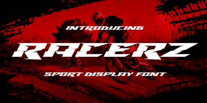 Introducing Racerz - Sport Display with strong and Sport nuances. very suitable for the title, logo, typography, clothes, magazines, brochures, packaging and much more for your design needs, making your designs more modern and professional.
 - Kohaku Monoline by HayyType Foundry,
$12.00 Kohaku Monoline! A Monoline font with a Japanese style. With thin strokes and an extraordinary curve, Kohaku Monoline is perfect for branding projects, cool text, product packaging - or simple style for your poster text.
 - Copperplate Modern by Wiescher Design,
$39.50 Copperplate Modern is my personal version of Copperplate with lowercase letters that contrast the standard rounded capitals. For good measure I designed a glitzy "Chrome" version for each weight. Yours very glitzy Gert Wiescher
 - Industriality JNL by Jeff Levine,
$29.00 Industriality JNL is a slab serif based on a classic typeface. Its condensed design allows for placing more copy inside a smaller area, and is best suited for ad headlines, titling or short blurbs.

