10,000 search results
(2.798 seconds)
- Univers Next Arabic by Linotype,
$99.00 Univers Next Arabic is designed by Lebanese designer Nadine Chahine as a companion to the Latin typeface Univers Next and with the consulting of Adrian Frutiger. It is a modern Kufi design with large open counters and low contrast. It is mainly designed to work in titles and short runs of text. Its contemporary look makes it perfect for corporate branding as well as for advertising work. It is also well suited for user interfaces and low resolution display devices. The font includes the basic Latin part of Univers Next and support for Arabic, Persian, and Urdu. It also includes proportional and tabular numerals for the supported languages.
 - BLT Gerhard by Black Lab Type,
$12.00 Gerhard is an early 1900’s Victorian style typeface that has been carefully refined for today. It was inspired from delicately hand painted lettering on a century-old vintage piano. This typeface has an bold and elegant natural aesthetic that can work for eye-catching headlines yet work gracefully enough for wedding invitations. Small caps have been designed for sub headings and allow a visual difference. Put it to use on your next branding, signage or publication project. A number of glyphs and diacritics included make this typeface usable for a wide number of languages. Alternate letters and forms have been included to create some versatility with your design.
 - Sassoon Sans US by Sassoon-Williams,
$48.00 North American version for teaching children’s first letterforms With dots and arrows these print script fonts have no ‘exit stroke’ found in the European version. An upright typeface family developed to meet the demand for letters to produce pupil material for handwriting as well as for reading. Upright letters with extended ascenders and descenders are ideal on screen. They facilitate word recognition. Teachers can print desk strips, charts of letter families and alphabet friezes, as well as consistent material across the curriculum. Together these typefaces provide a valuable resource for special needs teachers. Free to download resources How to access Stylistic Sets of alternative letters in these fonts
 - Zainer by Proportional Lime,
$9.99 Günther Zainer, (or Zeyner or Zeiner), was the first printer to operate in the city of Augsburg. He was active from 1468 to his death in 1478. In that single decade he was responsible for printing 80 works. Most of these editions were for the clergy but he also printed the first Calendar and large-scale illustrated book intended for the wider public. This font is based on one of his more interesting and peculiar fonts. And it has been enlarged to include over a 1,000 defined glyphs for modern use and also for historical purposes many glyphs recommended by the Medieval Unicode Font Initiative organization have also been included.
 - Piggy Bank by Missy Meyer,
$12.00 PIGGY BANK is a casual handwriting font, smoothed and cleaned for cutting and crafting, but also sharp and crisp for print projects! It contains two uppercase sets of letters, so you can mix and match for a hand-written look. It's useful for everything from kids' designs to branding, from book covers to product packaging! The PIGGY BANK family contains two weights - regular and bold - so you have options that will be easy to read no matter how large or small your design will be. Plus, it has my usual 500+ glyphs, including tons of punctuation and over 300 accented characters for language support!
 - Blacketor by Courtney Rhodes,
$20.00 Blacketor came about from hand lettering I had done for my own personal use several years ago. It remained unfinished until now. I was going for a more traditional serif font but in the process of play various versions came about while playing with the serifs, in an attempt to be slightly different. Many versions fell to the wayside as I learned more about what didn’t work than what did. What came about was a clean font with large open counters and short ascenders for an easy read. All caps works well for a bold but not shouty statement. A good font for Headlines and callouts as well as logotypes.
 - Leonardo Sans by Factory738,
$10.00 Leonardo Sans is a modern sans serif with a geometric touch. It comes in 10 weights, clean and modern caps, thereby creating more variability. Designed with powerful opentype features in mind. Each weight includes extended language support, fractions, tabular figures, arrows, ligatures and more. Perfectly suited for graphic design and any display use. It could easily work for web, signage, corporate as well as for editorial design. 10 Weights (Thin, UltraLight, Light, Regular, Medium, SemiBold, Bold, ExtraBold, Black, Heavy) Oblique font is available Numbers & Punctuation Extensive Language Support Thanks for looking, and I hope you enjoy it. Check out Newgate which is a great pair for Leonardo Sans.
 - HS Sama by Hiba Studio,
$50.00 HS Sama is an Arabic display typeface designed for book titles, creative graphic projects, and modern logos. It falls under the "titles" category and is based on the rules of Fatmic Kufi calligraphy, featuring a beautiful idea and special dimensions that maintain the beauty of the Arabic font and its fixed rates. With support for Arabic, Persian, and English, this font comes in two weights (Regular and Bold) that can be added to the library of contemporary Arabic Kufic fonts, meeting the needs of various designs for all tastes. Its versatile design makes it a great addition for those looking for a modern Arabic font with a unique touch.
 - Blackhole PB by Pink Broccoli,
$14.00 A vintage look to the future of type, this funky typestyle with circular cut outs was stylish for its day, and a true novelty for today. Blackhole PB began as a digitization of a film typeface known as Circue Solid by LetterGraphics. This typestyle has such funkadelic appeal to it that it just makes me smile. Definitely not for broad uses, but full of novel flair. This font is the bees knees for anyone with a circle fetish. They are like hidden mickeys in this typestyle, building up curves and counters all over the place. Take it for a spin and have a flashback to wilder times.
 - Honess by Zamjump,
$17.00 Honess is a luxurious handwritten script font with a thick classic feel this font is perfect for craft artists to elevate their work into beautiful masterpieces. Honess is also great for graphic designers looking for a cute font for their work. includes : - uppercase, - lowercase, - standard punctuation, - standard ligature, - bigining swash. - ending swash - numbers. - multi lingual to use a character with a line prefix is quite easy, that is, simply by typing an unterscore is added to the desired character, for example (_a) then the character a will have a line at the beginning, as well as a ending swash, type the character then followed by an underscore (a_).
 - Christmas Wish by Roland Hüse Design,
$11.00 Christmas Wish is a cursive brush calligraphy style script that comes in two weights: a thin Monoline and a brush Calligraphic version. Contains Western, Eastern and Central European accented characters. There are 2 stylistic sets of lowercase letters b d h k l r s t and z. Also 2 sets for hypen and underscore for some flourishes in front, after and under some shorter words. You can view a more detailed, OpenType guide pdf here. For additional customizations extra ligatures (for logotypes for example) please email me at contact@rolandhuse.com Thank you I hope you like this font. Merry Christmas! Roland Instagram: @rolandhusedesign
 - Bandera Cyrillic by AndrijType,
$21.00 This square serif typeface is a real workhorse. It is a modern tool for text design: extremely legible and well shaped. Bandera Cyrillic has six weights with original italics. It catches attention in headlines of posters and magazines or makes reading comfortable in plain texts. Bandera Cyrillic shares main proportions with sans serif Osnova Pro typefamily so ideally can pair it. It has Bandera Cyrillic Text and Bandera Cyrillic Display sister families as well. Please check also Pro verion for pan-european support (full Latin-Greek-Cyrillic). Bandera is Spanish for 'flag'. And Bandera is a symbol of Ukrainian fighting for freedom for many years.
 - Nofela by DYSA Studio,
$18.00 Nofela is a Handwritten Brush Script font. This another collection of script is perfect for your next personal branding project, excellent for your business. Nofela have a smooth edges, so this font gives an authentic handcrafted feel style. Nofela is perfect choice for people looking for clean, modern, minimalist, elegant, beauty design styles. Suitable for almost any graphic designs such as logo, branding materials, business cards, gift cards, t-shirt, cover, thumbnail, print, poster, photography, quotes .etc sans-serif, legible, geometric, clean, sans, modern, display, grotesque, corporate, branding, magazine, contemporary, text, headline, elegant, sans serif, grotesk, advertising, classic, swiss, poster, logo, editorial, technical, logotype
 - Neudoerffer Fraktur by Linotype,
$29.99Johann Neudörffer the Elder's 1538 writing manual fascinated the German designer Helmut Bomm for years. Together with Albrecht Dürer and Hieronymus Andreä, Neudörffer helped create Fraktur, perhaps the most Germanic of all the blackletter styles. As a tribute to this master, and bringing its letterforms to a 21st century public, Boom released the Neudoerffer Fraktur family through Linotype in 2009. Neudoerffer Fraktur's appearance is based very much in handwriting, and Bomm had already begun using letters from prototype versions of this typeface as early as the 1990s. For years, Neudoerffer Fraktur'sletters would appear secretly and seductively in design projects like historical sign restorations or heraldry pieces. The sources that Bomm used while drawing the typeface were images from Jan Tschichold's Treasures of Calligraphy" and Albert Kapr's "Schriftkunst." The Neudoerffer Fraktur family has four separate fonts. Any user of Adobe CS applications should consider licensing Neudoerffer Fraktur Regular (the font without any numeral suffixes). This font contains three different OpenType stylistic sets. Users can pick and choose which versions of the letters that they would like to set. Anyone using Quark XPress, Microsoft Word, or other applications without support for Stylistic Sets should license Neudoeffer Fraktur Regular 1, Neudoeffer Fraktur Regular 2, and Neudoeffer Fraktur Regular 3. Each of these three fonts has letters with slightly different style of flourish, and all three may be combined with each other. Neudoerffer Fraktur Regular 1 is optimal for longer texts; Neudoerffer Fraktur Regular 2 contains alternate letters, and well as more ornamented capitals; Neudoerffer Fraktur Regular 3's letters have a stronger calligraphic accent." - The Beatrix by Shakira Studio,
$17.00 Say hello to new serif font, The Beatrix! The Beatrix is a serif font that offers the perfect combination of modern and retro feel to each letter. Bold and well-contoured in character, The Beatrix embodies a boldness and charm that cannot be overlooked. The design exudes classic serif elegance but with a touch of fresh, up-to-date style. The Beatrix accentuates uniqueness with a variety of stylish alternatives. Each character alternative provides an interesting creative dimension, presenting a fun combination of modern and retro styles. You as a designer have the freedom to explore and express your unique ideas through captivating typography. The Beatrix is an ideal choice for a variety of design projects. With a modern and retro feel, this font is suitable for use in headlines, logos, branding, marketing materials, posters, and many more. Whether it's a project that wants to convey a contemporary feel or explore the charm of the retro era, The Beatrix has the flexibility to adapt and deliver a strong message. Here's what you get: The Beatrix Regular All Multilingual symbol Opentype features ( ligature, alternate ) Accessible in the Adobe Illustrator, Adobe Photoshop, Adobe InDesign, even work on Microsoft Word. PUA Encoded Characters - Fully accessible without additional design software. Multilingual character supports : (Afrikaans, Albanian, Catalan, Croatian, Czech, Danish, Dutch, English, Estonian, Finnish, French, German, Hungarian, Icelandic, Italian, Lithuanian, Maltese, Norwegian, Polish, Portuguese, Slovenian, Spanish, Swedish, Turkish, Zulu) Follow my shop for upcoming updates, and for more of my work, Thank you!
 - Soft Mouth by Alit Design,
$20.00 Introducing the stunning "Soft Mouth Victorian Typeface," a font that encapsulates the essence of Victorian elegance. This font style exudes an air of refinement and opulence, perfect for adding a touch of grandeur to your design projects. The "Soft Mouth Victorian Typeface" offers a versatile range of options with its four font families: Regular, Hole, Ornament, and Serif. The "Regular" font family serves as a reliable choice for everyday text, providing legibility and clarity. The "Hole" font family adds a unique twist, featuring intricate designs with hollowed-out letterforms, creating an intriguing visual effect. The "Ornament" font family boasts exquisite decorative elements, allowing you to embellish your designs with ornate flourishes. Lastly, the "Serif" font family offers a classic and refined aesthetic, perfect for evoking a sense of tradition and sophistication. This typeface includes a comprehensive set of ligatures and alternates, enabling seamless connections between letters and enhancing the overall flow and visual harmony of your text. With an impressive collection of 666 glyphs, you'll have an extensive range of characters and symbols at your disposal, allowing you to unleash your creativity and experiment with various typographic compositions. Whether you're working on elegant invitations, branding projects that require a touch of vintage sophistication, or creating elaborate typographic artworks, the "Soft Mouth Victorian Typeface" is a must-have resource. Its Victorian elegance, extensive features such as ligatures and alternates, a rich collection of 666 glyphs, and the added bonus of frames and floral embellishments, make it an invaluable asset for bringing a sense of timeless charm to your creative endeavors.
 - Faible by Identity Letters,
$29.00 An open-hearted humanist sans-serif. Playful and friendly. Faible is everybody’s darling. You cannot not like this good-natured humanist typeface. Sure, it’s a typeface for serious work—but all serious work is better when you put a smile on your face and a whistle on your lips. The typeface itself isn’t rooted in calligraphy, but there are quite some details in Faible that reference handwriting and add a friendly, humanist facet to its appearance. Take the bowls of B, P, and R: they are merrily bulged, like balloons about to take off. The curved leg of the R adds to this joyful mood. Faible’s italics are rendered playfully, too: they’re not merely sloped Roman styles. Rather, they were designed independently with an internal dynamic that sets them apart on the page. With its trademark glyphs, the swooshin’ K and k, and its friendly details, Faible will radiate optimism in display sizes, titles, and headlines. That makes it a great choice for book covers, posters, editorial design, branding, corporate design, advertising, and packaging. Nontheless, it’s carefully spaced and equipped with plenty OpenType features—a reliable tool for short texts and body copy, too. The font family consists of six weights (ranging from Thin to Black), each with its corresponding italic style. Faible’s glyph set contains more than 600 characters, allowing you to enhance your layouts with ligatures, different sets of figures, case sensitive forms, arrows, and other necessities for the ambitious typographer. Faible is the typeface that puts “fun” back into “functional”.
 - SST Japanese by Monotype,
$236.99 Designed for global branding and supporting 93 languages, the SST® typefaces blend the organic readability and controlled structure of modern sans serif designs. In combining these attributes, the SST family is understated, versatile – and sure to be a timeless design. The SST Japanese Pro family has 6 fonts in total. It spans four weights from ultra light to bold, and has two condensed weights to further expand the family’s vast range of uses. SST’s subtle design traits provide a quietly handsome and consistently friendly typographic presence that can be used for just about any typographic application. Broad range branding applicability, combined with coverage for almost a hundred languages, makes SST one of the most widely accessible and usable typefaces available. Originally designed in partnership with the global consumer brand, Sony, the SST family is one of the most comprehensive type families available. Since extensive multi-lingual support was a critical design goal from the beginning, Akira Kobayashi, Monotype type director and primary designer on the project, turned to a network of local designers around the world for their individual language expertise. As a result, the details – which could be as subtle as stroke curvature and width – are consistent across Latin, Greek, Cyrillic, Arabic and multiple Asian languages. SST performs equally well in print and on-screen and the designs can be used at very small sizes in packaging and catalogs; while massive print headlines – even complicated wayfinding projects — pose no stumbling blocks to the family’s typographic dexterity.
 - Tchig Mono by Eclectotype,
$30.00 This is Tchig Mono, a monospaced type family that doesn't take itself too seriously. Why make a monospaced font? For coding, sure, but display? It’s my humble opinion that it’s the aesthetic choices driven by the constraints of the monospaced environment that makes them attractive. It’s a challenge for the type designer to squash and expand glyphs into a rigid bounding box, and the more unorthodox shapes that spring from this have a feel about them which lends them to postmodernist layouts and hipsterish anti-design. And the payoff for the type designer - no kerning! Yay. So what’s different about Tchig? Like I said before, it doesn't take itself too seriously. Even the name Tchig is just a stupid, fun sound (although it does show off that nice g!). There are a selection of playful alternates that give text a slightly alien feel. Stylistic set 1 chops off ascenders and descenders of lowercase letters, giving it a kind of small caps meets unicase feel (it is also accessible using the small caps feature). The other sets (or stylistic alternates if you don't have access to stylistic sets) make certain letters more twirly, more square, more “experimental”. Automatic fractions use a half-width numerator and denominator so fractions like one half and five eighths have the same width as figures (and every other glyph). There you go then - a monospaced type family not initially intended for use in the usual ways monospaced families are intended to be used. Give it a try. You could even do some coding with it if you like.
 - Macklin by Monotype,
$50.99 Designed by Malou Verlomme of the Monotype Studio, Macklin is a superfamily, which brings together several attention-grabbing styles. Macklin is an elegant, high contrast typeface that demands its own attention and has been designed purposely to enable brands to appeal more emotionally to modern consumers. Macklin comprises four sub-families —Sans, Slab, Text and Display— as well as a variable. The full superfamily includes 54 fonts with 9 weights ranging from hairline to black. The concept for Macklin began with research on historical material from Britain and Europe in the beginning of the 19th century, specifically the work of Vincent Figgins. This was a period of intense social change--the beginning of the industrial revolution. A time when manufacturers and advertisers were suddenly replacing traditional handwriting or calligraphy models and demanding bold, attention-grabbing typography. Typographers experimented with innovative new styles, like fat faces and Italians, and developed many styles that brands and designers continue to use today, such as slabs, serifs, and sans serifs. Verlomme pays respect to Figgins’s work with Macklin, but pushes the family to a more contemporary place. Each sub family has been designed from the same skeleton, giving designers a broad palette for visual representation and the ability to create with contrast without worrying about awkward pairings. With Macklin, Verlomme shows us it’s possible to create a superfamily that allows for complete visual expression without compromising fluidity. Macklin™ font field guide including best practices, font pairings and alternatives. Featured in: Best Fonts for Websites
 - HG Soei Kakupoptai by RICOH,
$199.00 HG創英角ポップ体は、水本恵子氏がデザインした「創英ポップ体1」を字母とする書体です。店頭広告用文字のスタイルを模して作られた書体で、楽しく、軽快な書体です。極太角ゴシックのイメージをベースに作られていますが、それをやや崩し、柔らかさも取り入れ、フリーハンドで書いたイメージを残しています。見やすくするため、ふところは可能な限り大きくなっています。店頭のPOP、チラシ、看板などに最適の書体です。 HG Soei Kakupoptai is a typeface with a "fresh pop" designed by Mr. Mizumoto Keiko. It is a typeface made by mimicing the style of letters for party-style, fun and light typefaces. It is made on the basis of the image of thickSoei Kakugothic, but it breaks it open, and incorporates softness, leaving the font looking freehand. To make it easy to see, the boldness has become as thick as possible. It is a typeface best suited for store-front fun, leaflets, signboards and so on.
 - Termit by Ditatype,
$29.00 Termit is a striking display font designed with a game theme, featuring large letters with a fairly thick weight and a rectangular shape with sharp corners. This font shows large letters that demand attention and create a bold statement. The rectangular shape with sharp corners in Termit adds a sense of structure and stability to the font. The clean lines and defined angles create a visually bold and impactful appearance. This unique feature evokes a sense of strength and resilience, reflecting the competitive and strategic nature of the gaming world. Each character shares the same height and width, creating a cohesive and pleasing visual experience. With its low-contrast design, it offers a subtle and understated look. The minimal variation in stroke width adds a sense of uniformity and simplicity to the font, allowing the overall design to take center stage. This feature ensures that the focus remains on the content while still maintaining a strong visual impact. Enjoy the available features here. Features: Stylistic Sets Multilingual Supports PUA Encoded Numerals and Punctuations Termit fits in headlines, logos, posters, titles, branding materials, print media, editorial layouts, website headers, and any other game-themed projects. Find out more ways to use this font by taking a look at the font preview. Thanks for purchasing our fonts. Hopefully, you have a great time using our font. Feel free to contact us anytime for further information or when you have trouble with the font. Thanks a lot and happy designing.
 - First March by Nathatype,
$29.00 First March is a captivating display serif font designed with elegance and a touch of modernity. This typeface combines classic serif elements with a contemporary twist, offering a unique and refined look to your creative projects. The elegant letterforms with clean lines and balanced proportions adding a sense of sophistication and grace to your typography. The serif details provide a timeless appeal, while the modern twist brings a fresh and current vibe to the font. This combination creates a harmonious balance between tradition and innovation. What sets First March apart are its swinging endings in select letters. These graceful and subtle flourishes add a touch of dynamism and playfulness to the font, creating an engaging visual experience. The swinging endings bring a sense of movement and fluidity to the letterforms, enhancing the overall elegance of the typeface. Because of its legibility you can use this font in a variation of text sizes. Enjoy the available features here. Features: Ligatures Stylistic Sets Multilingual Supports PUA Encoded Numerals and Punctuations First March fits in headlines, logos, posters, titles, invitations, branding materials, print media, editorial layouts, website headers, and many more. Find out more ways to use this font by taking a look at the font preview. Thanks for purchasing our fonts. Hopefully, you have a great time using our font. Feel free to contact us anytime for further information or when you have trouble with the font. Thanks a lot and happy designing.
 - Sticky Melody by Nathatype,
$29.00 Sticky Melody is a charming display font that combines cuteness with a bold and prominent style. With its thick weight, rounded shapes, and distinct contrast, this typeface is designed to capture attention and infuse your designs with a playful and lively energy. The thick weight of Sticky Melody gives each letter a robust and substantial presence, making it stand out effortlessly. The rounded shapes add a touch of softness and friendliness, creating an endearing and approachable feel. The font's unique feature lies in its prominent contrast, which accentuates the curves and contours of each character, elevating the overall visual impact. Let the thick weight, rounded shapes, and prominent contrast of this font bring your creative visions to life, ensuring that your message stands out in the most charming and captivating way possible. You can use it in big text sizes to be greatly legible and enjoy the available features here. Features: Stylistic Sets Ligatures Multilingual Supports PUA Encoded Numerals and Punctuations Sticky Melody fits in children's books, toy packaging, posters, headlines, logos, social media designs, and any design project that require a touch of delightful playfulness. Find out more ways to use this font by taking a look at the font preview. Thanks for purchasing our fonts. Hopefully, you have a great time using our font. Feel free to contact us anytime for further information or when you have trouble with the font. Thanks a lot and happy designing.
 - Schnorr by HiH,
$10.00 Schnorr is a family of three fonts drawn by a German designer, Peter Schnorr. Schnorr Dekorativ is one of the less frequently seen of the alphabets he designed and one of the few for which he designed as lower case. Like many of the alphabets of the period, Schnorr Dekorativ is a delicate design. To provide a little more presence, we have added a DEMIBOLD version. Included in both Schnorr Dekorativ and Schnorr Demibold are an ornament of Schnorr’s design, seven T-ligatures and an alternate lower case t. 123=Ta, 125=Te, 135=Th, 137=Ornament, 167=Ti, 172=To, 188=Tr, 190=Tu and 177=alternate t. Schnorr’s design for the lower case t is unusual and not readily recognized. The alternate may be used to improve readability. Schnorr Initialen was designed as an upper case only design and as such is quite popular. It is often seen under the name of Odessa. Our font is a fresh scan and is paired with our Schnorr Demibold to provide a compatible lower case, along with all the rest of the auxiliary characters. Schnorr Initialen includes all the extras supplied with Schnorr Dekorativ and Schnorr Demibold: 123=Ta, 125=Te, 135=Th, 137=Ornament, 167=Ti, 172=To, 188=Tr, 190=Tu and 177=alternate t. In addition, Schnorr Initialen also includes an alternate uppercase I (172) and five lotus ornaments (123, 125, 167, 188 and 190).
 - TNA LOGO - Unknown license

- Simpsons Mmmm...Font - Unknown license

- Batman The Dark Knight - Unknown license

- Sonic Mega Font - Unknown license

- hannahhandlessbold - Unknown license

- HannahHand - Unknown license

- Lara Croft Tomb Raider - Unknown license

- TNA Lockdown - Unknown license

- AZ Cupcakes by Otto Maurer,
$23.00 AZ Cupcakes is a special Font for Cupcakes bakery Designs and for all Fans of Cupcakes. It comes in Creamy Design an with many sweet and sugar Graphics.
 - First Grade by m u r,
$10.00Searching for a font that resembled true children's handwriting, this font's creator designed a font from his own first grade penmanship assignments. Ideal for anything related to children. - Alt Vxt11 by ALT,
$- Vxtr11 is a experimental typeface for use on logos and titles this typeface is not for text! see the presentation here http://www.behance.net/gallery/Vxtr11-Experimental-Typeface/818127
 - Sarten by Patria Ari,
$15.00 Sarten is a modern all caps font with blocky shapes for display purpose. This font perfect for display purpose such as title. book cover, advertisement purposes, craft etc.
 - Cubic by Fontfabric,
$35.00 Cubic is a custom font which is applicable for any type of graphic design - web, print, motion graphics etc. It is perfect for t-shirts and other items.
 - Fantasik by Letterena Studios,
$17.00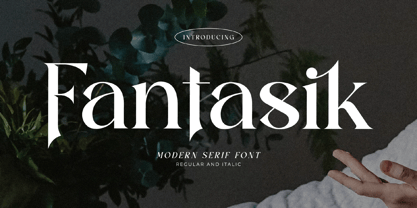 Fantasik is a sophisticated, charming serif font with a fashionable touch. Specially designed for luxury, elegant, feminine projects, this font is perfectly suitable for creating modern, chic designs.
 - Simple Stamp by Oleg Stepanov,
$20.00 Simple Stamp is the hand-drawn font. It is good for games, cartoons, posters, chidlren's books, and for any other places, where loud and funky headlines are needed.


