10,000 search results
(0.018 seconds)
- Layfort by Identity Letters,
$29.00 What do you get when you cross Industrial Revolution with Art Déco? The raw force of steam-powered vessels with the panache of dashing streamliners? A sturdy industrial grotesque with a swanky stylized sans? We don't know, but our Layfort is a strong contender. It's a contrasted sans-serif typeface with old-style proportions: varying letter widths create a more vivid texture than your usual contemporary sans, and the true italics are narrower than the uprights. Layfort is elegant enough for fashion, art, and luxury; yet sufficiently sincere for serious business. And at 16 styles & 750 glyphs, it's ready for complex typographic demands (try the round dots at SS09). Let your designs fly!
 - Future Bugler by Breauhare,
$35.00 Future Bugler is a font based on the second logo created by Harry Warren in early 1975 for his sixth grade class newsletter, The Broadwater Bugler, at Broadwater Academy in Exmore, Virginia, on Virginia’s Eastern Shore. This font can convey several perspectives or moods. It can suggest a space-age vision of the future, or an art-deco perspective of the future as in the movie “Sky Captain and the World of Tomorrow”. It also communicates the idea of high performance, or extreme sports, without the grunge. Also be sure to check out the upright version of this font, Future Bugler Upright, available separately. Digitized by John Bomparte. Additional tags: NFL, NFL Network, NFLN
 - MB Vinatage by Ben Burford Fonts,
$25.00 MB Vinatage is a 6 weight font family with italics that has its roots based firmly in the type and font design of the early 20th Century. With some art deco touches in the standard caps like the N and the low bars on the E, F & H, by using the stylistic alternates these can be changed to give the font a more contemporary look. The same applies to the lower case letters, with an alternate a and g and a stylistic lowercase t. The family works great as a display font using the thin and heavy weights and just as well for smaller & bulk text. Stay traditional or go contemporary or mix it up.
 - Transat by Typetanic Fonts,
$29.00 Transat is a geometric sans serif typeface, with caps inspired by Art Deco signage — found inside the “Gare Maritime” (literally “sea station”) ocean liner terminals in both Le Havre and Cherbourg, France, in the early 1930s. The name “Transat” is the common shortening of “Compagnie Générale Transatlantique,” the company that operated majestic ocean liners like the SS Normandie out of Le Havre from 1862–1974. (Transat also has a more rational text-friendly companion font, " Transat Text ") Transat includes many OpenType features, such as ligatures (ff/ft/fft), small capitals, case sensitive forms, stylistic alternates, arbitrary fractions, and a full complement of proportional, tabular, and oldstyle figures. Transat is released in 5 weights plus including optically-corrected obliques.
 - Qi by Cory Maylett Design,
$14.98 Qi is a display sans-serif inspired, in part, by the art deco typefaces sometimes seen on old signs along rural American backroads. Unlike these signs, Qi is new, fresh, a little bit quirky, and not at all in need of repair or a fresh coat of paint. The family is comprised of six distinct fonts with more on the way. With an entire set of Central and Western European (and, of course, American) glyphs, plus a bunch of alternates and ligatures, Qi could be the perfect display face for your next sign, poster, newsletter, headline or, well, most anything else. Hey, the lowercase alone makes these fonts well worth the price.
 - Printers Drawer JNL by Jeff Levine,
$29.00 Printers Drawer JNL continues building on a library of letterpress illustrations, cartoons, ad builders, Art Deco ad panels, ornaments, embellishments, and general miscellany. The images are re-drawn from vintage source material, and this font is jam-packed with 89 images spread throughout most all of the standard keyboard positions. This is officially the 1000th release from Jeff Levine Fonts since its inception in January of 2006. Jeff Levine Fonts aims to preserve the almost-lost artwork and lettering styles of the past within a digital type format, and often recreates the designs complete with their evident flaws, idiosyncrasies and eccentricities; allowing for a “real world” and nostalgic look to the computer generated art projects of today.
 - Sweet Treats by Jeff Levine,
$29.00 A piece of British sheet music for “You’re Sweeter than I Thought You Were” [from the 1935 film “Jack of All Trades” starring Jack Hulbert] provided inspiration for a digital typeface based on the credits for Hulbert and the film that rather than the song’s title. What’s interesting is the lettering style was influenced by Art Nouveau at a time when Art Deco was gaining in popularity. The result is Sweet Treats JNL, which is available in both regular and oblique versions. (According to Wikipedia, John Norman ‘Jack’ Hulbert (April 24, 1892 – March 25, 1978) was a British actor, director, screenwriter and singer, specializing primarily in comedy productions, and often working alongside his wife Cicely Courtneidge.)
 - Sabler Titling by insigne,
$- Make the right statement with the elegant Sabler Titling. This showstopping font features an inherent grace combined with the classic style of the Art Deco period. The subtle beauty of its letters is highlighted by the typeface’s stems, which taper towards the baseline highlight--a feature that adds clear distinction to your design. Originally inspired by a WPA poster, this typeface has been expanded to include three equally elegant proportions. Sabler Titling includes more than 60 free alternative forms, including support for most Latin-based languages. Add a hint of seduction to your work with Sabler’s high-contrast letterforms--ideal for magazines, advertisements and books on fashion, fine arts, and luxury goods of all kinds.
 - Celebrity by Canada Type,
$24.95 Celebrity is a new execution of a film type concept put forth by Willy Wirtz in 1971. The original idea, called Latus, had many irregularities and unfit characters that are now fixed and expanded in this digital version. Celebrity's construct combines extreme thicks with hairline thins to build forms that contribute to a type totality that is at once modern and techno, as well as retro-deco. Eye catching and memorable, Celebrity is ideal for use on posters, book covers, media sleeves and packaging. It also has enough geometric appeal to inspire unique logos and set attractive titling. Celebrity comes in all popular font formats, and includes a very expanded Latin character set.
 - Xylo by ITC,
$29.99Xylo is a rugged, no-nonsense typeface that was originally designed in 1924 by the Benjamin Krebs type foundry in Frankfurt am Main, Germany. Even back then, Xylo must have been very popular; the design made it at least as far as England. In 1995, after finding its design in an old London printer's reference book, the Letraset Type Studio faithfully converted Xylo into digital format. A time-proven display face, Xylo will convey a feeling of power and strength in any application. Best used big in headlines or logos; Xylo exudes an expressionistic and art deco spirit that just as much at home today as it was during the roaring 20s! - Chicago Moonshine by Roland Hüse Design,
$15.00 CHICAGO MOONSHINE is an Art Deco serif All Caps display font. Please note that this is primarily for headlines, logos posters in large size. The character set contains Western and Eastern European latin languages, basic symbols and punctuation. The Capital letters has geometric patterns and in place of lowercase letters there are filled in Capitals. Inquiries, feedback, customisation requests and/or extra characters please contact@rolandhusedesign.com or via rolandhuse.com * * * Background image (taken from Unsplash) credits: Chicago at night : Prafulla Chandra https://unsplash.com/@prafulla90 Moon I photoshopped onto the night skyline: Jason Darrell https://unsplash.com/@zebedeerox Moonshine Enjoy & Cheers : bartender holding a shot of liquor by Joel Herzog from unsplash https://unsplash.com/@joel_herzog Street Sign: Bruno Martins https://unsplash.com/@brunus
 - Uptown Review JNL by Jeff Levine,
$29.00 Cover art for the 1933 sheet music of Harold Arlen and Ted Koehler's "Stormy Weather" (from the musical production "Cotton Club Parade") listed the cast of the show in a condensed hand lettered sans that typified the 1930s and the Art Deco era. This served as the inspiration for Uptown Review JNL; available in both regular and oblique versions. The Cotton Club was a whites-only night club which showcased black acts, and was originally located on 145th Street in Harlem from 1923 to 1935, then existed for a short time in the New York theater district from 1936 to 1940. After the Broadway incarnation of the club closed, its space was taken over by the Latin Quarter.
 - Art Project JNL by Jeff Levine,
$29.00 A 1930s WPA (Works Projects Administration) poster advertising a play entitled “Abraham Lincoln, The Great Commoner” had the play’s name done in a hand-lettered Art Deco sans. This is the basis for Art Project JNL. According to Wikipedia, “the Works Progress Administration (renamed in 1939 as the Work Projects Administration; WPA) was the largest and most ambitious American New Deal agency, employing millions of unemployed people (mostly unskilled men) to carry out public works projects, including the construction of public buildings and roads. In a much smaller but more famous project, Federal Project Number One, the WPA employed musicians, artists, writers, actors and directors in large arts, drama, media, and literacy projects.”
 - LT Afficher Neue - 100% free

- Verve - Unknown license

- Bodybag - Unknown license

- Lotus Petal by Mysterylab,
$18.00 With firm roots in the groovy '60s and '70s — but with a modern twist — Lotus Petal is all whimsical and funky lines, coils, and curls. Just the right vibe for a vintage eye-catching banner headline or retro psychedelic poster graphics.
 - Velove by PojolType,
$11.00 Thank you for opening this Velove font. The elegant font script is a lot of fun. You can finish your handwriting fast and interesting. With fun curves and twists. Velove is for creating greeting text, invitations, logos, cards, product packaging, headers, t-shirts, certificates, What's really amazing is that Velove comes with a complete set of uppercase alternatives, and several lowercase alternative options, as well as ligatures that let you create original custom.
 - Matchout by Zanfonts,
$12.00 Matchout is caligraphy sans serif with seven variation weigh, This font is comes in uppercase, lowercase, punctuations, symbols, numerals including basic and advance cyrillic. Matchout can used in various styles, casual, fun and simple letter. You are also worry-free because with more than 323 glyphs every weight, and Support for up to 73 languages Matchout perfect for branding, websites, quotes, invitation, flyers, greeting cards, poster, education, fun, logo, and marketing purpose
 - Bloody Skinny by Mvmet,
$12.00 Bloody Skinny is a kids friendly blood drips display font! Not only can be used for Halloween theme needs, you can use it too for other things for example graffiti tag or street style art needs. Use it on t-shirts and clothing, for your scary book designs, greeting cards, stickers, posters, banners, or anything that needs a fun touch. Try it to create fabulous designs and feel the fun and cool vibes with it!
 - Retro Smile by Mvmet,
$12.00 Retro Smile is a cool font for your fun displays. It comes with 2 versions (filler and outline). The fun and happy vibe will be there when you use it. You can use it for anything ranging from t-shirts, other merchandise, kids’ book designs, and greeting cards to stickers and posters, or anything that needs a casual touch. Fall in love with its incredibly versatile style, and use it to create lovely designs!
 - Have a Nice Day by Cultivated Mind,
$20.00 Have A Nice Day is a handwritten font created by Cindy Kinash. This font features three font styles (Basic/Tall/Wide) and comes in three weights (Light/Regular/Bold). All three font styles can be used together as one unique and fun font! This font also includes a set of fun hand drawn ornaments like smiley faces, flowers, leaves, insects, frames, captions, desserts, food, clouds, and catchwords that will surely brighten your day! Enjoy!
 - No Bad Days by Cardigan,
$25.00 Get RAD with this unique, fun, handwritten font by Cardigan. This pack includes two fonts. A bold, brush font with a supporting thin, handwritten script font. These typefaces ooze good vibes, adding a fun and edgy style to any design. Whether you need a hand drawn feel to a logo or a bold organic font that jumps off any page. No Bad Days has your back and is a total dream to work with.
 - Tanked by Typadelic,
$14.95 Tanked is one crazy and mixed up font, perfect for any fun project you can think of! Upper and lower case letters are dispersed throughout the font, no need to use caps...just bang away on your keyboard without regard for any typographic rules. Use as a headline font or short lines of body copy, scrapbooking titles/captions...whatever! Tanked is fun and will supply a burst of energy for your projects.
 - Loskatos by Maulana Creative,
$15.00 Loskatos is a Fun Display font. With Bold sharp stroke, fun character with a bit of ligatures and alternates. To give you an extra creative work. Loskatos font support multilingual more than 100+ language. This font is good for logo design, Social media, Movie Titles, Books Titles, a short text even a long text letter and good for your secondary text font with script or signature. Make a stunning work with Loskatos font. Cheers, MaulanaCreative
 - March Loft by Maulana Creative,
$11.00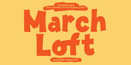 March Loft is a casual fun handwritten display font. With bold stroke, fun character. To give you an extra creative work. March loft font support multilingual more than 100+ language. This font is good for logo design, Social media, Movie Titles, Books Titles, a short text even a long text letter and good for your secondary text font with sans or serif. Make a stunning work with March Loft font. Cheers, Maulana Creative
 - Queenty by Zamjump,
$13.00 Queenty is a fun monoline font that can be applied to many of your precious designs. It's really handwriting that's kept simple and has an elegant style that makes this font a lot of fun. Queenty has a unique additional swash to complement this font, and it's very easy to pop it just by pressing a+underscore.. You can use it for posters, titles, greeting cards, packaging, invitations and more. Included : - Multi-language - Unique Swash
 - Absundo by Kaer,
$19.00 ABsunDO PROJECT is a playful font for your fun and happy design projects. The main idea of this font is a quirky replacement of uppercase and lowercase symbols. Uppercase is heavy and bold, at the same time lowercase is light and narrow. You'll get a playful font for fun advertising, fashion stickers, summer posters, wedding logos, retro sale themes, and much more. Please feel free to request to add characters you need: kaer.pro@gmail.com
 - Dolita House by Maulana Creative,
$14.00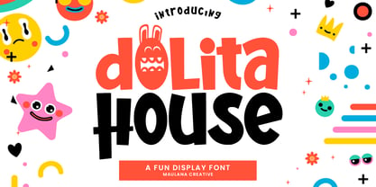 Dolita House fun display font. Bold stroke, fun character with a bit of ligatures and alternates. To give you an extra creative work. Dolita House font support multilingual more than 100+ language. This font is good for logo design, Social media, Movie Titles, Books Titles, a short text even a long text letter and good for your secondary text font with script or serif. Make a stunning work with Dolita House font. Cheers, Maulana Creative
 - Flower Hill by Olivetype,
$18.00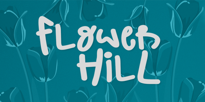 Introducing Flower Hill, a fun and quirky display font! With its vibrant and playful design, Flower Hill will instantly bring a touch of fun to any project. Whether you're designing a party invitation or creating social media graphics, this font can adapt to any theme or style effortlessly. Flower Hill Font features : Standard Latin Numbers, symbols, and punctuations Multilingual Support. Fully accessible without additional design software Simple Installations Works on PC & Mac Thank You.
 - Early Hours by Epiclinez,
$18.00 Early Hours is a fun crafty font. A little bit quirky, this font looks incredibly adept in a wide variety of contexts, such as children's craft, teaching material, quotes, apparel, or any other design that needs a touch of fun and playfulness. The font Early Hours contains 203 glyphs, supporting 66 languages from Africa, Albanian to English, and Zulu. The font Early Hours contains 8 ligatures in 1 OpenType feature. Thank You
 - Horror Vibes by Gassstype,
$25.00 Introducing of our new product the name is Horror Vibes - Handmade horror Font and Multilanguage support.Introducing of designs look modern, unique and fun. It’s perfect for labels, quotes, posters, DIY projects, branding, packaging, greeting cards, websites, photos, photography overlays, signs, window art, scrapbooking, tags and so much more!our new product that inspired by Street Tagging, graffiti style with a fun theme very good for graffity poster, flyer, childrenbook, cartoon, comic etc
 - Wayang by Hanoded,
$15.00 Wayang font was named after the beautiful shadow puppets from Indonesia. The font was hand made, using a bamboo pen and Chinese ink on rough, eco-friendly Italian paper. Wayang is spiky, ultra-thin, yet extremely legible. It comes with extensive language support.
 - Ace Attitude by Limelight Artistry,
$24.00 Ace Attitude is a friendly, readable font with character and flair. When I started designing this font I wanted something that was readable as well as interesting and appealing. Something that showed character. When I look at this font now I think of an old fashioned aviator. One of those poeple that likes to show off and have fun but can still follow rules. This font is perfect for logo's and branding. But its also very versatile would be great in things like magazines, posters, packaging, billboards, etc. Ace Attitude has an impressive 179 Contextual alternates. These are like ligatures, but oh so much better. These contextual alternates will give any project that personal touch - all without any extra effort. All you have to do is make sure that they are turned on in your program. Unfortunately, these do not yet show up in the sample text. To help with this I have created a demo version of the font so that you can still try it out before you spend the money. Ace Attitude also has Over 800 glyphs and includes features such as small caps, ordinals, ligatures, fractions, tabular numbers, proportional numbers, subscript, superscript, numerators and denominators.
 - HWT Etta by Hamilton Wood Type Collection,
$24.95 HWT Etta is a fun display typeface that has two styles: East and West! Its two variations ensure you have maximum wood type swagger in every display size that you might want. This fresh design takes a cue from the wild design experimentation that was happening in the heyday of mid 19th Century wood type—but filtered through 1960s photo-type sensibilities and served up for today’s design needs. Etta West is a decorative inline style and the Etta East is a whimsical reverse contrast style. They live together harmoniously, with their own specific flavors. Practically speaking, both styles are intended for display use, so use them big and use them proudly! Set your XXL size titles in West and your L to XL size types in East. As different as they might look at first, both fonts share a common DNA—Don’t be shy about using them together. The HWT Etta font is part of the Hamilton Wood Type and Printing Museum’s Type Legacy Project. In keeping with the project, Etta is named after Etta Shove Hamilton, who was J.E. Hamilton’s wife and the company’s first bookkeeper.
 - Outside Voice by Molly Suber Thorpe,
$13.99 Outside Voice is a handwritten, all-caps typeface, created as an homage to the robust history of handwritten protest signs. It's a beautiful display font for a huge range of projects, from poster art to holiday cards. With contextual alternates enabled, this font will automatically cycle through three sets of handwritten alphabets as you type. The result is type that looks as imperfect and handmade as a digital font can get. This makes Outside Voice a wonderful choice for pairing with hand-drawn illustrations. Consider varying the size, slant, and/or color of each line in your layouts. These adjustments make Outside Voice look even more handmade and organic, which is great for fun designs like posters and quotes. This typeface is quirky and ligature-rich, with over 600 glyphs and icons. It supports Latin and Modern Greek alphabets, and includes all European language diacritical markings. It includes a set of decorated word ligatures comprised of common protest words like 'peace,' 'vote', and 'yes!'. Additionally, you'll get a full set of common protest icons, such as a raised fist, planet, dove, and peace sign.
 - Presley Slab by Sudtipos,
$49.00 The lightest weight of Presley Slab takes inspiration from a late nineteenth-century type specimen, but what began as a decorative and delicate contrasted serif stirred Alejandro Paul’s imagination to conjure voluptuous reverse contrasted letterforms. These became the heaviest weight of Presley Slab, which nods to the lacquered hairstyles from the birth of rock ’n roll with its idiosyncratic ball terminals. Its playful allure and swagger remains visible in the weights that stand between these two extremes but as the curls loosened, many things happened in the design process including the appearance of swashes and alternates. Presley Slab’s personality has breadth; it is a fun, confident and contemporary palette of letters that will perfectly perform for any job, from editorial design to branding. The Extra Bold and Black weights are a powerful option at large sizes for use on posters and billboards; the graceful Thin and Extra Light weights are delicate options for packaging design or fashion branding. Despite it conjuring images of mid-century music halls, Presley Slab is also staunchly European in it’s aesthetic, offering everything from good-humour to elegance with its unique touches.
 - Lunanic by Ingrimayne Type,
$9.00 Lunanic is a geometric novelty typeface family with a touch of graffiti. The letters are formed from a circle with a notch or nick taken out, a shape that reminds me of a partial lunar eclipse. Half of the family have the nick on the left and half on the right. The faces are monospaced and so tightly spaced that there is no space between most of the letters so the filled styles cannot be used alone without tweaking. There are several ways to tweak them to make them readable: adjacent letters can be colored differently, the characters spacing can be increased, or an outlined style can be layered on top of the filled letters. The family does not have a true lower case. Most of the characters in the lower-case slots are alternates for those on the upper-case keys and they can be mixed in whatever way the user finds best. The family has twelve members: two orientations with three weights each and each of these six has an outline style to go with it. Lunanic is fun, bizarre, weird, and obviously a decorative display font.
 - ANWUTOK by Twinletter,
$17.00 Say hello to summer freshness with the Anwutok font! With a cheerful Display theme, this font is the perfect solution for creating projects with a relaxed and bright feel. Anwutok comes with impressive features. With ligatures and alternates, you can easily combine interesting characters and create unique and creative typography designs. Apart from that, Anwutok also supports multilingualism, allowing you to adapt this font to different languages. This gives you flexibility and extends the reach of your project to a wider market. With a fresh and playful style, Anwutok brings a fun and uplifting touch to your designs. Each letter is designed with care to convey evocative beauty. Choose Anwutok as your constant companion in creating enthralling and relaxing projects. Get this font now and let summer inspiration decorate your creations. What’s Included : File font All glyphs Iso Latin 1 Alternate, Ligature Simple installations We highly recommend using a program that supports OpenType features and Glyphs panels like many Adobe apps and Corel Draw so that you can see and access all Glyph variations. PUA Encoded Characters – Fully accessible without additional design software. Fonts include Multilingual support
 - Campcraft by Our House Graphics,
$- Remember those plastic Popsicle sticks that clicked together and you could make things from them with your sticky little fingers? Things like... camp crafts. Well, no� Of course you don't. You were too young. That�s why there is Campcraft. This is a fun loving dot-matrix font, or it would be a fun loving dot-matrix if the vertical and horizontal grid lines didn't pile up at the intersections. Then again, it wouldn't be any fun if they didn't pile up at the intersections, would it? Strictly a display type... Campcraft is excellent for what the name suggests. I goes well with Christmas sweaters, beaded jackets and purses and that time when we were all happy children with sticky little fingers.


