4,725 search results
(0.049 seconds)
- Earthling by Atlantic Fonts,
$26.00
- Charley Style by Zang-O-Fonts,
$25.00 - Moonsilver by HIRO.std,
$16.00
- DirtDevil - Unknown license

- Queen Sipur by Forberas Club,
$16.00
- Amelitta by Forberas Club,
$16.00
- New Lobster by Etewut,
$30.00
- Sutrisnice by Forberas Club,
$16.00
- Kishplay by Forberas Club,
$16.00
- Chewy Blossom by Jelloween,
$20.00 - Respexable by PizzaDude.dk,
$20.00
- Alfarn by Adobe,
$29.00 - Fun Signs JNL by Jeff Levine,
$29.00
- Night Club 70s - Personal use only

- MKorsair - 100% free

- Alba Super - Personal use only

- aaaiight! - Unknown license

- font twelve - Personal use only

- Bunky by Lebbad Design,
$24.95
- Margaret River by Epiclinez,
$13.00
- RM Serifancy by Ray Meadows,
$19.00
- Schabernack One by XTOPH,
$20.00
- Kate Blues by Forberas Club,
$16.00
- Old Story by Gleb Guralnyk,
$12.00
- Curly Babe by Forberas Club,
$16.00
- Bobolha by Intellecta Design,
$24.90 - Holy Saghne by Forberas Club,
$16.00
- TB Matrix by TrueBlue,
$10.00 - Eurofurence Modified - Unknown license

- Milden by Youthlabs,
$21.00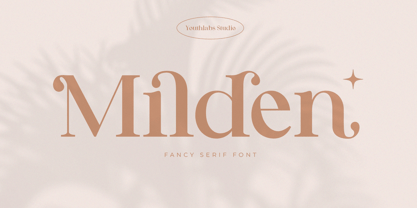
- Melina BT by Bitstream,
$50.99 - Pimpit by bb-bureau,
$65.00
- LDJ Snow Doodles by Illustration Ink,
$3.00 - Filature by JBFoundry,
$16.00
- Eveningnews by Wiescher Design,
$39.50
- Androganonamous - Unknown license

- Bruce Flourished by Intellecta Design,
$24.90 - Meso America by Intellecta Design,
$9.00 - Takeshimura by Epiclinez,
$18.00
- PuffiClaude BT by Bitstream,
$50.99


