10,000 search results
(0.059 seconds)
- Carbonium by Paweł Burgiel,
$38.00 Carbonium (with lining figures) and Carbonium OSF (with Old Style figures) is a cursive (upright and oblique) typeface. Its character set support Latin, Cyrillic and Greek scripts. Contain fraction- and scientific numerals, standard ligatures, currency symbols and popular recycling symbols used for packaging. Kerning is prepared as single ('flat') table for maximum possible compatibility with older software.
 - Nusqie by PizzaDude.dk,
$20.00 Slightly blurred, and handwritten - looks good with massive text. With ligatures for both upper- and lowercase double letters, and alternate letters, also for upper- and lowercase, it makes your text look soooo smooth! Oh, I almost forgot: Nusqie also comes with ligatures for double numbers! You will need to use OpenType supporting applications to use the autoligatures.
 - Outspace Fighter by Ditatype,
$29.00 Outspace Fighter is an electrifying game-themed display font designed in uppercase, capturing the essence of futuristic space battles. This font is made in boxy shapes with sharp corners, evoking a sense of strength and precision. Each uppercase letter is meticulously crafted to exude a futuristic aesthetic, mirroring the angular and geometric forms found in the vast expanse of outer space. This design choice gives the font a sleek and modern appeal, perfect for conveying the intensity of space battles. With low-contrast letters, this font places emphasis on the overall form and structure of the font. The subtle differences in stroke width create a balanced and unified visual experience. This design choice ensures legibility while maintaining a cohesive and visually appealing composition, allowing your audience to effortlessly engage with your game-themed designs. You can also enjoy the available features here. Features: Stylistic Sets Multilingual Supports PUA Encoded Numerals and Punctuations Outspace Fighter fits in headlines, logos, posters, titles, branding materials, print media, editorial layouts, website headers, and any other projects. Find out more ways to use this font by taking a look at the font preview. Thanks for purchasing our fonts. Hopefully, you have a great time using our font. Feel free to contact us anytime for further information or when you have trouble with the font. Thanks a lot and happy designing.
 - Tripper Pro by Underware,
$50.00 Tripper is a rock-hard display font family. The six styles – from Light to Black – of this robust stencil typeface will assure your text grabs all the attention it can get. Instead of settings large amount of texts, just use this font for a small amount of words. Or even better: just one word. But most importantly: make it really, really, really big. The lightest weight is pretty condensed, and slowly expands when the weight increases. The bridges – essential to a stencil font – have the same width across all styles, so you can safely apply all styles in the same size without the risk of stencils falling apart. Due to the absence of curves throughout the whole family, Tripper is suitable for more limited, industrial applications too. Tripper comes in several flavours. Next to the basic flavour, there is a stencil family which automatically creates borders around every letter, word or line. Then there is Tripper Rough, a textured version with that intelligent random, grungy look. Together with the previously released multi-colour font Tripper Tricolor, the complete family consists of 24 styles. Tripper is equipped with a bunch of OpenType features, like different figure styles, fractions, superiors, etc. But if all the OpenType ding-dong is not enough for you, just try the ornaments. The separate ornament font comes with icons, indicators, manicules, banderoles and patterns.
 - Sada by Arabetics,
$45.00 Sada is a text font designed with hand held devices and ebooks in mind. Glyphs are designed to be larger than usual and very clear with soft visual characteristics and many traditional Arabic calligraphic transitional features incorporated to improve legibility. The word “sada” means “echo” in Arabic. Even though Sada is a cursive style font it offers clearly distinguished and visually unified letter shapes in every position of a word. Sada supports all Arabetic scripts covered by Unicode 6.1, and the latest Arabic Supplement and Extended-A Unicode blocks, including support for Quranic texts. It comes with three weights, regular, bold, and ultra-light. Each weight has normal and left-slanted “italic” styles. The script design of this font family follows the Arabetics Mutamathil Taqlidi style and utilizes varying x-heights. The Mutamathil Taqlidi type style uses one glyph per every basic Arabic Unicode character or letter, as defined by the Unicode Standards, and one additional final form glyph, for each freely-connecting letter in an Arabic text. Sada includes the required Lam-Alif ligatures in addition to all vowel diacritic ligatures. Sada’s soft-vowel diacritic marks (harakat) are only selectively positioned with most of them appearing on similar lower or upper positions to emphasize they are not part of letters. Kashida is zero width glyph.
 - Winter Flowers by Great Studio,
$14.00 Winter Flowers, a font duo, is a unique and modern hand script that provides a large selection of alternative characters to choose from as well as ligatures that look natural and add to the authenticity of the letters. Winter Flowers is a modern handwritten font, loaded with awesome OpenType features, and a set of alternative characters for uppercase and lowercase letters. Make all the extra decorative and unique choices you wish with the included swashes, endings, and alternative letters. Designed to work harmoniously, Winter Flowers is also equipped with a sans font, to perfect your design. This font is perfect for branding, logos, web and editorial design, branding, prints, invitations, handicrafts, quotes, and more. Winter Flowers features OpenType stylistic alternates, ligatures and International support for most Western Languages is included. To enable the OpenType Stylistic alternates, you need a program that supports OpenType features such as Adobe Illustrator CS, Adobe Indesign & CorelDraw X6-X7, Microsoft Word 2010 or later versions. Winter Flowers is coded with PUA Unicode, which allows full access to all the extra characters without having special designing software. Mac users can use Font Book , and Windows users can use Character Map to view and copy any of the extra characters to paste into your favourite text editor/app. Need help? If you need help or advice, please contact me by e-mail Greatstudio92@gmail.com Thank you, Great Studio
 - Beaufort by Shinntype,
$59.00 Engaging the issue of scalability, Beaufort® is configured so that serifs render with great sharpness, independent of type size, limited only by device resolution. This scale of effect empowers the typographer with a design axis stretching from awesomely huge to preciously tiny, further enhanced by weights from Light to Heavy, small caps, and alternate figure styles. In style, Beaufort has a number of affinities. In particular, the bold romans recall a kind of “grotesque with small serifs” style popular with sign painters and package lettering artists in the early 20th century, and still going strong. In proportion, the basic Beaufort is in the vein of the classic oldstyle types that descend from Granjon , via the French Oldstyles, or Elzevirs, to Plantin and Times in the early twentieth century. Designed for optimum clarity, readibility, and word count, these types have a pronounced angle of stress in the lower case, which is quite large and fairly narrow in relation to the caps. None of the caps are exceptionally narrow, and both cases have an evenness of width that makes for a no-nonsense, orthodox appearance. The strength of the capitals distinguishes these types from those of another “optimizing” era, the 1970s and ’80s, when puny caps made for monotonous text. However, strong though they may be, Beaufort’s caps are not as obtrusive in text as those of Times or Plantin.
 - Kufi Mutamathil by Arabetics,
$39.00 Kufi Mutamathil is an Arabetic (extended Arabic) typeface design with heavy Arabic Kufi calligraphy accent, both on a single letter level and in an overall text look and feel. Although Kufi, the earliest Arabic calligraphy style, is often described as “stiff”, it is in fact a very flexible style. The Kufi Mutamathil typeface design underlines this calligraphy style flexibility and openness through visualizing a very legible Mutamathil design with Kufi shapes. The Mutamathil type style utilizes only one isolated glyph per Arabic Unicode character or letter, as defined in Unicode Standards. It is a very light style which does not require any standard glyph substitution or the shaping engine. The Kufi Mutamathil font family employs variable, unrestricted, x-height values. It comes in regular and left-slanted italic styles. Kufi Mutamathil includes all required Lam-Alif ligatures. Soft-vowel diacritic marks, or harakat, are selectively positioned with the majority of them appearing on the same level, over or below, following a letter, to ensure that they would not interfere with individual glyphs appearance. Kashida, or tatweel, (shft-j) is a zero-width character. Keying it before Alif-Lam-Lam-Ha will display the Allah ligature. Kufi Mutamathil includes both Arabic and Arabic-Indic numerals, in addition to all Standard English keyboard punctuations and major currency symbols.
 - Madriz by SilverStag,
$14.00 Introducing Madriz, a slab serif font with a retro feel that's perfect for any project that needs a touch of old-school charm. With over 32 fonts in one font family, Madriz offers a wide range of styles to suit any need. You can choose from Thin to Black weights and Regular to Extra Expanded widths to create your perfect look. Madriz is inspired by the old-school signage of Madrid, Spain. The name "Madriz" is actually the affectionate nickname that Madrileños, the people of Madrid, gave to their city. The font's bold, blocky letters capture the essence of Madrid's vibrant and historic streets. Madriz's versatile nature makes it a great choice for a wide range of projects. Its bold, retro style is perfect for showcasing heritage brands or giving a modern touch to classic designs. Madriz can also be used to create a sense of nostalgia, making it ideal for retro-themed projects or campaigns. Here are some of the ways you can use Madriz: Titles and headings: Madriz's bold, eye-catching style is perfect for titles and headings. Text blocks: Madriz's wide range of weights and widths makes it suitable for text blocks, from body copy to large paragraphs. Logos and branding: Madriz's retro charm makes it a great choice for logos and branding. With its 32 font styles and support for over 90 languages, Madriz is an incredibly powerful tool for any designer. It can be used to create a variety of looks, from classic and elegant to modern and edgy. Whether you're working on a print project, a web design, or an app, Madriz has the potential to make a lasting impression. Madriz is the perfect font for anyone who wants to add a touch of old-school charm to their designs. With its wide range of styles and features, Madriz is sure to make a statement in any project. Would you like to get 5 completely free fonts worth over $75? No tricks, no hidden words, terms or anything. Just subscribe to my newsletter, make sure to check your email to approve the subscription, add me to your contacts so that the emails don't end up in spam folder and you will get 5 fonts for free. The fonts are packed with alternates, ligatures and some even come with extra goodies. Happy creating everyone!
 - Bunken Tech Sans Wide by Buntype,
$49.00 The Bunken Tech Sans superfamily: A reminiscence of constructed fonts of the modern age designed with considerably cleaner forms. •See other members of the Superfamily: Bunken Tech Sans •For further details, view the Specimen PDF. Bunken Tech Sans Wide follows in the best tradition of the straight-lined and somewhat angular structures of its predecessors while offering a much more open and mild design. The shapes of the letters are therefore reduced to the most essential elements: The spurs on a, b, n and other lower case letters occur just as little as decorative or style details, the lightly rounded inside edges are more pleasing to the eye than certain historic role models and make for a harmonic, flowing style. Use In particular Bunken Tech Sans Wide stands out as an easy, distinctive headline font with its straight-lined, technical design. Open counters and large x-height make it equally suited for use in shorter texts. It is also perfectly complemented by Bunken Sans or Bunken Slab in longer texts (available soon). Features Available in 16 styles with widths ranging from Light to Heavy with associated Italics. All of the styles are very extensive: Support for at least 58 languages, Small Capitals, 9 number sets (e.g. Lining, Oldstyle, Tabular and Small Cap Figures), ligatures, alternate characters, numerous Opentype functions, and lots of other small features that make it more pleasant to work with the font on a daily basis as well as fulfilling typographic desires. Each style contains more than 870 characters! Each style is available in a professional (Pro) standard (Std) and Small Caps (SC) edition with a different range of functions. (Language support, OpenType features and number of glyphs). Details can be found on the respective pages. Bunken Tech Sans Wide is part of the Bunken Tech superfamily and is available in Condensed, Normal and Wide. Also of interest: The slab serif variation Bunken Tech Slab Features in Detail: 16 Weights: -Light -Book -Medium -SemiBold -Bold -ExtraBold -UltraBold -Heavy and corresponding Italics 3 Widths: -Condensed -Normal -Wide Alternate Characters: A, E, F, L, S, e, f, t, s, y, etc. Small Capitals 5 Sets of Figures: -Lining Figures -Old Style Figures -Tabfigures -Old Style Tabfigures -Small Cap Figures Automatic Ordinals Automatic Fractions Extended Language Support and more...
 - Parolm - Unknown license

- Czerny by Solfege,
$26.00 Czerny is a display typeface with clean contours and carefully cut-off edges. It combines the classical feel of old serif fonts with the sleek, minimalist aesthetics of contemporary design.
 - Aequitas by Fenotype,
$25.00 Aequitas is an expressive Roman Display typeface with three weights. Aequitas is great for fashion, branding, packaging or editorial use. Each weight of Aequitas is equipped with Swash & Titling Alternates.
 - Dot Script by Cruz Fonts,
$32.00 A display typeface built with dots for use at large sizes. It is smooth and elegant. Great for titles, headlines, advertising, music, toy products and cosmetics with a youthful flavor.
 - KD Diagona by Kassymkulov Design,
$9.95 KD Diagona is a display, geometrical face with 45 degree diagonal cut. Letter spacing along with almost 4000 kerning pairs were designed to match the diagonal progression of the font.
 - Manstromer by Trustha,
$16.00 Manstromer is a dynamic handwritten font, written with fast movements. Comes with two fonts styles, regular and slant. Manstromer is suitable for branding, advertising, headlines, packaging design, and many more.
 - Sandy by Oleg Stepanov,
$15.00 Sandy is a handwritten sans serif font, based on shapes made with ink brush. Sandy is a lively and informal typeface with good readability. Most of European languages are supported.
 - Episodian by Atlantic Fonts,
$26.00 Episodian is a retro-modern san-serif family with a sci-fi, techno edge and contemporary elegance of its own. Episodian now includes regular and bold with corresponding italic fonts.
 - Cadenza by Studio K,
$45.00 Cadenza is a bold condensed display font that combines flair with functionality, elegance with utility. Its weight and readability make it ideal for newspaper and magazine headlines, titling and signage.
 - Snubnose by Bogstav,
$17.00 ALL CAPS font with lovely traces after the brushstrokes. With contextual alternates, which makes sure that your text varies between 5 different versions of each letter - and they cycle automatically!
 - Magyar Symbols Pi by CheapProFonts,
$10.00Two fonts with traditional hungarian flower illustrations and repeatable line patterns - combine and enjoy! No "multilingual character set" as fonts from CheapProFonts usually have, but still with an international flair... - Artics Snow by FHFont,
$17.00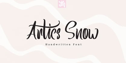 Artics Snow is beautiful script font with modern calligraphy style, with many OpenType features. Suitable for design, element design, wedding, event, t-shirt, logo, badges, sticker, and other awesome work.
 - Gumela Arabic by NamelaType,
$25.00 Arabic font version of Gumela, still with Gumela latin style, based on rounded sans serif whose edges end with unique shapes, to line up in harmony between Latin and Arabic.
 - Literaturnaya by ParaType,
$30.00 Musician with the stage name of Pelle Piano, with an interest in irregular and informal lettering, 1950s style lettering, and a childhood influenced by Letraset sheets and a Letraset catalog.
 - Gwyner by Typomancer,
$24.00 Gwyner, a strengthened didone with sharp and clean characteristics, comes with thin to bold weights and is suitable in italic for various uses. A condensed family for space-saving design.
 - Caeli AT by Arctype,
$18.99 A typeface that invokes the beauty, strength and liberty of nature. Plant life is honoured with curves flowing from strong stems along with subtle references to Art Nouveau letter-shapes.
 - Azkanio Script by Sipanji21,
$14.00 Azkanio is a sweet and charming script with a unique style. Get inspired by its bold feel, and turn any design idea into a true standout with this bold script!
 - Rockyeah by Majestype,
$19.00 Rockyeah is 3 style fonts: brush, serif and sans serif who have strong personalities and work very well in many design projects. - Rockyeah Brush made with fine brush pen with the fastest stroke movement. Comes with over 300 glyphs that will give you a vast possibility to play with each character. - Rockyeah Serif is an interpretation of Rockyeah brush. A serif font that focuses on legible, elegant and unique. With light and bold stroke combination this serif will give a modern-classic vibes on your design project. - Rockyeah Sans a geometric sans serif that focuses on legible, clean and useful for any project. This sans is an interpretation of Rockyeah Serif with the same caps height and bold stroke. This font is suitable for poster, tattoo, tees graphic, headline and etc :) Just play and rock it!
 - Straight Script by Typehill Studio,
$12.00 Straight Font Duo + Ornaments a calligraphy script font that comes with beautiful alternative characters. a mixture of copper calligraphy with handleting style. Designed to bring style elegance. Straight attracts such a subtle, clean, feminine, sensual, glamorous, simple and very readable typeface. The classic style is perfect to apply in various formal forms such as invitations, labels, menus, Logos, fashion, make up, stationery, letterpress, romantic novels, magazines, books, greeting / wedding cards, packaging, labels. Straight Script including multiple language support. With OpenType features with stylish alternatives, ligatures and characters, allowing you to mix and match pairs of letters to fit your design, as well as a touch of ornament to make this font look elegant. Straight also has a strong neoclassical serif typeface with high contrast, cool, unique style and appearance with alternative fonts, Ligature, and multilingual support. Thank you for your visit.
 - Hwaiting Serif by Konstantine Studio,
$20.00 Inspired by the emerging Korean culture that grabbing the worldwide actuation in so many realms of the industry. To bridge the vibes and to make it easier to consume, we found the gap to fill with simple things in life that are useful for it, and yes, it's a new day it's a new font. So without any further ado, please welcome Hwaiting Serif. 3/3 series of Korean vibes typefaces. It's a serif font with a thick and thin style of visuals, aiming the luxury and glamorous tone to catch up with high-fashion branding and today's graphic design trends Crafted with deep research about Korean traditional letters, shaped up with the approach of universal Latin letters. This is the last drop of 3 series from the Hwaiting family. Thank you for your engagement with us.
 - Kibble by Look Minus Today,
$15.00 Introducing Kibble - A Classic Western Font With A Modern Twist by Rijesain x Look minus today Kibble a classic western font with a modern twist. inspired slab serif font with a modern twist, Its unique style combines classic design elements with contemporary aesthetics, making it perfect for a wide range of projects. With its clean lines and distinctive letterforms, Kibble is a versatile and eye-catching font that will make your designs stand out. Whether you're creating branding materials, advertising campaigns, or any other type of design, Kibble is a font that will help you achieve your creative vision. Features: - Uppercase - Numerals & Punctuation - Accented characters - Multilingual I really hope you'll get pleasure using Kibble font and it will be perfect addition to your font collection! Contact me with an inbox message If you have any question. Thank you and enjoy!
 - Magoat by Fikryal,
$25.00 Magoat – Modern Clean Bold Font is the perfect choice to infuse a contemporary and bold touch into your graphic design projects. With its distinctive All Caps style, Magoat has the ability to capture attention with clarity and courage. Each character is designed with precision, showcasing the cleanliness and modernity that define this font. With its bold shapes, Magoat is well-suited for titles, logos, and other design elements that require a strong and clear presence. Despite its bold appearance, the clarity of each letter is maintained, ensuring that your message is conveyed with precision and readability. With Magoat, your design projects will gain a fresh, contemporary, and professional touch, bringing a clean and bold look to various visual platforms. If you have any questions please don’t hesitate to contact me Follow my Instagram: @fkryall Thank you
 - Brassens by Typorium,
$53.00 Le Typorium présente une nouvelle famille de caractères calligraphiques basés sur une écriture étudiée à travers les manuscrits et autographes de Georges Brassens, poète et musicien (1921-1981). Son tracé, rigoureux et appliqué, souvent minutieux, est à l’image d’une œuvre unique et singulière, immédiatement reconnaissable. Le script Brassens offre des fonctionnalités OpenType telles que des caractères alternatifs pour les majuscules et les minuscules afin de renforcer la fluidité d’une écriture manuelle, des chiffres alternatifs, des fractions et un jeu de caractères accentués étendu pour prendre en charge de nombreuses langues étrangères. Trois graisses ont été créées afin d’offrir une large palette de possibilités graphiques. 60 images d’un poète qui a cassé sa pipe à l’âge de 60 ans., classées en trois séries de vignettes (pictogrammes, symboles, portraits), elles illustrent l’univers imagé et la richesse symbolique de la poésie de Georges Brassens où les représentations mythologiques et allégoriques y tiennent une part importante. Georges Brassens est un poète, auteur-compositeur-interprète né à Sète le 22 octobre 1921, mort à Saint-Gély-du-Fesc le 29 octobre 1981 et enterré au cimetière Le Py de Sète. Auteur de plus de deux cents chansons populaires, il met en musique et interprète ses poèmes en s’accompagnant à la guitare. Outre ses propres textes, il met également en musique des poèmes de François Villon, Victor Hugo, Paul Verlaine, Paul Fort, Antoine Pol, ou encore Louis Aragon. Il reçoit le Grand Prix de Poésie de l’Académie Française e 1967. Un grand nombre d’écoles, salles de spectacle, voies, parcs et jardins portent également son nom, dont à Paris le parc Georges-Brassens, tout proche de l’impasse Florimont où il vécut ses premières années parisiennes, de sa maison de la rue Santos-Dumont et du café Les Sportifs Réunis – Chez Walczak – rue Brancion qui lui inspira « Le Bistrot ». À Sète, l’Espace Georges Brassens ainsi que de nombreux festivals et associations redonnent vie au poète et à son œuvre. The Typorium presents a new calligraphic typeface family based on a writing studied through the manuscripts and autographs of Georges Brassens, poet and musician (1921-1981). Its layout, rigorous and applied, often meticulous, is in the image of a unique and singular work, immediately recognizable. Brassens script offers OpenType features such as alternate characters for upper and lower case to enhance the fluency of handwriting, alternate numbers, fractions and an extended accented character set to support many foreign languages. Three weights have been created to offer a wide range of graphic possibilities. 60 images of a poet who broke his pipe (French expression for passing away) at the age of 60, classified into three series of vignettes (pictograms, symbols, portraits), they illustrate the imagery world and the symbolic richness of Georges Brassens poetry where mythological and allegorical representations hold an important part. Georges Brassens is a poet, singer-songwriter born in Sète on October 22, 1921, died in Saint-Gély-du-Fesc on October 29, 1981 and buried in Le Py cemetery of Sète. Author of more than two hundred popular songs, he sets to music and performs his poems, accompanying himself on the guitar. In addition to his own texts, he also sets to music poems by François Villon, Victor Hugo, Paul Verlaine, Paul Fort, Antoine Pol, or Louis Aragon. He received the Grand Prix of Poetry from the Académie Française in 1967. A large number of schools, theaters, streets, parks and gardens also bear his name, including in Paris the Georges-Brassens park, very close to the impasse Florimont where he lived his first years in Paris, his house in the rue Santos-Dumont and the café Les Sportifs Réunis - Chez Walczak - rue Brancion which inspired "Le Bistrot". In Sète, the Espace Georges Brassens as well as numerous festivals and associations bring the poet and his work back to life.
 - The "Cartoonist" font, designed by George Edward Purdy, is a testament to the playful, expressive nature of fonts inspired by the golden age of comics and animation. This typeface stands out due to i...
- The font named "BLUSH BEAR" by SpideRaY is a charming and playful typeface that captures the essence of fun, creativity, and warmth. Designed with a gentle nod to whimsical storytelling and the light...
- Ah, the "Scooby Doo" font by Lauren Ashpole, where every letter looks like it's ready to jump into a groovy mystery machine and solve a case or two while avoiding ghosts and ghouls! This font is as p...
- The Spacebeach font by Fontalicious is a unique typeface that conjures images of retro science fiction and laid-back beach vibes in a playful and inventive blend. This font stands out with its distin...
- Gigafly by ROHH,
$39.00 Gigafly™ is a contemporary high-contrast sans-serif display typeface designed for branding and impactful posters. The family features very modern and sharp design language, opening a world of lively compositions full of strength, energy and movement. Its playful contrast makes it stand out from the crowd and gives it a unique type of cheerful elegance. Gigafly features lots of stylistic alternates, allowing to create a collage-like, dynamic compositions by mixing the styles and weights of the letters. To make things even more fun, the family contains a set of quirky icons that will inject even more personality into your designs (do not miss out on the super cool manicules!). The family is very powerful, extravagant, playful, yet it manages to keep its elegance - it can be more calm, measured and simple when needed as well. It has a vibe of modern, crisp sans-serif as well as fashion magazine type didone. The full family consists of 15 styles - 5 weights in 3 different optical sizes for headlines, display sizes and big posters. The family offers a 2-axis variable (weight and optical size) font that contains every style and gives even more flexibility and versatility. Each font features 1400 glyphs, including uppercase, lowercase, icons, tons of alternates, as well as other OpenType features such as stylistic sets, case sensitive forms, lining and old style figures, basic fractions and superscript/subscript, slashed zero, currencies and symbols.
 - Microbrew Unicase by Albatross,
$19.00 Microbrew Unicase is the latest addition to the Microbrew family, a versatile retro display family. Microbrew Unicase has 14 individual styles plus a very functional set of catchwords, and a fresh and eclectic set of retro-style ornaments. Microbrew Unicase sports a nice mix between wood type poster style, and vintage letterpress. The more detailed styles work well at large sizes, and the cleaner styles add legibility at smaller sizes. Microbrew Unicase is an all caps display font, but the lowercase act as alternates. The uppercase are all uppercase letter forms, while the lowercase is mixed. Type in all caps to be a buzz-kill. Mix upper and lowercase to have a little fun. Or type in all lowercase to have a party! (more informal) For super-easy alternates, just mix uppercase and lowercase letters. To add to the realism, Microbrew Unicase includes double-letter ligatures. Microbrew Unicase also includes a set of extremely intentional and eclectic ornaments and symbols. Designed to give a vintage feel, the ornaments and symbols compliment Microbrew nicely to round off the family. The ornaments also include old style numbers, and lots of retro symbols. Don't let the name fool you, Microbrew Unicase is very versatile and works great for almost any subject matter, including weddings, birthdays, restaurants, coffee shops, music, and many more. Opentype features include automatic fractions, subscript numbers, superscript numbers, and double-letter ligatures.
 - Parfait Script by Lián Types,
$37.00Parfait Script Pro takes its inspiration from Spencerian script and pointed brush lettering. Technical Parfait Script has more than 850 glyphs. It’s up to you to choose, it’s up to you to have fun. Parfait would love to play. The font has lots of alternates. They'll certainly either embellish your words or provide more legibility. The alternates are: Standard Ligatures; Contextual Alternates; Discretionary Ligatures; Swashes; Stylistic Alternates; Titling Alternates; Terminal Forms; Historical Alternates * ; Stylistic Ligatures; Stylistic Set 1 and 2 * ; Ornaments. (* These Alternates are only included in Parfait Script Pro). Parfait Script Pro contains everything. Advice: Use designing programs that support the OpenType features named above, so you can easily alternate glyphs. However, for those who don't have this kind of program, or for those who don't want the entire font, we offer Parfait Script Pro as several separate fonts: Parfait Script Standard (the best for text); Parfait Script Contextual (decorative); Parfait Script Stylistic (decorative); Parfait Script Swashes (for giving the last letter a nice touch); Parfait Script Titling (both decorative and more Roman); Parfait Script Endings (for giving the word the look of a signature); and Parfait Script Ornaments (a set of swirls). These versions of Parfait Script Pro are Open-Type programmed too, in order to include the Standard, Discretional and Stylistic Ligatures. Pssst!... Take a look at Parfait Script Pro’s Guide in the gallery section in order to discover this beauty!
