10,000 search results
(0.017 seconds)
- Joseph Sophia by Fargun Studio,
$14.00 Joseph Sophia! A new fresh ans modern hand lettered font with decorative characters and a dancing baseline. So beautiful on invitation like handicraft, greeting cards, branding materials, business cards, quotes, posters, and more design concepts. Features : Unique ligatures Stylistic sets Basic Latin A-Z and a-z Numbers International Symbols included Punctuation Please send a message if you have questions or problems, and don't hesitate to say hello on Instagram https://www.instagram.com/fargunstudio/ Thank you.
 - Sweet Dreams by Fargun Studio,
$14.00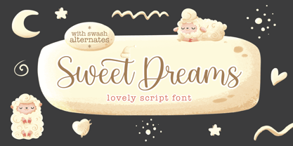 Sweet Dreams! A new fresh ans modern hand lettered font with decorative characters and a dancing baseline. So beautiful on invitation like handicraft, greeting cards, branding materials, business cards, quotes, posters, and more design concepts. Features : Unique ligatures Stylistic sets Basic Latin A-Z and a-z Numbers International Symbols included Punctuation Please send a message if you have questions or problems, and don't hesitate to say hello on Instagram https://www.instagram.com/fargunstudio Thank you.
 - Grow and Glow by Flawlessandco,
$9.00 Grow and Glow - A Playful Display Font, a whimsical display font designed to infuse your designs with a sense of joy and playfulness. There's some connected letters and some alternates that suitable for any graphic designs . This font support for some multilingual. Also contains uppercase A-Z and lowercase a-z, alternate character, numbers 0-9, and some punctuation. If you need help, just write me! Thanks so much for checking out my shop!
 - Mirallove Restimond by MJB Letters,
$20.00 Hello everyone, we hope you have a great day. Say hi to Mirallove Restimond a new casual modern font that is very perfect for branding, wedding designs, quotes, posters, business cards, logotype, display, watermarks, signatures, etc. This font also has a special character in terms of thickness and thinness on each side, so it will give a neat handwritten impression that will make your design look very attractive and it is PUA Encoded.
 - Fearlessly Authentic by Ahmad Jamaludin,
$19.00 Say hello to the new classic nineties retro font, Fearlessly Authentic! The trend is to make thin serif fonts that made the 80s and 90s style, so we wanted to make them too but with a different touch. Make it slightly rounded for a retro look and make your design look great! Fearlessly Authentic - A classic nineties retro with a complementary italic version. In the italic family, we make it different from the regular and make a shape with a unique uppercase so it looks more classic, retro but a little modern We've also been loving combining the regular and italic, especially for logos (see the "Symphatize logo, image #3) Included : Regular and Italic Letters, numbers, symbols, and punctuation Use in many programs even in Canva Multilingual Support Language Support: Danish, English, Estonian, Filipino, Finnish, French, Friulian, Galician, German, Gusii, Indonesian, Irish, Italian, Luxembourgish, Norwegian Bokmål, Norwegian Nynorsk, Nyankole, Oromo, Portuguese, Romansh, Rombo, Spanish, Swedish, Swiss-German, Uzbek (Latin) Come and say hello over on Instagram! https://www.instagram.com/dharmas.studio/ Dharmas Studio
 - LFT Etica Sheriff by TypeTogether,
$35.00 "LFT Etica, the moralist type family by Leftloft, began at the end of 2000, but its development is ongoing as it expands to fill the astute designer’s needs. The starting point was the common, cold grotesque sans typefaces — ubiquitous and often badly applied in their everyday visual environment. The challenge was to obtain the same force, versatility, and colour, but with a much warmer feel. LFT Etica resides aesthetically somewhere between a grotesque and a humanist sans serif, resulting from a design of soft strokes with open counters and terminals. LFT Etica successfully combines forcefulness and delicacy, wrapping both with sober charm. Milan-based Leftloft studio teamed up with Octavio Pardo to develop 24 additional styles for the very successful LFT Etica type family. This expansion is a direct response to type users’ requests who found in LFT Etica a de facto choice for web design. The new styles come in two series — 12 condensed widths and 12 compressed ones — and have proven versatile in applications where the ratio between information and space becomes an important challenge. Each letter was scrutinised to ensure durability throughout time and adaptability within circumstance, so LFT Etica meets the challenge of balance head-on. With its wide current range of 40 styles and many OpenType features (four sets of numerals, fractions, arrows, and dingbats, as well as stylistic alternates), LFT Etica is a versatile typeface suitable for corporate or casual use, for printed publications as well as web design. The complete LFT Etica family, along with our entire catalogue, has been optimised for today’s varied screen uses."
 - Qualion Text by ROHH,
$39.00 Qualion Text™ is a modern geometric sans serif typeface with humanist and calligraphic inspirations. It is a text family designed for excellent legibility. Qualion Text™ is a sibling of Qualion™ & Qualion Round™, geometric family with lots of swashes and ornaments. Letter shapes and proportions has been adjusted to fit paragraph text and small sizes: - typeface is narrower now in order to fit more text in the design space - larger stroke contrast - pronounced ink traps and tapering - elegant true italics made even more calligraphic - adjusted spacing and kerning - adjusted font weights The main purpose of the family is clean and legible paragraph text, however it is very attractive choice for branding, headlines and display use, too. The italic styles as well as thin, bold and black upright styles have very strong character and look great in display sizes. Italics are very fluent, calligraphic, subtle and elegant, from the other side bold and black uprigths are very modern, powerful and unique thanks to the pronounced ink traps. Qualion Text™ family consists of 20 styles - 10 weights with corresponding true italics. Both have extended language support, as well as broad number of OpenType features, such as small caps, case sensitive forms, standard and discretionary ligatures, swashes, stylistic sets, contextual alternates, lining, oldstyle, tabular and small cap figures, slashed zero, fractions, superscript and subscript, ordinals, currencies and symbols.
 - Flamante Sans by deFharo,
$8.00 Flamante Sans is a group of eight corporate typographies of geometric construction, without serifs and neo-grotesque style, are fonts with an excellent readability for titles, short texts or for use in signage. The group of fonts is made up of 4 weights: Light, Book, Medium & Bold plus their respective italics. This initial development of Flamante Sans typography has been the basis for the drawing of the "Flamante family" fonts composed of 5 styles (Sans, Serif, SemiSlab, Round & Stencil) making a total of 40 fonts that are perfect corporate use, advertising or editorial titles or signage of public spaces for example. They include the Bitcoin symbol. Swiss-style fonts built on a 4 ◊ 6 building grid, formed with 144 x 119 units (Medium version), two digits taken from the fibonacci and Perrin sequences, these measures define the width and height of the vertical and horizontal antlers and the overall proportion of the font. The metrics and kerning have been carefully set up for fluent reading in paragraph texts. ================================== - OpenType Features: Standard Ligatures, Additional languages, All Alternates, Alternate Annotation Forms, Superscript, Kerning, Superiors, Capital Spacing, Localized Forms, Superior letters, Discretionary Ligatures, Subscript, Fractions, Slashed Zero, Inferiors, Extended Fractions, Scientific Inferiors, Ordinals, Denominators, Oldstyle Figures, Numerators, Historical Forms, Historical Ligatures. They include the Bitcoin symbol. - 500 glyphs. Latin Extended-A ï OTF & TTF
 - Plunct Plact by PintassilgoPrints,
$19.00 If you say it, say it cool. Plunct Plact, an original font duo that’s worth a thousand words. Check it out!
 - FS Olivia Paneuropean by Fontsmith,
$90.00Antwerp On a visit to Belgium and the Netherlands while still an MA student at Reading University, Eleni Beveratou made some important discoveries. First, there was the letter ‘g’ from the Didot family seen at Plantin Moretus Museum in Antwerp, which seemed “almost like a mistake”. Then there were strange details such as the serifs on the “l”, “h”, “k”, “b” and “d” in Egmont Cursive and other typefaces by Sjoerk Hendrik de Roos, found in volumes of poetry she picked up from a chaotic bookshop in Amsterdam. These were characters that stood out from the text but seemed to blend harmoniously with the rest of the letters. “And there it was, the spark. I decided to design a typeface that would capture the details of the process of writing.” A guiding hand Eleni shared her initial thoughts with Phil Garnham and Jason Smith. They liked what they saw in her tentative first sketches, and gave her the chance to develop her ideas further. Phil, in particular, provided valuable input as FS Olivia took shape. Eleni’s main influence – the handwritten – would give the font its character. “When creating a typeface,” says Eleni, “it’s fair to say that it reflects some of the designer’s personality. And that’s certainly the case with FS Olivia. “Although technology is part of my everyday life. I am a great admirer of traditional graphic design where you can touch and feel paper and ink.” Irregular “What I particularly like,” says Eleni, “is that a printed item can develop its own personality sometimes as a result of imperfections in the print. “FS Olivia has some of these characteristics as it’s inspired by handwriting, and yet it also includes some very modern features.” Feminine and fascinating, FS Olivia captures the expressive twists and turns of (the poet’s?) pen on paper, with low junctions, deep top serifs and semi-rounded edges. Round outstrokes contrast with the rough corners of the instroke, while strong diagonals and inclined serifs create a richly textured pattern. Polytonic It’s only fitting that there should be a version of this poetic font for one of the birthplaces of poetry and song. Eleni, who hails from Athens, developed an extensive range of glyphs that could be used for the Greek language, in both modern and ancient texts. For the latter, there is a version of Olivia for displaying polytonic Greek (a system that utilises a range of accents and “breathings”), which brings the 21st century technology of OpenType to the presentation of poetic texts from Ancient Greece. Just think what Homer could have done with that. - FS Olivia by Fontsmith,
$70.00 Antwerp On a visit to Belgium and the Netherlands while still an MA student at Reading University, Eleni Beveratou made some important discoveries. First, there was the letter ‘g’ from the Didot family seen at Plantin Moretus Museum in Antwerp, which seemed “almost like a mistake”. Then there were strange details such as the serifs on the “l”, “h”, “k”, “b” and “d” in Egmont Cursive and other typefaces by Sjoerk Hendrik de Roos, found in volumes of poetry she picked up from a chaotic bookshop in Amsterdam. These were characters that stood out from the text but seemed to blend harmoniously with the rest of the letters. “And there it was, the spark. I decided to design a typeface that would capture the details of the process of writing.” A guiding hand Eleni shared her initial thoughts with Phil Garnham and Jason Smith. They liked what they saw in her tentative first sketches, and gave her the chance to develop her ideas further. Phil, in particular, provided valuable input as FS Olivia took shape. Eleni’s main influence – the handwritten – would give the font its character. “When creating a typeface,” says Eleni, “it’s fair to say that it reflects some of the designer’s personality. And that’s certainly the case with FS Olivia. “Although technology is part of my everyday life. I am a great admirer of traditional graphic design where you can touch and feel paper and ink.” Irregular “What I particularly like,” says Eleni, “is that a printed item can develop its own personality sometimes as a result of imperfections in the print. “FS Olivia has some of these characteristics as it’s inspired by handwriting, and yet it also includes some very modern features.” Feminine and fascinating, FS Olivia captures the expressive twists and turns of (the poet’s?) pen on paper, with low junctions, deep top serifs and semi-rounded edges. Round outstrokes contrast with the rough corners of the instroke, while strong diagonals and inclined serifs create a richly textured pattern. Polytonic It’s only fitting that there should be a version of this poetic font for one of the birthplaces of poetry and song. Eleni, who hails from Athens, developed an extensive range of glyphs that could be used for the Greek language, in both modern and ancient texts. For the latter, there is a version of Olivia for displaying polytonic Greek (a system that utilises a range of accents and “breathings”), which brings the 21st century technology of OpenType to the presentation of poetic texts from Ancient Greece. Just think what Homer could have done with that.
 - Casey by 50Fox,
$15.00 Say hello to Casey Typeface! A fancy and beautiful editorial serif with luxury ligatures, alternates glyphs and multilingual support - with a complementary italic version. It's a versatile font that looks great in big and small sizes. This has a wide variety of uses, including editorial projects, logo design, clothing branding, product packaging, magazine headers, and so much more. It's ideal for any type of graphic design project or as a stylish text overlay to any image.
 - Ballsye by Putracetol,
$28.00 Say Hello to Ballsye, a Superb bold display font. This font is a very bold font so it has a strong impression. But other than that, this font can also be a fun and playful font. Ballsye is perfect for branding design, posters, apparel, for logotype, website header, fashion design and any more. Come with Opentype feature with a lot of alternates, its help you to make great lettering. This font is also support multi language.
 - Floristica by PeachCreme,
$16.00 Say hello to our new modern calligraphy font "Floristica"! Featuring handwritten, sophisticated flows, it provides a full set of uppercase and lowercase letters, multilingual symbols, numerals, and punctuation. Additionally, it includes lowercase beginning and ending swashes, making it perfect for invitations and monograms. With its smooth texture, it would be ideal for all kinds of home crafters (cricut, silhouette, etc). "Floristica" works great for wedding designs, logos, stationery, signature, quotes, cards, display text, and so many other designs.
 - Michel Elisha Script by Fargun Studio,
$14.00 Michel Elisha Script! A new fresh and modern hand lettered font with decorative characters and a dancing baseline. So beautiful on invitation like handicraft, greeting cards, branding materials, business cards, quotes, posters, and more design concepts. Features : Unique ligatures Unique Alternates Stylistic sets Basic Latin A-Z and a-z Numbers International Symbols included Punctuation Please send a message if you have questions or problems, and don't hesitate to say hello on Instagram https://www.instagram.com/fargunstudio/ Thank you.
 - Antea by Wiescher Design,
$39.50 Antea is named after "Antaeus" the giant of Libya in Greek mythology, son of Poseidon and Gaia (mother earth), whose wife was Tinjis. He was extremely strong if he stayed in contact with the earth, but once lifted into the air he became weak and liquid. So is this font, strong if grounded and weak if floating in the air. I will in due course add different weights for different purposes. Your designer of very mysterious fonts, Gert Wiescher
 - Alepholon by Typodermic,
$11.95 Are you ready to take your designs to new heights? Look no further than Alepholon, the revolutionary industrial typeface with its own unique flair. With its unconventional curves and resilient, mechanized structure, Alepholon is the perfect choice for futuristic lunar road signs, as well as any design that needs to make a bold and impactful statement. By incorporating Alepholon into your work, you’ll be adding a sense of excitement and wonder that’s sure to captivate your audience. This typeface is more than just a font – it’s a symbol of progress and innovation that’s sure to elevate any message to new heights. So why settle for ordinary fonts when you can make a bold statement with Alepholon? Try it out today and experience the future of typography for yourself! Most Latin-based European, Greek, and some Cyrillic-based writing systems are supported, including the following languages. Afaan Oromo, Afar, Afrikaans, Albanian, Alsatian, Aromanian, Aymara, Bashkir (Latin), Basque, Belarusian (Latin), Bemba, Bikol, Bosnian, Breton, Bulgarian, Cape Verdean, Creole, Catalan, Cebuano, Chamorro, Chavacano, Chichewa, Crimean Tatar (Latin), Croatian, Czech, Danish, Dawan, Dholuo, Dutch, English, Estonian, Faroese, Fijian, Filipino, Finnish, French, Frisian, Friulian, Gagauz (Latin), Galician, Ganda, Genoese, German, Greek, Greenlandic, Guadeloupean Creole, Haitian Creole, Hawaiian, Hiligaynon, Hungarian, Icelandic, Ilocano, Indonesian, Irish, Italian, Jamaican, Kaqchikel, Karakalpak (Latin), Kashubian, Kikongo, Kinyarwanda, Kirundi, Komi-Permyak, Kurdish (Latin), Latvian, Lithuanian, Lombard, Low Saxon, Luxembourgish, Maasai, Macedonian, Makhuwa, Malay, Maltese, Māori, Moldovan, Montenegrin, Ndebele, Neapolitan, Norwegian, Novial, Occitan, Ossetian, Ossetian (Latin), Papiamento, Piedmontese, Polish, Portuguese, Quechua, Rarotongan, Romanian, Romansh, Russian, Sami, Sango, Saramaccan, Sardinian, Scottish Gaelic, Serbian, Serbian (Latin), Shona, Sicilian, Silesian, Slovak, Slovenian, Somali, Sorbian, Sotho, Spanish, Swahili, Swazi, Swedish, Tagalog, Tahitian, Tetum, Tongan, Tshiluba, Tsonga, Tswana, Tumbuka, Turkish, Turkmen (Latin), Tuvaluan, Uzbek (Latin), Ukrainian, Venetian, Vepsian, Võro, Walloon, Waray-Waray, Wayuu, Welsh, Wolof, Xhosa, Yapese, Zapotec Zulu and Zuni.
 - Mirantz by insigne,
$32.00 Y’all ready for this? Now starting for Insigne: the new serif Mirantz. This rookie all-star plays a precise game every game, cutting at all the right angles to leave your reader impressed and ready to see more. You can always count on Mirantz to lead with solid mechanics and a clean style, but don’t be surprised when the face keeps it real with a little individual flare and creativity. This personal touch is nothing short of elegance in every appearance. So what makes us love this rookie above the other great players in the field? Contrast, for one. Mirantz brings more contrast to the game than most serifs out there. The serifs on this face have a crisp, sharp wedge that naturally draws the reader’s eye. You can’t help but fall in love with its clean, natural style. Mirantz also features a tall x-height and regular proportions that can play a number of positions on the page and still stay strong through the last half of the copy or even the final period. Mirantz is a solid powerhouse player, containing a complete set of small capitals and nine weights from thin to bold. It can play well both down low and up top with its subscripts and superscripts and can move your reader’s eye easily across the copy with its titling capitals, condensed and extended variants, and open style figures. With its options covering more than 72 Latin-based languages, look for this newcomer to have international success in the near future. It you haven’t set your draft picks for this next round of projects, think hard before passing up Mirantz. A capable serif like this one is a guaranteed asset to any team of fonts. Production assistance from Lucas Azevedo.
 - Arkeo BT by Bitstream,
$50.99Arkeo BT is designer Brian Sooy's first typeface family published by Bitstream. Given very few design elements to work with, Brian has designed a bitmap font that is unique and very readable. There are three widths, Condensed, Regular and Extended. In our opinion, pixels never looked so good. Arkeo performs equally well on screen and as on paper. The OpenType versions include an extended character set featuring oldstyle figures, fractions and additional f-ligatures. Design was begun in late 2001 and completed in 2002. Sooy asked Bitstream to critique, which we did gladly. We also added additional characters for OpenType. This included alternate figure set, an extended set of fractions and additional f-ligatures. Sooy used preliminary versions for setting parts of the TypeCon 2002 material and website. - Struffoli by Hanoded,
$15.00 Struffoli are small, marble sized deep fried dough balls from Naples. They are served with a variety of sweet condiments, like honey, sugar and sprinkles. There is nothing deep fried about Struffoli font, nor does it resemble a deep fried dough ball: I just liked the name and at least now I can say what Struffoli are! Struffoli was handmade using a brush and Chinese ink. It does look like a connected script font, but it is not (really): only a few letters connect, making it a more versatile font. Use it for your cookbooks, posters and toy packaging. Rest assured, it comes with a generous serving of diacritics.
 - Mikha by Eurotypo,
$19.00 Mikha, designed by Carine de Wandeleer, is a delightfully handwritten family font which keeps the casual drawing of a marker with clean strokes. Its slight bounce and intentional irregularity, gives your words a wonderful flow. This new font family with 736 glyphs, includes Regular, Condensed and Sans. It has OpenType features such as Stylistics alternates, Swashes, Ligatures, up to five Stylistic sets by letter, initial and terminal forms in upper and lower, ornaments that allow you to mix and match pairs of letters and a Central European language support to fit your design. This OpenType features may only be accessible via OpenType-aware applications, or the Character Map to view and copy any of the extra characters to paste into your favorite text editor/app. This will help your creativity and make it easier to make expressive and elegant your typographic work. Also with Mikha Sans it is possible to write all in capitals. Mikha looks lovely on wedding invitations, greeting cards, logos, posters, labels, t-shirt design, logos, business-cards and is perfect for using in ink or watercolor based designs, fashion, magazines, food packaging and menus, book covers and whatever your imagination holds! Enjoy it!
 - Guanabara Sans by Plau,
$20.00 Guanabara is the third release of Plau Type Foundry. It started from the need of a wayfinding typeface that had personality enough to be the brand typeface for a city. The city of Rio de Janeiro, with its never-ending curves and all year long summer weather provided the constraints and requirements of this typeface. From there, it evolved to be a workhorse, with 8 weights from Thin to Black and matching true italics. It just had to have the features that all us designers have grown to love, such as alternate letters (a, g and r for the romans), tabular and proportional figures in lining and oldstyle set-ups as well as small caps, fractions and all that jazz (I mean, samba). And it needed to be recognizable and distinct. For that, design features like tapered R legs, capitals with classic proportions and calligraphic finishes on the terminals proved crucial. And last, but not least, like Rio, it had to welcome many cultures. We came to think of it as the “Typeface from Ipanema”, with a classic, timeless look, swinging elegance and joyful attitude.
 - Muisca by JVB Fonts,
$25.00 Muisca, that in its early edition was named as «Muisca Sans», was developed in mid-1997 and based on the graphic concept of pre-Columbian characteristics figures within some of the very few visual elements recovered from the Muisca culture. This ancient pre-Columbian tribe disappeared since the arrival of the Spanish 500 years ago, in what is now the center of Colombia. In fact, the name of the capital Bogotá goes back to Bacatá as primary or village downtown of what was once the imperial capital of the Muisca tribe. This typographic project was submitted as my work for the degree in Graphic Design, obtained in September of that year (at the Universidad Nacional de Colombia), under the creative concept of vindicating the ancient culture and identity through a functional typeface, into a fact without precedent in the country. Muisca was recently edited, arranged and completed, including multilingual diacritic glyphs to be versatile in several languages. Related and inspired by Latin America, Ethnic, Native, Tribal, Mysthical, Handmade, Aboriginal, Pre-Hispanic, Pre-Columbian, Textured, Fantasy. Ideal to be used in logos, display text & titles, games and other design applications that reminds of the Pre-Hispanic art.
 - Bembo MT by Monotype,
$45.99 The origins of Bembo go back to one of the most famous printers of the Italian Renaissance, Aldus Manutius. In 1496, he used a new roman typeface to print the book de Aetna, a travelogue by the popular writer Pietro Bembo. This type was designed by Francesco Griffo, a prolific punchcutter who was one of the first to depart from the heavier pen-drawn look of humanist calligraphy to develop the more stylized look we associate with roman types today. In 1929, Stanley Morison and the design staff at the Monotype Corporation used Griffo's roman as the model for a revival type design named Bembo. They made a number of changes to the fifteenth-century letters to make the font more adaptable to machine composition. The italic is based on letters cut by the Renaissance scribe Giovanni Tagliente. Because of their quiet presence and graceful stability, the lighter weights of Bembo are popular for book typography. The heavier weights impart a look of conservative dependability to advertising and packaging projects. With 31 weights, including small caps, Old style figures, expert characters, and an alternate cap R, Bembo makes an excellent all-purpose font family.
 - 1514 Paris Verand by GLC,
$20.00 This set of initial decorated letters was inspired by a font in use in the beginning of 1500s in Paris. Exactly, we have used the set that Barthélémy Verand employed for the printing of Triumphus translatez de langage Tuscan en François, (from “Triumph” of Petrarque) in the year 1514. Some letters, lacked, have been reconstructed to propose a complete alphabet. It appears that the printer used some letters to replace others, as V, turned over to make a A, or D to make a Q. The original font’s letters were drawn in white on a black background only, but it was tempting to propose a negative version in black on white. It is used as variously as web-site titles, posters and flyers design, publishing texts looking like ancient ones, or greeting cards, all various sorts of presentations, as a very decorative, elegant and luxurious additional font. This font supports strong enlargements remaining very smart and fine. It’s original medieval hight is about one inch equivalent to about four lines of characters. This font may be used with all blackletter fonts, but works particularly well with 1543 Humane Jenson, 1557 Italic and 1742 Civilite, without any anachronism.
 - Bembo Infant by Monotype,
$45.99The origins of Bembo go back to one of the most famous printers of the Italian Renaissance, Aldus Manutius. In 1496, he used a new roman typeface to print the book de Aetna, a travelogue by the popular writer Pietro Bembo. This type was designed by Francesco Griffo, a prolific punchcutter who was one of the first to depart from the heavier pen-drawn look of humanist calligraphy to develop the more stylized look we associate with roman types today. In 1929, Stanley Morison and the design staff at the Monotype Corporation used Griffo's roman as the model for a revival type design named Bembo. They made a number of changes to the fifteenth-century letters to make the font more adaptable to machine composition. The italic is based on letters cut by the Renaissance scribe Giovanni Tagliente. Because of their quiet presence and graceful stability, the lighter weights of Bembo are popular for book typography. The heavier weights impart a look of conservative dependability to advertising and packaging projects. With 31 weights, including small caps, Old style figures, expert characters, and an alternate cap R, Bembo makes an excellent all-purpose font family. - Mislab Std by Typofonderie,
$59.00 A brighter slab n’ sans in 18 styles Referred to as Egyptian’s in the early years of the nineteenth century, today slab serifs are primarily used in display sizes but seldom used in body text. With Mislab, Xavier Dupré has designed a brighter and more legible slab serif than most. Mislab aptly combines the strength of a slab serif with the lightness of a sans serif. Bold and thick serifs make for strong impact in display uses while performing extremely well under the most stressful body text conditions. A slight cursive feel adds spice to the text while its delicate rounded rectangular structure is naturally adapted to screen displays. The capitals have fully assumed serifs while the lowercases have more discreet versions. Notable features include sanserif endings on the lowercase a, c, e & s, inducing fluidity and enhanced readability. This highly versatile typeface brings clarity to headlines. Mislab will provide foolproof stability to your layouts. Mislab, a new design by Xavier Dupré Type Directors Club 2014 Tokyo TDC 2014 Communication Arts Typography Awards 2014 Club des directeurs artistiques, 45e palmarès Slanted: Contemporary Typefaces #25
 - Niemeyer by Latinotype,
$36.00 Oscar Niemeyer is one of the greatest architects of our time—his unique way of mixing straight lines and abstract curves gives rise to an unmistakable and characteristic style. This typeface is my own tribute to Brazilian architect Oscar Niemeyer. The design process started when my wife and I visited Brazil while she was running a series of workshops on calligraphy. In my spare time, I would walk through the streets of beautiful cities like Rio de Janeiro or São Paulo, enjoying the local architecture and urban life. I had also the opportunity to attend to some of the workshops during which I was able to observe the organic of calligraphy and people. Then, I started to draw some shapes that reflected everything about this beautiful place: Niemeyer’s architecture and work and, in his own words ‘the curves on the body of the beloved woman’. This versatile typeface comes in 8 weights with matching italics, alternative characters, oldstyle figures and much more! Niemeyer is well-suited for logotypes, advertising, publishing, branding and corporate use. Special thanks to everyone in the Latinotype Team (especially to César Araya) for their support, help with corrections and digital editing.
 - VLNL Bint by VetteLetters,
$35.00 Kornelis de Vries, a headmaster from the Dutch province of Friesland, cultivated new potato breeds that he named after pupils in his school. In the early 1900s he came up with the tasty Bintje (a Frisian girl’s name) and it became a big success – in Belgium and France it has remained the most popular potato for french fries to this day, more than a century since its introduction. Donald Roos took 10 kilos of fresh Bintje potatoes and cut the Bint typeface by hand with a short, sharp knife. He then inked each character once and printed it twice; the second, lighter printing is accommodated in the lower case alphabet. The Bint family offers a script to make the letters bounce up and down the baseline; with OpenType functionality the font randomly chooses each character from the upper- or lowercase alphabet. ‘Tabular lining figures’ will activate a series of negative numerals in boxes; ‘Discretionary ligatures’ activates specially designed letter combinations like ‘www’ as well as arrows and stars. Bint has a distinct, slightly rough handmade appearance, making it useful for a wide range of designs.
 - Pliego by Huy!Fonts,
$35.00 Pliego is a textface designed to offer a comfortable continuous reading, with humanist proportions, an even texture, and informal calligraphic details noticeable only at big sizes, that gives it a contemporary feeling. Pliego has been named after Pliegos de Cordel, the Spanish word for the popular books that were common during the XVI, XVII and XVIII centuries. These were rough, cheap books that basically consisted in a folded sheet attached to a string, hence the name. Their content was varied, from popular tales to ballads and songs, but also crimes and mysteries. They were cheaply made, roughly printed and bound. The name Pliego evokes the idea of a rough look, angular edges, informal taste, but classical look. To cover today’s needs, Pliego includes five weights with matching italics. Designed and engineered for continuous reading, the Book, Regular and Medium weights will perform at their best under 14 points. However, don’t be scared to use for headlines and titles: because of its quirky details and calligraphic flavour, Pliego’s personality is accentuated when enlarged. With an extensive Latin character set, Pliego covers a wide amount of Latin-based languages, including Latin Plus encoding and Vietnamese support.
 - Gutenberg B by Alter Littera,
$25.00 A clean, smooth rendition of the magnificent B42-type used by Johann Gutenberg in his famous 42-line Bible. In addition to the usual standard characters for typesetting modern texts, the font includes a comprehensive set of special characters, alternates and ligatures, plus Opentype features, that can be used for typesetting (almost) exactly as in Gutenberg’s Bible and later incunabula. Also available as The Oldtype “Gutenberg C” Font in a slightly roughened style simulating irregularities and ink spreads associated with old metal types, papers and parchments. The main historical sources used during the font design process were high-resolution scans from several printings of Gutenberg’s Bible. Other sources were as follows: Kapr, A. (1996), Johann Gutenberg - The Man and his Invention, Aldershot: Scolar Press (ch. 7); De Hamel, C. (2001), The Book - A History of The Bible, London: Phaidon Press (ch. 8); Füssel, S. (2005), Gutenberg and the impact of printing, Burlington: Ashgate (ch. 1); and Man, J. (2009), The Gutenberg Revolution, London: Bantam (ch. 7). Specimen, detailed character map, OpenType features, and font samples available at Alter Littera’s The Oldtype “Gutenberg B” Font Page.
 - Quickflio by Brenners Template,
$19.00 A font family with excellent visibility and aesthetic originality was developed after years of troubleshooting. It will be the best choice for designers as it contains a variable font with two axes. A variety of styles, including stem widths from 10pt to 220pt, will be an exciting attempt for unique typography. And, 44 beautiful and amazing ligatures will make your imagination deeper and richer. On the Typographic Foundation, it makes sense to break most of the ligatures used here into discretionary ligatures. However, in view of the trend of modern typography, in which the essential boundary between function and decoration is increasingly blurred, it may be meaningful to use them together. All ligatures of this font family are included in Standard Ligatures. Your choices become easier and clearer. Its name is Quickflio. OpenType Features 44 Ligatures : Am, An, Br, Cr, Gr, Le, Lo, Op, ad, am, an, at, ba, ck, ct, da, de, do, er, es, ff, fo, fi, fl, gh, ha, hn, hs, in, le, ll, lo, ma, ns, oe, om, on, re, sh, st, um, un, ve, wa Ordinals Oldstyle Figures Tabular Figures Fractions Scientific Inferiors Superscrpt
 - Pantera by Lián Types,
$39.00 ROARRR! THE STYLES -Pantera Pro is the most complete style, and although its default look is mono-rhythmic it gets really playful and crazy like the examples of the posters by just activating the Decorative Ligatures button in the Open-type Panel of Adobe Illustrator. However, I recommend using also the Glyphs Panel because there you'll find much more variants per letter. Pantera Pro is in fact, coded in a way the combination of thicknesses will always look fantastic. -Pantera Black Left, and Pantera Black Right are actually “lite” versions of Pantera Pro: They have very little Open-Type code, so what you see here is what you get. Pantera Black Left has its left strokes thick, while Pantera Black Right has its right strokes thick. -Pantera White is a lovely member in this family that looks lighter and airy, hence its name. With the feature Standard Ligatures activated (liga) the font gets very playful. -Pantera Caps is based on sign painters lettering and since it follows the same pointed brush rules as the other styles, it matches perfectly. -Pantera Claws like its name suggests, is a set of icons that were done by our dear panther. THE STORY It is said that typography can never be as expressive as calligraphy, but sometimes it can get close enough. I tend to think that calligraphic trials, in order to work well as potential fonts, need first to go through very strict filters before going digital: While calligraphy is synonym of freedom (once its rules are mastered), type-design, in the other hand, has its battlefield a little tighter and tougher. When I practice pointed brush lettering, there are so many things happening on the paper. And most of them are delicious. The ones who know my work may see that although many of my fonts are very expressive, my handmade brush trials are much more lively than them. With that in mind, this time I tried to go further and rescue more of those things that are lost in the process of thinking type when first sketches are calligraphic. I wondered if I could create something wild, hence its name Panther, by understanding the randomness that sometimes calligraphy conveys and turning it to something systemic: With Pantera, I created an ordered disorder. Like it happens a lot in many kinds of lettering styles, in order to enrich the written word the scribe mixes the thickness of the strokes and the width of the letters. Like one of my favorite mentors say (1), they make thoughtful gestures Some lively strokes go down with a thick, while some do that with a thin. Some letters are very narrow, meaning some of them will need to be very wide to compensate. Why not?. The calligrapher is always thinking on the following letters, and he/she designs in his head the combination of thicks and thins before he/she executes them. He/she knows the playful rhythm the words will have before writing them. It takes time and skill to master this and achieve graceful results. Going back to the font, in Pantera, this combination of varying thicknesses and widths of letters were Open-Type coded so the user will see satisfactory results by just enabling or disabling some buttons on the glyphs panel. I'm very pleased with the result since it’s not very easy to find fonts which play with the words' rhythm like Pantera does, following of course, a strong calligraphic base. I believe that if you were on the prowl for innovative fonts, this is your chance to go wild and get Pantera! NOTES (1) Phrase by Yves Leterme. In fact, it’s the title of a book by him. EPILOGUE Esta fuente está dedicada a mi panterita
 - Glupsk by Hökarängens Bokstavsfabrik,
$19.00 Do you remember that kid from Lord of the Flies? Why do I even remember that kid, I’m too young for that. However, his name was Piggy, and I wanted to make a typeface that resembled him. So this is my tribute to Piggy who got killed by that falling plastic rock in the movie. May he live forever through this typeface, on birthday cards, or maybe some sweet candy packaging or why not through an graphic identity for a toy company?
 - Bonjour by Nicky Laatz,
$25.00 Say hello to BONJOUR! A bold and beautiful brush-lettered font with inky watercolour-like contours, and a natural hand-painted look. Bonjour comes with Opentype alternate upper and lowercase characters, - switch between the letters available to make your lettering look more natural and less like a font. Perfect for using in ink or watercolour based designs or on its own as bold hand-brushed lettering. Bonjour makes for fun, bold branding, quotes, greetings, adverts, posters, packaging and so much more.
 - Ela Demiserif by Wiescher Design,
$39.50Ela Demiserif is the typeface I originally designed for the business of my second wife and mother of my two sons; her name is, of course, Michaela. Ela - the typeface - is suitable for magazines, newspapers, posters, advertiments, books, text, documentation/business reports, business correspondence, multimedia, and corporate design. Because lately this typeface became very popular I decided to extend it to eight weights and I added italic and smallcaps versions to it. So now Ela is a full fledged typeface. - Miniu by Mili + Wise,
$9.00 Say hello to Miniu - a sweet hand-drawn display font with plenty of ligatures and stylistic alternatives. Perfect for creating posters, logos, greeting cards, packaging and so much more! Its charming and warm character will help you give your project a truly unique feel. Designed and kerned with care and love to make using it a breeze. What you will get Miniu is packed with lovely features: many stylistic alternates plenty of ligatures multilingual support with accented characters for international designers
 - Little Pea by Creativemedialab,
$14.00 Little Pea is a cute and fun handwritten font, comes with four family weights: light, regular, medium and bold. the idea in making this font is the wishful thinking of childhood memory, where everything looks so cheerful, colorful and fun. Little Pea font will make your design look modern but still fun. Easy to read and perfect for any design that need a colorful and fun concept like children comic or picture books, greeting cards, toys, posters, song lyrics, website, and much more.
 - Tahiti Sans by Sharkshock,
$100.00 Tahiti Sans is a playful, all caps display sans available in 2 versions. At first glance it appears to be the offspring of a rather uniform font and a wacky one. The variations of letterforms as well as random angles are minimal. They’re tall by nature so squeezing text into tight spaces should be easy. Characters are slightly jumbled in a childlike manner and misaligned with varying degrees of spacing. Use it for youth sports, social media, toy packaging or advertising.
 - LOVE-BOX - Personal use only

