10,000 search results
(0.013 seconds)
- Velino Condensed Headline by DSType,
$50.00 Velino is one of our most complete type families. The serif version comes in two packages with three widths: Velino, Velino Condensed, and Velino Compressed. The display package contains high-contrast typefaces, with a modern flair—very feminine but with plenty of character, specially designed for fine print in big text sizes. The text package was designed for any running text. Its proportions and colors make it ideal for text, even in very difficult conditions such as newspaper printing. We also designed the perfect companion to this enormous type system: Velino Poster, a slab serif typeface with only one weight and its respective italic, but with plenty of muscle, for every time some extra strength is needed, such as setting very big text, magazine covers or newspapers’ special sections. Finally, we designed Velino Sans and Velino Sans Condensed to perfectly match the weight and proportions of Velino, all with matching italics.
 - Velino Ultra by DSType,
$50.00 Velino is one of our most complete type families. The serif version comes in two packages with three widths: Velino, Velino Condensed, and Velino Compressed. The display package contains high-contrast typefaces, with a modern flair—very feminine but with plenty of character, specially designed for fine print in big text sizes. The text package was designed for any running text. Its proportions and colors make it ideal for text, even in very difficult conditions such as newspaper printing. We also designed the perfect companion to this enormous type system: Velino Poster, a slab serif typeface with only one weight and its respective italic, but with plenty of muscle, for every time some extra strength is needed, such as setting very big text, magazine covers or newspapers’ special sections. Finally, we designed Velino Sans and Velino Sans Condensed to perfectly match the weight and proportions of Velino, all with matching italics.
 - Freco by Canada Type,
$24.95Freco is a celebration of the short but very productive life of Dutch designer and illustrator Fré Cohen (1903-1943). This font is mostly an assembled compilation of letters Fré created for a variety of print designs over the years, showcasing her consistent talent for the architectural moderne, art deco, and Wendingen styles of her era. Freco is a prime example of how seemingly minute details can visually be most relevant and consequential in typography. Fré Cohen's subtle variations on the familiar art deco forms and contrast have made her typographical work so stunning it continues to be taught and celebrated as some of the finest 20th century Dutch design. Freco comes in an expanded character set that includes support for Central and Eastern European languages, as well as Turkish, Baltic, Celtic, Maltese and Esperanto. It also includes complementary alternate forms and letter combinations for added flexibility in usage. - Bright by Ahmad Jamaludin,
$19.00 Start good day for new font! present to you, Bright! Bright is a stylish font It has both modern and retro look - clear, modern and fun. Helps to create layout design in 60s or 70s design projects. This font have more than 50 unique alternate and ligature that to give your logo,business card and another project to a unique vintage look. It has Italic version too so what a perfect vintage font! What's you get? Unique letterforms Works on PC & Mac Simple Installations Accessible in the Adobe Illustrator, Adobe Photoshop, Microsoft Word even work on Canva! PUA Encoded Characters Fully accessible without additional design software. I really hope you'll get pleasure using Bright font and it will be perfect addition to your font collection! If you have some questions, please write me a letter! Come and say hello over on Instagram! https://www.instagram.com/dharmas.studio/
 - Bell Martellus by Chank,
$99.00 Full of texture and regal personality, Bell Martellus was derived from a book published in 1475 by Henricus Martellus entitled “Liber Insularum.” The writing style is based on the Carolingian Script created by the Emperor Charlemagne and his scribe, Alquin of York, in the 9th century A.D. This old world lettering comes with new world OpenType capabilities, including swash caps and small caps. The James Ford Bell Library at the University of Minnesota commissioned Bill Moran to develop this font as a means of introducing their amazing collection of rare books, maps and manuscripts to a wider audience. Once the historic script was fontified by Bill, it was forwarded to Chank Co, where we added some snazzy baubles for the discriminating typographer. Everybody can enjoy the antique genuine nature of Bell Martellus, but advanced OpenType users also get extra features in Adobe CS applications.
 - Velino Condensed Ultra by DSType,
$50.00 Velino is one of our most complete type families. The serif version comes in two packages with three widths: Velino, Velino Condensed, and Velino Compressed. The display package contains high-contrast typefaces, with a modern flair—very feminine but with plenty of character, specially designed for fine print in big text sizes. The text package was designed for any running text. Its proportions and colors make it ideal for text, even in very difficult conditions such as newspaper printing. We also designed the perfect companion to this enormous type system: Velino Poster, a slab serif typeface with only one weight and its respective italic, but with plenty of muscle, for every time some extra strength is needed, such as setting very big text, magazine covers or newspapers’ special sections. Finally, we designed Velino Sans and Velino Sans Condensed to perfectly match the weight and proportions of Velino, all with matching italics.
 - Lectio by Eurotypo,
$14.00 Lectio is a Roman font based on a Venetian Renaissance early typefaces, but with a modern and expressive design. His obvious calligraphic influence favors continuous text reading. The generous internal "eye" gives Lectio an appropriate legibility, its soft and organic modulation avoids fatigue, its robust character is attractive and stimulating in large bodies, especially for use in headlines. Lectio comes in two versions: Lectio and Lectio B. Lectio has seven weight and their corresponding slanted variables (true italics). Lectio B is composed only of Italics in six weight. The ascenders are slightly lower, the descending are more regular and the oblique trace of some letters have a more constant rhythm. Each of these faces has the optimum amount of contrast agains the background and clear and open internal letter shape. These fonts include diacritics for CE languages, Old Style figures, standard and discretional ligatures.
 - Ply by chicken,
$17.00 So the lumber was cheap - just a pile of offcuts - and so was the carpenter… And you couldn't say he was exactly lazy, but he was certainly efficient… mostly he would just cut a couple of planks to size, slice off a corner now and then, once in a blue moon hash up a curve… I guess he didn't have a drill, cos there are no holes… and he sure as hell didn't have a ruler… But he did have some kind of an eye, and until it falls off the wall it'll look pretty OK… Ply comes in six styles, offering differing degrees of neatness and adorned or not with fixings… There are money-saving packages too… It’s uppercase only, with variations between upper and lower case, and OpenType types can switch on Stylistic Set 1 to take the effort out of keeping things varied…
 - Velino Condensed Text by DSType,
$55.00 Velino is the most recent of our Premium Typefaces. The serif version comes in two packages with three widths: Velino, Velino Condensed and Velino Compressed. The Display package contains high contrast typefaces, with a modern flair, very feminine but with plenty of character, specially designed for fine print in big text sizes. The Text package was designed for any running text. It’s proportions and colors make it the ideal for text, even in very difficult conditions such as newspaper printing. We also designed the perfect companion to this enormous type system: Velino Poster, a Slab Serif typeface with only one weight and it’s respective italic, but with plenty of muscle, for every time some extra strength is needed, like setting very big text, magazine covers or newspaper’s special sections. Finally we designed Velino Sans and Velino Sans Condensed to perfectly match the weight and proportions of Velino, all with matching italics.
 - Velino Sans by DSType,
$55.00 Velino is the most recent of our Premium Typefaces. The serif version comes in two packages with three widths: Velino, Velino Condensed and Velino Compressed. The Display package contains high contrast typefaces, with a modern flair, very feminine but with plenty of character, specially designed for fine print in big text sizes. The Text package was designed for any running text. Its proportions and colors make it the ideal for text, even in very difficult conditions such as newspaper printing. We also designed the perfect companion to this enormous type system: Velino Poster, a Slab Serif typeface with only one weight and its respective italic, but with plenty of muscle, for every time some extra strength is needed, like setting very big text, magazine covers or newspapers’ special sections. Finally we designed Velino Sans and Velino Sans Condensed to perfectly match the weight and proportions of Velino, all with matching italics.
 - Velino Display by DSType,
$55.00 Velino is the most recent of our Premium Typefaces. The serif version comes in two packages with three widths: Velino, Velino Condensed and Velino Compressed. The Display package contains high contrast typefaces, with a modern flair, very feminine but with plenty of character, specially designed for fine print in big text sizes. The Text package was designed for any running text. It’s proportions and colors make it the ideal for text, even in very difficult conditions such as newspaper printing. We also designed the perfect companion to this enormous type system: Velino Poster, a Slab Serif typeface with only one weight and it’s respective italic, but with plenty of muscle, for every time some extra strength is needed, like setting very big text, magazine covers or newspaper’s special sections. Finally we designed Velino Sans and Velino Sans Condensed to perfectly match the weight and proportions of Velino, all with matching italics.
 - PhotoWall by DearType,
$40.00 PhotoWall is a casual, connecting script in four weights with lots of swashes, ligatures and alternates. It comes with a comprehensive package of complementary fonts: PhotoWall Sans, PhotoWall Poster Sans (a bold humanist all caps font), PhotoWall Serif, PhotoWall Poster Serif and last but not least, a bunch of frames, borders and other design elements that will help you get creative. PhotoWall is perfect for logotypes, posters, cards, menus, product packaging and other printables, as well as web applications. It is friendly and lovable, fresh and fun to work with. The swashes and alternate letters will add a finishing touch to every logo or headline and the sans/serif fonts are ideal when you are in need of a subtext. Inspired by home decor, PhotoWall is a versatile and elegant toolkit family of fifteen fonts with tons of personality. Mix and match for best results!
 - All Is Quiet by Kitchen Table Type Foundry,
$15.00 The year 2022 went and 2023 came. I can honestly say that last year was a horrible year and I am happy it ended a couple of days ago. The first week after New Year’s Eve always fills my head with the U2 song ‘New Year’s Day’ - so I named this font after a line from the lyrics. I also happened to watch a fantastic movie called ‘Im Westen Nights Neues’, directed by Edward Berger, but based on a book by Erich Maria Remarque, which, in English, was published as ‘All Quiet On The Western Front’. So there you have it: naming a font in 2 easy steps! ;-) All Is Quiet is a lovely brush font, which I created using my father in law’s Chinese pencil and ink. I can suggest some uses here, but I am convinced you can come up with that yourself.
 - Velino Compressed Display by DSType,
$55.00 Velino is the most recent of our Premium Typefaces. The serif version comes in two packages with three widths: Velino, Velino Condensed and Velino Compressed. The Display package contains high contrast typefaces, with a modern flair, very feminine but with plenty of character, specially designed for fine print in big text sizes. The Text package was designed for any running text. It’s proportions and colors make it the ideal for text, even in very difficult conditions such as newspaper printing. We also designed the perfect companion to this enormous type system: Velino Poster, a Slab Serif typeface with only one weight and it’s respective italic, but with plenty of muscle, for every time some extra strength is needed, like setting very big text, magazine covers or newspaper’s special sections. Finally we designed Velino Sans and Velino Sans Condensed to perfectly match the weight and proportions of Velino, all with matching italics.
 - Adoquin by Huy!Fonts,
$20.00 Adoquin is a clean and friendly semi serif family. It comes in seven weights with small caps, wich makes it a versatile typeface. The design is based on geometric sans serif typefaces and the calligraphic features of old school models, making Adoquin a functional and warm font family. Its informal but elegant look makes it the perfect display type fitted for logotypes, book design, packaging or magazines. Its wide range of weights and discreet alternates makes it very enjoyable to read, so its also perfectly fitted for longer texts. Adoquin has an extended character set for Central and Eastern European languages, and shows all its potential wit OpenType-savvy applications. Every font includes small caps, ligatures, old style figures, fractions, numerators and denominators and alternative characters without some calligraphic features suited for smaller or longer texts (in this case, the alternative charecters are less ornamented).
 - Korolev by Device,
$39.00 DF Korolev is a 72 weight geometric sans serif family based on lettering by an anonymous Soviet graphic designer from the propaganda displays at the Communist Red Square parade in 1937. It has been named in honor of Sergey Pavlovich Korolyov, or Korolev, considered by many to be the father of practical astronomics. Rational and robust, it is also elegant and refined. Tracings done in Illustrator over a photograph featuring this type pinned down some of the basic character shapes. These were then imported into FontLab, where the full glyph complement was developed. The lower-case has been designed from scratch, and adheres to the structural logic of the uppercase as closely as possible. The complete Korolev super-family includes standard, italic, condensed, and compressed versions, each in five weights. Try the ‘rounded’ and ‘rough’ companion families. The Alternate families come with a double-story “a”.
 - Egyptian Hieroglyphics – Deities by Deniart Systems,
$30.00 Give your documents a sense of history. The study of the ancient Egyptian Hieroglyphics has been an ongoing fascination by scholars and Egyptology buffs for literally centuries. The discovery of the Rosetta stone in 1799 provided an incredible breakthrough in deciphering the hieroglyphs, however there continues to be conflicting opinions on the literal translation of both the phonetic and ideographic symbols. As such, the interpretation provided in this manual represents an assembly of the most popular transcriptions. This series contains 62 assorted gods and deities as well as a few well known kings or pharaoh's from the New Dynasty. It is important to note that most of the gods and deities were represented in many different forms throughout the centuries and regions of Ancient Egypt, and these are but some of these representations. NOTE: this font comes with an interpretation guide in pdf format.
 - TG Glifko by Tegami Type,
$30.00 TG Glifko is a new contemporary sans-serif grotesque typeface with a combination of large and small aperture, make Glifko feel quirky, dynamic, and unusual. TG Glifko works excellent for display applications and still looks gorgeous in small size. It comes in seven different weights, from ultra-light to extra black, and matches with italic. They also supported various OpenType features, like stylistic alternates, case-sensitive forms, numerators, denominators, superscripts, subscripts, fraction, and multilingual support, coverage more than 200 languages. We are pleased to see our typefaces used by many people. If you are one of them who use our typefaces in your project, feel free to send some in-use sample images to us at info@tegamitype.com. We may upload them on our social media and our website www.tegamitype.com If you have any question or concerns regarding our products, please send us an email at info@tegamitype.com
 - Aviator SG by Spiece Graphics,
$39.00 Aviator, also known as Ventura Slim, is based on an old 1930s lettering style popularized by Carl Holmes in his wonderful book on the subject. Angular and at the same time aerodynamic, this low-waisted typeface is great for tight-fitting headlines and other condensed titling situations. You may find it equally useful in developing company logos with a truly retro look. This resurrected digital version of Aviator comes with a convenient and stylish set of alternate characters and small figures. Now enjoy your flight! Aviator is now available in the OpenType Std format. Some new characters have been added to this OpenType version including stylistic alternates and historical forms. These advanced features work in current versions of Adobe Creative Suite InDesign, Creative Suite Illustrator, and Quark XPress. Check for OpenType advanced feature support in other applications as it gradually becomes available with upgrades.
 - Winter Brush by Barland Studio,
$10.00 Introducing Winter Brush is a new font with textured stroke detail, also provided some ligatures and swashes extra. Winter Brush can used for various purposes. such as the title, logo, correspondence, signage, labels, newsletters, badges, t-shirt, etc. Also supports in program, Adobe Illustrator, Adobe Photoshop, Adobe InDesign, Corel Draw X version, Microsoft Word, etc What included: Comes with Uppercase and lowercase characters, large set of punctuation glyphs, numerals, supports international languages, stylistic alternates for several key lower case characters And this Font has given PUA unicode (specially coded fonts). Features: - Winter Brush To enable the OpenType Stylistic alternates, you need a program that supports OpenType features such as Adobe Illustrator CS, Adobe Indesign & CorelDraw X6-X7. I hope you all enjoy with this stuff. If you have any question, please contact me Via e-mail : barmawymuchtar@gmail.com I'll try to respond as quickly as possible. Thank you for purchase!
 - Velino Headline by DSType,
$50.00 Velino is one of our most complete type families. The serif version comes in two packages with three widths: Velino, Velino Condensed, and Velino Compressed. The display package contains high-contrast typefaces, with a modern flair—very feminine but with plenty of character, specially designed for fine print in big text sizes. The text package was designed for any running text. Its proportions and colors make it ideal for text, even in very difficult conditions such as newspaper printing. We also designed the perfect companion to this enormous type system: Velino Poster, a slab serif typeface with only one weight and its respective italic, but with plenty of muscle, for every time some extra strength is needed, such as setting very big text, magazine covers or newspapers’ special sections. Finally, we designed Velino Sans and Velino Sans Condensed to perfectly match the weight and proportions of Velino, all with matching italics.
 - Velino Compressed Text by DSType,
$55.00 Velino is the most recent of our Premium Typefaces. The serif version comes in two packages with three widths: Velino, Velino Condensed and Velino Compressed. The Display package contains high contrast typefaces, with a modern flair, very feminine but with plenty of character, specially designed for fine print in big text sizes. The Text package was designed for any running text. It’s proportions and colors make it the ideal for text, even in very difficult conditions such as newspaper printing. We also designed the perfect companion to this enormous type system: Velino Poster, a Slab Serif typeface with only one weight and it’s respective italic, but with plenty of muscle, for every time some extra strength is needed, like setting very big text, magazine covers or newspaper’s special sections. Finally we designed Velino Sans and Velino Sans Condensed to perfectly match the weight and proportions of Velino, all with matching italics.
 - Velino Poster by DSType,
$55.00 Velino is the most recent of our Premium Typefaces. The serif version comes in two packages with three widths: Velino, Velino Condensed and Velino Compressed. The Display package contains high contrast typefaces, with a modern flair, very feminine but with plenty of character, specially designed for fine print in big text sizes. The Text package was designed for any running text. It’s proportions and colors make it the ideal for text, even in very difficult conditions such as newspaper printing. We also designed the perfect companion to this enormous type system: Velino Poster, a Slab Serif typeface with only one weight and it’s respective italic, but with plenty of muscle, for every time some extra strength is needed, like setting very big text, magazine covers or newspaper’s special sections. Finally we designed Velino Sans and Velino Sans Condensed to perfectly match the weight and proportions of Velino, all with matching italics.
 - Velino Compressed Ultra by DSType,
$50.00 Velino is one of our most complete type families. The serif version comes in two packages with three widths: Velino, Velino Condensed, and Velino Compressed. The display package contains high-contrast typefaces, with a modern flair—very feminine but with plenty of character, specially designed for fine print in big text sizes. The text package was designed for any running text. Its proportions and colors make it ideal for text, even in very difficult conditions such as newspaper printing. We also designed the perfect companion to this enormous type system: Velino Poster, a slab serif typeface with only one weight and its respective italic, but with plenty of muscle, for every time some extra strength is needed, such as setting very big text, magazine covers or newspapers’ special sections. Finally, we designed Velino Sans and Velino Sans Condensed to perfectly match the weight and proportions of Velino, all with matching italics.
 - ALS Klinkopis by Art. Lebedev Studio,
$63.00 Yana Klink is an illustrator at Art. Lebedev Studio, whose works are often accompanied by lines of fancy text written in her own recognizable manner with long strokes and “beauty spots.” Once we needed to apply that style to a number of pieces of text, we decided to design a decorative script called Klinkopis. It comes in one weight (regular). Text set in Klinkopis looks best when arranged in waves, like the original. It is recommended to use large sizes—from 24 pt and up—and have no more than just a couple of lines that become an essential part of the artwork. Klinkopis is designed to use OpenType Contextual Alternates. To beautify your project even further, some characters can be manually replaced with their more intricate or plainer variations depending on the neighboring letters. Klinkopis features long descenders and ascenders, which requires large leading to avoid congestion.
 - Velino Condensed Display by DSType,
$55.00 Velino is the most recent of our Premium Typefaces. The serif version comes in two packages with three widths: Velino, Velino Condensed and Velino Compressed. The Display package contains high contrast typefaces, with a modern flair, very feminine but with plenty of character, specially designed for fine print in big text sizes. The Text package was designed for any running text. It’s proportions and colors make it the ideal for text, even in very difficult conditions such as newspaper printing. We also designed the perfect companion to this enormous type system: Velino Poster, a Slab Serif typeface with only one weight and it’s respective italic, but with plenty of muscle, for every time some extra strength is needed, like setting very big text, magazine covers or newspaper’s special sections. Finally we designed Velino Sans and Velino Sans Condensed to perfectly match the weight and proportions of Velino, all with matching italics.
 - Touch Me by Latinotype,
$69.00 Touch Me is a Script hand-drawn style typeface—designed by Coto Mendoza—resulting from polyrhythmic exploration, sign deconstruction and altered calligraphic contrast plays with watercolour brush. Coto has been using these experimental calligraphy techniques when creating the catchwords for Macarons, the Boho Family, Bikini Season Script and Matcha Script and so forth. Touch Me was inspired by a character in a story written by Coto while attending a literary workshop with Ina Groovie in Santiago de Chile. The character is a tribal girl who lives on an island in the Caribbean. She is heir of ancestral knowledge and possesses wild beauty, very passionate and sensual: intense, strong and free. These features are reflected in the polyrhythm of the typeface's curves: an irregular baseline, variable x-height, different lengths of initial and terminal strokes (that sometimes expand and sometimes shrink) and amount of brush pressure that generates changes in contrast within the characters. This way, when composing, signs with stroke contrast randomly alternate with monolinear ones and with signs of altered contrast, thanks to the typeface's OpenType programming. The family, with more than 3,000 glyphs, provides a number of alternative characters, swashes, ligatures, initial and terminal forms, in short, a vast ocean of choices! Touch Me is a spontaneous typeface with a fresh and unique personality. It is the perfect choice for short text in both print and digital formats. The family comes with a Script Regular version and a seductive Script Drop that you will enjoy a lot! The Extras set includes some catchwords, dingbats and ornaments that allows for endless composition options. The family also comes with a Caps version —designed by Luciano Vergara—in 2 styles: a funny and big-headed condensed Sans Grotesk display of inverted vertical proportion plus a Grotesk, neutral and slightly expressive Petite. Both versions, available in 6 weights, have been especially designed to create hierarchies when composing. This allows for balance between strokes of different weight when it comes to the Sans and Script fonts. Come and dare yourself! Touch Me! Thanks Alisa for sharing your amazing and beautiful picture with us.
 - DT Paper Type by Dragon Tongue Foundry,
$9.00 DT PaperType has evolved and morphed over time from quite distant origins. I previously created DT Paperside. It was neither Papyrus nor SSI Countryside, but was inspired in some ways by the Papyrus form, although untextured and smoother, and had the more open dimensions and proportions, similar to that of Countryside SSi, with its larger easily readable lowercase body, and more consistent, shorter stems. DT Paperside had an open scripted feel which was pleasing to the eye and easy to read. DT PaperType has since been crafted from of the original Paperside font. The Organic flow and comfortable form of Paperside has been retained, but it has been shifted very much from the feel of a script font, into a quality, extremely readable, organic and friendly, serif font, retaining its clarity, while adding a great deal of pose and class. This font is primarily suited to body text, and as such is extremely readable. It does however also make an excellent Display font, and comes with a full set of over sized Caps that drop below the line to stand out on a headline when required. Paperside can also automatically enhance the first letter of most sentences, and changes other letters to suit their position within words, and the letters they appear beside. Now comes with an italic that curves and softens various letters. For best results, use this ‘smart font’ with Contextual Ligatures turned on. Mulitiple Stylistic Alternatives are included. Inspiration for this fonts predecessor (Paperside) came from two other fonts. Papyrus: designed by Chris Costello and created in 1982, it is a hand-drawn textured typeface, emulating texts written in biblical times. One of the most used (and misused) fonts of all times. Owned by Letraset, and currently published by the Internation Typeface Corporating (ITC). Countryside SSi: The serif font of an unknown designer, currently licensed by Southern Software Inc. Feel free to preview some other Dragon Tongue fonts that are yet to be released, at https://www.dragon-tongue.com/fonts
 - Linkpen Primary by Linkpen Handwriting Fonts,
$10.00 Linkpen Primary is a font family for teaching handwriting. It is designed to be used by teachers and parents to help children or adult learners practice their handwriting, at home or at school. Linkpen Primary gives you endless possibilities for creating your own educational resources - worksheets, signs, labels, etc. - to appeal to your learners and get them interested and passionate about learning to write. This versatile font family contains 24 styles, each with special features that support learning to write. For ultimate flexibility, styles are available with and without guide lines, and in regular and italic versions. The styles can each be purchased separately or as a complete family value pack. The letter shapes have been designed to be clear, simple and easy to read. There are 12 print styles designed for beginners or younger children, to allow them to practice writing the letter shapes. The print fonts all come in Regular, Guide, Dotted, Dotted Guide, Outline, and Arrow styles, to give learners different ways to build their confidence creating the letter shapes. There are 12 Join fonts, for when your learners are ready to progress onto joined up handwriting. The Join fonts automatically join up as you type on your computer, tablet, or interactive whiteboard, producing beautiful, neat, clear joined up text for your classroom or home resources. The Join fonts come in Regular and Dotted styles, as well as a special Connect style which highlights the join between letters, to help your learners make the transition from printed writing to joined up. The Join fonts are created with OpenType Contextual Alternate rules, which ensure that the joins are always formed correctly, depending on the context of each letter within a word. Compatible with Microsoft Word and Publisher 2010 onwards (desktop version), SMART Notebook 18 onwards, Pages and Keynote for iOS, TextEdit for macOS, LibreOffice 6, Notepad for Windows, and Promethean ActivInspire Version 2.21 onwards.
 - Duos Pro by Underware,
$50.00 Duos Pro, a script for illusionists, comes in 10 styles. Whatever style you pick: apply this speedy monolinear handwriting font in large sizes, because it is made for catching the attention. Take Duos Sharp, which comes with speedy strokes and sharp endings in light, regular and black weights. Or pick Duos Round, and its 3 styles with a softer voice and round endings. Some people call those endings “funky ball noses“, an odd but appropriate description. Round styles look more like round tip speedball lettering, but contrary to most speedball letterings they're written with a very high speed. Especially Duos Round Black is more cuddlesome than its sharper counterpart. For an even more intuitive feel, we added two more sets: Duos Brush & Duos Paint. Duos Brush combines monoline strokes with brush beginnings and endings, for that graphical, freshly lettered touch. A closer look will reveal how its brushed tails vary all the time. Duos Paint is made up out of rough & artistic painted strokes, with all its accompanying shortcomings. In contradiction to the finesses of lighter weights, Duos Paint Black scores in being the most nonchalant and impressionistic. Poésie brutale! As well as having the option to choose between (or mix) these 10 styles, Duos Pro has additional hidden functionalities. For example, every style has many alternate lettershapes and ligatures, offering various different results and lengths to display every single word. Or manually add one of the swashes for more emphasis. A bonus font, Duos Tools, includes tool icons, strokes and banners. If that ain’t enough, throw in some polysemic letters for smart, ambiguous communication if you like. Want to become a signpainter? Then be a signpainter. Always wanted to be an artist? This is your chance! Duos Pro boosts your look. Make your visual vocabulary as grandiose, dramatic, sensitive or picturesque as you want. But whatever you do, don't hesitate to apply Duos Pro “short & big”!
 - Noeri by Inumocca,
$21.00 Noeri is Western typeface. inspiration come from cowboy era and I want to Presenting the letterform style of that era. The Typeface comes with Stylistic Set Exellent typeface to use for covering your Project, like Branding, Movie Title, Headline Letter, Bookcover or Book Content, Magazine cover, Poster, Quotes Lettering, Logos, and more your project design. - Unique glyphs - Multilingual Characters Support - UPPERCASE - Lowercase - Numeric - Symbol - Punctuation Character - Stylistic Set inumocca type Studio
 - Lucky Fellas by Nicky Laatz,
$10.00 A rough-and-ready hand-brushed script, with edgy lines and awesome character! It includes opentype features - stylistic alternates for the lowercase letters, and a comprehensive set of natural looking Ligatures to add to the realistic nature of the typeface. Lucky Fellas font family includes a complimentary textured titling sans serif font, and some super sexy swashes and splatters font to add some finishing touches to your designs.
 - ALS Bingley by Art. Lebedev Studio,
$63.00 Bingley is a beautifully old-fashioned, proper, and full of class body typeface. The British feel of this face comes from its inspirational source—a tombstone script from Oxford. The characters are squat and nearly square in proportions, even cursive comes with a pronounced breadth. Generous counters and pleasant stroke weight contrast ensure high legibility of any text set in Bingley. Pronounced serifs and drop-shaped terminals further enrich the experience.
 - Blob Control by Rachel McBride Creative,
$9.00 Blob Control is the perfect typeface to use for any project that needs a youthful or juvenile flair. It's inspired by the messy, eccentric nature of adolescence. It comes with seven fonts and weights, so it can work with any project it's needed in! It comes equipped with over 400 characters to support most western languages! Great for use on children's books, toys, handwritten projects, retro projects, websites, and animations/cartoons.
 - Calamity Jane NF by Nick's Fonts,
$10.00This typeface is an amalgam of Edwardian and Art Deco letterforms: the lowercase letters come from a turn-of-the-twentieth-century typeface named Amsterdam, and the uppercase letterforms come from a 1930s logotype for the Théâtre Moderne in Paris. Like its namesake, this typeface is not easily overlooked. This font contains the complete Latin language character set (Unicode 1252) plus support for Central European (Unicode 1250) languages as well. - Mysterious by Hanoded,
$15.00 Mysterious is a bit of an unusual font. It looks old fashioned, but it comes with cool stylistic alternates, it could be a didone, but it is not (really), it looks formal, but it is rather scary. Mysterious was more or less based on the titling pages of 17th century atlases and my own twisted imagination. It comes with a whole bunch of ligatures and stylistic alternates, plus extensive language support.
 - Bernound by 38-lineart,
$8.00 The Bernound is an amazing typeface which comes in three weights. The clean weight comes with rounded corners and a slim shape that presents a minimalist impression. The outlined weight has a fancy feel when displayed on its own, and the rough weight has a vintage, rustic, and grunge look. All weights can be combined perfectly which gives you the opportunity to create endless unique designs with just this one download.
 - Inlander by Edignwn Type,
$12.00 The Inlander perfectly represents crafted stuff of serif display typeface. This project inspired by beautiful retro labels. The product include 4 styles (regular, smooth, rough and texture). Some letters contains beautiful ligatures characters and multilingual supported. The Inlander matches applies in some designs such as the logotype, poster, label, badge, packaging, branding, and more custom design. The features all-caps, numeral, punctuation & symbol, ligatures, multilingual support, PUA encoded.
 - Bosgema by Zaki Creative,
$12.00 Bosgema is a modern classy ligature serif typeface comes with joining ligatures that give it a fancy and unique style. This awesome font is perfect for branding, logos, invitation, watermark and so much more. Basgem typeface comes with regular, Condensed and Condensed italic font styles. Uppercase & lowercase letters, numbers, punctuation, ligatures, alternates and multilingual support. If you have any questions, please feel free to get in touch. Thank you
 - Valerie Indirose by sizimon,
$20.00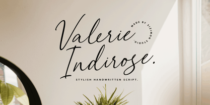 The font is called "Valerie Indirose", it is with fashionable themes. Script font contains 2 set alternates and some ligatures. The Valerie Indirose matches apply in some designs such as the logotype, quotes, wedding invitation, business card, packaging, branding, and more custom design. What's Include : Uppercase, lowercase, numeral, symbol and punctuation, alternates (ss01-ss02), ligature in script font PUA Encoded Multilingual support If you have any questions, please contact : info@sizimon.com