10,000 search results
(0.047 seconds)
- ZT Bros Oskon 90 s by Zelow Type,
$13.00 ZT Bros Oskon 90s is a captivating typographic creation that seamlessly blends the aesthetic charm of the 1990s retro era with a modern touch. With unmatched serif elegance and a unique 90s style, this font offers 72 variations, including sharp Condensed forms, graceful Expanded, and captivating italic styles. Every character in ZT Bros Oskon 90s is meticulously crafted, creating a vintage ambiance that is truly enchanting. Featuring 6 font weights ranging from Extra Light to Bold, this font provides you with the flexibility to create a wide range of striking and memorable designs. Features of ZT Bros Oskon 90s: 72 Unique Variations Aesthetic Retro Vibes from the 1990s Elegant Serif Style Condensed, Expanded, and Italic Forms 6 Font Weights: Extra Light, Light, Regular, Medium, Semi-Bold, Bold Exceptional Creative Versatility ZT Bros Oskon 90s is the perfect choice for graphic design projects, branding, posters, and other promotional materials that require a captivating retro touch. Unleash limitless creativity with this font and infuse a nostalgic 1990s vibe into every one of your creations. ZT Bros Oskon 90s has 6 free styles, you can get them on my GUMROAD I hope you have fun using ZT Bros Oskon 90s. Thanks for using this font ~ Zelowtype
 - Leidener by Talavera,
$40.00 This font family is inspired by printed work made by the Elzevir family back in the XVIIth century at Leiden (NL). They worked with material from several type designers, but further investigations sends us to the tracks of one in particular: Robert Granjon. Granjon italics were way ahead of his time, making some really beautiful signs like swashy ampersands and minuscule v letters. This font also contains old style figures in the same fashion as they were printed, like the flipped number 8 and open forms in 6 and 9. This is as much a revival as an original design, because of their weights bold and heavy (both with italics) that were inspired on some titles. In this font you can also find a lot of ligatures, small caps, diacritics and even a fleuron for each weight and variation. Leidener came up from two books: Constantini Imperiatoris (1611) and Exercitationum Mathematicarum (1657), printed by Louis and John Elzevir on their Leiden Workshop, back in the day.
 - Supertuba by Tipos Pereira,
$10.00 Supertuba is a :) geometric sans vernacular humanist :) display type family with 6 weights. There's literally dozens of ligatures in this font so It works very well for flyers, package, stickers and posters, also you can use it as a text font if you're looking for something slightly bold. Supertuba has multilingual support and useful open type features. Letter boards that used to be seen in churches, dive bars and butcher shops are the main inspiration for this typeface. The name Supertuba came from an old supermarket that no longer exists in the city of Indaiatuba , I just believe this name is super fun (at least in Portuguese) and wanted to keep it alive. I was in Indaiatuba when I get started designing this typeface so this is fair enough. Supertuba the third piece of a particular trilogy of fonts that Stubby and Stubby Rough take part, from the lazy vernacular drawing to an unusual geometry. Enjoy!
 - Warna by IKIIKOWRK,
$19.00 Proudly present Warna - Bohemian Font, created by ikiiko. With a design that is both fun and retro-inspired, Warna perfectly embodies that character. The font in question moves to the beat of your imagination. Each figure has a distinctive, hand-crafted quality, as though they were lovingly and enthusiastically created on a worn-out journal from the 1960s. "Warna" is more than simply a typeface; it's a lively storyteller who tells old tales with a contemporary twist. Its vibrant and youthful appeal makes it ideal for branding with a bohemian or retro aesthetic. The letters serve as your artistic friends, encouraging you to express your ideas with bold strokes that evoke the liberation of a joyful party. This font is very suitable for making a bohomian stuff, vintage boho brand, poster, magazine layout, fashion design, quotes, or simply as a stylish text overlay to any background image. What's Included? Uppercase & Lowercase Numbers & Punctuation Multilingual Support Works on PC & Mac
 - Salloon by Ingrimayne Type,
$8.95 The original version of Salloon was what has become Salloon-Wide. It was designed a year or two before 1990. The narrower version, which is now the regular version of the face, was constructed a few years later. There never has been a true lower-case set of letters for these fonts, but the narrower version introduced a second set of caps by removing the side bumps from the letters. Although Salloon may look like an old font, no historic font closely resembles it. Fonts with bold, thick stems such as Salloon invite interior decoration. The five striped versions and the shattered version of the font were produced a year or two after the construction of the narrower Salloon when the arrival of a font distortion program made it easy to cracked and stripe fonts. In 2019 an outline style and two highlighter styles were added to be used in layers with the Salloon-Regular and one highlighter style was added to be used with Salloon-Wide.
 - Beefcakes by Monotype,
$50.99 Inspired by butcher shop and supermarket window advertising, Beefcakes™ emulates "big brush” style lettering – with a contemporary twist. Not for the typographically timid, this is a design that makes a powerful and friendly statement in print and on screen. Advertising headlines, posters, cover art, menus and packaging are all in Beefcakes’ wheelhouse. While it would be a little crowded on small screens, big type in web sites and games are also part of Beefcakes kit-bag. Drawn by Jim Ford, Beefcakes’ big, sassy and playful shapes are sure to grab attention. Its letterforms are dense and sturdy – yet soft and welcoming as your mom’s old couch. The suite of Beefcakes fonts is available as all-caps designs with small caps, in roman, italic and shadow flavors. As a nod to the typeface’s inspiration, Beefcakes fonts also include a set of decorative abbreviations (lb, oz, kg, in, etc.) for bold signage and showcard-style displays.
 - Full Neue by Bülent Yüksel,
$19.00Full Neue is the younger brother of original Full Sans, Full Slab and Full Tools. Ideally suited for advertising and packaging, editorial and publishing, logo, branding and creative industries, poster and billboards, small text, way-finding and signage as well as web and screen design. Full Neue provides advanced typographical support for Latin-based languages. An extended character set, supporting Central, Western and Eastern European languages, rounds up the family. The designation “Full Neue LC 50 Book” forms the central point. The first figure of the number describes the stroke thickness: 10 Thin to 90 Bold. Full Neue LC comes 5 weights and italics also Full Neue SC comes 5 weights and italics total 20 types. The family contains a set of 485 characters. Case-Sensitive Forms, Classes and Features, Small Caps from Letter Cases, Fractions, Superior, Inferior, Denominator, Numerator, Old Style Figures just one touch easy In all graphic programs. Full Neue is the perfect font for web use. You can enjoy using it. - Bach by Los Andes,
$39.00 We have grown a new flower in our Garden, but this time, in a more emotional way, capturing its vibrations and using them to create a fresh handmade typeface: ‘Bach’, a display type system inspired by the new lifestyle trends that look to go back to basics and increase the value of old natural healing methods. Bach comes in two styles: a 6-weight Serif font in regular and italic versions, and a 2-weight Script in regular and bold versions. Ornaments are also included! Bach Script is based on the calligraphic catchwords set (handcrafted with brush pen) and the Serif version of the Garden typeface. This font is the perfect choice for labelling, packaging, illustrated books and posters. Go back to nature and feel the vibration again, this time with Bach! Bach is a Mendoza Vergara Studio design with the collaboration of Cecilia Mendoza in digital editing, under the supervision of Luciano Vergara and Coto Mendoza.
 - KT Quantum by Kotivoro Lab,
$11.00 KT Quantum is a Display Serif Typeface with 8 weight from Thin to Extrablack. Quantum adapted from 1911 old style serif typeface, Our mindset is to bring this historical typeface to this era, which is we have to redrawing that from the scratch and refining the shape to build the strong characteristic and make it ours. KT Quantum have total 434 glyphs and 203 language support. Quantum support latin basic, latin-1 supplement, latin extended A-B, Spacing modifier letters, and combining diacritical marks. This typeface have a bold characteristic with masculine and feminine effect in the same time, that's make this typeface suitable for your Headline and sub-headline, we don't recommended to use it as body text in small size, because it has a very large contrast and reduce the legibility and readability Whats Include: Webfont is available if you purchase the webfont option and we will send the file direct to download it. Enjoy & Happy Creating We're Here Tapinkco@gmail.com
 - ITC New Winchester by ITC,
$29.99ITC New Winchester is a revival of a typeface that never really had a first release. The original Winchester was an experimental design created by the American type designer W.A. Dwiggins in 1944. Dwiggins was interested in improving the legibility of the English language by reducing the number of ascenders and descenders; to do this, he gave Winchester very short descenders and created uncial forms for a number of letters. The result was a distinctive text typeface that was occasionally used by Dwiggins and Dorothy Abbe in handset form. Fifty years later, Indiana type designer Jim Spiece has turned Dwiggins's experiment into a new family of digital text types. Spiece gave New Winchester a bold weight, as well as small caps (both roman and italic) and old style figures; he also created two forms of the lowercase f, one with and one without an overhang (in metal type, a kern), and a full set of f-ligatures. - Stencil PTX by Pedro Teixeira,
$12.00 Introducing the Stencil PTx font family. We created two styles, sprayed, to be used in display giving the idea of graffiti on the wall and the clean, to possibly be used in print. This is the idea We have of an old school stenciled typeface/look. This typographic masterpiece brings the raw energy and urban flair of stencil graffiti art to your fingertips. The Stencil PTx font family is tailored for designers seeking to infuse their projects with the rebellious spirit and visual impact of street art. Whether you're designing for urban-themed events, streetwear branding, social media graphics, or edgy advertising campaigns, this font family adds an authentic urban edge to your creations. At Pedro Teixeira Foundry we're passionate about bringing the raw and vibrant energy of street art into the realm of typography. Explore the Stencil PTx font family to unleash the bold, gritty, and dynamic essence of stencil graffiti, elevating your designs with an urban attitude that commands attention and amplifies your message.
 - Monarcha by Isaco Type,
$45.00 Monarcha is a serifed type family, with a strong influence of the baroque style, for extended texts. Its roman versions are slightly skewed, in the sense of reading, and its italics have unusual calligraphic features. Moreover, the contrast between thick and thin strokes is relatively smaller than in conventional serif fonts. These characteristics, coupled with its rounded shapes, give Monarcha a delicious fluidity and texture. Monarcha innovates and brings an exclusive OpenType feature to convert Arabic to Roman numerals up to 3999. It also has several other professional features - small caps, fractions, old style-, lining-, tabular numbers, scientific superior/inferior figures, stylistic sets and more than 40 different ligatures (standard + discretionary). The family consists of 8 styles, 4 weights - Book, Regular, SemiBold and Bold - plus their respective italic versions. The fonts are available in OpenType PS format and have extended character set to support CE, Baltic, Turkish as well as Western European languages.
 - Mandelia by Type Innovations,
$39.00 Mandelia was created by Alex Kaczun, an American type designer, in 2010. The typeface was named in honor of Nelson Mandela, former president of South Africa, for his “shining example of the incredible strength of the human spirit to persevere in the face of adversity for the pursuit of freedom”. Mandelia is a strong, bold and wide-bodied serif typeface design, reminiscent of the great African landscape with its diverse animal life. It’s easy to see the influence of the 'Rhino' sharp serifs and ‘Elephant’ size stems and proportions. The font commands attention and respect. Great for headlines that pack a punch, logos, posters, and signage. And because it was well designed, it can even be used in body copy at various point sizes. Mandelia is available in Opentype format for both Mac and PC, and comes complete with true drawn small caps, old style figures and Unicode Latin 1252 and Central European 1250 character sets. It has everything you need to get the job done.
 - Bookish by Hackberry Font Foundry,
$24.95 This all started with a love for Jenson. I know there're hundreds of variations on that theme. But, that is where I began, several years ago. How far it came, as usual as I wandered through the vagaries of font design, is not unusual. If you've read any of my font design books, you know my design processes are quite loose and spontaneous. I wanted the general feel of a favorite old font, but softer, easier, and more comfortable. I built these on the same vertical metrics as my Librum Publishing Group. However, this family is not part of that group. I used the metrics because that shows my current taste in fonts. This family does work with the Librum group—but to be honest, I haven't experimented enough to come up with a good companion. I suspect I'll need to make another companion family. I may need make a non-modulated bold version also. But, that remains to be seen. I'm pleased with this.
 - Full Slab by Bülent Yüksel,
$19.00Full Slab is the younger brother of original Full Sans, FullNeue and Full Tools. Ideally suited for advertising and packaging, editorial and publishing, logo, branding and creative industries, poster and billboards, small text, wayfinding and signage as well as web and screen design. Full Slab provides advanced typographical support for Latin-based languages. An extended character set, supporting Central, Western and Eastern European languages, rounds up the family. The designation “Full Slab LC 50 Book” forms the central point. The first figure of the number describes the stroke thickness: 10 Thin to 90 Bold. Full Slab LC comes 5 weights and italics also Full Slab SC comes 5 weights and italics total 20 types. The family contains a set of 485 characters. Case-Sensitive Forms, Classes and Features, Small Caps from Letter Cases, Fractions, Superior, Inferior, Denominator, Numerator, Old Style Figures just one touch easy In all graphic programs. Full Slab is the perfect font for web use. You can enjoy using it. - Data Error AOE Pro by Astigmatic,
$24.00 The Data Error AOE Family was one of my earliest typefaces, at a time when I had become obsessed with all forms of "digital/techology" typestyles. It's been awhile since the early 2000's, but I've had a hankering for awhile now to revisit this typeface, giving it a more expansive language character set and fill it out with some Opentype features. Inspired by some old printouts of BASIC programs and an Atari 1050 Disk Drive manual with pin printer examples, comes the familiar yet oddly restricted style with this Data Error family. This family comes complete with Regular and Bold versions with their respective Oblique versions. Odd pin printer restrictions inherent in this typeface are: no characters extend below baseline or above ascender line, (except international accents). A nostalgic typeface for computer programmers everywhere, strong and legible at any size, Data Error is perfect for so many purposes, get it today!
 - Serpentine by Image Club,
$29.99Dick Jensen (USA) designed Serpentine, is a contemporary-looking display font, for the Visual Graphics Corporation in 1972. With the rise of digital typesetting and desktop publishing, this typeface quickly became both popular and ubiquitous. This dynamic, wide, boxy design is identifiable via tiny triangular swellings at the stroke endings - what might be called semi-serifs. Serpentine is available in six different font styles: Light, Light Oblique, Medium, Medium Oblique, Bold, and Bold Oblique. Serpentine" is a greenish rock that sometimes resembles a serpent's skin, and is often used as a decorative stone in architecture. Though this font doesn't seem at all snaky or sinuous, it does have an architectural, stone-like solidity. The subtle, almost non-existent curves and semi-serifs keep it from being too stern or cold. Although the underlying strokes of each weight are similar, the six members of the Serpentine font family all present their own individual personalities. Serpentine Light lends itself well to text for onscreen displays, for instance, while the numbers from typeface's heavier weights are seen around the world on soccer jerseys! Additionally, the oblique styles convey a streamlined sense of speed, furthermore lending Serpentine well to sport and athletic applications (especially the faster, high-speed varieties). Because of its 1970s pedigree, Serpentine has come to be known as a genuine "retro" face. This makes the typeface even more appropriate for display usage, in applications such as logo design, magazine headlines, and party flyers. If you like Serpentine, check out the following similar fonts in the Linotype portfolio: Copperplate Gothic (similar serifs) Eurostile (similar width) Princetown (another "athletic" font) Insignia (similar "techno" feeling)" - Serpentine by Linotype,
$29.00Dick Jensen (USA) designed Serpentine, is a contemporary-looking display font, for the Visual Graphics Corporation in 1972. With the rise of digital typesetting and desktop publishing, this typeface quickly became both popular and ubiquitous. This dynamic, wide, boxy design is identifiable via tiny triangular swellings at the stroke endings - what might be called semi-serifs. Serpentine is available in six different font styles: Light, Light Oblique, Medium, Medium Oblique, Bold, and Bold Oblique. Serpentine" is a greenish rock that sometimes resembles a serpent's skin, and is often used as a decorative stone in architecture. Though this font doesn't seem at all snaky or sinuous, it does have an architectural, stone-like solidity. The subtle, almost non-existent curves and semi-serifs keep it from being too stern or cold. Although the underlying strokes of each weight are similar, the six members of the Serpentine font family all present their own individual personalities. Serpentine Light lends itself well to text for onscreen displays, for instance, while the numbers from typeface's heavier weights are seen around the world on soccer jerseys! Additionally, the oblique styles convey a streamlined sense of speed, furthermore lending Serpentine well to sport and athletic applications (especially the faster, high-speed varieties). Because of its 1970s pedigree, Serpentine has come to be known as a genuine "retro" face. This makes the typeface even more appropriate for display usage, in applications such as logo design, magazine headlines, and party flyers. If you like Serpentine, check out the following similar fonts in the Linotype portfolio: Copperplate Gothic (similar serifs) Eurostile (similar width) Princetown (another "athletic" font) Insignia (similar "techno" feeling)" - Modern Neon by Ditatype,
$29.00 Modern Neon is an audacious display font that combines the allure of neon lights with an array of captivating lines. With its uppercase letterforms, this typeface commands attention, creating a visually stunning experience that leaves a lasting impression. The defining feature of Modern Neon lies in its bold and adventurous lines that adorn each letter. These radiant lines flow dynamically throughout the characters, adding an element of complexity and intrigue. The interplay of these luminous lines creates a visual spectacle, captivating the viewer's gaze and drawing them into a world of electrifying typography. Inspired by the vibrant glow of neon signs, Modern Neon exudes a futuristic energy. The font's luminosity casts a vivid hue, evoking a sense of innovation and modernity. Each letter pulsates with an otherworldly glow, creating a striking visual impact that cannot be ignored. Each letter of this font has been meticulously crafted to strike a balance between legibility and decorative intricacy. The interconnected lines add depth and movement to the characters, enhancing the overall composition without compromising readability. The result is a font that exudes creativity and boldness while ensuring your message remains clear and impactful. You can also enjoy the various features available in this font. Enjoy the various features available in this font. Features: Alternates Ligatures Multilingual Supports PUA Encoded Numerals and Punctuations The strong and bold strokes demand attention, making this font perfect for headlines, titles, and impactful statements. Whether you're creating posters, branding materials, digital artwork, or anything in between, this font will add a daring and captivating element. It particularly shines in applications related to technology, gaming, fashion, and futuristic themes. Find out more ways to use this font by taking a look at the font preview. Thanks for purchasing our fonts. Hopefully, you have a great time using our font. Feel free to contact us anytime for further information or when you have trouble with the font. Thanks a lot and happy designing.
 - Mac Sans by Jolicia Type,
$15.00 Introducing Mac Sans: The Perfect Blend of Firmness and Uniqueness Elevate your design projects with Mac Sans, a modern sans serif font that effortlessly combines a strong, authoritative presence with a distinctive character that sets it apart from the crowd. Key Features: Firm Yet Friendly: Mac Sans strikes the perfect balance between a bold, assertive statement and an inviting, approachable style. Its sturdy letterforms convey confidence without sacrificing approachability. Unique Personality: While many sans serif fonts may seem interchangeable, Mac Sans stands out with its one-of-a-kind personality. Each character has been meticulously crafted to ensure that your designs are memorable and captivating. Versatile Design: Whether you're working on a professional presentation, branding materials, web design, or a creative project, Mac Sans adapts effortlessly to various contexts. Its clarity and readability make it suitable for both headlines and body text. Extensive Character Set: Mac Sans includes a comprehensive set of characters, including uppercase and lowercase letters, numerals, punctuation marks, and special symbols. It also supports multiple languages, making it a truly global typeface. 4 Weights: Choose from a range of weights to suit your design needs, from the bold and commanding "Mac Sans Bold" to the sleek and sophisticated "Mac Sans Regular." Mix and match to create dynamic typographic processes. Easy to Use: With a user-friendly design, Mac Sans is a breeze to work with in various design software and applications. It ensures a smooth workflow and consistently outstanding results. Endless Possibilities: Whether you're designing logos, posters, websites, or print materials, Mac Sans empowers you to explore a world of creative possibilities. Its unique character injects personality into your projects, making them truly stand out. Elevate your typography game and leave a lasting impression with Mac Sans. Its firm yet unique character is sure to make your designs shine. Discover the versatility and distinctiveness of Mac Sans today, and let your creativity soar.
 - Felbridge by Monotype,
$29.00 The impetus behind Felbridge was both ambitious and highly practical: to develop an ideal online" typeface for use in web pages and electronic media. Robin Nicholas, the family's designer, explains, "I wanted a straightforward sans serif with strong, clear letterforms which would not degrade when viewed in low resolution environments." Not surprisingly, the design also performs exceptionally well in traditional print applications. In 2001, to achieve his goal, Nicholas adjusted the interior strokes of complex characters like the M and W to prevent on-screen pixel build-up and improve legibility. Characters with round strokes were drawn with squared proportions to take full advantage of screen real estate. In addition, small serifs were added to characters like the I, j and l to improve both legibility and readability. "The result," according to Nicholas, "is a typeface with a slightly humanist feel, economical in use and outstanding legibility - even at relatively small point sizes. Most sans serif typefaces have italics based on the simple "sloped Roman" principle, but italic forms for Felbridge have been drawn in the tradition of being visually lighter than their related Roman fonts, providing a strong contrast when the italic is used for emphasis in Roman text. The italic letter shapes also have a slightly calligraphic flavor and distinctive "hooked" strokes that improve fluency. Felbridge is available in four weights of Roman - Light, Regular, Bold and Extra Bold - with complementary italics for the Regular and Bold designs. The result is a remarkably versatile typeface family, equally comfortable in magazine text copy or in display work for advertising and product branding. As a branding typeface, Felbridge works in all environments from traditional hardcopy materials to web design, and is even suitable for general office use. As part of a corporate identity, this no-nonsense typeface family will be a distinctive and effective communications tool." Felbridge™ font field guide including best practices, font pairings and alternatives.
 - Tempest-narrow - Unknown license

- Harpagan by Borutta Group,
$39.00 Harpagan is an experimental type family characterized by scalable construction from mono linear grotesk to display bold. I’ve designed this typeface after my trip to Kyrgyzstan, Uzbekistan and Kazachstan, where i’ve been impressed by the impact of arabic script in Asian style Cyrillics. The Harpagan type Family consist of 5 futuristic styles.
 - Muscle Cars by Vozzy,
$10.00 Introducing vintage label font duo named Muscle Cars. These two fonts has an additional characters and multilungual support (check out all available characters on previews). Bold and Script fonts has two styles: Clean and Aged. This font will look good on any vintage styled designs like a poster, T-shirt, label, logo, etc.
 - Beast Sketch by 38-lineart,
$19.00 "Beast Sketch" is an extraordinary handwritten font created with bold, untamed strokes using ink and a bamboo pen. It boasts a masculine aesthetic, an organic, natural feel, and extensive Latin character support. Perfect for book titles, magazine covers, logos, and more, it adds a raw, authentic, and compelling vibe to your projects.
 - Urban Dope 3d Graffiti by Sipanji21,
$15.00 "Urban Dope" is a graffiti font characterized by its bold letterforms and rounded corners. This font is ideal for a wide range of design projects, including headlines and various other creative endeavors. With its edgy and dynamic style, "Urban Dope" adds an urban flair to your typography, capturing the essence of street culture.
 - Bakrie by 160 Std,
$20.00 Bakrie is a bold and incredibly unique display font. Masterfully designed to become a true favorite, this font has the potential to bring each of your creative ideas to the highest level! suitable for use in many design forms, for example Headline, Magazines, Postcards, Logos, DIY Projects, Brand, Apparel, Quotes, and much more.
 - Rockmore by Almarkha Type,
$29.00 Rockmore is a bold script font with a clear style and dramatic movements. This font is great for logos, printed quotes, invitations, cards, product packaging, headers, Logotype, Letterhead, Poster, Apparel Design, and much more! Rockmore comes with uppercase, lowercase, numerals, accents (Multilingual characters), punctuations and a lot of gorgeous variations on each character!
 - Sweet Party by Elysart,
$9.00 Sweet Party Font in 4 styles is a cute and bold handwritten font by @elysarto. Great for a fun and festive mood! The font will be awesome for many industries including : fashion, kids, school and many more! Here’s what you’ll get on the package : What's included? - Uppercase Characters - Lowercase Characters - Numbers and Punctuation
 - Volvoreta RG LG by LGF Fonts,
$17.00 Bolboreta Hollow is a revival of "Decorativa" font of Richard Gans Foundry .We've expanded the family with padded versions, striped versions (gray on other Gans fonts, in keeping with the days of lead fonts), and those same fills in separate font files, for graphic designer layered play. In addition to Bold versions.
 - Blacker Gothic by Letterara,
$25.00 Discover the allure of Blacker Gothic, an entrancing blackletter font that seamlessly blends bold elegance with distinctive character forms. Perfect for enhancing a variety of design projects, from product packaging to branding, its PUA encoding grants easy access to a wealth of unique glyphs and swashes, ensuring extraordinary results for your creative endeavors
 - Heifin by Daily Studio,
$16.00 Heifin is a beautiful bold typeface designed by Daily Studio. Contain unique upper and lowercase best for any purpose, especially to make a title, logo, and branding. This font will make your projects looks more stunning and amazing. Use your creativity to mix and match with other font to create a masterpiece.
 - Sortemun by Mandarin,
$15.00 Sortemun is a modernist display font based on heavy metal band graphics with a touch of horror movies from the 70/80’s. Bold, mysterious and vampiric it’s suitable for use in various projects such as rock/metal albums, scary games, horror movie titles, swag graphics, headlines, book covers, Halloween based parties etc.
 - Churchward Lorina by BluHead Studio,
$25.00 Churchward Lorina is a four weight typeface family originally designed in 1996 by New Zealand type designer Joseph Churchward. A personable geometric sans serif, it possesses some of Churchward's trademark quirkiness but reamins highly legible and readable on screen as well as in print. The family includes Light, Regular, Bold and Black.
 - Tropical Times by Sarid Ezra,
$19.00 Introducing Tropical Times - a handwritten tropical vibes font Tropical Times is a bold handwritten typeface with tropical and summer vibes. You can use this font for any purpose, especially for quotes, branding, book cover, or even merchandise. With stylish ligatures that will make your project more natural and handmade.This font also support multilingual.
 - Breakneck by Alphabet Agency,
$15.00 Breakneck Font Duo includes Breakneck and Breakneck Italic fonts. The fonts are excellent for expressing motion; ideal for racing themes. The sharp angles combined with the bold sport style create the expression of speed. Each font contains all basic Latin characters that includes uppercase, lowercase, numbers, punctuation plus much more (130+ characters).
 - Mightsilly by Qwrtype Foundry,
$14.00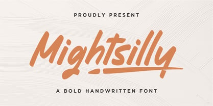 Proudly presenting Mightsilly Mightsilly is a bold handwritten font. Mightsilly is perfect for product packaging, branding project, magazine, social media, wedding invitations, or just used to express words above the background. Mightsilly also comes with multilingual support. Enjoy the font, feel free to comment or feedback, send me PM or email. Thank you!
 - Hometown by Balpirick,
$15.00 Hometown is a Modern Handbrushed Font. Hometown is a bold and fun handwritten font. It’s playfulness make it great for creative projects, be it inspirational wall posters or for communicating your brand. Hometown also multilingual support. Enjoy the font, feel free to comment or feedback, send me PM or email. Thank you!
 - Self Promotion JNL by Jeff Levine,
$29.00 The July 26, 1934 of the movie industry trade paper The Film Daily contained an ad for Paramount promoting its most recent releases. Hand lettered in an ultra bold Art Deco sans serif style, it was the working model for Self Promotion JNL, which is available in both regular and oblique versions.
 - Tidy Hand by Sean Johnson,
$- Tidy Hand is a clean and simple hand-written font, reminiscent of classic Swiss type. Perfectly suited to annotating sketches, UX / UI wireframes and architects drawings, where a slightly more formal, but still hand-drawn aesthetic is needed. Available in light, regular and bold; with Greek, Cyrillic and full extended Latin character sets.
