10,000 search results
(0.032 seconds)
- Hebrew Sevilha Tanach by Samtype,
$149.00 This is Classic Hebrew Sefardi Font. This is a beautiful typeface to invitations, posters, cover books and small texts. All diacritic marks for vocalization are present (Nikud), including shevana, kamats katan, cholam chaser and dagesh hazak.
 - Microdot by 2D Typo,
$24.00 Microdot is a pixel typeface that uses 5 by 7 grid. Fonts supports Latin, Cyrillic, and Hebrew, all with thoroughly designed diacritics. Microdot makes use of advanced OpenType features, just as any other modern text typeface.
 - Hebrew Sevilha Std by Samtype,
$49.00 This is Classic Hebrew Sefardi Font. This is a beautiful typeface to invitations, posters, cover books and small texts. All diacritic marks for vocalization are present (Nikud), including shevana, kamats katan, cholam chaser and dagesh hazak.
 - Trampoline by Tour De Force,
$25.00 Trampoline is neat handwriting typeface inspired by requests I'm receiving as designer from people who would like to display dose of human touch in their products and editorials by having an typeface with personality and individuality.
 - Onigiri by Megami Studios,
$12.50 Cute and adorable, they're...Onigiri! Designed to evoke the cuteness of Japanese mascots with the informality of script, these little riceballs o' text are sure to please! Comes in Latin alphabet, hiragana, katakana and onigiri dingbats!
 - Brounde by Ahmet Altun,
$17.00 Brounde font comes in four weights from extra light to medium. Legible texts can be created with its rounded slab serif configuration. Also it can be used in posters and every kind of graphic design works.
 - Deuglas by Sealoung,
$10.00 Deuglas is a minimal and neat sans serif font. It can easily be matched to an incredibly large set of projects, so add it to your creative ideas and notice how it makes them stand out!
 - JH Lina by JH Fonts,
$60.00 JH Lina is an Arabic Naskh typeface, including four weights; it is typical for long running text, headlines, branding , news letters, magazines, signage and electronic publishings ... The diacritic positioning is fine tuned per the publishers requirements.
 - Nacho by RodrigoTypo,
$25.00 Nacho, is a font inspired by the Mexican culture as the party of the dead and customs, created From the Thin to the Densa, it also contains a dingbat set to make the text more dynamic.
 - Geotrica by Rockboys Studio,
$15.00 Geotrica is a minimal and neat sans serif font. It can easily be matched to an incredibly large set of projects, so add it to your creative ideas and notice how it makes them stand out!
 - Typogravure by Jonahfonts,
$40.00 A family with a retro feel with 12 styles in 6 weights, for both headlines and body text use as well editorial and corporate design from advertising to packaging and digital design. Supports Central/European languages.
 - Proband by SH Grafikdesign,
$25.00 The goal was to create a typeface that looks reputable and still original. Notably, some uppercase characters indicate this font its unique character. It is ideally suited for both body text and headings, or modern logos.
 - AZ Cut Script by Artist of Design,
$25.00 AZ Cut Script utilizes a simple hand-drawn “old look” to the line work which is designed to have a “worn feel” to it. Ideal for use as headline or sub-head text in your design.
 - Northern Petal by Tanincreate,
$16.00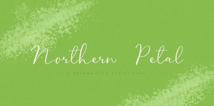 Northern Petal is a casual script font with a touch of naturally connected handwritten feel. It is perfect for eye-catching branding projects, text overlay to any background, social media, wedding invitations, greeting cards and more.
 - Cheristone by Rockboys Studio,
$23.00 Christine is a minimal and neat sans serif font. It can easily be matched to an incredibly large set of projects, so add it to your creative ideas and notice how it makes them stand out!
 - Handy Cut by Los Andes,
$34.00 Handy Cut is an experimental project inspired by paper cutting only using fingers, designed by Paty Bean from south Chilean farm. It includes dingbats and alternate characters to play with in expressive and irregular short texts.
 - Pumkinpie by Balpirick,
$15.00 Pumkinpie is a cute and lovely handwritten font. Fall in love with its simple and neat style and use it to create gorgeous wedding invitations, beautiful stationary art, eye-catching social media posts, and much more!
 - Murisa Mariana by Murisa Studio,
$10.00 Mariana is a minimal and neat sans serif font. It can easily be matched to an incredibly large set of projects, so add it to your creative ideas and notice how it makes them stand out!
 - Embossing Seals JNL by Jeff Levine,
$29.00 Twenty-Six various styles of document seals comprise Embossing Seals JNL. With a little imagination any plain document can take on an "official" look by adding text and a few special effects to the finished image.
 - Fatin Gengky by Stringlabs Creative Studio,
$15.00 Fatin Gengky is an authentic and neat serif font. It can easily be matched to an incredibly large set of projects, so add it to your creative ideas and notice how it makes them stand out!
 - Flambster by PizzaDude.dk,
$20.00Flambster is an uneven and quickly scribbled font - perfect to simulate ... well, uneven and quickly scribbled text! :) Comes with a good handful of ligatures! You will need to use OpenType supporting applications to use the autoligatures. - Alveru by Sakha Design,
$12.00 Alveru is a minimal and neat sans serif font. It can easily be matched to an incredibly large set of projects, so add it to your creative ideas and notice how it makes them stand out!
 - P22 1722 by IHOF,
$39.95 An historical font based on early 18th century printing, with the visual effect of uneven inking and indifferent presswork on handmade paper. Ideal for evoking the period. Effective in continuous text setting or in display sizes.
 - Rushfiel by Rotterlab Studio,
$10.00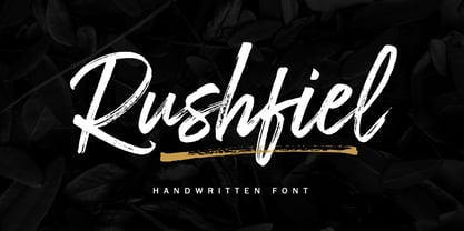 Introducing Rushfiel, a handwritten font made with quick-drying brush strokes in a distinctive styles. It's perfect for branding projects, household appliances design, product packaging or just as a text overlay for background images or posters.
 - Pen Gothic JNL by Jeff Levine,
$29.00 Pen Gothic JNL emulates lettering made with a round nib lettering pen, and is loosely based on some text found on the popular 1918 song "Ja-Da". The font is available in regular and oblique versions.
 - Violette Brush by Fargun Studio,
$12.00 Introducing Violette Brush Font!! Handwritten font with quick dry strokes and a signature style. perfect for branding projects, home ware designs, product packaging or simply as a stylish text overlay to any background image or posters.
 - Kitchen Utensils by Celebrity Fontz,
$24.99 Kitchen Utensils is a pictorial font with 36 different common kitchen tools and appliances in the shape of the letters of the alphabet and numbers. Perfect for cooking and kitchen-related texts, recipes, and culinary publications.
 - Melatea by San Studio,
$9.99 Melatea is a minimal and neat sans serif font. It can easily be matched to an incredibly large set of projects, so add it to your creative ideas and notice how it makes them stand out!
 - Crunk by Nerfect,
$15.00Crunk was inspired by the creator's (at the time) teenaged hoodlum of a brother. The font Crunk is great for headlines and text and has served its creator well over the years since it was made. - Proband Special by SH Grafikdesign,
$25.00 The goal was to create a typeface that looks reputable and still original. Notably, some uppercase characters indicate this font its unique character. It is ideally suited for both body text and headings, or modern logos.
 - Reyes by Yock Mercado,
$9.00 Reyes is a modern typeface with influence on consumer product labels from the early 1900s, is ideal for use in display texts and thanks to its 6 typographical weights lends itself to complex typographic design compositions.
 - Conmersa by AEN Creative Studio,
$16.00 Conmersa is a minimal and neat sans serif font. It can easily be matched to an incredibly large set of projects, so add it to your creative ideas and notice how it makes them stand out!
 - Steamer by Erik Bertell,
$29.95 Steamer is a grimy grotesque with a thick early 20th century air to it. A tireless workhorse, it is accustomed to carrying out any typographic task from continuous text to bold headlines steadily through any conditions.
 - Rotis II Sans by Monotype,
$50.99 Developed over several years by the late Otl Aicher and first released in the late 1980s, the Rotis® typeface has become a timeless classic. ROTIS II SANS HISTORY Aicher was a renowned German designer and corporate image consultant. He created the four basic designs of Rotis – sans serif, semi sans, semi seif and serif – within an extended typeface family concept, wherein all designs share a common cap height, lowercase x-height, basic stem weight and general proportions. While each version is part of the large, integrated family, each was also designed to function on its own as a distinctive typestyle. The result is that all members of the Rotis family combine smoothly with each other. Aicher, however, did not design the Rotis family with the weights and proportions normal for more contemporary releases. Rotis Sans Serif, for example, was drawn with just six weights and only two italics. Starting in 2010, Robin Nicholas, senior designer for Monotype Imaging in the UK, and freelance designer Alice Savoie collaborated to bring Rotis Sans Serif up to current standards. The result is Rotis II Sans, a completely new addition to the Rotis family. “We devised our approach together,” recalls Savoie, “deciding which weights to start with, what kind of alterations to make to the original Rotis, etc. I went to work on the typefaces, regularly submitting proofs to Robin. We would then decide in tandem on the next steps to take.” Nicholas elaborates, “We revisited the range of weights and added matching italics so that the new additions to the family offer increased versatility. We optimized the outlines, corrected the weight of several letters and re-examined overall spacing and kerning. In addition to a new set of numerals, with a height similar to the capitals, we also drew case-sensitive punctuation.” ROTIS II SANS USAGE The new Rotis II Sans suite comprises 14 typefaces: seven weights, ranging from extra light to black, each with a companion italic. The designs are available as OpenType® Pro fonts, allowing for automatic insertion of ligatures and fractions. Pro fonts also offer an extended character set supporting most Central European and many Eastern European languages. Aicher’s original Rotis designs were widely used for branding and advertising. With the addition of Rotis II Sans, the family is again poised to become a powerful communicator.
 - Roughhewn, as crafted by the talented GemFonts foundry under the creative direction of Graham Meade, is a distinctive and expressively rustic typeface that captures the essence of hand-carved letteri...
- Ah, the jovial and whimsical world of fonts, where each typeface has its own distinct personality and charm. Nestled within this realm of typographic delights, you'll find a gem named joeHand 3, craf...
- CoolHandLuke ttext - Unknown license

- FS Brabo Paneuropean by Fontsmith,
$90.00Worldly Even though it’s a new arrival, FS Brabo has seen the world. Designed by a Brazilian working in London and studying in Belgium under a Dutchman, it’s certainly well-travelled. And it was inspired by the extraordinary archive of early book typefaces at the world-renowned Plantin-Moretus Museum in Antwerp, while Fernando Mello was attending Frank Blokland’s Expert class Type Design course at the Plantin Institute of Typography. It was there that Fernando became engrossed in the collection of early metal type, matrices, punches and type samples by figures such as Garamond and Granjon. So much so that he took on the mighty task of developing ‘a beautiful, functional, serifed text font’ of his own. Heroic FS Brabo’s journey from sketch to font family took an epic three years, starting in Antwerp, continuing at Fontsmith in London, and reaching its conclusion back in Fernando’s home city of São Paulo. No wonder Fernando was reminded of another titanic face-off: that of Antwerp’s Roman hero of legend, Silvius Brabo, and the evil ogre, Antigoon. Brabo came to the town’s rescue after the tyrannical giant had been charging ships’ captains extortionate taxes and chopping off the hands of those who refused to pay up. Having finally downed Antigoon after a long and terrible duel, Brabo cut off the giant’s own hand and threw it into the river Scheldt, unwittingly giving the town its name: the Dutch for ‘hand-throw’ is hand werpen. What better way for Fernando to name his literary typeface than after the hero of Antwerp’s oldest tale? The garalde factor FS Brabo is not a revival, but a very much a contemporary, personal interpretation of a garalde – a class of typeface originating in the 16th century that includes Bembo, Garamond and Plantin, with characteristically rounded serifs and moderate contrast between strokes. Brabo’s ‘ct’ and ‘st’ ligatures, upper-case italic swashes and contextual ending ligatures – ‘as’, ‘is’, ‘us’ – all preserve the beauty and character of traditional typefaces, but its serifs are chunkier than a garalde. Their sharp cuts and squared edges give them a crispness at text sizes, helping to bring a beautifully bookish personality to hardworking modern applications. A workhorse with pedigree It may give the appearance of a simple, four-weight typeface, but FS Brabo has hidden depths beneath its simplicity and beauty. OpenType features such as cap italic swashes, contextual ending swashes – programmed only to appear at the end of words – and stylistic alternatives make this a complete and well-equipped typeface. Comprehensive testing was carried out at text and display sizes, too, to prevent counters from filling in. All of which makes FS Brabo a very modern take on a traditional workhorse serif typeface: colourful and versatile enough to adorn not just editorial projects but also signage, advertising and logotypes. - FS Brabo by Fontsmith,
$80.00 Worldly Even though it’s a new arrival, FS Brabo has seen the world. Designed by a Brazilian working in London and studying in Belgium under a Dutchman, it’s certainly well-travelled. And it was inspired by the extraordinary archive of early book typefaces at the world-renowned Plantin-Moretus Museum in Antwerp, while Fernando Mello was attending Frank Blokland’s Expert class Type Design course at the Plantin Institute of Typography. It was there that Fernando became engrossed in the collection of early metal type, matrices, punches and type samples by figures such as Garamond and Granjon. So much so that he took on the mighty task of developing ‘a beautiful, functional, serifed text font’ of his own. Heroic FS Brabo’s journey from sketch to font family took an epic three years, starting in Antwerp, continuing at Fontsmith in London, and reaching its conclusion back in Fernando’s home city of São Paulo. No wonder Fernando was reminded of another titanic face-off: that of Antwerp’s Roman hero of legend, Silvius Brabo, and the evil ogre, Antigoon. Brabo came to the town’s rescue after the tyrannical giant had been charging ships’ captains extortionate taxes and chopping off the hands of those who refused to pay up. Having finally downed Antigoon after a long and terrible duel, Brabo cut off the giant’s own hand and threw it into the river Scheldt, unwittingly giving the town its name: the Dutch for ‘hand-throw’ is hand werpen. What better way for Fernando to name his literary typeface than after the hero of Antwerp’s oldest tale? The garalde factor FS Brabo is not a revival, but a very much a contemporary, personal interpretation of a garalde – a class of typeface originating in the 16th century that includes Bembo, Garamond and Plantin, with characteristically rounded serifs and moderate contrast between strokes. Brabo’s ‘ct’ and ‘st’ ligatures, upper-case italic swashes and contextual ending ligatures – ‘as’, ‘is’, ‘us’ – all preserve the beauty and character of traditional typefaces, but its serifs are chunkier than a garalde. Their sharp cuts and squared edges give them a crispness at text sizes, helping to bring a beautifully bookish personality to hardworking modern applications. A workhorse with pedigree It may give the appearance of a simple, four-weight typeface, but FS Brabo has hidden depths beneath its simplicity and beauty. OpenType features such as cap italic swashes, contextual ending swashes – programmed only to appear at the end of words – and stylistic alternatives make this a complete and well-equipped typeface. Comprehensive testing was carried out at text and display sizes, too, to prevent counters from filling in. All of which makes FS Brabo a very modern take on a traditional workhorse serif typeface: colourful and versatile enough to adorn not just editorial projects but also signage, advertising and logotypes.
 - Clumsy by Gaslight,
$15.00 Clumsy is a two weight all caps handcrafted awkward font with alternates for all characters and digits. The font was inspired by a few lines of text from an old soviet book about vine. Clumsy is a good choice for small amounts of text. When Clumsy is used in OpenType applications, its Contextual Alternates feature produce a striking random-like effect on glyphs distribution, achieved by cycling through alternates. When not using the Contextual Alternates feature, you can still pick the alternates in the Glyphs palette or use the alternates available from the keyboard upper and lower case.
