10,000 search results
(0.029 seconds)
- Finador Slab by Julien Fincker,
$24.00 Finador Slab is a soft slab-serif family. It has a strong character and can be used for a lot of cases, especially for editorial, branding, packaging and logos. The Slab version is based on the Finador Sans version. It matches perfectly and can be used easily together. The Finador Slab family includes 8 weights, from thin to heavy + their matching italics. With 900+ glyphs per style it supports over 200+ latin based languages, includes an extended currency symbol set and a lot of Open Type Features like small caps, ligatures, fractions, alternates and many more. The lightest and boldest weights are good for display usage, while the middle weights can be also used for body text. Finador Slab supports almost every of your needs. It meets all the requirements to become your next favorite workhorse family. So just give it a try. The Medium weight is for free.
 - Chypre by insigne,
$- 21st century innovation demands a 21st century style. It’s the age of virtual assistants. It’s machine learning and AI. It’s blockchain and cryptocurrencies. Shape the feel of these modern concepts with the mechanically-inspired forms of Chypre. Chypre’s subtle technological feel is perfect for our culture’s evolving electronic media applications. At its source, the carefully adjusted character designs and the balanced weight contrast convey to the modern reader an understanding of cutting edge concepts through a pleasing human feel. Unlike many other tech-driven fonts out there, this next-gen cyborg is a great option for text settings as well as headlines. The new face is composed of six styles, including numerous alternates which dramatically alter the appearance. There are also extra letter shapes, numerous figure options, and extensive language support. Designed to fit where you need a high-tech feel, Chypre is a modern font for a modern age.
 - Wintanceastre by Hanoded,
$25.00 I am a HUGE fan of Bernard Cornwell’s ‘The Saxon Stories’. Ever since a television series has been made, the series of books is also know as ‘The Last Kingdom’. I have read them all, at break-neck speed and I can’t wait for the next book!! Wintanceastre (Winchester) is based on a 10th century Latin manuscript. I have tried to stay close to the original letters, but since Latin does not have all modern glyphs, I found myself designing the missing ones. So, before you scold me for having made a font that is historically inaccurate: it was never meant to be an exact replica, nor would anyone want an exact replica, as it would be useless for modern texts and designs. Wintanceastre comes with a whole bunch of ligatures and alternate glyphs. Use it for any design that needs a little ‘Dark Ages’ look!
 - Fika VP by VP Creative Shop,
$20.00 Introducing Fika Display Typeface Fika is bold, fun typeface that contains 4 fonts to enchant your next project. They are loaded alternate glyphs, ligatures and multilingual support. Very versatile fonts that works great in large and small sizes. Fika is perfect for branding projects, home-ware designs, product packaging, magazine headers - or simply as a stylish text overlay to any background image. Uppercase, lowercase, numeral, punctuation & Symbol Regular Outline Lines Rough Alternate glyphs Ligatures Multilingual support How to access alternate glyphs? To access alternate glyphs in Adobe InDesign or Illustrator, choose Window Type & Tables Glyphs In Photoshop, choose Window Glyphs. In the panel that opens, click the Show menu and choose Alternates for Selection. Double-click an alternate's thumbnail to swap them out. Feel free to contact me if you have any questions! Mock ups and backgrounds used are not included. Thank you! Enjoy!
 - Kitsch by Zetafonts,
$39.00 Designed by Francesco Canovaro with help from Andrea Tartarelli and Maria Chiara Fantini, Kitsch is a typeface happily living at the crossroads between classical latin and medieval gothic letterforms. But, rather than referencing historical models like the italian Rotunda or the french Bastarda scripts, Kitsch tries to renew both its inspirations, finding a contemporary vibe in the dynamic texture of the calligraphic broad-nib pen applied to the proportions of the classical roman skeleton. The resulting high contrast and spiky details make Kitsch excel in display uses, while a fine-tuned text version manages to keep at small sizes the dynamic expressivity of the design without sacrificing legibility. Both variants are designed in a wide range of weights (from the almost monolinear thin to the dense black), and are fully equipped with a extended character sets covering over two hundred languages that use latin, cyrillic and greek alphabets. Special care has been put in designing Kitsch italic letterforms, with the broad-nib movements referencing classical italian letterforms to add even more shades to your typographic palette. The resulting alternate letter shapes have also been included in the roman weights as Stylistic Alternates - part to the wide range of Open Type features (Standard and Discretionary Ligatures, Positional Numerals, Small Caps and Case Sensitive Forms) provided with all the 32 weights of Kitsch. Born for editorial and branding use, Kitsch is fashionable but solid, self-confident enough to look classic while ironic enough to be contemporary.
 - Neufile Grotesk by Halbfett,
$30.00 Neufile Grotesk has its roots in some of the earliest commercially available sans-serif typefaces. This highly legible sans-serif design is well-suited for many display and text-based typographic uses. Users can apply the fonts effortlessly to a large number of messages and media, from advertising to book design. The typeface family ships in two different formats. Depending on your preference, you can install the typeface as a single Variable Font or use the family’s eight static OpenType font files instead. Those weights run from Extralight through Black. While the static-format fonts offer a good intermediary-step selection, users who install the Variable Font have vastly greater control over their text’s stroke width. The Neufile Grotesk Variable Font’s weight axis allows users to differentiate between almost 1,000 possible font weights. That enables you to fine-tune your text’s exact appearance on-screen or in print. But even the eight static fonts satisfy the need for flexibility, creating harmonious variations of texture and emphasis. Whichever format you choose, the Neufile Grotesk fonts include several sophisticated OpenType features. In addition to standard ligatures, there are a few discretionary ligatures and a stylistic set replacing “a”, “g”, and “R” with geometric-sans-style forms. Other features include numeral variants – there are proportional and tabular versions of lining figures and oldstyle figures – as well as fractions and numbers in circles. The fonts have arrows and a feature for setting case-sensitive forms, too.
 - Namaste by Latinotype,
$49.00 With open palms, place your hands together at the center of your chest, close your eyes and bow the head slightly. Namaste! Welcome to a beautiful spiritual journey. Namaste is a font collection, designed by Coto Mendoza, consisting of two variants: a capital sans and a script font (based on watercolor calligraphy strokes). Each variant comes in 5 weights—Thin, Light, Regular, Bold and Black—and 2 versions: Essential and Pro. The script font, in its Pro version, provides a wide range of OpenType features such as swashes, alternates, ligatures and different stylistic sets. The Namaste family also includes a set of ornaments inspired by Hindu and Buddhist symbols—that Coto Mendoza saw virtually everywhere on her trip to India—like Mandalas and Yantras, and others found in textiles and monuments. Namaste is the perfect choice for wellness, healing and therapy oriented products. Its smooth shape and soft curves allow the user to create beautiful designs for essential oils, bath salts, quartz crystals, mindfoodness, candles, incense and aromatherapy products packaging. The font is well-suited for publishing design (short text); self-help and healing handbooks; tarot and divination cards; and women’s empowerment and spirituality publications. Namaste is an ideal typeface for yoga (and other body disciplines) center branding; holistic centers; and group meditation, womb blessing and circle of women invitations. Namaste is a beautiful journey full of love and inspiration. Namaste: a spiritual journey.
 - Garrigue by Nootype,
$45.00 Garrigue is a sans-serif typeface, it's inspired by the typography of German rationalism of mid XXth century, the base version is combining this rationalism with more organic elements, while Garrigue Sharp is simpler, ideal for technical applications. The OpenType functions allows near 700 different combinations of ligatures in Capital letters, which gives to text interesting patterns and a lot of dynamism in 100 different languages, including cyrillic. The family contains different stylistic alternates which gives more flexibility to the typeface. The Garrigue family includes 14 weights, seven styles from Thin to Black in Normal and “Sharp” version. Each font includes OpenType Features such as Discretional Ligatures, Proportional Figures, Tabular Figures, Numerators, Superscripts, Denominators, Scientific Inferiors, Subscript, Ordinals, Standard Ligatures, Stylistic Alternates and Fractions. Larsseit family supports Latin and Cyrillic, all these languages are covered: Latin language support: Afrikaans, Albanian, Asturian, Azeri, Basque, Bosnian, Breton, Bulgarian, Catalan, Cornish, Corsican, Croatian, Czech, Danish, Dutch, English, Esperanto, Estonian, Faroese, Filipino, Finnish, Flemish, French, Frisian, Friulian, Gaelic, Galician, German, Greenlandic, Hungarian, Icelandic, Indonesian, Irish, Italian, Kurdish, Latin, Latvian, Lithuanian, Luxembourgish, Malagasy, Malay, Maltese, Maori, Moldavian, Norwegian, Occitan, Polish, Portuguese, Provençal, Romanian, Romansch, Saami, Samoan, Scots, Scottish, Serbian, Slovak, Slovenian, Spanish, Swahili, Swedish, Tagalog, Turkish, Walloon, Welsh, Wolof Cyrillic language support: Adyghe, Avar, Belarusian, Bulgarian, Buryat, Chechen, Erzya, Ingush, Kabardian, Kalmyk, Karachay-Balkar, Karakalpak, Kazakh, Komi, Kyrgyz, Lak, Macedonian, Moldovan, Mongol, Permyak, Russian, Rusyn, Serbian, Tatar, Tofa, Tuvan, Ukrainian, Uzbek
 - Chiq by Ingo,
$36.00 The name suggests it: the Chiq is based on a well-known system font from Apple's classic Mac OS operating system. By revamping and expanding good old “Chicago“, I want to make that 90s tech charm available for the future. The model consisted of just a single style and inspired me to create “Chiq Bold,” which later became the starting point for the entire font family. The shapes of the Chiq are constructed according to a very simple principle. The contrast of stems and hairlines becomes more pronounced towards the bolder cuts. A few basic shapes form the framework for all characters. The shapes are very regular and sometimes form somewhat unusual figures, which has a negative effect on readability and makes the font rather unsuitable for long passages of text, but results in a very even typeface. This is particularly true for the extra-wide “UltraExpanded,” which is so wide that you can no longer recognize word images but literally have to spell them out. In this way, words are turned into letter bands with a great decorative effect. With variants from “Light” to “Black”, from “Normal” to “Ultra Expanded” and the italics, Chiq reaches beyond its archetype. This opens up a wide range of uses. It is even clearer, even more sober, and to a certain extent speaks an even more modern formal language. Chiq is also a variable font!
 - Assemblage by Latinotype,
$36.00 Assemblage Designed by Daniel Hernández, Alfonso García, Bruno Jara Ahumada and Luciano Vergara. Thanks to Pedro González for his contribution in the initial stage of the design process. Assemblage is a typeface-inspired by Roman square capitals-that comes in 6 different weights and ranging from Thin to Black. The background of the typeface makes it well-suited for branding, short text, titles and complex compositions, thanks to its italic version. Contrary to some conservative fonts, Assemblage includes an italic version with a look based on Elzeverian and Dutch Barroque typefaces, what gives the font an extra dash of elegance, resulting in a very enjoyable design. The family was specially created for labelling wine bottles and general packaging. Assemblage is a font collection consisting of a Sans Serif plus an Italic version of classic features. The family comes in 6 weights and includes ligatures, caps and small caps plus 3 sets of smaller small caps for different kinds of composition. The Italic version-with strong decorative features-comes with swashes. Assemblage also includes a set of dingbats, especially designed for packaging as well as for publishing or branding. The Sans contains 979 characters and the Italic version 620 characters. Assemblage supports 212 different languages and its OpenType features include ligatures, semi oldstyle figures, 3 sets of ornamental small caps (in the Sans version), swashes, ending forms and alternates in the Italic version.
 - Macklin Variable by Monotype,
$156.99Designed by Malou Verlomme of the Monotype Studio, Macklin is a superfamily, which brings together several attention-grabbing styles. Macklin is an elegant, high contrast typeface that demands its own attention and has been designed purposely to enable brands to appeal more emotionally to modern consumers. Macklin comprises four sub-families —Sans, Slab, Text and Display— as well as a variable. The full superfamily includes 54 fonts with 9 weights ranging from hairline to black. The concept for Macklin began with research on historical material from Britain and Europe in the beginning of the 19th century, specifically the work of Vincent Figgins. This was a period of intense social change--the beginning of the industrial revolution. A time when manufacturers and advertisers were suddenly replacing traditional handwriting or calligraphy models and demanding bold, attention-grabbing typography. Typographers experimented with innovative new styles, like fat faces and Italians, and developed many styles that brands and designers continue to use today, such as slabs, serifs, and sans serifs. Verlomme pays respect to Figgins’s work with Macklin, but pushes the family to a more contemporary place. Each sub family has been designed from the same skeleton, giving designers a broad palette for visual representation and the ability to create with contrast without worrying about awkward pairings. With Macklin, Verlomme shows us it’s possible to create a superfamily that allows for complete visual expression without compromising fluidity. - Interum by Jonahfonts,
$25.00 This roman face is suitable for text and captions. Designed for the graphic designer that is looking for a new and different text font as well as captions. It can be closely kerned.
 - Hadrianus by Scriptorium,
$18.00Hadrianus is a full-featured text font with calligraphic qualities. It's derived from Roman period lettering, but with the weight and style of pen-drawing and the features of a sophisticated text font. - Bevan by Wooden Type Fonts,
$20.00 Modern text font, medium weight.
 - Hushy by Fargun Studio,
$16.00 Hushy is a Rounded Bold and modern display typeface featuring characters that stand out from every background. It has multilingual language, it useful for your a cool and coolest project up next. Suitable for logos, posters, packaging, branding, cool invitations, etc.
 - The Heista Killer by Almarkha Type,
$29.00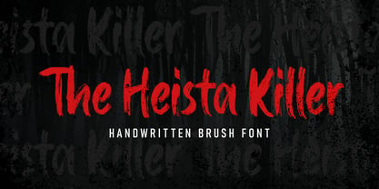 The Heista Killer – Handwritten Brush font with a clear style and dramatic movement this font is great for your next creative project such as logos, printed quotes, invitations, cards, product packaging, headers, Logotype, Letterhead, Poster, Apparel Design, Label, and etc.
 - Buttercell Script by Wacaksara co,
$16.00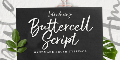 Buttercell Script is a hand brush script available in clean and rough edge versions. This font is great for your next creative project such as Logotype, printed quotes, invitations, cards, product packaging, headers, Letterhead, Poster, Apparel Design, Label, and etc.
 - P22 Way Out West by P22 Type Foundry,
$24.95 Howdy pardner! Giddy-up and lasso yerself these renegade typefaces. Created by renowned illustrator David Lyttleton , this set presents an Englishman's unique vision of the American West. Perfect for your next hoe-down, barn raising or Western-themed cricket match.
 - Rits Calltown by Zamjump,
$17.00 Rits Calltown is casual script typeface. Perfect for your next creative project such as Logotype, printed quotes, invitations, cards, product packaging, headers, Letterhead, Poster, Apparel Design, Label, and etc. FEATURES : – Uppercase – Lowercase – Number – Multilingual – Opentype FILES INCLUDED : OTF., TTF WOFF file
 - Dear Sunshine by Almarkha Type,
$29.00 Dear Sunshine is sweet and playful, but also elegant. This versatile script font has a wide range of applications ranging from greeting cards to kids’ crafts, and is guaranteed to add a sweet touch to your next design. Thank You.
 - NIghtvandals by Sipanji21,
$15.00 Night Vandal is an awesome graffiti font that features the street art vibe. This font is suitable for designs like logos, advertising, apparel, jerseys, sportswear, skateboard designs and more. Take your concepts to the next level with this stunning font!
 - Unstable by A New Machine,
$25.00 This almost-all-caps display font features a variable baseline to give it an unstable look. Also, the upper and lower cases differ slightly and can be used to add some alternates in words with letters next to each other.
 - Baksoda by Wacaksara co,
$15.00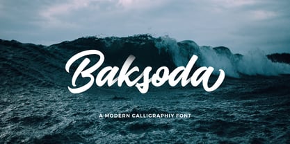 Baksoda is a handlettering script font with a clear style and dramatic movement this font is great for your next creative project such as logos, printed quotes, invitations, cards, product packaging, headers, Logotype, Letterhead, Poster, Apparel Design, Label, and etc.
 - Kids Chalk by Sakha Design,
$10.00 Kids Chalk is a cute and friendly handwritten display font. Take your kid-friendly designs to the next level with this captivating font! Use it to create unique t-shirt designs, baby onesies, nursery decorations, digital designs, cards, and many more.
 - Millerstown by Greater Albion Typefounders,
$16.00 Millerstown is full of that solid, 19th Century, transatlantic spirit of enterprise. It is an all capitals face, decorative but clear and legible, ideal for signage, posters and banners. Bring a touch of American inspired flair to your next design project!
 - Stavol by DonyaDesign,
$19.00 Stavol is a rough brush script font with a clear style and dramatic movement. This font is great for your next creative project such as logos, printed quotes, invitations, cards, product packaging, headers, Logotype, Letterhead, Poster, Apparel Design, Label, and etc.
 - Straphang by PizzaDude.dk,
$15.00 Straphand is my idea of what you need for your next greeting card, invitation, poster or whatever needs a fresh and lovely brush! Looks awesome, even when written in ALL CAPS! Comes with extended language support and ligatures for double lettering!
 - The Blackheads by Almarkha Type,
$35.00 The Blackheads - Authentic Bold Script font with a clear style and dramatic movement this font is great for your next creative project such as logos, printed quotes, invitations, cards, product packaging, headers, Logotype, Letterhead, Poster, Apparel Design, Label, and etc.
 - Lovely Branding by Lucky Type,
$16.00 Lovely Branding is the newest serif combination font. Beautiful plain serif combined with italic serif is the main attraction of this font. Also Has modern serif characters in it. The elegant combination font is perfect for your next fancy design project.
 - Relaxa by ahweproject,
$10.00 Relaxa is a fun, retro-style script display font that is ready to take your designs to the next level. Add it to your vintage-inspired posters, stickers, apparel, or social media posts and you will definitely impress your audience.
 - Hiruko by Thinkdust,
$10.00 With 15 different styles and support for all sorts of languages, Hiruko is the open and easy sort of font that can be used in almost any situation, as long as you want your message to be readable. Smooth, simple and clear, Hiruko takes inspiration from both Swiss and Japanese styles, focusing on minimalism and function within its form, the idea that less is more and the careful, exquisite craftsmanship that makes such minor changes have a big impact. From extra-light to thick, black weights, in italics or in outlines, Hiruko can be used to convey messages in such a variety of styles that you’ll never be disappointed. Alternatively if you're looking for something a little more comprehensive, why not check out the follow up to this family Hiruko Pro.
 - Linotype Scrap by Linotype,
$29.00Linotype Scrap is part of the Take Type Library, chosen from the entries of the Linotype-sponsored International Digital Type Design Contests of 1994 and 1997. The font is available in two weights and was designed by German artist Ingo Preuss. It is as though the forms of the basic weight were cut with scissors out of pieces of paper. There are no inner contours, only the outer silhouettes. The capital letters which make up Scrap Bonus are set on black rectangular backgrounds and are white and framed with a white contour. This weight includes a number of different pictograms which were also not spared the scissors. The decorative Linotype Scrap embodies the comic style of the 1990s and is meant exclusively for headlines of points sizes 18 and larger. - Caros Soft by cretype,
$20.00 Caros Soft is the rounded version of Caros. Caros Soft Family is a modern sans-serif typeface that is clean, simple and highly readable. Letters in this type family are designed with geometric shapes without any decorative distractions. The spaces between individual letter forms are precisely adjusted to create the perfect typesetting. Caros Soft is a versatile type family of 18 fonts. Caros Soft family consists of 9 weights (Thin, ExtraLight, Light, Regular, Medium, Bold, ExtraBold, Heavy & Black) with their corresponding italics. The Open Type fonts contain complete Latin 1252, Cyrillic, Central European 1250, Turkish 1254 character sets. Each font includes proportional figures, tabular figures, numerators, denominators, superscript, scientific inferiors, subscript, fractions and case features. We highly recommend it for use in books, web pages, screen displays, and so on.
 - Soprani Variable by insigne,
$129.99 "Step into a world where the 1920s meet the future with Soprani—a typeface that seamlessly blends vintage charm and modern sophistication. Drawing inspiration from a distinctive plaque unearthed in New Zealand, Soprani showcases serifs that flare and shimmer, capturing the essence of art nouveau and arts & crafts in a contemporary light. Dive into its rich OpenType features, granting designers unparalleled flexibility to bring their visions to life. Its condensed yet elegant letterforms are the perfect fit for everything from artful table books and stylish menus to dynamic media showcases in TV and film. Spanning from the graceful subtlety of its thin variant to the undeniable boldness of the black, Soprani is diverse and dynamic. Soprani isn't just a typeface—it's a revolution in design. Production assistance by Lucas Azevedo and ikern.
 - Quanton by Mans Greback,
$49.00 Quanton is a clear serif typeface in a modern style. Its sharp edges and soft curves combines to the perfect balance of tradition and innovation. Quanton has character and personality, while keeping regular and maintaining its legibility, making for an optimal headline and bodytext style. The Quanton family consists of eight typeface styles: The weights Thin, Medium, Bold and Black, and each thickness as Italic. The font is built with advanced OpenType functionality and has a guaranteed top-notch quality, containing stylistic and contextual alternates, ligatures and more features; all to give you full control and customizability. It has extensive lingual support, covering Arabic and all Latin-based languages, from North Europe to South Africa, from America to South-East Asia. It contains all characters and symbols you'll ever need, including all punctuation and numbers.
 - Square Technocrat by Mans Greback,
$39.00 Square Technocrat is a sharp, geometric font that embodies the essence of structure and modernity. Drawing inspiration from cube-like forms and contemporary architecture, this font family is perfect for designs that require a strong, stable presence. The Square Technocrat font family comes in five weights: Thin, Light, Regular, Bold, and Black, giving you a wide range of options for creating impactful designs that demand attention. The font is built with advanced OpenType functionality and has a guaranteed top-notch quality, containing stylistic and contextual alternates, ligatures, and more features; all to give you full control and customizability. It has extensive lingual support, covering all Latin-based languages, from Northern Europe to South Africa, from America to South-East Asia. It contains all characters and symbols you'll ever need, including all punctuation and numbers.
 - SK Paragrapher by Shriftovik,
$10.00 SK Paragrapher™ is a monumental geometric typeface whose structure was inspired by the paragraph glyph. The entire typeface is built on a rhythmic composition and a black-to-white balance. Each character corresponds to a grid, and all its characters are monospaced, so the typeface looks harmonious and complete, despite the complexity of perception of its appearance. This typeface has both uppercase and lowercase letters, as well as a capital! The typeface supports a multilingual layout that includes: extended Latin and Cyrillic characters, additional characters, and Hebrew. This typeface also includes more than 10 currency symbols, as well as 4 fonts: Solid, Outline, Rounded, Sharp! As a result, SK Paragrapher is a multilingual, monospaced geometric monumental typeface that contains almost 1000 glyphs for your any design work, be it a poster or a website!
 - Artico Soft by cretype,
$20.00 Artico Soft is the rounded version of Artico. Artico Soft Family is a modern sans-serif typeface that is clean, simple and highly readable. Letters in this type family are designed with genuine neo-grotesque and neutral shapes without any decorative distractions. The spaces between individual letter forms are precisely adjusted to create the perfect typesetting. Artico Soft is versatile type family of 18 fonts. Artico family consists of 9 weights (Thin, ExtraLight, Light, Regular, Medium, Bold, ExtraBold, Heavy & Black) with their corresponding italics. The Open Type fonts contain complete Latin 1252, Cyrillic, Central European 1250, Turkish 1254 character sets. Each font includes proportional figures, tabular figures, numerators, denominators, superscript, scientific inferiors, subscript, fractions and case features. We highly recommend it for use in books, web pages, screen displays, and so on.
 - Sign Stickers JNL by Jeff Levine,
$29.00 In the early 1960s, the Duro Decal Company of Chicago, Illinois added to its line of water-applied decal lettering a retail sign cabinet of die-cut, pressure sensitive vinyl letters and numbers. Four of the six sizes offered for sale were cut from white plastic with a black outline and a secondary gold inline for a tri-color effect. Sign Stickers JNL emulates as closely as possible the look of these nostalgic pieces, complete with the slight shifts in line weight due to hand-cut silk screens and the printing process. For those of you who prefer to make your own multi-colored letters, a three piece fill font set is available for the low price of a single font purchase. Combine the backfill, midfill and frontfill layers for a truly retro look!
 - Penitentiary Gothic by E-phemera,
$30.00Penitentiary Gothic is a digital recreation of the letters used on California state license plates, designed in order to make props for movies and television shows. The regular style is meant to be used on its own, but the other four styles are meant to be used one on top of another in different colors to create an embossed 3D effect. For best results, use the fill style in a dark color on top of a light colored background. Put the lolite style directly on top of the fill style in 10 - 30% of the background color. Put the hilite style directly on top of that in 10 - 30% of your fill color. Put the shadow style directly on top of that using your background color plus 50 - 80% black.