10,000 search results
(0.025 seconds)
- VVE Giallo by vve.type,
$39.99 VVE Giallo brings simplicity, elegance and a certain warmth wherever a contemporary geometric typeface is needed. The balanced characteristics, clear and legible silhouette and simultaneously vivid appearance of VVE Giallo makes it perfect for any needs. VVE Giallo’s characteristic high x-height does not only give perfect legibility but also perfect matching for strong headlines, outstanding logos and also for long texts. By keeping the “o” and “a” perfect circles gives VVE Giallo the minimalist and modernist looking. VVE Giallo has six weights, thin to heavy, give it a full range of expression for branding; in print and on screen. Matching true italics, carefully slanted 10º, are perfectly designed one by one. The family totally consists of 16 styles. lt supports many OpenType features, such as tabular numerals, inferiors & superiors, numerators & denominators, fractions, discretionary ligatures, arrows and etc. It combined more than 500 glyphs.
 - Avenir Next Paneuropean by Linotype,
$99.00 Avenir Next Paneuropean is a new take on a classic face—it’s the result of a project whose goal was to take a beautifully designed sans and update it so that its technical standards surpass the status quo, leaving us with a truly superior sans family. This family is not only an update though, in fact it is the expansion of the original concept that takes the Avenir Next design to the next level. In addition to the standard styles ranging from UltraLight to Heavy, this 56-font collection offers condensed and semi condensed faces that rival any other sans on the market in on and off—screen readability at any size alongside heavy weights that would make excellent display faces in their own right and have the ability to pair well with so many contemporary serif body types. Overall, the family’s design is clean, straightforward and works brilliantly for blocks of copy and headlines alike. Akira Kobayashi worked alongside Avenir’s esteemed creator Adrian Frutiger to bring Avenir Next Pro to life. It was Akira’s ability to bring his own finesse and ideas for expansion into the project while remaining true to Frutiger’s original intent, that makes this not just a modern typeface, but one ahead of its time. Complete your designs with these perfect pairings: Dante™, Joanna® Nova, Kairos™, Menhart™, Soho® and ITC New Veljovic®.
 - NT Brick Sans by Nurrontype,
$17.00 Back to the future! NT Brick Sans is a pixelated sans serif. Inspired by the Pixel Art phenomenon and Lego bricks, bringing back the good old 16-bit era with open-type features. It's bold, soft rounded, supports multi-language, featuring low caps option. Brick Sans will make your project special. Grab it now.
 - Super Car by Greentrik6789,
$24.00 Super car is a modern display font that grabs a lot of attention in a crowd. This font comes with various futuristic styles and alternative characters that you can use for your various display needs. Super Car is perfect for display needs such as Logos, Labels, Posters, Covers, Advertising and various needs with futuristic themes.
 - Trembling Hands by Olivetype,
$18.00 With its flowing strokes and natural-looking letterforms, Trembling Hands captures the essence of hand-drawn beauty. Each character has a slightly wobbly touch, giving it a charming imperfection that sets it apart from other fonts. Whether you're creating headlines, logos, or branding materials, Trembling Hands adds an artistic flair that will grab attention.
 - Westward JNL by Jeff Levine,
$29.00 Westward JNL is an interesting variation on the popular wood type known as a French Clarendon style, or more popularly known as Western or Circus lettering. Based on an A-Z set of wood type pieces, this novelty approach of curved and wavy horizontal strokes is sure to grab attention when applied to headlines.
 - Ballmarks by Letterhend,
$19.00 Ballmarks beautiful calligraphy font with swash. This font will add a feminine touch to make your design more soft and beautiful. This font is perfect for wedding invitation, quotes, branding, packaging, etc. What will you get: Including number and symbol. Support Multi Language This font also support PUA Encoded! So, grab your own. Thank You!
 - Clocko by upirTYPO,
$7.00 Clocko automatically turns the time stamp text into an analog clocks using the OpenType ligatures. Even when the ligatures are turned off, the time is still visible and readable, and it does not change or ruin the layout. Perfect for web usage and even for small sizes. For a crisp look, please use sizes divisible by 30, for example 30pt or 60pt. To make a custom analog clock, type any uppercase or lowercase letter to have a border (see previews for examples), and then type the time in 12 hour or 24 hour format with or without seconds. Use colon, comma, semicolon, hyphen, period or plus as a separator. Few examples: 12:45 9:25:46 10.50 13:30.10 The borders can be mixed together for more interesting look, please see the screenshots above. An additional background shape can be added to the clocks by typing a symbol (! # $ % & ( ) < = > ) as a first character, for example %A12:40:55. Please note that in order to keep the clocks visible, the background shape and the clocks need to have a different colors.
 - PF DIN Text by Parachute,
$79.00 The purpose of the original DIN 1451 standard was to lay down a style of lettering which is timeless and easily legible. Unfortunately, these early letters lacked elegance and were not properly designed for typographic applications. Ever since its first publication in the 1930’s, several type foundries adopted the original designs for digital photocomposition. By early 2000, it became apparent that the existing DIN-based fonts did not fulfil the ever-increasing demand for a diverse set of weights and additional support for non-Latin languages. Parachute® was set out to fill this gap by introducing the PF DIN series which has become ever since the most comprehensive and sophisticated set of DIN typefaces. It was based on the original standards but was specifically designed to fit typographic requirements. Its letterforms divert from the stiff geometric structure of the original and introduce instead elements which are familiar, softer and easier to read. The first set of fonts was completed in 2002 as a group of 3 families which included condensed and compressed versions. With its vast array of weights, the extended language support, but most of all its meticulous and elaborate design, it has proved itself valuable to numerous design agencies around the world. Ever since its first release, it has been used in diverse editorials, packaging, branding and advertising campaigns as well as a great number of websites. It was quoted by Publish magazine as being “an overkill series for complex corporate identity projects”. The whole PF DIN Text type system (with normal, condensed and compressed styles) includes 45 weights from Hairline to Extra Black including true-italics. Additionally, every font in the Pro series is powered by 270 very useful symbols for packaging, environmental graphics, signage, transportation, computing, fabric care. There are 2 versions to choose from: The PRO version is the most powerful. All weights support Latin, Cyrillic, Greek, Central/Eastern European, Romanian, Baltic and Turkish, with 20 advanced opentype features including small caps. The standard STD version is more economic. All weights support Latin, Central/Eastern European, Romanian, Baltic and Turkish, with 18 advanced opentype features including small caps. In 2010 Parachute® released 4 new families DIN Monospace, DIN Stencil, DIN Text Arabic and DIN Text Universal. All these are complemented by the popular DIN Display version. Altogether the Parachute DIN series is a set of 8 superfamilies with a total of 96 weights.
 - Slippery Fishes by Ingrimayne Type,
$9.00 SlipperyFishes alternates two letter sets to create an undulating line of text that reminds me of a slippery fish. It resembles Undulate, another typeface that uses the OpenType feature of contextual alternatives (calt) to alternate letters, but while the tops and bottoms of letters in Undulate trace parallel paths, the tops and bottoms of letters in SlipperyFishes trace reflecting paths. SlipperyFishes is monospaced with tight letter spacing to accentuate the ripple pattern. The family has four members: regular, outlined, condensed, and condensed outlined. The outline styles that can be used in a layer with their base styles to add color.Slippery fishes is bizarre and weird and can be used in places where those attributes will create attention-grabbing lettering.
 - Verathrine by Nathatype,
$29.00 Ready to enchant your audience and enhance your branding? A beautiful and spirited design like this is a great way to grab everyone’s attention! Wait no more, this beautiful font can be yours right now! Verathrine-A Handwritten Font This font is all about elegance and style. The curvature of the Verathrine was fully thought out to easily meld inside your designs. These fonts make a good foundation of what you want it to be! Great to be used on headings, logos, business cards, printed quotes, cards, packaging, resumes, and even your website or social media branding. Features: Ligatures Stylistic Sets Swashes PUA Encoded Numerals and Punctuation Thank you for downloading premium fonts from Nathatype
 - As an optimistic and helpful artist, I'd love to introduce you to the intriguing world of typography through the lens of the font I2ArabiaConsole. Though I must clarify, detailed specifics about I2Ar...
- Big Bag NF by Nick's Fonts,
$10.00This industrial-strength titling face takes its design cues from Hans Eduard Meier's Syntax Antigua. This version is bolder and beefier, so your headlines will grab and hold attention in a refined and genteel manner. Both versions include complete Latin 1252, Central European 1250 and Turkish 1524 character sets, with localization for Moldovan, Romanian and Turkish. - Ayara by Twinletter,
$13.00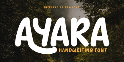 Introducing "AYARA Font" - a harmonious fusion of traditional handwriting and contemporary design. Whether you're working on invitations, posters, or branding materials, AYARA Font effortlessly adds a unique handwritten style that instantly grabs attention. What’s Included : File font All glyphs Iso Latin 1 Alternate, Ligature Simple installations PUA Encoded Characters – Fully accessible without additional design software. Fonts include Multilingual support
 - Riotous by Letterhend,
$19.00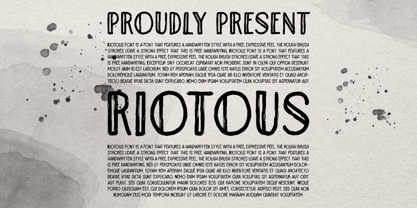 Introducing, Riotous Brush Font! Riotous is a font that features a handwritten style with a free and expressive feel. the rough brush strokes leave a strong effect to make your design looks more natural and unique! What will you get: Including number and symbol. Support Multi Language This font also support PUA Encoded! So, grab your own. Thank You!
 - Steel Grrrder Groove by ULGA Type,
$9.00 A single-weight display font, Steel Grrrder Groove is a constructivist inline stencil design best used in short display settings or as an introductory drop cap to grab attention. The design is sharp, angular and slightly condensed with a striking inline groove giving it an air of chiselled chunkiness. It’s groovy but in a slightly robotic way.
 - Jarric by The Indigo Sea,
$10.00 Jazz up your project with Jarric. It’s a vibrant, bold and delightfully random hand-drawn font; an excellent choice for creators and makers. From attention-grabbing graphics and prints, to branding and creative projects, you’ll be sure to stop them in their tracks with Jarric. Jarric includes a upper and lower case characters, numbers, and full multilingual support
 - Gorgonzo by Typogama,
$29.00 Gorgonzo is a creamy new bold typeface designed for attention grabbing headlines. Inspired by a blend of calligraphic strokes and printed letters, it includes a large character set that covers extended Latin, Greek and Cyrillic. Filled with a wide selection of Opentype features, this single weight offers a range of numbers, alternate letters, ligatures and even some typographic fleurons.
 - Crypton Ink by Olivetype,
$18.00 Crypton Ink is a raw brush typeface. Its cool texture is carefully handcrafted to straight away grab the attention of the viewers. Suitable if use for logos, posters, headlines, brandings, apparel, etc. This font is supporting Multi-Languages, which includes: Afrikaans Albanian Catalan Danish Dutch English Estonian Finnish French German Italian Norwegian Portuguese Spanish Swedish Zulu. Thank you
 - Cloudia by PHDesign,
$30.00 Cloudia is a versatile, modern font with an attention-grabbing angularity. It has a thoroughly mechanical, science fiction look; but with slightly unconventional vowel shapes to give it a dynamic edge. Its precisely cut letters need to be displayed as large as possible for maximum impact. Perfect for book titles, magazines, band logos, movie titles, stencils and video games.
 - Eighty Miles by Four Lines Std,
$15.00 Introducing "Eighty Miles" font's thick and attention-grabbing characters ensure that your message takes center stage. While "Eighty Miles" embraces wild shapes, it never compromises on readability. Each character is carefully crafted to ensure that your audience can enjoy the whimsy without missing a beat. It's a font that's as fun to read as it is to look at.
 - Winter Pen by Abo Daniel,
$13.00 Introducing WINTER PEN - simple signature font - This font is great for branding, logo, signature, packaging, t-shirt design, social media and anything your project that need an elegant taste. It came with two styles : Regular and Italic. Features: Uppercase Lowercase Number & Punctuations Multilingual Support PUA Encoded Hope you love it Grab it fast... regards, Abo Daniel Studio
 - Rainboface by Forberas Club,
$16.00 This cute font create with love and inspired below the rainbow. When the rain is coming, the rainbow definitely will blooming. So what make you think twice? just grab it fast, crafter should do crafting. The magical weapon is here, do your thing as invitation card, greeting card, gift card, or wedding decoration this font sure ready for you.
 - Gardo Grotesk by Ayca Atalay,
$18.00 Gardo Grotesk is a bold condensed display typeface designed to make a strong impact. Armed with eye catching ligatures and catchwords, combined with its striking visual features, Gardo Grotesk grabs the attention of the reader effortlessly. Gardo Grotesk's Opentype Features include Standard and Discretionary Ligatures, Alternates, Catchwords (Contextual Alternates), Case Sensitive Forms, Fractions, Scientific Inferiors, Superscript and Tabular Figures.
 - VVDS Suffer by Vintage Voyage Design Supply,
$10.00 Do you hear that sound of Dick Dale's guitar? Here it is! Introducing you a new font family with retro surf rock vibes! Straight outta retro vinyl covers and surf gig posters to your font collection! We're all missed the sun, so grab this family and get some of the summer vibes. No matter what your next design project – a tiki t-shirt collection / summer rock festival or gigs / greeting cards / or a header for your new zine, - you'll get your goals with this family. A lot of alternates will give you a hand written's mood and absolutely unique typographic style. Up to 10 styles for some of them. Open Type Features as Stylistic Alternates, Small Caps and Fractions. Three styles: Clear, Roughen and Scratched. Three widths: Light, Regular and Bold.
 - Rockwell by Monotype,
$40.99 Whether you call them slab serif, square serif, or Egyptian, you know them when you see them – sturdy, nearly monoweight designs with blunt, straight-edged serifs and a no-nonsense attitude. The Rockwell® Nova family is a fine example of this appealing and eminently usable type style. This is a design that is both robust and adaptable. Marked by the flat top-serifs on the cap A, unusual Q tail and high-legibility two-storied lowercase a, Rockwell has a bit of handmade charm that distinguishes it from the cool, more modern interpretations of the slab serif style. The family is excellent for branding, headlines and other display uses. The simple shapes and hearty serifs also make it a good choice for short blocks of textual content in both print and on-screen environments. The light and bold weights are perfect for setting blocks of text copy, while the extra bold and condensed designs bring authority to display copy. Throw in a little color, and you amp up Rockwell’s messaging power. The regular and italic designs perform handsomely, in the most modest of screen resolutions. With four weights of normal proportions, each with a complementary italic, and three condensed designs, two with italics, the family is a commanding and versatile graphic communicator. Rockwell’s large x-height, simple character shapes and open counters, make for an exceptionally legible design. It should not, however, be set so tight that its serifs touch, as this will erode legibility and impair readability. A benefit to Rockwell’s slab serifs, however, is that the design combines beautifully with both sans serif typefaces and a variety of serif designs. Rockwell OpenType® Pro fonts have an extended character set supporting Greek, Cyrillic, most Central European and many Eastern European languages, in addition to providing for the automatic insertion of ligatures and fractions. Looking for its perfect pairing? Look no further than ITC Berkeley Old Style, Between™, ITC Franklin Gothic®, Harmonia Sans™, Metro® Nova or Frutiger® Serif.
 - Urbani by W Type Foundry,
$25.00 URBANI is the result of a mix between Neohumanist and Neogrotesque types. The subtle narrowness of its proportions makes it ideal for composing extensive blocks of text. The slightly superior height of its ascenders, the wider proportions of its counter-forms, the addition of ink traps at certain stroke intersections; every aspect of URBANI’s design was conceived with reading in mind. The Opentype tool Alternative Glyphs is especially important, since its use is fundamental in achieving a universal and geometrical visual language through the rationalization of the font family. URBANI is inspired upon the works of Adrian Frutiger and Paul Renner, a constant source of admiration and inspiration to W. This type family comes fully equipped with Opentype tools, a huge range of alternate glyphs, fractions, modern and old style numbers, superiors and inferiors, ligatures and smallcaps. Universality is a major goal when it comes to creating our fonts. URBANI is ideally suited for general graphic design, print and digital publications, motion graphics, web design, branding and interaction design. Learn about upcoming releases, work in progress and get to know us better! On Instagram W Foundry On facebook W Foundry wtypefoundry.com
 - Spellcaster by Comicraft,
$19.00 Raven hair and ruby lips, it may have been a trick of the light but I'm sure sparks flew from her fingertips. I definitely heard echoed voices in the night, of a restless spirit on an endless flight. If I remember correctly she held me spellbound in the night, with dancing shadows and firelight. Yes, I think I did see a crystal ball on the table, showing the future, the past and I did drink the potion she offered me, when I really should have gotten out of there fast. And that's my story and I'm sticking to it, your honor. It was that girl with the white hair, I'm telling you. She has my wallet too.
 - Legere by B2302,
$35.00 Legere is a slim, light and decorative font, based on the idea to work as close as possible on the geometric forms of the circle, the triangle and the square. As a natural conclusion the number of angles is limited. Legere comes in these weights: THIN, LIGHT, REGULAR and a very special DECO version. Legere might be used as a headline font, for posters or cover layout, it might also be transformed into that fashion label logotype you are working on. Have fun!
 - Moreva by HIRO.std,
$17.00 Moreva is a new casual modern script font. This font describes about girly, feminist, elegant, catchy, dynamic, humanist, easy to use and will bring a good harmony when the letters are connected and paired each other. FEATURES - Support Opentype Features - Support Ligatures - Automatic stylistic alternates am an ar at att bb bl cl ct dd fl el elt em en er et ett ff gg gt hh il im in ir it itt kk ll lt mm nn nt oo ol olt om on or ot ott pp rr ss se sh sk sl so st tt the um un ur utt yl yt Sl Sk St Sh Gl Gh Kl Kh Ch Cl Bl Bh - Uppercase - Lowercase - Numbering and Punctuations - Multilingual Support - Works on PC or Mac USE Moreva works great in any branding, logos, magazines, apparel, wedding designs, social media posts, advertisements, quotes, product packaging, product designs, label, photography, watermark, invitation, stationery and any projects that need handwriting taste. Enjoy using! Thanks. HIRO.std
 - Royal Palms by Set Sail Studios,
$16.99 Let the natural letterforms flow with Royal Palms, a clean & casual script font by Set Sail Studios. The Royal Palms family includes four fonts; The Signature version contains a larger, more exaggerated set of capital letters which is perfect for signature-style logos and display text. The Regular version offers a more practical set of smaller capital letters, for use when space is more limited. Both the Regular and Signature styles include a full set of alternate characters available as their own separate fonts, which can be used for an alternative word layout, or to mix and match with the regular versions to create a more customised look. It’s a timeless script set which is equipped to tackle a variety of design briefs for years to come. Language Support • English, French, Italian, Spanish, Portuguese, German, Swedish, Norwegian, Danish, Dutch, Finnish, Indonesian, Malay, Hungarian, Polish, Croatian, Turkish, Romanian, Czech, Latvian, Lithuanian, Slovak, Slovenian. Standard Ligatures • ti, tt, tl, ll, lt, ve, ov, wr, ox, nx, wx, rx.
 - Totemic by Canada Type,
$29.95 Jim Rimmer’s first typeface was originally published in 1970 as a basic film type alphabet through a small, independent type house in central California. Its sources of influence (now calligraphic type standards by Dair, Goudy and Zapf) are ones that remained with Jim for the rest of his career. If you squint at Totemic in just the right way, you can see some recognizable themes Jim would later flesh out and make his own in later works throughout his career as a type designer and printer. Totemic is now available for the first time as a digital font, of the refined and expanded kind now expected from Canada Type. It comes with quite a few standard advanced typography features: Small caps, caps-to-small-caps, automatic fractions and standard ligatures, stylistic alternate sets, six kinds of figures, case-sensitive forms, and extended Latin language support. It also comes with a very unique and unprecedented feature: Variably stackable totem poles. Simply enable the discretionary ligatures feature, type any unique three-digit combination using numbers between 1 and 4, and watch the magic happens. With a name like Totemic, we just couldn't help ourselves. Many thanks to Andrew Steeves of Gaspereau Press for finding Jim’s lost gem in a most unexpected place, and for helping us bring it back to life 45 years after its analog birth. 20% of Totemic’s revenues will be donated to the Canada Type Scholarship Fund, supporting higher typography education in Canada.
 - Plain by Sultan Fonts,
$19.99 Sultan Plain is an active contemporary variable font, complete with a flexible range of cases tailored to responsive layouts The font places itself at the boundary between two eras of contemporary typographic design, Between stillness and movement, between past exclusivity and present diversity, between the finite and the infinite. Although it is like many of the modern Naskh fonts, Sultan Plain has amazing unique energy Which is missing by many of the fonts that we designed since the beginning of the second millennium. The font is clear and legible in small sizes, suitable for printing for large texts, web pages, and other visual uses. The font includes a matching Latin design and support for Arabic, Persian, Kurdish, and Urdu.
 - FF Amman Sans by FontFont,
$79.99 German type designer Yanone created this sans FontFont in 2010. The family has 14 weights, ranging from Thin to Black (including italics) and is ideally suited for advertising and packaging, logo, branding and creative industries as well as poster and billboards. FF Amman Sans provides advanced typographical support with features such as ligatures, small capitals, alternate characters, case-sensitive forms, fractions, and super- and subscript characters. It comes with a complete range of figure set options – oldstyle and lining figures, each in tabular and proportional widths. As well as Latin-based languages, the typeface family also supports the Arabic writing system. This FontFont is a member of the FF Amman super family, which also includes FF Amman Serif.
 - Aceituna by Hanoded,
$15.00 Aceituna means ‘olive’ in Spanish. It comes from the Arabic Al-Zeitoun. I am multi-tasking today: finishing this font and thinking about what to cook for my family tonight (yes, I am the one who cooks!). We normally eat Asian food, but I was toying with the idea of serving something Mediterranean and realised we had run out of olives. So there you have it: the super simple trick of naming a new font! But enough of cooking: Aceituna font was made with a Japanese brush pen. It is a very versatile font: tall and thin, elegant and a little messy. A hint of texture and, like olives, it goes with almost anything.
 - Manchette Fine by Abjad,
$45.00 Manchette Fine is the high contrast cut of Manchette typeface, which was inspired by the hand-written Naskh newspaper headlines during the 60s-70s era in the Arab world. The word "manchette" is a french word, that means headline. It was used mainly by the Egyptian calligraphers and designers. The typeface presents sharp and contemporary details, while taking into consideration the original Naskh rules to echo the elegancy of the hand-written titles. Featuring many opentype features, such as contextual alternates, ligatures, and a small set of stylistic alternates. The typeface also features a dynamic Kashida that can be controlled through the variable fonts technology in the Variable GX file which contains all the weights as well.
 - Candy Design by Typophobia,
$20.00 Candy Design is a display font containing 265 glyphs. It was designed during a stay in Tanzania, Zanzibar in 2022. The main idea was to combine a sans-serif modernist, grotesque typeface with the addition of delicate Arabic accents. Its main assumption of use is posters, product design and branding. Unusual, dynamic and unpredictable accents that are found in practically every letter give the character of a very custom font, also completely not intended for typesetting, which, contrary to the features mentioned above, remains legible. Usually all letters are of the same size - however, as we used to when designing, hide small flavors in the whole sequence of numbers / letters and characters.
 - FF Amman Serif by FontFont,
$79.99 German type designer Yanone created this serif FontFont in 2010. The family has 8 weights, ranging from Regular to Extra Bold (including italics) and is ideally suited for advertising and packaging, editorial and publishing as well as logo, branding and creative industries. FF Amman Serif provides advanced typographical support with features such as ligatures, small capitals, alternate characters, case-sensitive forms, fractions, and super- and subscript characters. It comes with a complete range of figure set options – oldstyle and lining figures, each in tabular and proportional widths. As well as Latin-based languages, the typeface family also supports the Arabic writing system. This FontFont is a member of the FF Amman super family, which also includes FF Amman Sans.
 - Resistance Is Lowered by Comicraft,
$19.00 Lower your shields and surrender your ships. You will talk to your central world authority in upper AND lower case, and order global surrender. Your culture will adapt to serve us in sentence case. You will not shout in UPPER CASE as before. You will be upgraded. You will become like us. Upgrading RESISTANCE IS FUTILE to RESISTANCE IS LOWERED is compulsory. There is no escape. Artwork from Monster Truck by Shaky Kane
 - Juxta Sans Mono by NaumType,
$19.00 Juxta Sans Mono is an experimental monospace sans, an extension of the Juxta superfamily. During the creation of the Juxta script, I felt that the aesthetics and the main idea of the font had promising potential and I started thinking about a pair for it. So the idea of Juxta Sans Mono was formulated. Juxta has several style-forming elements: 45° beveled or cross out bowls, squared m and w arcs and other unobvious letter structures. Despite its unusual and sometimes odd (f, g, m) letterforms, Juxta Sans is fairly easy to read due to its monospace font nature and wide spacing. Juxta Sans Mono offers great customization potential. It has two sets of stylistic alternates — [salt] makes a letter underscored, but keep it in line, [ss01] replaces some of the glyphs with different letterforms. The [case] function automatically adjusts the height of the punctuation marks to the neighbor letter and [onum] is a set of old style numbers. Juxta Sans Mono also has subscript and superscript features, but they are utilized a bit unconventionally — if you want to customize your logo or headline, you can make a glyph superscript and the one next to it subscript and they automatically kern into one letter width. You can see examples of using these features in the presentation. Juxta Sans Mono is available in 8 weights, including Thin, Light, Regular, Medium, SemiBold, Bold, ExtraBold and Black. It extends multilingual support to Basic Latin, Western European, Euro, Catalan, Baltic, Turkish, Central European, Pan African Latin, Afrikaans, and Basic Cyrillic.