10,000 search results
(0.026 seconds)
- Degalena by Agny Hasya Studio,
$12.00 Degalena is a Modern Retro Vintage Display Font with bold curves, groovy, '70s '80s, and '90s vibes, and unique, beautiful, elegant, and versatile. Come in 2 (two) styles (regular & italic) and is created with glyph variations like alternates and ligatures. Featured with Uppercase and Lowercase, Numeral and Punctuation, Multilingual Support, and Opentype Features. Perfect for your design projects like logos, branding, advertising, product designs, stationery, magazine designs, book/cover title designs, photography, art quotes, wedding designs, fashion designs, special events, labels, product packaging, and more.
 - Fanchy by ArimaType,
$19.00 Fanchy Created from our explorations inspired by retro 70s style and pop culture visual designs such as comics, cartoons, and old posters. Strong bold character with groovy style makes us feel the retro vibe and brings us to the 70s. Fanchy Comes with beautiful characters and curves consisting of 6 sets of styles. Contains 2 regular and italic styles, 2 shadow styles and 2 outline styles. This font is best used for headings, logotypes, quotes, apparel designs, posters, flyers, packaging, book covers, and much more.
 - Option by Vladimir Likh,
$10.00 Option is a modern condensed sans serif. Inspired by geometric architectural fonts. But despite the geometric construction every single letter was build based on optical evaluation. This approach makes Option more organic and lively in a text line. Option was created for wide spaces. Condensed and thin, but extremely sweeping vertically font makes your massage elegance and strong. The font functions great in many sizes and surroundings. The family comes in one weights plus italics. Creating of bold weight is underway. Options supports Cyrillic as well.
 - Stepside by Sean Thorenson,
$12.00 Stepside is a slick retro display face with plenty of horsepower. Stepside’s heavy-duty type chassis of sturdy uprights and bold strokes was modified with sweet retro details like graceful curves and tapered fins. Inspired by street rods, custom vans and power wagons, Stepside modestly hides its muscle like a true sleeper. Take Stepside for a spin on logos, posters and t-shirts for a more classic look. Need more speed? Step on the gas with Stepside Italic — perfect for type in need of emphasis.
 - FF Angkoon by FontFont,
$47.99 French type designer Xavier Dupré created this serif FontFont in 2003. The family has 8 weights, ranging from Light to Bold (including italics) and is ideally suited for advertising and packaging, festive occasions as well as editorial and publishing. FF Angkoon provides advanced typographical support with features such as ligatures, small capitals, alternate characters, and case-sensitive forms. It comes with a complete range of figure set options – oldstyle and lining figures, each in tabular and proportional widths. In 2004, FF Angkoon received the TDC2 award.
 - Remus by RMU,
$25.00 Both fonts of the Remus family are complete redesigns of turn-of-the-century fonts. The regular style is based upon an inhouse design of Schelter & Giesecke in 1889, called Romanisch. This font was adopted by other German foundries and slightly modified and a bold version was added. Due to their proportions, these fonts fit perfectly into narrow columns, and still they are very legible. In January 2023, an Italic style was added. Here too it is recommended to use both ligature features Standard and Discretionary.
 - The West Forest by Hustle Supply Co,
$14.00 The West Forest The West Forest is a strong, bold all-caps Wide Sans Serif Typeface. Included are 8 font files ranging from clean to Textured, Rounded & Rough with Oblique options for each. The West Forest is sure to be a work horse typeface that is continually used within many of your projects. This typeface has the potential to fill many different needs for a range of different aesthetics. What's Included? Regular, Textured, Rough & Rounded Versions Oblique (Italic) Versions of each Western European Characters
 - Gazpacho by Monotype,
$29.00 Gazpacho is inspired by the serif typefaces used in editorial media in the 70s and 80s. The morphology of the letterforms makes this typeface ideal for display purposes like logos and big, bold headlines. Also, thanks to its large x-height it works perfectly on headlines with tight leading. On the other hand, its high contrast and very simple and recognisable shapes makes it highly readable, so it works on small, long texts as well. It comes in 7 different weights and 2 styles (Standard & Italic).
 - Boberia by Linotype,
$29.99Linotype Boberia is part of the Take Type Library, which features winners of Linotype’s International Digital Type Design Contest. Designed by Bo Berndal, its historical roots lie in the neoclassicism of the turn of the 20th century. The slender letters with a large x-height and marked stroke contrast give the font an elegant character. The nostalgic, flowing forms are typical of Art Deco fonts and allow designers a number of possibilities for the font’s use. Boberia includes regular, italic and bold type styles. - Rick's Cafe by NorFonts,
$30.00 Rick's Cafe font is my emulation of those typefaces used in newspapers, it's being inspired from my "NorB TypeWriter" typeface. You may want to use this font with any word processing program for text and display use, print and web projects, apps and ePub, comic books, graphic identities, branding, editorial, advertising, restaurant menus, newspapers, scrapbooking, cards and invitations and any casual lettering purpose… or even just for fun! Rick's Cafe font comes in 4 styles, Normal and Bold each with Italic and Condensed versions.
 - Accio by Jehoo Creative,
$19.00Accio is a modern and versatile sans serif font that effortlessly combines legibility with a touch of unique character. With its clean lines and distinctive curved terminals in the bold variant, Accio offers a refreshing and friendly appearance that sets it apart from traditional sans serif typefaces. Designed to meet the needs of a wide range of design projects, Accio boasts a total of nine meticulously crafted weights, each complemented by a corresponding italic style, providing designers with a comprehensive toolbox for all their typographic needs. - Revaux by Wahyu and Sani Co.,
$18.00 Revaux is elegant display serif designed with ball terminals and back-slanted counters which is uncommon in type design. Modern, Stylish and Elegant were the main keywords to keep when designing the typeface. Revaux is a family of 14 fonts, consisting of 7 weights from Extra Light to Extra Bold for both upright and italic styles. Each font has 230+ glyphs including alternates & ligatures which support Major Western European languages - 61 languages supported! Revaux is unique, different, and a must have item to complete your font arsenal!
 - Ultima Pro by TipografiaRamis,
$39.00 Ultima Pro is a geometric sans serif typeface family of eight styles – light, regular, bold and black in roman and italic respectably. Ultima Pro typeface is an upgrade addition to Ultima family (2010). All glyphs have gone through shape refinements, and the amount of glyphs was significantly extended, which enabled support of more Latin languages as well as full support of Cyrillic. Fonts released in OpenType format with some opentype features. The typeface is ideal for use in display sizes though is quite legible in text.
 - Halokia by Locomotype,
$18.00 Introducing Holakia, a monoline script font based on the condensed style that is trendy, elegant and stylish. Supported by many OpenType features such as discretionary ligatures, swashes, contextual alternates etc. It has the potential to create interesting, beautiful and eye-catching typography combinations. Halokia is available in upright and italic versions. This font is perfect for use on packaging designs, quote prints, wedding invitations or personal logos. It is ideal for displaying something that is old-fashioned to make it look more modern and bold.
 - Tall Tales by Comicraft,
$39.00 In a World where no stories are small stories... In a Land where words need to be Bold, Meaningful and maybe even Italic... Comes a font worthy of telling Marvelous Tales some thought Too Tall, Too Astonishing to be told... And when those Untold Stories, those Astounding Tall Tales, are finally told... THAT WORLD WILL NEVER BE THE SAME AGAIN! From Visionary Font Director John Roshell and the Studio that brought you BlahBlahBlah, you must not miss TALL TALES! In theaters and Streaming now.
 - Sierra by Linotype,
$29.99Sierra is an antiqua with a high x-height and generous, open counters. Many curves of the letters are almost right angles, which was particularly suited to the Digiset machines from Dr. Ing. Rudolf Hell, Kiel. The forms of Sierra with their flowing stroke contrast and half serifs have a calligraphic touch, which is especially highlighted in the italic weights. This is a graceful text type and its bold weights look almost like woodcuts. Sierra is an excellent choice for both texts and headlines. - FF Engine by FontFont,
$47.99 Dutch type designer Alex Scholing created this display and sans FontFont in 1995. The family has 6 weights, ranging from Light to Bold (including italics) and is ideally suited for book text, editorial and publishing as well as software and gaming. FF Engine provides advanced typographical support with features such as small capitals, alternate characters, case-sensitive forms, fractions, super- and subscript characters, and stylistic alternates. It comes with a complete range of figure set options – oldstyle and lining figures, each in tabular and proportional widths.
 - Lasta by Tour De Force,
$25.00 Lasta is small serif font family with simple elegant shapes, refreshing Italics and poetic endings. Containing 2 weights and 2 italics, with lower x-height which brings more air (empty space, white space...) into paragraphs making text more graceful and legible. Thin serifs bring small touch of dynamic into letter forms, just enough to bring specific tone to paragraph. Beside being mainly imagined as fully text family, Lasta is suitable titles or decorative typography as well for, especially the Italics with fancy curvy endings.
 - The Seasons by My Creative Land,
$25.00 The Seasons is an elegant classic serif font family consisting of a high contrast serif fonts with a vintage chic look, with corresponding calligraphic cursive italics that are based on a number of humanist italic scripts and written with a Pilot Parallel Pen. Both upright and italic fonts (6 in total) share same style soft terminals with a sharp cut and are enhanced by OpenType features such as ligatures and stylistic alternates. The Seasons can be used in high-end branding, logo designs, magazines, product packaging & invitations.
 - Anno by Linotype,
$29.99The impulse behind André Maaßen’s design of the Anno typeface was the design of a New Year’s card for the year 2000 (Anno 2000). His desire to create the perfect printed image developed into a family with four styles: Anno 1, Anno 1 Italic, Anno 2, and Anno 2 Italic. Anno 1 and its Italic are semi-classicist typefaces, with a high degree of stroke contrast, while Anno 2 and its Italic are semi-grotesks, with less stroke contrast. Both Anno 1 and Anno 2 are sans serifs typefaces, but they each offer a new interpretation of the genre. The Anno typeface may be used in a number of applications and sizes. And it is naturally suitable for New Year’s greetings and other cards, of course! - Urbani by W Type Foundry,
$25.00 URBANI is the result of a mix between Neohumanist and Neogrotesque types. The subtle narrowness of its proportions makes it ideal for composing extensive blocks of text. The slightly superior height of its ascenders, the wider proportions of its counter-forms, the addition of ink traps at certain stroke intersections; every aspect of URBANI’s design was conceived with reading in mind. The Opentype tool Alternative Glyphs is especially important, since its use is fundamental in achieving a universal and geometrical visual language through the rationalization of the font family. URBANI is inspired upon the works of Adrian Frutiger and Paul Renner, a constant source of admiration and inspiration to W. This type family comes fully equipped with Opentype tools, a huge range of alternate glyphs, fractions, modern and old style numbers, superiors and inferiors, ligatures and smallcaps. Universality is a major goal when it comes to creating our fonts. URBANI is ideally suited for general graphic design, print and digital publications, motion graphics, web design, branding and interaction design. Learn about upcoming releases, work in progress and get to know us better! On Instagram W Foundry On facebook W Foundry wtypefoundry.com
 - Lecheet by Zamjump,
$17.00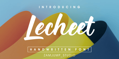 Lecheet is a handwritten script font. It has an authentic modern calligraphy look and feels bold which makes it perfect for digital branding and design. Use this font for logos, social media, wedding decorations, invitations, home decor, websites, blogs, instagram, business cards, branding and more!
 - Quidic by Ingrimayne Type,
$12.95 Quidic is an unusual display typeface. The upper-case letters are strongly vertical, condensed, and bold. Used by themselves, they make headlines and titles that stand out. The lower case letters do not have serifs similar to those on the upper-case letters, but rather have the serif shapes one expects from an italic style. The lower-case is also quite short compared to the upper-case letters. The italic styles of the family are unusual because the lower-case letters keep their shapes and the upper-case letters and numbers change. The family has three styles that differ more by width rather than by weight. Although some Bauhaus fonts have several letter shapes that are similar, there is no other typeface quite like Quidic. The family can be used for many things, but not for text. For a "normalized" version of this typeface, see Qwatick.
 - Floora by Valentino Vergan,
$16.00 Floora is a modern and unique font duo. The font combines two different type styles, a polished uppercase sans serif and a Neue Nouveau style lowercase, this combination makes the font very unique and distinct. The uppercase sans serif comes with large ink traps at its joints, this gives the font a modern and trendy appearance. Floora has a set of italic uppercase and lowercase letters, this combination of regular and italic letters gives you the ability to create a multitude of different letter combinations. Floora was also created with unique ligatures, alternative characters and multi-language support. Floora is perfect for designing posters, magazines, logos, Instagram posts, websites, blog posts, pull quotes, social media posts and much more. If you a looking for something modern and unique for you next project, Floora is the font for you. I hope you enjoy using the Floora typeface.
 - Umba Soft by TypeThis!Studio,
$54.00 The best thing about Umba is its surprise! UMBA Soft is a mellow sans serif typeface designed by Anita Jürgeleit. Your creation should be soft and gentle and you need a suitable font? Something that should be cuddly, sweet and soft but a serious type family that covers all your concerns? Umba Soft is your match! Your typographic composition will improve with your new favourite font. Thirty styles from thin to bold and matching italics helps you to create a highly appealing design product. Alternates and small caps are accessible in separate styles. There is no need for any special software to use them. The styles will appear in your font menu to make sure you stay aware of the many possibilities that your new font offers. 30 styles Italics Alternates Small Capitals Predefined Fractions Sub-/Superscript Numerator/Denominator Old style figures Tabular figures Ligatures Let’s get in touch! www.typethis.studio
 - Petunia by Great Lakes Lettering,
$40.00 Petunia is a calligraphy style font designed by New York based calligrapher Eliza Gwendalyn . Her modern copperplate script has been a style she has been developing throughout her career. Her angelic flourishes and bouncy style are widely influenced by Eliza’s favorite childhood character Alice in Wonderland falling down the rabbit hole. She pairs her elegant script with a traditional sans serif and serif which is based on Eliza’s everyday handwriting. The name ‘Petunia' acquired from her childhood nickname her parents called her which was only fitting to choose as the name of her font that was derived from her childhood fantasies. Widely known in the wedding industry, she curated this font family for industry professionals with a versatile array of styles: a script, a bold script, sans serif, sans serif italic, serif, serif italic, and specially calligraphy words & ornaments making this a total package for all types of designers.
 - Opal by Linotype,
$29.99 Opal Pro is a text family designed by Hannes von Döhren in 2008. It gives every text a noble character. The typeface has long ascenders that clearly rise above the capital letters and a low x-height. Opal’s letters sport inktraps at stroke junctions, which on one hand create a cutout feeling and on the other hand strengthens the image in larger point sizes. In total, the letterforms have clear emphasis on their verticals and horizontals; they do not fear the weight on their curves. In addition to the Italic and Bold, the Opal type family includes a Script face, whose letterforms include connections, similar to handwriting. On top of that, the typeface possesses swash letters for italic and script, small caps, many ligatures and borders & ornaments. With a little bit of care, designers will be able to create the finest of traditional, elegant work with this family.
 - Stapel by ParaType,
$30.00 Stapel is a contemporary closed sans serif with sci-fi looking forms and eloquent, thin stroke joints. The superfamily consists of three subfamilies of different width: Normal, Narrow and Condensed. Each subfamily contains seven weights with corresponding true italics. Additionally, there are several extra wide bold styles. All these styles work perfectly in headings and short display texts. Another important subfamily is Stapel Text which includes upright and italic styles of lower contrast and more generous spacing. Text styles are great for body text in small and medium point sizes. Most styles include alternate characters, proportional and lining figures, math symbols, fractions, currency signs and case-dependent punctuation. A wide range of styles and typographic features makes Stapel ideal for use in brand identity, infographics and all kinds of designs related to technology, science, finance, politics or sports. Stapel was designed by Alexander Lubovenko and released by Paratype in 2020.
 - Garota Sans SC - Personal use only

- Enzian by Polygraph,
$65.00 Enzian is the fruit of a yearlong German Chancellor Fellowship sponsored by the Alexander von Humboldt Foundation. Our hope was simple: to make something useful and beautiful out of something that most people consider to be neither. We were fascinated by the complex persona of Blackletter in Germany and drawn to its emotive ornament and its sensual, non-geometry. Two areas in particular, the long-standing rivalry and widely-believed inferiority that Blackletter had with Roman type and Blackletter’s relevance in contemporary culture, became the foundation of the project. The result is Enzian: an invigorated, original Blackletter of uncommon depth and hopefully, a bit of charm. It is warm and expressive, feminine and contemporary, while staying true to its hand-written, calligraphic roots. Enzian is a multi-language, workhorse typeface that can create hierarchy (with unconventional italic and small caps), and has numerals that fit the family. It is a display face that isn't afraid of handling longer text; one that is equally comfortable in headlines and in poetry. We are delighted to announce that Enzian has been awarded a Certificate of Excellence in Type Design by the Type Director’s Club.
 - After 5 by Our House Graphics,
$17.00 From the basement labs and after hours lounge of R?U?S?S?T Institute, we present After 5. With a somewhat formal (ha ha) yet warm, friendly feel, its normally calm, even tempered and sensible rhythm takes on the syncopated, jazzy beat that goes along with too many martinis when discretionary ligatures are turned on. A friend once asked, was I trying to design a font that looked sort of �Korean?� I said no, I was trying to mess up the Latin alphabet. So, here it is: After 5, a bold, upright condensed slab-serif display typeface with a mixed-up attitude. Complete with bold roman and matching italics. This attention getting font is ideal for Posters, headlines, Packaging and logos.
 - Cooper BT by ParaType,
$30.00Bitstream Cooper was designed at Bitstream in 1986 by means of adding light, medium, and bold styles, with the corresponding italics, to the existing black ones. Based on Cooper Black, 1919, by Oswald Bruce Cooper, which was firstly released as a hand composition font in 1922 by Barnhart Brothers & Spindler of Chicago and later spread by ATF. Cooper Black is an extra bold face based on Cooper Old Style. Bitstream Cooper is an old style face with rounded serifs and tilted back ovals. For use both in text (normal weights) and in advertising and display typography (heavy weights). Cyrillic version was developed for ParaType in 2000 by Manvel Shmavonyan and based on TM Oswald face of TypeMarket, 1996, by Victoria Grigorenko. - Carouge Pro by André Simard,
$14.00 Carouge Pro is a contemporary typeface with a classical twist. This duality gives Carouge an energetic and vivid sensibility. Its subtle shapes are highly suitable for all types of documents, including corporate collateral and publicity literature. The fineness of the types provides a pure and elegant style that is highly valued in the fashion and design industry. While extremely legible in small body sizes, its personality comes into full bloom when used in large type sizes. Carouge comprises a wide range of bold fonts, from Ultra Thin to Ultra. The italic companion of the roman type has a split-line allure with a rounded personality. Carouge Pro is available in eight weights from the UltraThin to an Ultra Black. Each weight is also supported by a strong personality cursive italic. “When I designed Carouge, I wanted to create a typeface with a sober appearance and a dash of audacity. Carouge provides a fine balance between two different worlds.” — André Simard Carouge Pro is a contemporary typeface with a classical twist. This duality gives Carouge an energetic and vivid sensibility. Its subtle shapes are highly suitable for all types of documents, including corporate collateral and publicity literature. The fineness of the types provides a pure and elegant style that is highly valued in the fashion and design industry. While extremely legible in small body sizes, its personality comes into full bloom when used in large type sizes. Carouge comprises a wide range of bold fonts, from Ultra Thin to Ultra. The italic companion of the roman type has a split-line allure with a rounded personality. Carouge Pro is available in eight weights from the UltraThin to an Ultra Black. Each weight is also supported by a strong personality cursive italic. “When I designed Carouge, I wanted to create a typeface with a sober appearance and a dash of audacity. Carouge provides a fine balance between two different worlds.” — André Simard
 - TT Phobos by TypeType,
$35.00 TT Phobos useful links: Specimen | Graphic presentation | Customization options TT Phobos is a pliable display serif with a soft and gentle character. The features of the typeface are the moderate contrast between bold and thin strokes, pliable visual compensators, and the counter-clockwise bend of internal ovals. In addition to 6 weights and 6 italic, TT Phobos also includes two original decorative fonts, inline and stencil. Despite its pliability and display character, TT Phobos is dynamic enough and is well suited for text arrays even in large text blocks. The serifs of letters are completely asymmetrical and bring in dynamics when reading the text from left to right. Thanks to the harmonious contrast of black and white forms and internal negative spaces of the letters, as well as its broad letter spacing, the typeface is well read in small sizes. In this case, the character of the letters is completely preserved, partially thanks to the exaggerated elegant visual compensators. The ornamental pattern used in TT Phobos Inline varies for capital and lowercase letters. Capital letters implement a more complex double inline with a rhombic element in the middle, and in the lower case features a simplified form of the inline, made in a single movement. Thanks to the original cutting, TT Phobos Stencil stands out for its expression, and the rounded cuts add even more visual style to the font. TT Phobos consists of 14 faces: 6 weights (Light, Regular, DemiBold, Bold, ExtraBold, Black), 6 Italics, inline and stencil. There are 17 ligatures in TT Phobos, including several Cyrillic ones. The typeface has stylistic alternates, which adds an italic effect to the upright fonts, and a little solemnity of the upright version to the italics. In addition, we have not forgotten about the old-style figures and other useful OpenType features, such as ordn, sups, sinf, dnom, numr, onum, tnum, pnum, liga, dlig, salt (ss01), frac, case.
 - Gaumont - Unknown license

- Brozo by Creaditive Design,
$19.00 Brozo typeface is a versatile font with 18 styles, ranging from thin to black, thin italic to black italic. Its captivating and elegant look, complemented by multilingual support and a standard character set, caters to diverse designs. Brozo's minimalist yet sophisticated appeal ensures comfortable readability. Elevate your designs with Brozo's perfection.
 - Scandinavia Brush by Mans Greback,
$69.00 Scandinavia Brush is a wild calligraphy font by Mans Greback, inspired by the untamed beauty of Nordic nature. It captures a rugged essence, with each stroke reflecting the raw energy and grace of natural environments. This brush-painted typeface is perfect for logos, handwritten designs, and tattoo art with its active and streetwise feel. Designed with a professional touch and high-quality craftsmanship, Scandinavia Brush comes in six versatile styles: Regular, Upright, Bold, Italic, and the combinations Bold Italic and Bold Upright. The range of styles allows you to create unique, expressive designs that capture the spirit of adventure, speed, and beauty. Use underscores _ anywhere in a word to make an underline swash. Example: Nord___ic Bru_sh Ideal for designer and art projects, or high-end handcrafted products, Scandinavia Brush brings a bold, authentic, and captivating touch to your creative endeavors. The font is built with advanced OpenType functionality and has a guaranteed top-notch quality, containing stylistic and contextual alternates, ligatures, and more features; all to give you full control and customizability. It has extensive lingual support, covering all Latin-based languages, from Northern Europe to South Africa, from America to South-East Asia. It contains all characters and symbols you'll ever need, including all punctuation and numbers. Mans Greback is a Swedish typeface designer with a passion for creating unique and versatile fonts. With an extensive background in design and typography, Mans has built a reputation for his meticulous attention to detail and prolific craftsmanship. His many fonts are widely used by designers around the world, making his work synonymous with creativity and innovation.
 - Resistance Is Lowered by Comicraft,
$19.00 Lower your shields and surrender your ships. You will talk to your central world authority in upper AND lower case, and order global surrender. Your culture will adapt to serve us in sentence case. You will not shout in UPPER CASE as before. You will be upgraded. You will become like us. Upgrading RESISTANCE IS FUTILE to RESISTANCE IS LOWERED is compulsory. There is no escape. Artwork from Monster Truck by Shaky Kane
 - Zentral by Wilton Foundry,
$29.00 My goal in designing Zentral was to create a distinctive sculptural font intentionally in Regular and Italic only. I believe Zentral Regular and Italic has the latitude and flexibility needed in most type scenarios without having to resort to multiple weights. Zentral Regular upper/lowercase provides a very pleasant contrast and can be varied by using Zentral Regular capitals. Zentral Italic is ideal for creating emphasis of words, quotes or phrases. This combination provides maximum impact and readability. Zentral is a contemporary font ideal for branding, packaging, advertising, editorial in print and e-print applications.
 - Clear Prairie Dawn by Quadrat,
$25.00Clear Prairie Dawn is an original humanist sans serif family based on the designer's own printing. Designed for use as a text face, as a humanist sans it shares some of the characteristics you might notice in other such faces as Optima, Gill Sans or Stone Sans. The italic is a designed italic, rather than merely a slanted roman, and incorporates many of the ideas that the designer found too lively for the roman fonts. The complete CPD package consists of three weights with italics, and a set of original ornaments.

