10,000 search results
(0.022 seconds)
- Demiella by Keristyper Studio,
$14.00 Demiella is an elegant beauty sans serif. Simple letter shapes with playful swash & stylistic, keeping its legibility high. This font is good for logo design, Social media, Movie Titles, Books Titles, short text even long text letters, and good for your secondary text font with sans or serif. Featured: Standard Uppercase & Lowercase Numeral & Punctuation Multilingual : ä ö ü Ä Ö Ü ß ¿ ¡ Alternate & Ligature PUA encoded We recommend programs that support the OpenType feature and the Glyphs panel such as Adobe applications or Corel Draw. so you can use all the variations of the glyphs. Hope you enjoy our fonts!
 - Alkeno by Keristyper Studio,
$14.00 Alkeno is a rounded bold display font with an elegant old-school look. This font is good for logo design, Social media, Movie Titles, Books Titles, short text even long text letters, and good for your secondary text font with the script, sans, or serif. Featured: Standard Uppercase & Lowercase Numeral & Punctuation Multilingual : ä ö ü Ä Ö Ü ß ¿ ¡ Alternate & Ligature PUA encoded We recommend programs that support the OpenType feature and the Glyphs panel such as Adobe applications or Corel Draw. so you can use all the variations of the glyphs. Hope you enjoy our fonts!
 - Fellani by Keristyper Studio,
$14.00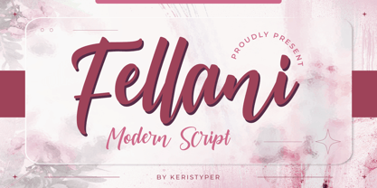 Fellani is a font created with a special touch to give a beautiful and attractive look. . This font is good for logo design, Social media, Movie Titles, Books Titles, short text even long text letters, and good for your secondary text font with sans or serif. **Featured:** * Standard Uppercase & Lowercase * Numeral & Punctuation * Multilingual : ä ö ü Ä Ö Ü ß ¿ ¡ * Alternate & Ligature * PUA encoded We recommend programs that support the OpenType feature and the Glyphs panel such as Adobe applications or Corel Draw. so you can use all the variations of the glyphs. Hope you enjoy our fonts!
 - Linotype Sketch by Linotype,
$29.99 Linotype Sketch is part of the Take Type Library, chosen from the contestants of Linotype’s International Digital Type Design Contests of 1994 and 1997. German designer Dieter Kurz gave his display font a calligraphic character. The forms lean slightly to the right and have a spontaneous and individual look. This light, cheerful font also displays a harmony among the forms and gives text a personal touch. Linotype Sketch combines well with modern text fonts which have the same narrow proportions. This font is well-suited for headlines and short and middle length texts with point size 12 or larger.
 - The Bellonte by Aminmario Studio,
$20.00 The Bellonte is a fashionable and relaxed handwritten font with a unique feel and a stunning impact. Comes with rough style regular and italic. This font is great for your creative projects such as watermark on photography, and perfect for logos & branding, photography, invitation, watermark, advertisements, product designs, stationery, wedding designs,label, product packaging, social media, movie titles, books titles, a short text even a long text letter and good for your secondary text font with sans or serif. And also for special events or anything that need handwritting taste. Thanks for checking out this font. I hope you enjoy it!
 - Valorica by Keristyper Studio,
$14.00 Valorica is a modern design with a vintage feel. A monoline display font that combines classic & modern styles. This font is good for logo design, Social media, Movie Titles, Books Titles, short text even long text letters, and good for your secondary text font with sans or serif. Featured: OTF Standard Uppercase & Lowercase Numeral & Punctuation Multilingual : ä ö ü Ä Ö Ü ß ¿ ¡ Alternate & Ligature PUA encoded We recommend programs that support the OpenType feature and the Glyphs panel such as Adobe applications or Corel Draw. so you can use all the variations of the glyphs. Hope you enjoy our fonts!
 - Mogicka by Keristyper Studio,
$14.00 Mogicka is a classic bold serif font with a stylish shape, It has both a modern and retro look. This font is good for logo design, Social media, Movie Titles, Books Titles, short text even long text letters, and good for your secondary text font with sans or serif. Featured: Standard Uppercase & Lowercase Numeral & Punctuation Multilingual : ä ö ü Ä Ö Ü ß ¿ ¡ Alternate & Ligature PUA encoded We recommend programs that support the OpenType feature and the Glyphs panel such as Adobe applications or Corel Draw. so you can use all the variations of the glyphs. Hope you enjoy our fonts!
 - Fukoya by Keristyper Studio,
$14.00 Fukoya is a bold font with a soft and confident impression, modern with a clean touch. This font is good for logo design, social media, movie and book titles, short text, even long text letters, and good for your secondary text font with the script, sans, or serif. Featured: Standard Uppercase & Lowercase Numeral & Punctuation Multilingual : ä ö ü Ä Ö Ü ß ¿ ¡ Alternates & Ligatures PUA encoded We recommend programs that support OpenType features and the Glyphs panel such as Adobe applications or Corel Draw so you can use all the variations of the glyphs. Hope you enjoy our fonts!
 - Elderich by Keristyper Studio,
$14.00 Introducing Elderich is a modern gothic typeface. Strong and geometric with a fraktur style inspired by the blackletter concept. This font is good for logo design, Social media, Movie Titles, Books Titles, short text even long text letters, and good for your secondary text font with script, sans, or serif. Featured: Standard Uppercase & Lowercase Numeral & Punctuation Multilingual : ä ö ü Ä Ö Ü ß ¿ ¡ Alternate & Ligature PUA encoded We recommend programs that support the OpenType feature and the Glyphs panel such as Adobe applications or Corel Draw. so you can use all the variations of the glyphs. Hope you enjoy our fonts!
 - Dafilea by Keristyper Studio,
$14.00 Introducing **Dafilea** font, a lightweight elegance in romantic curves with a glitchy and fluid aesthetic. This font is good for logo design, Social media, Movie Titles, Books Titles, short text even long text letters, and good for your secondary text font with the script, sans, or serif. **Featured:** * Standard Uppercase & Lowercase * Numeral & Punctuation * Multilingual : ä ö ü Ä Ö Ü ß ¿ ¡ * Alternate & Ligature * PUA encoded We recommend programs that support the OpenType feature and the Glyphs panel such as Adobe applications or Corel Draw. so you can use all the variations of the glyphs. Hope you enjoy our fonts!
 - Geofota by Keristyper Studio,
$14.00 Geofota is a bold and heavy modern style font inspired by urban street culture. This font is good for logo design, Social media, Movie Titles, Books Titles, short text even long text letters, and good for your secondary text font with sans or serif. Featured: Standard Uppercase & Lowercase Numeral & Punctuation Multilingual : ä ö ü Ä Ö Ü ß ¿ ¡ Alternate & Ligature PUA encoded We recommend programs that support the OpenType feature and the Glyphs panel such as Adobe applications or Corel Draw. so you can use all the variations of the glyphs. Hope you enjoy our fonts!
 - Kalvier by Keristyper Studio,
$14.00 Introducing Kalvier a horror display font for your Halloween project with sharp and spiky style. This font is good for logo design, Social media, Movie Titles, Books Titles, short text even long text letters, and good for your secondary text font with sans or serif. **Featured:** * Standard Uppercase & Lowercase * Numeral & Punctuation * Multilingual : ä ö ü Ä Ö Ü ß ¿ ¡ * Alternate & Ligature * PUA encoded We recommend programs that support the OpenType feature and the Glyphs panel such as Adobe applications or Corel Draw. so you can use all the variations of the glyphs. Hope you enjoy our fonts!
 - Rieskeda by Keristyper Studio,
$14.00 Rieskeda is a luxurious and elegant font influent by both classically elegant and modern. This font is good for logo design, Social media, Movie Titles, Books Titles, short text even long text letters, and good for your secondary text font with script, sans, or serif. Featured: Standard Uppercase & Lowercase Numeral & Punctuation Multilingual : ä ö ü Ä Ö Ü ß ¿ ¡ Alternate & Ligature PUA encoded We recommend programs that support the OpenType feature and the Glyphs panel such as Adobe applications or Corel Draw. so you can use all the variations of the glyphs. Hope you enjoy our fonts!
 - Bogemia by Keristyper Studio,
$14.00 Proudly introduce our new font Bogemian decorated with geometric elements inspired by the Boho style. This font is good for logo design, Social media, Movie Titles, Books Titles, short text even long text letters, and good for your secondary text font with sans or serif. **Featured:** * Standard Uppercase & Lowercase * Numeral & Punctuation * Multilingual : ä ö ü Ä Ö Ü ß ¿ ¡ * Alternate & Ligature * PUA encoded We recommend programs that support the OpenType feature and the Glyphs panel such as Adobe applications or Corel Draw. so you can use all the variations of the glyphs. Hope you enjoy our fonts!
 - Nosta by Protimient,
$29.95Nosta is a modern text typeface. It was designed to be easily legible and therefore expressly suitable for setting sizeable lengths of continuous text such as magazine articles, books and essays. It achieves this through, amongst other things, finely balanced proportions, optimal character spacing and an adherence to predictable letter forms. Despite this, however, Nosta manages to retain a contemporary look and feel by using a variety of modern type design devices such as the efficacious wedge serif. The italic avoids using too many of the cursive elements that are often found in traditional italics and has only a modest slant, giving it a modern look that does not overly disrupt the text while still providing emphasis. While designed for continuous text, Nosta can also be used as a display face, making it a good all round typeface, suitable for many applications. - Burgstaedt Antiqua by Linotype,
$29.99At first glance, Burgstaedt Antiqua looks like an old typewriter face, or rather like a typeface from a typewriter that has gone hopelessly wrong! Only after your second glance will you see this font for what it really is - a thoroughly new text face. Several features of Burgstaedt Antiqua, and its companion italic face, are worth special attention: First, the terminal styles of the letters vary throughout the alphabet. This gives text set in Burgstaedt Antiqua a slightly jittery feeling. A second interesting feature is the lowercase q", which takes the form of a shrunken-down uppercase "Q". Burgstaedt Antiqua Regular and Burgstaedt Antiqua Italic may be used in both text and headlines. For use in text, we recommend employing a slightly larger point size (12 pt or 14 pt and above). British designer Richard Yeend designed this family in 2002. - SCR-N by URW Type Foundry,
$39.99 SCR fonts are screen optimized (also called 'pixel fonts'). Unlike standard fonts (and like the few well-hinted fonts like Verdana or Arial), they give a crisp look on screen at very small sizes, thus increasing legibility. The perfect applications for those fonts are web pages and software user interfaces (computer, cellular phones, console games and any other system that uses a screen interface). Unlike most pixel fonts, SCR fonts contain kerning information. Kerning is the adjustment of space between certain pairs of characters (like 'AV') to make text look more fluid, thus increasing legibility and appeal. To benefit from this feature, auto-kerning must be activated in the application. In Photoshop, kerning must be set to 'Metrics'. Although SCR fonts are optimized for screen, they can be used for print (in Illustrator or Indesign for example) for a decorative 'computer text' effect. In this case, there is no constraint: they can be used as any other font. For screen use (in Photoshop, Fireworks, Flash... ), they have to keep aligned with the screen pixel grid not to look blurred or distorted. To achieve this, here are the guidelines to follow: RESOLUTION If the application permits it (Photoshop, Fireworks), document resolution must be set to 72 pixels per inch. SIZE The font size must be set to 10 (or multiples of 10) points. POSITIONING & ALIGNMENT The reference points of text fields and text blocks (upper left corner for left aligned text, upper right for right aligned text) must be positioned at integer values of pixels. In Photoshop, text can be precisely moved with [Edit Free Transform]. In Flash, movie clips containing text fields must also be positioned at integer values on the stage. Text must be aligned to the left or right only. Center alignment can be simulated with left alignment by adding spaces at the begin of each line. To dispense with the positioning and alignment constraints, text anti-aliasing can be turned off if the application permits it (Photoshop, Flash MX 2004). OTHER SETTINGS Leading (line spacing), tracking (letter spacing), manual kerning and baseline shift must be set either to integer values of points or to multiples of 100 units (depending on the application). Vertical and horizontal scaling must be set to 100%. Faux bold or Faux italic must not be used. The document must neither be resized on export, nor allow resizing (Flash Movies).
 - SCR-I by URW Type Foundry,
$39.99 SCR fonts are screen optimized (also called 'pixel fonts'). Unlike standard fonts (and like the few well-hinted fonts like Verdana or Arial), they give a crisp look on screen at very small sizes, thus increasing legibility. The perfect applications for those fonts are web pages and software user interfaces (computer, cellular phones, console games and any other system that uses a screen interface). Unlike most pixel fonts, SCR fonts contain kerning information. Kerning is the adjustment of space between certain pairs of characters (like 'AV') to make text look more fluid, thus increasing legibility and appeal. To benefit from this feature, auto-kerning must be activated in the application. In Photoshop, kerning must be set to 'Metrics'. Although SCR fonts are optimized for screen, they can be used for print (in Illustrator or Indesign for example) for a decorative 'computer text' effect. In this case, there is no constraint: they can be used as any other font. For screen use (in Photoshop, Fireworks, Flash... ), they have to keep aligned with the screen pixel grid not to look blurred or distorted. To achieve this, here are the guidelines to follow: RESOLUTION If the application permits it (Photoshop, Fireworks), document resolution must be set to 72 pixels per inch. SIZE The font size must be set to 10 (or multiples of 10) points. POSITIONING & ALIGNMENT The reference points of text fields and text blocks (upper left corner for left aligned text, upper right for right aligned text) must be positioned at integer values of pixels. In Photoshop, text can be precisely moved with [Edit Free Transform]. In Flash, movie clips containing text fields must also be positioned at integer values on the stage. Text must be aligned to the left or right only. Center alignment can be simulated with left alignment by adding spaces at the begin of each line. To dispense with the positioning and alignment constraints, text anti-aliasing can be turned off if the application permits it (Photoshop, Flash MX 2004). OTHER SETTINGS Leading (line spacing), tracking (letter spacing), manual kerning and baseline shift must be set either to integer values of points or to multiples of 100 units (depending on the application). Vertical and horizontal scaling must be set to 100%. Faux bold or Faux italic must not be used. The document must neither be resized on export, nor allow resizing (Flash Movies).
 - Starvetica - Unknown license

- Waimea by BA Graphics,
$45.00A bold powerful design with a bit of Latin flare, great for headlines yet suitable for text. - Doric by Wooden Type Fonts,
$15.00 A revival of one of the popular wooden type fonts of the 19th century, suitable for text.
 - Balshan MF by Masterfont,
$59.00 Derived from old signage, this serif font is unique and readable in titles and text as well.
 - Covered By Your Grace by Kimberly Geswein,
$5.00 Authentic markered handwriting, neat enough to read but fun enough to inject some personality into your project.
 - Lefferts JNL by Jeff Levine,
$29.00Lefferts JNL is a wide, light type face type with a square shape. Perfect for formal text. - Zarina by BohFonts,
$- Sans serif typeface with calligraphic features and outstanding contrast between curve and line designed for small text.
 - Clarendon Condensed by Wooden Type Fonts,
$15.00A revival of one of the popular wooden type fonts of the 19th century; suitable for text. - Grandeur by BA Graphics,
$45.00A contemporary design can be used in all applications from text to Headlines. Very clean and readable. - ThomasSchrift by URW Type Foundry,
$39.99 Since better (larger) text samples were available for Thomas Versalien, this font is closer to it's original.
 - News Gothic Light by Wooden Type Fonts,
$15.00 A revival of one of the popular fonts of the early 20th century, suitable for light text.
 - De Vinne by Wooden Type Fonts,
$15.00 A revival of one of the popular wooden type fonts of the 19th century; suitable for text.
 - Tzoba MF by Masterfont,
$59.00 Inspired by old manuscript serif font, this low contrast font makes it high legible for long texts.
 - News Gothic by Wooden Type Fonts,
$15.00 A revival of one of the popular of the early 20th century fonts, suitable for bold text.
 - Antique Three by Wooden Type Fonts,
$15.00A revival of one of the popular wooden type fonts of the 19th century, suitable for text. - Prosaic Std by Typofonderie,
$59.00 A Postmodern vernacular sanserif in 8 fonts Prosaic designed by Aurélien Vret is a Postmodern typographic tribute to the french vernacular signs created by local producers in order to directly market their products visible along the roads. These signs drawn with a brush on artisanal billboards do not respect any typographic rules. The construction of these letterforms is hybrid and does not respect any ductus. Nevertheless the use of certain tools provokes a certain mechanism in the development of letter shapes. It’s after many experiments with a flat brush, that’s these letterforms have been reconstructed and perfected by Aurélien Vret. This is the starting point for the development of an easily reproducible sanserif with different contemporary writing tools. From non-typographical references of Prosaic towards readability innovation The influence of the tool is revealed in the letterforms: angular counterforms contrasting to the smoothed external shapes. This formal contrast gives to Prosaic a good legibility in small sizes. These internal angles indirectly influenced by the tool, open the counterforms. In the past, to deal with phototype limitations in typeface production, some foundries modified the final design by adding ink traps. In our high resolution digital world, these ink traps — now fashionable among some designers — have little or no effect when literally added to any design. Should one see in it a tribute to the previous limitations? Difficult to say. Meanwhile, there are typeface designers such as Ladislas Mandel, Roger Excoffon, and Gerard Unger who have long tried to push the limits of readability by opening the counters of their typefaces. Whatever the technology, such design research for a large counters have a positive impact on visual perception of typefaces in a small body text. The innovative design of counter-forms of the Prosaic appears in this second approach. Itself reinforced by an exaggerated x-height as if attempting to go beyond the formal limits of the Latin typography. It is interesting to note how the analysis of a non-typographical letters process has led to the development of a new typographic concept by improving legibility in small sizes. Disconnected to typical typographic roots in its elaboration, Prosaic is somewhat unclassifiable. The formal result could easily be described as a sturdy Postmodern humanistic sanserif! Humanistic sanserif because of its open endings. Sturdy because of its monumental x-height, featuring a “finish” mixing structured endings details. The visual interplay of angles and roundness produces a design without concessions. Finally, Prosaic is Postmodern in the sense it is a skeptical interpretation of vernacular sign paintings. Starting from a reconstruction of them in order to re-structure new forms with the objective of designing a new typeface. Referring to typographic analogy, the Prosaic Black is comparable to the Antique Olive Nord, while the thinner versions can refer to Frutiger or some versions of the Ladislas Mandel typefaces intended for telephone directories. Prosaic, a Postmodern vernacular sanserif Prosaic is radical, because it comes from a long artistic reflection of its designer, Aurélien Vret, as well a multidisciplinary artist. The Prosaic is also a dual tone typeface because it helps to serve the readability in very small sizes and brings a sturdy typographic power to large sizes. Prosaic, a Postmodern vernacular sanserif
 - Bagerich by Zealab Fonts Division,
$10.00 Bagerich is font designed by Reza Rasenda & Riska Candra Dewi, with design choices inspired by the Art Nouveau era. Bagerich comes with stylistic, alternates, ligatures and supports multilingual languages. Create unique & beautiful logotype, use it as an elegant solution for your next magazine layout, or choose Bagerich for any graphics that require a sleek look with a elegant flair.
 - Paragon by Greater Albion Typefounders,
$12.50 Paragon is a display Roman family of nine faces, combining elements of formality and fun. It embodies a high degree of contrast between near hairline horizontal strokes and bold vertical strokes. The family is offered in three widths and in regular, small capitals and title faces. Use Paragon to lend impact to your next design project.
 - Satin Orange by Epiclinez,
$18.00 Satin Orange is an elegant and delicate script font. This versatile script font has a wide spectrum of applications ranging from greeting cards to headlines and is guaranteed to add a romantic feel to your next project. So what's included : Basic Latin A-Z & a-z Numbers, symbols, and punctuations Ligatures Accented Characters : ÀÁÂÃÄÅÆÇÈÉÊËÌÍÎÏÑÒÓÔÕÖØŒŠÙÚÛÜŸÝŽàáâãäåæçèéêëìíîïñòóôõöøœšùúûüýÿžß Thank you
 - Hayles by ahweproject,
$10.00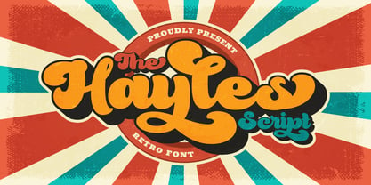 Hayles is a fun, retro-style script display font that is ready to take your designs to the next level. Add it to your vintage-inspired posters, stickers, apparel, or social media posts and you will definitely impress your audience. This font is PUA encoded, which means you can access all of the glyphs and swashes with ease!
 - Nikaru by Twinletter,
$18.00 Nikaru is a retro-inspired display font designed in a simple and contemporary style that gives it a modern feel. This elegant typography is perfect for designing any project, especially editorial work, branding, product packaging, and promotional designs with bold and fun characters. It’s time to add some zest to your next project with this font.
 - Cheesy Broccoli by Olivetype,
$18.00 Cheesy Broccoli is a care free signature script font. This versatile script font has a wide spectrum of applications ranging from logotype, product branding to headlines. Add a masculine feel to your next project with this modern calligraphy-styled font. So what’s included : Basic Latin A-Z & a-z Numbers, symbols, and punctuations Ligatures Accented Characters : ÀÁÂÃÄÅÆÇÈÉÊËÌÍÎÏÑÒÓÔÕÖØŒŠÙÚÛÜŸÝŽàáâãäåæçèéêëìíîïñòóôõöøœšùúûüýÿžß Thank you
