10,000 search results
(0.04 seconds)
- Murisa Baby Fish by Murisa Studio,
$10.00 Murisa BabyFish is our next font in early 2022. This font is inspired by the joy of children playing. Their joy is reflected in the creation of this font. Cheerful, joyful and colorful, are the strengths of this font. This font is perfect for use in your products that are targeting children and teenagers. Babyfish will lead your product to success. Get it right now.
 - Display Hatched by Greater Albion Typefounders,
$16.50 Display Hatched is ideal for posters with an industrial theme and is designed as a complement to Greater Albion’s “Singwriter Standard” typeface. All glyphs are diagonally shaded giving just a delicate touch of ‘industrial edge’ which is so ‘on trend’ at the moment. Display Hatched includes small capitals and title forms, as well as three forms of numerals. Bring a little industrial grit to your next project!
 - Brenly by Valentino Vergan,
$16.00 Brenly is a modern variable sans serif font. Brenly has a unique and elegant look which makes it perfect for designing posters, brand packages & logos. Brenly also has a variable version, which makes it easy to manually adjust the slant from oblique to reversed oblique. If you are looking for something modern and unique for your next project, Brenly is the font for you.
 - Valley Country by Balpirick,
$15.00 Valley Country is a Modern Script Font. Valley Country Script is an enchanting handwritten font. This versatile script font has a wide spectrum of applications ranging from greeting cards to headlines and is guaranteed to add a romantic feel to your next project. Valley Country also multilingual support. Enjoy the font, feel free to comment or feedback, send me PM or email. Thank you!
 - Ruined Dreams by Gleb Guralnyk,
$14.00 Hello! Introducing an original bold font with crashed letters. A unique feature of "Ruined Dreams" font is few variations for each English letter which creates more natural broken effect. Using OpenType feature (contextual alternates) each next letter will be replaced automatically. Note: Multilingual characters has only 2 variants for capital and small letters. Please make sure that OpenType features in your app are supported & enabled.
 - Something Sweet Duo by Ghuroba Studio,
$13.00 Something Sweet is a beautiful and modern duo font. It combines a cute script with a great sans serif. Combining these two fonts on your next design will give a versatile and outstanding feel. This font is PUA encoded which means you can access all of the cute glyphs and swashes with ease! It also features a wealth of special features including alternate glyphs and ligatures.
 - Rollinkland by Almarkha Type,
$29.00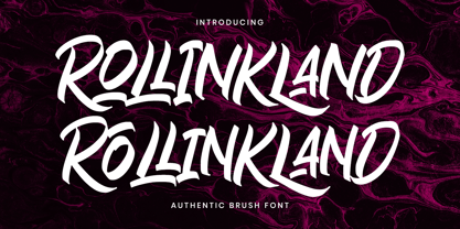 Rollinkland is a Authentic brush font with a clear style and dramatic movement this font is great for your next creative project such as logos, printed quotes, invitations, cards, product packaging, headers, Logotype, Letterhead, Poster, Apparel Design, Label, and etc. Rollinkland comes with uppercase, lowercase, numerals, accents (Multilingual characters), punctuations and so many variations on each character include OpenType alternates, swash to let you customize your design
 - Joleigh by Supfonts,
$12.00 This font is a new Signature Script with a floating baseline, ligatures, swashes and multilingual support :) Joleigh Script will look beautiful on holiday invitations, wedding invites and stationery, logos, and more. Test it out below to see how it could look for your next project! Includes: Uppercase and lowercase Numbers and punctuation Foreign language support 159 ligatures Check out my blog: www.instagram.com/dmitriychirkov pinterest.com/dmitriychirkov7 Enjoy!
 - Salsiccia by Bech Type,
$19.00 Inspired by bold and rounded typefaces on signs from the 1970s, Salsiccia can promote both your hot dog stand and your international toy store enterprise. Its boldness and roundness is combined with classical proportions, with wide letters — like the O — next to little nubby ones — like the T. This not only looks nice, but helps us even out the white spaces across words and sentences.
 - Linotype American Indian by Linotype,
$29.99German designer Georg Popp designed Linotype American Indian in 2002. This symbol font contains mostly-triangular elements, which were inspired by paintings and other arts practiced by the North American Plains Indians. The symbols in Linotype American Indian, and Popp's other fonts, add a delightful touch to any design, especially when used in repetition. Try setting them large in your next flyer or brochure. - Tropical Harmony by Balpirick,
$15.00 Tropical Harmony is a Modern Calligraphy Font. Tropical Harmony Script is an enchanting handwritten font. This versatile script font has a wide spectrum of applications ranging from greeting cards to headlines and is guaranteed to add a romantic feel to your next project. Tropical Harmony also multilingual support. Enjoy the font, feel free to comment or feedback, send me PM or email. Thank you!
 - Something Rounded by wearecolt,
$16.00 Something Rounded is a soft version of Something New and has been designed with logo designers and typographers firmly in mind. This feature-packed display font is a perfect addition to your design arsenal, ready for your next logo wordmark, heavy headings, or coffee labels. "A stylish mix of serif and blackletter" Great for; logos, branding materials, business cards, gift cards, t-shirts, prints, posters, quotes, etc.
 - Bittersoni by Letterara,
$14.00 Bittersoni is an enchanting handwritten font. This versatile script font has a wide spectrum of applications ranging from greeting cards, logos to headlines and is guaranteed to add a romantic or casual feel to your next project. Add it confidently to your projects, and you will love the results. This font is PUA encoded which means you can access all the beautiful glyphs and swashes with ease!
 - City Spark by Olivetype,
$18.00 Looking for a font that's fun and expressive? Look no further than City Park! This playful hand-lettered font is a good option for posters, headlines, logotypes, product packaging, movie titles, and more. With its unique character and charm, City Park can make your next project stand out from the crowd. City Park font includes : Standard Latin Uppercase and Lowercase Numbers, symbols, and punctuations Multilingual Support. Cheers
 - Maelie by Supfonts,
$15.00 Hello dears! This font is a new Calligraphic Script. Here is that: floating baseline, ligatures and multilingual support :) Maelie Script will look beautiful on holiday invitations, wedding invites and stationery, logos, and more. Test it out below to see how it could look for your next project! Includes: Uppercase and lowercase Numbers and punctuation Foreign language support Ligatures Check out my blog: https://www.instagram.com/zloillev pinterest.com/dmitriychirkov7
 - Nothing So Childish by PizzaDude.dk,
$20.00 If you're looking for cuteness, something whimsical and unpredictable madness - then Nothing So Childish is something for you. The font is 100% handmade with a slightly dry pen. With a closer look, the font reveals several scribbles and scratches - only to make the font look more authentic! Your next birthday- or greeting card will love this font! :) Comes with ligatures which substitutes double letters!
 - Rosalina by Supfonts,
$15.00 Hello, friends. Here's my new experiment. This font breaks the boundaries even more. Rosalina combines all these qualities: simple and clear, looks at ease. It is perfect for signatures or design, wedding invites and cards, where you do not need a strict style :) Test it out below to see how it could look for your next project! Check out my blog: https://www.instagram.com/zloillev pinterest.com/dmitriychirkov7 Enjoy
 - Scary Scrimshaw NF by Nick's Fonts,
$10.00Fire up the incense and break out the love beads! A 1968 poster for a Doors concert by legendary artist Gary Grimshaw provided the inspiration for this wild, far-out and funky romp through the alphabet. Use it liberally to add a little trippy hippie charm to your next project. Both versions of the font include 1252 Latin, 1250 CE (with localization for Romanian and Moldovan). - Andron 2 EIR Corpus by SIAS,
$34.90 SIAS opens a new chapter in Irish vernacular typography: the Andron-2-Irish font family. The genes of the insular typographic heritage have been blended with the timeless classical style of the versatile Andron series. Whereas most Irish-style fonts available more or less stick to ancient designs, Andron-2-EIR is different: it’s an entirely new design in which Irishness meets the beauty of a matured Venetian Roman text face. Envision a new horizon for setting Irish text in its own visual mode! Now you can utilize Italics, Semibold and Small capitals for Irish just as you have been doing in other languages for a long time. But the icing on the cake is the fifth font: Andron Irish Middlecase honours the rich medieval tradition of Ireland by a special uncial-style glyph set. It corresponds to the Andron MC series. Last but not least the Irish type connoisseur will relish this font package for it’s unique utilization of Opentype functionality. In Opentype-aware applications, by just ticking a box you can switch to the special insular forms of s and r. By ticking another box you can transform the text from modern-day orthography to the traditional spelling with lenited consonants. This built-in intelligence has never been implemented in any Irish font before. Briefly, the Opentype substitution features are: [Ligatures] – default basic f-ligatures; [Descretionary Ligatures] – more ligatures for typographic reason, mainly t- and long-s-combinations; [Style set 1] – turns all lowercase r and s into their insular glyph variants; [Style set 2] – replaces all consonant-h digraphs by dotted consonants (ḃċḋḟġṁṗṡẛṫ, ḂĊḊḞĠṀṖṠṪ), works for lowercase, uppercase and upper-lowercase alike; [Style set 3] – provides another range of additional special ligatures (for Regular and Italic only); [Oldstyle figures] – turns the default lining figures into proportional oldstyle figures. Andron Irish will also perfectly combine with every other Andron product in mixed settings. For an overview please go to the SIAS main page. For a quick reference go to Andron Latin, Andron Greek, Andron English or Andron MC. For more wonderful new Irish fonts look at Hibernica and Ardagh!
 - Arabetics Symphony by Arabetics,
$59.00 Arabetics Symphony is a Sans Serif Latin typeface with a comprehensive support for the Arabetic scripts, including Quranic texts. It is designed with a uniform glyph thickness and weight throughout, using a combination of simplified and clear open lines and curves and plenty of spikes and visual hints to compensate for the missing Latin serifs or traditional cursive Arabic calligraphic influence. This type family is suitable for both text and display applications. Additional Latin spacing is added to match an overall open-looking Arabic and is further maintained by a careful implementation of a typical Latin font kerning process. The design of this font family, including metrics and dimensions, was intended to make its Latin harmonize with other Arabetics foundry fonts. Arabetics Symphony fully supports MS 1252 Western and 1256 Arabic code pages, in addition to all the transliteration characters required by the ALA-LC Romanization tables. Users can either select an accented character directly or form it by keying the desired combining diacritic mark following an unaccented character. For Arabic, it fully supports Unicode 6.1, and the latest Arabic Supplement and Extended-A Unicode blocks. The Arabic design of this font family follows the Mutamathil Taqlidi design style with connected glyphs, emphasizing vertical strokes to bring added harmony, and utilizing slightly varying x-heights to match that found in Latin. The Mutamathil Taqlidi type style uses one glyph for every basic Arabic Unicode character or letter, as defined by the Unicode Standards, and one additional final form glyph, for each freely-connecting letter of the Arabic cursive text. Arabetics Symphony includes the required Lam-Alif ligatures in addition to all vowel diacritic ligatures. Soft-vowel diacritic marks (harakat) are selectively positioned with most of them appearing on similar high and low levels—top left corner—, to clearly distinguish them from the letters. Tatweel is a zero-width glyph. Keying the “tatweel” key (shft-j) before Alif-Lam-Lam-Ha will display the Allah ligature. Arabetics Symphony includes both Arabic and Arabic-Indic numerals, in addition to generous number of punctuation and mathematical symbols. Available in both OpenType and TrueType formats, it includes two weights, regular and bold, each has normal, Italic, and left-slanted styles.
 - Protipo by TypeTogether,
$35.00 Protipo helps information designers work smarter. Veronika Burian and José Scaglione’s Protipo type family is an information designer’s toolbox: a low-contrast sans of three text widths with a separate headline family, accompanied by an impressive two-weight icon set, and working with the advanced variable (VAR) font format. From annual reports and wayfinding to front page infographics and poster use, designers consistently turn to the simplicity and starkness of grotesque sans fonts to get their point across. Protipo is made for such environments. When designing information you may start with the headline, which in the case of this family is called Protipo Compact and comes in eight weights. From Hairline to Black, set it large, overlap it, or let it run off the page. Protipo Compact was made to hit hard and attract attention with a different character set and different proportions than the three text fonts. It sets the stage for what’s to come. Great information designers are aces at melding form and function, so we’ve stacked the Protipo family with Narrow, Regular, and Wide versions as a way of organising your information and directing the reader. Each width has seven distinct weights (light to bold) and italics, while maintaining the round-rect shapes of its DNA. Subtle details amplify its place in the typographic universe, like an ‘a’ and ‘e’ that go from solid to supple when italicising, an ‘f’ that gains an italic descender, two versions of the lowercase ‘r’ and ‘l’, and clipped corners on diagonals to keep the tight fit inherent to this kind of design work. Protipo is not meant to be loudmouthed, but stakes its claim through refinement, breadth, and impact. Some changes at first don’t seem substantial, but the Protipo family doesn’t handle text like most in its category. Protipo helps readers find and process data in a clear and unequivocal way and accounts for the complexity involved in rendering large amounts of information while still appealing to aesthetics. Protipo is ideal in all informative situations: apps, infographics, UI, wayfinding, transport, posters, display, and even internet memes. Add to all this the icon sets and upcoming variable font capability, and you’re assured a level of creativity, productivity, and impact on a much greater scale.
 - Smashed Display by Raquel Fernandes,
$17.49 Smashed Typeface is a reversed-contrast, slab serif, display font. Was inspired by the old west days that we can often see in printing, circus posters and wanted notices in western movies, even tho the style was really used in many parts of the world during that period. This style is sometimes called as "circus letter" too. Was designed to have a modern look, using straighter lines and an extended style, can be used on various situations like posters, logos for restaurants, alternative business like an old washing station (as you can see on the next images), music bands etc. I believe that is a promising typography that can be used by various designers in a lot of diverse project. It counts with 226 multi language characters, one weight on version 1.0, on a next version I hope to take this project to another level, creating a variable typeface from condensed to really extended weights. It would complete this typography and eliminate the limits of use.
 - Heystone Typeface by Joelmaker,
$18.00 ITRODUCING Heystone Typeface & Heystone Exstrude Heystone Typeface is a combination of brush script with an Extrude effect from artistic touch elegant modern the as well as a unique blend of ligatures a letter, so that the authors compose it with a and little swirly embedding, so that a modern font is formed and ready to make a statement by adding elegant and unique flair to your next design project. Heystone Typeface & Extrude can be used for various purposes such as Magazine Title, Poster, Logo, T-Shirt, Sub Title, Business cards, Trademark, Label, Book Covers, Wedding Invitations,Templates Instagram Story Post, Greeting Cards, Quotes, etc. These letters are embedded into the font file and easily accessible in programs such as photoshop and illustrator. You can access these in more basic design programs but you will need to use your character map or font book Come on..let's style and pamper your next design with Heystone Typeface & Extrude. File Included Thanks You for Visit
 - Bhuyin by Twinletter,
$17.00 "Welcome to the world of one-of-a-kind typography!" Bhuyin is a display typeface with a totally unique sense of design. Bhuyin is the ideal choice if you need a bold and distinct style for a wide range of visual design tasks. What distinguishes Bhuyin from others? Its attributes are fantastic. With ligatures and alternatives available, Bhuyin allows you to express yourself in an infinite number of ways. You can quickly construct one-of-a-kind letter combinations to lend a particular, personalized touch to any project. Because we understand the value of interacting with a worldwide audience, Bhuyin supports several languages. Your message will be clearly and successfully delivered to individuals all around the world. Are you ready to take your design to the next level? Bhuyin is ready to take your projects to the next level. Get this font now and see how Bhuyin turns every design into an unforgettable work of art.
 - Zomsenso by Pootis Type Corp.,
$31.99 Zomsenso is an angular, semi-modular typeface that supports OpenType alternates. The angular part means that the entire* font uses only angular segments and shapes. The alternate glyph shapes are under Stylistic Set 01. This font includes Seven Segment display (U+E000 to U+E07F) and arbitrary fractions (U+E1nd, n=numerator; d=denominator) that are mapped to the Private Use Area, so users can easily insert them via Unicode input. You can combine these fractions with the superscript and subscript numerals to create more fractions. This font can be used for essays, signs, logos, posters, commercial projects, videos, and many more. *except the circles in the Geometric Shapes block, which are still round
 - Socialite JNL by Jeff Levine,
$29.00Socialite JNL takes its cue from the Art Deco style of the 1930s with its clean, angular lines and stylized letter shapes. - MarkerMoe by JOEBOB graphics,
$- What happens when you write small characters with a huge marker? The answer is MarkerMoe; very irregular handwriting that's only just readable.
 - Cybersky by Typefactory,
$14.00 Cybersky is a sharp, angular, futuristic font in a retro style. Perfect for sci-fi themes, night street race and space adventures!
 - Master Script by Solotype,
$19.95An unusual angular vertical script. In late Victorian times it was seen mostly in advertising work, seldom in social stationery and announcements. - P22 Freely by IHOF,
$24.95 A loosely-written, slightly irregular but very legible handwriting style. Useful for the personal touch on menus, advertisements, greeting cards, flyers etc.
 - RePublic by Suitcase Type Foundry,
$75.00In 1955 the Czech State Department of Culture, which was then in charge of all the publishing houses, organised a competition amongst printing houses and generally all book businesses for the design of a newspaper typeface. The motivation for this contest was obvious: the situation in the printing presses was appalling, with very little quality fonts existing and financial resources being too scarce to permit the purchase of type abroad. The conditions to be met by the typeface were strictly defined, and far more constrained than the ones applied to regular typefaces designed for books. A number of parameters needed to be considered, including the pressure of the printing presses and the quality of the thin newspaper ink that would have smothered any delicate strokes. Rough drafts of type designs for the competition were submitted by Vratislav Hejzl, Stanislav Marso, Frantisek Novak, Frantisek Panek, Jiri Petr, Jindrich Posekany, and the team of Stanislav Duda, Karel Misek and Josef Tyfa. The committee published its comments and corrections of the designs, and asked the designers to draw the final drafts. The winner was unambiguous — the members of the committee unanimously agreed to award Stanislav Marso’s design the first prize. His typeface was cast by Grafotechna (a state-owned enterprise) for setting with line-composing machines and also in larger sizes for hand-setting. Regular, bold, and bold condensed cuts were produced, and the face was named Public. In 2003 we decided to digitise the typeface. Drawings of the regular and italic cuts at the size of approximatively 3,5 cicero (43 pt) were used as templates for scanning. Those originals covered the complete set of caps except for the U, the lowercase, numerals, and sloped ampersand. The bold and condensed bold cuts were found in an original specimen book of the Rude Pravo newspaper printing press. These specimens included a dot, acute, colon, semicolon, hyphens, exclamation and question marks, asterisk, parentheses, square brackets, cross, section sign, and ampersand. After the regular cut was drafted, we began to modify it. All the uppercase letters were fine-tuned, the crossbar of the A was raised, E, F, and H were narrowed, L and R were significantly broadened, and the angle of the leg and arm of the K were adjusted. The vertex of the M now rests on the baseline, making the glyph broader. The apex of the N is narrower, resulting in a more regular glyph. The tail of Q was made more decorative; the uppercase S lost its implied serifs. The lowercase ascenders and descenders were slightly extended. Corrections on the lower case a were more significant, its waist being lowered in order to improve its colour and light. The top of the f was redrawn, the loop of lowercase g now has a squarer character. The diagonals of the lowercase k were harmonised with the uppercase K. The t has a more open and longer terminal, and the tail of the y matches its overall construction. Numerals are generally better proportioned. Italics have been thoroughly redrawn, and in general their slope is lessened by approximatively 2–3 degrees. The italic upper case is more consistent with the regular cut. Unlike the original, the tail of the K is not curved, and the Z is not calligraphic. The italic lower case is even further removed from the original. This concerns specifically the bottom finials of the c and e, the top of the f, the descender of the j, the serif of the k, a heavier ear on the r, a more open t, a broader v and w, a different x, and, again, a non-calligraphic z. Originally the bold cut conformed even more to the superellipse shape than the regular one, since all the glyphs had to be fitted to the same width. We have redrawn the bold cut to provide a better match with the regular. This means its shapes have become generally broader, also noticeably darker. Medium and Semibold weights were also interpolated, with a colour similar to the original bold cut. The condensed variants’ width is 85 percent of the original. The design of the Bold Condensed weights was optimised for the setting of headlines, while the lighter ones are suited for normal condensed settings. All the OpenType fonts include small caps, numerals, fractions, ligatures, and expert glyphs, conforming to the Suitcase Standard set. Over half a century of consistent quality ensures perfect legibility even in adverse printing conditions and on poor quality paper. RePublic is an exquisite newspaper and magazine type, which is equally well suited as a contemporary book face. - Cyclic by ArtyType,
$29.00 Cyclic is a stylish and modern slab serif in three practical, highly legible weights. The name ‘cyclic’ suits this typeface in several ways. Firstly because I wanted to create an ‘all-round’ typeface (pun intended) that could adapt to most applications, but also, as the dictionary definition explains - “occurring in circles, regularly repeated”. The basis for a lot of the characters did begin with a circle or sections of one; the equally distributed, rounded forms of this font are complemented however by the vertical strokes, and further counter-balanced by angular slab serifs on the remaining glyphs. Curved alternates with a celtic vibe are also included in the fonts and feature on the default slots in the separate Cyclic Uncial set. In summary, the whole Cyclic type family comprises a combined palette of circles and straight lines; something the cubist movement would have been proud of!
 - Cyclic Uncial by ArtyType,
$29.00 Cyclic is a stylish and modern slab serif in three practical, highly legible weights. The name ‘cyclic’ suits this typeface in several ways. Firstly because I wanted to create an ‘all-round’ typeface (pun intended) that could adapt to most applications, but also, as the dictionary definition explains - “occurring in circles, regularly repeated”. The basis for a lot of the characters did begin with a circle or sections of one; the equally distributed, rounded forms of this font are complemented however by the vertical strokes, and further counter-balanced by angular slab serifs on the remaining glyphs. Curved alternates with a celtic vibe are also included in the fonts and feature on the default slots in the separate Cyclic Uncial set. In summary, the whole Cyclic type family comprises a combined palette of circles and straight lines; something the cubist movement would have been proud of!
 - Yes:Union - Unknown license

- Regato by La Boîte Graphique,
$39.00 Regato is a hand made font ideal for your graphic project. Usage recommendations : Title, short text, children's book, poster, book cover, brochure, label, magazine
 - JulianaJoy by Lebbad Design,
$24.95 JulianaJoy is a condensed elegant sharp serif typeface for headline display and text use. Several alternate characters are included with this original font design.
 - Comicbon by BaronWNM,
$12.00 Comicbon is a handwritten font that simultates text being writen on a comic, ads, creating logos, branding, teaching websites/apps/games, and many more.
 - PR Arco by PR Fonts,
$10.00 Arcs for framing curved lines of text, in a style common on Victorian posters and almanac covers, and still seen on modern food packaging.
 - Water by La Boîte Graphique,
$25.00 Water is a rounded hand-printed font ideal for graphic project. Usage recommendations : Title, short text, children’s book, poster, book cover, brochure, label, magazine
 - Andron Freefont by SIAS,
$- Try out one of the most distinguished text faces for free! Andron is a new design inspired by the best of classical Roman typefaces.
